


Color affects up to 90% of a first impression. That single fact explains why getting your color palette right matters more than most people realize.
So what is a color palette, exactly? It’s the specific set of colors chosen to work together in a design, brand, or creative project. Not random picks. A deliberate system built on color theory, harmony rules, and practical testing.
This guide covers how palettes are constructed, the difference between a palette and a color scheme, how major brands use them, and what makes one actually work across screens, print, and physical spaces. Whether you’re picking colors for a website, a logo, or a room, the principles are the same.
What Is a Color Palette
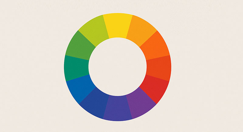
A color palette is a specific set of colors selected to work together within a design, artwork, or visual project. It’s not a random collection of shades thrown onto a canvas. It’s a system.
The term comes from the physical board painters use to hold and mix pigments. That original tool, usually oval-shaped and made of wood, gave artists a way to organize their color choices before applying them. The digital version does the same thing, just without the mess.
Every color palette consists of individual hues, each carrying a specific saturation level and brightness value. These three properties (hue, saturation, brightness) define how each color looks and feels within the set.
Research from Straits Research shows that color can increase brand recognition by up to 80%. That’s not a small number. It means the palette you pick for a project does more than just “look nice.” It creates memory.
People often confuse a color palette with a color scheme. They’re related but not identical. A color scheme refers to the specific relationship rule between colors (complementary, triadic, etc.). A color palette is the broader collection of all usable colors in a project, which may follow one scheme or combine several.
Think of it like this. A color scheme is the grammar. The palette is the full vocabulary.
Users form opinions about a product within 90 seconds, and between 60% and 90% of that initial impression is based on color alone, according to research cited by Emerald Insight. So whether you’re building a website, designing a logo, or picking paint for a living room, the palette is where everything starts.
Types of Color Palettes
Not all palettes are built the same way. The type you choose depends on the mood you’re after, the medium, and how much visual tension you want in the final result.
Monochromatic and Analogous Palettes

Monochromatic palettes use a single base hue and explore it through different tints, shades, and tones. You get monochrome colors that feel unified and cohesive without competing for attention.
Looka’s 2025 logo data found that brown, blue, and yellow had the most monochromatic pairings among new brand logos. Designers are pairing dark and light ends of the same color for that sleek, modern look.
Analogous colors sit next to each other on the color wheel. They blend smoothly and create a natural, easy-on-the-eyes result. Spotify’s green-and-dark palette is a good example of this approach in action.
Both types work well when you want calm, low-friction visuals. But they can feel flat if you’re not careful with contrast.
Complementary and Triadic Palettes

A complementary color scheme pairs colors from opposite sides of the color wheel. High tension. Maximum visual pop.
A triadic color scheme takes three colors equally spaced around the wheel. It’s harder to pull off, but the payoff is a balanced yet vibrant result that grabs attention fast.
| Palette Type | Number of Hues | Visual Effect | Best For |
|---|---|---|---|
| Monochromatic | 1 (varied tones) | Unified, minimal | Editorial, luxury brands |
| Analogous | 2–3 adjacent | Harmonious, natural | Wellness, nature brands |
| Complementary | 2 opposites | High contrast, bold | CTA-heavy pages, posters |
| Triadic | 3 equidistant | Vibrant, balanced | Playful brands, apps |

There are also split-complementary and tetradic palettes. Split-complementary uses one base color plus the two colors adjacent to its complement. Tetradic uses four colors forming a rectangle on the wheel.
These take more skill to manage. Your mileage may vary depending on the project complexity.
How Color Palettes Are Built
Building a palette is part color theory, part intuition, and part trial and error. Took me forever to figure out there’s no single “right” way to do it. But there are methods that consistently produce better results.
Building a Palette from a Base Color
Start with one color. Just one. This becomes the anchor for everything else.
From that base, apply color harmony rules using the color wheel. Expand outward by pulling complementary, analogous, or triadic colors depending on the mood you need.
Tools that speed this up:
- Adobe Color generates palettes from harmony rules and can pull colors from uploaded images
- Coolors lets you lock a base color and press spacebar to generate matching combinations
- Khroma uses AI to learn your color preferences over time
An Adobe 2025 survey found that 18% of respondents believed brands would use AI-generated palettes for most color decisions moving forward. That’s still a minority, but the tools are getting smarter every quarter.
Extracting Palettes from Images
One approach that’s gotten popular: pulling a palette directly from a photograph or piece of artwork.
Upload a landscape photo. The tool samples the dominant and accent colors, then organizes them into a usable set. Adobe Color, Coolors, and Colormind all support this.
It works particularly well for branding projects where the visual identity needs to connect with a specific place, feeling, or cultural reference. Interior designers and packaging design teams use this method constantly.
The big catch? Extracted palettes often need tweaking. Raw photo colors don’t always meet accessibility standards, especially when it comes to color contrast ratios for text readability.
Color Palette vs. Color Scheme vs. Color System
These three terms get tossed around like they mean the same thing. They don’t.
Color palette: the full collection of colors available for a project. It’s the total set you draw from.
Color scheme: the rule or relationship governing how colors relate to each other. Complementary, analogous, triadic. These are schemes.
Color system: a structured framework for applying colors at scale. Google’s Material Design color tokens, for example, define semantic roles for each color across entire product ecosystems.
| Term | What It Is | Example |
|---|---|---|
| Color Palette | Full set of available colors | Brand’s 8 approved colors |
| Color Scheme | Rule governing color relationships | Complementary, triadic |
| Color System | Scalable framework with tokens and roles | Material Design, IBM Carbon |
The distinction matters most in web design and product work. A palette tells you what colors you have. A system tells you when and where to use them.
Figma’s color styles and variables, for instance, let teams define a palette and then assign semantic roles (primary, secondary, error, success) that carry meaning across every component. That’s a system. Without it, designers on large teams end up using slightly different shades of blue across 40 different screens. And nobody notices until it’s too late.
What Makes a Color Palette Work
A palette can have beautiful colors individually and still fall apart when applied. The difference between a palette that works and one that doesn’t comes down to structure.
The 60-30-10 rule is probably the most reliable starting point. 60% dominant color. 30% secondary. 10% accent. This creates visual hierarchy without overwhelming the viewer.
Research from Website Planet shows that 95% of the top 100 global brands use only one or two colors in their logos. Restraint isn’t boring. It’s strategic.
Contrast and Hierarchy
Without enough contrast between your primary and accent colors, the palette feels muddy. The eye doesn’t know where to land.
WCAG 2.2 requires a minimum contrast ratio of 4.5:1 for normal text and 3:1 for large text. WebAIM’s 2025 Million analysis found low-contrast text on 79.1% of the top one million home pages. Color contrast is the single most common accessibility violation on the web.
Cultural Context
White signals purity in Western cultures but mourning in parts of East Asia. Red means luck in China but danger in the U.S.
Color psychology shifts dramatically across regions. A palette that works in New York might misfire in Tokyo. If your audience is global, you need to test color associations with local users, not just assume they’ll read the way you intended.
Context Over Isolation
I always test palettes inside the actual layout, never in a standalone swatch grid. Colors behave differently on dark backgrounds versus light ones, next to photographs versus flat shapes.
Simulate colorblindness modes using tools like Stark or Color Oracle. If your palette relies entirely on color to communicate meaning (green for success, red for error), you’re shutting out roughly 8% of men with color vision deficiency.
Color Palettes in Branding and Identity
Color is probably the fastest shortcut to brand recognition that exists. Faster than a tagline. Faster than the logo shape.
Amra and Elma’s 2025 data found that 78% of consumers remembered a brand’s colors, while only 43% could recall its name. That gap is huge. It means people are recognizing your brand by its palette before they even process the words.
Coca-Cola owns red. Tiffany & Co. literally trademarked their specific shade of blue (Pantone 1837). Slack uses a multi-color palette that somehow feels cohesive despite having four distinct hues in its mark.
Why consistency matters financially: more than 60% of companies reported a roughly 20% revenue boost from maintaining consistent branding, including palette use, according to Amra and Elma.
A brand palette lives inside the brand guidelines document. It defines exact hex codes, RGB values, and CMYK equivalents for print. The brand style guide then shows how those colors should appear across different contexts: social media, physical signage, packaging, dark mode interfaces.
Look, nothing annoys me more than seeing a brand use seven different shades of “their blue” across platforms because nobody pinned down the exact values. That’s how visual identity erodes.
Among Fortune 500 companies, blue is the dominant logo color at approximately 40% of the list, according to Website Planet research. Red comes second at about 30%, followed by grayscale at 23%. If you’re building a brand in finance, tech, or healthcare, blue is the safe bet. But “safe” is a double-edged sword when everyone in your category looks the same.
Adobe’s 2025 consumer survey showed that 50% of consumers have chosen one brand over another based solely on color. For Gen Z and millennials, that number climbed to 51%. The palette isn’t a detail. It’s a decision driver.
Color Palettes in Web and UI Design

In digital product design, a color palette does more than decorate. It communicates function. Every button, alert, and navigation element relies on color to signal what it does and how it behaves.
Lounge Lizard research shows that 93% of buyers focus on visual appearance when making purchasing decisions, and color influences 85% of those choices. That pressure falls directly on UI teams to get palette decisions right from the start.
Semantic Colors in Interface Design
Semantic colors are palette entries tied to meaning rather than aesthetics. Green means success. Red means error. Amber means warning. Blue means information.
These aren’t arbitrary choices. They’re baked into design system frameworks like Google’s Material Design, IBM’s Carbon, and Microsoft’s Fluent. Each system defines color tokens (named variables) that map specific hex values to functional roles across every component.
| Color Role | Purpose | Typical Hue |
|---|---|---|
| Primary | Brand identity, headers, key CTAs | Brand-specific |
| Secondary | Supporting sections, illustrations | Complements primary |
| Accent | Links, badges, attention elements | High contrast |
| Neutral | Backgrounds, borders, text | Grays, off-whites |
| Semantic | Success, error, warning, info | Green, red, amber, blue |
CSS custom properties (variables) and Tailwind theme configs make it possible to manage these roles in code. Change one token, and the update rolls across every component that references it.
Accessibility and Color Contrast
WebAIM’s 2024 Million analysis found low-contrast text on 81% of home pages tested. It was the most common accessibility violation detected across the entire sample of one million websites.
WCAG 2.2 sets clear minimums:
- 4.5:1 contrast ratio for normal text
- 3:1 for large text (18pt or 14pt bold)
- 3:1 for UI components and graphical objects
Never rely on color alone to communicate meaning. If a form field turns red on error but has no icon or text label, roughly 8% of male users with color vision deficiency may miss the signal entirely.
Tools like the Stark plugin, WebAIM Contrast Checker, and Color Oracle let you test palettes against these standards before shipping. Figma’s color styles now support built-in contrast checking between layers.
Dark Mode Palettes
By 2025, around 82% of smartphone users prefer dark mode, according to Earthweb data. Stack Overflow’s annual survey shows over 85% of developers also default to dark interfaces.
A dark mode palette isn’t just the light palette inverted. You need separate tokens: softer blacks (not pure #000000), slightly desaturated text colors, and adjusted accent hues that maintain readability against dark backgrounds. Mini Tools Hub research found that sites using dark mode as default see 22% longer session durations.
Color Palettes in Art, Fashion, and Interior Design

Color palettes exist well beyond screens. The concept is older than any digital tool. Painters, textile makers, and architects have been building with deliberate color sets for centuries.
Limited Palettes in Fine Art
Anders Zorn, the Swedish painter, became famous for working with just four pigments: yellow ochre, cadmium red, ivory black, and white. The “Zorn palette” proved you could paint almost any subject convincingly with extreme color restraint.
Johannes Itten, the Bauhaus design instructor, formalized much of modern color harmony thinking in his 1961 book “The Art of Color.” His color star and contrast theories still show up in design education today.
Josef Albers pushed it further with “Interaction of Color,” showing how the same hue looks completely different depending on what sits next to it. Context changes everything.
Seasonal Palettes and Fashion
The Pantone Color Institute has announced a Color of the Year every December since 2000, and it ripples through fashion, home goods, beauty, and product design almost immediately.
Pantone’s 2025 pick was Mocha Mousse (PANTONE 17-1230). Within weeks of the announcement, Motorola, Wix, Spoonflower, and Joybird had all launched products in the color. Paint company Behr estimates over 2 million gallons of its annual Color of the Year shade are sold.
For 2026, Pantone chose Cloud Dancer (PANTONE 11-4201), a soft off-white. These selections trickle down into retail seasonal palettes, fashion collections, and interior paint trends throughout the following year.
Interior Design Color Palettes
Room function drives palette choice:
- Cool blues and greens for bedrooms (calming)
- Warm earth tones for living rooms (grounding)
- Bright accents in kitchens (energizing)
Interior designers frequently extract palettes from reference images, fabric swatches, or natural materials. But the same principles apply: limit your core colors, test them under different lighting conditions, and make sure the palette reads consistently across surfaces (paint, textile, wood, metal).
The crossover between digital and physical is real. Benjamin Moore chose “Cinnamon Slate” for 2025. Sherwin-Williams leaned into earthy browns. These decisions influence mood board creation across both interior and digital projects.
How to Choose a Color Palette for Your Project
Pick the mood first. Then pick the colors. Not the other way around.
That sounds obvious, but I’ve watched people spend hours scrolling through Coolors generating random combinations before they’ve even defined what the project needs to communicate. It’s backwards, and it leads to palettes that look nice in isolation but fall apart in context.
Start With Purpose
Ask what emotion or response the design should trigger. Calm and trustworthy? Energetic and bold? Clinical and precise? The answer narrows your hue range immediately.
Adobe’s 2025 consumer survey found that 54% of consumers rank blue as the most trusted brand color, followed by black at 44%. If trust is your primary goal, the data points in a clear direction.
Anchor With One or Two Colors
Pick a primary color that carries the project’s personality. Add a secondary that complements or contrasts it. Build the rest of the palette outward from there: neutral backgrounds, an accent for calls-to-action, and semantic colors for feedback states if you’re building an interface.
Test in Real Conditions
Colors on a white swatch grid mean nothing. Test them on actual screens, in actual layouts, under both light and dark mode conditions. Print them if the project includes physical materials. DPI and paper stock change how ink-based colors appear compared to their screen versions.
Common Mistakes to Avoid
Too many colors. Most strong palettes run between 4 and 8 total colors. More than that and the visual system starts to feel chaotic.
Ignoring neutrals. Grays, off-whites, and dark surfaces are the backbone. Without them, primary and accent colors have nowhere to breathe. White space and neutral tones create the structure that makes your color choices readable.
Skipping accessibility testing. A beautiful palette that fails WCAG contrast ratios will exclude a significant portion of your audience. Check contrast early, not at the end.
Copying trends blindly. Pantone’s Color of the Year is a reference point, not a mandate. If Mocha Mousse doesn’t match your brand’s personality, don’t force it in because it’s trending.
| Decision Point | DIY With Generator Tools | Hire a Professional |
|---|---|---|
| Budget | Free or low-cost | $500–$5,000+ |
| Best for | Personal projects, MVPs | Brand launches, rebrands |
| Depth | Basic harmony rules | Full system with tokens and guidelines |
| Risk | Inconsistency at scale | Lower, if brief is clear |
If you’re building something small, a generator tool and solid design principles can get you there. For anything with long-term brand implications, investing in a professional makes the difference between a palette that works for a week and one that holds up for years.
FAQ on What Is A Color Palette
What is a color palette in graphic design?
A color palette is a curated set of colors used together in a design project. It defines the primary, secondary, accent, and neutral colors that maintain visual consistency across layouts, typography, and imagery.
How many colors should a color palette have?
Most effective palettes contain 4 to 8 colors. That typically includes one primary, one secondary, one or two accents, and a few neutrals. More than that tends to create visual noise rather than clarity.
What is the difference between a color palette and a color scheme?
A color scheme is the rule governing color relationships (complementary, triadic, analogous). A color palette is the full collection of usable colors in your project. The scheme is the logic. The palette is the output.
What are the main types of color palettes?
The core types are monochromatic, analogous, complementary, split-complementary, triadic, and tetradic. Each follows a different position pattern on the color wheel and produces a distinct visual feel.
How do I create a color palette from scratch?
Start with one base color that matches your project’s mood. Then apply harmony rules using tools like Adobe Color or Coolors to expand outward. Test the result in your actual layout, not just as swatches.
What is a warm color palette vs. a cool color palette?
Warm palettes use reds, oranges, and yellows. They feel energetic and inviting. Cool palettes lean on blues, greens, and purples, creating a calmer, more reserved tone. Most projects blend both for balance.
Why does a color palette matter for branding?
Consistent color use can boost brand recognition by up to 80%. Your palette becomes a shortcut for memory. People recall a brand’s colors before they remember its name, making palette selection a core branding decision.
Can I use a color palette generator for professional work?
Yes, for starting points. Tools like Coolors and Khroma generate solid combinations quickly. But professional projects need manual refinement for accessibility, brand fit, and cross-medium consistency that generators can’t fully handle.
What is a neutral color palette?
A neutral palette uses blacks, whites, grays, beiges, and taupes as its foundation. These colors support rather than compete. They’re common in minimalist design and luxury branding where restraint signals sophistication.
How do I test if my color palette is accessible?
Use tools like the WebAIM Contrast Checker or Stark plugin to verify that text meets WCAG’s 4.5:1 contrast ratio minimum. Also simulate color blindness modes to confirm that meaning isn’t conveyed through color alone.
Conclusion
Understanding what is a color palette goes beyond picking pretty shades. It’s about building a visual system that communicates mood, creates hierarchy, and stays consistent across every touchpoint.
Whether you’re working with hex color values in a Figma file or selecting paint swatches for an interior project, the same foundations apply. Start with purpose. Limit your selections. Test under real conditions.
The tools are better than ever. Adobe Color, Coolors, and Khroma make generating color combinations fast. But a generator can’t replace understanding how warm and cool tones interact, or why a gradient works in one layout and falls flat in another.
Get the palette right, and everything else in the design gets easier. Colors carry weight. Use them with intention.

Renowned for his expertise in logo design and visual branding, Bogdan has developed a multitude of logos for various clients.
His skills extend to creating posters, vector illustrations, business cards, and brochures. Additionally, Bogdan's UI kits were featured on marketplaces like Visual Hierarchy and UI8.
He also wrote in the past years on sites like Design Your Way, WebDesignerDepot, WPDean, Designmodo, Speckyboy, Slider Revolution, and more.
- How Designers can Build a Stronger Online Creative Identity - 9 October 2026
- Minecraft Font Generator - 8 October 2026
- How Top Meta Ad Creative Is Designed for E-commerce Brands - 8 October 2026

Bogdan Sandu is a seasoned designer who has been designing websites since 2008. Renowned for his expertise in logo design and visual branding, Bogdan has developed a multitude of logos for various clients. His skills extend to creating posters, vector illustrations, business cards, and brochures. Additionally, Bogdan's UI kits were featured on marketplaces like Visual Hierarchy and UI8. He also wrote in the past years on sites like Design Your Way, WebDesignerDepot, WPDean, Designmodo, Speckyboy, Slider Revolution, and more.
You Might Also Like


