Every design project starts with a gap between what a client imagines and what a designer understands. A mood board closes that gap. If you’ve ever wondered what a mood board is in design, the answer is simple: it’s a visual composition of images, colors, textures, and type samples that communicates the aesthetic direction of a project before any real production begins.
Mood boards are used across graphic design, interior design, fashion, branding, UX/UI, and film. They turn vague descriptions like “clean but warm” into concrete references that teams and clients can actually react to.
This guide covers what goes into a mood board, how to build one, which tools designers actually use, and when skipping the mood board is the smarter move.
What Is a Mood Board
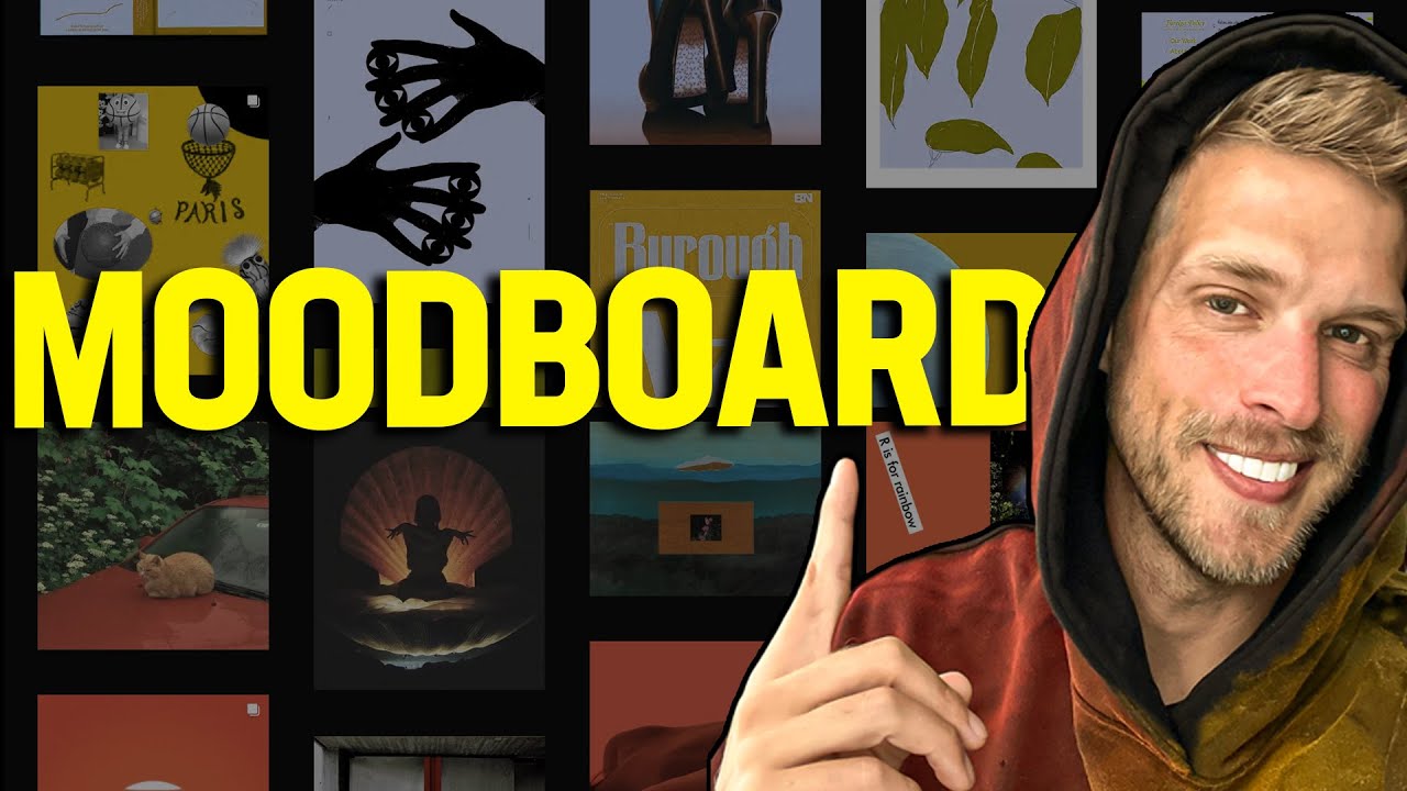
A mood board is a visual composition of images, textures, colors, and type samples arranged to communicate the aesthetic direction of a project. It’s the first tangible artifact in any creative process, and it exists to answer one question: what should this thing feel like?
Not a wireframe. Not a style guide. Not a final mockup. A mood board sits before all of those, capturing the emotional tone and visual language before any real design decisions get locked in.
Designers across fields use them. Graphic designers build mood boards when launching a new visual identity. Interior designers lean on them to align material palettes with a client’s preferences. Fashion designers pull fabric swatches, runway shots, and cultural references into a single frame. UX/UI teams assemble them to set the visual tone for a digital product before building a single screen.
The concept isn’t new. Magazine editors and advertising creatives have been pinning reference images to corkboards since the mid-20th century. What’s changed is the tooling. Digital mood boards now live inside platforms like Figma, Milanote, and Canva, making collaboration across remote teams much easier.
Canva alone had over 220 million monthly active users by the end of 2024, according to Backlinko. Figma hit 4 million users the same year, with 90% of designers citing it as their primary UI design tool (UX Tools survey). These numbers tell you something: visual collaboration tools are mainstream, and mood boards are a core use case inside them.
The purpose of a mood board is to reduce ambiguity. When a client says “clean and modern,” that phrase means ten different things to ten different people. A mood board pins it down. It turns subjective language into concrete visual references everyone can react to.
What a Mood Board Includes
Every mood board is different. But most share a set of common building blocks that, together, communicate a design direction clearly enough for a team or client to understand what’s being proposed.
Core Visual Elements
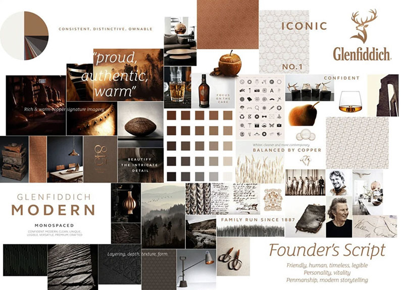
Color palettes anchor the entire board. These might show up as Pantone swatches, hex code strips, or colors sampled straight from reference photography. The color palette sets the emotional baseline for everything else on the board.
A mood board for a luxury skincare brand will lean toward muted tones and monochrome colors. One for a kids’ educational app might use complementary color combinations with high saturation.
Typography samples are another fixture. Pairing fonts on a mood board lets you test whether a serif font feels right alongside a sans-serif, or whether the project calls for something more expressive like a display font or a script typeface.
Photography, illustrations, textures, and patterns round out the visual layer. These aren’t final assets. They’re references, pulled from stock libraries, competitor sites, magazine scans, or personal photography to capture the feeling being targeted.
| Element | What It Communicates | Example |
|---|---|---|
| Color palette | Emotional tone, energy level | Earthy greens for organic brand |
| Typography | Voice, personality, formality | Geometric sans-serif for tech startup |
| Photography | Lifestyle, audience, context | Candid shots for authentic brand feel |
| Textures and materials | Tactile quality, depth | Linen or concrete for minimal aesthetic |
| Keywords or phrases | Tone of voice, messaging direction | “Bold but approachable” |
Physical Mood Boards vs. Digital Mood Boards
Physical boards use printed images, fabric swatches, paint chips, and material samples pinned to foam core or cork. They’re tactile. You can feel the weight of a paper stock or the texture of a woven sample. Interior designers and packaging designers still prefer them for this reason.

Digital boards, on the other hand, are built inside tools like Milanote, Pinterest, Figma, or Adobe Express. They’re easier to share, easier to revise, and easier to present to remote clients. Pinterest reached 570 million monthly active users in early 2025, with 80% of weekly users saying they come to the platform specifically for inspiration (Pinterest data).
Neither format is better. It depends on what the project needs. A physical board makes more sense when you’re selecting fabrics for an interior project. A digital board works better when your team is spread across three time zones and needs to comment asynchronously.
Why Designers Use Mood Boards
The short answer: they prevent expensive misunderstandings.
A mood board catches misalignment before production starts. If a client hates the direction, you find out when it costs nothing to change, not after the brand launch, not after the website goes live. That feedback loop alone justifies the time spent creating one.
According to MRFR, the design collaboration software market was valued at $7.34 billion in 2023 and is projected to reach $25.8 billion by 2032, growing at a 14.99% CAGR. Teams are investing heavily in tools that support early-stage visual alignment, and mood boards sit right at the center of that workflow.
Faster decision-making: Once a mood board is approved, every downstream decision gets easier. Should the button be rounded or sharp? Look at the board. Should the headline font be bold or light? The board already answers that.
Shared vocabulary: Designers, developers, clients, and project managers often speak different languages. A mood board creates a single reference point that everyone can literally point to during conversations.
Reduced revision cycles: Getting the direction locked early means fewer “that’s not what I imagined” moments later. Decorating Den Interiors, for instance, walks every client through a concept mood board before purchasing begins, which builds confidence and reduces costly returns.
Took me a while to appreciate this, honestly. Early in my career, I’d skip the mood board and jump straight into Photoshop. Almost every time, I’d end up redoing work. The board feels like extra effort upfront, but it saves you triple the effort downstream.
Mood Boards in Different Design Disciplines
A mood board for a restaurant rebrand looks nothing like one for a mobile app. The tool is the same, but its contents shift depending on the discipline and what decisions need to be made next.
Interior Design
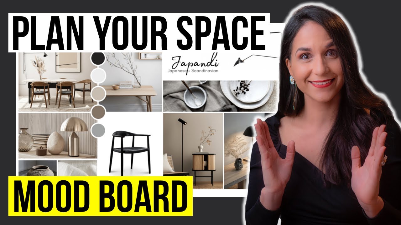
Interior designers build some of the most layered mood boards in any field. Material palettes, room layouts, furniture references, lighting moods, and color swatches all show up. The board communicates both the aesthetic direction and the physical experience of the space.
Many interior firms still create physical boards with actual fabric samples and finish swatches pinned alongside printed reference images. The tactile dimension matters when you’re choosing between three different countertop stones.
Branding and Identity

For branding projects, the mood board focuses on logo exploration context, color theory direction, and typographic tone. The goal is to capture the personality of the brand before any mark or wordmark gets designed.
A mood board for a financial services rebrand would feature different photography, different type treatments, and a different color system than one for a streetwear label. Understanding how colors affect perception becomes critical here because the palette shapes how audiences feel about the brand before they even read a word.
Arounda Agency found that brand-consistent UX updates led to a 28% average reduction in bounce rates across SaaS, FinTech, and healthcare projects. That consistency starts at the mood board stage.
UX/UI Design
In product design, mood boards capture interaction patterns, visual hierarchy references, and component inspiration. Figma’s State of the Designer report found that 84% of designers collaborate with developers weekly, and mood boards serve as the bridge between what the design team envisions and what the engineering team builds.
A UX mood board might include screenshots of competitor apps, UI pattern references, icon style explorations, and color system proposals. It’s less about “feeling” and more about “direction.”
Fashion and Film
Fashion designers pull fabric textures, silhouette references, and cultural or seasonal themes. The board tells the story of a collection before a single garment gets cut.
Film production designers use mood boards to lock down set design tone, lighting references, and color grading direction. Every department head on a film set references these boards to stay visually consistent across scenes and locations.
How to Make a Mood Board
Start with the brief, not with images. This is where most people go wrong.
If you open Pinterest before defining what you’re trying to communicate, you’ll end up with 200 saved pins and zero cohesion. The brief (or at least the creative intent) gives you a filter. Every image you collect either supports the direction or gets discarded.
The Process, Step by Step
Define the intent. What’s the project? Who’s the audience? What emotion should the final result trigger? Write this down in two or three sentences. That’s your anchor.
Gather broadly, then edit ruthlessly. Pull 40 to 60 references from various sources. Photography, textures, type samples, colors, objects. Then cut it down to 10 to 15 pieces that actually work together. If two images fight each other visually, one goes.
Arrange with intent. Place a dominant image in the center or upper third. Support it with secondary references, accent colors, and texture samples. White space matters here. A board crammed with 30 images communicates chaos, not clarity.
Good composition on a mood board follows a lot of the same graphic design principles you’d apply to any layout. Think about balance, contrast, and proximity between elements.
Test it. Show the board to someone without explaining it. If they can name the mood or feeling within five seconds, you’re on track. If they’re confused, the board needs more editing.
Common Mistakes That Weaken a Mood Board
Too many conflicting styles. If half the board says “rustic farmhouse” and the other half says “sleek penthouse,” you don’t have a direction. You have a contradiction.
Treating it like a Pinterest dump. A mood board is curated, not collected. Every element should earn its place through its relationship to other elements on the board. If you can’t explain why an image is there, it probably shouldn’t be.
Ignoring typeface and color as mood-setting tools. I’ve seen boards that are just images with zero type samples and no defined hue range. That’s half a mood board. The psychology behind font choices matters as much as the imagery, maybe more.
Low-resolution or generic stock images. Nothing kills a board faster than an overused stock photo that everyone has already seen. Your references need to feel specific and intentional.
Not editing. Honestly, the best boards have fewer elements, not more. At least in my experience, the boards that get approved fastest are the ones with 8 to 12 carefully chosen pieces instead of 25 random ones.
Mood Board Tools and Software
The tool you pick depends on the kind of project, your team’s workflow, and whether you need real-time collaboration. There’s no single best option, but there are clear leaders for specific use cases.
Digital Tools Breakdown
Milanote was built specifically for visual creative projects. Drag-and-drop boards with columns and freeform layout, plus built-in web clipping. It’s the closest thing to a digital corkboard, and creative agencies love it for this reason.
Figma and FigJam are popular with UX/UI teams who already live inside Figma for wireframing and prototyping. Figma held a 40.65% market share in design tools as of 2024 (Cropink data), making it the single most used platform for collaborative design work. Building a mood board inside FigJam keeps everything in one ecosystem.
Pinterest works well for early-stage collection but falls short for final presentation. You can’t control the layout, and it’s hard to arrange elements with the kind of precision a mood board needs. That said, with 570 million monthly active users and 1.5 billion pins saved weekly in 2025, it remains the go-to starting point for visual inspiration gathering.
| Tool | Best For | Limitation |
|---|---|---|
| Milanote | Freeform creative boards, agency work | No prototyping integration |
| Figma / FigJam | UX/UI teams, collaborative boards | Steeper learning curve |
| Early inspiration gathering | No layout control | |
| Canva | Quick client-facing boards | Limited design depth |
| Adobe Express | Branding and print projects | Less collaborative |
Canva makes mood board creation accessible for non-designers and fast for professionals who need something client-ready in minutes. With 220 million monthly active users at the end of 2024 (Backlinko), it’s the widest-reaching design tool by raw numbers. The templates give you a quick starting structure, though the customization ceiling is lower than Figma or Milanote.
Adobe InDesign and Express still get used for branding and print-focused projects where the mood board eventually becomes part of a larger presentation deck or brand guidelines document.
Physical Tools
Foam core, X-Acto knives, spray adhesive, printed reference images. If you’re in interior design or textile work, these haven’t been replaced. The hands-on process of cutting, arranging, and pinning actual materials creates a different kind of creative engagement that screens can’t fully replicate.
Some designers start physical and then photograph their board for digital sharing. Works well enough when you need the tactile process but also need to email results to a client across the country.
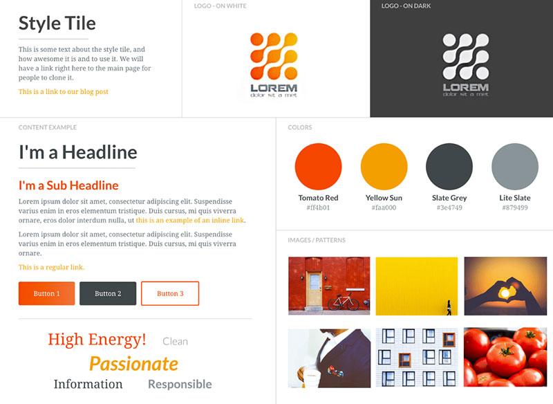
Mood Board vs. Style Guide vs. Brand Board
These three documents get mixed up constantly. Clients ask for a “style guide” when they actually need a mood board. Designers deliver a brand board when the project is still in the exploration phase.
They’re different tools for different stages of the same process.
Where Each One Lives in the Design Process
Miro’s guide puts it clearly: a mood board belongs in the Discover phase, a brand board in the Define phase, and a style guide in the Deliver phase. They’re sequential, not interchangeable.
| Document | Purpose | Project Stage |
|---|---|---|
| Mood board | Explore direction, set emotional tone | Beginning (discovery) |
| Brand board | Summarize finalized identity elements | Middle (definition) |
| Brand style guide | Document rules for consistent application | End (governance) |
A mood board captures feeling and direction before decisions are final. It’s loose on purpose. The whole point is to give stakeholders something to react to while changes are still cheap.
A brand board is a single-page summary of a completed brand identity. It includes the final logo suite, approved colors, selected fonts, and supporting patterns or imagery. Think of it as the mood board’s more buttoned-up sibling.
A style guide goes much further. It documents spacing rules, leading and tracking specifications, logo clear zones, do-and-don’t examples, and voice and tone guidelines. It’s the rulebook that keeps everything consistent at scale.
Why This Distinction Matters
Lucidpress found that consistent brand presentation across all platforms can increase revenue by up to 33%. But consistency doesn’t start with a style guide. It starts with a mood board that gets everyone aligned on direction before production begins.
And yet, according to Capital One Shopping Research, 95% of organizations have brand guidelines but only about 25-30% actively enforce them. That gap usually traces back to poor early-stage alignment. When the mood board step gets skipped or rushed, the style guide feels disconnected from the original creative intent.
Some designers evolve a mood board into a brand board as the project matures. That’s a natural progression. The mood board’s curated images get replaced with finalized assets, and what was once exploratory becomes definitive.
What Makes a Good Mood Board
A good mood board doesn’t just look nice. It communicates a single, clear direction that a viewer can identify within seconds.
The difference between a strong board and a weak one usually comes down to editing. Not adding more, but removing everything that doesn’t belong.
Cohesion Without Sameness
Every element should feel related but not identical. A board full of the same soft beige tones and minimalist photography might look “cohesive,” but it’s actually flat. There’s no tension, no range.
Good boards include variety within a controlled palette. Maybe the dominant mood is calm and organic, but one image introduces an unexpected texture or a slightly warmer color harmony that adds depth without breaking the whole thing.
Understanding how design elements interact with each other, things like repetition, rhythm, and unity, helps you build boards that hold together even when individual pieces look different on their own.
Clear Visual Priority
According to G2’s branding research, 42% of online shoppers base their opinion of a website on overall design alone. That first-glance judgment applies to mood boards too.
Your board needs a focal point. One or two images should anchor the composition. Everything else plays a supporting role.
Without that hierarchy, the viewer’s eye bounces around with no landing spot. The board reads as a collection, not a concept. Applying the same rule of thirds you’d use in photography or layout design helps structure where the dominant elements sit.
Intentional Color Relationships
Color does more work than any other element on a mood board. A signature color can increase brand recognition by up to 80%, according to research cited by multiple branding studies including Cropink’s 2025 analysis.
Random color placement signals a lack of direction. Intentional relationships, like an analogous color scheme with one accent that breaks the pattern, signal that you’ve made deliberate choices.
The board’s color system should give the viewer a clear sense of what the final project’s palette will feel like, even if the specific hex codes haven’t been locked in yet.
Appropriate Specificity
Loose boards work for early exploration when you’re presenting three different directions to a client and want reactions.
Tight boards work for final alignment, where every element is close to what the finished product will actually reference.
Matching the board’s level of detail to the project stage prevents a common problem: clients treating an exploratory mood board as a final design decision. If you’re still exploring, the board should feel exploratory.
When a Mood Board Is Not the Right Tool
Mood boards get treated like a universal starting point. They’re not.
There are situations where building one wastes time, misleads stakeholders, or delays the actual work that needs to happen. Knowing when to skip the mood board is just as much a skill as knowing how to build one.
When the Creative Direction Is Already Locked
If the brand already has an established style guide with documented rules for color contrast, typographic hierarchy, and visual tone, a mood board adds nothing.
The design system already answers the questions a mood board would ask. Making one at that point is redundant busywork, unless you’re proposing a departure from the established direction.
When the Deliverable Needs Specificity
A mood board can’t replace a wireframe, a prototype, or a set of technical specifications. If the next step in the project is building a functional layout for web design or mapping interaction flows for a mobile app, the mood board won’t get you there.
Nielsen Norman Group recommends mood boards for defining visual direction early in product design, but their use drops off once the team moves into prototyping and testing. At that point, the mood board’s job is done.
When Images Are Too Literal
This one’s tricky. If every image on a mood board shows the exact product, exact room, or exact layout you plan to create, you’ve made a reference sheet, not a mood board.
Mood boards work best when they evoke a feeling, not when they prescribe specific outputs. A board full of literal product shots can mislead clients into thinking you’re going to replicate what’s shown rather than draw inspiration from it.
Fast-Turnaround Projects
Some projects just don’t have the timeline. A quick social media design update or a one-off poster for an event with a 48-hour deadline doesn’t need a mood board phase.
Skip it. Use existing brand assets and design references you already have. Getting a mood board approved when the deadline is tomorrow just adds friction.
Not everything needs the full process. That’s fine. Knowing when a mood board genuinely adds value versus when it’s just a checkbox is what separates experienced designers from ones who follow every step regardless of context.
FAQ on What Is a Mood Board in Design
What is the purpose of a mood board?
A mood board communicates the aesthetic direction of a project before production begins. It aligns designers, clients, and stakeholders around a shared visual language, reducing misunderstandings and cutting revision cycles later in the process.
What should a mood board include?
Most mood boards include a color palette, typography samples, photography, textures, patterns, and material references. Some also feature keywords or short phrases that capture the intended tone of voice for the project.
What is the difference between a mood board and a vision board?
A mood board sets the visual direction for a design project. A vision board is a personal goal-setting tool. They both use image collages, but mood boards serve professional creative workflows while vision boards focus on individual aspirations.
Can I make a mood board digitally?
Yes. Tools like Figma, Milanote, Canva, Pinterest, and Adobe Express all support digital mood board creation. Digital boards are easier to share with remote teams and allow real-time collaboration across locations.
How many images should a mood board have?
Between 8 and 15 elements works for most projects. Fewer than that risks being too vague. More than that creates visual clutter. Every piece on the board should earn its spot through its relationship to the overall direction.
Do UX designers use mood boards?
Yes. UX/UI teams use mood boards to define visual direction, interaction style references, and component inspiration. Figma and FigJam are popular choices for building collaborative mood boards within product design workflows.
What makes a bad mood board?
Too many conflicting styles, low-resolution images, and no clear color system. Treating it like a Pinterest dump instead of a curated composition is the most common mistake. Every element should support a single cohesive direction.
How is a mood board different from a style guide?
A mood board explores direction at the start of a project. A style guide documents finalized rules for consistent brand application after decisions are made. They serve different stages of the same creative process.
Are mood boards only for graphic designers?
Not at all. Interior designers, fashion designers, film production teams, branding agencies, and web designers all use mood boards. Any project that needs early visual alignment benefits from one.
How long does it take to create a mood board?
A focused mood board takes 2 to 4 hours from brief review through final arrangement. Gathering references is the longest step. The editing and layout process should be faster if the creative direction is clearly defined upfront.
Conclusion
A mood board in design is the fastest way to turn abstract ideas into a shared visual direction. Whether you’re working on a branding project, an interior redesign, or a digital product, the board keeps everyone aligned before production costs start adding up.
The tools have gotten better. Figma, Milanote, and Canva make digital mood board creation faster than ever. But the fundamentals haven’t changed: start with intent, curate ruthlessly, and arrange with clear visual priority.
Good mood boards don’t just collect images. They communicate a feeling that guides every design decision that follows, from color palette choices to typography elements and layout composition.
Skip the mood board when it’s not needed. But when the project calls for one, invest the time. The creative process gets smoother, client presentations get easier, and the final result stays closer to the original vision.

Renowned for his expertise in logo design and visual branding, Bogdan has developed a multitude of logos for various clients.
His skills extend to creating posters, vector illustrations, business cards, and brochures. Additionally, Bogdan's UI kits were featured on marketplaces like Visual Hierarchy and UI8.
He also wrote in the past years on sites like Design Your Way, WebDesignerDepot, WPDean, Designmodo, Speckyboy, Slider Revolution, and more.
- Versatile Georgia Font Pairing for Timeless Layouts - 24 October 2026
- How to Turn Inconsistent UI into One Design System (Without a Full Redesign) - 24 October 2026
- Beautiful Fonts Similar to Poppins You Should Try - 22 October 2026

Bogdan Sandu is a seasoned designer who has been designing websites since 2008. Renowned for his expertise in logo design and visual branding, Bogdan has developed a multitude of logos for various clients. His skills extend to creating posters, vector illustrations, business cards, and brochures. Additionally, Bogdan's UI kits were featured on marketplaces like Visual Hierarchy and UI8. He also wrote in the past years on sites like Design Your Way, WebDesignerDepot, WPDean, Designmodo, Speckyboy, Slider Revolution, and more.
You Might Also Like