


You’ve seen script fonts everywhere, from the Coca-Cola logo to wedding invitations. But what is a script font, exactly, and why does picking the wrong one wreck a design so quickly?
A script font is a typeface built on the flowing, connected strokes of handwriting and calligraphy. It’s one of the most expressive categories in typography, and also one of the most misused.
This guide covers how script typefaces work, the different types available (formal, casual, brush, calligraphic), where they belong in your designs, how to pair them, and the mistakes that trip up even experienced designers. You’ll also find practical advice on licensing, web performance, and sourcing quality options from platforms like Google Fonts and Adobe Fonts.
What Is a Script Font
A script font is a typeface that mimics the fluid, connected strokes of handwriting or calligraphy. The letters flow into each other (or nearly do), creating a sense of natural, pen-driven movement across the page.
That’s the short version. But there’s more going on under the hood.
Script fonts are built on stroke variation. Thick-to-thin transitions, angled slants, entry and exit strokes that link one character to the next. These aren’t just decorative choices. They come directly from the physical act of writing with a pointed pen or brush.
What separates a script font from a serif or sans-serif font isn’t just style. It’s structural logic. Serif and sans-serif typefaces are designed for sustained reading at small sizes. Script fonts prioritize visual personality and expressive movement.
The roots go back centuries. Copperplate engraving, Italian Renaissance chancery hands, Spencerian penmanship. All of these calligraphic traditions fed into what we now call script typography.
Monotype’s 2024 Font Use & Forecasting Survey found that 83% of designers see typography as a key part of brand identity. Script fonts sit right at the intersection of that. They carry emotion, formality, or playfulness depending on the style, and they do it faster than almost any other typeface category.
WhatFontIs data from 2023 shows script font usage grew by 25% over a two-year period, driven largely by branding, packaging, and social media design work.
How Script Fonts Differ from Handwritten Fonts
People mix these up constantly. And, look, I get it. Both script fonts and handwritten fonts look like someone put pen to paper. But the similarities pretty much stop there.
The Structural Difference
Script fonts follow a consistent baseline rhythm. The letters connect (or nearly connect) through deliberate entry and exit strokes. There’s a predictable slant angle and uniform stroke behavior across the entire character set.
Handwritten fonts are looser. Letters sit independently. The strokes feel casual, sometimes rough. Connections between characters are rare or absent.
How to Tell Them Apart
| Feature | Script Fonts | Handwritten Fonts |
|---|---|---|
| Letter connections | Connected or semi-connected | Disconnected |
| Baseline consistency | Uniform and rhythmic | Irregular, bouncy |
| Stroke variation | Deliberate thick-thin contrast | Casual, uneven |
| Slant angle | Consistent throughout | Varies per character |
| Typical use | Wedding invitations, luxury branding | Casual branding, greeting cards |
Take Snell Roundhand. That’s a textbook formal script. Every letter links smoothly to the next, the stroke contrast is pronounced, and the whole thing reads like a practiced hand wrote it with a pointed nib.
Now compare that to Architect’s Daughter on Google Fonts. Totally different energy. The characters stand alone, the baseline wobbles around, and the overall feeling is casual, almost sketchy. That’s a handwritten font, not a script.
Your mileage may vary on which one fits your project. But knowing the difference saves you from picking an overly casual handwritten font for a wedding invitation, or a rigid formal script for a children’s brand. Both are mistakes I’ve seen more times than I’d like to admit.
Types of Script Fonts
Not all script fonts are created equal. The category breaks down into distinct subcategories, and each one carries a different tone, serves different projects, and comes from a different tradition.
Formal Script Fonts

These are the heavy hitters for elegance. Edwardian Script, Palace Script, Snell Roundhand. Built with dramatic thick-thin stroke contrast, elaborate swash characters, and connections that flow seamlessly between letters.
Formal scripts descend from copperplate calligraphy and pointed-pen traditions. They show up on wedding invitations, certificates, luxury packaging, and high-end brand identity work.
One thing worth knowing: formal scripts look terrible in all caps. The connected letter logic breaks completely when every character is uppercase. That’s a rookie mistake that still pops up everywhere.
Casual Script Fonts
Brush Script, Pacifico, Lobster. These are relaxed, approachable, and way more forgiving than their formal cousins.
Looser stroke patterns. Less consistent thick-thin contrast. More personality, less precision. Casual scripts work well for restaurant menus, social media graphics, product labels, and any project that needs warmth without stuffiness.
Pacifico alone appears on thousands of websites through Google Fonts. It’s one of those typefaces that people either love for its friendliness or avoid because they’ve seen it everywhere. At least in my experience, it still works if the rest of the design supports it.
Calligraphic and Brush Scripts
Calligraphic scripts imitate flat-pen or broad-nib writing. Think of the kind of lettering you’d see in historical manuscripts or formal documents. The stroke angle stays consistent because it’s mimicking a held pen position.
Brush scripts go in a different direction entirely. They simulate ink brush or marker strokes, which means heavier weight, more texture, and an energetic, hand-made feel.
Mistral is a classic brush script from the photo-typesetting era. It still gets used. Meanwhile, newer brush-style options from foundries like Sudtipos or designers like Laura Worthington have pushed the category into much more expressive territory.
The HTTP Archive’s 2025 Web Almanac reports that web fonts now appear on roughly 88% of websites. Script and display fonts make up a growing share of that, especially for headline and accent use.
Anatomy of a Script Letterform

If you want to actually pick the right script font (and not just grab whatever looks pretty in a thumbnail), you need to understand what’s happening inside the letters. This is where typography elements get specific.
Stroke Behavior and Connections
Every script letter has an entry stroke and an exit stroke. These are the thin connecting lines that link one character to the next. In formal scripts, these connections are precise and unbroken. In casual scripts, they’re looser, sometimes barely touching.
Stroke contrast (the difference between thick and thin parts of a letter) defines the personality of the font. High contrast reads as elegant and traditional. Low contrast feels modern and approachable.
Key Structural Features
X-height: The height of lowercase letters like “a” and “o.” Script fonts with a larger x-height tend to be more readable at smaller sizes. Fonts with a shorter x-height look more refined but harder to read in body text.
Ascenders and descenders: The parts of letters that extend above (like “h”) or below (like “g”) the main body. In script fonts, these often carry flourishes or extended strokes that add to the overall decorative feel.
Swashes and alternates: Many script fonts include alternate glyph options, activated through OpenType features. Swash characters add decorative tails and loops to specific letters, usually at the beginning or end of a word.
The 2024 Web Almanac notes that OpenType feature support across web fonts keeps rising. This means more designers can access contextual alternates and ligatures directly through CSS, making digital script fonts look significantly more natural than they did even five years ago.
Why These Details Matter
Understanding kerning and spacing behavior in script fonts is not optional. Script typefaces are more sensitive to letter spacing than almost any other font category. Increase the tracking too much and the connections break. Reduce it too much and letters pile into each other.
Well, the thing is, most design tools default to spacing that works for sans-serif text. That default will almost always need adjustment when you’re working with scripts.
Where Script Fonts Are Used
Script fonts show up in more places than most people realize. But they also fail spectacularly when used in the wrong context. Knowing where they work (and where they don’t) is half the battle.
Print and Stationery

Wedding invitations, event stationery, formal certificates. This is traditional script font territory and has been for decades. The elegance of a formal script typeface matches the tone of these materials perfectly.
Print design is where script fonts still feel most at home. Linearity data shows that script fonts are commonly used for decorative and artistic purposes across invitations, greeting cards, and branded materials.
Branding and Logo Design

Coca-Cola. Ford. Cadillac. Three of the most recognized brands on the planet, and all three use script-based logos.
The Coca-Cola logo, created by Frank Mason Robinson in 1886, uses Spencerian script. It’s barely changed in over 130 years. About 94% of the world’s population can identify it on sight, according to branding research. That’s the power of a well-chosen script typeface paired with strong design principles.
Ford’s logo also draws from the Spencerian tradition. Both brands prove that script fonts, when executed well, create some of the most lasting visual identities in commercial history.
Script typefaces in brand typography communicate personality, warmth, and heritage. Font psychology research consistently shows that cursive and script styles trigger perceptions of elegance, creativity, and human touch.
Digital and Social Media
Website headers, social media graphics, app UI accents. Script fonts work as attention-grabbing headline treatments when paired with clean body text.
Google Fonts makes several popular script options freely available, including Dancing Script, Great Vibes, and Pacifico. These are widely used across web design projects, especially for lifestyle brands, food businesses, and creative portfolios.
Where Script Fonts Fail
Body text. Just don’t. Script fonts were never designed for sustained reading at small sizes. Your readers will bounce.
Data-heavy layouts. Tables, dashboards, forms. Script fonts reduce readability in any context that requires quick information scanning.
Monotype’s 2024 survey found that 76% of designers prioritize readability and accessibility in their font choices. Script fonts score low on both of those criteria at small sizes, which is exactly why they should be limited to headlines, accents, and decorative elements.
How to Pair Script Fonts with Other Typefaces
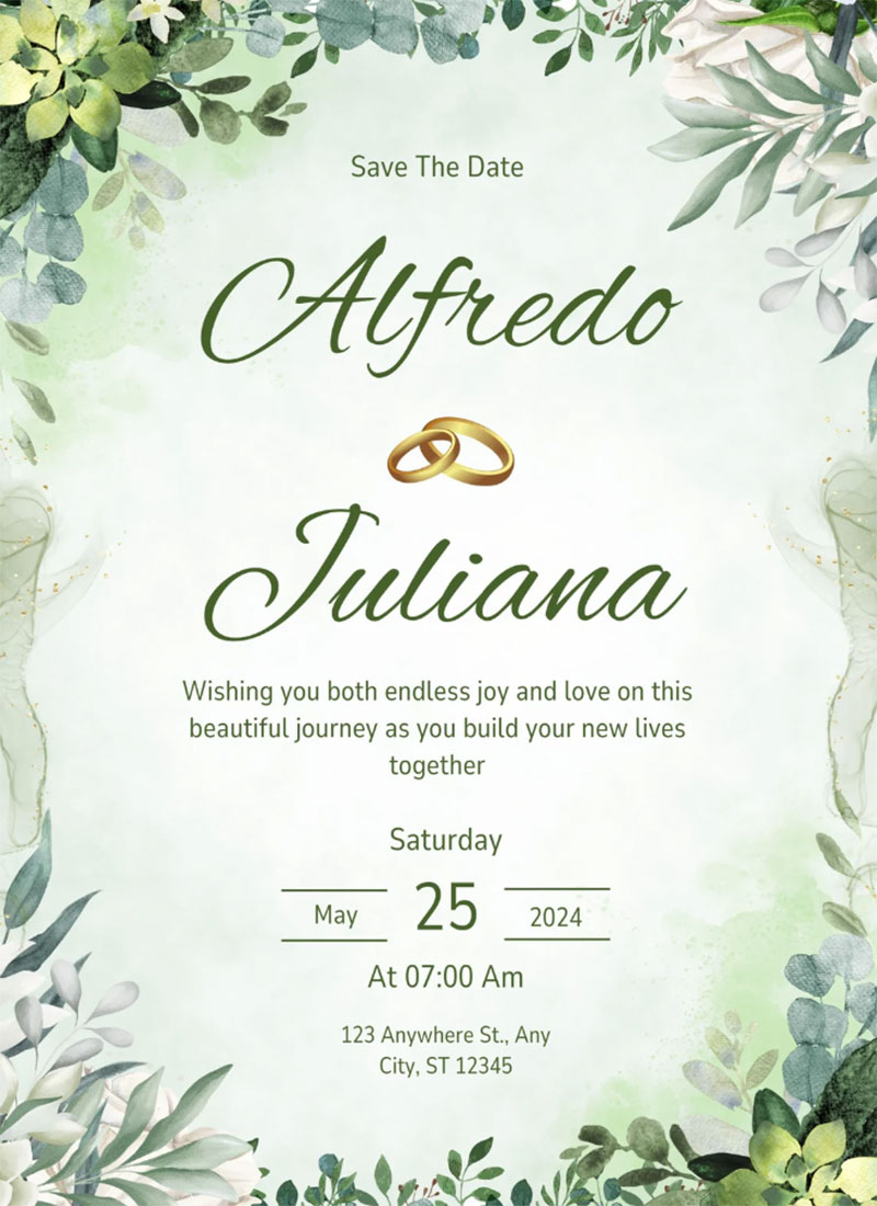
A script font on its own can look gorgeous. But put it next to the wrong partner and the whole design falls apart. Pairing fonts well is one of those skills that separates solid work from amateur hour.
Script Plus Sans-Serif
This is the most reliable combination. A script headline with a clean sans-serif body font creates immediate contrast and clear typographic hierarchy.
Proven pairings:
- Great Vibes + Montserrat
- Dancing Script + Lato
- Pacifico + Open Sans
The logic is simple. The script carries the emotion, the sans-serif handles the reading. Neither fights the other for attention.
Script Plus Serif
This combo works in editorial and luxury contexts. A calligraphic script headline with a traditional serif body (like Lora or Playfair Display) creates a tone that feels polished and refined.
It’s trickier to pull off, though. Both font categories share some structural DNA (stroke contrast, refined details), so you need enough difference in weight and style to keep them from blending together visually.
What to Avoid
Script on script. Two script fonts on the same page almost always creates visual chaos. They compete instead of complementing each other.
Also, think about your visual hierarchy. The script should serve as the accent, not the primary reading face. Use it for headlines, pull quotes, or a single word that needs emphasis. Let the body font do the heavy lifting.
A Dribbble study of the top 1,000 websites found that roughly 85% of fonts used are sans-serif. Script fonts make up a small fraction of overall usage precisely because they’re best as supporting players, not leads.
But that’s exactly what makes them effective. A single script element in an otherwise clean layout becomes the focal point of the whole design.
Common Mistakes When Using Script Fonts
Script fonts are beautiful when used correctly. They’re also the fastest way to wreck a layout when mishandled.
Took me a while to learn some of these the hard way. Here are the mistakes that keep showing up.
Setting Script Fonts in All Caps
This is the single biggest mistake. Script fonts are designed around connected lowercase letterforms. Set them in all caps and those connections break entirely.
The result is a line of disconnected uppercase letters jammed together with no flow. SilkCards puts it simply: script in all caps makes it impossible to see the separation between words.
Harvard’s Digital Accessibility Services notes that all-caps text reduces readability because every word becomes a uniform rectangular shape, eliminating the ascender and descender cues readers rely on to recognize words quickly.
Using Script at Small Sizes
Adobe research shows 38% of users will leave a website if the content or layout is unattractive. Script fonts at body text sizes are a direct path to that outcome.
The thin strokes and tight connections that make script fonts elegant at large sizes become illegible below roughly 16px on screen. Stick to headlines, accents, and poster treatments.
Ignoring Kerning and Spacing
Script typefaces are sensitive. The default letter spacing in most design tools is calibrated for sans-serif body text. Apply that same spacing to a script font and the connections either overlap or break apart.
You need to manually adjust leading and spacing for nearly every script font you use. It’s tedious. But skipping it guarantees the text looks off.
Overloading Swashes and Alternates
OpenType features give you access to decorative swash characters, stylistic alternates, and ligatures. The temptation is to turn everything on.
Don’t. Overusing flourishes turns readable text into visual noise. Use swashes at the beginning or end of a word, not in the middle. Use alternates to break up repeated letter patterns, not as blanket replacements.
Where to Find Quality Script Fonts
Not all script fonts are worth your time. The gap between a well-made commercial script and a free download with broken kerning tables is enormous. Knowing where to look saves hours of frustration.
| Source | Cost | Best For |
|---|---|---|
| Google Fonts | Free, open-source | Web projects, personal and commercial use |
| Adobe Fonts | Included with Creative Cloud | Professional design work |
| MyFonts | Per-font purchase | Finding specific commercial scripts |
| Creative Market | Per-font purchase | Independent and boutique script fonts |
| Fontspring | Per-font purchase | Worry-free font licensing |
Free Options
Google Fonts offers solid script options at zero cost. Dancing Script, Great Vibes, Pacifico, and Sacramento are all widely used and fully licensed for both personal and commercial projects.
Google Fonts is used by nearly 12 million websites worldwide, according to Toner Buzz data. The script category is a smaller slice of that, but the quality of individual options is surprisingly good for free fonts.
Paid and Commercial Sources
MyFonts and Creative Market carry thousands of script typefaces from independent designers. This is where you find the more expressive, niche options that don’t show up on every other website.
Independent type foundries produce some of the best work in the category. Sudtipos (Argentina) and Laura Worthington consistently release highly detailed calligraphic and brush scripts with extensive OpenType feature sets.
Monotype’s 2024 survey found that 70% of creatives purchase fonts through popular marketplaces. Small businesses spend roughly $300 per year on font licensing on average, according to Linearity data.
Licensing Basics
Desktop license: Covers use in design software for print, logos, and static images. Most common license type.
Web license: Allows embedding fonts into website CSS. Typically limited by monthly pageviews.
App license: Required if you embed the font in mobile or desktop software. Separate from both desktop and web licensing.
Monotype notes that the average creative spends eight hours per week on font-related administrative tasks, including licensing. Choosing platforms with clear licensing terms (like Google Fonts or Fontspring) cuts that overhead significantly.
Script Fonts in Web Design

Using script fonts on websites is trickier than using them in print. File sizes, rendering differences, and accessibility all come into play. But when handled right, a script accent can give a site an identity that stock sans-serifs can’t match.
Loading and Performance
The HTTP Archive’s 2025 Web Almanac reports web fonts appear on roughly 88% of websites. That makes font loading a performance question, not an optional one.
WOFF2 is the standard format. It uses Brotli compression and delivers about 30% smaller files than the older WOFF format, according to DebugBear. About 97% of browsers now support it.
Script fonts tend to have larger glyph sets than standard sans-serifs (swashes, alternates, ligatures). Subsetting, which trims unused characters from the font file, is not optional here. SearchX documented a real-world case where font subsetting improved Largest Contentful Paint by 20% and First Contentful Paint by 10%.
CSS Implementation
Load script web fonts via @font-face with WOFF2 as the primary source. Set font-display: swap to prevent invisible text while the font loads.
For accessing OpenType features like stylistic alternates and swash characters in CSS, use the font-feature-settings property. Tags like "swsh", "calt" (contextual alternates), and "ss01" through "ss20" (stylistic sets) activate specific glyph substitutions.
The 2024 Web Almanac confirms that OpenType feature support across web fonts keeps rising year over year. Designers who tap into these features can make digital script fonts behave more like real calligraphy with contextual letter variations.
Accessibility Considerations
Script fonts score low on screen readability. Keep them out of body text, form labels, and navigation elements.
Check color contrast ratios carefully. Thin strokes in script fonts reduce perceived contrast even when the calculated ratio meets WCAG standards. Stick to high-contrast pairings, and test at responsive breakpoints because thin script strokes can disappear on smaller screens.
Brief History of Script Typefaces
Script fonts didn’t start with computers. The digital versions we use today are built on centuries of penmanship, engraving, and calligraphic tradition.
From Copperplate to Spencerian
Copperplate script originated in 17th-century England, tied directly to the technique of engraving text into copper plates for printing. George Bickham’s The Universal Penman (1733-1741) compiled the work of 25 London calligraphers and became the reference point for this style.
By the mid-1800s, Platt Rogers Spencer developed Spencerian script in the United States. It became the country’s standard business handwriting from roughly 1850 to 1925, before the typewriter made it obsolete. Both Coca-Cola and Ford adopted Spencerian letterforms for their logos during this period.
Metal Type and Photo-Typesetting
Civilité, one of the earliest printed script typefaces, appeared in France in 1557. It mimicked the cursive handwriting of its era and set a precedent for translating handwritten forms into reproducible type.
The photo-typesetting era (mid-20th century) brought scripts like Mistral (1953) and Brush Script (1942) into wider use. These fonts reached audiences through advertising, packaging, and commercial printing at a scale that hand-lettering never could.
Digital Type and OpenType
The shift to digital type in the 1980s and 1990s opened the door for script fonts with much larger character sets. But the real breakthrough was OpenType technology.
OpenType introduced contextual alternates, allowing a script font to automatically swap letterforms based on surrounding characters. A letter “a” at the start of a word could look different from the same “a” in the middle. This made digital scripts feel dramatically more natural, closer to actual handwriting than anything that came before.
Platforms like MyFonts and Google Fonts made thousands of script typefaces accessible to anyone with an internet connection. The HTTP Archive notes that variable fonts now appear on 34% of mobile pages, and while most variable fonts are sans-serifs, the technology is increasingly being applied to script and display categories too.
Several well-known designers like Hermann Zapf and Matthew Carter contributed to the development of script and calligraphic typefaces that bridged the gap between traditional penmanship and digital functionality.
FAQ on What Is A Script Font
What is a script font?
A script font is a typeface that replicates the fluid, connected strokes of handwriting or calligraphy. The letters typically link together through entry and exit strokes, creating a flowing, pen-driven appearance distinct from serif or sans-serif typefaces.
What is the difference between script and cursive fonts?
Script fonts and cursive fonts overlap significantly. Script refers to the broader typeface category, while cursive specifically describes connected, slanted letterforms. Most script fonts are cursive, but some casual scripts feature semi-connected or disconnected characters.
Are script fonts hard to read?
At small sizes, yes. Script fonts work best for headlines, logos, and decorative accents. Thin stroke contrast and tight letter connections reduce legibility in body text. Keep them at 16px or larger on screen for reasonable readability.
Can you use script fonts for logos?
Absolutely. Coca-Cola and Ford both use Spencerian script in their logos. Script typefaces communicate elegance, heritage, and personality. They work especially well for brands in food, beauty, fashion, and luxury markets.
What are the best free script fonts?
Google Fonts offers several strong options: Dancing Script, Great Vibes, Pacifico, Sacramento, and Lobster. All are open-source, licensed for both personal and commercial use, and optimized for web loading.
Why should you never use script fonts in all caps?
Script fonts rely on connected lowercase letterforms. Setting them in all caps breaks those connections entirely, producing an unreadable line of disconnected uppercase characters. It’s the most common script font mistake in design.
How do you pair script fonts with other typefaces?
Pair a script headline with a clean sans-serif body font for contrast. Great Vibes with Montserrat or Dancing Script with Lato are proven combinations. Avoid pairing two script fonts together on the same page.
What are formal vs casual script fonts?
Formal scripts (Edwardian Script, Snell Roundhand) feature high stroke contrast and precise connections, suited for invitations and luxury branding. Casual scripts (Brush Script, Pacifico) are looser and more relaxed, better for packaging and social media.
Do script fonts support OpenType features?
Many premium script fonts include OpenType features like contextual alternates, swash characters, ligatures, and stylistic sets. These allow automatic letter variation based on position, making digital script text look closer to real handwriting.
Are script fonts good for web design?
They work well as accent typography, for headlines or single words. Use WOFF2 format, apply font subsetting to reduce file size, and set font-display: swap in CSS. Avoid using them for navigation or body content.
Conclusion
Understanding what is a script font gives you a real advantage when making typographic decisions. These typefaces carry emotion and personality that no standard slab serif or geometric sans-serif can replicate.
The key is restraint. Use script lettering for headlines, logo accents, and decorative touches. Never for body copy. Never in all caps.
Pay attention to stroke contrast, letter connections, and OpenType alternate characters. These details separate amateur script usage from professional work.
Whether you’re pulling from Google Fonts for a web project or licensing a premium calligraphic typeface from a foundry like Sudtipos, match the script style to your audience and medium. A formal copperplate script sends a completely different message than a loose brush script.
Get the pairing right, respect the spacing, and script fonts become one of the strongest tools in your typographic hierarchy.

Renowned for his expertise in logo design and visual branding, Bogdan has developed a multitude of logos for various clients.
His skills extend to creating posters, vector illustrations, business cards, and brochures. Additionally, Bogdan's UI kits were featured on marketplaces like Visual Hierarchy and UI8.
He also wrote in the past years on sites like Design Your Way, WebDesignerDepot, WPDean, Designmodo, Speckyboy, Slider Revolution, and more.
- Canva vs PowerPoint: Which Is Better for Presentations? - 22 September 2026
- How to Install Fonts on Mac (Step-by-Step Guide) - 20 September 2026
- From Mockup to Code: How AI-Augmented Development Speeds Up the Design Handoff - 19 September 2026

Bogdan Sandu is a seasoned designer who has been designing websites since 2008. Renowned for his expertise in logo design and visual branding, Bogdan has developed a multitude of logos for various clients. His skills extend to creating posters, vector illustrations, business cards, and brochures. Additionally, Bogdan's UI kits were featured on marketplaces like Visual Hierarchy and UI8. He also wrote in the past years on sites like Design Your Way, WebDesignerDepot, WPDean, Designmodo, Speckyboy, Slider Revolution, and more.
You Might Also Like


