Your logo will be judged in under 50 milliseconds. That’s not a guess. That’s how fast the brain processes a visual mark and forms an opinion about the brand behind it.
Most logos fail not because they look bad, but because the thinking behind them is weak. Understanding logo design principles is what separates a mark that builds recognition over decades from one that needs a redesign in three years.
This guide covers the core principles that determine whether a logo actually works: balance, simplicity, scalability, versatility, color choice, typography, uniqueness, relevance, and timelessness.
Each one affects how your visual identity performs across every surface, size, and context it will ever appear in.
What Are Logo Design Principles
A logo is the most recognizable brand identifier a company has. That’s not an opinion. Research by Renderforest found it’s considered more identifiable than visual style, color, or brand voice combined.
Logo design principles are the rules that govern whether a mark actually works. Not whether it looks nice. Whether it performs: at 16px on a mobile screen, embroidered on a cap, reversed out on a dark background, printed in black and white.
These principles didn’t come out of nowhere. They draw from Gestalt principles, grid systems, and decades of graphic design movements including Bauhaus design and Swiss design. They’re not aesthetic preferences. They’re functional requirements.
What separates a good logo from a forgettable one comes down to a handful of decisions, made deliberately.
Why principles matter more than trends
Trends have a shelf life. Principles don’t.
Approximately 95% of the world’s most recognized brands use simple logo designs (Linearity, 2023). Not because simplicity is trendy, but because it works at every size, on every surface, in every context.
The graphic design principles that made the IBM logo last since 1972 are the same ones that make a startup’s logo work today. Different aesthetics, same underlying logic.
The difference between a principle and a preference
Preference: choosing a geometric sans-serif over a humanist one.
Principle: the logo must read clearly at thumbnail size.
One is a style decision. The other is a pass/fail test. Logo design principles operate at the second level. They exist because a logo that fails in practical use fails the brand, regardless of how polished the original concept looked.
Understanding design elements like shape, line, and color theory matters. But principles are the framework that tells you how to use those elements so the result actually holds up.
—
Balance

Visual balance in logo design isn’t about making both sides equal. It’s about controlling how the viewer’s eye moves through the mark.
An unbalanced logo creates visual tension. Sometimes that’s intentional. Most of the time it’s a mistake that makes the logo feel unstable or unresolved.
Symmetrical vs. asymmetrical balance
These aren’t better or worse than each other. They just create different feelings.
| Type | What it communicates | Works well for |
|---|---|---|
| Symmetrical | Stability, trust, formality | Finance, law, healthcare |
| Asymmetrical | Energy, movement, modernity | Tech, sports, creative agencies |
| Radial | Unity, completeness, focus | Community brands, seals, badges |
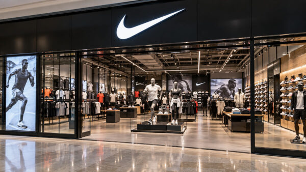
The Nike swoosh is asymmetrical. Its heavier left side creates a sense of forward motion. That’s not accidental. The weight distribution is doing work.
How balance interacts with negative space
Balance isn’t only about the visible elements. The space around and between shapes carries just as much visual weight as the shapes themselves.
The FedEx logo is a good example. The negative space between the “E” and “x” forms an arrow that reinforces the brand’s identity. That hidden element only works because the overall mark is balanced enough for the eye to notice it.
Ignoring negative space is one of the most common reasons logos feel crowded or heavy, even when the individual elements are well-drawn.
Balance and the design grid
Most professional logo designers work on a grid. The golden ratio and the rule of thirds are both tools for building balance into the geometry of a mark before a single visual decision is made.
The Google logo redesign in 2015 used a custom geometric grid to ensure every letterform sat in proportion to the others. Small adjustment. Significant impact on how stable the wordmark feels at any size.
—
Simplicity
Brands that moved from complex logos to simpler ones saw a 21% increase in positive brand perception (StudyFinds). That’s a meaningful number, and it tracks with what designers have known for a long time: simplicity isn’t about doing less, it’s about doing only what’s necessary.
Simple logos are also 13% more likely to be remembered by consumers, according to a Siegel+Gale study. The “Branded in Memory” research made this even clearer by asking 150 Americans to draw 10 famous logos from memory. Bold wordmarks like IKEA and clean pictorial marks like Target came out on top.
Simple is not the same as simplistic
This is where a lot of logo work goes wrong.
Simplistic: generic, underdeveloped, forgettable.
Simple: reduced to what’s necessary without losing meaning or distinctiveness.
The FedEx logo looks simple. The thinking behind it isn’t. The hidden arrow in the negative space between “E” and “x” took careful typographic and spatial decisions to land correctly. That’s not simplistic. That’s refined.
The reduction process
A practical test: print the logo at 1 inch wide. Everything that disappears or becomes illegible at that size is probably unnecessary.
- Remove decorative elements that don’t support the brand meaning
- Avoid thin strokes that break down in small-scale reproduction
- Cut colors down to the minimum needed to communicate the idea
- Test the mark without color before adding any
Apple’s logo works at 8mm on a product label and 4 meters on a storefront. Same mark, no adjustments. That’s the real test of simplicity.
Where gradients complicate things
Gradients are popular. Instagram’s rebrand leaned hard into them, and the refresh worked. But gradients add a layer of complexity that creates real problems.
A logo with a gradient can’t be embroidered cleanly. It fails in single-color reproduction. It breaks down in low-resolution or fax contexts. For brands that operate in physical spaces, on merchandise, or in print, gradient-heavy logos create more problems than they solve.
The 34 Fortune 500 companies that use gradients are mostly digital-first brands. That context matters.
—
Scalability
In 2023, most businesses were already running vector-based logos specifically because of scalability requirements (Linearity). By 2024, 80% of new logos were designed with digital contexts in mind from the start. Those aren’t just design trends. They reflect where logos actually have to work.
Why vector format is the baseline
Vector files (SVG, EPS, AI) are resolution-independent. A vector graphic scales from a 16×16px favicon to a 30-foot billboard without losing any sharpness.
A bitmap or JPEG logo does not. DPI limitations mean a raster file will always have a ceiling, and that ceiling gets hit faster than most clients expect. The moment a brand wants a banner printed or a logo on signage, raster files become a problem.
Every logo should be delivered in vector format first. Everything else is secondary.
Responsive logo systems

A single logo file is rarely enough. Most professional brand rollouts include a system of variants designed for different size ranges.
| Variant | Use case |
|---|---|
| Full lockup | Print, presentations, hero placements |
| Horizontal version | Website headers, email signatures |
| Simplified mark | Social media profiles, app icons |
| Favicon | Browser tabs, 16–32px |
Mastercard’s interlocking circles work at every scale because the mark was built to be reduced. The wordmark drops off entirely in small-size applications. That’s a deliberate, functional decision baked into their brand system.
Testing for scale problems early
Most scale issues are visible long before production. Check the logo at these sizes before finalizing anything:
- 32px (favicon)
- 300px wide (standard web header)
- Print at 1 inch
- Simulated embroidery (reduces fine detail significantly)
If any detail disappears or looks broken at those sizes, it needs to be addressed in the design, not worked around in production.
—
Versatility
A logo that only works on a white background on a website is not a finished logo. It’s a starting point.
Versatility is about how a mark performs across contexts it wasn’t specifically designed for. Dark backgrounds. Single-color print. Embossed on packaging. On a branded pen. On a vehicle wrap. A visual identity that falls apart in any of these situations creates real operational problems for the brand.
What a complete logo system includes
Full color version: primary use, digital and print.
One-color version: for single-color printing, stamps, embroidery.
Monochrome version: black and white only, for fax, photocopying, legal documents.
Reversed version: white on dark, for dark backgrounds.
If a logo can’t survive all four of these without breaking down, the design has a problem.
Testing on real surfaces
Surface testing is where a lot of logos fail in ways that weren’t obvious in the design phase.
- Merchandise (caps, shirts, bags)
- Signage (illuminated, non-illuminated, exterior)
- Digital screens with varying brightness
- Printed materials in both full color and grayscale
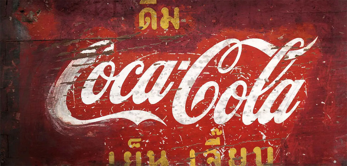
Coca-Cola’s visual identity system is built to work across everything from glass bottles to aluminum cans to digital display ads. That consistency isn’t accidental. It’s the result of brand guidelines that govern every approved use of the mark.
Dark mode and light mode performance
This is a newer requirement, but it’s now standard for digital brands.
A logo with dark elements on a transparent background will disappear on a dark-mode interface. Having a light-background and dark-background approved version is no longer optional for any brand with a digital presence. Most well-run brand systems document this explicitly in their brand style guide.
—
Color Choice
Using a consistent color in a logo can improve brand recognition by up to 80% (University of Loyola). That number comes up often enough in brand research that it’s worth taking seriously. Color is doing real work in how quickly people identify and remember a mark.
95% of top 100 brands use only one or two colors in their logo. Not because they couldn’t afford more, but because more colors create more complexity and fewer reproduction options.
Color psychology in logo design

Color associations are not universal, but within specific cultural and industry contexts they’re predictable enough to be useful. Color psychology in logo design is less about emotion and more about expectation management.
- Blue: used by 39% of Fortune 500 companies. Communicates trust, reliability, stability. Common in finance, tech, healthcare.
- Red: primary color for 16% of Fortune 500 brands. High energy, urgency, appetite. Common in food, retail, entertainment.
- Black/grayscale: 23% of companies. Luxury, authority, precision.
- Green: sustainability, health, growth. Common in organic and wellness brands.
Why the logo must work in black and white first
This is a rule a lot of designers skip, and it causes problems later.
If a logo only works because of its colors, the underlying form isn’t strong enough. Color should enhance a well-structured mark, not compensate for a weak one.
Design in black and white first. Add color second. If the mark doesn’t hold up without color, go back to the form.
Color systems and reproduction
A single brand color needs to be defined across multiple systems to ensure consistency across print and screen.
| System | Used for |
|---|---|
| Pantone | Spot color printing, physical production |
| CMYK | Four-color process printing |
| RGB | Digital screens |
| HEX | Web and UI design |
Starbucks green looks different on screen, in print, and on a paper cup. A brand that hasn’t defined its colors across all four systems will see inconsistencies across touchpoints. That inconsistency quietly erodes recognition over time.
Color harmony also matters inside the mark itself. A logo using analogous colors will feel cohesive and calm. One using a complementary color scheme creates more contrast and energy. The choice should reflect what the brand actually needs to communicate, not just what looks interesting in the design software.
Typography

Consistent use of a specific font can increase brand recognition by up to 80%, according to Monotype. That’s the same lift you get from color. Yet most brands spend far more time debating color palettes than they do thinking carefully about their typography.
Over 50% of Fortune 500 companies now use custom fonts for branding (EPC Group). That’s not a vanity expense. It’s a recognition that a proprietary typeface is one of the hardest brand assets to copy.
Serif vs. sans-serif in logo design
Sans-serif is the dominant choice. Among the Forbes 250’s largest global companies, 179 out of 250 use sans-serif in their logo branding (Custom Neon, 2025).
That said, serif fonts aren’t disappearing. IBM, Aviva, and Barclays all use them, and for good reason: serifs carry associations with authority, heritage, and reliability. The choice between a sans-serif and a serif should come from brand strategy, not personal preference.
Quick rule: test the chosen typeface at 12px on screen and at 6pt in print. If either fails, the font is wrong for the logo.
When to use a wordmark vs. a symbol
| Format | Best for | Example |
|---|---|---|
| Wordmark | Startups, unknown brand names | Google, Coca-Cola |
| Lettermark | Long names, established brands | IBM, CNN |
| Combination mark | Growing brands building recognition | Nike, Adidas |
| Symbol only | Highly established brands | Apple, Shell |
Most combination marks are designed so the symbol can stand alone once brand recognition is established. That transition takes years. Skipping the wordmark stage prematurely is a common mistake among early-stage brands.
Spacing, weight, and legibility
Kerning: spacing between individual characters. Even minor inconsistencies here make a wordmark feel amateurish.
Tracking: overall letter spacing across the full word. Wider tracking in uppercase wordmarks improves readability at small sizes.
Weight: bold weights survive reproduction better. Thin fonts look elegant in mockups. They fall apart in embroidery, signage, and small-scale print.
Spotify’s custom typeface “Circular” is a good case study. It’s rounded, minimal, and reads cleanly at any weight, across every surface the brand uses.
—
Uniqueness

A unique logo can improve brand visibility by 80% (The Logo Company). Logos that clearly convey brand personality are 27% more likely to connect with consumers (The Logo Company).
Those numbers are only possible if the mark is actually distinct. Generic logos don’t build that kind of recognition. They blend in.
Generic vs. distinctive design decisions
Most logo clichés are industry-specific. A lightbulb for an ideas company. A globe for an international one. A handshake for a services firm. These aren’t just overused. They actively work against memorability because they’re what the viewer expects to see.
- Lightbulb, gear, globe, swoosh, speech bubble
- Any leaf, tree, or green element for an “eco” brand
- Blue shield or padlock for a security company
If you can guess the logo before seeing the brand name, it’s not distinctive enough.
Trademark search as part of the process
The USPTO received over 730,000 trademark applications in 2023, with an approval rate of 54% (PatentPC). A large portion of rejections come from similarity to existing marks.
Running a trademark search before finalizing a logo is not optional. It’s risk management. Discovering a conflict after launch means a forced rebrand, which costs far more than the original design work.
Where to check: USPTO’s TESS database, the EU Intellectual Property Office, and visual similarity search tools like Brandmark or Trademarchia.
How uniqueness holds up over time
Logo fatigue is real in saturated categories. When dozens of brands in the same space use similar marks, the whole group loses distinctiveness.
Tech companies are a good example. The late 2010s produced a wave of flat, rounded, gradient-heavy app icons that all looked broadly the same. Brands that held to a distinctive form stood out. Those that followed the trend disappeared into the category.
McDonald’s golden arches have been maintained consistently since 1962. According to a 2023 Kantar BrandZ study, those distinctive assets contribute directly to its $196.5 billion brand value. Consistency protects uniqueness over time.
—
Relevance
A logo that doesn’t connect to what a brand actually does creates confusion. One that leans too literally on what a brand does limits its ability to grow. Finding the right balance is one of the harder parts of logo design.
Logos that convey brand personality clearly are 27% more likely to connect with consumers (The Logo Company). Relevance drives that connection. Without it, even a well-executed mark fails to build meaning.
Literal vs. abstract representation
Literal: the mark shows exactly what the brand does. A house for real estate. A tooth for a dentist. Works when the category has low visual noise. Fails when the brand outgrows or pivots from its original service.
Abstract: the mark uses shape and form to suggest qualities rather than depict them. Nike’s swoosh doesn’t show an athlete. It implies motion. This approach gives the brand room to grow into new categories without the logo becoming irrelevant.
Symbolic: uses an existing symbol with a well-understood cultural meaning. Shell’s scallop, Apple’s apple. Memorable, but requires significant investment to build the association.
Industry clichés and how they happen
Industry clichés don’t start as clichés. One brand uses a particular visual language effectively. Others copy it because it “looks like the category.” Over time, the whole industry converges on the same visual shorthand.
The psychology of shapes matters here. Circles suggest community and continuity. Squares communicate stability and reliability. Triangles suggest direction and movement. Understanding these associations helps designers make choices that connect to brand meaning rather than visual habit.
Avoid designing for the designer. The target audience has no idea what’s considered good design. They respond to whether the mark feels right for what the brand is, not whether it follows current design conventions.
Brand personality and visual choices
A playful brand using a rigid geometric serif will feel off. A luxury brand using a casual script may undercut its own positioning. The logo’s visual language needs to match how the brand sounds, behaves, and what it actually delivers.
- Playful brands: rounded letterforms, warm colors, looser spacing
- Premium brands: restrained color palette, clean geometry, generous white space
- Technical brands: precise letterforms, structured layout, minimal decoration
Font psychology and symbolism in graphic design both feed into relevance decisions. Every element should be chosen because it supports what the brand is, not because it’s visually interesting on its own.
—
Timelessness

The average major brand redesigns its logo once every seven years (StudyFinds). Brands that redesigned saw a 15% increase in awareness in the first six months. But the brands that didn’t need to redesign, because their original mark held up, came out ahead.
Timelessness isn’t about resisting change. It’s about building something strong enough that change is optional rather than forced.
What timeless actually means
Not boring. Not trend-resistant. Not frozen in time.
The Coca-Cola script has been refined subtly over more than a century, but the core mark is recognizable across every decade. IBM’s striped letterforms, introduced in 1972, still feel current. These logos weren’t preserved by accident. They were built on design decisions that don’t depend on any particular era’s aesthetic preferences.
85% of logo redesigns are driven by the goal of modernizing the brand identity (StudyFinds). A large portion of those redesigns could have been avoided with better initial design decisions.
Trend vs. direction
This is a distinction worth making clearly.
A trend is a visual style that peaks and fades. Skeuomorphism. Gradient everything. Brutalist logos. These have defined periods, and logos built around them look dated outside those periods.
A direction is a broader, slower-moving shift in how people respond to design. Reduction toward simplicity has been a consistent direction for decades. That’s not a trend. Building for simplicity doesn’t make a logo look dated.
The test: does this design choice depend on what’s popular right now, or on how people have responded to visual communication across decades? If it’s the former, it has a shelf life.
When a redesign is the right call
Not every redesign is a failure of original design. Some are genuinely warranted.
- The original mark was poorly executed and never performed well
- The brand has expanded significantly beyond its original category
- A merger or acquisition requires a unified visual identity
- The mark has legal problems or trademark conflicts
GAP’s 2010 logo change was reversed in five days after public backlash. The original mark had strong recognition built over decades. The redesign abandoned that equity without a clear reason, and the market responded immediately.
When the reason for redesign is “it feels dated,” the better question is usually whether the execution can be refined rather than replaced. The evolution of logos over time at the most recognized brands shows that refinement consistently outperforms replacement.
Building for longevity from the start
A few practical decisions made during the design process protect a logo’s lifespan.
Avoid effects that belong to a specific era: 3D bevels, drop shadows, gradient fills that depend on screen rendering. These age faster than the underlying form.
Ground the design in geometry: marks built on proportional relationships, like the scale and proportion principles borrowed from architecture and print, outlast marks built on arbitrary stylistic decisions.
Test against a 10-year question: would this logo still feel right for the brand in a decade, regardless of what design trends look like then? If the honest answer is no, the design needs to go back a step.
The brand identity design work that lasts isn’t always the most striking at launch. Striking fades. Solid holds.
FAQ on Logo Design Principles
What are the basic principles of logo design?
The core principles are balance, simplicity, scalability, versatility, color choice, typography, uniqueness, relevance, and timelessness.
Each one addresses a different way a logo can succeed or fail in real-world use.
Why is simplicity important in logo design?
Simple logos are 13% more memorable than complex ones, according to Siegel+Gale research.
A clean mark scales better, reproduces cleanly in any format, and is faster to recognize. Complexity adds visual noise without adding meaning.
What makes a logo timeless?
Timeless logos avoid effects tied to a specific era: gradients, drop shadows, 3D styling.
They’re built on geometry, clear proportion, and design principles that don’t depend on what’s currently trending. IBM’s logo, unchanged in core form since 1972, is a good reference point.
How does color affect logo design?
Color improves brand recognition by up to 80% (University of Loyola). Color psychology shapes how people feel about a brand before they read a single word.
Every logo color should be defined in Pantone, CMYK, RGB, and HEX for consistent reproduction.
What file format should a logo be in?
Vector graphics (SVG, EPS, AI) are the baseline requirement. They scale without losing quality, from a 16px favicon to a billboard.
Raster formats like JPEG or bitmap have resolution limits that create problems in print and large-scale production.
What is visual hierarchy in a logo?
Visual hierarchy controls which element the eye reads first. In a combination mark, it determines whether the symbol or the wordmark takes priority.
Poor hierarchy makes a logo feel uncertain and unresolved, even when the individual elements are well drawn.
Should a logo include the company name?
It depends on brand recognition. New brands almost always need a wordmark because the name itself builds familiarity.
Established brands like Apple or Shell can rely on a symbol alone. Most growing brands use a combination mark that includes both, then phase out the name as recognition grows.
How many colors should a logo have?
95% of top brands use one or two colors. More colors create more complexity and fewer reproduction options.
Always design in black and white first. If the logo doesn’t work without color, the underlying form isn’t strong enough. Color should enhance the mark, not compensate for a weak one.
What is negative space in logo design?
Negative space is the empty area around and between design elements. Used deliberately, it adds meaning without adding visual weight.
The FedEx logo hides an arrow in the gap between “E” and “x.” That detail only works because the overall mark is balanced enough for the eye to catch it.
How often should a logo be redesigned?
Major brands redesign on average once every seven years (StudyFinds). But redesign should be driven by a real reason, not restlessness.
Refinement almost always beats replacement. Brands that abandon strong, recognized marks for arbitrary modernization rarely come out ahead.
Conclusion
This conclusion is for an article presenting logo design principles as functional requirements, not aesthetic preferences.
Every decision covered here, from alignment and scalability to color choice and timelessness, exists to make a mark perform reliably across every context it encounters.
A logo that only works under ideal conditions isn’t finished. It’s a liability.
The brands with the strongest visual standards didn’t get there by following trends. They built on proven design foundations that hold up regardless of what’s popular in any given year. that hold up regardless of what’s popular in any given year.
Apply these principles deliberately. Test the mark at every scale, on every surface, in every color variant.
Good logo design isn’t a one-time decision. It’s a standard you hold the work to.

Renowned for his expertise in logo design and visual branding, Bogdan has developed a multitude of logos for various clients.
His skills extend to creating posters, vector illustrations, business cards, and brochures. Additionally, Bogdan's UI kits were featured on marketplaces like Visual Hierarchy and UI8.
He also wrote in the past years on sites like Design Your Way, WebDesignerDepot, WPDean, Designmodo, Speckyboy, Slider Revolution, and more.
- The Windsurf Logo History, Colors, Font, And Meaning - 10 October 2026
- How to Remove Background From Product Photos (No Photoshop) - 10 October 2026
- How Designers can Build a Stronger Online Creative Identity - 9 October 2026

Bogdan Sandu is a seasoned designer who has been designing websites since 2008. Renowned for his expertise in logo design and visual branding, Bogdan has developed a multitude of logos for various clients. His skills extend to creating posters, vector illustrations, business cards, and brochures. Additionally, Bogdan's UI kits were featured on marketplaces like Visual Hierarchy and UI8. He also wrote in the past years on sites like Design Your Way, WebDesignerDepot, WPDean, Designmodo, Speckyboy, Slider Revolution, and more.
You Might Also Like