


Every composition you’ve ever liked, from a clean website layout to a striking photograph, got the relationship between positive space vs negative space right. Every cluttered design that made you leave a page got it wrong.
These two forces shape how your brain processes visual information. They control where your eye goes, what feels important, and whether a design reads as polished or chaotic.
This guide breaks down how positive and negative space function across graphic design, photography, web layout, and fine art. You’ll learn the Gestalt principles behind figure-ground perception, see real examples from brands like FedEx and Apple, and pick up practical methods for training your spatial awareness.
What Is Positive Space

Positive space is the area in a composition occupied by the main subject. The object, the figure, the thing your eye lands on first. That’s it.
In a portrait photograph, the person is positive space. On a poster, the headline and central image are positive space. In a UI card layout, the text block and button fill the positive space.
It carries visual weight. The more positive space dominates a composition, the heavier and more dense the layout feels. Fill a canvas with too much of it and the whole thing suffocates.
How Positive Space Functions Across Visual Disciplines
Positive space works differently depending on the medium. A painting handles it one way. A mobile screen handles it another.
Graphic design: The logo mark, headline type, and hero image all sit in positive space. They define the composition.
Photography: The subject fills positive space within the frame. A bird in a field. A face in a crowd. Everything you’re meant to look at.
Web layout: Content blocks, navigation elements, and call-to-action buttons all occupy positive space on the screen.
According to Siteefy, roughly 20% of web designers consider poor use of spatial relationships one of the most common design mistakes. Most of that comes down to cramming too many positive elements into too little room.
Visual Weight and Its Effect on Composition
Not all positive space carries the same weight. A large dark shape pulls harder than a small light one.
Size, color, texture, and position all affect how heavy an element feels within a layout. A red circle in the center of a white page demands more attention than a gray square tucked into a corner.
This is where visual hierarchy starts. The heaviest positive element becomes the focal point. Everything else orbits around it.
Research from VWO shows that 94% of first impressions about a website are design-related. How you distribute positive space across a layout is a huge part of that snap judgment.
What Is Negative Space

Negative space is the empty or unoccupied area surrounding and between subjects in a composition. Not “wasted” space. Not “blank” space. Active, functional space that shapes how you perceive everything else on the page.
It doesn’t have to be white either. Negative space can be any color, texture, or pattern. The term comes from traditional art, where the area around the subject defines the subject just as much as the subject defines itself.
Why Negative Space Is Not Empty Space
This is the biggest misconception in design. People look at open areas in a layout and think something is missing.
Nothing is missing. That breathing room is doing real work.
Jan Tschichold, one of the most influential typographers of the 20th century, put it bluntly: white space should be treated as an active element, not a passive background. That was nearly a century ago and designers still haven’t fully absorbed it.
According to a UXPin case study, reducing the amount of content surrounding a call-to-action button (increasing negative space around it) consistently improves conversion rates. The empty space is literally doing the selling.
Famous Examples of Negative Space in Design
The FedEx logo is the textbook case. The negative space between the “E” and “x” forms a hidden forward-pointing arrow. Lindon Leader designed it in 1994, and it has since earned over 40 international design awards.
Rolling Stone named it among the eight best logos in 35 years. Design schools still teach it as the definitive example of negative space done right.
Then there’s Rubin’s vase, the classic optical illusion from Danish psychologist Edgar Rubin. Two faces or a vase, depending on what your brain assigns as figure and what it assigns as ground. It demonstrates how negative and positive space are completely interchangeable based on perception.
| Example | What Negative Space Creates | Discipline |
|---|---|---|
| FedEx logo | Hidden arrow between E and x | Brand identity |
| Rubin’s vase | Faces or vase depending on perception | Psychology |
| WWF logo | Panda shape from black-and-white patches | Nonprofit branding |
| M.C. Escher’s Sky and Water | Birds transform into fish through figure-ground reversal | Fine art |
The Guild of Food Writers logo, the NBC peacock, and countless other marks rely on the same trick. What you leave out matters as much as what you put in.
How Positive and Negative Space Work Together

Neither exists without the other. Change the positive space, and the negative space changes with it. Shrink the subject, and the surrounding emptiness grows. They’re locked in a permanent relationship.
This is figure-ground perception at its core. Your brain constantly assigns “figure” status to one part of a visual scene and “ground” status to everything else.
Figure-Ground Relationship in Practice
Max Wertheimer published his foundational paper on Gestalt principles in 1912. Over a century later, the figure-ground relationship he helped define is still the backbone of how we process visual information.
The brain uses several cues to decide what’s figure and what’s ground:
- Size plays a role because smaller regions tend to be perceived as figure
- Convex shapes are more likely read as figures than concave ones
- Contrast between foreground and background helps the brain separate the two
- Lower regions in a display are more often assigned as figure, according to research published in the Journal of Experimental Psychology
A study by Vecera and Vogel at the University of Iowa found that participants picked stimuli in the lower region of a display as “figure” at rates significantly greater than chance. Participants found it, in their words, “extraordinarily difficult” to see the upper region as figure.
Gestalt Principles and Spatial Perception
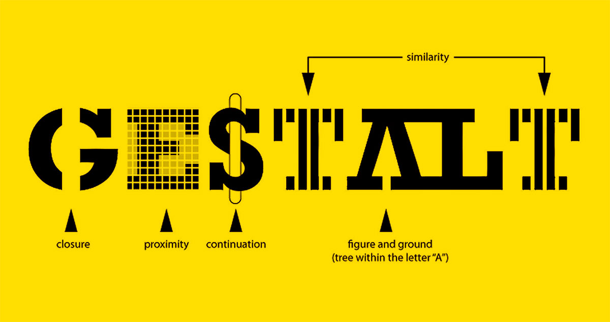
Figure-ground is just one piece of the Gestalt framework. Other principles like proximity, similarity, closure, and good continuation all influence how we group and separate visual elements.
Closure is especially relevant here. Your brain fills in missing information to perceive complete shapes. A circle with gaps still reads as a circle. That’s negative space actively participating in shape perception.
Symmetry matters too. Symmetric regions are more readily perceived as figures, while asymmetric regions tend to recede into the background.
The practical takeaway? Every layout decision you make, from the spacing between menu items to the padding around a hero image, is a figure-ground decision. You’re always choosing what’s figure and what’s ground, whether you realize it or not.
Positive Space vs Negative Space in Graphic Design
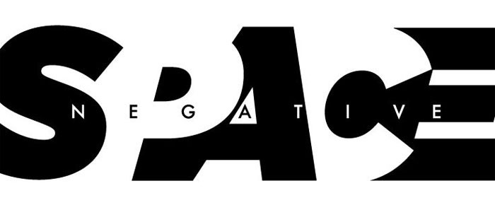
Graphic design is where the tension between positive and negative space gets most visible. Every poster, every brand mark, every package is a deliberate distribution of filled and unfilled areas.
The balance you strike determines whether a piece feels clean or cluttered, premium or cheap, loud or quiet.
Negative Space in Logo Design
Took me years to actually appreciate how much negative space shapes a logo’s identity. When it’s done well, the empty area carries just as much meaning as the mark itself.
The FedEx arrow is the obvious one. But look at the WWF panda. The NBC peacock. The Spartan Golf Club logo, where the golfer’s swing forms a Spartan helmet in the negative area.
These aren’t accidents. Lindon Leader spent nine months and produced over 200 versions before arriving at the final FedEx mark. That hidden arrow between the E and x was only discovered partway through the process.
According to research from Taipei Medical University published in 2023, knowing about the hidden arrow in the FedEx logo changes how people visually process it going forward, making them react faster to similar negative-space designs. Your brain literally rewires itself once it “sees” the trick.
Poster and Print Composition
Minimalist design leans hard into negative space. Think of the classic Swiss design movement: grid systems, generous margins, type floating in open white fields.
Maximalism goes the other way. Dense, packed layouts where positive space crowds every corner. Both approaches work when they’re intentional.
The problem shows up when designers split the difference without thinking about it. Not minimal enough to breathe, not dense enough to feel purposeful. Just… muddled.
According to a LinkedIn analysis of 2024 design trends, abstract shapes and negative space created by experimental typography are engaging audiences more than the actual words in many print compositions.
Tools That Control Space Distribution
Adobe Illustrator’s pathfinder panel lets you add, subtract, and intersect shapes to manipulate how positive and negative areas interact. Boolean operations in Figma do the same thing.
These aren’t just shape tools. They’re space-distribution tools. Every time you subtract one shape from another, you’re converting positive space into negative space. Or vice versa.
Vector graphics make this process non-destructive. You can endlessly adjust the spatial relationship between filled and unfilled areas without losing quality.
Positive Space vs Negative Space in Photography

Photography handles space differently than graphic design because you’re working with what’s already in front of the lens. You don’t draw the subject. You frame it.
And framing is, at its core, a decision about how much positive and negative space ends up in the final image.
The Rule of Thirds and Space Distribution
The rule of thirds is really just a spatial distribution framework. Place the subject at one of the intersection points and you automatically create an uneven split between positive and negative space.
That asymmetry is what makes it interesting. A subject dead center splits the composition into roughly equal positive and negative areas. Not terrible, but predictable. Offset the subject and the negative space starts doing its own storytelling.
A portrait with the person on the left third, looking right into open space, creates tension and direction. The viewer’s eye follows the subject’s gaze into the negative area.
Minimalist Photography and Negative Space
Minimalist photography is basically a negative-space-first genre. The subject is small. The surrounding area is vast. A single tree in a snow field. A lone boat on flat water.
The emphasis shifts from “what” to “where.” The subject matters, sure. But the emptiness around it carries the emotional weight.
Some photographers push this to the extreme. Michael Kenna’s work, for example, features subjects that occupy maybe 5-10% of the frame. The rest is fog, water, sky, or shadow. All negative space. All doing critical compositional work.
How Depth of Field Blurs the Boundary
Bokeh (the soft blur from a wide aperture) turns background elements into something between positive and negative space. The blurred lights and shapes aren’t “empty.” But they aren’t subjects either.
This middle ground creates a layered spatial relationship that flat graphic design can’t replicate. The subject is sharp positive space. The background is soft, partial negative space. And the transition between them guides the eye.
| Photography Style | Positive Space Ratio | Negative Space Ratio | Effect |
| Minimalist landscape | Low (5-15%) | High (85-95%) | Solitude, vastness |
| Street photography | Medium (40-60%) | Medium (40-60%) | Context, narrative |
| Macro/close-up | High (70-90%) | Low (10-30%) | Detail, texture |
| Environmental portrait | Medium (30-50%) | Medium-high (50-70%) | Story, setting |
Positive Space vs Negative Space in Web and UI Design

This is where the positive-negative space conversation has real, measurable financial consequences. The spacing decisions you make in a web layout directly affect whether people stay, scroll, click, or leave.
Siteefy research found that 84.6% of designers say overcrowded layouts are the most common mistake small businesses make on their websites. Too much positive space, not enough breathing room.
How Whitespace Affects Readability and Conversion
A widely cited claim suggests that adding whitespace between paragraphs and in the margins can improve reading comprehension by up to 20%. Fair warning: the original attribution of this statistic to a 2004 study has been disputed by the study’s own author, who confirmed it had nothing to do with whitespace.
That said, the directional finding holds up across multiple UX research sources. Spacing helps comprehension. It’s just not as cleanly quantifiable as a single number suggests.
What is well-documented: Loop11 reports that A/B testing whitespace adjustments can improve conversions by 12%. And UXPin’s case studies show that reducing clutter around CTA buttons consistently lifts click-through rates.
Apple’s website is the case study everyone points to. Generous negative space surrounds every product image and headline, letting each element command full attention. The Baymard Institute studied Apple’s UX across 705 different design elements with multiple rounds of usability testing, including eye-tracking, and found the clean layout approach performs well across user groups.
CSS Properties That Control Negative Space
In web design, negative space is controlled through specific CSS properties. Padding, margin, and line-height are the primary tools.
- Padding creates space inside an element, between its content and its border
- Margin creates space outside an element, between it and its neighbors
- Font spacing and line-height control micro-level negative space within text blocks
Google’s Material Design system specifies an 8dp baseline grid for spacing. Every spatial decision, from card padding to section margins, aligns to multiples of 8. That consistency creates a predictable spatial rhythm across the entire interface.
Content-Heavy vs. Marketing Layouts
News sites and dashboards pack information densely. The BBC, Bloomberg, and similar platforms use minimal macro negative space because their users want data density. The negative space exists at the micro level, between lines and columns, just enough to keep things legible.
Marketing pages do the opposite. Stripe’s website, Apple’s product pages, and most SaaS landing pages use vast amounts of negative space to slow the user down, focus attention, and create a premium feel.
Neither approach is “correct.” The right ratio depends entirely on what the user came to do.
Mind Inventions research from 2026 projects the UI services market will reach $61 billion by 2035, driven by a 9.22% compound annual growth rate. Spatial design decisions, how you distribute positive and negative space across interfaces, are a major part of what’s fueling that growth.
Positive Space vs Negative Space in Art and Painting

This is where the whole conversation started. Long before anyone thought about UI layouts or web interfaces, painters and sculptors were making spatial decisions that defined entire art movements.
The way an artist distributes filled and empty areas across a canvas tells you almost everything about their intent.
Classical and Renaissance Approaches
Caravaggio used dark, empty backgrounds to isolate his subjects in dramatic light. The positive space (the figure) punches forward while the negative space (deep shadow) swallows everything else. This technique, called chiaroscuro, makes the figure-ground relationship almost violent in its contrast.
Renaissance painters generally treated negative space as something to fill. Backgrounds got landscapes, architecture, skies. Paul Cézanne’s still life work later challenged that by flattening depth and giving the space between objects as much visual attention as the objects themselves.
MoMA’s permanent collection features Cézanne’s Still Life with Apples on a Sideboard (1900-1906) as a key example of how positive and negative space in painting doesn’t need to follow a black-and-white binary.
Matisse and the Cut-Outs
Henri Matisse’s late-career cut-outs are probably the clearest example of positive and negative space becoming genuinely interchangeable in fine art.
As the Saint Louis Art Museum noted, each cutting produced both a positive and a negative form, the cut piece and the leftover paper. Matisse frequently used both pieces in his compositions.
MoMA’s 2014 retrospective featured approximately 100 cut-outs from collections worldwide. The show demonstrated how Matisse treated scissor-cut shapes and the voids they left behind as equally important compositional tools.
Eastern vs. Western Spatial Philosophy
Western tradition: Fill the canvas. Paint the background. Leave minimal unoccupied area. The subject dominates.
Eastern tradition: Empty space carries meaning. Japanese ink wash painting (sumi-e) deliberately leaves large areas untouched. The void isn’t absence. It’s atmosphere, distance, silence.
Notan, a Japanese design concept meaning “dark-light,” treats positive and negative space as inseparable halves of the same whole. Arthur Wesley Dow introduced Notan to Western audiences through his 1899 book Composition, which influenced generations of art education.
The yin-yang symbol is the most direct visual representation of this idea. You can’t have positive space without negative space. They define each other.
| Tradition | Space Philosophy | Typical Ratio | Key Example |
|---|---|---|---|
| Renaissance (Western) | Fill the background | High positive, low negative | Raphael’s crowded compositions |
| Baroque (Western) | Dramatic contrast | Mixed, light vs. dark | Caravaggio’s chiaroscuro |
| Ink Wash (Eastern) | Void carries meaning | Low positive, high negative | Sesshū Tōyō’s landscapes |
| Modernist | Space as active element | Varies intentionally | Matisse’s cut-outs |
Common Mistakes When Balancing Positive and Negative Space
Most spatial problems in design come down to the same handful of errors. They show up everywhere, from student projects to corporate websites to book covers.
Siteefy research shows 84.6% of designers say overcrowded layouts are the most common mistake businesses make. That’s a spatial problem, not a content problem.
Filling Every Inch Because Empty Space Feels Wrong
This is the number one mistake. Non-designers see open areas and assume something is missing. They want to add more text, more images, more buttons.
According to BusinessDasher, 79% of users leave a site because of poor usability, which includes cluttered layouts. The fix isn’t more content. It’s more breathing room.
Apple’s entire brand identity is built on resisting this impulse. Their product pages are mostly negative space with a few carefully placed elements doing all the work.
Inconsistent Spacing Across a Layout
Tight margins in one section, loose padding in another, with no clear rationale. That’s what kills spatial rhythm in a composition.
Consistent spacing creates pattern. Pattern creates expectation. When the pattern breaks without reason, the viewer feels something is off (even if they can’t say what).
Google Material Design solves this with its 8-density-pixel spacing system. Every element aligns to the same spatial grid, keeping the balance predictable and clean.
Ignoring Responsive Breakpoints
A layout can look perfectly balanced on desktop and completely fall apart on mobile. Space ratios shift when screen widths change, and most designers don’t account for this.
Hostinger reports that 53.8% of web designers cite non-responsive layouts as the primary trigger for a website redesign. BusinessDasher data shows 73.1% of visitors leave a site specifically because of non-responsive design.
The negative space that separates a two-column desktop layout collapses when those columns stack vertically on a phone. If you’re not testing at every breakpoint, your spatial relationships are only working at one screen width.
How to Train Your Eye for Positive and Negative Space

Spatial awareness isn’t something you either have or don’t. It’s a skill that develops through practice. Specific exercises exist that speed up the process.
The Squinting Technique
Squint at any composition and the details blur away. What remains is mass and void. Dark shapes and light shapes. Positive and negative.
This is the quickest way to evaluate whether a layout’s spatial distribution works. If the dark-light balance looks off when you squint, no amount of detail will fix the underlying composition.
Notan Studies
How it works: Reduce any image or scene to only two values (black and white). No grays. No gradients. Just positive and negative.
Arthur Wesley Dow popularized Notan exercises in Western art education through his 1899 book. Over a century later, art schools still use them because nothing else strips a composition down to its spatial bones as effectively.
The Georgia O’Keeffe Museum describes Notan as recognizing the “separate but equally important identity of both a shape and its background.” That single idea, applied consistently, changes how you see every design you encounter.
Flipping and Inverting Compositions
Turn your layout upside down. Invert the colors. Both tricks disrupt your brain’s pattern recognition and force you to see the actual spatial distribution instead of the content.
When you flip a webpage mockup vertically, you stop reading the words and start seeing the blocks. The positive space becomes abstract shape. The negative space becomes visible structure.
Wireframing and Grayscale Reviews
Strip the color out of any layout and you’re left with spatial relationships in their purest form.
| Method | What It Reveals | Best For |
|---|---|---|
| Squinting | Mass vs. void distribution | Quick evaluation of any composition |
| Notan study | Dark-light balance stripped to two values | Paintings, illustrations, photographs |
| Flipping/inverting | Hidden spatial imbalances | Layouts, posters, web mockups |
| Grayscale review | Spatial hierarchy without color distraction | UI design, web pages |
Wireframes work the same way. Before any visual polish gets applied, a wireframe shows you exactly how positive and negative space are distributed across a page.
These days, Figma and Adobe XD make it easy to toggle between full-color mockups and simplified spatial views. Use that. Check the bones before dressing the surface.
FAQ on Positive Space Vs Negative Space
What is the difference between positive and negative space?
Positive space is the area occupied by the main subject in a composition. Negative space is the empty area surrounding it. Together they create the figure-ground relationship that defines every visual layout, from paintings to web pages.
Why is negative space important in design?
Negative space improves readability, directs attention, and reduces visual clutter. Without adequate breathing room between design elements, layouts feel crowded and users disengage. It’s an active compositional tool, not wasted area.
Can negative space be any color?
Yes. Despite the name, negative space doesn’t have to be white. It can be any hue, texture, or pattern. The term refers to unoccupied areas in a composition, regardless of their color value.
What is a famous example of negative space in a logo?
The FedEx logo is the most cited example. The negative space between the letters E and x forms a hidden forward-pointing arrow. Designer Lindon Leader created it in 1994, and it has won over 40 international design awards.
How do positive and negative space work together?
They’re interdependent. Changing one automatically changes the other. This relationship is rooted in shape psychology and Gestalt figure-ground perception, where the brain assigns “figure” and “ground” status to different areas of a visual scene.
What is Notan in art?
Notan is a Japanese design concept meaning “dark-light.” It treats positive and negative space as equal, inseparable halves of a composition. Arthur Wesley Dow introduced it to Western art education in his 1899 book Composition.
How does negative space affect website usability?
Proper spacing between text blocks, buttons, and images improves comprehension and keeps users on the page longer. Overcrowded layouts push visitors away. Strategic whitespace around calls to action consistently improves click-through rates.
What is the rule of thirds and how does it relate to space?
The rule of thirds divides a frame into nine equal sections using two horizontal and two vertical lines. Placing subjects at intersection points creates an uneven, dynamic split between positive and negative space.
Is more negative space always better?
No. Too much negative space can make a layout feel incomplete or push critical content below the fold. News sites and dashboards intentionally use dense layouts. The right ratio depends on the content type and user intent.
How can I practice seeing positive and negative space?
Try squinting at compositions to blur detail and see only mass versus void. Notan exercises (reducing images to black and white only) and flipping layouts upside down both help train spatial awareness quickly.
Conclusion
Understanding positive space vs negative space changes how you approach every visual decision. Whether you’re adjusting padding in a CSS layout, composing a photograph, or sketching a brand mark, the interplay between filled and unfilled areas drives the result.
The core principles haven’t changed since Edgar Rubin first demonstrated figure-ground perception. What has changed is where we apply them. Screens, interfaces, responsive layouts, and motion graphics all demand spatial awareness that earlier generations of designers never had to consider.
Start with Notan exercises. Squint at your layouts. Check your spacing at every breakpoint.
The space you leave empty will always do as much work as the space you fill. Treat both with equal intention and your compositions will show it.

Renowned for his expertise in logo design and visual branding, Bogdan has developed a multitude of logos for various clients.
His skills extend to creating posters, vector illustrations, business cards, and brochures. Additionally, Bogdan's UI kits were featured on marketplaces like Visual Hierarchy and UI8.
He also wrote in the past years on sites like Design Your Way, WebDesignerDepot, WPDean, Designmodo, Speckyboy, Slider Revolution, and more.
- Canva for Teams Review: Is It Worth the Business Plan? - 24 July 2026
- 5 Brand Compliance Checkpoints Every Enterprise Should Automate - 23 July 2026
- Timeless Open Sans Font Pairing for Any Project - 22 July 2026

Bogdan Sandu is a seasoned designer who has been designing websites since 2008. Renowned for his expertise in logo design and visual branding, Bogdan has developed a multitude of logos for various clients. His skills extend to creating posters, vector illustrations, business cards, and brochures. Additionally, Bogdan's UI kits were featured on marketplaces like Visual Hierarchy and UI8. He also wrote in the past years on sites like Design Your Way, WebDesignerDepot, WPDean, Designmodo, Speckyboy, Slider Revolution, and more.
You Might Also Like


