

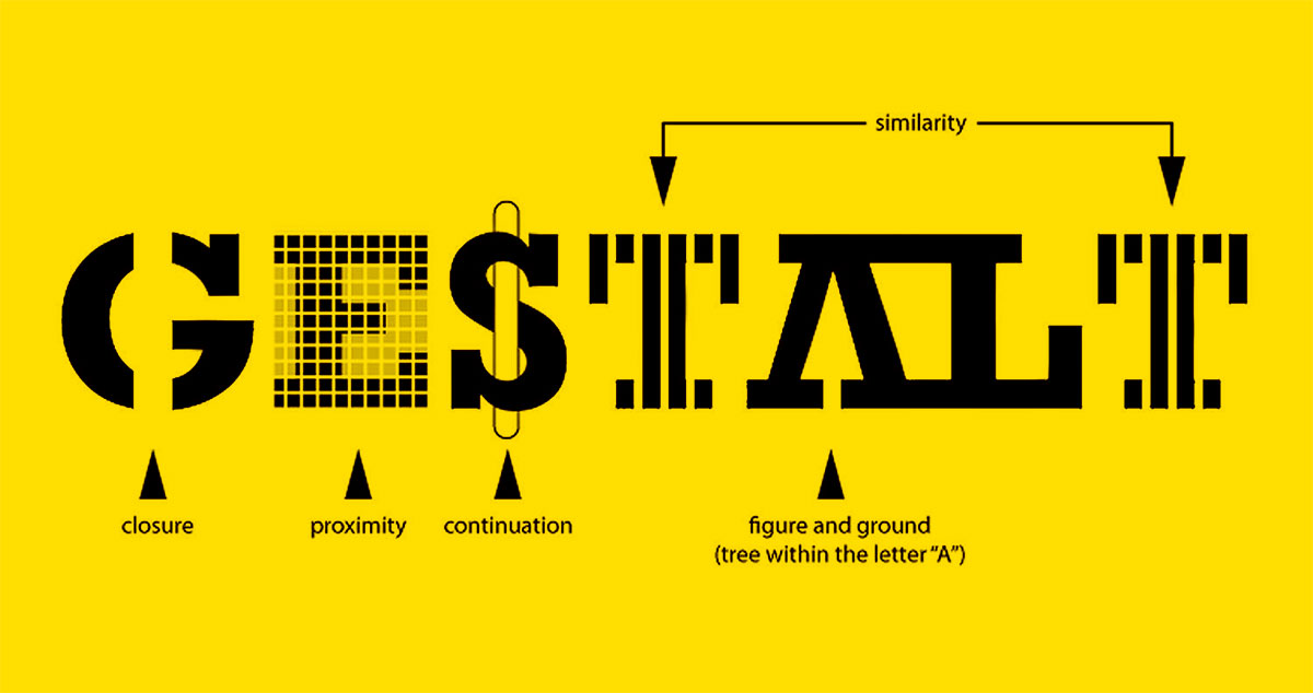
Your brain makes design decisions before you do.
The Gestalt principles of design are a set of perceptual rules that explain how the human mind groups visual elements into meaningful patterns. They come from early 20th-century cognitive psychology and have been shaping visual communication ever since.
Every layout you find intuitive, every logo that clicks instantly, every interface that feels effortless – those outcomes aren’t accidental. They follow predictable rules of visual perception.
This article covers all the core principles: proximity, similarity, continuity, closure, figure-ground, symmetry, and common fate. You’ll also see how they interact in real design systems and where usability testing reveals when they break.
What Are the Gestalt Principles of Design

Gestalt principles of design are a set of rules that describe how the human brain groups visual elements into meaningful patterns. They come from Gestalt psychology, a school of thought that emerged in early 20th-century Germany, and they explain why we see a whole image before we notice its individual parts.
The core idea, summed up by psychologist Kurt Koffka: “The whole is other than the sum of its parts.”
When you look at a logo and instantly recognize it without studying each letter or shape, that’s perceptual organization at work. Your brain has already grouped the elements, assigned meaning, and moved on.
These principles aren’t just theory from a psychology textbook. Designers at Airbnb, Apple, and Google actively use them to build interfaces that feel intuitive without explaining themselves. That’s the goal: design that works on the user before the user works on the design.
Where They Come From
Max Wertheimer published the first formal documentation of Gestalt principles in 1912, alongside colleagues Wolfgang Köhler and Kurt Koffka at the University of Berlin.
Their research was, at the time, a direct pushback against the dominant view that perception was just a collection of individual sensations. They argued the opposite: humans perceive things holistically, not piece by piece.
That insight traveled from psychology into the Bauhaus design movement, which was also operating in Germany during the same period, and it never really left design since.
Why Designers Still Use Them
Research shows that 94% of first impressions of a digital product are design-related, formed within as little as 50 milliseconds (Lindgaard et al., 2006). That’s before anyone reads a headline.
Gestalt principles are the framework behind those snap judgments. They explain how visual hierarchy, spacing, and grouping guide a user’s eye before conscious thought kicks in.
In practice, they cover everything from how a navigation menu reads to why a button feels clickable. They apply to web design, print design, packaging design, and just about any medium where visuals communicate something.
| Principle | Core Idea | Common Application |
|---|---|---|
| Proximity | Close elements appear related | Navigation menus, form layouts |
| Similarity | Matching elements appear grouped | Button states, icon systems |
| Continuity | The eye follows smooth paths | Timelines, onboarding flows |
| Closure | The brain completes incomplete shapes | Logo design, negative space |
| Figure-Ground | Viewers separate subject from background | Modals, hero images |
| Common Fate | Elements moving together appear related | Animations, hover states |
The Principle of Proximity

Elements placed close together are perceived as related. That’s it. Simple rule, serious design implications.
Proximity is probably the most commonly used Gestalt principle in interface design because it handles a lot of the organizational work without requiring color, labels, or borders. Spacing alone carries the meaning.
How It Works in Practice
Form layouts are the clearest example. When a label sits directly above its input field with a small gap, and a larger gap separates it from the next field, users instantly understand the grouping. No line needed, no color coding.
The same logic applies to navigation. Google’s search results page groups the title, URL, and description of each result into a tight visual cluster, with clear space between results. Users don’t have to think about which description matches which title.
Airbnb’s listing cards do this too. Price, rating, and location sit in close proximity to the property image, creating a self-contained unit the eye reads as a single object.
Where Designers Get It Wrong
Inconsistent spacing is the most common mistake. When gaps between related elements are similar to gaps between unrelated elements, the grouping breaks. The eye can’t figure out what belongs together.
This is especially tricky in dense UI, like dashboards. I’ve seen designers spend hours on color and typography, then undo all of it with sloppy spacing. Proximity failures create cognitive load even when everything else looks fine.
Proximity also interacts with alignment. Elements that are close but misaligned can still feel scattered. The two principles usually need to work together to fully land the grouping.
Proximity and Cognitive Load
Poor visual design measurably increases cognitive load and the likelihood of user error, while well-organized interfaces can cut operational errors by 30% to 70% (MDPI systematic review, 2020-2024).
That’s a meaningful range. And proximity is one of the clearest ways to organize information without adding visual weight.
The Principle of Similarity

Elements that share visual traits – color, shape, size, texture – are perceived as part of the same group. Similarity signals relationship without requiring physical closeness.
Where proximity groups by location, repetition of visual traits achieves grouping across distance. That distinction matters a lot in complex layouts where related elements can’t always sit next to each other.
Similarity in UI Systems
Color is the most direct application. When all primary action buttons share the same hue, users learn quickly that this color means “do something.” That pattern builds fast.
Icon systems work the same way. A consistent stroke weight, corner radius, and visual style across an icon set tells users all the icons belong to the same category of function. Figma and Notion both do this deliberately across their interfaces.
Size creates hierarchy through similarity too. Larger elements are perceived as more important, and elements of the same size are read as peers.
Breaking Similarity on Purpose
This is actually useful. When everything follows the same visual pattern, one deliberate deviation draws the eye immediately.
A red button in a sea of gray ones. An oversized headline among body copy. A filled icon in a set of outlined ones. These breaks use the similarity principle in reverse: the brain notices the outlier because it’s used to grouping everything else.
That’s how focal points work in composition. You create a clear focal element by making everything around it similar, and the focal element different.
A Note on Accessibility
Similarity based on color alone is risky. Nielsen Norman Group recommends using multiple similarity signals (shape, size, and color together) because relying solely on color contrast excludes users with color blindness. A good design system uses all three.
| Similarity Type | Best For | Limitation |
|---|---|---|
| Color | Button states, categories | Fails for colorblind users alone |
| Shape | Icon families, tag systems | Needs consistent style library |
| Size | Typographic hierarchy, emphasis | Can conflict with accessibility sizing |
| Texture/Style | Illustration systems, brand consistency | Harder to maintain at scale |
The Principle of Continuity

The brain prefers smooth, continuous lines over abrupt directional changes. When visual elements align along a path, the eye follows that path naturally, even past the actual end of the line.
Continuity is about guiding attention without explicit arrows or labels. It’s one of the quieter Gestalt principles, but it does a huge amount of work in layout design.
Reading Flows and Scan Patterns
Most users don’t read pages linearly. Nielsen Norman Group’s eye-tracking research consistently shows F-pattern and Z-pattern scanning behaviors, where the eye moves along predictable horizontal and vertical axes.
Continuity is what makes those scan patterns predictable. A row of elements creates a horizontal line the eye follows. A left-aligned column creates a vertical one. Designers who understand this can place critical content exactly where the eye naturally lands next.
Duolingo’s onboarding flow is a good example. Each screen leads the user’s eye downward through a clear vertical path, with a call-to-action always sitting at the natural endpoint of that visual line. Nothing interrupts the flow.
Continuity in Timelines and Progress Indicators
Step-by-step flows and progress bars depend entirely on this principle. A connected line running through numbered steps signals sequence and completion simultaneously. The line creates continuity; the numbers create order. Together they tell the user: you’re moving through something.
Break the visual continuity in a progress indicator (misaligned steps, inconsistent spacing), and users start to feel like the process is broken, even when it isn’t.
Where It Interacts With Other Principles
Continuity + proximity often work together in card-based layouts. The consistent spacing between cards creates horizontal and vertical lines the eye reads as a grid, which the brain then interprets as a structured, organized system.
This is also where grid systems and Gestalt formally meet. A grid enforces continuity by keeping elements on invisible lines, making the whole layout feel coherent even when content lengths vary.
The Principle of Closure

The brain completes incomplete shapes. Given enough context, a person will fill in missing visual information and perceive a whole object, even when part of it isn’t actually there.
Closure is the principle that makes negative space in logo design possible. It’s also what allows designers to create clean, minimal layouts without making them feel sparse.
Classic Logo Examples
The WWF panda logo uses closure directly: a panda outline with missing sections that the brain fills in automatically. The IBM logo uses horizontal stripes breaking up letterforms that the eye completes into readable letters. The NBC peacock is made of solid color shapes the brain assembles into a bird.
None of these logos explain themselves. They rely on the viewer’s perceptual system to do part of the work, which creates a small but satisfying moment of recognition. That moment builds memory. Closure is partly why some logos stick better than others.
Closure in Interface Design
Partially visible content at the edge of a screen is a direct application of closure in mobile UI. When a card is half-visible at the right edge, users understand there’s more content to scroll to without any arrow or label. The incomplete element implies continuation.
Bordered containers and cards also use a softer version of closure: even a light background color or a partial border is enough for the brain to perceive an enclosed, complete region.
The Limit
Closure fails when too much information is missing. The principle works because users bring pattern recognition and prior knowledge. Remove too many elements, and the pattern doesn’t register. A logo that’s too abstract isn’t clever; it’s just unrecognizable. Took a lot of failed creative reviews to understand that one.
The Principle of Figure-Ground
The brain automatically separates a visual field into two parts: the subject (figure) and everything behind it (ground). This happens instantly and unconsciously.
Figure-ground is the principle behind contrast in design. Without a clear separation between figure and ground, a layout has no hierarchy, no focal point, and no clear place to look first.
The Classic Example
Rubin’s vase is the most famous figure-ground demonstration: a black and white image that reads as either two faces or a vase, depending on which element you treat as the figure. Most people can switch between the two interpretations, but rarely see both at the same time.
That’s the key insight. Figure and ground are mutually exclusive. When they’re ambiguous, perception becomes unstable. In design, that instability usually reads as confusion.
Figure-Ground in UI
Modal overlays are a direct application. Dimming the background content when a dialog appears pushes the dialog forward as the figure and pushes everything else into the ground. The effect is immediate: users know where to look and what the rest of the screen’s status is.
Hero image design works the same way. Text needs sufficient separation from the background image to read as figure against ground. A gradient overlay on a hero image is almost always a figure-ground fix: darken the ground, bring the text forward.
When It Goes Wrong
Poor figure-ground contrast is one of the most common accessibility failures. Text that blends too closely with its background isn’t just a design problem; it’s a WCAG compliance issue. The visual design is undermining usability at the most basic level.
75% of visitors judge a website’s credibility based on its design (Kinesis Inc.), and figure-ground clarity is a direct part of that judgment. A cluttered, low-contrast layout reads as untrustworthy before anyone reads a word. The relationship between positive space and negative space controls this directly, and getting it wrong costs more than it looks like it should.
The Principle of Symmetry and Order
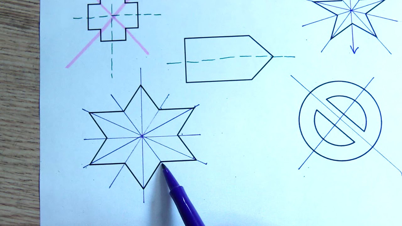
Symmetrical layouts feel stable. The human brain actively looks for symmetry and groups symmetrical elements together, which is why balanced compositions read as organized and trustworthy even before a user consciously evaluates them.
The German term for this is Prägnanz, meaning “good figure.” The brain defaults to the simplest, most ordered interpretation of any visual scene. Symmetry is the fastest route there.
Symmetry in Layout Design
Google’s homepage is the clearest case: almost every element is center-aligned, with the two primary buttons mirroring each other. Nothing fights for attention. The symmetry signals that both options are equal choices, which is exactly the right message.
Pricing pages use symmetry the same way. Columns of equal width and consistent vertical spacing let users compare tiers without doing extra mental work. Break the column widths or misalign the rows, and comparisons become effort.
In 2023, Google Material Design was the top design system choice at 28% adoption across surveyed organizations, followed by Apple’s Human Interface Guidelines at 15% (Webinarcare). Both are built on strong symmetrical grid structures.
When to Break It
Asymmetry draws attention. A layout that’s mostly balanced but contains one deliberately off-center element creates a focal point through contrast with the surrounding order.
Apple product pages do this consistently: symmetric grid for the supporting content, one oversized centered hero element that breaks the grid slightly. The break feels intentional because everything else is so controlled.
Key distinction: symmetry creates stability, asymmetry creates emphasis. Good layout design usually needs both.
Symmetry and Balance
Symmetry and balance aren’t the same thing. Radial balance, for example, distributes visual weight around a central point without requiring mirror-image symmetry. Asymmetric compositions can still feel balanced when visual weight is distributed carefully across the layout.
Sites designed without either tend to increase interaction costs and feel less intuitive to navigate, according to The Story design research. Readability and navigation flow both suffer when order isn’t built into the structure from the start.
The Principle of Common Fate
Elements that move in the same direction, or at the same speed, are perceived as a group. Common fate extends the logic of similarity into motion: shared behavior signals shared purpose.
It’s one of the less talked-about Gestalt principles, but it’s everywhere in modern interface design. Any time animation is doing organizational work, common fate is the underlying mechanism.
Motion as a Grouping Tool
Dropdown menus are a direct application. When all items in a menu slide open together in the same direction, users immediately understand they belong to one group. Change the direction or timing of a single item, and the grouping breaks.
Accordion components work the same way. IxDF notes that FAQ accordions use downward arrows on all items, implying shared directional movement, which signals to users that every item behaves consistently as a group.
Apple’s horizontal navigation bar uses common fate across its entire top menu. All items respond to hover states in the same way, reinforcing that they’re part of one unified system.
Common Fate in Animation and Micro-Interactions
Google’s Material Design motion principles are built around this. Related elements animate together with matched timing and easing curves. Elements that aren’t related animate independently or not at all.
- Shared animation timing signals functional relationship
- Independent animation signals distinct purpose
- No animation signals static or inactive state
This is why sloppy animation libraries can break Gestalt grouping. When unrelated elements animate together because a developer applied a global transition, users perceive those elements as related even when they aren’t. Common fate works whether you intend it or not.
Where It Conflicts With Other Principles
Common fate vs. proximity: two elements can be physically close (proximity grouping) but animate in opposite directions (common fate separation). The brain resolves this, but the experience feels slightly off. When the two principles agree, interfaces feel natural. When they conflict, users slow down.
Took a while to appreciate this in practice. Debugging an interface that “felt weird” for no obvious reason often comes down to a common fate conflict buried in the animation layer.
How Gestalt Principles Work Together in Real Designs
No production interface uses a single Gestalt principle in isolation. Real layouts combine several at once, and the skill is knowing which combinations reinforce each other and which ones create visual noise.
One study found that participants using a well-structured design system were 34 times more likely to achieve their goals than those without one (Webinarcare, 2023). Design systems are, in large part, codified Gestalt thinking applied at scale.
A Navigation Bar as a Case Study
A standard top navigation bar uses at least four principles simultaneously:
- Proximity: nav items sit close together, separated from page content by a larger gap
- Similarity: identical font, size, and color across all items signal they’re the same type of element
- Continuity: items align along a horizontal baseline the eye follows left to right
- Common fate: all items respond to hover in the same way
Break any one of these and users notice. Not always consciously, but the navigation starts to feel effortful.
How Conflicting Principles Create Visual Tension
Sometimes conflict is the point. A design that’s mostly organized by proximity and similarity, with one element deliberately violating both, creates tension that draws the eye. That’s how a call-to-action button works in context: everything around it follows the rules, the CTA breaks them.
Notion’s interface is a good example of intentional tension. The sidebar uses tight proximity grouping for organizational items, then breaks the grouping with a visually distinct “New page” button that sits just outside the expected pattern. The break signals affordance without a label.
Design Systems as Gestalt Infrastructure
IBM’s adoption of the Carbon Design System resulted in teams shipping features 47% faster while cutting visual inconsistencies by over 60% (Forrester/IBM). That consistency is Gestalt working at the system level: similarity and proximity enforced programmatically so individual designers don’t have to make those calls from scratch each time.
In 2023, design systems with dedicated documentation sites had a 72% adoption rate across organizations, versus 31% for those documented only in Figma files (zeroheight, 2023). Well-documented systems get used. And used systems mean Gestalt principles applied consistently across every product touchpoint.
| Principle Combination | Effect | Common Use Case |
|---|---|---|
| Proximity + Similarity | Strong, clear grouping | Card grids, form fields |
| Continuity + Alignment | Guided reading flow | Navigation, timelines |
| Figure-Ground + Closure | Clean focus without clutter | Modals, logo design |
| Symmetry + Common Fate | Organized, predictable behavior | Menus, accordions |
Gestalt Principles in UX and Usability Testing

Gestalt violations show up in usability testing before testers can name them. Users say things like “I wasn’t sure where to click” or “something felt off” without realizing the layout broke a perceptual grouping rule. Knowing which principle was violated makes the fix obvious.
Forrester’s research on UX investment is worth keeping in mind here: every $1 invested in UX yields up to $100 in return, a 9,900% ROI. Gestalt-informed design is one of the most direct paths to UX that actually works.
How Gestalt Failures Surface in Testing
First-click tests (run through tools like Optimal Workshop) often reveal proximity failures directly. When users click the wrong element because it was spatially closer to a label than the intended target, that’s a Gestalt problem, not a content problem.
Eye-tracking data shows continuity failures. When scan paths zigzag or stop unexpectedly, the visual flow has broken somewhere. Hotjar’s heatmap data frequently shows this: attention clusters in places designers didn’t intend because the layout’s implicit paths weren’t clear.
A/B testing quantifies figure-ground and similarity problems. A button that underperforms against a variant often turns out to have insufficient contrast from the background, or too much visual similarity to surrounding non-clickable elements.
Testing Tools That Surface Perceptual Problems
| Tool | What It Tests | Gestalt Principle It Reveals |
|---|---|---|
| Hotjar heatmaps | Attention distribution | Figure-Ground, Continuity |
| Optimal Workshop | First-click accuracy | Proximity, Similarity |
| Maze | Task completion paths | Continuity, Common Fate |
| A/B testing (any platform) | Conversion and engagement | Figure-Ground, Similarity |
Connecting Test Results to Gestalt Fixes
The practical loop is simple. Test first, identify where users hesitate or misclick, map that to a Gestalt principle, then adjust spacing, similarity, contrast, or motion accordingly and retest.
Staples saw a 500% increase in online revenue following a UX-focused site redesign (UXCam), and redesigning e-commerce checkouts specifically improves conversion rates by an average of 35.26% for large sites (MindInventory). Those aren’t abstract numbers. They’re the downstream result of layouts that stopped fighting perceptual grouping and started working with it.
The F-pattern and Z-pattern movement patterns identified in Nielsen Norman Group’s eye-tracking research confirm that users follow predictable visual paths. Designs that align with those paths through continuity and proximity see measurably better engagement. Designs that don’t, regardless of how polished they look, create unnecessary friction at every step.
FAQ on Gestalt Principles of Design
What are the Gestalt principles of design?
The Gestalt principles of design are rules from cognitive psychology that describe how the human brain groups visual elements into patterns. They include proximity, similarity, continuity, closure, figure-ground, symmetry, and common fate. Designers use them to build intuitive, organized layouts.
How many Gestalt principles are there?
Most design frameworks reference six to nine core principles. The most commonly applied are proximity, similarity, continuity, closure, figure-ground, and the Law of Prägnanz. Some sources add common fate, uniform connectedness, and focal point as extended principles.
Who created the Gestalt principles?
Max Wertheimer, Kurt Koffka, and Wolfgang Köhler developed Gestalt psychology in early 20th-century Germany. Wertheimer published the foundational research in 1912. Their work argued that humans perceive wholes before parts, which became the basis for all subsequent Gestalt design theory.
What is the most important Gestalt principle?
The Law of Prägnanz is often considered the foundation. It states the brain always interprets visual information in the simplest possible way. All other principles, proximity, similarity, closure, and the rest, are expressions of this core tendency toward perceptual simplicity.
How are Gestalt principles used in UX design?
UX designers use them to reduce cognitive load, guide attention, and create intuitive layouts. Proximity groups related form fields. Similarity unifies button states. Figure-ground separates modals from background content. Together, they make interfaces feel natural without requiring users to consciously analyze the layout.
What is the difference between proximity and similarity?
Proximity groups elements by physical closeness. Similarity groups them by shared visual traits like color, shape, or size. Proximity is typically stronger, but both can operate simultaneously. When they conflict, proximity usually wins in terms of how users perceive initial groupings.
What is the principle of closure in design?
Closure is the brain’s tendency to complete incomplete shapes. Given enough context, viewers fill in missing visual information and perceive a whole object. It’s widely used in logo design, where negative space creates recognizable forms without fully drawn outlines.
Do Gestalt principles apply to graphic design and print?
Yes. They apply across all visual media, including graphic design, print, packaging, and branding. The perceptual grouping rules don’t change with the medium. A poster and a mobile app both rely on the same underlying visual perception principles to communicate hierarchy and structure.
What is figure-ground in Gestalt design?
Figure-ground describes how the brain separates a visual subject from its background. The figure is what the eye focuses on; the ground is everything behind it. Poor figure-ground contrast creates confusion and is one of the most common causes of accessibility failures in interface design.
How do Gestalt principles relate to visual hierarchy?
Gestalt principles are the mechanism behind visual hierarchy. Similarity signals importance levels. Proximity creates content groups. Continuity guides reading order. Together, they tell users where to look first, what belongs together, and how to move through a layout without explicit instruction.
Conclusion
This conclusion is for an article presenting the Gestalt principles of design as practical tools, not just psychological theory.
Proximity, closure, common fate, figure-ground – each principle targets a specific part of how the visual cortex processes information. Apply them together and perceptual organization happens automatically, without user effort.
The Law of Prägnanz runs underneath all of it. Simplicity wins. Layouts that respect how the brain naturally seeks order will always outperform ones that don’t, regardless of how polished the surface looks.
Real design systems like Google Material Design and Apple’s Human Interface Guidelines encode these rules at scale. That’s not coincidence.
Understanding perceptual grouping changes how you diagnose design problems and how confidently you fix them.

Renowned for his expertise in logo design and visual branding, Bogdan has developed a multitude of logos for various clients.
His skills extend to creating posters, vector illustrations, business cards, and brochures. Additionally, Bogdan's UI kits were featured on marketplaces like Visual Hierarchy and UI8.
He also wrote in the past years on sites like Design Your Way, WebDesignerDepot, WPDean, Designmodo, Speckyboy, Slider Revolution, and more.
- How to Embed Fonts in PDF for Reliable Printing - 30 September 2026
- How to Create Product Design Principles That Evolve With Your Product - 29 September 2026
- Canva vs Midjourney: AI Design Tools Compared - 28 September 2026

Bogdan Sandu is a seasoned designer who has been designing websites since 2008. Renowned for his expertise in logo design and visual branding, Bogdan has developed a multitude of logos for various clients. His skills extend to creating posters, vector illustrations, business cards, and brochures. Additionally, Bogdan's UI kits were featured on marketplaces like Visual Hierarchy and UI8. He also wrote in the past years on sites like Design Your Way, WebDesignerDepot, WPDean, Designmodo, Speckyboy, Slider Revolution, and more.
You Might Also Like


