Every layout you’ve ever trusted, every website that felt easy to use, every brand you recognized from across a room. That’s graphic design principles doing their job.
These rules govern how color theory, typography elements, alignment, and contrast work together to turn raw visual elements into something that communicates clearly. They apply to web design, poster layouts, brand identity systems, and pretty much anything someone looks at and forms an opinion about.
This guide breaks down each principle with real data, practical examples, and the trade-offs that actually matter when you’re making layout decisions. No filler. Just what works, why it works, and where most people get it wrong.
What Are Graphic Design Principles
Graphic design principles are the foundational rules that control how visual elements behave on a page, screen, or any designed surface. They dictate how shapes, colors, text, and images interact with each other to communicate a message.
They’re not the same as design elements. Elements are the raw materials (line, shape, color, texture). Principles are the instructions for arranging those materials into something that actually works.
Think of it this way. A pile of bricks is just a pile of bricks. Principles are what turn that pile into a wall, an arch, or a building.
These rules apply everywhere. Print design, web design, packaging design, branding, motion graphics. The medium changes. The principles don’t.
According to a Behaviour and Information Technology study, users form an opinion about a website’s visual appeal within 50 milliseconds. That’s faster than a blink. Design principles are the reason some of those snap judgments land as “this looks trustworthy” instead of “this looks like a scam.”
Where did they come from? Not from a single textbook.
A lot of what we treat as standard design logic traces back to early 20th-century movements. Bauhaus design in 1920s Germany pushed the idea that form follows function. Swiss design (also called the International Typographic Style) brought grid-based layouts and clean typography into the mainstream during the 1950s.
And then there’s Gestalt psychology, which gave designers a scientific framework for understanding how the human brain groups and interprets visual information. Proximity, similarity, closure, continuity. Your brain fills in the gaps whether you want it to or not.
The global graphic design market hit $52.32 billion in 2024, according to Mordor Intelligence. That’s a lot of money flowing into work that ultimately boils down to applying these same core rules, over and over, across different contexts.
Look, I’ve seen people treat principles like a checklist. Tick off alignment, add some contrast, call it done. But the actual skill is knowing when to follow the rules and when to break them on purpose. That only comes from understanding why they exist in the first place.
Balance

Balance in a design layout is about how visual weight gets distributed across a composition. When it works, the eye settles. When it doesn’t, something feels off, even if you can’t explain why.
There are three main types, and they do very different things.
Symmetrical, Asymmetrical, and Radial Balance
Symmetrical balance mirrors elements on either side of a central axis. Think of a formal wedding invitation or a government building facade. It reads as stable and orderly. Sometimes too orderly.
Asymmetrical balance uses unequal elements that still feel visually stable. A large dark shape on the left, offset by several smaller, brighter elements on the right. Apple’s product pages use this constantly. One hero image, minimal text, tons of negative space. It looks effortless but takes serious control to pull off.
Radial balance arranges elements around a center point. Less common in layout work, but you’ll see it in dashboards, infographics, and logo marks.
| Balance Type | Visual Feel | Common Use |
|---|---|---|
| Symmetrical | Stable, formal, traditional | Editorial layouts, government sites, invitations |
| Asymmetrical | Dynamic, modern, energetic | Product pages, portfolios, landing pages |
| Radial | Centered, focused, unified | Logos, infographic layouts, dashboards |
What Creates Visual Weight
Size is the obvious one. Bigger things feel heavier. But color saturation, density, texture, and position all play a role too.
A small, highly saturated red square can “weigh” as much as a large pale blue rectangle. Dark elements feel heavier than light ones. Objects near the edges feel heavier than objects near the center.
White space is part of this equation. It’s not empty. It’s structural. Removing whitespace doesn’t give you “more design.” It just throws everything off balance.
According to a Forbes study, 94% of first impressions are design-related. And the balance of elements on a page is one of the first things the brain registers, even before consciously processing any content.
The Biggest Mistake
Confusing balance with symmetry. They’re not the same. A perfectly centered layout is symmetrical but can feel lifeless and boring. An off-center composition with intentional counterweights can feel way more balanced, and far more interesting.
Took me a while to really get that. Your mileage may vary.
Contrast

Contrast is difference. It’s the gap between two elements that makes both of them more visible. Without contrast, everything blends into visual noise.
Cropink’s 2025 industry report found that 68% of marketers say high-quality design is critical for business success. Contrast is a huge part of what separates “high-quality” from “just okay.” It’s the single fastest way to make something look more polished without changing a single element on the page.
Types of Contrast That Actually Matter
Color contrast gets all the attention. Dark text on a light background, bright button against a muted layout. But it’s only one type.
- Size contrast: A 48px headline next to 14px body text creates instant hierarchy
- Weight contrast: Bold headers paired with light body text
- Shape contrast: A circle in a field of rectangles pulls focus immediately
- Texture contrast: A smooth element against a rough or patterned background
Size and spatial contrast often do more heavy lifting than color in real layouts. At least in my experience. A well-placed oversized headline against tight body copy creates more visual pull than a bright color ever will.
Contrast and Accessibility
WCAG 2.1 guidelines set a minimum color contrast ratio of 4.5:1 for normal body text and 3:1 for large text. These aren’t suggestions.
About 300 million people globally have color vision deficiency, according to UX research from MindInventory. If your contrast relies entirely on red vs. green distinctions, you’ve excluded a significant chunk of your audience without realizing it.
Tools like the Stark plugin for Figma, WebAIM’s contrast checker, and Adobe’s built-in accessibility features make this easy to test. There’s really no excuse anymore.
But here’s the thing. Accessible contrast and good design contrast are not the same conversation. A layout can pass every WCAG check and still feel flat because there’s no intentional contrast between layout sections, element sizes, or typographic weights. Meeting minimums isn’t the same as using contrast well.
Hierarchy

Visual hierarchy controls the order in which someone’s eye moves through your content. Done right, people don’t even notice it happening. Done wrong, they bounce.
A study from Behaviour and Information Technology found that visual appeal can be judged in just 50 milliseconds. Hierarchy is a big reason why some pages pass that test and others don’t. It tells the brain where to look first, second, and third.
How Designers Build Hierarchy
Four primary tools, usually combined:
Scale: Bigger things read first. A 72px headline dominates a 16px paragraph, no matter where it sits on the page.
Color and contrast: High-contrast elements pop. Low-contrast elements recede. A bright orange CTA button on a gray page wins every time.
Position: Top-left gets seen first in left-to-right reading cultures. Nielsen Norman Group’s eye-tracking research confirmed the F-pattern for text-heavy pages and the Z-pattern for more visual layouts. These aren’t theories. They’re observable scanning behaviors backed by decades of eye-tracking data.
Typography weight: Bold headings, medium subheadings, regular body text. The typographic hierarchy alone can carry an entire layout if it’s done well enough.
Newspaper front pages are basically a masterclass in this. Look at how The New York Times uses headline sizing, column width, and image placement to tell you what to read first without a single instruction.
How Hierarchy Works in Digital Interfaces
On the web, hierarchy gets trickier. You’re dealing with responsive layouts, variable screen sizes, and users who scroll fast.
Button sizing, CTA placement, and card-based layouts are all hierarchy decisions. A primary action button should look and feel different from a secondary one. Not just in color, but in size, weight, and spacing.
Flat design made this harder. When minimalist design trends stripped out shadows, gradients, and depth cues around 2013-2014, designers lost some of the easiest hierarchy signals. Google’s Material Design was partly a correction, bringing back elevation and layering to restore visual order.
According to MindInventory’s 2025 UX research, 38% of consumers look at layout and navigational structure first when visiting a website. Hierarchy determines whether those users find what they need or hit the back button.
Alignment
Alignment connects elements along invisible lines. It’s what makes a layout feel organized instead of randomly scattered.
Every element on a page has edges. When those edges line up with the edges of other elements, the brain reads them as connected and intentional. When they don’t, it reads them as mistakes.
Edge Alignment vs. Center Alignment
Left-edge alignment is the workhorse. It creates a strong vertical axis that the eye can follow down the page. Most web layouts default to left alignment for body text because it’s the most readable in left-to-right languages.
Center alignment works for short blocks of text (invitations, headlines, poster designs). But center-align a full paragraph and readability drops fast. The ragged starting edge forces the eye to hunt for the beginning of each line.
Right alignment is situational. Pull quotes, captions, specific UI elements. It creates visual tension, which can be useful or distracting depending on intent.
Grid Systems as Alignment Infrastructure
Grid systems are the backbone of professional alignment. The 12-column grid dominates web design because it divides evenly into halves, thirds, quarters, and sixths.
Modular grids (used heavily in editorial and magazine design) go further, creating both vertical and horizontal divisions that organize content into discrete blocks.
Josef Müller-Brockmann’s work on grid systems in the 1960s is still the reference point. His book “Grid Systems in Graphic Design” is one of the most cited works in the field. Most of what we use in CSS Grid and Figma’s auto-layout features traces back to principles he formalized decades ago.
According to G2’s 2024 design industry research, 85% of organizations have brand design guidelines, but only 30% actually enforce them. Alignment is usually the first thing to break down when guidelines aren’t followed. You’ll see it in misaligned margins, inconsistent padding, and text blocks that don’t relate to anything else on the page.
Breaking Alignment on Purpose
Here’s where it gets tricky. Intentional misalignment creates emphasis. An element that breaks the grid draws attention precisely because everything else is orderly.
Brutalist design plays with this a lot. Overlapping text, off-grid images, deliberately jarring placement. But it only works because the designer clearly knows where the grid is and is choosing to break it.
Accidental misalignment just looks sloppy. There’s no way around that.
Repetition and Consistency

Repetition is how design builds recognition. When the same colors, typefaces, spacing values, and graphic elements show up across multiple touchpoints, the brain starts connecting them. That connection is what turns random visuals into a brand.
Straits Research data shows that consistent use of signature colors boosts brand recognition by up to 80% compared to monochrome presentation. And consumers are 81% more likely to recall a brand’s color than its name, according to multiple branding studies.
What Gets Repeated
Pretty much everything that can be standardized:
- A defined color palette applied across all materials
- Consistent font choices and type sizing hierarchies
- Uniform spacing and margin systems
- Recurring graphic motifs, icon styles, or photographic treatments
Coca-Cola’s red is the textbook example. IBM’s 8-point grid system is a more technical one. Spotify’s “Duotone” image treatment defined their visual identity for years.
Design Systems and Brand Enforcement

Brand guidelines document these decisions. Design tokens (standardized values for color, spacing, typography) make them enforceable at scale, especially in digital products.
But here’s a stat that should bother anyone working in brand design. G2 research found that while 85% of organizations have brand guidelines, only 30% actually enforce them. That gap is where consistency breaks down and brand recognition erodes.
Brand style guides solve part of the problem. Design systems built into tools like Figma or Storybook solve more of it. But nothing replaces someone actually caring about consistency across every single deliverable. At least that’s what I’ve seen.
When Repetition Becomes Monotony
Too much repetition kills interest. Every layout looks the same. Every page blurs into the next. The user stops paying attention because there’s nothing new to notice.
Variety is the counterbalance. You repeat the system (colors, fonts, grid) but vary the application (different layouts, different image treatments, different content structures).
The best brand systems are consistent without being boring. They create a recognizable framework and then allow enough flexibility within it to keep things interesting. Google’s Material Design does this well. So does Airbnb’s design system.
Proximity and Grouping

Proximity is one of those principles that works so quietly you barely notice it. Until someone gets it wrong. Then everything feels scattered and confusing.
The rule is simple. Elements placed close together are perceived as related. Elements placed far apart are perceived as separate. Your brain does this automatically, faster than you can consciously process it.
The Gestalt Foundation
This comes directly from Gestalt psychology, developed by Wertheimer, Köhler, and Koffka in the early 20th century. Their research showed that humans organize visual information into groups based on spatial relationships.
Here’s what’s interesting. Studies have shown that proximity is more powerful than color or shape when it comes to perceptual grouping. People will see elements as related if they’re close together, even when those elements look completely different.
That’s a big deal for layout work. It means your spacing decisions carry more weight than your color coding in how users interpret relationships between elements.
Where Spacing Breaks Down
The most common mistake? Equal spacing everywhere.
When every element has the same distance from every other element, the brain can’t tell what belongs together. It’s like a paragraph with no sentence breaks. Technically readable, practically exhausting.
Form design is a perfect example. If the label “Email Address” is equidistant between the field above it and the field below it, users hesitate. Which field does it belong to? Place that label closer to its own input field, and the confusion disappears instantly.
Hotjar’s user behavior report found that 95% of visitors care about how content is structured on a page. Proximity is the single biggest factor in whether that structure reads as clear or chaotic.
Practical Applications
- Navigation menus: group related links with tighter spacing, separate categories with wider gaps
- Card layouts: keep title, image, and description tight within each card, increase spacing between cards
- Content blocks: the space between groups should always be larger than the space within groups
Mailchimp’s email builder interface uses proximity well. Related settings sit close together, unrelated options have clear visual separation, and the whole thing feels scannable without any explicit labels telling you what goes with what.
White Space

White space (or negative space) is not empty. It’s not wasted. It’s not “room we forgot to fill.” It’s an active design element with a specific job.
Jan Tschichold said it best: white space should be treated as an active element, not a passive background. That was decades ago, and people still argue about it in every design review I’ve ever sat through.
Micro vs. Macro White Space
| Type | What It Covers | What It Affects |
|---|---|---|
| Micro | Line spacing, letter spacing, padding between UI elements | Readability, legibility, text comfort |
| Macro | Margins, section breaks, spacing between major content blocks | Page structure, visual breathing room, scannability |
Both types work together. You can’t fix macro spacing problems with micro adjustments, and vice versa. A page can have perfect line height but still feel cramped if the margins are too tight.
The Comprehension Connection
A Wichita State University study found that properly used white space between paragraphs and margins can increase reading comprehension by up to 20%. And a separate study by Barbara Chaparro found that 80% of readers prefer layouts with more white space over dense alternatives.
These aren’t small numbers. They directly impact how much of your content people actually absorb and retain.
The tricky part is convincing stakeholders. “Can we fill this space with something?” is a question every designer has fielded. The answer is almost always no, but good luck with that conversation.
White Space as Brand Signal
Luxury brands figured this out early. Apple, Aesop, Céline. Generous white space communicates that the product is more valuable than the real estate it occupies.
According to a Crazy Egg case study, increasing white space by 20% around key elements increased conversions by 13%. Less clutter, more focus, more action. It works in high-end branding and it works in conversion-focused landing pages.
Budget brands do the opposite on purpose. Dense layouts, packed with offers and prices, signal value and abundance. Neither approach is wrong. But the intentionality behind the spacing is what separates good design from random layout choices.
Movement and Flow

Movement in design is how you guide someone’s eye through a composition in a specific sequence. Without it, the viewer decides where to look. And viewers, left to their own devices, tend to bounce around randomly or just leave.
Directional Cues in Static Design
Leading lines are the most direct tool. Diagonal lines, pointing fingers, eye gaze direction in photographs. All of these create implied motion that pulls the viewer’s attention in a specific direction.
The direction a person faces in a photo matters. If a model looks toward a CTA button, the viewer’s eye follows. If the model looks off-page, attention leaks out of the layout. Small detail, but it’s been tested and proven in A/B testing over and over.
Rhythm works alongside movement. Repeating elements at regular intervals (like evenly spaced section breaks or alternating image-text blocks) creates a visual tempo that pulls users down the page.
Scroll-Based Flow in Web Design
Vertical rhythm keeps users scrolling. Consistent spacing between sections, predictable content patterns, and visual cues that signal “there’s more below” all contribute.
Cropink’s 2025 research found that 71% of brands now use motion graphics and video-based design in their marketing. That number keeps climbing because movement captures attention in ways static content simply can’t.
Wyzowl’s 2026 data shows that 91% of businesses use video as a marketing tool, with 82% saying it increased web traffic. The connection to graphic design principles is direct. The same rules of hierarchy, contrast, and flow that govern a static poster apply to motion work. They just have an extra dimension: time.
Motion in UI Design
Google’s Material Design guidelines formalized much of this. Easing curves, timing, and motion choreography are all documented. A button doesn’t just “appear.” It eases in with a specific duration and trajectory.
These micro-interactions do more than look nice. A study cited by Single Grain found that websites with thoughtful micro-animations saw conversion rate improvements of up to 23% compared to static interfaces.
That said, motion is easy to overdo. Gratuitous animation slows things down, distracts from content, and annoys users who just want to find information. The best motion design is the kind you barely notice consciously but that makes the whole experience feel smoother.
How Graphic Design Principles Work Together

No design principle operates alone. Every layout decision involves at least two or three principles pulling in slightly different directions. The skill isn’t knowing each principle individually. It’s knowing how to prioritize when they conflict.
Trade-offs Between Principles
Strong contrast can disrupt balance. A bright red CTA button stands out (good contrast), but it might throw off the visual weight distribution of your layout (bad balance).
Tight proximity reduces white space. Grouping elements closely creates clear relationships, but it can also make a layout feel cramped if you don’t compensate with macro spacing elsewhere.
More repetition means less variety. Too much consistency and the design becomes predictable and dull. Too much variety and it loses unity.
| Principle A | Potential Conflict With | Resolution |
|---|---|---|
| Contrast | Balance | Use visual weight elsewhere to counterbalance high-contrast elements |
| Proximity | White space | Increase macro spacing to compensate for tight grouping |
| Repetition | Variety | Repeat the system, vary the application |
| Hierarchy | Alignment | Allow intentional grid-breaking to create focal points |
Prioritizing by Project Type
The principle that matters most changes depending on what you’re designing.
Editorial layouts lean heavy on hierarchy and type systems. A magazine spread lives or dies by how well it guides the reader’s eye.
Web interfaces prioritize alignment and proximity. Users need to scan fast and find things quickly. If the grid is messy or groupings are unclear, bounce rates spike.
Brand identity work depends on repetition and consistency above all else. A logo, color system, and type choices need to feel like the same family across every single touchpoint.
According to Forrester Research, a well-executed UX design can boost conversion rates by up to 200%. That result isn’t the product of one principle done well. It’s the product of all of them working together, with the right trade-offs made for the right context.
The Difference Between Knowledge and Judgment
You can memorize every principle and still produce mediocre work. The gap between “knows the rules” and “designs well” is judgment. And judgment comes from doing the work, seeing what breaks, and understanding why.
Famous designers like Paul Rand, Massimo Vignelli, and Josef Müller-Brockmann didn’t follow rigid formulas. They understood principles deeply enough to know when breaking one would serve the overall composition better.
That’s the real goal. Not mastering a checklist, but developing the instinct to apply these rules fluidly depending on what the project actually needs.
FAQ on Graphic Design Principles
What are the basic graphic design principles?
The core principles include balance, contrast, hierarchy, alignment, repetition, proximity, and white space. These rules control how visual elements interact on any surface, from book covers to digital interfaces. They apply across every design discipline.
What is the difference between design principles and design elements?
Design elements are the raw materials: line, shape, color, texture, space. Principles are the rules for arranging those materials. Elements are what you work with. Principles are how you organize them.
Why is visual hierarchy so important in design?
Hierarchy tells the viewer where to look first, second, and third. Without it, users scan randomly and miss key information. Scale, color, position, and typeface weight all create hierarchy within a composition.
How does contrast improve a design?
Contrast creates difference between elements, making each one more visible. It works through color, size, weight, and shape. Strong contrast improves readability, draws attention to focal points, and makes layouts look sharper overall.
What role does color theory play in graphic design?
Color theory provides a framework for choosing colors that work together. Schemes like complementary, triadic, and analogous create different visual effects. Color psychology also influences how audiences emotionally respond to designs.
How do grid systems help with layout design?
Grids provide invisible structure that keeps elements aligned and proportional. The 12-column grid is standard in web design because it divides evenly into multiple configurations. Grids reduce guesswork and speed up the design process significantly.
What is the rule of thirds in design?
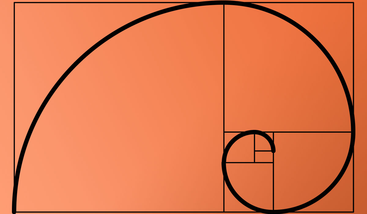
The rule of thirds divides a composition into a 3×3 grid. Placing key elements along the intersections creates more dynamic, visually engaging layouts. It’s closely related to the golden ratio in how it guides element placement.
Why does typography matter in graphic design?
Typography affects readability, mood, and hierarchy simultaneously. Choosing the right font, adjusting kerning, and setting proper tracking can transform a layout from amateur to professional. Poor type choices undermine even the strongest visual concepts.
How do Gestalt principles apply to modern design?
Gestalt principles explain how the brain groups visual information. Proximity, similarity, closure, and continuity all affect how users perceive layouts. These psychological patterns directly influence UI design, infographic layouts, and advertising design today.
Can you break graphic design principles intentionally?
Yes, and experienced designers do it regularly. Breaking alignment creates emphasis. Disrupting repetition adds surprise. But intentional rule-breaking only works when the audience can tell you knew the rule first. Random violations just look like mistakes.
Conclusion
Graphic design principles aren’t decorative theory. They’re the structural decisions behind every layout that works, from a social media graphic to a full visual identity system.
Balance, contrast, hierarchy, alignment, proximity, repetition, and white space. Each one solves a specific visual problem. Together, they determine whether a composition communicates or confuses.
The real skill isn’t memorizing definitions. It’s developing the judgment to know which principle to prioritize when they compete with each other.
Tools like Figma and Adobe Creative Suite make execution faster. But no software replaces understanding why a baseline grid matters, how font psychology shapes perception, or when framing should override strict alignment.
Start with the fundamentals. Apply them deliberately. Then learn when to break them. That’s the whole game.

Renowned for his expertise in logo design and visual branding, Bogdan has developed a multitude of logos for various clients.
His skills extend to creating posters, vector illustrations, business cards, and brochures. Additionally, Bogdan's UI kits were featured on marketplaces like Visual Hierarchy and UI8.
He also wrote in the past years on sites like Design Your Way, WebDesignerDepot, WPDean, Designmodo, Speckyboy, Slider Revolution, and more.
- How photo recovery software works and when to use it - 7 October 2026
- Top Source Sans Pro Font Pairing for Clean UIs - 6 October 2026
- Best Email Design System Examples From Leading Brands - 5 October 2026

Bogdan Sandu is a seasoned designer who has been designing websites since 2008. Renowned for his expertise in logo design and visual branding, Bogdan has developed a multitude of logos for various clients. His skills extend to creating posters, vector illustrations, business cards, and brochures. Additionally, Bogdan's UI kits were featured on marketplaces like Visual Hierarchy and UI8. He also wrote in the past years on sites like Design Your Way, WebDesignerDepot, WPDean, Designmodo, Speckyboy, Slider Revolution, and more.
You Might Also Like