Negative Space: What It Is And Where To Use It
Imagine an artist, brush in hand, painting away not just with colors but with the canvas itself. That’s the magic of negative space, a concept that, believe it or not, speaks volumes by saying nothing at all.
Dive into this invisible yet powerful element that artists and designers wield to draw the eye, create balance, and evoke emotion without crowding the visual field. It’s the breathing room around and between subjects, a strategic void which often makes the loudest statement in art elements and graphic layout. Ever gazed at a logo and felt an instant connect? That’s negative space working its silent charm.
By the end of this read, you’ll grasp how to harness it to amplify visual hierarchy and design simplicity, bringing about aesthetic spacing and design principles to life in your projects. We’ll unwrap the secrets behind a pared-back approach that can make your designs stand out in today’s cluttered visual landscape.
Get ready to unwrap a new dimension of designing that’s right in front of you and yet, unseen. It’s time to play with space, the unsung hero of design that could redefine your creative boundaries.
Table of contents
- What is Negative Space
- The Role of Negative Space in Various Design Forms
- Psychological and Emotional Effects of Negative Space
- Negative Space in Composition and Layout
- Practical Applications and Examples
- Negative Space Examples
What is Negative Space?
Negative space is the empty or open space around and between the subjects of an image or design. It’s a crucial element in art and design that helps to define or emphasize the main subject, enhancing overall composition and balance.
Proper use of negative space can create depth, add interest, and improve readability and aesthetics in a design.
The Role of Negative Space in Various Design Forms
Graphic Design
Let’s chat about how negative space rocks the world of graphic design. It’s like this secret sauce that can totally transform your designs, from logos to posters.
Think of negative space as the cool, quiet background that makes the loud, bold stuff (aka the positive space) pop. It’s not just empty space; it’s a powerful tool.
Application in Logos, Illustrations, and Posters
Okay, so you’ve seen logos where the space around the logo elements tells a story, right? That’s negative space working its magic.
It’s like a visual puzzle that adds depth and meaning. And in illustrations and posters, this space plays a massive role in creating focus and emotion.
It’s all about balance—like a dance between what’s there and what’s not. It’s not just about the main subject but also about the space around it.
Enhancing Visual Communication Through Negative Space

Now, let’s talk about talking without words. Negative space in graphic design is a way to communicate more with less.
It adds subtlety and sophistication. By using minimalist art principles, designers can convey powerful messages in a simplified form. It’s like whispering in a world that’s always shouting.
UI/UX Design
Moving into the digital realm, negative space is a big deal in UI/UX design too.
Websites and apps are not just about buttons and menus; it’s also about the space between them.
Importance in Web and Mobile App Interfaces
In web and mobile app design, negative space isn’t just empty; it’s functional. It’s about making things look neat and easy to use.
Too much clutter? Users get lost.
Too little? Users might miss what’s important.
Impact on Usability and Navigability
Ever noticed how some websites feel easy to navigate while others feel like a maze? That’s often down to how they use negative space.
It guides your eyes smoothly from one point to another, making your journey through the site or app feel like a walk in the park.
It’s all about using that space to create a visual hierarchy. You know, highlighting what’s important and kind of fading the rest into the background.
Psychological and Emotional Effects of Negative Space
Creating Mood and Atmosphere
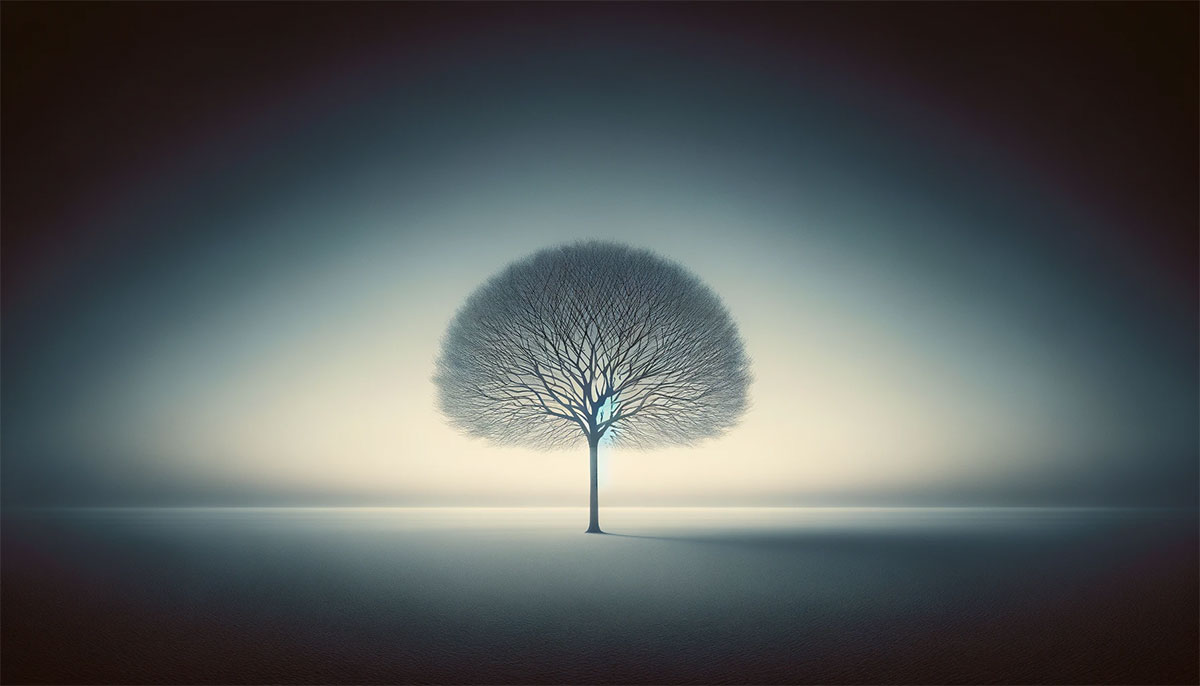
Ever walked into a room and felt instantly calm? Or looked at a photo and felt a bit tense? That’s the power of negative space.
It’s not just about the art or design itself; it’s about the vibes it gives off. In film and photography, directors and photographers use negative space to set the mood, big time.
Imagine a scene with a lone tree in a vast open field. That wide, open space around the tree? It can make you feel all kinds of things: loneliness, peace, or even awe.
This isn’t just about what’s in the shot; it’s about all that space around it. That’s the beauty of visual balance and spatial relationships.
Use in Film and Photography to Convey Emotions

In movies, a close-up with a lot of negative space around a character can feel super intense. It’s like the world is just them, their thoughts, their feelings.
And in photos, how things are framed with the rule of thirds or how the foreground and background play together can totally change the vibe. It’s all about creating an atmosphere that sucks you in.
Examples from Cinema Highlighting Mood Creation
Let’s take a classic example from cinema.
You know those scenes where everything feels tense and suspenseful? A lot of that comes from how the shot is composed with negative space.
It’s like the empty space is holding its breath, waiting for something to happen.
Directing Viewer’s Attention
Here’s the deal: negative space is like a stealthy guide. It’s subtle but super effective in pointing your eyes where to look.
Focusing on Key Elements in a Composition
Picture this: a poster with one word in the middle and nothing else around. That word is gonna pop. Why? Because the negative space around it is doing its job.
It’s like a spotlight, focusing your attention right where it needs to be.
Simplifying Imagery to Enhance Message Clarity
Less is often more, right? In design, using negative space to simplify an image can make the message clearer. It’s like decluttering a room so you can actually see the beautiful furniture.
When you take away the extras, what’s left gets all the attention.
Negative Space in Composition and Layout
Enhancing Readability and Legibility
Let’s break it down. Ever tried reading a super crowded, text-heavy page? It’s like trying to find a needle in a haystack, right?
That’s where negative space comes in and saves the day.
It’s this superhero that makes reading not just easy, but enjoyable.
In the realm of typography and text layout, negative space is like the unsung hero. It’s all about giving words their own room to breathe.
It’s not just empty space; it’s a vital part of the design that helps the brain process information. Think of a book or a website where text is nicely spaced – it just feels good to read, doesn’t it?
Importance in Typography and Text Layout
Okay, let’s talk fonts and spacing. You know how some texts are just a pleasure to read, and some are like, ugh? A lot of that comes down to how they use negative space.
It’s not just about the words themselves but also about the space between lines, letters, and even words.
Creating a Balance Between Text and Imagery
Now, balancing text with images is an art in itself. Too much text, and you lose the visual appeal. Too many images, and the message gets lost.
Negative space plays this awesome role of a mediator. It helps in creating a harmony that’s just right. It’s like the perfect mix of salt and pepper – you need both for that perfect taste.
Establishing Visual Hierarchy
Ever looked at a design and just knew where to look first? That’s negative space establishing visual hierarchy.
It’s a guide that takes your hand and leads you through the design.
Guiding the Viewer’s Eye Through Design Elements
Here’s the thing: our eyes are kind of lazy. They need easy paths to follow. Negative space creates these paths.
It highlights the important stuff and gently nudges your eyes towards what matters. It’s like a subtle game of “look here, not there.”
Use of Macro and Micro Negative Space
So, there’s this thing about macro (big) and micro (small) negative space. Macro is like the overall spacing in a design, and micro is the tiny spaces between smaller elements.
Both are super important. They work together like a team, creating focus and harmony. It’s like a symphony – every note matters.
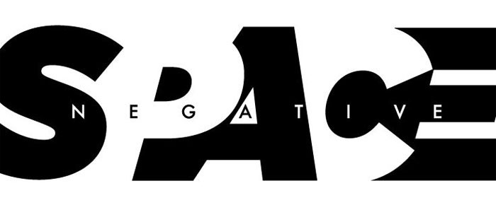
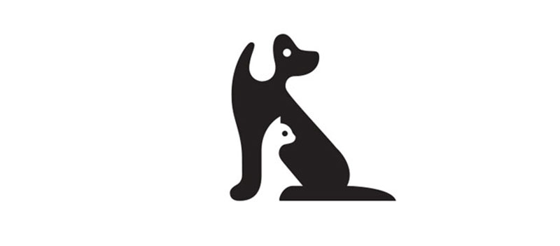
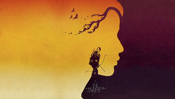
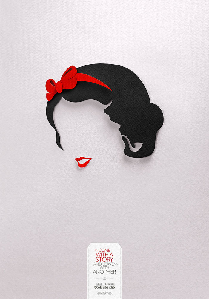
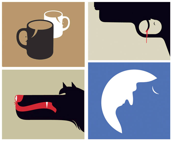
Examples of Negative Space in Design
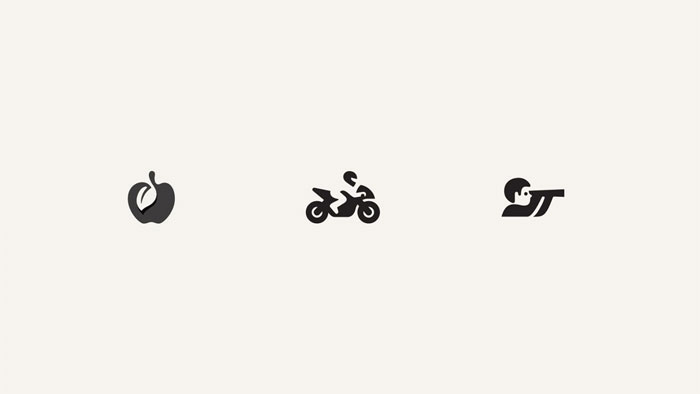
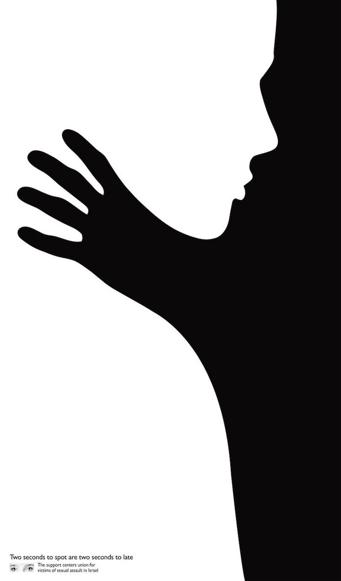
![]()
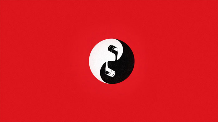
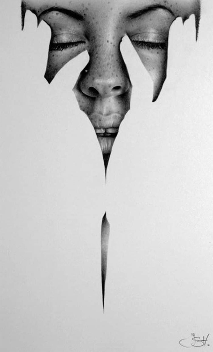
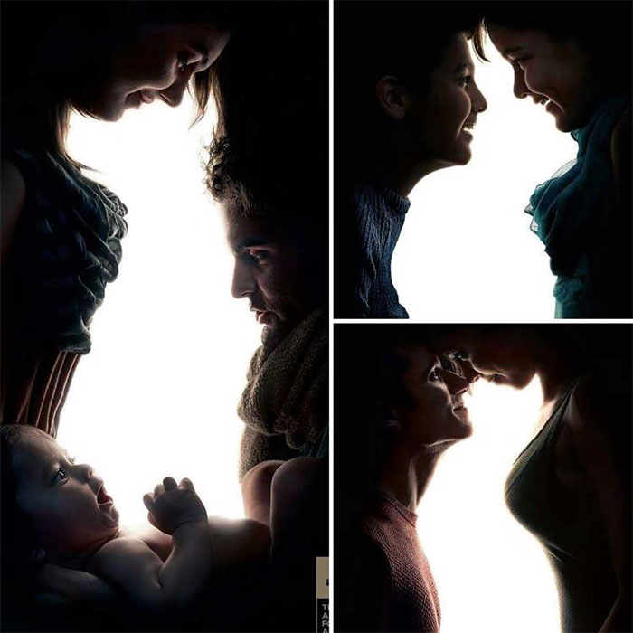

![]()

![]()

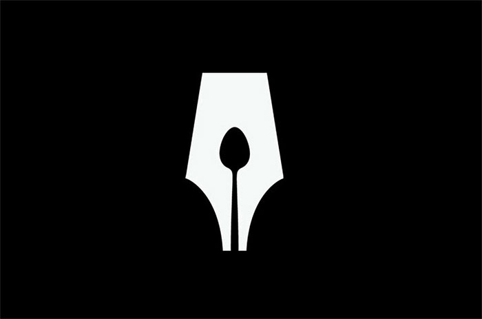
FAQ on Negative Space
What Exactly is Negative Space?
It’s the area that surrounds the main subject in any composition – kind of like a silent stage setter. In design, this space isn’t filler; it’s a crucial part of the visual structure that boosts visual clarity.
How Does Negative Space Impact Design?
Think of it as the art of using nothing to enhance everything. It sets the rhythm of a design, guiding the eye and creating balance.
Properly used, it lets visuals breathe, providing aesthetic spacing while cranking up user focus.
Can Negative Space Affect Emotions in Art or Design?
Absolutely. It’s a mood-maker. By playing with the voids, an artist can evoke curiosity, calmness, or even tension. It adds layers of subtlety to artwork and designs, dialing up the emotive punch without crowding the canvas.
Why is Negative Space Important in Logo Design?
Logos need to pop and lock visual attention fast. Negative space nails this by carving out identities that stick, whispering brand stories without a word.
Simplicity here is not just style; it’s strategic, making logos memorable and scalable.
How is Negative Space Used in Photography?
It’s all about framing the shot to make your subject sing. Photographers use this concept to emphasize a subject, draw the eye, or to snap a feeling of openness and serenity.
It’s the pause that gives the picture composition techniques a high note.
What is the Figure-Ground Relationship in Negative Space?
Grab a yin-yang symbol, and you’ve got the picture. Figure-ground is this dance of contrast where the significant elements (figure) and the empty space (ground) push and pull on viewers’ eyes, creating order out of optical chaos.
Is There a Difference Between Negative Space and White Space?
Sort of. White space refers specifically to blank areas in design pieces, while negative space could be any color. White space is a subset, responsible for readability and focus, especially in web design and typography.
Does Negative Space Have to Be White?
Nope, it’s a trickster. Negative space can be any hue – it just plays the counterpart to the dominant subjects.
Whether it’s a deep blue night sky or a lush green field, what matters is the contrast.
How Does Negative Space Relate to Minimalism in Design?
Negative space and minimalism are BFFs. They both prioritize the essence of form, ditching the excess. Negative space in minimalist designs isn’t just empty; it’s eloquent, refined, leading to designs that cut the clutter with purpose.
Should Every Design Utilize Negative Space?
Not always. It’s like seasoning – not every dish needs the same pinch. Like web design whitespace, it depends on the message and the medium.
But when used wisely, it can transform a busy mess into a tranquil triumph.
Conclusion
So here’s the scoop. We dove deep into the invisible art of negative space. It’s the silent power player in designs, snaps, and even logos. Now, it’s like the air around us – you might not see it, but man, does it make a difference.
- Space isn’t just about emptiness. It’s about letting designs breathe, giving the content its own spotlight.
- Think clean, think clear, that’s the environment negative space crafts. It’s the quiet that makes the loud parts of a design sing out.
- From page layout to visual hierarchy, this unspoken hero holds the secret sauce to nailing that minimalistic chic.
Rounding up, next time you’re crafting something – pause. Consider the potential of nothing. Harness the art of design simplicity through strategic use of space, giving your work that edge. This isn’t just about creating; it’s about curating visuals that speak volumes without saying a word. Remember, sometimes, the best touch is a no-touch. Keep it simple, keep it fresh, and let the space work its magic.
If you liked this article, you should check out these as well:
- Graphic Design Resume: Best Practices and 51 Examples
- Letterhead Examples and Ideas: 60+ Cool Stationary Designs
- 18 brilliant examples
- Examples on Canva
Bogdan Sandu, a seasoned designer with 15 years of diverse experience, has been designing websites since 2008.
Renowned for his expertise in logo design and visual branding, Bogdan has developed a multitude of logos for various clients.
His skills extend to creating posters, vector illustrations, business cards, and brochures. Additionally, Bogdan's UI kits were featured on marketplaces like Visual Hierarchy and UI8.
Latest posts by Bogdan Sandu (see all)
- Rainbow Color Palettes for Joyful Designs - 29 April 2024
- The Bethesda Logo History, Colors, Font, And Meaning - 28 April 2024
- Out of This World: Space Color Palettes for Cosmic Designs - 28 April 2024