The Atlanta Hawks Logo History, Colors, Font, and Meaning
Imagine the ferocity and agility of a hawk captured in a single emblem—an emblem that embodies the spirit of an entire basketball fraternity and the pulse of a vibrant city.
This isn’t just any illustration; it’s the Atlanta Hawks logo, a symbol that soars beyond mere graphics, dribbling the essence of sports identity and community pride right onto the center court of NBA iconography.
In the play of lines, colors, and forms, lies the power to ignite passions and foster a sense of belonging. Here, the alchemy of sports logo design meets the dynamism of professional basketball.
Unveiling the story behind this iconic emblem, the intricacies of its visual identity, and the brand saga it unfolds, promises to be a thrilling expedition.
By the finale of this article, anticipate a newfound appreciation for the craft that marries athletic apparel design with corporate sponsorship nuances, all while celebrating Atlanta’s sports heritage.
Prepare for an insider’s tour of the Hawks’ brand evolution, a dive into the symbol’s fan gear artistry, and reflection on the digital design trends shaping the very fabric of the NBA team symbols today.
The Meaning Behind the Atlanta Hawks Logo
Deep Dive into Symbolism
So, let’s get straight to it! You know when you’re sitting there, watching a Hawks game and you think, “Man, that’s a fierce bird!”? That’s not by accident.
The hawk symbolizes a certain intensity, a boldness, and most importantly, an unmatched drive. It’s more than just a cool bird; it’s a reflection of the team’s spirit.
Why a Hawk Though?
Think about it. Hawks are predators. They’ve got that sharp vision, swooping down and seizing opportunities.
In a lot of ways, the team does the same on the court, seizing every chance, making bold moves, and staying ahead in the game. It’s all about that “hunt or be hunted” vibe, and the Atlanta Hawks logo embodies that. No chill.
The History of the Atlanta Hawks Logo
Evolution is the Name of the Game
Oh boy, where do we begin? The Hawks logo has been through more makeovers than a pop star in the 2000s. From its earliest days to the modern sleek design we see now, it’s been a journey!
The Retro Days
Let’s take a step back. Back in the day, the logo had a more vintage feel. A bit cartoonish, with our beloved hawk donning a jersey, dribbling away. Cute, right? But, as the game evolved, so did the logo.
Modernization, Baby!
Fast forward a bit and things got cleaner, sharper. We saw the introduction of the fierce hawk head, zoomed in and looking like it meant serious business. The kind of logo that makes a statement, you know?
The Colors of the Atlanta Hawks Logo
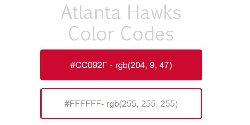
Not Just a Pretty Palette
Colors speak, believe it or not. For the Hawks, their color scheme has always been about passion, energy, and a touch of sophistication.
Red & White – The Dynamic Duo
Red stands for passion, energy, and action. It’s the kind of color that demands attention. Then there’s white, which adds depth and a hint of mystery. It’s the perfect counterpart to the fiery red.
Subtle Accents
Over the years, there have been hints of other colors – white for purity, and sometimes touches of gold, representing excellence.
The Font Used in the Atlanta Hawks Logo
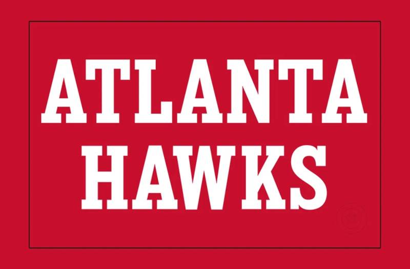
Simplicity Meets Elegance
When it comes to fonts, the Hawks ain’t messing around. Over the years, it’s been about choosing something that’s readable but still has character.
The Bold Choice
The word “ATLANTA HAWKS” usually pops out in bold, uppercase letters, giving it a sense of authority. It’s straightforward but there’s a certain flair to it. Just enough to keep it edgy.
Symbolism in Sports Design
The Importance of Representation
Logos aren’t just about looking good on a jersey. They tell a story. They represent a city, a fanbase, and a legacy.
The Hawks logo isn’t just a piece of graphic design; it’s a symbol for Atlanta and all the hoops enthusiasts who bleed red and white.
The Fan Connection
Think about wearing a cap or a tee with that logo. It’s a statement, right? It’s a way for fans to feel connected, to say, “I belong to this tribe.” And trust me, that feeling? Priceless.
The Impact on Merchandise
A Logo Beyond the Court
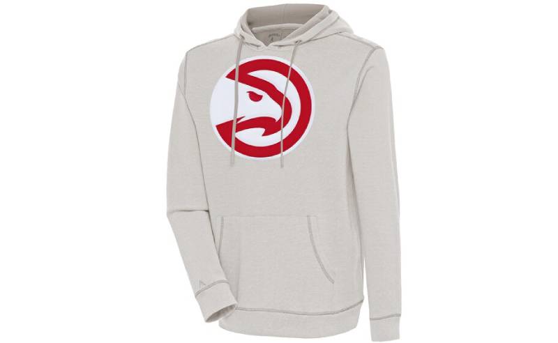
The Atlanta Hawks logo isn’t just seen during game time. From hoodies to mugs, this emblem has made its mark in the merch game too.
Trendsetting Design
With such a distinct logo, fans and even non-fans want to rock that hawk. It sets a trend, it’s a conversation starter, and let’s be real, it looks pretty dope on a snapback.
With every dunk, every three-pointer, and every win, the Atlanta Hawks logo is there, representing more than just a team, but an entire community. Cheers to the art behind the sport!
FAQ On The Atlanta Hawks Logo
What inspired the Atlanta Hawks logo design?
Imagination takes flight when considering the Atlanta Hawks logo—a blend of the hawk’s ferocity and Atlanta’s dynamic spirit.
It’s that electric intersection of urban pulse and the predatory elegance of the bird that shapes this potent NBA emblem, bringing fans a visual chant that resonates with energy and tenacity.
How has the Atlanta Hawks logo evolved over time?
A story of transformation, the logo has undergone several redesigns, echoing the team’s growth and the NBA’s shifting aesthetic.
From minimalist representations to complex illustrations, each iteration reflects a chapter in the Hawks’ narrative, a page turned with every season change—a time capsule in graphic form.
What do the colors of the Atlanta Hawks logo signify?
Red, black, and white—each hue charged with meaning. Red screams of passion and power, black anchors with sophistication, white offers clarity—a trio that delivers contrast and visibility, standing out in the fray of NBA rivalry and fan merchandise, weaving through the brand’s visual identity like a silent battle cry.
Are there hidden meanings in the Atlanta Hawks logo?
Subtexts slink beneath the surface: the hawk’s focused gaze represents unwavering resolve; the spread wings, a striving for victory. Together, they code a message of ambition and agility, a subtle nudge to viewers that here lies more than an image, but a symbol feathered with intent and pride.
Who designed the current Atlanta Hawks logo?
The latest reimagining of the Hawks’ icon was often a collaborative journey—not the brainchild of a single artist but a blend of minds.
Creative agencies typically join forces with the Hawks’ branding team, ensuring the logo not only captures imagination but strategically aligns with NBA marketing zeal.
What is the significance of the basketball in the Atlanta Hawks logo?
Centerstage, the basketball represents the game’s beating heart, etched into the design like a promise to uphold the thrill of the sport.
Its presence in the emblem enshrines love for the game, a global language spoken fluently by players and fans alike, embraced by the community it rallies.
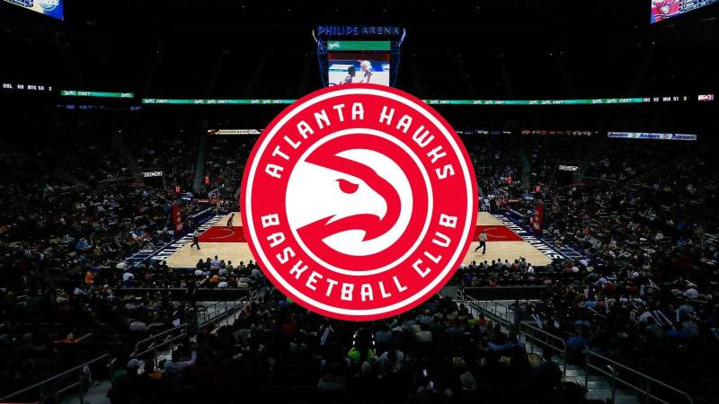
Where is the Atlanta Hawks logo predominantly displayed?
Showcased proudly across State Farm Arena, rippling through merchandise, and splashed over digital platforms, the logo claims its sovereign ground.
It shapes player jerseys, imprints on fan gear, banners across social media—a sentinel of the Hawks legacy echoing through the streets of Atlanta and beyond.
How often does the Atlanta Hawks logo get updated?
Change is not whimsical—it’s strategic. The logo adapts to the times but holds onto updates only when they mirror a shift in the franchise’s ethos or a renovation in visual trends. These leaps are measured in years, a cadence set to the dance of a dynamic brand.
What are some fan-favorite merchandise items featuring the Atlanta Hawks logo?
From the staple jersey to the coveted snapback hat, fans clamor for tangible pieces of the Hawks’ soul. T-shirts, hoodies, basketballs—each item fans the flames of fervor, woven into daily lives with the same ease as iconic imagery nestles into a sports fanatic’s heart.
How does the Atlanta Hawks logo impact team branding and marketing?
It acts as a keystone, anchoring all branding endeavors—a beacon that attracts partnerships, molds marketing campaigns, and shapes the team’s story.
In the sport’s marketing arena, the logo is the keel that steadies the Hawks’ course through the tempest of professional basketball spectacle and commerce.
Conclusion
The journey through the visual saga of the Atlanta Hawks logo concludes here but lingers in the mind like the afterglow of a thrilling game at State Farm Arena. The emblem stands as a testament to Atlanta’s sports culture, its wings unfurled, embracing every corner of NBA iconography with a fierce grip. From the palpable rush of the court to the quiet scrutiny of logo evolution, each facet has been carefully examined, revealing layers of design and narrative tightly woven into its fabric.
- A metaphor for growth,
- A beacon of innovation,
- A binding symbol of community.
Its presence on fan gear and digital streams serve not just as a decorative element, but as the pulsing heart of a franchise—a franchise etched into the very skyline of Atlanta. May this emblem continue to fly high, carrying with it the echoes of cheers, the weight of history, and the promise of tomorrow’s triumphs.
If you liked this article about the Atlanta Hawks logo, you should check out this article about the Sacramento Kings logo.
There are also similar articles discussing the Dallas Mavericks logo, the Washington Wizards logo, the Brooklyn Nets logo, and the New York Knicks logo.
And let’s not forget about articles on the Orlando Magic logo, the Denver Nuggets logo, the Los Angeles Lakers logo, and the Minnesota Timberwolves logo.
Bogdan Sandu, a seasoned designer with 15 years of diverse experience, has been designing websites since 2008.
Renowned for his expertise in logo design and visual branding, Bogdan has developed a multitude of logos for various clients.
His skills extend to creating posters, vector illustrations, business cards, and brochures. Additionally, Bogdan's UI kits were featured on marketplaces like Visual Hierarchy and UI8.
Latest posts by Bogdan Sandu (see all)