The Denver Nuggets logo represents a professional basketball franchise competing in the NBA’s Western Conference.
The current design features crossed pickaxes, mountain peaks, and a basketball within a circular badge. This reflects Colorado’s mining heritage and mountain landscape.
The team was founded in 1967 as the Denver Rockets before joining the NBA in 1976 as the Nuggets. The franchise has undergone eight distinct logo iterations throughout its history.
What is the Denver Nuggets Logo?
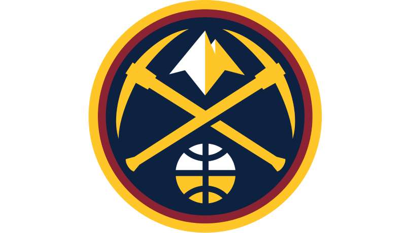
The Denver Nuggets logo is a circular emblem featuring crossed golden pickaxes, snow-capped mountain peaks, and a basketball, introduced in 2018 by the team’s in-house design team led by Kelley Kocher at Kroenke Sports & Entertainment, symbolizing Colorado’s mining history and Rocky Mountain geography.
Design Type: Combination mark incorporating symbolic elements and typography
The logo blends iconography with text to create a complete brand identity. The circular format provides versatility across different applications.
Primary Elements:
- Two crossed golden pickaxes (representing mining heritage)
- White mountain peaks (Rocky Mountains imagery)
- Basketball with globe-like lines
- “Denver Nuggets” wordmark with star separators
- Circular badge structure with double outline
Official Introduction Date: June 6, 2018
Designer/Agency: Kelley Kocher and the Kroenke Sports & Entertainment creative team
The 2018 rebrand was developed internally after extensive market research. Kocher worked closely with NBA and Nike representatives throughout the design process.
Trademark Status: Registered trademark of the Denver Nuggets organization
Color Palette:
- Midnight Blue: Hex #0E2240, RGB (13, 34, 64), CMYK (100, 76, 12, 70), Pantone PMS 289 C
- Sunshine Yellow: Hex #FEC524, RGB (255, 198, 39), CMYK (0, 24, 91, 0), Pantone PMS 123 C
- Flatirons Red: Hex #8B2131, RGB (139, 35, 50), CMYK (29, 96, 76, 29), Pantone PMS 202 C
- Skyline Blue: Hex #1D428A, RGB (29, 66, 138), CMYK (100, 86, 15, 3), Pantone PMS 7687 C
Usage Context:
The logo appears on team uniforms, merchandise, court designs, digital platforms, and marketing materials. It serves as the primary identifier for the franchise across all media.
How Has the Denver Nuggets Logo Evolved Over Time?
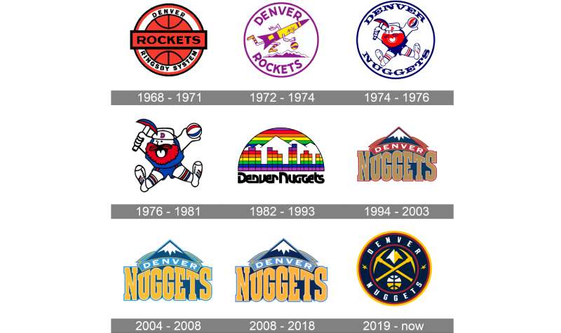
The Denver Nuggets logo has undergone eight major redesigns since 1967, transitioning from basketball-focused emblems to mascot characters, rainbow skylines, mountain crests, and ultimately to the current pickaxe design that honors Colorado’s mining legacy and geographical identity.
Original Denver Rockets Logo (1967-1971)
Years Active: 1967-1971
Design Description: Minimalist circular badge with red basketball
A simple orange basketball sat in the center of a white circle. The design featured double black and red outlines with a horizontal red banner.
Color Scheme: Red, orange, white, black
Designer: Bill Ringsby (team owner)
Context: Created when the team was founded as an ABA franchise
The design incorporated Ringsby’s trucking company logo. “ROCKETS” appeared across the basketball with “DENVER RINGSBY SYSTEM” around the perimeter.
Key Changes from Previous: First logo for the franchise
Cultural Significance: Represented the team’s ABA origins and connection to the owner’s business empire
Denver Rockets Second Logo (1971-1974)
Years Active: 1971-1974
Design Description: Cartoon rocket character dribbling basketball
A yellow and purple rocket ran with a basketball over mountain peaks. The design featured playful, animated styling.
Color Scheme: Yellow, purple, white
Designer: Unknown
Context: Reflected the fun, experimental nature of ABA branding
The wordmark appeared in purple around the circular perimeter. This marked a shift toward more entertaining, character-driven design.
Key Changes from Previous: Complete departure from minimalist approach to cartoon character
Cultural Significance: Captured the ABA’s flashy, entertainment-focused identity
Original Denver Nuggets Logo (1974-1976)
Years Active: 1974-1976
Design Description: “Maxie the Miner” character holding pickaxe and basketball
A bearded prospector jumped energetically in red, white, and blue colors. The character held a pickaxe in one hand and an ABA basketball in the other.
Color Scheme: Red, white, blue
Designer: Unknown (created during ABA-NBA merger preparations)
Context: Team renamed to “Nuggets” due to Houston Rockets existing in NBA
The name change anticipated the ABA-NBA merger. “Denver” appeared in red and “Nuggets” in blue around the character.
Key Changes from Previous: New team name, new mascot character replacing rocket
Cultural Significance: Established mining heritage as core brand theme, introduced beloved Maxie character
Denver Nuggets Refined Logo (1976-1981)
Years Active: 1976-1981
Design Description: Enhanced Maxie the Miner with darker colors
Same character design but with darkened colors and bolder outlines. The circular background was removed.
Color Scheme: Darker red, deeper blue, white
Designer: Unknown
Context: Team joined NBA after ABA-NBA merger in 1976
Refinements included blackened mouth detail and emphasized “D” on Maxie’s cap. The ABA acronym was removed from the basketball.
Key Changes from Previous: Removed circular border, intensified colors, cleaned up details
Cultural Significance: Marked transition from ABA to NBA while maintaining fan-favorite mascot
Rainbow Skyline Logo (1981-1993)
Years Active: 1981-1993
Design Description: Denver skyline with rainbow gradient arc
A semicircular rainbow palette framed geometric buildings representing Denver’s skyline. White Rocky Mountain peaks appeared in the background.
Color Scheme: Rainbow (red, orange, yellow, green, blue, purple), white
Designer: Fan contest winner selected by GM Carl Scheer
Context: Reflected Denver’s nickname “Rainbow City” and 1980s design trends
The wordmark in black used bold sans-serif lettering. This became one of basketball’s most iconic and recognizable designs.
Key Changes from Previous: Eliminated mascot character, adopted architectural elements
Cultural Significance: Most beloved design in franchise history, coincided with nine consecutive playoff appearances
Mountain Crest Logo (1993-2003)
Years Active: 1993-2003
Design Description: Stylized mountain peaks with arched banner
Royal blue and white mountain peaks dominated the design. A red arched banner displayed “DENVER” above enlarged gold “NUGGETS” text.
Color Scheme: Royal blue, gold, red, white
Designer: Tom O’Grady (NBA creative director)
Context: Shift toward more professional, grounded visual identity
The bold serif typeface and shield-like structure conveyed strength. This marked a deliberate move away from rainbow aesthetics.
Key Changes from Previous: Removed rainbow colors and skyline, introduced metallic gold
Cultural Significance: Represented franchise’s effort to establish serious, competitive image
Refined Mountain Logo (2003-2018)
Years Active: 2003-2018
Design Description: Mountain peaks with color variations
The same basic mountain structure with evolving color palettes. Light blue and brighter yellows appeared in 2003.
Color Scheme: Sky blue, bright yellow, navy blue (evolving)
Designer: Tom O’Grady with modifications
Context: Carmelo Anthony era brought renewed optimism
Colors shifted multiple times. By 2008, darker blue and yellow created more intense visual impact.
Key Changes from Previous: Multiple color palette adjustments while maintaining core mountain design
Cultural Significance: Spanned team’s most successful regular season period (2004-2013 playoff streak)
Current Pickaxe Logo (2018-Present)
Years Active: 2018-Present
Design Description: Circular badge with crossed pickaxes and mountain peaks
Two golden pickaxes cross at the center with a basketball below and white mountain peaks above. “Denver Nuggets” encircles the design with star separators.
Color Scheme: Midnight blue, sunshine yellow, Flatirons red, skyline blue, white
Designer: Kelley Kocher and KSE creative team
Context: Complete rebrand reflecting modern Denver and team’s competitive ambitions
The design balanced heritage elements (mining tools, mountains) with contemporary aesthetics. Five distinct logo variations were introduced simultaneously.
Key Changes from Previous: Reintroduced mining symbolism, added circular badge format, new color names
Cultural Significance: Coincided with team’s rise to championship contender status, culminating in 2023 NBA Championship
What Do the Design Elements of the Denver Nuggets Logo Mean?
The design elements symbolize Colorado’s rich mining history through crossed pickaxes, honor the state’s geographical identity with mountain peaks, and represent basketball through the globe-like ball design, creating a comprehensive visual narrative of the team’s regional roots and sporting purpose.
What Is the Symbolism Behind the Pickaxes?
The crossed pickaxes reference Colorado’s 19th-century gold rush era.
Mining tools directly connect to the “Nuggets” team name. Colorado experienced massive population growth during the 1858 Pike’s Peak Gold Rush.
The pickaxe became shorthand for prospecting and mineral extraction. These tools symbolize the hard work, determination, and reward-seeking that built Denver into a major city.
Why Did Denver Nuggets Choose These Specific Colors?
Midnight Blue (Hex #0E2240, Pantone PMS 289 C)
Represents Colorado’s night sky and mountain shadows. The deep navy conveys professionalism and stability.
This primary color anchors the entire brand identity. Blue carries psychological associations with trust and competence.
Sunshine Yellow (Hex #FEC524, Pantone PMS 123 C)
Symbolizes gold nuggets and Colorado sunshine. The bright yellow evokes energy and optimism.
Gold connects directly to mining heritage. Yellow creates high visibility and excitement in athletic contexts.
Flatirons Red (Hex #8B2131, Pantone PMS 202 C)
Named after Boulder’s Flatirons rock formations. Red represents passion and competitive intensity.
The crimson shade adds warmth to the color palette. Red stimulates emotional engagement with the brand.
Skyline Blue (Hex #1D428A, Pantone PMS 7687 C)
References Denver’s clear mountain skies. This accent color adds depth and variation.
The lighter blue balances the darker midnight blue. It provides versatility for secondary applications.
What Typography Style Is Used in the Denver Nuggets Logo?
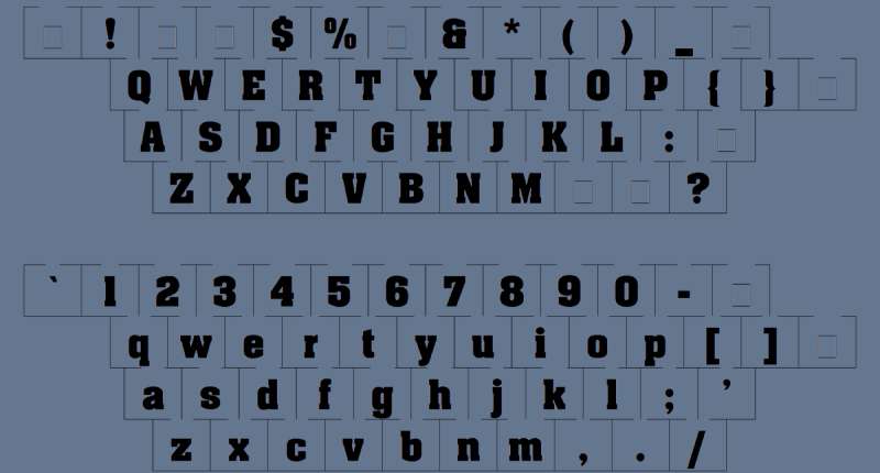
The wordmark uses a custom sans-serif typeface designed specifically for the team.
Bold, geometric letterforms ensure readability at any size. The font balances modern aesthetics with athletic energy.
Clean lines and uniform stroke width create contemporary appeal. The typography resembles industrial-style lettering found in mountain town signage.
What Are the Hidden Meanings in the Denver Nuggets Logo?
The basketball features meridian-like lines creating a globe effect.
This subtle detail suggests worldwide reach and universal appeal. The mountain peaks point upward, symbolizing aspiration and achievement.
Two stars separate the team name halves, potentially representing dual excellence (franchise and fanbase). The circular format creates unity and completeness without beginning or end.
How Does the Denver Nuggets Logo Compare to Competitor Logos?
The Denver Nuggets logo distinguishes itself through explicit geographical and historical references, while competitors like the Utah Jazz logo and Portland Trail Blazers logo use more abstract design approaches focused on musical notes and pinwheel patterns respectively.
Western Conference teams employ diverse visual strategies. The Los Angeles Lakers logo emphasizes wordmark simplicity, while the Golden State Warriors logo features architectural bridge imagery.
The Nuggets’ literal representation of mining tools creates immediate comprehension. This contrasts with symbolic designs like the Phoenix Suns logo basketball-sun fusion.
Among NBA logos, the Nuggets rank highly for regional specificity and historical authenticity. The design communicates place and heritage more explicitly than mascot-based identities.
The color combination sets Denver apart from typical blue logos in professional sports. Adding sunshine yellow and Flatirons red creates a distinctive palette not easily confused with competitors.
What Are the Technical Specifications of the Denver Nuggets Logo?
Official Color Codes:
Midnight Blue:
Sunshine Yellow:
- Hex: #FEC524
- RGB: (255, 198, 39)
- CMYK: (0, 24, 91, 0)
- Pantone: PMS 123 C
Flatirons Red:
- Hex: #8B2131
- RGB: (139, 35, 50)
- CMYK: (29, 96, 76, 29)
- Pantone: PMS 202 C
Skyline Blue:
- Hex: #1D428A
- RGB: (29, 66, 138)
- CMYK: (100, 86, 15, 3)
- Pantone: PMS 7687 C
Dimensions and Proportions:
The logo maintains a 1:1 aspect ratio in circular form. Minimum reproduction size is 0.5 inches diameter for print applications.
Clear space equals the height of one pickaxe handle. This prevents visual crowding when placed near other elements.
Official usage guidelines specify maintaining proportional relationships between internal elements. Distortion or stretching is prohibited.
What Cultural Impact Has the Denver Nuggets Logo Had?
The Rainbow Skyline logo became a cultural touchstone for 1980s Denver nostalgia and remains the most requested throwback design.
Nike and the Nuggets released City Edition uniforms in 2018 honoring the rainbow era. These sold out within hours, demonstrating lasting emotional connection.
The current logo coincided with Denver’s 2023 NBA Championship victory. This cemented the pickaxe design as a symbol of franchise success.
Merchandise featuring the logo generates millions in annual revenue. The design appears on apparel, accessories, home goods, and digital products.
How Does the Denver Nuggets Logo Fit Into the Overall Brand Identity?
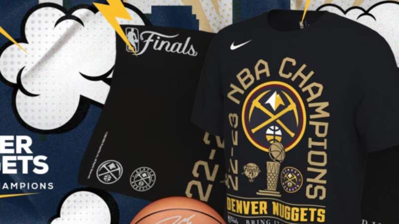
The logo serves as the centerpiece of a comprehensive visual system.
It connects to uniform designs, court graphics, arena signage, and digital presence. Every brand touchpoint reinforces the core themes of mountain geography and mining heritage.
Brand guidelines dictate precise color usage, spacing, and scale requirements. This ensures consistent application across thousands of touchpoints.
The design supports multiple secondary logos for specific contexts. Variations include pickaxes-only marks and text-only wordmarks for different applications.
How Should the Denver Nuggets Logo Be Used?
Official Usage Guidelines:
Never alter logo colors or proportions. Always maintain specified clear space around the mark.
Don’t place the logo on busy backgrounds that reduce visibility. Avoid rotating or skewing the circular design.
Where to Access Official Logos:
Official vector graphics are available through NBA official channels. High-resolution versions exist for print and digital applications.
Media professionals can access logos through NBA media resources. Fans can download approved versions for personal use.
Licensing Information:
The logo is protected under federal trademark law. Commercial use requires licensing agreements with the Denver Nuggets organization.
Unauthorized reproduction for profit violates intellectual property rights. Personal, non-commercial use is generally permitted within reasonable limits.
Trademark Protection Details:
The logo is registered with the United States Patent and Trademark Office. Multiple trademark classes cover apparel, entertainment services, and merchandise.
The organization actively enforces trademark rights. Counterfeit merchandise is subject to legal action.
FAQ About the Denver Nuggets Logo
When was the Denver Nuggets logo created?
The current logo was unveiled on June 6, 2018, though the franchise’s first logo appeared in 1967 when the team was known as the Denver Rockets and competed in the American Basketball Association.
Who designed the Denver Nuggets logo?
Kelley Kocher led the internal creative team at Kroenke Sports & Entertainment that designed the 2018 logo, working closely with NBA officials and Nike representatives throughout the development process to create the current pickaxe and mountain design.
What do the colors in the Denver Nuggets logo mean?
Midnight blue represents Colorado’s mountain shadows, sunshine yellow symbolizes gold nuggets and state sunshine, Flatirons red honors Boulder’s rock formations while conveying passion, and skyline blue references Denver’s clear mountain skies and adds visual depth.
How many times has the Denver Nuggets logo been redesigned?
The franchise has undergone eight major logo redesigns since 1967, including the original Rockets design, cartoon rocket, Maxie the Miner versions, Rainbow Skyline, mountain crest variations, and the current pickaxe design introduced in 2018.
Where can I download the official Denver Nuggets logo?
Official logos are available through NBA media resources, the Denver Nuggets official website, and authorized sports media platforms, with different file formats including vector graphics for professional use and standard image files for personal applications.
Is the Denver Nuggets logo trademarked?
Yes, the logo is registered with the United States Patent and Trademark Office and protected under federal intellectual property law, with the Denver Nuggets organization actively enforcing trademark rights and requiring licensing for commercial applications.
What font is used in the Denver Nuggets logo?
The logo uses a custom sans-serif typeface designed specifically for the team, featuring bold geometric letterforms that ensure readability at various sizes while maintaining modern athletic aesthetics similar to industrial mountain town signage styles.
Why did Denver Nuggets choose pickaxes for their logo?
The pickaxes directly reference Colorado’s 19th-century gold rush era and the “Nuggets” team name, symbolizing mining heritage, hard work, determination, and the prospecting spirit that built Denver into a major city during the 1858 Pike’s Peak Gold Rush.
Conclusion
The Denver Nuggets logo represents one of professional basketball’s most geographically and historically specific designs.
From Maxie the Miner to the Rainbow Skyline to crossed pickaxes, each iteration reflected Denver’s cultural identity. The current design balances heritage with modern aesthetics.
Colorado’s mining legacy and mountain geography remain central to the brand. The 2018 rebrand successfully merged tradition with contemporary graphic design principles.
As the franchise continues winning championships, this logo will define a golden era of Denver basketball.
If you liked this article about the Denver Nuggets logo, you should check out this article about the Sacramento Kings logo.
There are also similar articles discussing the Dallas Mavericks logo, the Washington Wizards logo, the Atlanta Hawks logo, and the Brooklyn Nets logo.
And let’s not forget about articles on the New York Knicks logo, the Orlando Magic logo, the Los Angeles Lakers logo, and the Minnesota Timberwolves logo.

Renowned for his expertise in logo design and visual branding, Bogdan has developed a multitude of logos for various clients.
His skills extend to creating posters, vector illustrations, business cards, and brochures. Additionally, Bogdan's UI kits were featured on marketplaces like Visual Hierarchy and UI8.
He also wrote in the past years on sites like Design Your Way, WebDesignerDepot, WPDean, Designmodo, Speckyboy, Slider Revolution, and more.
- How to Embed Fonts in PDF for Reliable Printing - 30 September 2026
- How to Create Product Design Principles That Evolve With Your Product - 29 September 2026
- Canva vs Midjourney: AI Design Tools Compared - 28 September 2026

Bogdan Sandu is a seasoned designer who has been designing websites since 2008. Renowned for his expertise in logo design and visual branding, Bogdan has developed a multitude of logos for various clients. His skills extend to creating posters, vector illustrations, business cards, and brochures. Additionally, Bogdan's UI kits were featured on marketplaces like Visual Hierarchy and UI8. He also wrote in the past years on sites like Design Your Way, WebDesignerDepot, WPDean, Designmodo, Speckyboy, Slider Revolution, and more.
You Might Also Like