The Orlando Magic Logo History, Colors, Font, and Meaning

Imagine a symbol that captures the essence of athleticism, the buzz of competition, and the spirit of an entire city. This emblem isn’t just a design—it’s a beacon for fans and a banner for players.
The Orlando Magic logo stands as a testament to this—the fusion of artistry and sportsmanship.
Unraveling the stitches of its fabric, we delve into the tapestry of history, hues, and hoop dreams.
You’ll be taken on a journey through the core of the Orlando Magic’s brand identity, exploring how the convergence of sports emblem significance and graphic design elements can embody the dynamism of NBA’s pulsating action.
By the article’s conclusion, you will have uncovered the Magic’s visual saga, from basket logo history to current team branding identity.
Expect to grasp the intricate dance between sports logos design and fan gear evolution, all steeped in the culture of Orlando, Florida.
We’ll dissect:
- The origin and design philosophy underlying the Magic’s insignia
- The impact of the logo on sports team marketing
- How a motif intertwines with community and fans
Prepare for an expedition into visuals that resonate beyond the court.
The Meaning Behind the Orlando Magic Logo
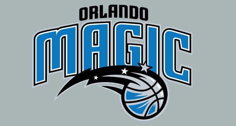
Do you ever think about the hidden stories and tales behind logos? They’re not just random doodles! The Orlando Magic logo is much more than a simple emblem for a basketball team. There’s magic in those curves and lines!
The Magic in the Name
Right, the name “Orlando Magic” isn’t just about basketball tricks. Think about Orlando itself.
A place of theme parks, dreams, and yes, a touch of magical experiences. The logo embodies that spirit, capturing both the charm of the city and the magic of the game.
Stars, Basketballs, and Beyond
Notice the star in the logo? Stars are often symbols of dreams, aspirations, and excellence. The fusion of the star with the basketball indicates not just the magical performance of the players but also the lofty aspirations of the team.
The History of the Orlando Magic Logo
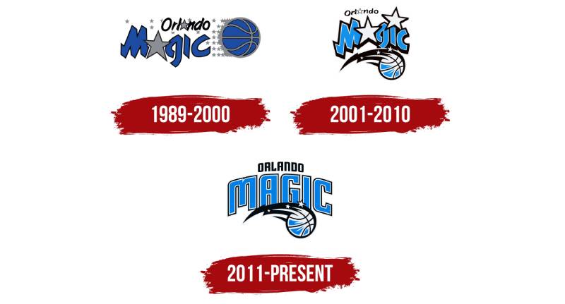
Like a fine wine, a logo gets better over time, or at least it evolves.
The Initial Splash
Remember the ‘90s? Everything was big, bold, and flashy. The original logo reflected that trend, popping off with bright colors and bold fonts.
The Evolution
As the years passed, the logo has seen tweaks and changes, adapting to contemporary styles. Yet, it has always maintained its core essence, ensuring that the team’s legacy and spirit remain intact.
The Colors of the Orlando Magic Logo
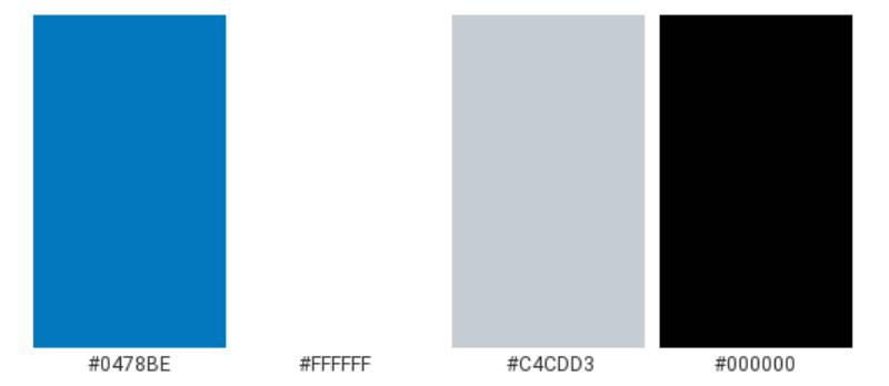
Colors aren’t just colors. They evoke emotions, set moods, and tell stories.
Blue: More than Just a Shade
The dominant blue in the logo? That’s a shout-out to reliability, trust, and a sense of calm. It’s like that reliable player who’s always got your back.
Silver Streaks
Ah, the silver! It’s sleek, modern, and speaks of sophistication. Plus, it adds that dash of dazzle, doesn’t it?
The Font Used in the Orlando Magic Logo
Fonts can be the unsung heroes of design, y’know?
Bold and Assertive
The font in the logo is strong and dynamic, reflecting the aggressive play and the on-court strategies. It’s not just about looking good; it’s about making a statement.
The Impact on Fans
You might not realize it, but logos influence us in subtle ways.
Creating a Bond
The Orlando Magic logo isn’t just a design. For fans, it’s an emblem of pride, passion, and loyalty. It’s that flag you wave, the badge you wear on your chest.
Timeless Appeal
While jerseys and players might change, the logo remains. It’s a constant, connecting fans across different eras, becoming a symbol of timeless love for the game.
Global Recognition
Ever thought about how universal some logos are?
The Global Stage
Basketball is an international love. And with its distinctive design, the Orlando Magic logo has garnered recognition not just in the U.S., but all over the globe.
Beyond Just Basketball
The magic of the logo extends beyond courts. From merchandise to pop culture references, the emblem’s influence is wide and far-reaching. You see it on caps, tees, and even in movies sometimes!
FAQ On The Orlando Magic Logo
What inspired the Orlando Magic logo design?
The design drew inspiration from Orlando’s enchanting identity, with nods to the world of magic. It balanced basketball symbolisms and the fantastical elements, mirroring a city known for imagination and entertainment.
The star-studded ball has become iconic, capturing the essence of the team and its community.
Has the Orlando Magic logo changed over the years?
Yes, evolution is key in sports branding. The logo has seen updates to stay modern while retaining its core identity. Changes often reflect trends in graphic design and the team’s direction—ensuring Orlando Magic basketball remains symbolically fresh and competitive.
What do the colors of the Orlando Magic logo represent?
The colors symbolize depth and vibrancy. Blue stands for loyalty, black represents strength, and silver signifies technology and the future. Together, they encapsulate the vision and the spirit of the team—bold, forward-thinking, and full of energy, much like the city itself.
Is there any significant meaning behind the star in the logo?
Absolutely. The star exudes magic and excellence, core values the franchise aspires to. Its presence is a promise of quality and a beacon of ambition, guiding the team and its fans toward the pinnacle of victory and dreams realized in the intense realm of professional basketball.
How does the logo reflect the Orlando Magic brand?
The logo is the cornerstone of Orlando Magic branding, serving as an immediate identifier.
It encapsulates the team’s narrative, from NBA logo guidelines to sports team marketing, creating a strong visual language. It conveys energy, community, and the competitive spirit that defines the Orlando Magic.
Can you buy merchandise with the classic Orlando Magic logo?
Indeed, classic never fades. Retro gear with the classic logo has gained a nostalgic appeal among fans. It’s readily available, catering to a deep-rooted affection for the eras that shaped the Magic’s legacy, showing sports emblem significance isn’t just about the present.
What impact has the logo had on Orlando’s local community?
This emblem unites. It’s a totem for the local community, bringing together diverse populations under a shared passion for basketball. It’s featured in community events and adorns public spaces, symbolizing the city’s vibrant sports culture and enduring partnership with the fan base.
How does the Orlando Magic logo compare to other NBA team logos?
Each NBA logo has its story. Orlando’s version stands out for its blend of mystique and athleticism. Its unique symbolic language, incorporating stars and magical elements, holds its own in the league, signifying a spirited legacy amidst a sea of professional basketball symbols.
What role has the Orlando Magic logo played in fan engagement?
It’s a rallying cry. The logo adorning jerseys, banners, and digital spaces sparks fan excitement. Physically and virtually, it’s a signature for fan experiences, inciting engagement and loyalty, showing how a simple visual can fuel the fire in fans’ hearts.
How has the Orlando Magic logo influenced the team’s digital presence?
In the digital sphere, the logo is omnipresent, from social media to online advertising. It’s crucial in digital marketing, where visual consistency cements brand presence.
The Magic’s digital platforms leverage the logo to enhance recognition, fan connection, and to stand out in the fast-paced digital landscape.
Conclusion
In the realm of design, a logo transcends ink and pixels, maturing into a cultural symbol. The Orlando Magic logo embodies this transformation. It’s a visual chant that echoes in the grand arena and whispers in the alleyways where hoops await their players.
Through the explorations of this article, the hope is that eyes have opened to the saga etched into every curve and color of the insignia. The journey through the Magic’s emblematic history and design intricacies has revealed:
- The deep-rooted NBA team emblems resonance with a city’s soul.
- The subtleties of sports logos design reflecting an organization’s evolution.
- The undeniable power of iconography in uniting Orlando sports mascots with global spectators.
The logo stands not merely as a marketing tool but as a quiet testament to the passion and pride that fuels everything from professional basketball symbols to the threads of fan gear designs. It is the crescendo of creativity, where the love for the game and the art of design dance together in harmonious spectacle.
If you liked this article about the Orlando Magic logo, you should check out this article about the Sacramento Kings logo.
There are also similar articles discussing the Dallas Mavericks logo, the Washington Wizards logo, the Atlanta Hawks logo, and the Brooklyn Nets logo.
And let’s not forget about articles on the New York Knicks logo, the Denver Nuggets logo, the Los Angeles Lakers logo, and the Minnesota Timberwolves logo.
- The Kirin Logo History, Colors, Font, And Meaning - 13 May 2024
- The Benefits Of Print on Demand - 13 May 2024
- Earthly Delight: Rich Brown Color Palettes - 13 May 2024


