The Houston Rockets logo represents a professional basketball franchise competing in the NBA’s Western Conference Southwest Division.
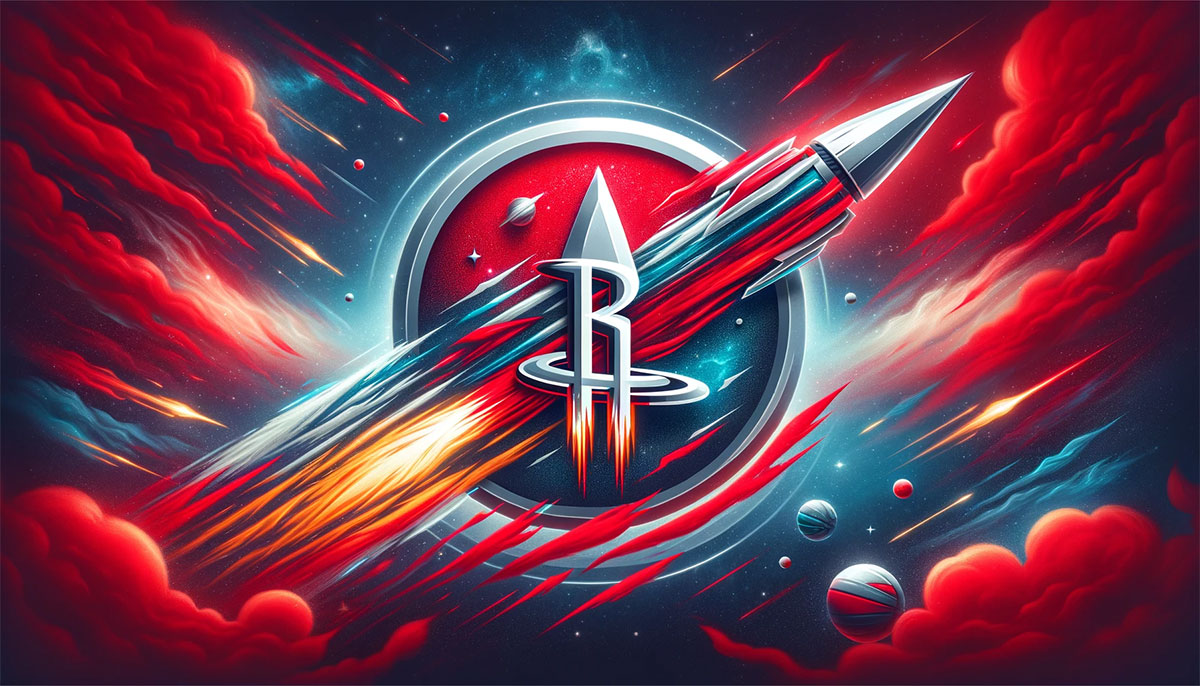
The design blends space exploration themes with basketball identity, connecting to Houston’s Space City nickname and NASA heritage. The current version features a stylized “R” shaped like a rocket taking off, encircled by an orbital ring against a planetary basketball backdrop.
Since relocating from San Diego in 1971, the franchise has undergone five major logo redesigns. Each iteration reflected both the team’s evolution and broader shifts in sports branding approaches.
What is the Houston Rockets Logo?

The Houston Rockets logo is a red letter “R” shaped like a rocket with exhaust flames, positioned on a gray-black basketball planet surrounded by an orbital ring containing the team wordmark in white. It was introduced in 2003, designed by Oscar-winning costume designer Eiko Ishioka in collaboration with Rafael Esquer of Alfalfa Studio, and won the Merit Award from Graphis in their Logo Design 6 competition.
Design Type: Combination mark blending wordmark, icon, and emblem elements
Primary Elements:
- Rocket-shaped “R” with forked exhaust trails
- Planetary basketball with gradient gray-black surface
- Circular orbital ring with team name
Official Introduction Date: 2003-04 NBA season
Designer/Agency: Eiko Ishioka (uniform and concept) and Rafael Esquer/Alfalfa Studio (logo execution and typography)
Trademark Status: Registered with USPTO, protected under NBA franchise licensing
Color Palette:
- Red: Pantone 200 C, Hex #CE1141, RGB (206,17,65), CMYK (0,100,65,15)
- Black: Pantone Black 6 C, Hex #000000, RGB (6,25,34), CMYK (30,0,0,100)
- Silver: Pantone 877 C, Hex #C4CED4, RGB (196,206,211), CMYK (5,0,0,20)
Usage Context: Team uniforms, merchandise, arena signage, digital platforms, promotional materials, and official NBA broadcast graphics
How Has the Houston Rockets Logo Evolved Over Time?

The franchise logo has transformed through five distinct eras, shifting from playful cartoon aesthetics to sophisticated space-themed abstraction. The progression mirrors both changing design trends and the team’s competitive status across five decades of professional basketball.
Original San Diego Rockets Logo (1967-1971)
Years Active: 1967-1971
Design Description: Blue rocket ascending diagonally across an orange basketball enclosed in a thick green circular frame
Color Scheme: Orange, green, gold, and blue
Designer: Unknown
Context: Created for the expansion franchise entering the NBA, reflecting San Diego’s aerospace industry prominence
Key Changes from Previous: First logo for the franchise
Cultural Significance: Connected team identity to California’s booming aerospace sector and space race era optimism
Cartoon Rocket Player Logo (1971-1972)
Years Active: 1971-1972 (one season only)
Design Description: Caricature basketball player with jetpack rocket attached, spinning a yellow NBA basketball on his finger with fiery exhaust trail
Color Scheme: Red and yellow (dubbed “ketchup and mustard” by fans)
Designer: Unknown
Context: Created immediately after franchise relocation to Houston, aligned with NASA presence
Key Changes from Previous: Completely new design reflecting geographic move and Houston’s space identity
Cultural Significance: Brief experiment with whimsical sports mascot branding popular in early 1970s
Ketchup and Mustard Logo (1972-1995)
Years Active: 1972-1995 (23 seasons)
Design Description: Gold basketball with black “ROCKETS” wordmark in center, surrounded by two red curved arcs with white “HOUSTON” text on upper arc
Color Scheme: Red and gold
Designer: Unknown
Context: Simplified design introduced as team built competitive roster through 1970s and 1980s
Key Changes from Previous: Eliminated cartoon character, adopted cleaner geometric approach
Cultural Significance: Became synonymous with championship era, worn during 1994 and 1995 NBA title runs with Hakeem Olajuwon
Shark-Rocket Logo (1995-2003)
Years Active: 1995-2003
Design Description: Animated rocket with aggressive shark-like face orbiting red basketball, with “ROCKETS” in beveled white and silver lettering
Color Scheme: Navy blue, red, crystal blue, and silver
Designer: Tom O’Grady (NBA Creative Director) and Gameplan Creative
Context: Launched after back-to-back championships despite fan resistance to changing winning look
Key Changes from Previous: Introduced blue for first time, abandoned gold entirely, added metallic effects and sublimated patterns
Cultural Significance: One of most controversial NBA rebrands, ironically became top-selling vintage throwback design decades later
Modern Rocket “R” Logo (2003-2019)
Years Active: 2003-2019
Design Description: Large red “R” with vertical bars elongated into rocket flame shape, horizontal red orbital ring surrounding it, “HOUSTON ROCKETS” wordmark split above and below
Color Scheme: Red, black, and silver
Designer: Eiko Ishioka and Rafael Esquer
Context: Debuted with Yao Ming’s arrival and move to Toyota Center
Key Changes from Previous: Eliminated navy blue, returned to red dominant scheme, created custom typeface, adopted minimalist aesthetic
Cultural Significance: Won design awards, restored traditional team colors while modernizing visual identity
Current Planetary Logo (2019-Present)
Years Active: 2019-present
Design Description: Red rocket “R” positioned in front of gray-black basketball planet with gradient surface, white “HOUSTON ROCKETS” wordmark encircling orbital ring
Color Scheme: Red, black, silver, and gray gradient
Designer: In-house creative team
Context: Updated during rebuild phase following James Harden era
Key Changes from Previous: Added planetary texture and gradient effects, enclosed wordmark in orbital ring, enhanced dimensional appearance
Cultural Significance: Deepened space exploration metaphor while maintaining core rocket identity established in 2003
What Do the Design Elements of the Houston Rockets Logo Mean?
The rocket-shaped “R” symbolizes upward trajectory, speed, and launch power while referencing Houston’s identity as America’s space capital. The design connects the franchise to NASA’s Johnson Space Center and the city’s aerospace industry legacy while representing athletic ascension and competitive drive in professional basketball.
Why Did Houston Rockets Choose These Specific Colors?
Red (Pantone 200 C, #CE1141)
Red represents energy, passion, and competitive fire.
The color psychology creates visual intensity and commands attention in arena environments. It aligns with aggressive playing styles and fast-paced basketball.
Black (Pantone Black 6 C, #000000)
Black adds sophistication and strength to the overall identity.
The neutral provides contrast for the vibrant red while symbolizing power and authority on the court.
Silver (Pantone 877 C, #C4CED4)
Silver references metallic spacecraft materials and technological innovation.
The accent color connects to Houston’s aerospace heritage while adding modern polish to merchandise and uniform details.
What Typography Style Is Used in the Houston Rockets Logo?

Rafael Esquer designed the custom typeface specifically for optimal legibility from arena distances and television broadcasts.
The sans-serif font features slightly elongated letterforms with softened corners and unique angular cuts. The design prioritizes readability while maintaining futuristic character that complements the rocket motif.
What Are the Hidden Meanings in the Houston Rockets Logo?
The red orbital ring doubles as the center circle found on basketball courts.
Ishioka drew inspiration from basketball’s vertical nature when creating the upward rocket design. The forked exhaust trails at the “R” base intentionally resemble dripping blood, a subtle callback to her Oscar-winning work on “Bram Stoker’s Dracula” in 1992.
How Does the Houston Rockets Logo Compare to Competitor Logos?
The Rockets logo stands among the most sophisticated NBA designs through its abstract conceptual approach rather than literal representation. While teams like the Chicago Bulls logo and Boston Celtics logo use mascots or shamrocks, Houston employs typographic abstraction that functions across multiple scales and contexts.
The design shares minimalist tendencies with the Miami Heat logo and Portland Trail Blazers logo pinwheel. Unlike mascot-heavy identities seen in the Toronto Raptors logo or Memphis Grizzlies logo, the Rockets avoid literal animal representation.
The red logo palette positions Houston alongside the Bulls, Heat, and Washington Wizards logo as teams leveraging aggressive color psychology. The space theme remains unique in NBA branding, with only the Orlando Magic logo touching similar celestial concepts.
What Are the Technical Specifications of the Houston Rockets Logo?
Official Color Codes:
Primary Color: Red
- Pantone: 200 C
- Hex: #CE1141
- RGB: (206,17,65)
- CMYK: (0,100,65,15)
Secondary Color: Black
- Pantone: Black 6 C
- Hex: #000000
- RGB: (6,25,34)
- CMYK: (30,0,0,100)
Accent Color: Silver
- Pantone: 877 C
- Hex: #C4CED4
- RGB: (196,206,211)
- CMYK: (5,0,0,20)
Dimensions and Proportions:
- Aspect ratio maintains balance between vertical rocket element and horizontal wordmark
- Minimum size requirements ensure legibility at 0.5 inches for print applications
- Clear space specifications require empty area equal to height of “R” on all sides
- Official usage guidelines prohibit color alterations, rotations, or distortions
What Cultural Impact Has the Houston Rockets Logo Had?
The 2003 redesign helped shift NBA branding toward cleaner, more sophisticated visual systems.
Ishioka’s involvement brought high-fashion sensibility to sports design, elevating the field’s creative standards. The logo proved that championship-winning teams could successfully rebrand without alienating core fans.
The design influenced subsequent NBA identity updates, demonstrating how custom typography and abstract symbolism could replace dated mascot-based approaches. Collectors and vintage enthusiasts now prize both the 1972 “ketchup and mustard” and 1995 “shark rocket” versions as cultural artifacts representing distinct basketball eras.
How Does the Houston Rockets Logo Fit Into Overall Brand Identity?

The logo anchors a comprehensive visual system extending across uniforms, court design, digital presence, and arena environments.
The rocket “R” appears in multiple configurations including standalone icon versions, horizontal lockups, and vertical arrangements. Brand guidelines specify exact color relationships and spacing requirements for consistent application.
The franchise maintains connection to Houston’s aerospace legacy through partnership activations with NASA and Space Center Houston. The planetary basketball and orbital elements reinforce “Space City” positioning that differentiates Houston from other NBA markets and connects sports achievement to scientific exploration.
How Should the Houston Rockets Logo Be Used?
Official Usage Guidelines:
- Never alter official colors or substitute similar hues
- Maintain required clear space around all logo edges
- Do not rotate, skew, or distort proportions
- Use only official file formats provided by NBA licensing
- Never recreate or redraw logo elements
- Respect trademark symbols in all applications
Where to Access Official Logos:
Official vector graphics files available through NBA licensing department for approved commercial use. High-resolution PNG and JPEG files provided through official Rockets media resources portal. Minimum DPI requirements vary by application (300 DPI print, 72 DPI web).
Licensing Information:
Commercial usage requires NBA Properties licensing agreement and franchise approval. Fan merchandise and personal use follow different guidelines than commercial applications. Unauthorized reproduction violates federal trademark law and NBA intellectual property protections.
Trademark Protection Details:
Registered with United States Patent and Trademark Office under multiple classifications covering entertainment services, apparel, and promotional materials. Protected internationally through World Intellectual Property Organization filings. Active enforcement program monitors unauthorized usage across digital and physical markets.
FAQ About the Houston Rockets Logo
When was the Houston Rockets logo created?
The current logo debuted for the 2003-04 NBA season, replacing the 1995 design featuring a shark-faced rocket. The franchise has maintained this core identity for over two decades with minor refinements in 2019 adding gradient planetary effects.
Who designed the Houston Rockets logo?
Oscar-winning costume designer Eiko Ishioka created the concept and uniform design in collaboration with Rafael Esquer of New York-based Alfalfa Studio, who executed the logo and custom typeface. Ishioka won the Academy Award for “Bram Stoker’s Dracula” in 1992.
What do the colors in the Houston Rockets logo mean?
Red symbolizes competitive fire and athletic intensity using Pantone 200 C as the dominant brand color. Black adds sophistication and strength while silver references aerospace materials and technological innovation tied to Houston’s space exploration heritage.
How many times has the Houston Rockets logo been redesigned?
The franchise has undergone five major redesigns since 1967: the original San Diego version (1967-1971), cartoon jetpack player (1971-1972), ketchup and mustard era (1972-1995), shark-rocket design (1995-2003), and current rocket “R” (2003-present with 2019 update).
Where can I download the official Houston Rockets logo?
Official logo files are available through NBA Properties licensing department for commercial applications and the Houston Rockets media resources portal for approved editorial use. High-resolution files require proper credentials and licensing agreements depending on intended usage.
Is the Houston Rockets logo trademarked?
Yes, the logo is registered with the United States Patent and Trademark Office and protected internationally through WIPO filings. The NBA Properties division enforces trademark protections covering commercial usage, merchandise, and digital applications across global markets.
What font is used in the Houston Rockets logo?
The team uses NBA Rockets Regular, a custom typeface Rafael Esquer designed specifically for the 2003 rebrand. The font features unique characteristics optimizing legibility from arena distances and television broadcasts with elongated letterforms and softened corners.
Why did Houston Rockets choose a rocket for their logo?
The rocket symbolizes the team name while connecting to Houston’s identity as home to NASA’s Johnson Space Center and America’s human spaceflight program. The design represents upward trajectory, speed, and explosive power aligned with competitive basketball while celebrating the city’s aerospace heritage.
Conclusion
The Houston Rockets logo represents sophisticated sports branding that balances abstract symbolism with clear team identity.
The rocket-shaped “R” design created by Eiko Ishioka and Rafael Esquer has proven remarkably durable across two decades of NBA evolution. The identity successfully connects franchise heritage to Houston’s space exploration legacy while maintaining flexibility across digital and physical applications.
As NBA visual standards continue advancing, the Rockets logo stands as proof that thoughtful design transcends temporary trends. The planetary basketball and orbital elements create lasting brand equity that will likely anchor the franchise identity for years ahead.
If you liked this article about the Houston Rockets logo, you should check out this article about the Chicago Bulls logo.
There are also similar articles discussing the Golden State Warriors logo, the Miami Heat logo, the Detroit Pistons logo, and the Milwaukee Bucks logo.
And let’s not forget about articles on the Cleveland Cavaliers logo, the Utah Jazz logo, the Toronto Raptors logo, and the Memphis Grizzlies logo.

Renowned for his expertise in logo design and visual branding, Bogdan has developed a multitude of logos for various clients.
His skills extend to creating posters, vector illustrations, business cards, and brochures. Additionally, Bogdan's UI kits were featured on marketplaces like Visual Hierarchy and UI8.
He also wrote in the past years on sites like Design Your Way, WebDesignerDepot, WPDean, Designmodo, Speckyboy, Slider Revolution, and more.
- The Cursor Logo History, Colors, Font, And Meaning - 24 September 2026
- Top 7 Web Design Subscription Services That Replace Full-Time Hires - 24 September 2026
- Canva vs PowerPoint: Which Is Better for Presentations? - 22 September 2026

Bogdan Sandu is a seasoned designer who has been designing websites since 2008. Renowned for his expertise in logo design and visual branding, Bogdan has developed a multitude of logos for various clients. His skills extend to creating posters, vector illustrations, business cards, and brochures. Additionally, Bogdan's UI kits were featured on marketplaces like Visual Hierarchy and UI8. He also wrote in the past years on sites like Design Your Way, WebDesignerDepot, WPDean, Designmodo, Speckyboy, Slider Revolution, and more.
You Might Also Like