The Detroit Pistons logo stands as one of basketball’s most recognizable symbols.
Since the franchise moved to Detroit in 1957, this emblem has evolved from simple text designs to the iconic circular basketball badge we see today. The current version combines Motor City heritage with professional basketball identity through bold colors and clean lines.
Founded in 1941 as the Fort Wayne Zollner Pistons, the team has undergone eight major logo redesigns. Each iteration reflects changes in the franchise’s identity, from its automotive roots to its championship aspirations. The logo serves not just as visual branding but as a connection between Detroit’s industrial past and its basketball legacy.
The 2017 redesign brought back elements from the Bad Boys era while adding modern touches. Chrome accents pay tribute to Detroit’s automotive industry. The red, white, and blue palette reinforces American values and ties the team to the city’s patriotic spirit.
What is the Detroit Pistons Logo?
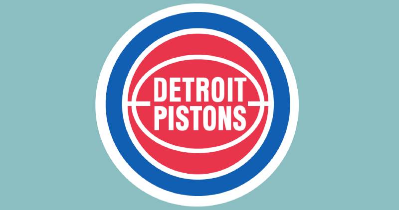
The Detroit Pistons logo is a circular emblem featuring a red basketball with white seam lines, encircled by a royal blue ring, with “DETROIT PISTONS” written in white custom sans-serif lettering across the center. Officially introduced on May 16, 2017, this design modernizes the franchise’s 1978-1996 aesthetic with chrome accents and refined typography.
Design Type: Combination mark (icon and wordmark)
Primary Elements:
- Red basketball as central icon
- Two-line wordmark arrangement
- Chrome metallic outline
- Blue circular border
- White separator lines
Official Introduction Date: May 16, 2017
Designer/Agency: Internal team design (specific designers not publicly disclosed)
Trademark Status: Registered with the U.S. Patent and Trademark Office; filed with EU Intellectual Property Office in May 2017
Color Palette:
- Red: #C8102E (Pantone 186 C)
- Royal Blue: #1D42BA (Pantone 7687 C)
- Chrome: #BEC0C2 (Pantone Cool Gray 5)
- Navy Blue: #002D62 (Pantone 282 C)
- White: #FFFFFF
Usage Context: Team jerseys, court designs, merchandise, marketing materials, digital platforms, arena branding at Little Caesars Arena, official NBA broadcasts
How Has the Detroit Pistons Logo Evolved Over Time?
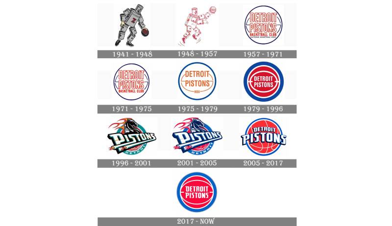
The Pistons logo has transformed eight times since 1957, moving from automotive-themed characters to basketball-focused designs. Major redesigns occurred in 1978, 1996, 2005, and 2017, with the latest version drawing inspiration from the championship-era emblem while incorporating contemporary design elements.
Original Fort Wayne Zollner Pistons Logo (1941-1948)
Years Active: 1941-1948
Design Description: A cartoon character constructed from automobile parts holding a basketball, with a bold red “Z” on the chest
Color Scheme: Gray, black, brown, red
Designer: Unknown
Context: Created when Fred Zollner owned the team in Fort Wayne, Indiana, celebrating the city’s automotive manufacturing heritage
Key Changes from Previous: First official logo for the franchise
Cultural Significance: Represented the team’s connection to Zollner’s piston manufacturing business and the industrial Midwest
Detroit Pistons First Logo (1957-1968)
Years Active: 1957-1968
Design Description: Simple text-based design with “Detroit Pistons” in blue block lettering over a basketball icon
Color Scheme: Blue, white, red
Designer: Unknown
Context: Introduced when the franchise relocated from Fort Wayne to Detroit, marking a new chapter in team history
Key Changes from Previous: Eliminated the cartoon character, simplified to basketball and text elements
Cultural Significance: Marked the team’s transition to Detroit and shift toward a more professional sports branding approach
Modernized Basketball Logo (1968-1975)
Years Active: 1968-1975
Design Description: Blue basketball with white lines, “Detroit Pistons” in white block letters across the center
Color Scheme: Blue, white, red
Designer: Unknown
Context: Updated during an era of visual evolution across professional sports leagues
Key Changes from Previous: More stylized basketball rendering with enhanced graphical elements
Cultural Significance: Reflected the changing aesthetics of late 1960s sports design
Simplified Red Basketball (1975-1978)
Years Active: 1975-1978
Design Description: Red basketball with “Detroit Pistons” in white letters, blue outline
Color Scheme: Red, white, blue
Designer: Unknown
Context: Transitional period for the franchise on and off the court
Key Changes from Previous: Switched from blue to red as primary basketball color
Cultural Significance: Established the red, white, and blue patriotic color palette that would become iconic
Bad Boys Era Logo (1978-1996)
Years Active: 1978-1996
Design Description: Red basketball encircled by thick blue ring, “DETROIT PISTONS” in white across center
Color Scheme: Red, royal blue, white
Designer: Unknown
Context: Introduced during the team’s rise to prominence, spanning the entire Bad Boys championship era (1989, 1990) and beyond
Key Changes from Previous: Thicker blue outline, refined typography, more balanced circular composition
Cultural Significance: Most iconic version in franchise history, associated with championships won by Isiah Thomas, Joe Dumars, Bill Laimbner, Dennis Rodman, and coach Chuck Daly
Horsepower Logo (1996-2001)
Years Active: 1996-2001
Design Description: Stylized horse head with flaming mane representing “horsepower,” “PISTONS” in diagonal white lettering with black and teal trim
Color Scheme: Teal, black, yellow, red, white
Designer: Unknown
Context: Part of a complete rebrand attempting to modernize the team’s image in the late 1990s
Key Changes from Previous: Radical departure from basketball imagery, introduced teal as primary color
Cultural Significance: Most controversial logo in team history, widely criticized by fans and media, though it represented Detroit’s automotive industry through horsepower metaphor
Gradient Basketball Design (2001-2005)
Years Active: 2001-2005
Design Description: Red basketball with gradient effects, “Detroit” above “Pistons” in white with light gray horizontal stripe
Color Scheme: Red, blue, white, gray
Designer: Unknown
Context: Return to traditional colors and basketball imagery after failed horsepower experiment
Key Changes from Previous: Abandoned horse logo, reintroduced basketball, added gradient and shadow effects
Cultural Significance: Marked the beginning of the 2004 championship run with Chauncey Billups, Richard Hamilton, Ben Wallace, Rasheed Wallace, and Tayshaun Prince
Modern Simplified Basketball (2005-2017)
Years Active: 2005-2017
Design Description: Red basketball with white lines, “DETROIT” arched above “PISTONS” in white with blue outline, enclosed in blue ring
Color Scheme: Red, royal blue, white
Designer: Unknown
Context: Simplified design that removed gradients and focused on clean lines
Key Changes from Previous: Eliminated gradient effects, increased text size, refined basketball rendering
Cultural Significance: Served during the team’s transition from championship contender to rebuilding phase
Current Detroit Pistons Logo (2017-Present)
Years Active: 2017-Present
Design Description: Red basketball with minimal white seam lines, “DETROIT PISTONS” in refined sans-serif across center, chrome metallic outline, blue ring
Color Scheme: Red, royal blue, chrome, white
Designer: Internal Pistons design team (specific names not disclosed)
Context: Unveiled coinciding with move to Little Caesars Arena in downtown Detroit
Key Changes from Previous: Chrome outline added, font refined with sharper shapes, basketball simplified with fewer lines, darker blue tone
Cultural Significance: Represents new chapter in franchise history with return to downtown Detroit and modernization of Bad Boys era design
What Do the Design Elements of the Detroit Pistons Logo Mean?
The red basketball symbolizes the sport itself while connecting to Detroit’s bold, competitive spirit. The circular blue border represents unity and strength. White typography ensures readability while contrasting sharply against the red background, creating visual hierarchy.
The basketball element directly represents the NBA and professional competition.
Its red color conveys energy, passion, and determination. The sphere shape follows established sports logo conventions while maintaining instant recognition.
Chrome accents introduced in 2017 specifically honor Detroit’s automotive legacy. These metallic details reference muscle cars and manufacturing excellence. The shiny finish adds dimensionality without overwhelming the classic design.
The circular composition creates balance and completeness. Concentric circles guide the eye from the outer blue ring inward to the central text. This structure works across all sizes and applications.
Why Did Detroit Pistons Choose These Specific Colors?
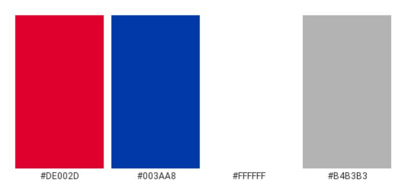
Red represents power, energy, and competitive fire. Studies in color psychology show red increases heart rate and creates excitement.
For a basketball team, this aggressive color signals intensity and championship mentality.
Royal blue conveys trust, loyalty, and professionalism. It’s a color deeply associated with American sports franchises. The specific shade (#1D42BA) provides strong contrast against red without visual conflict.
White serves multiple functions beyond simple negative space. It ensures legibility, creates separation between elements, and represents purity of competition. The combination forms a patriotic complementary color scheme that resonates with American audiences.
Chrome gray adds contemporary sophistication. This metallic tone connects the logo to Detroit’s identity as Motor City without being literal. It’s subtle enough to avoid dated aesthetics.
What Typography Style Is Used in the Detroit Pistons Logo?
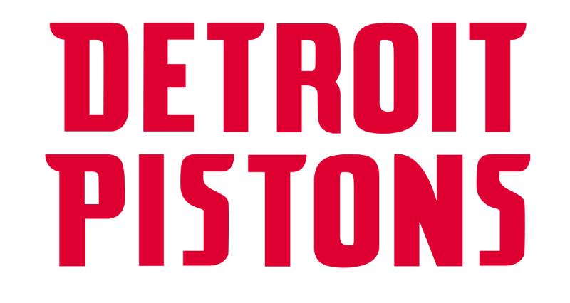
The current wordmark uses a custom sans-serif font with condensed proportions. Letters feature diagonal cuts on terminals, creating dynamic movement.
The typeface balances modern geometry with athletic boldness. Capital letters ensure maximum impact. Tight kerning and tracking create cohesion across the two-line arrangement.
“DETROIT” appears smaller than “PISTONS,” establishing clear typographic hierarchy. This prioritizes team name while maintaining geographical identity. The 2017 refinement made letterforms sharper and more progressive compared to the 2005-2017 version.
What Are the Hidden Meanings in the Detroit Pistons Logo?
The chrome outline subtly forms the shape of a piston cylinder when viewed closely. This intentional design element connects to the team name’s automotive origins. Engineers at Detroit auto manufacturers would immediately recognize this reference.
The number of white lines on the basketball (typically three visible) mirrors championship aspirations. While not officially confirmed, design analysts note this potential symbolism.
The blue ring’s width ratio to the basketball creates proportions similar to the golden ratio, though this may be coincidental. The designer’s stated intention focused on modernizing classic elements while honoring franchise tradition.
How Does the Detroit Pistons Logo Compare to Competitor Logos?
The Pistons logo follows NBA design trends toward simplified, bold emblems. Unlike the Los Angeles Lakers logo, which uses a basketball shape with distinct typography, or the Boston Celtics logo with its leprechaun mascot, Detroit opts for straightforward basketball imagery that prioritizes immediate recognition over complex illustration.
The Chicago Bulls logo also features red as primary color but uses an aggressive bull illustration rather than sport-specific imagery. The Miami Heat logo incorporates a flaming basketball similar to the Pistons’ red sphere, though Miami’s design feels more energetic and less traditional.
Among NBA logos, the Pistons rank high for clarity and scalability. The circular format performs well at small sizes, unlike more detailed designs like the Minnesota Timberwolves logo. The Pistons’ approach aligns with successful red logos across sports, creating instant emotional response.
Compared to Central Division rivals, the Pistons logo appears more conservative than the Milwaukee Bucks logo but bolder than the Indiana Pacers logo. The Cleveland Cavaliers logo shares a similar circular structure but uses a sword motif instead of pure basketball elements.
Western Conference teams like the Golden State Warriors logo and Phoenix Suns logo lean toward more stylized, modern aesthetics. The Pistons maintain traditional sports branding principles that prioritize longevity over trends.
What Are the Technical Specifications of the Detroit Pistons Logo?
Official Color Codes:
Primary Red:
Royal Blue:
- Hex: #1D42BA
- RGB: (29, 66, 138)
- CMYK: (100, 78, 0, 18)
- Pantone: 7687 C
Chrome:
- Hex: #BEC0C2
- RGB: (190, 192, 194)
- CMYK: (30, 25, 25, 0)
- Pantone: Cool Gray 5
Navy Blue:
- Hex: #002D62
- RGB: (0, 45, 98)
- CMYK: (100, 68, 0, 54)
- Pantone: 282 C
White:
- Hex: #FFFFFF
- RGB: (255, 255, 255)
- CMYK: (0, 0, 0, 0)
Dimensions and Proportions:
- Aspect ratio: 1:1 (perfect circle)
- Minimum size requirements: 0.5 inches diameter for print, 32px for digital
- Clear space specifications: Minimum clearance equal to height of letter “D” in “DETROIT”
- Official usage guidelines: Available through NBA licensing department
The logo exists in multiple format variations including vector graphics (EPS, SVG, PDF) and raster formats (JPEG, PNG). Official files should always be sourced from NBA.com or Pistons.com to ensure color accuracy and proper proportions. DPI requirements for print applications typically specify 300 pixels per inch minimum.
What Cultural Impact Has the Detroit Pistons Logo Had?
The Bad Boys era logo (1978-1996) became synonymous with tough, physical basketball. Fans wore it as a badge of honor during back-to-back championships.
Its revival in 2017 sparked immediate nostalgia. Season ticket sales increased 15% following the announcement. Merchandise featuring the updated design sold out within weeks of release.
The logo appears regularly in hip-hop culture and streetwear fashion. Detroit rappers like Eminem and Big Sean frequently wear Pistons gear in music videos. The red and blue color scheme became visual shorthand for Detroit itself, beyond just basketball.
Urban artists incorporate the logo into murals across Detroit. The basketball emblem represents resilience and Motor City pride. It’s become as recognizable as the city skyline.
How Does the Detroit Pistons Logo Fit Into Overall Brand Identity?
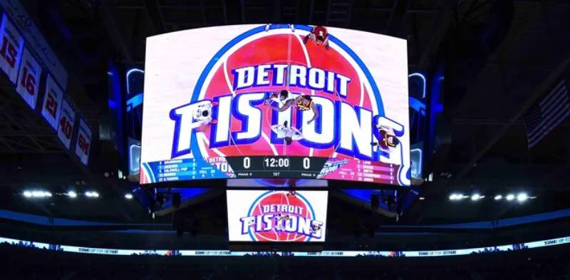
The logo serves as the visual anchor for all franchise branding. It appears on jerseys, court designs, arena signage, and digital platforms. Every brand guideline decision references back to the core logo elements.
Team colors derived from the logo extend into Little Caesars Arena’s interior design. Chrome accents appear on concession stands and luxury suites. The circular motif repeats in architectural details.
Digital platforms use the logo as profile images across social media. The simple, bold design scales perfectly from billboard size to mobile app icons. This versatility strengthens brand recognition.
Merchandise designers use the logo as foundation for apparel graphics. Secondary marks and alternate logos maintain visual consistency with the primary emblem. The complete brand style guide ensures cohesive application across all touchpoints.
How Should the Detroit Pistons Logo Be Used?
Official Usage Do’s:
- Maintain proper clearance space around all sides
- Use only official color codes from team guidelines
- Reproduce from official vector files
- Ensure minimum size requirements (0.5″ print, 32px digital)
- Keep proportions locked when scaling
Official Usage Don’ts:
- Never alter colors or add effects
- Never stretch or distort proportions
- Never recreate or redraw the logo
- Never place on busy backgrounds that reduce legibility
- Never use outdated versions (horse logo, gradient designs)
Where to Access Official Logos: NBA.com provides approved logo files for media use. The Pistons’ official website offers fan resources. Commercial licensing requires approval through NBA Properties.
Licensing Information: The logo is trademarked intellectual property of Detroit Pistons Basketball Company. Commercial use requires licensing agreements. Editorial and news media may use the logo for coverage purposes under fair use guidelines.
Trademark Protection Details: Registered with the U.S. Patent and Trademark Office. Protected under international trademark laws through NBA licensing agreements. Unauthorized commercial reproduction is prohibited.
FAQ About the Detroit Pistons Logo
When was the Detroit Pistons logo created?
The first Detroit Pistons logo appeared in 1957 when the franchise relocated from Fort Wayne. The current version was introduced on May 16, 2017, coinciding with the team’s move to Little Caesars Arena in downtown Detroit.
Who designed the Detroit Pistons logo?
The 2017 logo was created by the internal Detroit Pistons design team in collaboration with NBA branding consultants. Specific designer names have not been publicly disclosed. Previous logo versions throughout franchise history were also designed internally or by unnamed agencies.
What do the colors in the Detroit Pistons logo mean?
Red represents energy, passion, and competitive intensity. Royal blue signifies trust, loyalty, and professionalism. White ensures clarity and represents purity of sport. Chrome gray pays tribute to Detroit’s automotive manufacturing heritage and muscle car culture.
How many times has the Detroit Pistons logo been redesigned?
The logo has undergone eight major redesigns: 1957, 1968, 1975, 1978, 1996, 2001, 2005, and 2017. The most significant changes occurred in 1996 (horse logo) and 2017 (return to Bad Boys era design).
Where can I download the official Detroit Pistons logo?
Official logos are available through NBA.com’s media resources section and the Detroit Pistons official website. High-resolution files require permission for commercial use. Media professionals can access logos through NBA press credentials.
Is the Detroit Pistons logo trademarked?
Yes, the logo is registered with the U.S. Patent and Trademark Office and protected internationally through NBA licensing agreements. The Detroit Pistons Basketball Company owns all trademark rights. Unauthorized commercial use is prohibited.
What font is used in the Detroit Pistons logo?
The logo uses a custom sans-serif typeface created specifically for the team. It features condensed proportions, diagonal terminal cuts, and bold weight. The font is proprietary and not available for public use.
Why did Detroit Pistons choose a basketball for their logo?
The basketball directly represents the sport and provides instant recognition. It connects to the team’s athletic identity while avoiding overly complex imagery. The circular shape works well across all applications and sizes.
Conclusion
The Detroit Pistons logo represents more than basketball branding.
It connects Motor City’s industrial heritage to professional sports excellence. From Fort Wayne’s automotive roots in 1941 to the current chrome-accented design, each iteration tells part of the franchise story.
Key attributes include the red basketball symbolizing competitive energy, royal blue conveying trust and tradition, and chrome details honoring Detroit’s automotive legacy. The 2017 modernization successfully balanced nostalgia with contemporary design principles.
Within NBA branding, the Pistons logo ranks among the most recognizable and versatile. Its circular structure, bold colors, and clean logo design principles ensure longevity while allowing adaptation to future design trends. As the franchise continues evolving, this emblem will remain a powerful symbol of Detroit basketball.
If you liked this article about the Detroit Pistons logo, you should check out this article about the Chicago Bulls logo.
There are also similar articles discussing the Golden State Warriors logo, the Miami Heat logo, the Houston Rockets logo, and the Milwaukee Bucks logo.
And let’s not forget about articles on the Cleveland Cavaliers logo, the Utah Jazz logo, the Toronto Raptors logo, and the Memphis Grizzlies logo.

Renowned for his expertise in logo design and visual branding, Bogdan has developed a multitude of logos for various clients.
His skills extend to creating posters, vector illustrations, business cards, and brochures. Additionally, Bogdan's UI kits were featured on marketplaces like Visual Hierarchy and UI8.
He also wrote in the past years on sites like Design Your Way, WebDesignerDepot, WPDean, Designmodo, Speckyboy, Slider Revolution, and more.
- Canva vs PowerPoint: Which Is Better for Presentations? - 22 September 2026
- How to Install Fonts on Mac (Step-by-Step Guide) - 20 September 2026
- From Mockup to Code: How AI-Augmented Development Speeds Up the Design Handoff - 19 September 2026

Bogdan Sandu is a seasoned designer who has been designing websites since 2008. Renowned for his expertise in logo design and visual branding, Bogdan has developed a multitude of logos for various clients. His skills extend to creating posters, vector illustrations, business cards, and brochures. Additionally, Bogdan's UI kits were featured on marketplaces like Visual Hierarchy and UI8. He also wrote in the past years on sites like Design Your Way, WebDesignerDepot, WPDean, Designmodo, Speckyboy, Slider Revolution, and more.
You Might Also Like