
The Chicago Bulls Logo History, Colors, Font, and Meaning
Unmistakable in its bold red and black hues, the Chicago Bulls logo transcends the world of basketball, becoming an emblematic beacon of an era dominated by legends.
Its very silhouette evokes a saga of grit, glory, and relentless pursuit of excellence—remarkably encapsulating the essence of a city and its undying love for the game.
This iconic insignia isn’t just stitched into the fabric of sports apparel; it’s woven into the very heart of sports culture.
Embark on this exploration as we delve into the logo’s storied inception, its aesthetic and symbolic evolution, and its enduring legacy in the National Basketball Association (NBA).
You’ll emerge with an insider’s appreciation of how this emblem—more than a mere Bulls emblem or sports team branding—represents a historical tapestry of triumphs, the spirit of its fans, and the soul of Chicago itself.
From the emblem’s design nuances to its influence on merchandise and fan gear, let’s unravel the threads of this celebrated symbol.
The Meaning Behind the Chicago Bulls Logo
A Symbol of Tenacity
Ever paused and thought, “Why a bull?” Bulls are more than just a random animal choice. They symbolize strength, determination, and tenacity. When you watch a bull in action, you’ll see raw power and drive. Just like the Chicago Bulls on the court, right?
Not Just a City Name
But it’s not all about the beast. The name ‘Chicago’ placed above the bull ties the team to its city – the heart and soul of where the action happens.
Chicago isn’t just a place; it’s an identity. By linking the city’s name with the bullish symbol, it’s like giving the city its own mascot.
The History of the Chicago Bulls Logo
Origins and Early Days
Back in the late 1960s, the logo wasn’t as polished as we see it today. But the essence? Oh, it was there from day one! A bull, red and fierce, ready to take on any challenge.
Evolution and Changes
Logos evolve, like fashion or your taste in music. Through the years, there were tweaks here and there to the Chicago Bulls logo. But guess what? The bull always stayed the star.
The Colors of the Chicago Bulls Logo

Red: The Dominant Hue
Red isn’t just a color; it’s a statement. It speaks of passion, energy, and, let’s be real, a little danger. The dominant red in the Chicago Bulls logo isn’t there by accident. It sets the stage, pumps up the energy, and tells the competitors: “We’re here to conquer.”
Black and White: The Understated Balance
While red gets the spotlight, black and white give depth and contrast. They tone down the intensity a tad, providing balance, making sure the logo isn’t screaming but making its powerful presence felt.
The Font Used in the Chicago Bulls Logo
Bold and Direct
The font in the logo isn’t frilly or fancy. It’s straightforward and bold, much like the team’s approach on the court. No distractions, just pure focus.
A Slight Arc for Dynamism
Notice the slight curve? That’s not just for show. It gives a sense of movement, a dynamism. Because basketball isn’t a static game. And neither are the Chicago Bulls.
The Iconic Horns: More Than Just Features
A Recognizable Silhouette
Ask any basketball fan, or heck, even someone who isn’t into sports, and they’ll recognize those horned silhouettes. It’s become synonymous with excellence in basketball. Those horns are more than just a feature; they’re an emblem.
Symbolism and Pop Culture
Those horns have found their way into pop culture. Whether it’s in music videos, fashion, or art, they’re everywhere. Why? They’re not just representative of a basketball team. They’re a symbol of dedication, hard work, and success.
The Global Influence of the Logo
From the Courts to the Streets
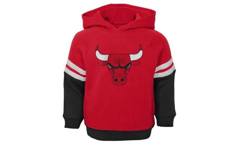
Sure, the logo started on basketball courts. But now? Sneakers, caps, tees – the Chicago Bulls logo is streetwear royalty. It has transcended from being a mere sports logo to a fashion statement.
Inspiring Other Designs
Many teams and brands have drawn inspiration from this iconic logo. It’s not just about copying but understanding the power a simple design can have. The Chicago Bulls logo is a lesson in design: keep it straightforward, keep it iconic.
FAQ On The Chicago Bulls Logo
Who designed the Chicago Bulls logo?
The creative architect behind the Chicago Bulls logo is Dean P. Wessel. Mr. Wessel crafted it in 1966, and it has largely remained unchanged ever since.
His design, featuring a fierce bull’s face with sharp horns, unites simplicity with a powerful representation of the team’s combative spirit.
What is the meaning behind the Chicago Bulls logo?
Depth and dynamism converge in the Chicago Bulls logo. It suggests power and tenacity—a bull ready for battle.
The red presents passion, while the stoic countenance of the bull mirrors the unwavering focus of the athletes and, by extension, Chicago’s characteristics of resoluteness and resilience.
When did the Chicago Bulls logo first appear?
Debuting alongside the birth of the team, the iconic Chicago Bulls logo made its first appearance in 1966.
Its inception coincided with the team’s introduction into the NBA, marking the onset of a new chapter in Chicago’s rich sporting history and laying the foundation for a globally recognized brand.
Has the Chicago Bulls logo ever changed?
Consistency is key; the Chicago Bulls have largely maintained the original logo’s design. Few tweaks have been made; minor color adjustments and refinements in detail.
That said, the quintessence—the bullish visage and the stark color palette—has stood the test of time, much like the team’s enduring legacy.
Why does the Chicago Bulls logo not have the word ‘Chicago’ in it?
Impactful in its brevity, the logo forgoes text to let imagery speak volumes; it’s the fierce charge of the bull that captures attention. The team’s domicile is widely recognized; the city’s name is made implicit—a global symbol doesn’t necessitate geographical identifiers.
How does the Chicago Bulls logo differ from other NBA team logos?
The Chicago Bulls logo distinguishes itself through its staunch adherence to tradition and singular focus.
In an arena where many franchises update their emblems frequently, the Bulls logo stands as a testament to stability and enduring brand identity within the NBA’s evolving landscape.
What does the color of the Chicago Bulls logo represent?
Each hue within the Chicago Bulls logo holds significance; red screams passion and energy, embodying the heart of the game.
Black underlines sophistication and power, an unstoppable force propelling the team forward. The colors encapsulate the raw emotion and the majestic prowess of the Bulls.
Is the Chicago Bulls logo one of the most recognized in the world?
Truly, the Chicago Bulls logo has soared beyond mere recognition in the NBA—it’s a global icon. Fueled by the team’s historic championship runs and the Michael Jordan phenomenon, the logo has become synonymous with excellence, etching itself into the fabric of pop culture.
How has the Chicago Bulls logo influenced sports branding?
As a paragon of sports branding, the Chicago Bulls logo illustrates the might of cohesive design.
It’s spurred a trend where logos embody a team’s persona, influencing sports branding towards creating symbols that resonate emotionally with fans and echo the essence of the city they represent.
Can I use the Chicago Bulls logo for personal projects?
Caution is advised; the Chicago Bulls logo falls under strict trademark laws. Personal projects, not for profit, may navigate safer waters, but commercial exploitation without permission is a direct violation. As a best practice, seek clarity through official channels before any use.
Conclusion
In the seamless tapestry of sports emblems, the Chicago Bulls logo stands as an unwavering icon, a beacon of both history and modernity fused together. Its visual power lies not just in design but in the tale it weaves—a narrative steeped in victories and the kind of legends that hardwood dreams are made of. It’s not merely an NBA logo; it has come to symbolize the relentless spirit of Chicago, a city that echoes the fortitude and the fiercely competitive nature of its beloved Bulls.
As this exploration comes to close, let’s consider:
- The timelessness of Dean P. Wessel’s design;
- The impact an unyielding symbol can have beyond the court — influencing fan gear, merchandise, and the realm of graphic design itself;
- The cultural resonance that transcends geographical boundaries, exemplified by this cherished red and black emblem.
Entrenched in the fabric of the sporting world, the Chicago Bulls logo remains not just an image, but a legacy proudly carried forward.
If you liked this article about the Chicago Bulls logo, you should check out this article about the Golden State Warriors logo.
There are also similar articles discussing the Miami Heat logo, the Houston Rockets logo, the Detroit Pistons logo, and the Milwaukee Bucks logo.
And let’s not forget about articles on the Cleveland Cavaliers logo, the Utah Jazz logo, the Toronto Raptors logo, and the Memphis Grizzlies logo.
Bogdan Sandu, a seasoned designer with 15 years of diverse experience, has been designing websites since 2008.
Renowned for his expertise in logo design and visual branding, Bogdan has developed a multitude of logos for various clients.
His skills extend to creating posters, vector illustrations, business cards, and brochures. Additionally, Bogdan's UI kits were featured on marketplaces like Visual Hierarchy and UI8.
Latest posts by Bogdan Sandu (see all)