


The Utah Jazz logo stands as one of professional basketball’s most recognizable emblems.
This combination mark blends a musical note with basketball imagery, creating a unique visual identity that connects New Orleans jazz heritage with Salt Lake City sports culture.
The franchise launched in 1974 as the New Orleans Jazz before relocating to Utah in 1979. The team has cycled through seven distinct logo iterations, yet the musical note concept has anchored their brand identity for over four decades.
Today’s version, unveiled in 2016, features the iconic J-note paired with “UTAH” text in a navy, gold, and green color scheme that reflects both franchise history and regional pride.
What is the Utah Jazz Logo?
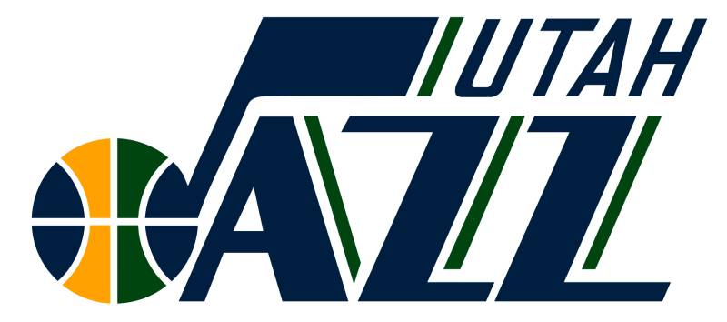
The Utah Jazz logo combines a stylized letter “J” shaped as a musical eighth note with an integrated basketball, positioned above “UTAH JAZZ” wordmark text. Introduced in its current form in May 2016, the design was created in-house by the Larry H. Miller Sports & Entertainment creative services team, with art direction by Ben Barnes.
Design Type: Combination mark (wordmark plus symbol)
Primary Elements:
- J-note symbol (musical eighth note integrated with basketball)
- “UTAH” wordmark in sans-serif font
- “JAZZ” wordmark in custom typeface
Official Introduction Date: May 12, 2016 (current version)
Designer/Agency: Ben Barnes (Art Director), Larry H. Miller Sports & Entertainment creative services department
Trademark Status: Registered trademark of the Utah Jazz organization
Color Palette:
- Navy Blue: Hex #002B5C, Pantone PMS 289 C, RGB (0, 43, 92), CMYK (100, 64, 0, 60)
- Gold/Yellow: Hex #F9A01B, Pantone PMS 137 C, RGB (249, 160, 27), CMYK (0, 43, 100, 0)
- Green: Hex #00471B, Pantone PMS 350 C, RGB (0, 71, 27), CMYK (80, 0, 90, 75)
Usage Context: Team uniforms, merchandise, digital platforms, Vivint Arena court design, promotional materials, social media branding
How Has the Utah Jazz Logo Evolved Over Time?

The Utah Jazz visual identity has undergone seven major transformations since 1974, cycling between musical note emphasis and mountain imagery before returning to its roots with the classic J-note design.
Each iteration reflects both NBA branding trends and the franchise’s connection to its New Orleans origins.
Original New Orleans Jazz Logo (1974-1979)
Years Active: 1974-1979
Design Description: Stylized purple “J” designed as an eighth musical note with a basketball forming the note’s base
Color Scheme: Purple, gold, green, with “NEW ORLEANS” script above
Designer: Unknown
Context: Created for the expansion franchise’s debut in New Orleans, the birthplace of jazz music
Key Changes from Previous: First logo design for the franchise
Cultural Significance: Directly honored New Orleans’ jazz music heritage and Mardi Gras color traditions
Utah Jazz Note Logo (1979-1996)
Years Active: 1979-1996
Design Description: Retained the original J-note design with “UTAH” replacing “NEW ORLEANS” in the wordmark
Color Scheme: Purple, gold, green maintained from New Orleans era
Designer: Unknown
Context: Following the 1979 relocation to Salt Lake City, the team kept its musical identity despite Utah’s lack of jazz heritage
Key Changes from Previous: Geographic wordmark change only. The J-note symbol remained identical.
Cultural Significance: Preserved franchise continuity and New Orleans roots while establishing Utah presence
Purple Mountain Logo (1996-2004)
Years Active: 1996-2004
Design Description: Purple basketball with white mountain peaks, surrounded by copper ring bearing “UTAH” text with “JAZZ” wordmark below in purple and turquoise
Color Scheme: Purple, copper, turquoise, black
Designer: Tom O’Grady (former NBA creative director)
Context: Inspired by the 1993 All-Star Game logo O’Grady designed, which featured Utah’s Wasatch Mountains. Introduced during the team’s championship run years.
Key Changes from Previous: Dramatic departure from musical note symbol to geographic mountain imagery
Cultural Significance: Aligned brand identity with Utah’s mountain landscape and natural beauty. Coincided with the Jazz’s back-to-back NBA Finals appearances in 1997 and 1998.
Navy Mountain Note Hybrid (2004-2010)
Years Active: 2004-2010
Design Description: Reintroduced J-note above basketball with mountain silhouette visible inside the sphere
Color Scheme: Navy blue, purple, powder blue, silver
Designer: Unknown
Context: Attempted to merge the classic note symbol with popular mountain imagery
Key Changes from Previous: Brought back musical note element while maintaining mountain reference
Cultural Significance: Transitional design bridging two distinct brand eras
Green Mountain Simplified (2010-2016)
Years Active: 2010-2016
Design Description: Streamlined purple basketball with white and green mountain peaks, encircled by navy ring with “UTAH” above and “JAZZ” below in gold
Color Scheme: Navy blue, green, gold, white, purple
Designer: Unknown
Context: Modernization effort with cleaner lines and updated color palette
Key Changes from Previous: Removed musical note entirely, simplified mountain design, introduced green as prominent color
Cultural Significance: Represented team’s commitment to Utah geographic identity
Classic J-Note Revival (2016-2022)
Years Active: 2016-2022
Design Description: Return to original 1974 J-note concept with “UTAH” wordmark added above “JAZZ” text. Navy, gold, and green color scheme.
Color Scheme: Navy blue, gold, green
Designer: Ben Barnes (Art Director)
Context: Fan demand drove return to classic design after mountain logo proved less popular. Created uniform 66-degree angle throughout all brand elements.
Key Changes from Previous: Eliminated mountains completely, revived musical note symbol with modern refinement
Cultural Significance: Acknowledged franchise heritage and fan preference for traditional identity
Current Logo (2022-Present)
Years Active: 2022-present
Design Description: Refined J-note with enhanced contrast and optimized digital rendering. Black and gold variations introduced for alternate uniforms.
Color Scheme: Navy blue, gold, green (primary); black and “spotlight yellow” (alternates)
Designer: Ben Barnes with Studio Dumbar/DEPT and The New Company (motion design and expanded brand system)
Context: Comprehensive rebranding ahead of 2022-23 season with expanded motion design language and social media templates
Key Changes from Previous: Subtle refinements to proportions and spacing. Introduction of 25-degree angled typography system echoing the musical note.
Cultural Significance: Balances historical continuity with contemporary design trends. Embraces “intrepid, innovative, and contrary” positioning that mirrors jazz music philosophy.
What Do the Design Elements of the Utah Jazz Logo Mean?
The J-note basketball hybrid serves as the central symbol, representing the franchise’s New Orleans musical origins fused with basketball culture.
The eighth note shape connects to jazz music’s improvisational rhythm and syncopation.
Why Does the Logo Feature a Musical Note?
The musical note directly references the team’s New Orleans Jazz origins from 1974.
New Orleans earned its reputation as the birthplace of jazz music, with the genre emerging from the city’s diverse cultural influences in the early 20th century. When the franchise launched as an expansion team, the “Jazz” name honored this heritage.
The eighth note specifically was chosen because it’s a fundamental musical symbol representing rhythm and timing. These concepts parallel basketball’s pace and flow.
Though the team relocated to Salt Lake City in 1979, they retained the jazz identity. The musical note remains their most recognizable design element across all logo iterations.
Why Did Utah Jazz Choose These Specific Colors?
Navy Blue symbolizes strength, reliability, and professionalism.
The dark blue provides strong contrast against light backgrounds and creates visual hierarchy in the design. Hex code #002B5C, Pantone PMS 289 C.
Gold/Yellow represents excellence, achievement, and the “spotlight designated to the greatest performers in history” according to team branding materials.
The bright gold creates energy and optimism. Hex code #F9A01B, Pantone PMS 137 C.
Green connects to Utah’s natural landscape and outdoor recreation culture. The deep green grounds the palette and provides balance between warm and cool tones.
Hex code #00471B, Pantone PMS 350 C. Together, these colors reference both Mardi Gras traditions (purple, gold, green) and Utah’s mountain environment.
What Typography Style Is Used in the Utah Jazz Logo?
The “JAZZ” wordmark uses a custom font with the J designed as a musical eighth note.
The letterforms feature bold, assertive strokes with slight italicization suggesting forward movement. The “UTAH” text employs a clean sans-serif font with condensed proportions.
All typography elements align at a 66-degree angle, creating rhythm and unity across the brand system. This consistent angle appears in jersey stripes, court designs, and digital graphics.
The 2022 rebrand introduced a customized version of Plaak typeface by 205ft for extended brand communications, with a 25-degree variant echoing the musical note angle.
What Are the Hidden Meanings in the Utah Jazz Logo?
The basketball integrated into the J-note base creates dual symbolism – music and sport merge into one element.
This fusion represents how basketball players improvise like jazz musicians, reading the game and adapting rhythmically.
The curved J shape mimics a saxophone’s form, though this connection wasn’t explicitly stated by designers. The white and black color scheme used in alternate versions references piano keys, “a significant element in the history of jazz music” per official team statements.
The 66-degree angle applied throughout the brand system isn’t arbitrary. It creates dynamic energy and suggests upward movement, matching the team’s aspirational messaging.
How Does the Utah Jazz Logo Compare to Competitor Logos?
The Utah Jazz logo stands apart from other NBA logos through its musical symbolism rather than animal mascots or geographic imagery.
While teams like the Toronto Raptors, Memphis Grizzlies, and Milwaukee Bucks use wildlife, and the Denver Nuggets reference mining heritage, the Jazz maintains its cultural arts connection.
Similar Approach: The New Orleans Pelicans also connects to Louisiana culture, though through state bird imagery rather than music.
Color Comparison: Few NBA teams use navy, gold, and green together. The Cleveland Cavaliers employ wine and gold, while the Boston Celtics use green and white. The Jazz color palette creates unique recognition.
Wordmark Emphasis: Like the Brooklyn Nets and Dallas Mavericks, the Jazz prioritizes wordmark design over pictorial symbols. This contrasts with icon-focused logos like the Chicago Bulls or Miami Heat.
Design Simplicity: The J-note achieves instant recognition through minimalist design principles, similar to the Portland Trail Blazers pinwheel logo. Both avoid complex illustration in favor of geometric clarity.
What Are the Technical Specifications of the Utah Jazz Logo?
Official Color Codes:
Primary Navy Blue:
Gold/Yellow:
- Hex: #F9A01B
- RGB: (249, 160, 27)
- CMYK: (0, 43, 100, 0)
- Pantone: PMS 137 C
Green:
- Hex: #00471B
- RGB: (0, 71, 27)
- CMYK: (80, 0, 90, 75)
- Pantone: PMS 350 C
Alternate Spotlight Yellow:
- Pantone: 107 C (used in 2022 black and yellow uniforms)
Alternate Key Black:
- Pantone: Process Black C
Dimensions and Proportions:
- Aspect ratio: Approximately 3:2 (width to height) for primary logo
- Minimum size requirements: 0.5 inches width for print, 72 pixels for digital
- Clear space specifications: Minimum clear space equals the height of the “U” in “UTAH”
- All brand elements align at 66-degree angle
- Typography system includes 25-degree variant for motion graphics
Official Usage Guidelines:
The logo must maintain proper alignment and baseline positioning. Color theory principles dictate navy serves as primary with gold and green as accents.
Official files are provided in vector graphics formats (EPS, SVG) for scalability, plus raster formats (PNG, JPEG) at various resolutions. Minimum DPI for print applications is 300.
What Cultural Impact Has the Utah Jazz Logo Had?
The purple mountain logo from 1996-2004 became synonymous with the Stockton-Malone era and the team’s back-to-back NBA Finals appearances.
Fans still wear vintage mountain logo merchandise decades later. When the team attempted to move away from this design, the backlash led to its return as a throwback “City Edition” uniform.
The J-note symbol has achieved recognition beyond basketball. It appears in Salt Lake City public art, local business branding, and represents Utah sports culture broadly.
The logo’s evolution mirrors broader trends in sports branding. The shift from musical note to mountains to note again demonstrates how teams balance tradition with contemporary design trends.
The 2022 black and yellow rebrand faced significant criticism from fans who preferred traditional purple. This tension between innovation and heritage reflects ongoing debates in sports design about respecting history versus modernization.
How Does the Utah Jazz Logo Fit Into the Overall Brand Identity?
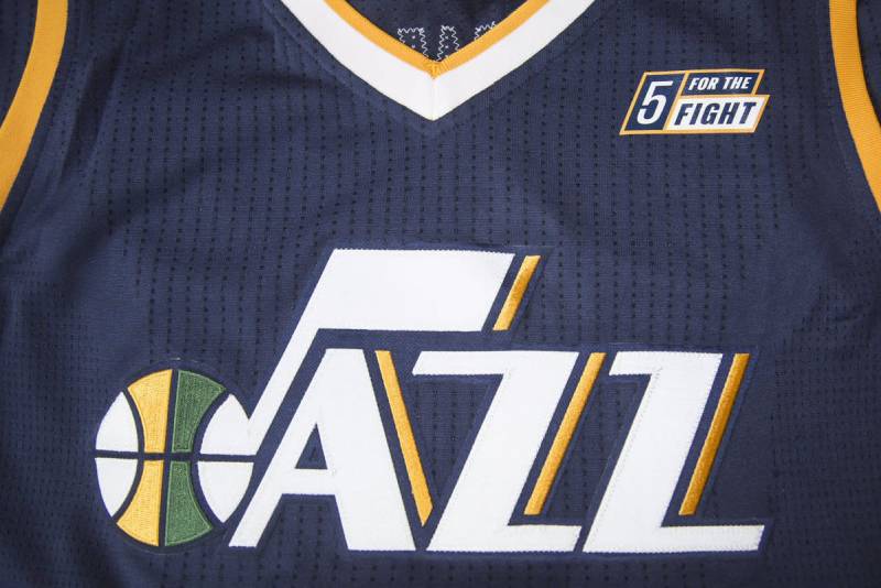
The logo serves as the focal point for a comprehensive brand system that extends to court design, uniforms, digital platforms, and arena environments.
The 66-degree angle from the logo repeats in jersey striping, creating repetition and rhythm across touchpoints. The three-color palette maintains consistency from tickets to social media graphics.
Vivint Arena features the logo at center court with matching color applications throughout the venue. Secondary logos include the tri-colored basketball mark and isolated J-note symbol for flexible applications.
The brand guidelines emphasize “intrepid, innovative, and contrary” positioning that mirrors jazz music’s improvisational nature. This philosophy influences design decisions, photography direction, and content storytelling.
Typography choices, custom patterns, and motion design language all stem from core logo elements. The 2022 collaboration with Studio Dumbar created templates for social media, animated graphics, and arena displays that extend the visual system.
How Should the Utah Jazz Logo Be Used?
Official Usage Guidelines:
Do:
- Maintain proper clear space around the logo
- Use official color specifications for print and digital
- Download official files from team-approved sources
- Preserve aspect ratios when scaling
- Use vector graphics for professional applications
Don’t:
- Alter colors or add effects like gradients or shadows
- Rotate, skew, or distort the logo
- Use low-resolution images for large-format printing
- Place logo on busy backgrounds that reduce legibility
- Modify typography or spacing
Where to Access Official Logos:
Official logos are available through the Utah Jazz media relations department for credentialed media and commercial partners. Unauthorized use for commercial purposes violates trademark protections.
Fans can access approved logo files through official team merchandise channels. High-resolution files require proper licensing for commercial applications.
Licensing Information:
The Utah Jazz logo is a registered trademark owned by the team organization. Commercial use requires written permission and licensing agreements. Editorial and news use follows fair use guidelines with proper attribution.
Trademark Protection:
The logo is protected under U.S. trademark law. The team actively enforces its intellectual property rights against unauthorized commercial use. Counterfeit merchandise bearing the logo faces legal action.
For print applications, follow brand guidelines for CMYK color specifications. Digital use should reference RGB and hex codes. When preparing print-ready files, ensure proper bleed and trim size settings.
FAQ About the Utah Jazz Logo
When was the Utah Jazz logo created?
The original Jazz logo debuted in 1974 when the franchise launched in New Orleans. The current version featuring the J-note with “UTAH” text above “JAZZ” was introduced May 12, 2016.
Who designed the Utah Jazz logo?
Tom O’Grady, former NBA creative director, designed the iconic purple mountain logo (1996-2004). Ben Barnes, the team’s art director, led the 2016 J-note revival and 2022 comprehensive rebrand with contributions from Studio Dumbar and The New Company.
What do the colors in the Utah Jazz logo mean?
Navy blue represents strength and reliability. Gold symbolizes excellence and achievement. Green connects to Utah’s natural landscape. The combination references both Mardi Gras traditions and mountain state identity.
How many times has the Utah Jazz logo been redesigned?
The franchise has used seven distinct primary logos: 1974 New Orleans original, 1979 Utah adaptation, 1996 purple mountain, 2004 mountain-note hybrid, 2010 simplified mountain, 2016 J-note revival, and 2022 refined current version.
Where can I download the official Utah Jazz logo?
Official logos for media use are available through the Utah Jazz communications department. Commercial licensing requires written permission. Fans can find approved graphics through official team merchandise retailers and the NBA website.
Is the Utah Jazz logo trademarked?
Yes. The Utah Jazz logo is a registered trademark owned by the franchise organization. Commercial use without proper licensing violates trademark protections and can result in legal action.
What font is used in the Utah Jazz logo?
The “JAZZ” wordmark uses a custom font with the J designed as a musical note. “UTAH” employs a condensed sans-serif font. Extended brand communications use customized Plaak typeface by 205ft.
Why did Utah Jazz choose a musical note for their logo?
The musical note honors the team’s New Orleans origins as the birthplace of jazz music. When founded in 1974, the franchise name celebrated the city’s cultural heritage. Despite relocating to Utah in 1979, the team retained this identity.
Conclusion
The Utah Jazz logo exemplifies how sports franchises can honor their origins while adapting to new contexts.
The J-note symbol has persisted through seven design iterations, proving its strength as a core brand element. Key attributes include the musical eighth note integrated with basketball imagery, navy-gold-green color palette, and wordmark emphasis using custom typography.
Within NBA branding, the Jazz logo occupies unique territory by connecting to cultural arts rather than animals or geography. The recent return to classic design elements demonstrates that successful logo design principles prioritize authenticity and fan connection over trends.
As the franchise continues evolving, the musical note symbol will likely remain central to their visual identity, linking Salt Lake City to New Orleans across five decades of professional basketball.
If you liked this article about the Utah Jazz logo, you should check out this article about the Chicago Bulls logo.
There are also similar articles discussing the Golden State Warriors logo, the Miami Heat logo, the Houston Rockets logo, and the Detroit Pistons logo.
And let’s not forget about articles on the Milwaukee Bucks logo, the Cleveland Cavaliers logo, the Toronto Raptors logo, and the Memphis Grizzlies logo.

Renowned for his expertise in logo design and visual branding, Bogdan has developed a multitude of logos for various clients.
His skills extend to creating posters, vector illustrations, business cards, and brochures. Additionally, Bogdan's UI kits were featured on marketplaces like Visual Hierarchy and UI8.
He also wrote in the past years on sites like Design Your Way, WebDesignerDepot, WPDean, Designmodo, Speckyboy, Slider Revolution, and more.
- Canva vs PowerPoint: Which Is Better for Presentations? - 22 September 2026
- How to Install Fonts on Mac (Step-by-Step Guide) - 20 September 2026
- From Mockup to Code: How AI-Augmented Development Speeds Up the Design Handoff - 19 September 2026

Bogdan Sandu is a seasoned designer who has been designing websites since 2008. Renowned for his expertise in logo design and visual branding, Bogdan has developed a multitude of logos for various clients. His skills extend to creating posters, vector illustrations, business cards, and brochures. Additionally, Bogdan's UI kits were featured on marketplaces like Visual Hierarchy and UI8. He also wrote in the past years on sites like Design Your Way, WebDesignerDepot, WPDean, Designmodo, Speckyboy, Slider Revolution, and more.
You Might Also Like


