Every element you add to a layout is a decision. Every element you remove is a better one. That’s the core logic behind minimalist graphic design, an approach that reduces visual communication to only what’s needed to deliver the message.
It sounds simple. It’s not. Stripping a composition down to its fundamentals while keeping it functional, accessible, and visually compelling takes more skill than filling a canvas with decoration.
This guide covers how minimalism works in practice: its origins in the Bauhaus and Swiss movements, the specific principles that define it, where it fits (and where it doesn’t), common mistakes that weaken results, and the psychological impact it has on how audiences perceive brands and products.
What Is Minimalist Graphic Design?

Minimalist graphic design is a visual communication approach that strips a composition down to only what’s needed to deliver its message. Every shape, line, and color choice must justify its presence on the canvas. If it doesn’t serve a purpose, it gets cut.
This isn’t the same as “simple” or “clean” design, though people mix them up constantly. A clean layout can still have twelve elements fighting for attention. Minimalism demands that you remove those twelve and keep three.
The roots go back to early 20th-century art movements. Bauhaus design pushed the idea that form follows function, stripping away decoration in favor of geometric precision. De Stijl reduced everything to primary colors and straight lines. Then Swiss design, also called the International Typographic Style, took those ideas and built a formal system around them in the 1950s.
Josef Müller-Brockmann, Armin Hofmann, and Max Bill turned this philosophy into a repeatable method. Asymmetrical layouts. Grid systems for structure. Sans-serif typefaces like Helvetica for clarity. Their work remains some of the most referenced material in design education today.
The distinction matters: minimalism is a reductive approach to visual hierarchy. It’s not about having less stuff on the page. It’s about making fewer things do more work.
According to a 2023 Adobe survey, nearly two-thirds of consumers favor minimalist designs, with Millennials and Gen Z leading that preference. The style isn’t just an aesthetic choice at this point. It’s a communication strategy backed by measurable audience demand.
Core Principles of Minimalist Graphic Design

There’s a difference between understanding minimalism and actually pulling it off. These are the specific constraints that separate this approach from everything else.
The Role of Negative Space
White space in a minimalist layout isn’t leftover area. It’s a working design element that directs attention, groups related content, and creates breathing room around what matters most.
A Wichita State University study found that whitespace improves reading comprehension by up to 20%, though it may slightly reduce reading speed. That trade-off is the entire point of minimalism: slower consumption, better understanding.
Designers split it into two types. Micro white space handles the gaps between lines, paragraphs, and small UI components. Macro white space separates major layout sections and creates the overall sense of openness. Both need to be balanced, or the design feels either cramped or abandoned.
Apple’s product pages are probably the most cited example. Their use of negative space around product imagery has become so distinctive that it functions as branding itself, recognizable without any visible logo.
Typography Choices in Minimalist Work
When you remove most visual elements from a layout, typography has to carry the entire composition. The font choice becomes the design, not just a part of it.
Monotype’s 2024 Font Use & Forecasting Survey found that 76% of designers prioritize readability and accessibility when choosing typefaces. Sans-serif fonts remain the dominant pick for minimalist work, but that’s starting to shift.
Monotype’s 2023 Type Trends report noted a 25% increase in elongated sans-serif usage in luxury branding. And serif fonts are making a quiet comeback in editorial minimalism, now that larger screens have resolved older readability concerns.
Typographic hierarchy does the heavy lifting here. Scale, weight, and spacing between letters replace decorative graphics. A single typeface at three different sizes can structure an entire page if the leading and kerning are handled well.
Color Restraint and Contrast
Minimalist palettes typically stay within one to three colors. That’s it. The fewer the colors, the harder each one has to work.
| Color Approach | Common Use | Effect |
|---|---|---|
| Monochromatic | Editorial, brand identity | Cohesion, elegance |
| Neutral + single accent | UI, packaging | Focus, clarity |
| Black and white only | Posters, logos | Maximum contrast |
Pantone‘s 2025 Color of the Year, Mocha Mousse, reflects a broader push toward warm neutrals in minimalist contexts. The days of stark, cold-white minimalism are fading. Designers are pulling in earth tones, soft taupes, and muted greens to add warmth without visual clutter.
Color theory still applies here, just with fewer variables. Color psychology becomes more noticeable when you’re only working with two hues. A single accent color against a neutral background creates a focal point that’s hard to miss.
Where Minimalist Graphic Design Works Best
Minimalism doesn’t fit every project. Knowing where it works (and where it doesn’t) is half the skill.
Brand Identity and Logo Design
McKinsey’s 2024 data shows luxury brands using minimalist strategies have 18% greater customer retention than those relying on loud, logo-heavy branding. That’s not a small number.
Apple, Muji, and Aesop built entire visual identities around restraint. Their brand guidelines read like exercises in what to leave out. Muji doesn’t even translate its name on most products. The absence of information becomes the brand signal.
Brands like The Row and Loro Piana have taken this further. Deloitte’s 2023 research found that stealth-branded luxury products often command higher average prices than their logo-heavy equivalents. Minimalism, paradoxically, signals more confidence than maximalism in these markets.
Digital Products and Web Interfaces
94% of first impressions are design-driven, according to Digital Silk’s 2026 research. Users form opinions in under half a second, and cluttered layouts push them away almost instantly.
Stripe’s website, Linear’s interface, and Google’s homepage all follow minimalist web design principles. Clean layouts. Generous spacing. Typography that guides you through content without needing additional visual cues.
A Nielsen Norman Group analysis of 112 minimalist websites found over 90% used flat patterns and limited monochromatic color palettes. More than 80% maximized their use of negative space while keeping features and navigational elements to a minimum.
Where Minimalism Falls Short
Children’s products, entertainment marketing, event posters that need raw energy. These don’t work with two colors and a single typeface. At least, not usually.
Packaging design for food brands often needs color density and visual warmth to compete on shelves. And poster design for concerts or festivals thrives on controlled chaos, not calculated emptiness.
The point is: minimalism is a tool, not a religion. Use it where it serves the audience and the message.
Techniques for Creating Minimalist Designs

Knowing the principles is one thing. Actually making a minimalist design that doesn’t look empty or unfinished takes specific methods. Took me a while to figure out that starting minimal almost never works. You need to start full and cut.
The Subtraction Method
Begin with everything. Every element you think the layout needs. Then start removing things one at a time.
After each removal, ask: did the message get weaker? If not, the element wasn’t doing anything. Keep going until something breaks. Then add that last piece back. That’s your design.
Dieter Rams built his career at Braun on this exact process. His ten principles of good design circle back to one idea: good design is as little design as possible. His product work for Braun in the 1960s became the visual DNA for Apple’s hardware decades later.
The squint test is a quick way to check progress. Squint at your layout. Whatever you notice first is your focal point. If nothing stands out, the hierarchy isn’t working yet.
Working Within Self-Imposed Constraints
One font. Two colors. No images.
That’s it. Set these rules before you open any design software. The constraint forces creativity because you can’t fall back on another stock photo or a third accent color when the layout feels flat.
Working in grayscale first, before adding any color, is another effective constraint. It forces the graphic design principles of alignment, balance, and emphasis to do all the work. If the design falls apart without color, the structure isn’t strong enough.
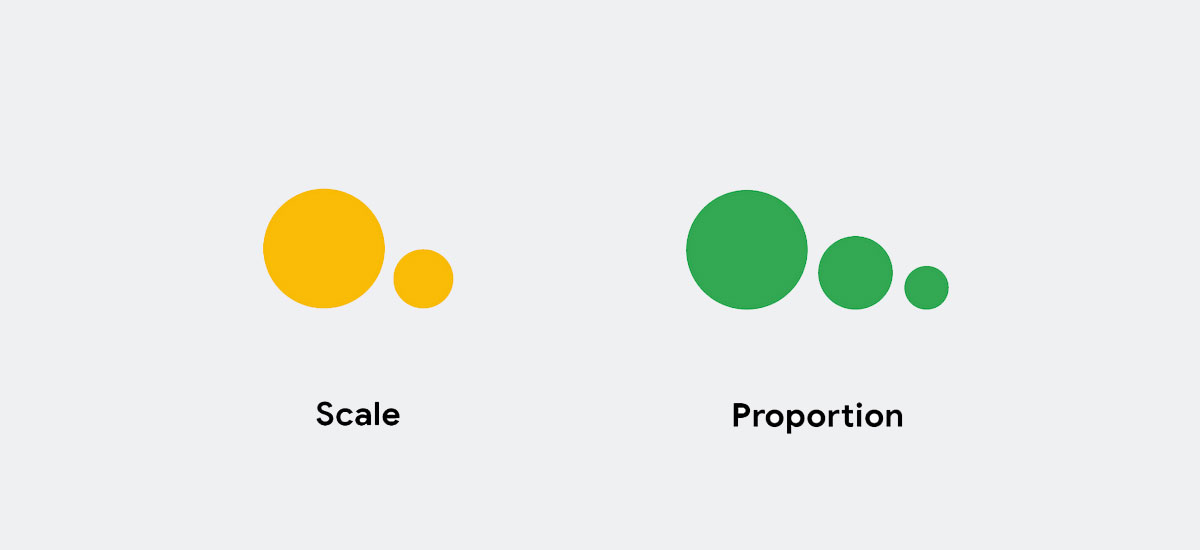
Try using type scale and weight as your only tools for creating scale and proportion. A bold heading at 72px next to body text at 14px creates natural tension and hierarchy without needing any graphic elements at all.
Minimalist Design vs. Flat Design
People use these terms interchangeably. They shouldn’t.
Flat design removes skeuomorphism, those fake shadows and textures that made early iPhone apps look like physical objects. Minimalist design removes everything that doesn’t serve the message. These overlap, but they’re solving different problems.
| Aspect | Minimalist Design | Flat Design |
|---|---|---|
| Core goal | Communication with fewest elements | Elimination of 3D visual effects |
| Can be visually busy? | No | Yes (Material Design is flat but dense) |
| Color palette | Typically 1–3 colors | Can use many bold colors |
| Origin | Art/print, 1920s–1960s | Digital UI, 2012–2013 |
| Applies to | Print, digital, packaging, branding | Primarily digital interfaces |
Google’s Material Design is flat. It avoids gradients and realistic textures. But it’s absolutely not minimalist. Material Design layers cards, icons, navigation drawers, and floating action buttons across the screen. That’s flat UI with high information density.
When Apple introduced iOS 7 in 2013, it pushed flat aesthetics into mainstream digital design. But Jony Ive’s team still used blur effects, layered translucency, and depth cues. Flat, yes. Minimal? Only in certain spots.
The graphic design movements that fed into minimalism, from Constructivism to Swiss Style, cared about reducing decoration to improve communication. Flat design cared about reducing visual noise to improve usability. Related goals, different starting points.
And then there’s Brutalist design, which rejects both approaches entirely. Raw HTML, default system fonts, no polish. It’s worth knowing about if only to understand what minimalism is not. Minimalism is still refined. Brutalism is deliberate roughness.
Tools and Software for Minimalist Graphic Design
The software matters less than you’d think. But some tools fit the minimalist workflow better than others.
Vector and Layout Tools
Figma has become the default for most digital minimalist work. Its auto-layout features enforce baseline grid thinking naturally, and component-based design keeps things consistent across screens. The collaborative editing is a bonus when working on brand identity systems with multiple designers.
Adobe Illustrator still handles vector graphics with more precision than anything else. For logo design and print design work, the control over anchor points, pathfinder operations, and color management (including full CMYK and RGB support) makes it hard to replace.
Canva gets the job done for quick social media posts and presentations. But its template-driven approach tends to fight against true minimalism. You end up spending more time removing default elements than building from scratch.
Typography and Color Resources
Google Fonts offers a huge library, and pairing fonts from it has become standard practice. Typewolf is better for finding distinctive combinations that don’t look like every other website.
For color, tools that work within limited palettes are more useful than massive generators. Coolors lets you lock a single base saturation and generate restrained options around it. And if you’re working in print, understanding DPI requirements matters more than picking the perfect hex code.
Procreate works surprisingly well for hand-drawn minimalist illustration. The limitation of a tablet screen and a single brush can push you toward simpler, bolder strokes that fit the aesthetic naturally.
Examples of Minimalist Graphic Design Done Right
Theory is useful. Seeing it work in the real world is better. These are specific cases where minimalism didn’t just look good, it solved a communication problem.
Print Examples
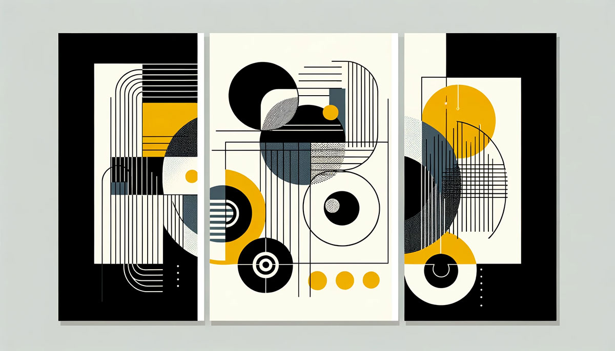
Josef Müller-Brockmann’s “Musica Viva” concert posters from the 1950s and 1960s remain the gold standard. Abstract geometric shapes, a limited color palette, and typographic elements set in Akzidenz-Grotesk. No illustrations, no photographs, no noise. The posters conveyed musical rhythm through pure visual form.
Armin Hofmann’s “Giselle” ballet poster for Basel’s Stadt Theater is another textbook case. Simple geometric shapes, stark black-and-white contrast, and just enough information to communicate the event without cluttering the visual. Both designers are regularly cited among the most famous graphic designers of the 20th century.
Massimo Vignelli’s work for the New York City subway system turned wayfinding into a masterclass in restraint. Helvetica. Color-coded lines. Clear spatial relationships. Millions of people navigate by his system every day without thinking about why it works. That’s the point.
Digital and Brand Examples
Apple: Their product pages use full-bleed imagery on neutral backgrounds with generous spacing. Nielsen Norman Group’s analysis noted Apple’s layouts rely on macro whitespace to create a premium, uncluttered experience that lets hardware become the focal point.
Stripe: The fintech company’s website treats typography as structure. Clean sans-serif type, generous line height, and a restrained color system that uses complementary contrast against white backgrounds.
Muji: The Japanese retailer’s brand identity barely exists in a traditional sense. No loud logo, no tagline, minimal text on packaging. The brand style is communicated entirely through the absence of visual noise, paired with natural materials and earth-tone monochromatic colors.
Notion: Its interface uses black-and-white monoline icons, no gradients or drop shadows, and generous whitespace around content blocks. The design feels like a Swiss editorial layout adapted for a digital workspace.
Common Mistakes in Minimalist Graphic Design
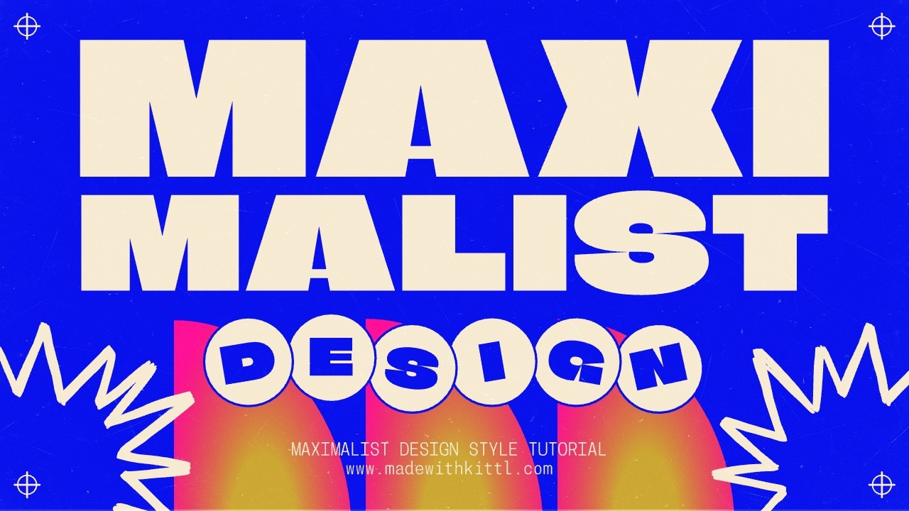
Minimalism is easy to attempt and tricky to pull off. Most failures come from misunderstanding what the approach actually requires.
Confusing Empty with Minimal
Removing everything is not the same as being selective. A page with a tiny logo in the corner and nothing else isn’t minimalism. It’s an incomplete design.
The whole point is that fewer elements carry more weight, not less. Each remaining piece has to do the job of three. When designers strip too aggressively, the message disappears along with the decoration.
Weak Typography That Can’t Carry the Layout
Monotype’s 2024 survey found 83% of designers recognize typography’s importance in brand identity. In minimalist work, that number should be 100%. There’s nothing else to lean on.
A bad typeface choice destroys a minimalist layout faster than it would a busy one. Light-weight variable fonts at small sizes on low-contrast backgrounds. Tracking that’s too tight, leading that squeezes lines together. These mistakes get amplified when there’s nothing else on the page to distract from them.
Ignoring Accessibility
This is the big one. WebAIM’s 2025 Million report found low-contrast text on 79.1% of home pages, making it the most common accessibility failure on the web.
Minimalist design is particularly prone to this problem. Light gray text on white backgrounds looks refined but fails WCAG contrast requirements. Ultra-thin typefaces read well on a 27-inch Retina display but become illegible on a budget Android phone.
| Common Accessibility Issue | Minimalist Risk | Fix |
|---|---|---|
| Low contrast text | Very high (light palettes) | Use contrast checkers, aim for 4.5:1 ratio |
| Missing visual cues | High (removed decorations) | Add subtle indicators for interactive elements |
| Small font sizes | Medium (aesthetic choice) | Set body text at 16px minimum |
| No focus indicators | High (removed outlines) | Style custom focus states instead of removing them |
Color blindness affects roughly 1 in 12 males globally, around 350 million people. A minimal palette that relies on two similar hues to distinguish information will fail for a significant portion of users.
Using Minimalism as a Shortcut
This one stings because it’s common. Putting a few words on a white page takes ten minutes. But that’s not minimalism, it’s low effort wearing a costume.
Real minimalist work takes more time, not less. Every spatial relationship, every type size, every color value has to be precise because there’s no visual clutter to hide behind. Dieter Rams didn’t simplify things because it was easier. He simplified things because it made them better, and that process took longer than doing it the complicated way.
How Minimalist Graphic Design Affects User Perception
Minimalism doesn’t just look a certain way. It makes people feel a certain way, and there’s research to back that up.
Cognitive Load and Processing Speed
Fewer elements on a page means the brain processes information faster. A Wichita State University study confirmed that whitespace improves comprehension by up to 20% by reducing visual competition between elements.
Product pages with well-managed spacing show 20-30% lower bounce rates compared to cluttered alternatives. That tracks with how short-term memory works and with Gestalt principles like proximity. Research on Miller’s Law suggests we process about 7±2 chunks of information at a time. Minimalist layouts naturally group content into fewer chunks, making the whole page easier to absorb.
Perceived Value and Luxury Associations
A study published in the Journal of Consumer Research by Pracejus, Olsen, and O’Guinn found that whitespace increases perceived product value by up to 300% in digital environments. Products surrounded by generous spacing received quality ratings averaging 7.8 out of 10, compared to 5.2 for the same products in dense layouts.
A 2025 study in the Journal of Sensory Studies confirmed this with packaging. Large white spaces and refined typefaces both increased luxury perception and product quality ratings among 1,193 participants.
Brands like Aesop and The Row lean on this effect. Their restrained visual language signals confidence and quality without saying a word about either. The design does the storytelling. And the psychological weight of the chosen fonts amplifies that perception even further.
Cultural Considerations
Western vs. East Asian preferences:
- Western audiences tend to associate whitespace with sophistication and luxury
- East Asian markets historically favor higher visual density and information-rich layouts
- Japanese brands like Muji and IKEA-inspired Scandinavian aesthetics have created a bridge between these tendencies
A 2024 study on Generation Z in Indonesia found that minimalist designs using white space and clean type increased user engagement by up to 30%. But the researchers emphasized that cultural and generational context shapes how audiences respond to sparse visuals.
Adobe’s 2023 data showed 38% of people stop engaging with a website if the layout is unattractive. But “attractive” doesn’t mean the same thing everywhere. A minimalist landing page that performs well in Stockholm might underperform in Seoul without adjustments to information density and visual warmth.
Your mileage may vary. Literally. Know your audience before committing to maximum restraint.
FAQ on Minimalist Graphic Design
What is minimalist graphic design?
It’s a visual communication approach that uses the fewest possible elements to deliver a clear message. Every shape, color, and font choice must earn its place. If it doesn’t serve the composition, it gets removed.
What are the core principles of minimalist design?
Limited color palettes, generous white space, strong typographic hierarchy, and grid-based alignment. Every remaining element carries more weight because there’s nothing else competing for attention.
How is minimalist design different from flat design?
Flat design removes 3D visual effects like shadows and textures. Minimalist design removes everything that doesn’t serve the message. Google’s Material Design is flat but visually dense. Minimalism demands fewer elements overall.
What tools work best for minimalist graphic design?
Figma handles digital layouts with auto-layout and component systems. Adobe Illustrator gives precision for vector work and logo projects. Typewolf and Google Fonts help with pairing clean typefaces.
Which brands use minimalist design effectively?
Apple, Muji, Aesop, and Stripe all built their visual identities around restraint. Their layouts rely on negative space, clean type, and limited color to communicate quality and confidence without visual clutter.
Is minimalist design good for SEO and web performance?
Yes. Fewer elements typically mean faster page loads and cleaner code. Minimalist layouts also improve readability and reduce bounce rates, both of which support stronger search performance over time.
What are common mistakes in minimalist design?
Confusing empty with minimal, choosing weak typography that can’t carry a layout alone, and ignoring accessibility standards like color harmony and contrast ratios. Low-effort work disguised as minimalism is another frequent problem.
Does minimalist design work for every industry?
No. It fits luxury branding, tech, editorial design, and packaging well. But children’s products, entertainment marketing, and event promotions often need more visual energy and color density to connect.
How does minimalist design affect user perception?
Research shows whitespace increases perceived product value by up to 300% in digital settings. Audiences associate sparse, well-structured layouts with luxury, trustworthiness, and higher quality.
Where did minimalist graphic design originate?
Its roots trace to the Bauhaus school in the 1920s and the Swiss International Typographic Style of the 1950s. Designers like Josef Müller-Brockmann and Dieter Rams shaped the philosophy that still drives the approach today.
Conclusion
Minimalist graphic design isn’t about doing less work. It’s about making fewer elements do more.
The approach demands precision in every decision, from glyph selection to the exact ratio of negative space around a display font. Get it right, and the result communicates faster, feels more premium, and holds attention longer than any cluttered alternative.
But it only works when the fundamentals are solid. Strong compositional structure, accessible color choices, and typefaces that can carry an entire layout on their own.
Start with everything. Remove until it breaks. Add the last piece back. That’s the process. The simplicity you see in the final result is always the hardest part to achieve.
Skip the shortcuts. Do the reduction honestly. The work speaks louder when there’s less of it competing for attention.

Renowned for his expertise in logo design and visual branding, Bogdan has developed a multitude of logos for various clients.
His skills extend to creating posters, vector illustrations, business cards, and brochures. Additionally, Bogdan's UI kits were featured on marketplaces like Visual Hierarchy and UI8.
He also wrote in the past years on sites like Design Your Way, WebDesignerDepot, WPDean, Designmodo, Speckyboy, Slider Revolution, and more.
- The Arc Browser Logo History, Colors, Font, And Meaning - 14 September 2026
- From Information to Persuasion: A Practical Framework for Strategic Presentation Design - 14 September 2026
- Canva vs Photoshop: When Does Each Make Sense? - 12 September 2026

Bogdan Sandu is a seasoned designer who has been designing websites since 2008. Renowned for his expertise in logo design and visual branding, Bogdan has developed a multitude of logos for various clients. His skills extend to creating posters, vector illustrations, business cards, and brochures. Additionally, Bogdan's UI kits were featured on marketplaces like Visual Hierarchy and UI8. He also wrote in the past years on sites like Design Your Way, WebDesignerDepot, WPDean, Designmodo, Speckyboy, Slider Revolution, and more.
You Might Also Like