The Philadelphia Flyers logo stands as one of the most recognizable emblems in professional hockey. A logo does more than identify a team. It carries decades of history, fan memories, and franchise identity in a single graphic mark.
The Flyers entered the NHL during the 1967 expansion, bringing orange and black to the league’s visual landscape. Since then, the winged P has become synonymous with Philadelphia hockey. The logo has seen only minor refinements across nearly six decades, which is pretty rare for professional sports.
Currently, the team uses a version introduced in 1999. The franchise has cycled through just a handful of iterations total. That kind of consistency? It speaks to how well the original concept worked.
What Is the Philadelphia Flyers Logo?
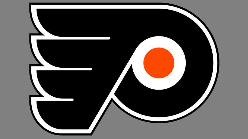
The Philadelphia Flyers logo features an orange winged letter “P” set against a black circular background. Officially introduced in 1967 when the franchise joined the NHL, the emblem symbolizes speed, flight, and Philadelphia’s heritage. The design has remained remarkably consistent, with the current version dating to 1999.
Key Attributes:
- Design Type: Combination mark (letter integrated with symbolic element)
- Primary Elements: Stylized “P” with four wings extending outward, contained within a black circle
- Official Introduction Date: 1967 (original), 1999 (current iteration)
- Designer/Agency: Sam Ciccone, a local Philadelphia artist
- Trademark Status: Registered trademark of Philadelphia Flyers LLC and Comcast Spectacor
- Color Palette: Flyers Orange (#F74902), Black (#000000), White (#FFFFFF)
- Usage Context: Jerseys, arena signage, merchandise, digital platforms, broadcast graphics
How Has the Philadelphia Flyers Logo Evolved Over Time?

The Flyers logo has changed less than most NHL logos over the decades.
From 1967 to now, only subtle refinements have occurred.
The core winged P concept has never been abandoned. Most updates involved color adjustments and proportion tweaks rather than complete redesigns.
Original Philadelphia Flyers Logo (1967-1999)
- Years Active: 1967-1999
- Design Description: Orange winged P on black circle, with wings extending in four directions
- Color Scheme: Orange, black, white border
- Designer: Sam Ciccone
- Context: Created for the 1967 NHL expansion. Philadelphia wanted something that conveyed speed and aggression.
- Key Changes from Previous: N/A (original design)
- Cultural Significance: This logo accompanied the Broad Street Bullies era and two Stanley Cup championships in 1974 and 1975
Refined Philadelphia Flyers Logo (1999-Present)
- Years Active: 1999-present
- Design Description: Same winged P concept with cleaner lines and slightly adjusted proportions
- Color Scheme: Brighter orange (#F74902), deeper black, crisper white accents
- Designer: In-house refinement
- Context: Updated to work better on HD broadcasts and digital media
- Key Changes from Previous: Sharper wing edges, more defined letter strokes, updated orange shade
- Cultural Significance: Maintained brand continuity while modernizing for new media formats
What Do the Design Elements of the Philadelphia Flyers Logo Mean?
The winged P carries layered meanings that connect Philadelphia’s history to the sport of hockey.
Wings represent speed and the fast-paced nature of the game.
The letter P grounds everything in the city’s identity. Together, they create a mark that’s both athletic and geographically specific.
Why Did the Philadelphia Flyers Choose These Specific Colors?
Orange and black weren’t random picks. The psychology behind color choices in sports branding runs deep.
Orange conveys energy, enthusiasm, and aggression. Perfect for hockey.
Black adds power and sophistication. The combination creates high contrast, making the logo pop on any background.
- Flyers Orange: Hex #F74902, Pantone 165 C. Symbolizes energy, warmth, and Philadelphia’s fighting spirit. Creates immediate visual impact.
- Black: Hex #000000. Represents power, authority, and intimidation. Anchors the design.
- White: Hex #FFFFFF. Provides separation and clarity between elements.
What Typography Style Is Used in the Philadelphia Flyers Logo?

The “P” in the Flyers logo isn’t pulled from any existing font family.
It’s a custom letterform designed specifically for this mark. Bold, slightly italicized, with thick strokes that suggest forward motion.
The typography leans into athletic aesthetics. Strong, readable, aggressive. No serifs, no frills.
What Are the Hidden Meanings in the Philadelphia Flyers Logo?
Four wings extend from the central P. Some interpret this as representing the four main directions, suggesting the team’s reach and influence.
Others see the wings as a nod to speed, considering the psychology of shapes in design.
The circular border contains the energy, creating a unified badge. Sam Ciccone never publicly detailed hidden meanings, but the simplicity has allowed fans to project their own interpretations.
How Does the Philadelphia Flyers Logo Compare to Competitor Logos?
Within the Metropolitan Division, the Flyers logo holds its own against rivals.
The Pittsburgh Penguins logo uses a skating penguin. Friendly, mascot-based.
The New York Rangers logo relies on a text-heavy shield. More traditional, almost vintage.
Philadelphia’s approach sits between these extremes. Abstract enough to feel modern, but symbolic enough to carry meaning. The winged P doesn’t depict a literal object like the Detroit Red Wings logo does with its wheel. Instead, it suggests movement and power through form.
Orange also sets the Flyers apart. Few NHL teams use it as a primary color, giving Philadelphia instant recognition in any broadcast or merchandise lineup.
What Are the Technical Specifications of the Philadelphia Flyers Logo?
Official Color Codes:
- Flyers Orange: Hex #F74902, RGB (247, 73, 2), CMYK (0, 80, 100, 0), Pantone 165 C
- Black: Hex #000000, RGB (0, 0, 0), CMYK (0, 0, 0, 100), Pantone Black C
- White: Hex #FFFFFF, RGB (255, 255, 255), CMYK (0, 0, 0, 0)
Dimensions and Proportions:
- Aspect Ratio: 1:1 (circular primary mark)
- Minimum Size: 0.5 inches for print, 50 pixels for digital
- Clear Space: Minimum padding equal to 10% of logo width on all sides
- File Formats: Available in vector graphics (AI, EPS, SVG) and raster formats (PNG, JPEG)
What Cultural Impact Has the Philadelphia Flyers Logo Had?
The winged P became inseparable from Philadelphia’s sports identity during the 1970s.
Those Broad Street Bullies teams turned the logo into a symbol of toughness. Fans wear it as a badge of pride.
The orange and black appear throughout the city during hockey season. Murals, street art, tattoos. This logo transcended sports branding and became part of Philadelphia’s cultural fabric.
How Does the Philadelphia Flyers Logo Fit Into the Overall Brand Identity?

The logo anchors everything else. Jersey designs, arena graphics, merchandise, digital presence. All of it flows from the winged P.
Gritty, the team’s mascot introduced in 2018, uses the same orange and black color palette.
The brand guidelines ensure consistency across all touchpoints. Secondary marks, wordmarks, and alternate logos all reference the primary emblem’s visual language.
How Should the Philadelphia Flyers Logo Be Used?
Official Usage Guidelines:
- Do: Use official files from NHL or team sources. Maintain clear space. Preserve color accuracy.
- Don’t: Stretch, rotate, or alter proportions. Add effects like shadows or gradients. Place on busy backgrounds that reduce legibility.
- Access: Official logos available through NHL media resources and Comcast Spectacor’s brand portal
- Licensing: Commercial use requires licensing through NHL Enterprises
- Trademark: Protected under U.S. trademark law. Unauthorized commercial reproduction prohibited.
FAQ on The Philadelphia Flyers Logo
When Was the Philadelphia Flyers Logo Created?
The original Flyers hockey emblem debuted in 1967. That’s when the franchise joined the NHL through the expansion draft.
Sam Ciccone designed the winged P symbol. The current refined version has been in use since 1999.
Who Designed the Philadelphia Flyers Logo?
Sam Ciccone, a Philadelphia-based artist, created the original design. He crafted the orange and black logo specifically for the 1967 NHL expansion.
Later refinements came from in-house teams at Comcast Spectacor. The core concept never changed.
What Does the Philadelphia Flyers Logo Represent?
The winged P combines Philadelphia’s initial with wings suggesting speed and flight. It reflects hockey’s fast pace.
The emphasis on motion connects to the sport’s intensity. Four wings extend outward, creating a sense of energy and reach.
Why Are the Flyers Colors Orange and Black?
Ed Snider, the team’s founder, wanted colors that would stand out. Orange brings energy and aggression to the NHL team branding.
Black adds authority. Together, they create the complementary color scheme that defines Philadelphia hockey identity.
Has the Philadelphia Flyers Logo Changed Over the Years?
Barely. The Flyers logo evolution includes only minor tweaks since 1967.
The 1999 update sharpened lines and adjusted the orange hue. No dramatic redesigns. This consistency is rare among professional sports emblems.
What Font Is Used in the Philadelphia Flyers Logo?
The “P” uses a custom typeface created for this mark. It’s not from any commercial font family.
Bold strokes and slight italicization suggest forward movement. The typographic hierarchy keeps the letter as the clear focal point.
Where Can I Download the Official Flyers Logo?
Official Flyers brand assets are available through NHL media resources. Comcast Spectacor also maintains a brand portal.
For commercial use, you’ll need licensing from NHL Enterprises. Fan use has more flexibility but still has limits.
Is the Philadelphia Flyers Logo Trademarked?
Yes. The hockey team emblem is a registered trademark of Philadelphia Flyers LLC.
Comcast Spectacor holds brand rights. Unauthorized commercial reproduction violates U.S. trademark law. Always check licensing requirements before any business use.
What Are the Official Philadelphia Flyers Color Codes?
Flyers Orange uses hex #F74902. Black is standard #000000. White (#FFFFFF) provides accents.
The orange corresponds to Pantone 165 C. These hockey team colors must stay accurate across jerseys, merchandise, and Wells Fargo Center signage.
Why Does the Flyers Logo Have Wings?
Wings represent speed, a core element of hockey. They also suggest the concept of flight, tying into the “Flyers” name.
The balance of four wings creates symmetry. This Broad Street Bullies emblem became iconic during the Stanley Cup wins of 1974 and 1975.
Conclusion
The Philadelphia Flyers logo proves that great logo design principles stand the test of time. Nearly six decades later, the winged P remains a cornerstone of the franchise’s visual identity.
Ed Snider’s vision created something lasting. The Flyers primary logo connects generations of fans from the Stanley Cup era to today’s Gritty phenomenon.
Few sports identity systems achieve this kind of consistency. The meaning behind this hockey emblem runs deeper than just a letter with wings. It represents South Philadelphia, the Broad Street Bullies legacy, and a city’s passion for the game.

Renowned for his expertise in logo design and visual branding, Bogdan has developed a multitude of logos for various clients.
His skills extend to creating posters, vector illustrations, business cards, and brochures. Additionally, Bogdan's UI kits were featured on marketplaces like Visual Hierarchy and UI8.
He also wrote in the past years on sites like Design Your Way, WebDesignerDepot, WPDean, Designmodo, Speckyboy, Slider Revolution, and more.
- The Cursor Logo History, Colors, Font, And Meaning - 24 September 2026
- Top 7 Web Design Subscription Services That Replace Full-Time Hires - 24 September 2026
- Canva vs PowerPoint: Which Is Better for Presentations? - 22 September 2026

Bogdan Sandu is a seasoned designer who has been designing websites since 2008. Renowned for his expertise in logo design and visual branding, Bogdan has developed a multitude of logos for various clients. His skills extend to creating posters, vector illustrations, business cards, and brochures. Additionally, Bogdan's UI kits were featured on marketplaces like Visual Hierarchy and UI8. He also wrote in the past years on sites like Design Your Way, WebDesignerDepot, WPDean, Designmodo, Speckyboy, Slider Revolution, and more.
You Might Also Like