The Florida Panthers Logo History, Colors, Font, And Meaning
Imagine the sleek silhouette of a prowling panther, its sharp gaze locked onto target. This isn’t just a predator in the wild—it’s the essence of tenacity and elegance, encapsulated in the Florida Panthers logo.
With each line, color, and contour, there lies a story deeper than the ice on which hockey is played.
Set against the backdrop of the NHL, this emblem stands as a beacon, embodying the spirit of the team and its fervent supporters.
The logo isn’t merely a symbol; it’s a banner under which fans rally and a proud marker of the sport’s relentless camaraderie.
In the paragraphs that follow, unravel the rich tapestry behind the Florida Panthers emblem. From the stroke of creativity that birthed its distinctive image to its significance in the heart of Sunrise, Florida, the journey is nothing short of captivating.
By the end, possess a newfound appreciation for the intricate dance of graphic design in sports and the profound impact it has on branding—a testament to identity and legacy that goes well beyond the rink.
The Meaning Behind the Florida Panthers Logo
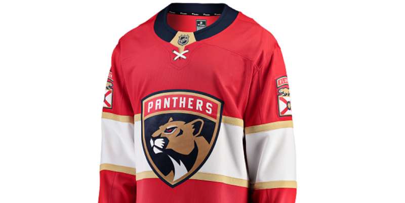
![]()
Hey there, logo lover!
Diving right into it, the Florida Panthers logo is more than just a slick design; it’s a symbol packed with significance.
The Mighty Panther
Let’s start with the obvious. The panther. It’s fierce, it’s determined, and it embodies the spirit of the team.
Panthers are known for their strength, agility, and predatory prowess, and the team aims to mirror these traits on the ice.
The Broken Stick
Ever noticed that broken hockey stick in the logo? Yup, that’s not there just for show.
It signifies resilience and an unbreakable spirit. Even when faced with challenges (or, you know, aggressive defense), the Florida Panthers keep pushing forward.
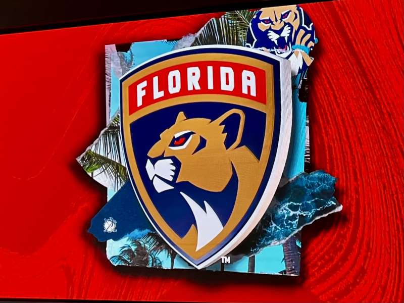
The History of the Florida Panthers Logo
![]()
Sit tight, ’cause we’re going on a lil’ time-travel.
The Debut
Back in the mid-90s, the Florida Panthers stormed onto the NHL scene. Their initial logo featured that wild-eyed panther leaping at you. Intense, right?
Evolutions and Tweaks
Like any style-savvy entity, the logo underwent a few makeovers. The changes were subtle but impactful, keeping the essence while adapting to modern aesthetics.
While the panther always remained central, its design and positioning evolved, reflecting the team’s growth and maturity.
The Colors of the Florida Panthers Logo
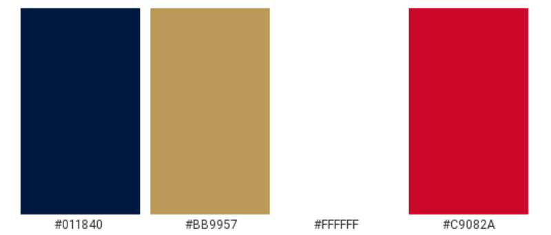
Color me impressed, ’cause this palette is on point.
The Bold Red
Ever seen a panther and thought, “red?” Probably not. But in branding, it’s all about vibes. Red represents passion, energy, and determination. Perfect for a team that’s all about that hustle!
The Navy Blue
Ah, the depth of the navy. It’s not just there to look pretty. It provides contrast and symbolizes strength and sophistication.
Golden Accents
Gold, often associated with prestige and top-tier performance, accents the logo, giving it that extra “oomph.”
The Font Used in the Florida Panthers Logo
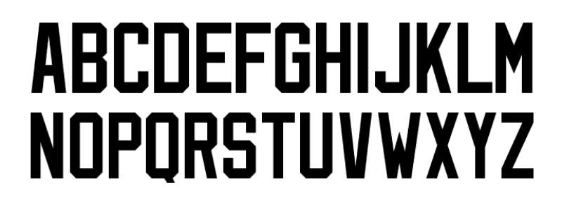
Fonts, my friends, speak volumes without saying a word.
Sleek yet Assertive
The typography in the Florida Panthers logo is a blend of sleek modern lines with a touch of assertiveness. It’s designed to be bold and readable, embodying both the team’s modern flair and their timeless spirit.
The Emblem’s Integration
Cohesive Design
One cannot simply slap elements together and call it a logo. The way the panther, the stick, and other elements meld seamlessly speaks to the artistry behind the design. It’s a cohesive unit, each part reinforcing the others.
Balance and Symmetry
The arrangement ensures that no single component overshadows another. There’s a delightful balance, making the emblem visually pleasing and instantly recognizable.
Branding Beyond the Rink
Merchandise Magic
From jerseys to mugs, the Florida Panthers logo adds flair to everything it touches. It’s more than just an emblem on a jersey; it’s a lifestyle for many fans.
The Broader Impact
Beyond just hockey, the logo has made its mark. It’s a symbol of Florida pride, and it’s not uncommon to spot it across various platforms and events, from charity matches to community gatherings.
FAQ On The Florida Panthers Logo
What Inspired the Florida Panthers Logo?
The logo draws inspiration from the fierce, stealthy nature of its namesake, the Florida panther—a creature symbolic of power and precision.
Elements of South Florida’s vibrant culture and essence of the NHL sporting spirit further influence its design, crafting a unique brand image that resonates with fans.
How Has the Florida Panthers Logo Evolved Over Time?
Since its inception, the logo underwent subtle refinements. The initial leaping panther portrayed a bold presence.
Modern iterations added sophistication, capturing the sleekness of the predator, refining its features to express dynamism—a reflection of the team’s evolution within the NHL’s Eastern Conference.
Can You Describe the Color Scheme of the Florida Panthers Logo?
Navy blue, red, and gold—the color scheme stands for prestige, vigor, and excellence. The palette was precisely picked, projecting a regal aura against the backdrop of Sunrise, Florida.
These colors are not just visually striking, they’re deeply emblematic of the team’s ardent spirit.
What Does the Florida Panthers Logo Symbolize?
This emblem is a beacon, galvanizing supporters under a common emblem. It embodies more than a team—it’s a community, a shared passion for the Stanley Cup dream. The panther denotes agility and strength, traits cherished by players and fans alike.
How Do the Florida Panthers Incorporate Their Logo into Merchandise?
The logo’s adaptation into merchandise is masterful. From jerseys to fan paraphernalia, each item is meticulously crafted to showcase the Panther’s effigy.
This strategy amplifies brand identity, lets supporters don and display their allegiance, and is a critical part of the team’s marketing and brand engagement.
What Role Does the Florida Panthers Logo Play in Team Branding?
Central to the team’s identity, the logo encapsulates the franchise’s ethos. It’s a visual language, speaking of the team’s legacy, its combative spirit on the ice, its aspirations within the NHL.
This vital part of team branding resonates through every advertisement, poster, and social media post.
How Often Do the Florida Panthers Update or Change Their Logo?
Changes are rare and deliberate. Each adjustment aims to enhance appeal while respecting tradition.
The current iteration, still fresh with contemporary verve, remains firmly rooted in the team’s history—indicating revisions occur only when necessary to maintain relevance and fan connection.
What Are the Legal Restrictions on Using the Florida Panthers Logo?
Copyright laws safeguard the logo. Unauthorized use can lead to legal actions, as the emblem is an intellectual property of Sunrise Sports & Entertainment.
Usage requires permission, ensuring the logo’s integrity and exclusive association with official team-related materials and merchandise.
How Do Fans React to Changes in the Florida Panthers Logo?
Fans are emotionally invested in the logo, their reactions to changes are mixed with nostalgia and anticipation.
While some embrace modernization, craving a fresh representation of their team in the competitive NHL environment, others hold onto the familiar emblem that marked countless victories and memories.
What Differentiates the Florida Panthers Logo from Other NHL Team Logos?
Its unmistakable fusion of Floridian flair with sports aesthetics sets it apart. The leaping panther, while common in team mascots, is executed with a balance of aggression and grace unique to the Panthers’ brand.
It’s interwoven with local identity and captures the energy of Sunrise, Florida—distinct in its portrayal.
Conclusion
Diving into the depths of the Florida Panthers logo, culminating this journey reveals much more than the anatomy of an emblem. It reflects the connection between a team and its community, bound by a symbol steeped in pride and tradition.
Throughout these lines, readers journeyed from the BB&T Center, across the sun-drenched landscape of Sunrise, Florida, straight into the thrill of the NHL. The logo does more than just adorn merchandise or flash across screens; it is the heart of the Panthers’ soul, pulsating with every slap shot and cheer.
- A tale woven with threads of history…
- A narrative embroidered with dedication and courage…
- A dynasty painted with strokes of red, blue, and gold…
It stands, not merely as a logo but as a testament to the ceaseless march of time—a beacon for future heroes of the ice to rally under. For onlookers, fans, and dreamers alike, the emblem is eternal—a legacy carved into the very spirit of hockey.
If you liked this article about the Florida Panthers logo, you should check out this article about the Detroit Red Wings logo.
There are also similar articles discussing the Edmonton Oilers logo, the Los Angeles Kings logo, the Minnesota Wild logo, and the Montreal Canadiens logo.
And let’s not forget about articles on the Nashville Predators logo, the New Jersey Devils logo, the New York Islanders logo, and the New York Rangers logo.
Bogdan Sandu, a seasoned designer with 15 years of diverse experience, has been designing websites since 2008.
Renowned for his expertise in logo design and visual branding, Bogdan has developed a multitude of logos for various clients.
His skills extend to creating posters, vector illustrations, business cards, and brochures. Additionally, Bogdan's UI kits were featured on marketplaces like Visual Hierarchy and UI8.
Latest posts by Bogdan Sandu (see all)
- The Bethesda Logo History, Colors, Font, And Meaning - 28 April 2024
- Out of This World: Space Color Palettes for Cosmic Designs - 28 April 2024
- The Bungie Logo History, Colors, Font, And Meaning - 27 April 2024