
The Montreal Canadiens logo stands as one of the most recognizable emblems in professional hockey. It’s been around since 1917, which makes it older than most sports brands you’ll encounter today.
Within the broader landscape of NHL logos, the Canadiens mark holds a unique position. It represents the oldest continuously operating professional hockey franchise in North America.
The current version features the iconic “CH” monogram in red, white, and blue. There have been roughly a dozen iterations since the team’s founding in 1909. The design we see today was solidified in 1952, though minor refinements followed.
What makes a logo last over a century? In this case, simplicity and deep cultural meaning.
What is the Montreal Canadiens Logo?
The Montreal Canadiens logo is a combination mark featuring an intertwined “C” and “H” letterform set against a red, white, and blue color scheme. Officially established in its modern form around 1917, the design represents “Club de Hockey Canadien” and symbolizes French-Canadian hockey heritage.
Design Specifications
- Design Type: Combination mark (lettermark monogram with enclosing shape)
- Primary Elements: Interlocking “C” and “H” letters within a larger “C” shape
- Official Introduction Date: 1917 (modern CH configuration)
- Designer/Agency: Not officially documented; evolved organically through team history
- Trademark Status: Registered trademark owned by the Club de Hockey Canadien
- Color Palette: Canadiens Red (#AF1E2D), White (#FFFFFF), Canadiens Blue (#192168)
- Usage Context: Jerseys, merchandise, arena branding, digital platforms, official communications
How Has the Montreal Canadiens Logo Evolved Over Time?
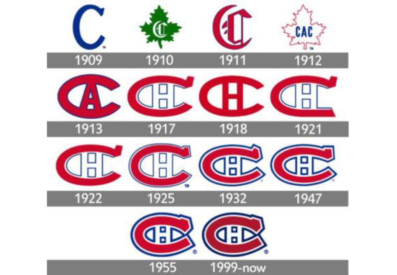
The Canadiens logo has undergone significant transformations since 1909. Early versions looked nothing like today’s design.
The team experimented with different letter combinations and layouts before settling on the CH monogram. Each change reflected ownership shifts, league affiliations, and evolving brand sensibilities.
What’s remarkable is how stable the design became after the 1950s. Most franchises completely overhaul their marks every few decades. The Habs didn’t.
Original Canadien Athletic Club Logo (1909-1910)
- Years Active: 1909-1910
- Design Description: A green maple leaf with a gothic “C” in the center
- Color Scheme: Green and white
- Designer: Unknown
- Context: The team was founded as the Canadien Athletic Club by J. Ambrose O’Brien. The maple leaf represented Canadian identity.
- Key Changes from Previous: First logo in franchise history
- Cultural Significance: Established the team’s connection to national identity before focusing on French-Canadian heritage
Early “CA” Logo (1910-1911)
- Years Active: 1910-1911
- Design Description: Blue “CA” letters on a white jersey
- Color Scheme: Blue and white
- Designer: Unknown
- Context: Represented “Club Athletique Canadien” during a brief organizational period
- Key Changes from Previous: Dropped the maple leaf entirely; shifted to lettermark approach
- Cultural Significance: Transitional design that moved toward the eventual monogram style
First “CAC” Logo (1911-1913)
- Years Active: 1911-1913
- Design Description: A large “C” containing smaller “A” and “C” letters
- Color Scheme: Red and blue on white
- Designer: Unknown
- Context: The team was now officially “Club Athletique Canadien”
- Key Changes from Previous: Introduced the nested letter concept; first appearance of red
- Cultural Significance: Established the enclosing “C” framework that would define all future designs
The “CHC” Era Logo (1913-1917)
- Years Active: 1913-1917
- Design Description: Large “C” with “HC” inside, representing “Club de Hockey Canadien”
- Color Scheme: Red, white, and blue
- Designer: Unknown
- Context: George Kennedy acquired the team and rebranded it as a hockey-focused organization
- Key Changes from Previous: Replaced “A” with “H” to emphasize hockey identity
- Cultural Significance: Marked the transition from athletic club to dedicated hockey franchise
Modern “CH” Logo (1917-Present)
- Years Active: 1917-present
- Design Description: Streamlined “CH” within a larger “C”, creating the iconic nested monogram
- Color Scheme: Canadiens Red, White, Canadiens Blue
- Designer: Evolved organically; refined over decades
- Context: Coincided with the founding of the NHL in 1917
- Key Changes from Previous: Removed the small “C” from “CHC” creating cleaner “CH” configuration
- Cultural Significance: Became synonymous with hockey excellence and Montreal identity
Refinements (1952, 1999, and Beyond)
- Years Active: 1952 refinement still in use
- Design Description: Sharper lines, more defined proportions, standardized colors
- Color Scheme: Official Canadiens Red (#AF1E2D), White, Canadiens Blue (#192168)
- Designer: In-house refinements
- Context: The 1952 version coincided with the team’s dynasty era; 1999 brought minor digital-age tweaks
- Key Changes from Previous: Cleaner geometry, standardized stroke weights
- Cultural Significance: The 1952 version is associated with 24 Stanley Cup victories
What Do the Design Elements of the Montreal Canadiens Logo Mean?
The CH monogram carries layered meaning. It officially stands for “Club de Hockey” (not “Canadiens Habitants” as commonly believed).
The nested letter structure creates visual depth. The outer “C” embraces the inner elements, suggesting unity and protection.
Red represents passion and energy. Blue conveys tradition and stability. White provides clarity and balance between the two.
Why Did the Montreal Canadiens Choose These Specific Colors?
The red, white, and blue palette connects directly to French-Canadian heritage. These are the colors of both the French tricolor and the Union Jack, reflecting Quebec’s complex colonial history.
Understanding color psychology helps explain the emotional impact. Red triggers excitement and aggression, perfect for a sports context.
Blue creates trust and loyalty. Fans wearing bleu-blanc-rouge feel connected to something larger than a hockey game.
- Canadiens Red: Hex #AF1E2D | Symbolizes passion, aggression, and French-Canadian pride | Creates high visibility and emotional intensity
- White: Hex #FFFFFF | Represents purity, ice, and winter sports | Provides contrast and readability
- Canadiens Blue: Hex #192168 | Conveys tradition, loyalty, and stability | Anchors the design with depth
What Typography Style Is Used in the Montreal Canadiens Logo?
The CH letterforms use a custom serif-influenced design. The letters feature thick strokes with subtle decorative elements at the terminals.
This isn’t a standard font you can download. It’s a bespoke creation refined over decades.
The typography conveys heritage and permanence. Modern sans-serif letters would feel wrong here.
Readability works at any scale because the forms are bold and uncluttered. You recognize it from across an arena.
What Are the Hidden Meanings in the Montreal Canadiens Logo?
The most persistent myth involves the “H” standing for “Habitants.” It doesn’t. But that interpretation has become part of the logo’s cultural meaning anyway.
Look closely at the negative space. The interlocking creates a sense of depth and dimension, almost like the letters are woven together.
Some see the outer “C” as protective arms embracing the team. This wasn’t necessarily intentional, but it resonates with fans.
The designers, whoever they were, created something that invites interpretation. That’s part of why it endures.
How Does the Montreal Canadiens Logo Compare to Competitor Logos?
Among Original Six franchises, the Canadiens logo stands out for its longevity and consistency. The Detroit Red Wings logo shares this timeless quality with its iconic winged wheel.
The Toronto Maple Leafs logo, Montreal’s fiercest rival, has changed dramatically over the years. Same with the Chicago Blackhawks logo.
Newer teams like the Vegas Golden Knights logo or Tampa Bay Lightning logo use bolder, more aggressive imagery. They’re designed for the modern era.
Canadian rivals show different approaches. The Vancouver Canucks logo has cycled through multiple identities. The Edmonton Oilers logo and Calgary Flames logo lean into regional symbolism.
What separates Montreal? The restraint. No mascot, no dramatic illustrations. Just letters that have meant the same thing for over a century.
What Are the Technical Specifications of the Montreal Canadiens Logo?
Official Color Codes
- Canadiens Red (Primary): Hex #AF1E2D | RGB (175, 30, 45) | CMYK (0, 100, 80, 20) | Pantone 200 C
- White (Secondary): Hex #FFFFFF | RGB (255, 255, 255) | CMYK (0, 0, 0, 0)
- Canadiens Blue (Accent): Hex #192168 | RGB (25, 33, 104) | CMYK (100, 90, 10, 50) | Pantone 289 C
Dimensions and Proportions
- Aspect Ratio: Approximately 1:1 (circular containment)
- Minimum Size: 0.5 inches (12.7mm) for print; 50 pixels for digital
- Clear Space: Minimum padding equal to the height of the “H” on all sides
- File Formats: Available in vector graphics (AI, EPS, SVG) and raster formats (PNG, JPEG)
- Official Usage: Governed by NHL and team licensing agreements
What Cultural Impact Has the Montreal Canadiens Logo Had?
The CH symbol transcends hockey. It represents Quebec identity, French-Canadian pride, and a shared cultural history.
Walk through Montreal and you’ll see it everywhere. Not just on jerseys, but tattooed on arms, painted on murals, woven into the city’s visual fabric.
During the Quiet Revolution of the 1960s, the team and its logo became symbols of French-Canadian achievement. Winning mattered beyond sports.
The logo appears in film, music, and art. It’s been referenced by everyone from local painters to international designers studying graphic design movements.
How Does the Montreal Canadiens Logo Fit Into the Overall Brand Identity?

The logo anchors everything. Jersey designs, arena graphics, merchandise, and digital presence all flow from that central CH mark.
“Bleu, blanc, rouge” isn’t just a color palette. It’s an identity statement that fans use to describe themselves.
The team’s brand guidelines maintain strict consistency. You won’t see the logo stretched, recolored, or modified in official contexts.
Secondary marks exist, like the “Habs” wordmark and anniversary logos. But they always defer to the primary CH.
This consistency builds recognition. Generations of fans know exactly what those colors and letters mean.
How Should the Montreal Canadiens Logo Be Used?
Official Usage Guidelines
- Do: Use official logo files from NHL licensing partners
- Do: Maintain clear space around the logo
- Do: Use approved color combinations only
- Don’t: Stretch, rotate, or distort the proportions
- Don’t: Apply unauthorized color schemes
- Don’t: Combine with other logos without approval
Accessing Official Logos
Licensed vendors and media partners can access official assets through NHL Brand Standards. Fan use for non-commercial purposes is generally tolerated but not officially sanctioned.
Licensing Information
Commercial use requires licensing through NHL Enterprises. The logo is protected intellectual property with active trademark enforcement.
Trademark Protection
The CH design and “Montreal Canadiens” wordmark are registered trademarks. Unauthorized commercial use can result in legal action. The team actively monitors and protects its brand assets globally.
FAQ on The Montreal Canadiens Logo
What Does the CH Stand for in the Montreal Canadiens Logo?
The CH monogram stands for “Club de Hockey.” Many fans believe it means “Club Canadiens Habitants.” That’s a myth.
The letters represent the official French name: Club de Hockey Canadien. This hockey team emblem has carried this meaning since 1917.
When Was the Montreal Canadiens Logo Created?
The modern CH configuration debuted in 1917. But the franchise started in 1909 with a completely different design.
That first team branding featured a green maple leaf. The iconic red, white, and blue scheme came later as the team identity evolved.
Has the Montreal Canadiens Logo Ever Changed?
Yes. The Habs symbol went through roughly a dozen iterations. Early versions included “CA” and “CAC” lettermarks before settling on CH.
The 1952 refinement created the version most fans recognize today. Minor tweaks followed, but the core design remained stable for decades.
What Are the Official Colors of the Montreal Canadiens Logo?
The official bleu blanc rouge palette includes Canadiens Red (#AF1E2D), White (#FFFFFF), and Canadiens Blue (#192168).
Understanding color theory explains why this works. The contrast between red and blue creates visual tension while white provides balance.
Who Designed the Montreal Canadiens Logo?
No single designer gets credit. The logo evolved organically over decades through various ownership changes.
This differs from modern logo design principles where agencies document everything. The Canadiens mark grew from practical needs, not strategic branding sessions.
Why Is the Montreal Canadiens Logo So Iconic?
Longevity matters. Over a century of Stanley Cup victories created deep emotional connections.
The design follows Gestalt principles naturally. The nested letters create unity and recognition. Simple shapes endure where complex illustrations fade.
What Font Is Used in the Montreal Canadiens Logo?
The CH uses a custom serif font design. You won’t find it in any typeface library.
The letterforms feature thick strokes with classic terminals. This typography style conveys heritage and permanence fitting for an Original Six franchise.
Is the Montreal Canadiens Logo Trademarked?
Absolutely. The NHL hockey insignia and team marks receive aggressive trademark protection.
Commercial use requires licensing through NHL Enterprises. The league monitors unauthorized usage globally. Fan merchandise without proper licensing faces legal consequences.
Where Can I Download the Official Montreal Canadiens Logo?
Licensed media partners access official files through NHL Brand Standards. High DPI versions exist for print design applications.
Fan downloads from unofficial sources risk quality issues. Official assets maintain proper scale and proportion specifications.
How Does the Canadiens Logo Compare to Other Original Six Logos?
The New York Rangers logo uses similar lettermark principles. The Boston Bruins went mascot-based instead.
Montreal’s minimalist design approach stands apart. No illustrations, no mascots. Just letters that defined Canadian hockey culture for generations.
Conclusion
The Montreal Canadiens logo represents more than hockey. It carries over a century of Quebec heritage, Stanley Cup glory, and French-Canadian pride in one simple monogram.
Few sports emblems achieve this level of cultural weight. The CH has become iconic through symmetry, restraint, and consistency.
The bleu blanc rouge colors trigger instant recognition. No mascot needed. No trendy redesigns required.
Whether displayed at the Bell Centre or tattooed on a fan’s arm, the Habs symbol connects generations. That’s the mark of true visual hierarchy in sports branding.
Some logos chase trends. This one outlasts them.

Renowned for his expertise in logo design and visual branding, Bogdan has developed a multitude of logos for various clients.
His skills extend to creating posters, vector illustrations, business cards, and brochures. Additionally, Bogdan's UI kits were featured on marketplaces like Visual Hierarchy and UI8.
He also wrote in the past years on sites like Design Your Way, WebDesignerDepot, WPDean, Designmodo, Speckyboy, Slider Revolution, and more.
- The Cursor Logo History, Colors, Font, And Meaning - 24 September 2026
- Top 7 Web Design Subscription Services That Replace Full-Time Hires - 24 September 2026
- Canva vs PowerPoint: Which Is Better for Presentations? - 22 September 2026

Bogdan Sandu is a seasoned designer who has been designing websites since 2008. Renowned for his expertise in logo design and visual branding, Bogdan has developed a multitude of logos for various clients. His skills extend to creating posters, vector illustrations, business cards, and brochures. Additionally, Bogdan's UI kits were featured on marketplaces like Visual Hierarchy and UI8. He also wrote in the past years on sites like Design Your Way, WebDesignerDepot, WPDean, Designmodo, Speckyboy, Slider Revolution, and more.
You Might Also Like