The Edmonton Oilers Logo History, Colors, Font, And Meaning
Imagine the pulse of a city, the roar of a crowd, all encapsulated in a singular emblem—a beacon of pride that dances on the chests of athletes as they carve across the ice.
This isn’t just any crest; this is the Edmonton Oilers logo, an icon etched into the heart of Alberta, a symphony of color, history, and passion on a canvas of jerseys and fan memorabilia.
In this sea of sports symbols, the Oilers’ insignia emerges not merely as a graphic but as a visual anthem representing decades of NHL legacy.
As a craftsman of design, I appreciate the finesse of linework and the psychology of color that forge connections beyond the rink.
Delving into this article, we unearth the tapestry woven by tradition and innovation, from the logo’s inception to its current status within the fabric of Canadian hockey team badges.
Together, we will decode the emblem’s evolution, its impact on sports team branding and how it reflects the Edmonton Oilers history. Discover the nuances hidden within lines and hues, exploring the lore behind this visual herald.
The Meaning Behind the Edmonton Oilers Logo
![]()
You know, whenever I see a logo, especially one from a sports team, there’s like this whole story behind it. And Edmonton Oilers? No exception.
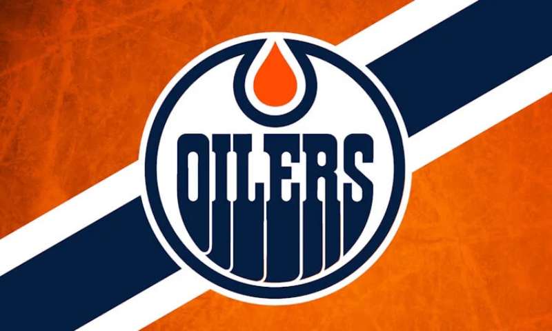
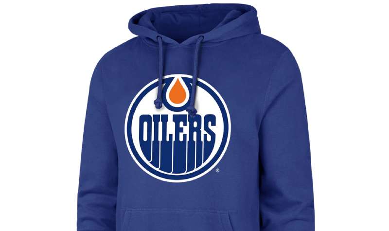
Oil Drop and the Rig
The main deal here? That oil drop, right? If you’re not from Edmonton, you might be scratching your head. Why the oil? Edmonton is pretty much the heart of Canada’s oil industry.
So, it’s kind of like a nod to the city’s heritage. Like, “Hey, this is us. This is what we’re about.” And that oil derrick? That’s an oil rig. Again, oil. Makes sense, right?
Grit and Determination
Now, let’s dig a bit deeper. Sports logos aren’t just about representing a city or a name. They’re about attitude. There’s a certain toughness in the Oilers’ logo. It’s not just about oil; it’s about the grind, the hustle, and the hard work that goes into extracting it.
The History of the Edmonton Oilers Logo
![]()
Man, history of logos. Always a trip.
In the Beginning
The Edmonton Oilers logo hasn’t undergone a ton of changes since its birth, which is kinda cool. Consistency, you know? The Oilers joined the NHL back in the 70s, and they’ve kept that core look. Sure, there’ve been tweaks, but the essence? Rock solid.
The Evolution
Over the years, there’ve been tiny adjustments. Think of it as getting a little touch-up here and there. But throughout, that signature oil drop and derrick have been steadfast, like an old pal you can always rely on.
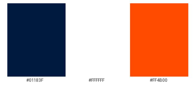
The Colors of the Edmonton Oilers Logo
Colors aren’t just, well, colors. They’ve got feels and vibes.
Blue like the Sky
That dominant blue? It’s kinda like the vast Alberta sky or the deep oceans where all those rigs get the oil. Also, blue’s solid, right? Trustworthy.
Orange Burst
Then there’s that pop of orange. Energy, dynamism, and a hint of fire – all things that kind of mirror the energy of the game and the players.
The Font Used in the Edmonton Oilers Logo
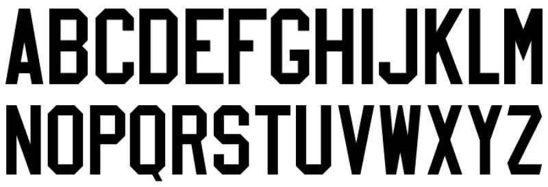
Fonts, man. They can make or break a design.
Bold and Classic
The font used is bold and assertive. No wishy-washy, lightweight stuff here. It’s got weight, and it holds its ground, much like a hockey player in the midst of an intense game.
The Iconic Nature of the Logo
Now, let’s dive into why this logo is just so… iconic.
Recognizability
All around the NHL, fans instantly recognize the Oilers’ emblem. It has that blend of unique design and consistent history that just sticks in the mind.
Emotional Connection
For many, the logo isn’t just about a team. It’s memories, shared moments, and an identity tied up with the city and its people.
The Logo’s Influence on Merchandise
Ever thought about how a logo pops on merchandise?
Apparel Domination
From jerseys to hats, the Oilers’ logo looks slick. The colors stand out, and the design feels contemporary, even with its deep roots.
Beyond Clothing
And it’s not just clothes. Think mugs, posters, and all that fun fan gear. The design’s versatility means it looks rad on just about anything.
FAQ On The Edmonton Oilers Logo
What is the significance of the Edmonton Oilers logo?
The Oilers logo is more than just a team identifier; it’s the heart of their brand—crafted to embody Edmonton’s spirit.
Who designed the Edmonton Oilers logo?
The corporate design firm Calder Bateman conceived the Oilers logo, channeling energy from the city’s namesake, the oil industry.
Has the Edmonton Oilers logo changed over the years?
Certainly, the logo has seen subtle refinements, evolving to stay modern while respecting its storied past in the NHL team logos arena.
What do the colors in the Oilers logo represent?
Blue symbolizes loyalty, while orange echoes the oil drop’s vibrant energy—a nod to Edmonton’s oil heritage.
Why is there an oil drop on the Edmonton Oilers logo?
It’s a tribute to Alberta’s oil industry, the backbone of the region that the team proudly represents.
Can the Edmonton Oilers logo be used for personal merchandise?
Usage typically requires permission—it’s protected to maintain the integrity and value of the brand.
What is the most popular version of the Edmonton Oilers logo among fans?
The classic emblem, with bold colors and sharp lines, resonates most, fueling nostalgia and team pride.
How does the Oilers logo compare to other NHL team logos?
It stands out with its unique oil drop motif—an unmistakable mark that commands attention both on and off the ice.
Has any player influenced the design of the Edmonton Oilers logo?
Influence, no; but legendary players like Wayne Gretzky have elevated its status, intertwining personal legacy with the emblem.
How does the Edmonton Oilers logo impact the team’s brand identity?
This iconic symbol anchors the team’s marketing, merchandise, and fan loyalty, acting as a beacon drawing in a community of passionate followers.
Conclusion
As we reach the close, the tale behind the Edmonton Oilers logo unfolds in full—a narrative steeped in design prowess, team spirit, and the unyielding force of a city’s pride. The emblem stands as more than just an arrangement of color and form; it’s a beacon of history and identity, a representation that resonates with the visceral roar of fans clad in blue and orange.
From the initial sketches by creative visionaries to the turbocharged cheers in Rogers Place, every element speaks volumes. This motif, an oil drop cradled in bold letters, encapsulates triumph, tradition, and the fiery grit of competition, reaching far beyond mere sports team branding.
In the reflection of this enduring symbol, there’s a glimmer of every goal scored, every victory celebrated, and every fan’s whisper of “Let’s go Oilers!” Let the legacy etched into this iconic insignia serve not just as homage to Edmonton Oilers history but as a promise of the electric moments to come.
If you liked this article about the Edmonton Oilers logo, you should check out this article about the Detroit Red Wings logo.
There are also similar articles discussing the Florida Panthers logo, the Los Angeles Kings logo, the Minnesota Wild logo, and the Montreal Canadiens logo.
And let’s not forget about articles on the Nashville Predators logo, the New Jersey Devils logo, the New York Islanders logo, and the New York Rangers logo.
Bogdan Sandu, a seasoned designer with 15 years of diverse experience, has been designing websites since 2008.
Renowned for his expertise in logo design and visual branding, Bogdan has developed a multitude of logos for various clients.
His skills extend to creating posters, vector illustrations, business cards, and brochures. Additionally, Bogdan's UI kits were featured on marketplaces like Visual Hierarchy and UI8.
Latest posts by Bogdan Sandu (see all)