The Minnesota Wild logo stands as one of the most intricate and layered marks in professional hockey. Introduced in 2000 when the franchise joined the NHL as an expansion team, this emblem captures Minnesota’s wilderness identity through a complex illustration that rewards closer inspection.
The current primary logo has remained unchanged since the team’s founding. SME Branding, a New York-based sports design firm, created the mark. It features a wild animal head composed of natural landscape elements. The franchise has used three logo iterations total, though the primary mark has stayed consistent for over two decades.
Within NHL branding history, the Wild logo broke from conventional approaches. Most hockey teams at the time used straightforward animal depictions or simple lettermarks. Minnesota chose something different.
What Is the Minnesota Wild Logo?
![]()
The Minnesota Wild logo is a circular emblem featuring a stylized wild animal head made from wilderness imagery, including a forest landscape, river, shooting star, and sun/moon. SME Branding designed it for the team’s 2000 NHL debut. The mark symbolizes Minnesota’s natural heritage and “State of Hockey” identity.
Design Type: Combination mark (pictorial emblem with integrated wordmark on alternate versions)
Primary Elements:
- Wild animal head silhouette (commonly interpreted as a bear, though intentionally ambiguous)
- Forest treeline forming the head’s upper portion
- River cutting through the design
- Setting sun or rising moon as the eye
- Shooting star beneath the eye
- Circular border containing the scene
Official Introduction Date: January 22, 2000
Designer/Agency: SME Branding (New York)
Trademark Status: Registered trademark of the Minnesota Wild Hockey Club, LP
Color Palette:
- Iron Range Green (primary)
- Harvest Gold
- Minnesota Red
- White
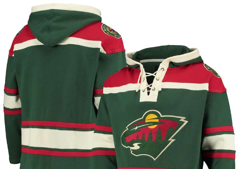
Usage Context: Game jerseys, arena signage at Xcel Energy Center, official merchandise, digital platforms, marketing materials, and broadcast graphics
How Has the Minnesota Wild Logo Evolved Over Time?
![]()
The Minnesota Wild has maintained remarkable logo consistency since 2000. Unlike many NHL franchises that undergo frequent redesigns, the Wild kept their primary mark virtually untouched.
The team introduced alternate logos and slight refinements over the years. But the core wilderness scene remains the centerpiece of their visual identity.
This stability reflects confidence in the original design’s strength.
Original Minnesota Wild Logo (2000-Present)
Years Active: 2000 to present
Design Description: A circular emblem containing a wild animal head created entirely from Minnesota wilderness elements. The creature’s head emerges from negative space, formed by pine trees, a river, and natural features. The eye is a setting sun or moon with a shooting star trail beneath it.
Color Scheme: Iron Range Green, Harvest Gold, Minnesota Red, and White. These analogous colors create warmth while honoring the state’s mining heritage.
Designer: SME Branding
Context: Created for Minnesota’s return to the NHL after the North Stars relocated to Dallas in 1993. The design needed to honor hockey tradition while establishing a fresh identity separate from the departed franchise.
Key Changes from Previous: This was the franchise’s inaugural logo. No predecessor existed.
Cultural Significance: The logo became a source of state pride, connecting professional hockey to Minnesota’s wilderness heritage and outdoor culture.
Circle Wordmark Logo (2000-Present)
Years Active: 2000 to present
Design Description: The primary logo with “MINNESOTA WILD” text arched around the circular emblem. The wordmark uses a custom serif font with angular characteristics.
Color Scheme: Same as the primary mark.
Context: Introduced alongside the primary logo for applications requiring team name identification.
Key Changes from Previous: Added text elements around the existing emblem.
Alternate Script Logo (2000-Present)
Years Active: 2000 to present
Design Description: A stylized “Wild” script in green with red and gold accents. Features an integrated pine tree element dotting the letter “i.”
Color Scheme: Iron Range Green with Harvest Gold and Minnesota Red trim.
Context: Created for shoulder patches and secondary branding applications.
Key Changes: Standalone wordmark without the circular emblem.
What Do the Design Elements of the Minnesota Wild Logo Mean?
Every element in the Wild logo carries specific meaning tied to Minnesota’s identity. The wilderness animal represents the untamed spirit of the state’s northern regions.
Nothing in this design happened by accident. SME Branding packed layers of symbolism into a single mark.
Why Did Minnesota Wild Choose These Specific Colors?
Iron Range Green
- Hex: #154734
- Pantone: 3435 C
- Symbolizes Minnesota’s vast forests and connection to nature
- Named after the Iron Range mining region in northern Minnesota
Harvest Gold
- Hex: #DDCBA4
- Represents Minnesota’s agricultural heritage
- Creates warmth against the darker green
- Evokes autumn in the northern woods
Minnesota Red
- Hex: #A6192E
- Adds intensity and competitive energy
- Connects to the state’s sports tradition
- Provides strong contrast in the color palette
The color psychology here is pretty straightforward. Green builds trust and connects to nature. Red drives emotion and energy. Gold adds prestige.
What Typography Style Is Used in the Minnesota Wild Logo?
The Wild uses a custom typeface with sharp, angular serifs. It feels aggressive without being overly harsh.
The letterforms have a slightly condensed structure. This allows “MINNESOTA WILD” to wrap around the circular emblem without crowding.
For the alternate script logo, the typography shifts to a flowing, hand-lettered style. The pine tree replacing the dot on the “i” shows clever integration of brand elements into typography elements.
What Are the Hidden Meanings in the Minnesota Wild Logo?
The logo’s genius lies in its layered imagery. Look closely and you’ll find multiple scenes within one mark.
The animal itself isn’t any specific creature. SME Branding designed it as ambiguous, letting viewers see a bear, wildcat, or wolf. This was intentional.
The star beneath the eye has been interpreted as the North Star (Minnesota’s state symbol). The river flowing through represents the state’s 10,000 lakes and waterways.
Some fans see the moon and star as representing night games. Others interpret the scene as depicting a specific time of day. The designers have confirmed the ambiguity was deliberate.
How Does the Minnesota Wild Logo Compare to Competitor Logos?
Among NHL Central Division rivals, the Wild logo stands apart through complexity. The Colorado Avalanche logo uses a simpler stylized “A” with motion lines.
The Dallas Stars logo takes minimalist design approach with a single star shape. Nashville’s Predators logo features a straightforward saber-toothed cat head.
The Wild chose density over simplicity. Where other teams went clean, Minnesota went detailed.
This approach has tradeoffs. The logo loses detail at small sizes. But at full scale, it rewards attention in ways simpler marks cannot.
Compared to other animal-based NHL logos, the Wild mark uses its creature differently. The Florida Panthers logo shows a literal panther. The San Jose Sharks logo depicts an actual shark.
Minnesota’s animal emerges from landscape. That’s the difference.
What Are the Technical Specifications of the Minnesota Wild Logo?
Official Color Codes:
Iron Range Green (Primary)
Harvest Gold
- Hex: #DDCBA4
- RGB: (221, 203, 164)
- CMYK: (12, 16, 37, 0)
- Pantone: 4545 C
Minnesota Red
- Hex: #A6192E
- RGB: (166, 25, 46)
- CMYK: (16, 100, 83, 6)
- Pantone: 187 C
Dimensions and Proportions:
- Aspect Ratio: 1:1 (circular format)
- Minimum Size: The logo requires larger reproduction sizes than simpler marks due to interior detail
- Clear Space: Minimum clear space equal to the height of the “W” in WILD on all sides
The logo works as vector graphics for scaling. High DPI versions exist for print design applications.
What Cultural Impact Has the Minnesota Wild Logo Had?
The Wild logo reconnected Minnesota with NHL hockey after the painful North Stars departure. It became a symbol of the state’s sports identity revival.
Fans embraced the wilderness imagery immediately. The “State of Hockey” had a new visual anchor.
The hidden animal design sparked countless online discussions. Debates over whether it’s a bear, wolf, or wildcat continue today. This ambiguity keeps the logo in conversation.
Youth hockey programs across Minnesota adopted similar nature-based imagery following the Wild’s debut. The logo influenced regional sports branding beyond the NHL.
How Does the Minnesota Wild Logo Fit Into the Overall Brand Identity?
The logo anchors a broader brand system built around Minnesota’s wilderness identity. Everything connects back to the primary emblem.
Jersey designs emphasize the forest green as the dominant color. The alternate script “Wild” logo appears on shoulders and secondary materials.
Arena graphics at Xcel Energy Center extend the wilderness theme throughout the venue. Even the ice surface features subtle woodland elements during special games.
Merchandise uses different logo versions strategically. The full circular mark appears on premium items. The script logo works for casual apparel.
The team’s mascot, Nordy, shares the logo’s color scheme and wilderness aesthetic. This creates visual unity across all brand touchpoints.
How Should the Minnesota Wild Logo Be Used?
Official Usage Guidelines:
- Never distort, rotate, or alter the logo proportions
- Maintain required clear space around the mark
- Use only approved color variations
- Don’t place the logo on busy backgrounds that reduce visibility
- The primary logo should appear at sizes large enough to preserve detail
Accessing Official Logos:
Official logo files are available through NHL licensing partners. Media outlets can access press materials through the Minnesota Wild communications department.
Licensing Information:
Commercial use requires licensing through NHL Properties or authorized partners like Fanatics. Unauthorized reproduction violates trademark protections.
Trademark Protection:
The Minnesota Wild logo is a registered trademark. The NHL actively enforces protection against counterfeit merchandise and unauthorized commercial use.
Fan art and non-commercial uses typically fall under fair use, but selling items with the logo requires proper licensing.
FAQ on The Minnesota Wild Logo
What Animal Is in the Minnesota Wild Logo?
The animal is intentionally ambiguous. SME Branding designed it so viewers might see a bear, wolf, or wildcat.
This wasn’t lazy design. It was strategic. The wilderness imagery lets fans project their own interpretation onto the hockey team emblem.
Who Designed the Minnesota Wild Logo?
SME Branding, a New York sports design firm, created the logo in 2000. They specialize in professional sports branding and team identity systems.
The firm applied core logo design principles while building something entirely unique for the NHL expansion team.
What Do the Minnesota Wild Logo Colors Mean?
Iron Range Green honors Minnesota’s northern forests and mining heritage. Harvest Gold represents agricultural traditions.
Minnesota Red adds competitive intensity. Understanding color theory shows why this combination works so well for sports merchandise and arena signage.
What Is Hidden in the Minnesota Wild Logo?
Look closer. The animal head contains a forest treeline, flowing river, sun or moon, and shooting star.
These design elements form the creature through negative space. It’s visual storytelling at its finest.
When Was the Minnesota Wild Logo Created?
The franchise unveiled the logo on January 22, 2000. This was months before the team’s inaugural NHL season began.
Minnesota had been without professional hockey since the North Stars left for Dallas in 1993. The new team logo marked a fresh chapter.
Has the Minnesota Wild Logo Ever Changed?
The primary logo has stayed virtually unchanged since 2000. That’s rare in professional sports.
The team added alternate wordmark versions over the years. But the main wilderness scene remains untouched. This consistency built strong franchise identity recognition.
What Font Does the Minnesota Wild Use?
The team uses a custom typeface with angular serifs. It appears aggressive yet readable.
The alternate script font version of “Wild” features a pine tree as the dot on the letter “i.” Smart font psychology at work.
Where Can I Download the Official Minnesota Wild Logo?
Official files come through NHL licensing partners. Media outlets access them via the Wild’s communications department at Xcel Energy Center.
Be careful with random downloads. Many unofficial versions have wrong colors or poor resolution for print applications.
Why Is the Minnesota Wild Logo Circular?
The circle creates natural framing for the wilderness scene. It also works well as a jersey patch and center ice graphic.
Circular logos offer visual balance. The shape contains all the layered imagery without feeling cluttered or overwhelming on fan gear.
What Does the Star in the Minnesota Wild Logo Represent?
The shooting star beneath the eye connects to Minnesota’s nickname: the North Star State.
Some fans see it as a hockey puck in motion. Others interpret it as a symbol of the State of Hockey heritage. Both readings work.
Conclusion
The Minnesota Wild logo remains one of the most thoughtfully designed marks in professional hockey. Its hidden imagery and layered wildlife illustration reward closer inspection every time.
Few NHL franchises achieve this level of visual depth. The Wild logo meaning connects directly to the State of Hockey culture.
From Xcel Energy Center ice to fan merchandise worldwide, this nature-inspired sports logo carries Minnesota’s wilderness heritage forward. The team visual assets work across every application.
Twenty-plus years later, the design still holds up. That says everything about the original graphic design principles behind it.
Renowned for his expertise in logo design and visual branding, Bogdan has developed a multitude of logos for various clients.
His skills extend to creating posters, vector illustrations, business cards, and brochures. Additionally, Bogdan's UI kits were featured on marketplaces like Visual Hierarchy and UI8.
He also wrote in the past years on sites like Design Your Way, WebDesignerDepot, WPDean, Designmodo, Speckyboy, Slider Revolution, and more.
- Canva for Teams Review: Is It Worth the Business Plan? - 24 July 2026
- 5 Brand Compliance Checkpoints Every Enterprise Should Automate - 23 July 2026
- Timeless Open Sans Font Pairing for Any Project - 22 July 2026
Bogdan Sandu is a seasoned designer who has been designing websites since 2008. Renowned for his expertise in logo design and visual branding, Bogdan has developed a multitude of logos for various clients. His skills extend to creating posters, vector illustrations, business cards, and brochures. Additionally, Bogdan's UI kits were featured on marketplaces like Visual Hierarchy and UI8. He also wrote in the past years on sites like Design Your Way, WebDesignerDepot, WPDean, Designmodo, Speckyboy, Slider Revolution, and more.
You Might Also Like