The New Jersey Devils Logo History, Colors, Font, And Meaning
Imagine a symbol that ignites the passion of thousands, an emblem woven into the very fabric of sports culture. The New Jersey Devils logo stands at this intersection of art and allegiance.
This distinctive crest does more than just adorn jerseys; it encapsulates history, a relentless spirit, and a fierce identity.
Striding into the arena of aesthetics and fanhood, this article peels back the layers of design that craft such an iconic image.
You will journey through the evolution of the Devils’ insignia, exploring the tapestries of professional hockey branding and the nuances of sports logo design.
Encompassing the bold red and black hues synonymous with the team, this exploration delves into the significance of emblem loyalty, the impact of visual identity on NHL teams, and the essence it brings to team merchandise.
Prepare to uncover the artistry behind the symbol that dances on the ice-fueled dreams of the New Jersey sports landscape.
The Meaning Behind the New Jersey Devils Logo
The Devilish Inspiration
So, let’s chat about the New Jersey Devils logo. Ever seen it? There’s a lot more to that design than just a snazzy picture.
Dive a bit deeper, and you’ll find it’s loaded with symbolism. For starters, the name “Devils” isn’t just about being intimidating on the ice.
It’s actually a nod to the Jersey Devil, a legendary creature said to inhabit the Pine Barrens of South Jersey. Cool, huh?
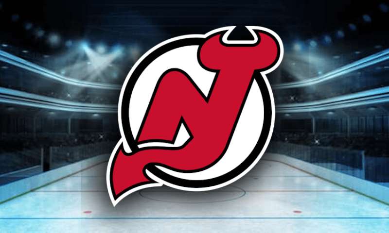
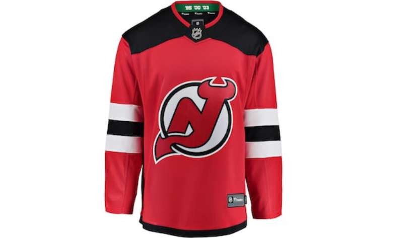
The ‘N’ and ‘J’
You see the letters “N” and “J” combined in the logo, right? That’s a straightforward shoutout to “New Jersey”. Simple, but pretty sleek and efficient. And hey, that devil’s tail curling the ‘J’? That’s just genius design work.
The History of the New Jersey Devils Logo
The Beginning
Before we had the iconic logo we all know today, the team went through its own identity crisis. When the franchise first started, it wasn’t even in New Jersey!
Back in the day, they were the Kansas City Scouts, then the Colorado Rockies. Only after that did they become the New Jersey Devils.
Evolution and Refinement
Once they settled in Jersey, the team needed a brand-new image. The current logo made its grand debut in the 80s and has since become iconic.
Over time, there were slight tweaks here and there, but the core essence remained the same. The designers wanted to keep it fresh yet true to its roots.
The Colors of the New Jersey Devils Logo
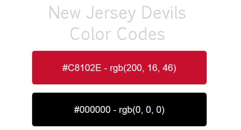
Red, Black, and White
Color says a lot in design. The New Jersey Devils chose red, black, and white.
Why? Red, folks, is energy, passion, and danger. Black adds a touch of mystery, power, and elegance. And white? It balances things out with its purity and innocence vibes.
The Emotional Connect
Ever notice how seeing certain colors make you feel a certain way? That’s no accident. Colors evoke emotions. So when you see that fiery red, it’s not just about the team’s energy; it’s about igniting that passion in the fans.
The Font Used in the New Jersey Devils Logo
Bold and Edgy
Fonts, oh man, they’re like the unsung heroes of design. The font in the Devils logo? Bold. It speaks of strength and dominance. You wouldn’t see a soft, curly font here. It’s about making a statement, loud and clear.
A Touch of Tradition
While the font feels modern, there’s a nod to tradition there. It’s like mixing the old school with the contemporary. Representing both the rich history of the team and its forward-moving trajectory.
The Legacy of the New Jersey Devils Logo
A Symbol Beyond Sport
This logo, it’s not just for the ice. It’s found its way onto merchandise, fan tattoos, and even art. It’s become a symbol, a brand, an identity not just for the team, but for the fans and the state.
The Cultural Impact
Culture and sport go hand in hand. The logo stands as a beacon, uniting fans from all walks of life under one emblem. It’s more than just design. It’s a piece of cultural fabric.
The Future of the New Jersey Devils Logo
Standing the Test of Time
With how iconic the logo has become, it’s hard to imagine major changes in the near future. Some things are just timeless, and this design seems to be one of them.
Potential Innovations
That said, as designers, we’re always itching for some innovation. So while the core may remain, we might see new interpretations, adaptations for digital media, or exciting merchandise designs. The sky’s the limit!
FAQ On The New Jersey Devils Logo
What inspired the New Jersey Devils logo design?
The logo’s inspiration stems from the legend of the Jersey Devil, a mythical creature of local folklore. Fusing this with a sharp NJ monogram, the design encapsulates a devilish figure with the tail of a demon, all while embodying the spirit and grit of the hockey team.
What do the colors of the New Jersey Devils logo represent?
Red symbolizes energy, passion, and danger, fitting for a team named after a devilish legend. Black adds a sense of power and aggression. Together, they reflect the team’s fierce competitive nature on the ice and its bold presence in the NHL.
Has the New Jersey Devils logo changed over time?
Absolutely, though subtly. Since its inception in the early 80s, tweaks in detailing and color shades have occurred. Each alteration, minute as it might be, aimed at modernizing the look without straying from that iconic visual identity that fans know and love.
What does the New Jersey Devils logo mean to the fans?
To the sea of supporters, it’s more than a logo. It’s a badge of honor, a rallying point that unifies thousands under the banner of hockey passion. It conjures pride, connecting the fanbase with a shared language of loyalty and community.
How does the New Jersey Devils logo reflect the team’s brand identity?
Crafted with the intensity of hockey in mind, the emblem captures the essence of the brand – bold, fearless, resolute. The devilish motif emphasizes the team’s determination, mirroring the ethos of an organization committed to excellence and the thrill of the sport.
Where can you see the New Jersey Devils logo in use?
Beyond the primal battleground of the Prudential Center, the emblem graces various forms of team merchandise, adorning everything from jerseys to fan apparel and accessories.
Its presence extends to digital landscapes, marking its territory all over social media and marketing materials.
What other elements are used in the New Jersey Devils branding beside the logo?
The branding extends to include a palette of red, black, and white, custom typography for player names and numbers, and alternate logos like the secondary mark. Together, they build a cohesive narrative that enhances the NHL team’s visual storytelling.
How does the New Jersey Devils logo compare to other NHL team logos?
Staying faithful to its origin story, it holds its ground as one of the more unique and storied logos in the league. While each NHL team’s logo carries its flair and history, the Devils’ version prides itself on simplicity and narrative depth.
What is the role of the New Jersey Devils logo in marketing and fan engagement?
As a central element in branding, it’s pivotal in marketing efforts, fostering a deep connection with the fanbase. It functions as the face of the team, essential in driving merchandise sales, promotional campaigns, and fan engagement both online and off the rink.
Can the New Jersey Devils logo be used for personal or commercial purposes?
Usage is governed by copyright laws. While fans can flaunt the emblem on personal items, any commercial use requires authorization. The design is a protected asset of the team, ensuring it remains a distinctive symbol of the Devils’ brand.
Conclusion
As the final buzzer of this exploration echoes, our journey through the nuances of the New Jersey Devils logo reaches its end. We’ve skated through the evolution, the colors weaving stories of fervor, and the brand identity sharply etched into the minds of devotees. The emblem stands, unwavering, at the helm of a legacy, an anchor in the ever-churning sea of NHL history.
- The silhouette, an ode to folklore
- The palette, an embodiment of power
- The branding, a beacon of professional hockey devotion
Brilliant in its simplicity, the logo remains a testament to design that resonates, creating an indelible mark that transcends the sports marketing arena. So, whether etched onto fan apparel or emblazoned across the heart of Prudential Center, the symbol serves as a timeless beacon, guiding the storied ship of the Devils through the icy waters of competition, camaraderie, and community.
If you liked this article about the New Jersey Devils logo, you should check out this article about the Detroit Red Wings logo.
There are also similar articles discussing the Edmonton Oilers logo, the Florida Panthers logo, the Los Angeles Kings logo, and the Minnesota Wild logo.
And let’s not forget about articles on the Montreal Canadiens logo, the Nashville Predators logo, the New York Islanders logo, and the New York Rangers logo.
Bogdan Sandu, a seasoned designer with 15 years of diverse experience, has been designing websites since 2008.
Renowned for his expertise in logo design and visual branding, Bogdan has developed a multitude of logos for various clients.
His skills extend to creating posters, vector illustrations, business cards, and brochures. Additionally, Bogdan's UI kits were featured on marketplaces like Visual Hierarchy and UI8.
Latest posts by Bogdan Sandu (see all)