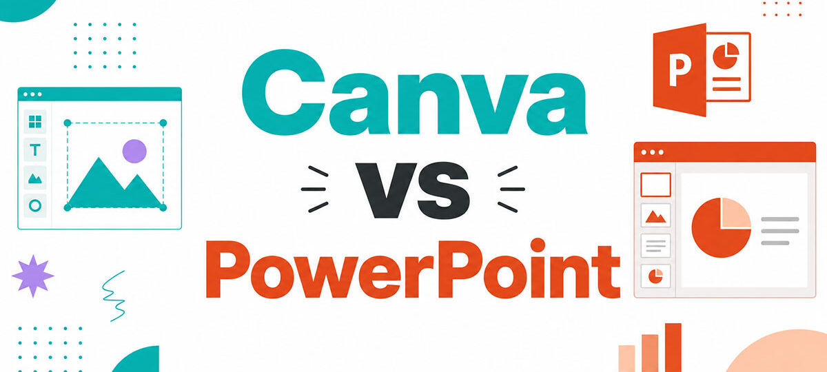
Most people pick their presentation tool once and never question it again. The Canva vs PowerPoint debate has a real answer, but it depends entirely…
Author
Bogdan Sandu is a seasoned designer who has been designing websites since 2008. Renowned for his expertise in logo design and visual branding, Bogdan has developed a multitude of logos for various clients. His skills extend to creating posters, vector illustrations, business cards, and brochures. Additionally, Bogdan's UI kits were featured on marketplaces like Visual Hierarchy and UI8. He also wrote in the past years on sites like Design Your Way, WebDesignerDepot, WPDean, Designmodo, Speckyboy, Slider Revolution, and more.
Most people pick their presentation tool once and never question it again. The Canva vs PowerPoint debate has a real answer, but it depends entirely…
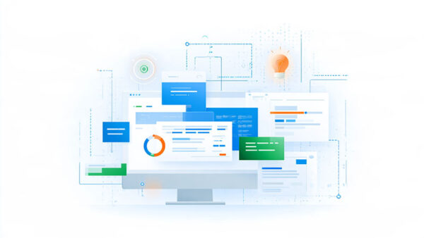
Every font that ends up on a Mac passes through Font Book. Apple bundles it with the operating system, so there’s nothing to download and…
Every handoff has this moment. “That’s 8px, not 12.” The developer nods. The designer moves on. Three days later, the button is still off. Multiply…
The Beehiiv logo is the visual identity of Beehiiv, a newsletter publishing platform built for creators and media companies. It functions as a combination mark,…
Small engineering teams are supposed to be flexible. A backend developer may work on an API in the morning, troubleshoot an AWS deployment after lunch,…
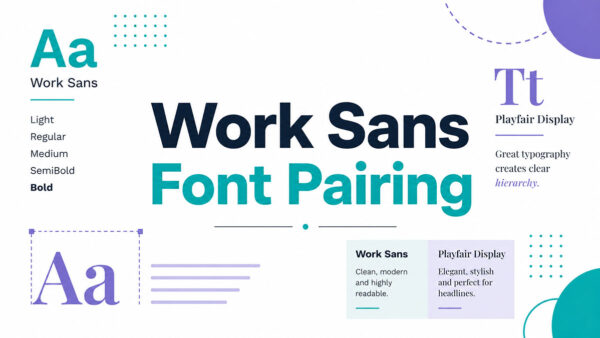
Most fonts are forgettable. Work Sans is not. Designed by Wei Huang for Google Fonts, Work Sans is a geometric sans-serif font built for screen…
A client asks for “just the final files, please,” and suddenly your desktop is a graveyard of “logo_final2_REAL.ai” and forty loose exports nobody labeled. Learning…
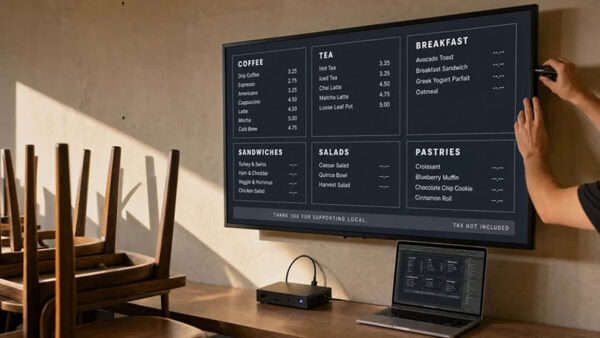
A printed menu board locks in a price for as long as the lamination survives. The moment a supplier raises wholesale or the kitchen runs…
The Arc browser logo is the official visual mark of Arc, a Chromium-based web browser developed by The Browser Company. It functions as both a…
A strong business presentation does more than organize facts. It helps a specific audience understand an argument, assess the evidence, and decide what to do…
The Canva vs Photoshop debate comes down to one question: what does your work actually require? Canva has 260 million monthly active users. Photoshop holds…
Animation is where a character stops being an illustration. A design can look finished as a static render and still fall apart the moment it…
The Webflow logo is a combination mark featuring a three-part geometric “W” symbol alongside a custom wordmark. Introduced with a major rebrand at Webflow Conf…
Every designer has that one project. The one with the big fish client, the impressive contract value, and the invoice that made them do a…
3D stopped being optional for designers somewhere around the time every product page grew a spinning model and every brand deck wanted “dimensional” type. What…
Most font combinations look fine. A few actually work. Getting DM Sans font pairing right means understanding what makes this geometric sans-serif tick. Designed by…
An excellent portfolio gets noticed, but it’s not always the only factor standing between a designer and an offer. The resume, cover letter, and a…
The Miro logo is the official visual mark of Miro, the online collaborative whiteboard platform used by product teams, designers, and remote workers worldwide. It…
SaaS websites have a problem that most other websites don’t. They’re selling something people can’t hold, touch, or immediately understand from a single image. Unlike…
This CM to MM converter turns a centimeter value into millimeters instantly, and it works the other way around too. Type into either field and…
Most visual identities work fine while the person who designed them is still in the room. The trouble starts the moment production moves to people…
An online store can look polished, load quickly and convert well in its home market, yet still lose the majority of visitors who arrive from…
This serif italic font generator rewrites your text using Unicode characters that are already drawn on a slant. No font file, no install, no CSS. The styling…
Are you still spending hours creating UI/UX copy or typography without getting AI assistance? Maybe because you are skeptical about its creativity and accuracy, or…
The font you pick for headings can make or break a design. Not just aesthetically, but functionally. Space Grotesk has become a go-to choice for…
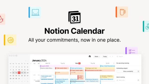
The Notion Calendar logo is the official app icon and visual identity for Notion’s standalone scheduling product, built on the foundation of Cron, a calendar…
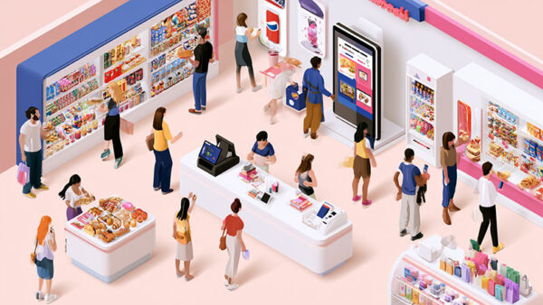
A shopper may want to spot a current promotion, while a hospital visitor needs directions to the correct department. An office team has a different…
Have you ever spent hours filming a product video, only to watch it fail to get views after two days? In the current digital landscape,…
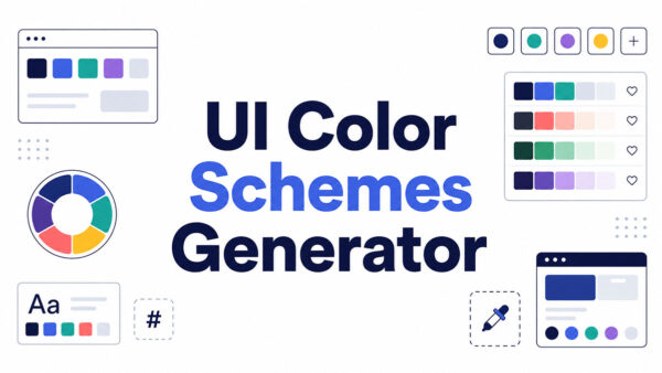
A UI color schemes generator is a tool that produces coordinated color palettes for interface design using color theory rules or a trained model. Feed…
A strong portfolio can get a designer noticed, but it does not tell the whole story of a career. For graphic designers, product designers, UX…