
The Framer logo is the identity of Framer, the Amsterdam-based website builder founded by Koen Bok and Jorn van Dijk. It pairs a black-and-white geometric F icon with a clean “Framer” wordmark. Framer grew from a prototyping tool into a no-code site builder and raised $100 million at a $2 billion valuation in August 2025.
It is often grouped with Figma and Webflow as a design tool with a restrained identity. Framer’s own brand page is one of the few official sources, so the colors and usage facts below come from it.
What Is the Framer Logo?

The Framer logo is a combination mark: an angular F icon made of triangles and rectangles, set beside the word “Framer” in a clean sans-serif. Framer’s brand page offers the icon, the wordmark and an app icon, in black or white. No designer is publicly credited, and no official date for the current version is given.
| Symbol | Angular geometric F made of triangles and rectangles |
| Designer/agency | Not publicly credited |
| Current version since | Not officially dated; the brand page tells users not to use the “old colored logo” |
| Colors (hex) | Black #000000, white #FFFFFF; accents Framer Blue #0099FF and Framer Deep Blue #0055FF (per framer.com/brand) |
| Typeface | Not named by Framer; a clean sans-serif in mixed case |
| Previous major version | An older colored logo, not documented publicly |
How Has the Framer Logo Evolved Over Time?
Framer has no published logo history, and the brand page contains no history section. The only confirmed fact is a negative one: Framer’s guidelines tell users not to use the old colored logo, which means the current black-and-white version replaced a colored one.
What Did the Old Framer Logo Look Like?
The previous mark was colored rather than monochrome, and the brand page says it should no longer be used. We could not find a dated, reliable image history, so this article does not assign years or designers to earlier versions, and earlier claims about three major versions with exact periods have been removed.
What Does the Current Framer Logo Look Like?
The current version is the black or white F icon with the “Framer” wordmark. The brand page says the icon must not be recolored, and blue stays in the product and brand system, not in the logo.
What Do the Design Elements of the Framer Logo Mean?

Framer has not published an official meaning. The icon reads as an F built from two stacked shapes: a rectangle clipped by a diagonal on top, and a lower block ending in an arrow-like point. Because the product is built around a design canvas, it is easy to see frames and layers in it, but that is an interpretation, not a stated intent.
What Are the Framer Logo Colors?
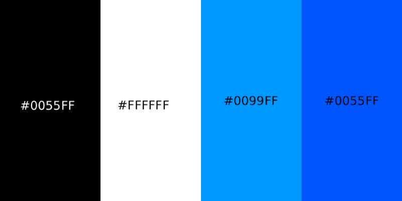
The logo itself is black or white. Framer’s brand page lists four colors: black #000000, white #FFFFFF, Framer Blue #0099FF and Framer Deep Blue #0055FF. The blues belong to the wider brand, and the guidelines say not to apply color to the logo. Another aggregator lists a different blue, #0067D6, which Framer’s own page does not support.
What Font Does the Framer Logo Use?
Framer does not name the wordmark’s typeface. The letters are a clean, geometric-leaning sans-serif in mixed case, not all caps. Framer’s guidelines forbid pairing the logo with other typefaces and creating custom wordmark combinations, so the lettering should be treated as fixed artwork, not a font to reproduce. Any specific font match you see online is a guess.
How Does the Framer Logo Compare to Competitor Logos?
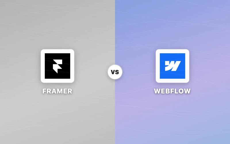
Framer’s app icon is black with a white F, while the Webflow logo sits on a blue tile with a white W, and the Figma logo uses several colored shapes. Framer is the only one of the three that is strictly monochrome in its logo.
How Does the Framer Logo Fit Into the Overall Brand Identity?
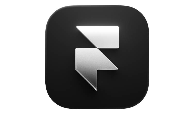
Framer supplies the flat logo, a wordmark and an app icon, shown above as a glossy rounded square. The brand page also offers product shots for press and blog use. Color enters the identity through the two blues, not through the logo.
How Should the Framer Logo Be Used?
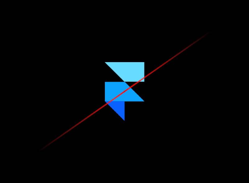
According to Framer’s brand page, the logo must not be distorted, outlined, rotated, skewed, recolored or placed on low-contrast backgrounds. Other typefaces and custom logo combinations are out, and the icon must not be used as the letter F alongside the wordmark. For partnerships, Framer asks for generous space around both logos and says to pair wordmarks with wordmarks and icons with icons at equal size. Framer’s trademark guidelines are on a separate page, so check them before any commercial use.
FAQ on the Framer Logo
What does the Framer logo look like?
It is an angular F icon built from triangles and rectangles, set next to the word “Framer” in a clean sans-serif, in black or white.
What colors are used in the Framer logo?
Black (#000000) and white (#FFFFFF). Framer Blue (#0099FF) and Framer Deep Blue (#0055FF) belong to the wider brand but are not applied to the logo.
Who designed the Framer logo?
No designer or agency is publicly credited. Founders Koen Bok and Jorn van Dijk built the company, but no source links them to the logo design.
When was the current Framer logo introduced?
Framer has not published a date. Its brand page only says the old colored logo should not be used.
What does the Framer logo icon represent?
Framer has not explained it. It reads as a stylized F, and the layered shapes fit a design-canvas product, but that is interpretation.
What did the old Framer logo look like?
It was a colored version rather than black and white, and Framer tells users not to use it. No reliable dated history of earlier versions is available.
What font does the Framer logo use?
Framer does not name it. The wordmark is a clean mixed-case sans-serif, and Framer’s guidelines say not to use other typefaces with the logo.
Is the Framer logo an F?
Visually, yes. The brand page also warns against using the icon as the letter F inside a wordmark.
Where can I download the official Framer logo?
Framer’s brand page at framer.com/brand has the icon, wordmark and app icon.
Can I recolor the Framer logo?
No. Framer’s guidelines say not to apply color to it, so use the black or white version.
Conclusion
The Framer logo is a monochrome F icon and wordmark that leaves color to the rest of the brand. Its history is thinly documented: Framer confirms that an older colored logo existed but gives no dates or credits.
The reliable facts are the colors and the usage rules published on Framer’s own brand page.
Sources
- Framer, Brand and trademark guidelines – https://www.framer.com/brand
- TechCrunch, No-code website builder Framer reaches $2B valuation – https://www.techcrunch.com/2025/08/28/no-code-website-builder-framer-reaches-2b-valuation/
- Framer, About – https://www.framer.com/about

Renowned for his expertise in logo design and visual branding, Bogdan has developed a multitude of logos for various clients.
His skills extend to creating posters, vector illustrations, business cards, and brochures. Additionally, Bogdan's UI kits were featured on marketplaces like Visual Hierarchy and UI8.
He also wrote in the past years on sites like Design Your Way, WebDesignerDepot, WPDean, Designmodo, Speckyboy, Slider Revolution, and more.
- The YouTube Logo History, Colors, Font, and Meaning - 10 November 2026
- Monthly Retainer Billing for Freelance Designers: How to Get Paid on Time, Every Month - 10 November 2026
- How Design Studios Lose New Clients Between the First Email and the Signed Proposal - 10 November 2026

Bogdan Sandu is a seasoned designer who has been designing websites since 2008. Renowned for his expertise in logo design and visual branding, Bogdan has developed a multitude of logos for various clients. His skills extend to creating posters, vector illustrations, business cards, and brochures. Additionally, Bogdan's UI kits were featured on marketplaces like Visual Hierarchy and UI8. He also wrote in the past years on sites like Design Your Way, WebDesignerDepot, WPDean, Designmodo, Speckyboy, Slider Revolution, and more.
You Might Also Like