

The Webflow logo is a combination mark featuring a three-part geometric “W” symbol alongside a custom wordmark. Introduced with a major rebrand at Webflow Conf in October 2023, it replaced the platform’s long-standing wordmark-first identity. The current mark was created in-house by Webflow’s brand team, and it reflects the platform’s no-code positioning within the broader SaaS and web design industry.
Webflow was founded in 2013 by Vlad Magdalin, Sergie Magdalin, and Bryant Chou. The platform sits at the crossroads of visual design tools and production-grade web development, and its logo history reflects that growing ambition. Over its first decade, the brand went through two major visual identities before landing on the current mark.
Current version: 2023 rebrand
Year founded: 2013
Logo iterations: 3 (2013 wordmark, refined 2019 version, 2023 rebrand)
Designer: Webflow in-house brand team
What Is the Webflow Logo?
The Webflow logo is a combination mark built from a custom three-piece “W” symbol and a wordmark set in WF Visual Sans, Webflow’s proprietary typeface. The logomark was unveiled in October 2023 and uses blue (#146EF5) as its primary color, representing the three core pillars of the web: HTML, CSS, and JavaScript.
- Design Type: Combination mark (geometric symbol + wordmark)
- Primary Elements: Three-shape abstract “W” symbol, custom sans-serif wordmark
- Official Introduction Date: October 2023 (Webflow Conf 2023)
- Designer/Agency: Webflow in-house brand team
- Trademark Status: Registered trademark; all rights reserved by Webflow, Inc.
- Color Palette: Primary Blue (#146EF5), Near-Black (#080808), White (#FFFFFF)
- Usage Context: Product UI, marketing materials, digital platforms, merchandise, co-branding with agencies and Webflow app partners
How Has the Webflow Logo Evolved Over Time?
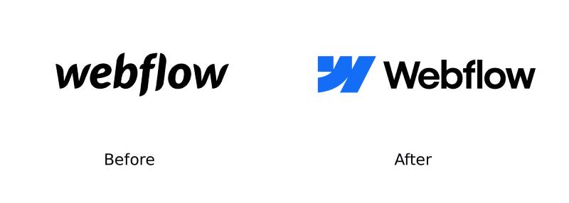
Webflow’s logo history runs across three distinct phases: an early wordmark from 2013, a refined but similar version through the mid-to-late 2010s, and a full rebrand in 2023 that introduced a standalone geometric symbol for the first time.
The jump from the 2013 design to the 2023 mark is significant. Early on, the brand leaned on a stylized wordmark with a wave-like “w” at the front. The new version is modular, systematic, and built to work at any scale, from a tiny favicon to a conference stage backdrop.
Original Webflow Logo (2013-2019)
- Years Active: 2013-2019
- Design Description: Wordmark-driven identity with a stylized lowercase “w” and clean sans-serif lettering; no separate icon or symbol
- Color Scheme: Blue and white, with a slightly muted blue tone compared to the current brand
- Designer: Co-founders and early team
- Context: Launched alongside the platform itself; needed to convey credibility for a then-unknown no-code tool
- Key Changes from Previous: N/A (first version)
- Cultural Significance: Positioned Webflow as a professional tool rather than a hobbyist website builder, at a time when that distinction really mattered
Refined Wordmark (2019-2023)
- Years Active: 2019-2023
- Design Description: Cleaner, more geometric wordmark; the standalone “w” mark became more defined and was used as a favicon and profile icon
- Color Scheme: Brighter blue, closer to the current primary color
- Designer: Webflow design team
- Context: Aligned with the platform’s growth into enterprise and agency markets
- Key Changes from Previous: More refined letterforms, increased use of blue, early attempts at a standalone mark
- Cultural Significance: Reflected Webflow’s shift from scrappy startup to a recognized platform with a $4 billion valuation
Current Logo (2023-Present)
- Years Active: 2023-present
- Design Description: Three-part geometric “W” symbol used independently or alongside the WF Visual Sans wordmark; modular system with sub-brand lockups
- Color Scheme: Vibrant blue (#146EF5), near-black (#080808), white (#FFFFFF)
- Designer: Webflow in-house brand team
- Context: Revealed at Webflow Conf 2023 to mark the platform’s 10th anniversary and a new product direction
- Key Changes from Previous: Introduced a true standalone symbol for the first time; dropped the informal wave “w” in favor of a structured three-shape mark; new custom typeface (WF Visual Sans)
- Cultural Significance: Signals Webflow’s maturity as a platform and its expansion beyond pure website building into a full website experience system
What Do the Design Elements of the Webflow Logo Mean?
The three-piece “W” mark is the most intentional element in Webflow’s identity. Each of the three shapes represents one of the foundational technologies of the web: HTML, CSS, and JavaScript. Together they form a “W” that is geometric, modular, and scalable.
The shapes work both as individual units and as a unified whole. That mirrors exactly what Webflow does as a product: it combines three separate technical layers into one visual interface.
What Does the Symbol Represent in Webflow’s Brand?
The three-part construction is not accidental. Webflow’s CEO Vlad Magdalin described the shapes as representing the “superpowers” the platform gives its users: structure (HTML), style (CSS), and interactivity (JavaScript).
The geometric approach connects to a long tradition in logo design where abstract shapes carry layered meaning. It also lines up with broader principles like Gestalt principles, where separate elements are perceived as a single coherent form.
The choice of a modular mark also gives Webflow room to build a sub-brand system, something the previous wordmark-only identity could not easily support.
Why Did Webflow Choose These Specific Colors?
- Blue (#146EF5)
Color name: Blue Ribbon RGB: (20, 110, 245) CMYK: (92, 55, 0, 4) Pantone: 2727 C Meaning: Trust, reliability, and technical precision. Blue is the dominant color across SaaS and tech company logos. Webflow’s specific shade is brighter and more electric than legacy enterprise tools, which signals energy and creativity alongside competence. From a color psychology standpoint, this blue pushes toward confidence and forward motion.
- Near-Black (#080808)
Color name: Cod Gray RGB: (8, 8, 8) CMYK: (0, 0, 0, 97) Pantone: Black 6 C Meaning: Webflow uses a near-black rather than a true black (#000000). This subtle choice softens the contrast slightly and gives the brand a more refined, high-end feel. It pairs with dark-mode design trends that dominate the platform’s current visual direction.
- White (#FFFFFF)
RGB: (255, 255, 255) CMYK: (0, 0, 0, 0) Meaning: Used as the inverse logo color for dark backgrounds and as a core neutral throughout the design system. White space is built directly into Webflow’s brand guidelines as a non-negotiable element of their visual identity.
What Typography Style Is Used in the Webflow Logo?
The wordmark uses WF Visual Sans, a custom typeface developed specifically for Webflow’s 2023 rebrand. It is a geometric sans-serif with optical size variants: WF Visual Sans Display for headlines and WF Visual Sans Text for body copy, each tuned for readability at different scales.
The letterforms are clean, slightly condensed at smaller sizes, and set with optical kerning. Webflow’s brand guidelines specify sentence case for most uses, with all-caps reserved for eyebrows and labels only.
Before the 2023 rebrand, the wordmark used a third-party sans-serif font. Switching to a proprietary typeface is a meaningful signal: it means Webflow now has full control over its typographic identity, and can extend it consistently across every product touchpoint. That level of investment is usually reserved for brands operating at serious scale.
What Are the Hidden Meanings in the Webflow Logo?
The most discussed element is the three-shape “W” construction. On the surface it reads as a simple letterform. But the intentional split into three distinct pieces directly encodes the platform’s product logic.
There is also a subtle reference to movement in the shapes. The curved construction of the earlier Webflow marks, which explicitly referenced flow and fluidity, is toned down in the 2023 version. The current mark is more structured. But the name “Webflow” and the geometric curves still carry that sense of things moving forward, of design that does not get stuck.
Webflow’s brand team has not publicized any additional subliminal elements. What you see is mostly what you get, and that restraint is itself a design choice.
How Does the Webflow Logo Compare to Competitor Logos?
Webflow sits in a competitive space alongside tools like Framer, WordPress, Wix, and Squarespace. Its logo is notably more technical and systematic in feel than most of its direct competitors, which tend toward warmer, friendlier visual identities.
Framer uses a geometric mark of its own, but its identity leans more editorial. WordPress relies on a circular emblem that has barely changed in 20 years. Wix and Squarespace both use straightforward wordmarks with no symbol, which gives them less flexibility at small sizes.
The Webflow mark is closest in spirit to design tools like Figma, which also uses a multi-shape geometric symbol where each piece carries meaning. Both brands are making a similar argument: that their tools are serious, systematic, and built for professionals. That said, Figma’s mark is more playful with color. Webflow’s is more restrained, leaning heavily on a single blue plus black and white.
Compared to Linear and Notion Calendar, which both use extremely minimal single-color marks, Webflow’s identity is richer and more expressive. It has more to say about what the product actually does.
What Are the Technical Specifications of the Webflow Logo?
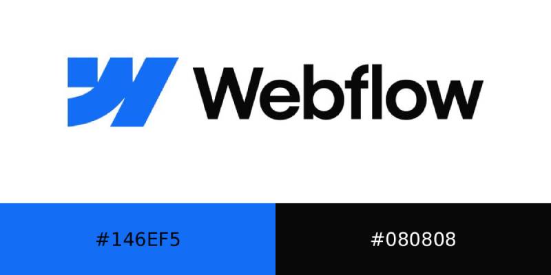
Official Color Codes
- Primary Color: Blue Ribbon
Hex: #146EF5 RGB: (20, 110, 245) CMYK: (92, 55, 0, 4) Pantone: 2727 C
- Secondary Color: Cod Gray (Near-Black)
Hex: #080808 RGB: (8, 8, 8) CMYK: (0, 0, 0, 97) Pantone: Black 6 C
- Accent/Inverse Color: White
Hex: #FFFFFF RGB: (255, 255, 255) CMYK: (0, 0, 0, 0)
Dimensions and Proportions
- Aspect ratio: The combination mark (symbol + wordmark) is approximately 6:1 width to height in landscape lockup
- Minimum size requirements: The symbol should not be used below 16px for digital; the combination mark should not appear below 80px wide
- Clear space: Webflow’s official guidelines specify clear space equal to the height of the “W” symbol on all sides
- Official usage guidelines: Available at brand.webflow.com; monochromatic usage only (one color, black, and white per asset); no multi-color combinations in a single element
What Cultural Impact Has the Webflow Logo Had?
The 2023 rebrand was well received within the design and no-code communities. The reveal at Webflow Conf generated immediate discussion on design forums and social platforms, largely positive, with many noting how much more scalable and intentional the new mark is compared to the previous wordmark.
For the no-code community specifically, the rebrand mattered because it signaled that Webflow was not positioning itself as a side tool or a beginner’s shortcut. The structured, technical symbolism of the three-part “W” says: this is a platform for people who take building seriously.
The decision to develop a custom typeface (WF Visual Sans) also caught attention among type designers and brand professionals. It put Webflow in a category alongside larger companies that invest in proprietary typography as a long-term brand asset.
How Does the Webflow Logo Fit Into the Overall Brand Identity?
The logo is the entry point into a much larger system. Webflow’s full brand identity includes a multi-color palette (though monochromatic per asset), a proprietary type family with multiple optical sizes, a specific illustration style modeled on technical/medical illustration, and a dark-mode-first visual direction.
The three-part symbol also enables a sub-brand system. Webflow uses it for product lines, community programs, agency partnerships, and event co-branding. That kind of flexibility is hard to build from a wordmark alone.
The brand guidelines are publicly available at brand.webflow.com and serve as a working document for Webflow’s partners, agencies, and Marketplace app developers. This transparency is consistent with how Webflow has built its community: by treating users as professionals who can handle the details.
The logo connects directly to a broader brand style guide that governs everything from photography direction to color usage in product UI versus marketing materials.
How Should the Webflow Logo Be Used?
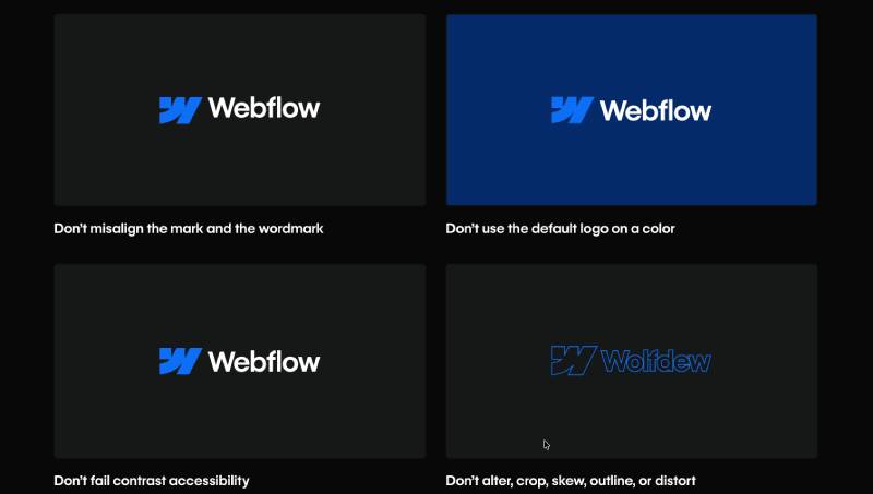
Do’s
- Use the full combination mark (symbol + wordmark) as the default lockup
- Use the standalone symbol as a favicon, app icon, or where space is very limited
- Maintain clear space equal to the height of the “W” on all sides
- Use in full color (blue on white), all white (on dark or colored backgrounds), or all black
- Follow the monochromatic rule: one color, black, and white per asset
Don’ts
- Do not stretch, distort, or recolor the mark
- Do not use multiple brand colors within a single logo element
- Do not place the logo on busy backgrounds that reduce legibility
- Do not use the Webflow logo to imply official endorsement without authorization
- Do not alter the proportions between the symbol and the wordmark
Where to Access Official Logos
Official logo files (SVG, PNG) are available at brand.webflow.com/brand-assets. The brand guidelines, including usage rules and sub-brand specifications, are at brand.webflow.com/design-guidelines.
Licensing and Trademark
The Webflow logo is a registered trademark of Webflow, Inc. Use by third parties, including agencies, app developers, and community organizers, is governed by Webflow’s brand guidelines and co-branding policy. Unauthorized commercial use or modification is not permitted. For partnership co-branding (split logos, event badges), Webflow provides specific lockup templates through its brand portal.
FAQ on The Webflow Logo
What does the Webflow logo represent?
The three-part geometric “W” symbol stands for HTML, CSS, and JavaScript.
Each shape represents one of those web-building layers. Together they form a combination mark that reflects the platform’s core mission: visual development without hand-coding.
When was the current Webflow logo introduced?
The current logo launched at Webflow Conf 2023 in October 2023, marking the platform’s 10th anniversary.
It was the first time Webflow introduced a true standalone symbol separate from its wordmark.
What font does the Webflow logo use?
The wordmark is set in WF Visual Sans, a custom typeface developed specifically for the 2023 rebrand.
It comes in two optical sizes: Display for headlines, Text for body copy. Both are geometric sans-serif cuts tuned for readability at different scales.
What are the official Webflow logo colors?
The primary color is Blue Ribbon (#146EF5), with RGB values of (20, 110, 245) and Pantone 2727 C.
Supporting colors are near-black (#080808) and white (#FFFFFF). The brand uses a monochromatic rule: one color, black, and white per asset.
How many times has the Webflow logo changed?
There have been three main versions: the original 2013 wordmark, a refined version around 2019, and the current 2023 rebrand.
The 2023 version was the most significant shift, introducing the three-piece logomark for the first time.
Who designed the Webflow logo?
The 2023 rebrand was handled by Webflow’s in-house brand team.
Earlier versions were developed internally by the founding team and design staff. No external agency has been credited publicly for the current brand identity work.
Can I use the Webflow logo on my website?
You can use it under Webflow’s official brand guidelines, available at brand.webflow.com.
Unauthorized modifications, recoloring, or using the logo to imply official endorsement without permission are not allowed. Trademark protection applies to all logo assets.
What is the difference between the Webflow logo and the Webflow mark?
The mark is the standalone three-shape “W” symbol used when space is limited, such as favicons or app icons.
The full logo is the combination mark: the symbol paired with the WF Visual Sans wordmark. Both are part of the same logo system.
How does the Webflow logo compare to Framer and Figma?
All three use geometric symbols, but each takes a different direction. Figma’s mark is more colorful and playful. Framer’s leans editorial.
Webflow’s is the most restrained, using a single primary blue alongside black and white. It reads as technical and systematic rather than expressive.
Where can I download the official Webflow logo files?
Official SVG and PNG files are available at brand.webflow.com/brand-assets.
The page includes logo variants for light and dark backgrounds, the standalone mark, and sub-brand lockup templates for agency and app partner co-branding use.
Conclusion
The Webflow logo is more than a wordmark refresh. It is a deliberate identity system built around the three pillars of web development: HTML, CSS, and JavaScript.
The three-piece logomark gives the brand flexibility it never had before, working across favicons, conference stages, and co-branded agency assets without losing clarity.
With a custom typeface, a tight monochromatic color rule, and a primary blue (#146EF5) that sits firmly in SaaS branding territory, Webflow’s visual identity now matches the scale and seriousness of the platform itself.

Renowned for his expertise in logo design and visual branding, Bogdan has developed a multitude of logos for various clients.
His skills extend to creating posters, vector illustrations, business cards, and brochures. Additionally, Bogdan's UI kits were featured on marketplaces like Visual Hierarchy and UI8.
He also wrote in the past years on sites like Design Your Way, WebDesignerDepot, WPDean, Designmodo, Speckyboy, Slider Revolution, and more.
- Versatile Georgia Font Pairing for Timeless Layouts - 24 October 2026
- How to Turn Inconsistent UI into One Design System (Without a Full Redesign) - 24 October 2026
- Beautiful Fonts Similar to Poppins You Should Try - 22 October 2026

Bogdan Sandu is a seasoned designer who has been designing websites since 2008. Renowned for his expertise in logo design and visual branding, Bogdan has developed a multitude of logos for various clients. His skills extend to creating posters, vector illustrations, business cards, and brochures. Additionally, Bogdan's UI kits were featured on marketplaces like Visual Hierarchy and UI8. He also wrote in the past years on sites like Design Your Way, WebDesignerDepot, WPDean, Designmodo, Speckyboy, Slider Revolution, and more.
You Might Also Like


