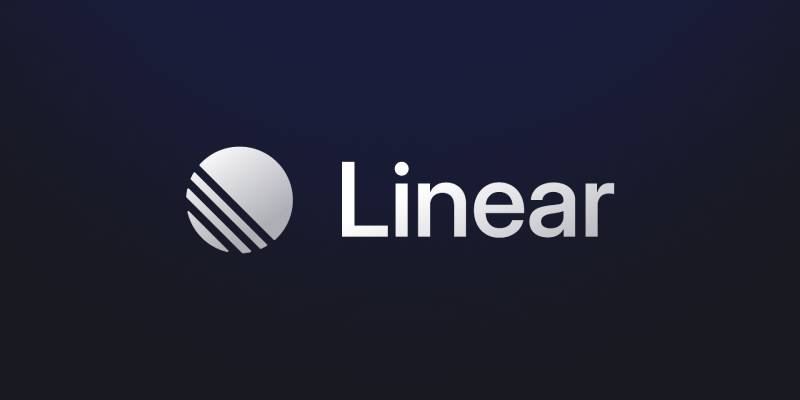
The Linear logo is the visual identity for Linear (legal name: Linear Orbit, Inc.), a software project management tool built for engineering teams.
It consists of a geometric logomark paired with a clean wordmark, both reflecting the product’s core focus on speed, precision, and minimal friction.
Linear was founded in 2019 by Karri Saarinen, Jori Lallo, and Tuomas Artman, all veterans of companies like Airbnb, Coinbase, and Uber.
The brand has gone through quiet but deliberate visual updates since launch, staying consistent with its professional, dark-mode-first identity.
What Is the Linear Logo?
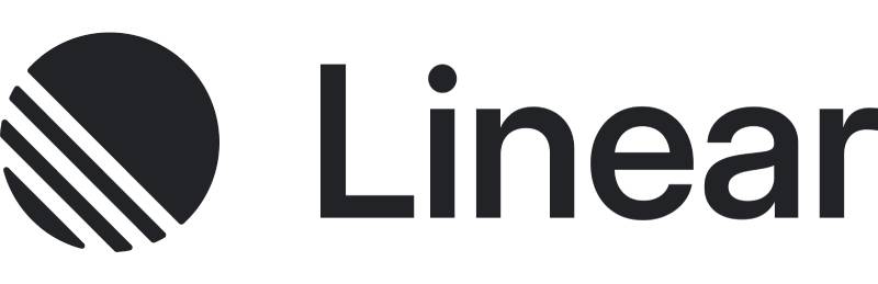
The Linear logo is a combination mark featuring a geometric spherical logomark and a sans-serif wordmark set in Inter. Introduced when the company launched in 2019, it was designed internally by co-founder Karri Saarinen. The mark uses a restrained indigo-blue accent against near-black backgrounds, built to communicate precision and craftsmanship to its engineering audience.
- Design Type: Combination mark (logomark + wordmark)
- Primary Elements: Geometric sphere-derived icon, Inter-based wordmark
- Official Introduction Date: 2019
- Designer: Karri Saarinen (co-founder, CEO)
- Trademark Status: Proprietary; all graphics protected under intellectual property law per Linear’s official brand guidelines
- Color Palette:
- Mercury White: #F4F5F8
- Nordic Gray: #222326
- Linear Lavender-Blue (primary accent): #5E6AD2
- Lavender Hover: #8299FF
- Usage Context: Product UI, marketing site, social media, brand assets, app icons, documentation
How Has the Linear Logo Evolved Over Time?
Linear’s visual identity has stayed deliberately minimal since 2019, with gradual refinements rather than dramatic overhauls. The core elements, the sphere-derived icon, the Inter wordmark, and the dark color system, have remained consistent. The biggest visible shift came with the full UI redesign rolled out in early 2024, which tightened contrast and updated the overall visual language.
Original Linear Logo (2019-2022)
- Years Active: 2019-2022
- Design Description: A gradient sphere logomark (rendered in a mix of purple, teal, and pink tones) paired with the “Linear” wordmark in Inter, set against a near-black background
- Color Scheme: Gradient sphere using blues, purples, and teals; dark gray/black background; light gray text
- Designer: Karri Saarinen
- Context: Launched alongside the product in 2019, designed to look professional and technical rather than playful; directly aimed at engineers who wanted serious tooling
- Key Changes from Previous: N/A (first version)
- Cultural Significance: The original logo helped define what would later be called “Linear style” across SaaS design, a dark-mode aesthetic with gradient accents that spread widely across the industry
Refined Linear Logo (2022-2024)
- Years Active: 2022-2024
- Design Description: The gradient sphere was toned down; the logomark shifted toward a cleaner, more restrained geometric mark; wordmark remained in Inter
- Color Scheme: Reduced reliance on the multi-color gradient; shifted toward the indigo-blue primary accent (#5E6AD2)
- Designer: Linear design team
- Context: As the product matured and the team grew, the brand moved toward more consistency and restraint
- Key Changes from Previous: Less saturated gradient; more controlled color usage; cleaner icon geometry
- Cultural Significance: Marked the shift from “scrappy startup” to a product serious enough to compete with Jira and Asana
Current Linear Logo (2024-Present)
- Years Active: 2024-present
- Design Description: Fully refined combination mark. The logomark is a clean geometric shape, and the wordmark is set in a custom-edited sans closely related to Inter. Official brand guidelines distinguish three uses: the wordmark (primary), the logomark (tight layouts), and a stylized icon (social/chip contexts)
- Color Scheme: Mercury White (#F4F5F8), Nordic Gray (#222326), Lavender-Blue (#5E6AD2)
- Designer: Linear design team, led by Romain and Yann with Karri Saarinen overseeing direction
- Context: Released alongside the full UI redesign in March 2024, bringing a neutral, timeless look with higher contrast
- Key Changes from Previous: Increased contrast, more neutral base tones, tighter geometric logo execution, explicit three-tier brand asset system (wordmark / logomark / icon)
- Cultural Significance: Solidified Linear’s position as a design-forward tech product; the brand is now widely cited as a benchmark for SaaS visual identity
What Do the Design Elements of the Linear Logo Mean?
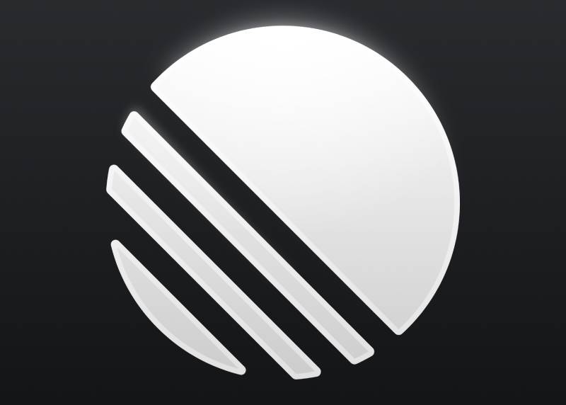
Every element of the Linear logo carries a specific intent. The geometric logomark communicates precision and structure. The Inter-based wordmark reads as technical without being cold. The overall system is built for balance across light and dark contexts, which matters a lot for a product that ships both themes.
The logomark functions as a focused focal point within the brand system, compact enough to work as a favicon or app icon, clear enough to hold up in a wordmark lockup.
Why Does the Visual Identity Lean So Heavily on Dark Tones?
Karri Saarinen has spoken about this directly. The dark background was deliberate, built to mirror the coding environments engineers already live in.
It reduces eye strain. It signals professionalism over playfulness. And it sets Linear apart from the colorful, illustration-heavy SaaS brands that were common when the company launched in 2019.
The choice was also practical. Dark interfaces drain less battery on OLED screens, which matters when your users are staring at the product for eight or more hours a day.
Why Did Linear Choose These Specific Colors?
- Lavender-Blue (#5E6AD2)
- Color name: Linear Lavender-Blue (internal designation)
- Hex: #5E6AD2 | RGB: 94, 106, 210
- Symbolic meaning: Focus, precision, technical credibility
- Psychological impact: Calm authority without being corporate or cold; the desaturation keeps it from feeling aggressive
- Brand connection: Used exclusively on the brand mark, focus rings, and primary CTA; never decoratively
- Mercury White (#F4F5F8)
- Color name: Mercury White
- Hex: #F4F5F8 | RGB: 244, 245, 248 | CMYK: 2, 1, 0, 3
- Symbolic meaning: Clarity, breathing room, legibility
- Psychological impact: Softens the contrast just enough to avoid harshness; it is off-white rather than pure white, which feels more considered
- Brand connection: Preferred for monochrome wordmark usage on light backgrounds
- Nordic Gray (#222326)
- Color name: Nordic Gray
- Hex: #222326 | RGB: 34, 35, 38 | CMYK: 11, 8, 0, 85
- Symbolic meaning: Depth, focus, technical seriousness
- Psychological impact: Near-black with a subtle blue tint; warmer than pure black, less stark on screen
- Brand connection: The primary dark surface across the brand and product UI
Understanding how these colors interact is really about color theory in a practical context. Linear uses monochrome colors as its backbone, with the lavender-blue appearing sparingly as the single chromatic accent. That restraint is what makes it work.
What Typography Style Is Used in the Linear Logo?
The wordmark uses Inter, a sans-serif font designed by Rasmus Andersson, originally built for screen interfaces.
For the current brand system, Linear uses a custom-edited version of this typeface for the wordmark, with a separate display cut (with SF Pro Display as a fallback) used for marketing headlines. Body copy in the product uses a text-optimized variant, with a monospace cut for code snippets.
The tracking in display contexts pulls aggressively negative, down to -3.0px at 80px. At body sizes it holds near zero. That contrast between tight display type and neutral body type is a signature of the Linear visual style.
The font choice reinforces the product’s positioning. Inter is not ornamental. It is legible, neutral, and built for dense UI, exactly what a project management tool for engineers needs.
What Are the Hidden Meanings in the Linear Logo?
There is no complex hidden symbolism in the Linear logo. That is actually the point.
Karri Saarinen has said repeatedly that Linear is designed to look professional rather than clever. The logomark reads as geometric and precise, and that is the message: this tool does not waste your time.
The earlier gradient sphere did carry some unintentional associations. It referenced depth, motion, and energy, but it also started a whole design trend across SaaS. By 2022, dozens of products had adopted similar gradient orbs. Linear quietly moved away from that to stay distinct.
The current mark is more controlled. The emphasis is on geometry and restraint, not spectacle.
How Does the Linear Logo Compare to Competitor Logos?
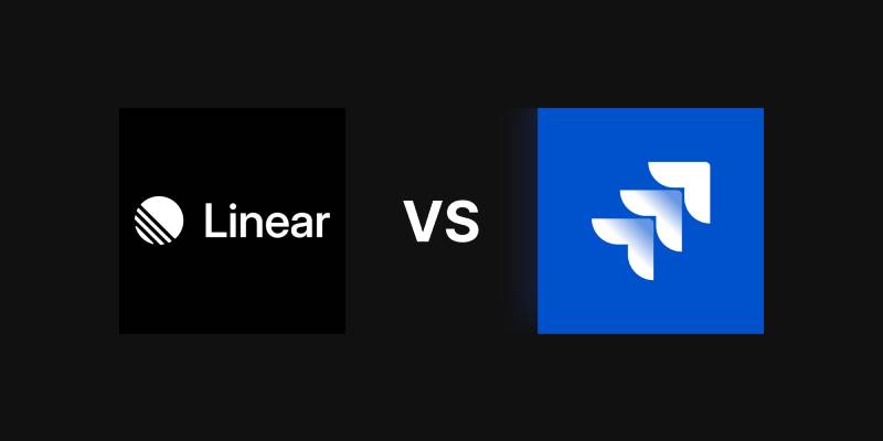
Linear sits in a space alongside tools like Jira (Atlassian), Asana, ClickUp, and Notion. Most of those brands lean into bright, approachable color palettes. Linear does the opposite.
Look at the Atlassian logo or the Monday.com logo. Both are built around vibrant colors and friendly wordmarks, aiming to feel accessible and human. Linear goes the other direction on purpose.
The Notion Calendar logo and the Figma logo are closer comparisons in terms of minimal design sensibility. Both use restrained palettes and clean geometry. But Figma relies on multi-color and Notion on warm neutrals.
Linear’s indigo accent and near-black base are more austere than any of these. It is the only major tool in this space that deliberately mirrors a dark IDE. That specificity is a real differentiator. Whether you love it or find it cold depends entirely on who you are.
Compare it to something like the ClickUp logo, which goes heavy on color and energy. Completely different philosophy. ClickUp wants to feel exciting. Linear wants to feel precise.
That tension is worth noting. As more SaaS tools have adopted the dark, minimal aesthetic, the original distinctiveness of Linear’s brand has had to work harder. The 2024 redesign was partly a response to that, pushing toward a more timeless look rather than a trendy one.
What Are the Technical Specifications of the Linear Logo?
Official Color Codes
- Primary Accent: Linear Lavender-Blue
- Hex: #5E6AD2
- RGB: (94, 106, 210)
- Hover state: #8299FF
- Light: Mercury White
- Hex: #F4F5F8
- RGB: (244, 245, 248)
- CMYK: (2, 1, 0, 3)
- Dark: Nordic Gray
- Hex: #222326
- RGB: (34, 35, 38)
- CMYK: (11, 8, 0, 85)
- Canvas (deep dark surface):
- Hex: #010102
- RGB: (1, 1, 2)
Dimensions and Proportions
- Aspect ratio: Not publicly specified; the logomark and wordmark are available as separate assets
- Minimum size: Not formally published; the logomark is built to scale down to favicon size
- Clear space: Linear’s brand guidelines specify giving assets “plenty of space to breathe”; no specific measurement is published
- File formats available: SVG, PNG (available via the official brand asset download at linear.app/brand)
- Usage: Monochrome usage is preferred for the wordmark; the brand color (lavender-blue) is typically reserved for backgrounds rather than the wordmark itself
What Cultural Impact Has the Linear Logo Had?
The Linear logo, and the broader design system around it, had a measurable impact on SaaS design between 2020 and 2024.
The combination of dark background, gradient accent, and Inter-based wordmark became so widely copied that the term “Linear style” entered common use in design circles. What started as a deliberate product decision became a genre. By 2024, LogRocket’s design blog noted that “almost every SaaS website looks the same” due to the proliferation of Linear-influenced design.
That is an unusual kind of influence. Most tech company logos do not define an aesthetic category. The original Apple, Google, and Stripe identities influenced their peers, but not to the degree that a single product’s design language became a named trend.
The gradient sphere from the original identity is part of why. It was widely reproduced and adapted. Karri Saarinen himself has credited Finnish design sensibility, particularly the preference for function and durability over ornament, as a core influence on the brand’s character. That ethos tracked closely with how minimalist design was already developing in tech, and Linear amplified it at exactly the right moment.
The 2024 move toward a more neutral, timeless look was, at least in part, a response to that saturation. When your brand has been copied enough that it defines a trend, the only way to stay distinctive is to quietly evolve past it.
How Does the Linear Logo Fit Into the Overall Brand Identity?
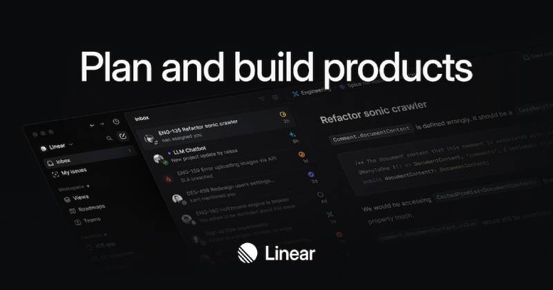
The logo is one part of a tightly controlled identity system. Linear’s brand connects the logomark, the wordmark, the color system, the typography, and the product UI into a single coherent visual language.
The brand guidelines are public and specific. The company distinguishes between three logo assets: the wordmark (for general use), the logomark (for tight layouts), and a stylized icon (for social media and chip contexts). That level of structure is more typical of large enterprises than a startup, which says something about how seriously the founders take craft.
The lavender-blue accent appears on the brand mark, in the product’s focus rings, and on the primary call-to-action button. It does not appear decoratively. That kind of discipline is rare. Most brands dilute their accent color through overuse.
The product UI itself functions as a brand touchpoint. The dark surfaces, the tight typography, the geometric visual hierarchy, all of these extend the logo’s logic into the actual software. That unity between brand and product is one of the reasons Linear is frequently cited in design discussions about what a well-crafted SaaS identity looks like.
The brand style guide also reflects a useful relationship between the logo and the product name. “Linear” is always capitalized, always treated as a single word, never “Linear app.” That naming consistency reinforces the alignment between how the brand looks and how it speaks.
How Should the Linear Logo Be Used?
Do’s
- Use the wordmark for all general references to Linear where space allows
- Use the logomark for tight layouts or logo grids
- Use the stylized icon for social media profiles or “chip” design contexts
- Give the logo plenty of space; do not let it feel cramped
- Use monochrome versions of the wordmark with the official brand colors
- Scale assets freely (large or small) as long as clear space is maintained
Don’ts
- Do not alter the logo files in any way
- Do not use the graphics in a way that implies affiliation, endorsement, or partnership with Linear
- Do not incorporate the logo into your own product, business, or service name
- Do not combine the logo with other graphics without written consent from Linear
Where to Access Official Assets
Official brand assets (SVG, PNG) are available for download at linear.app/brand. The download includes the wordmark, logomark, and icon in both light and dark variants.
Licensing and Trademark
The Linear logo and all associated graphics are proprietary and protected under intellectual property law. The trademark is held by Linear Orbit, Inc. Any questions about usage rights should be directed to hello@linear.app.
The logo is a registered brand asset, not an open-source graphic. Using it outside of standard editorial or press contexts requires direct permission from Linear.
FAQ on The Linear Logo
What type of logo does Linear use?
Linear uses a combination mark. That means a geometric logomark paired with a wordmark set in Inter.
The logomark works standalone in tight layouts. The wordmark is preferred for general brand references. Both are available as separate assets from the official brand page.
What font is used in the Linear logo?
The wordmark uses Inter, a sans-serif typeface built for screen interfaces.
For the current brand system, Linear uses a custom-edited version. Display headlines use a separate cut with SF Pro Display as fallback. It is clean, neutral, and built for dense UI contexts.
What are the official Linear logo colors?
Linear’s brand color system uses three main values: Mercury White (#F4F5F8), Nordic Gray (#222326), and Lavender-Blue (#5E6AD2).
The lavender-blue is the single chromatic accent. It appears on the brand mark and primary CTA. A lighter hover state (#8299FF) extends the same hue. No other colors appear decoratively.
Who designed the Linear logo?
Karri Saarinen, co-founder and CEO of Linear, designed the original identity when the company launched in 2019.
Saarinen previously led design at Airbnb and Coinbase. The logo reflects his preference for professional, minimal aesthetics aimed specifically at engineering teams rather than a general audience.
Has the Linear logo changed over time?
Yes, though the changes have been gradual. The original identity featured a multi-color gradient sphere in purple, teal, and pink tones.
Over time that was replaced with a more restrained geometric mark. The 2024 UI redesign brought the biggest shift, moving toward higher contrast, neutral tones, and a more timeless visual language overall.
What does the Linear logo symbolize?
The logo communicates precision, speed, and professional craft. There is no complex hidden symbolism. That is intentional.
Karri Saarinen has said the design is meant to look professional rather than playful. The geometric logomark and restrained color palette reflect the product’s core values: focus, clarity, and minimal friction for engineering teams.
What is the Linear logo file format?
Official assets are available in SVG and PNG formats. Both are downloadable from linear.app/brand.
SVG is the preferred format for most digital uses since it scales without quality loss. The download pack includes the wordmark, logomark, and stylized icon in light and dark variants.
How does the Linear logo compare to other project management tools?
Most competitors, including Asana, ClickUp, and Monday.com, use bright and approachable color palettes. Linear goes the opposite direction.
The near-black background and single indigo accent are more austere than anything else in the space. It mirrors a dark IDE intentionally. That specificity is what makes it recognizable among engineering-focused teams.
Can I use the Linear logo in my project?
The Linear logo is proprietary and protected under intellectual property law. You cannot alter it, embed it in your own product name, or imply endorsement from Linear.
Standard editorial and press use is generally acceptable. For anything beyond that, contact Linear directly at hello@linear.app before using any brand assets.
Why did the Linear logo influence so many SaaS brands?
The original gradient sphere combined with a dark background and clean wordmark design hit at exactly the right moment in SaaS design history.
It was widely copied, and the term “Linear style” entered common use in design circles by 2022. That level of influence is rare for a single product identity. By 2024, Linear had quietly moved past the trend it started.
Conclusion
The Linear logo is one of the more deliberately considered brand marks in the current SaaS space, built around a single chromatic accent, a restrained geometric logomark, and a wordmark system that prioritizes precision over personality.
What makes it work is consistency. The stroke-based logo design, the Inter-derived typography, and the near-black color system all reinforce the same message across every surface.
It started a design trend. Then it quietly evolved past it. That is a harder thing to pull off than it looks.

Renowned for his expertise in logo design and visual branding, Bogdan has developed a multitude of logos for various clients.
His skills extend to creating posters, vector illustrations, business cards, and brochures. Additionally, Bogdan's UI kits were featured on marketplaces like Visual Hierarchy and UI8.
He also wrote in the past years on sites like Design Your Way, WebDesignerDepot, WPDean, Designmodo, Speckyboy, Slider Revolution, and more.
- The Windsurf Logo History, Colors, Font, And Meaning - 10 October 2026
- How to Remove Background From Product Photos (No Photoshop) - 10 October 2026
- How Designers can Build a Stronger Online Creative Identity - 9 October 2026

Bogdan Sandu is a seasoned designer who has been designing websites since 2008. Renowned for his expertise in logo design and visual branding, Bogdan has developed a multitude of logos for various clients. His skills extend to creating posters, vector illustrations, business cards, and brochures. Additionally, Bogdan's UI kits were featured on marketplaces like Visual Hierarchy and UI8. He also wrote in the past years on sites like Design Your Way, WebDesignerDepot, WPDean, Designmodo, Speckyboy, Slider Revolution, and more.
You Might Also Like