Color choices shape how people respond to everything from a website layout to a gallery wall. But what are monochrome colors, and why do designers keep reaching for them over multi-hue palettes?
A monochromatic color scheme uses tints, shades, and tones of a single base hue. It’s one of the simplest approaches in color theory, and one of the most effective when you want visual cohesion without clutter.
This article breaks down how monochrome palettes work, how they compare to other color schemes, and where they show up in practice. You’ll also learn when a single-hue approach falls short, and what to do about it.
What Are Monochrome Colors

Monochrome colors are variations of a single base hue. You take one color from the color wheel, then create lighter, darker, and muted versions of it. That’s the full picture.
The word itself comes from Greek. “Mono” means one. “Chroma” means color. Simple enough.
But here’s where most people get tripped up. Monochrome doesn’t mean black and white. That’s probably the most common misconception out there, and it’s wrong. Black and white is technically achromatic, which means “without color” entirely. A monochrome palette can start from any hue on the spectrum.
Pick blue. Pick red. Pick a murky olive green. Doesn’t matter. Once you’ve locked in your base color, everything else in the palette gets built from three operations:
- Tints: Add white to the base color. You get lighter, softer versions.
- Shades: Add black. The color gets deeper and darker.
- Tones: Mix in gray. This mutes the color without making it strictly lighter or darker.
A well-built monochrome color palette typically uses between three and seven of these variations. The Tate Art Museum puts it plainly: a monochrome artwork includes only one color.
Straits Research data shows that 85% of buyers say color is the primary factor when selecting a product. That alone explains why understanding how a single-hue palette works matters for anyone making design decisions.
How Monochrome Color Schemes Work
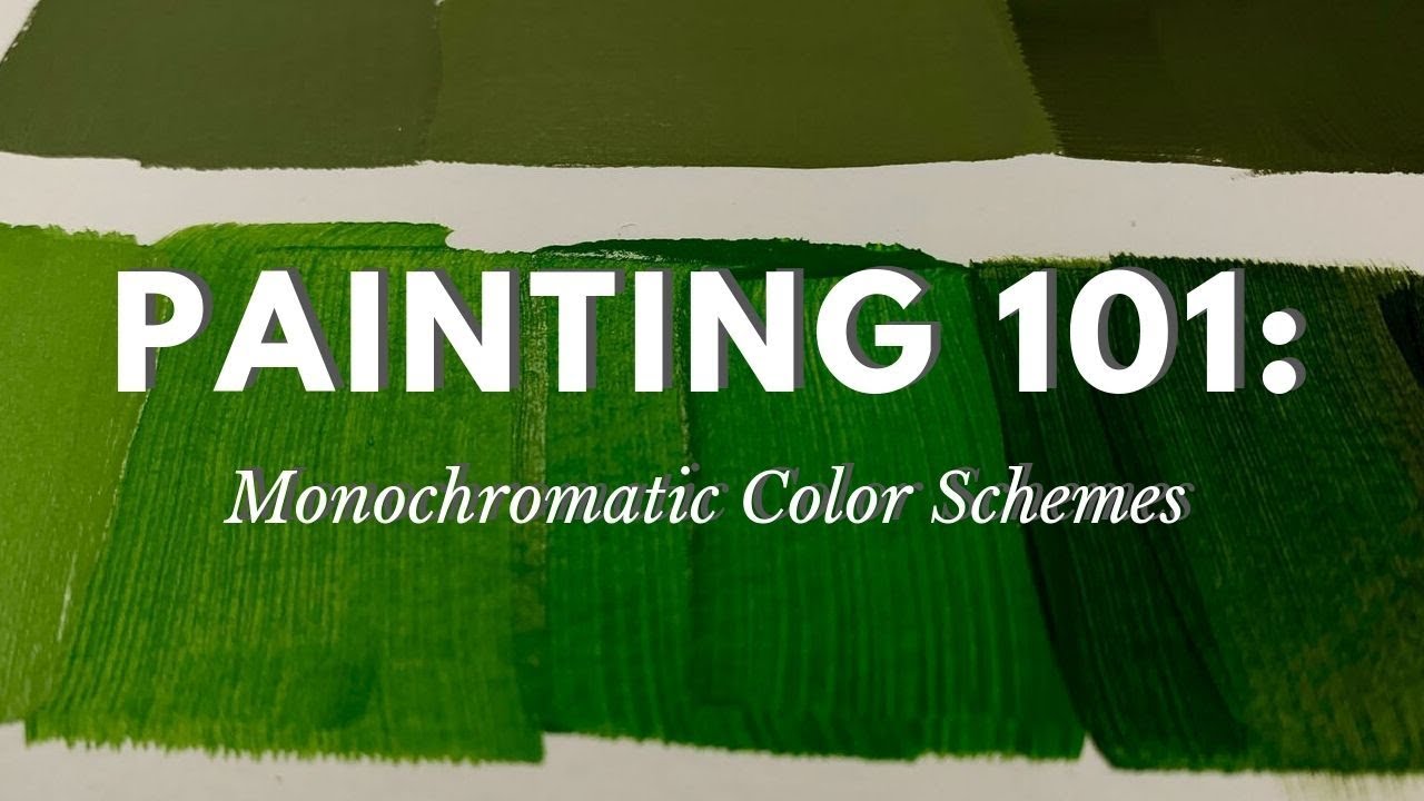
Building a monochromatic color scheme starts at the color wheel. You pick one position on it, and that becomes your anchor.
Everything that follows is a manipulation of that single hue’s lightness and saturation. The hue itself never changes. You’re just sliding the brightness up or down and adjusting how vivid or muted each step looks.
In HSL terms (Hue, Saturation, Lightness), only the S and L values move. The H stays fixed. Took me a while to really internalize that distinction, but once you see it in a color picker, it clicks fast.
| Operation | What Changes | Visual Result |
|---|---|---|
| Tint | White added to base hue | Lighter, pastel-like versions |
| Shade | Black added to base hue | Deeper, richer versions |
| Tone | Gray added to base hue | Muted, subdued versions |
The key is spacing. If your lightest tint and your darkest shade are too close together, the palette looks flat. Too far apart and you lose the sense that they belong together. Most usable palettes land somewhere around five to seven distinct values.
Monochrome vs. Achromatic Colors
This gets confused constantly. Achromatic means zero hue. Black, white, and every gray in between. No color at all.
Monochrome means one color, but it’s still a color. A deep navy, a pale sky blue, and a muted slate blue are all monochromatic if they share the same base hue. They’re not achromatic because there’s actual color information present.
The confusion probably comes from photography. “Monochrome photo” has been shorthand for black-and-white images for decades. But in color theory, the two concepts are clearly separate.
Monochrome Colors vs. Other Color Schemes

A monochromatic scheme is the most restricted option on the spectrum of color relationships. One hue. That’s it. Every other scheme pulls from multiple positions on the wheel.
Analogous colors sit next to each other on the wheel. Think blue, blue-green, and green. They share a visual warmth but introduce more variety than a single hue can offer. A complementary color scheme pulls from opposite sides, like blue and orange, creating maximum contrast.
| Scheme | Hues Used | Best For |
|---|---|---|
| Monochromatic | One | Cohesion, elegance, focused branding |
| Analogous | Two to three (adjacent) | Harmonious, nature-inspired palettes |
| Complementary | Two (opposite) | High-contrast, attention-grabbing layouts |
| Triadic | Three (evenly spaced) | Balanced variety, playful designs |
| Split-complementary | Three (base + two flanking) | Contrast with less tension |
Where monochrome wins: it’s almost impossible to create a clashing palette when you only use one color. The visual color harmony is built in.
Where it loses: differentiating between multiple data categories, or creating strong visual hierarchy across complex interfaces. If you need five clearly distinct sections on a dashboard, a single hue won’t cut it. Your mileage may vary, but I’ve found that monochrome works best when you’re making one thing feel intentional rather than trying to juggle many competing elements.
Monochrome Color Theory in Practice

The jump from theory to practice is where monochrome gets interesting. A single-hue palette shows up across nearly every design discipline, but how it’s used varies a lot.
Branding and identity: Apple’s product photography leans heavily on achromatic and monochromatic approaches. Their logo and product shots frequently use one dominant tone against a neutral background. Consistent color can boost brand recognition by up to 80%, according to Straits Research. For companies building a visual identity, staying within one hue family makes consistency easier across touchpoints.
Interior design: Monochromatic rooms layer varying shades of a single color across walls, furniture, and textiles. Interior designer Kirsten Blazek describes the effect as “subtle and relaxing, but also very impactful.” The trick is varying texture and material so the space doesn’t flatten out.
Fashion: Single-color outfits have cycled back into trend status. Shutterstock reports that monochromatic dressing became a significant fashion trend, with matching sets and tailored suits gaining popularity on the street style circuit in Milan, New York, and Paris.
UI and web design: Monochrome palettes reduce decision fatigue for users. Fewer competing colors means clearer pathways through an interface. But accessibility is a real constraint here. WCAG guidelines require a minimum color contrast ratio of 4.5:1 for normal text.
Monochrome in Digital Design Tools
Tools like Adobe Color, Coolors, and Figma all have built-in monochromatic palette generators. You input a base hex code and the tool outputs a range of tints, shades, and tones automatically.
The HSL model is why these tools work so smoothly. Since hue stays constant and only saturation and lightness shift, the math is straightforward. RGB makes it harder to build a monochrome set manually because all three values change at once. CMYK adds another layer of complexity for print design, since ink mixing behaves differently than light mixing.
Pantone color matching is also relevant here. When a monochrome palette goes from screen to print, Pantone references keep the color values consistent across materials. Without that reference, a shade that looks perfect on a monitor can come out completely wrong on paper or fabric.
Psychology Behind Monochrome Colors

Reducing a design to a single hue doesn’t reduce its psychological impact. If anything, it concentrates it.
A blue monochrome palette reads as calm and trustworthy. A red one feels urgent, sometimes aggressive. Green skews organic and balanced. The emotional association of the base hue gets amplified when it’s the only color present, because there’s nothing else competing for attention.
Research published in the Journal of Consumer Psychology found that people form product opinions within 90 seconds, and between 62% and 90% of that snap judgment comes from color alone. That’s a staggering amount of weight placed on something most people think of as decoration.
Cognitive load drops. When you strip a palette down to one color, the viewer’s brain has less to process. Everything feels more organized, more intentional. This is part of why minimalist design and monochrome palettes overlap so often.
Luxury brands figured this out a long time ago. Chanel, Bottega Veneta, Celine. They all lean on monochromatic or near-monochromatic presentations to signal refinement. Desaturated palettes consistently perform better at communicating premium positioning. There’s a reason the most expensive products rarely come in neon packaging.
And then there’s color psychology applied to spaces. Interior designers use monochromatic blue palettes in bedrooms because the reduced visual stimulation promotes rest. Restaurants rarely go full monochrome, though. Appetite and excitement require contrast and warmth, which a single cool hue can’t deliver alone.
How to Create a Monochrome Color Palette
Start with purpose, not preference. What’s the palette for? A corporate brand guideline document demands different values than a poster design or a mobile app interface.
Once you’ve identified the context, pick a base hue. This is the single most consequential decision in the whole process.
Step-by-Step Process
Pick the base hue. Consider your target audience, the mood you want to set, and any existing brand colors. Don’t just pick your favorite blue.
Generate five to seven values. Space them evenly across the lightness scale. A good range goes from around 10% lightness (near black) to 90% (near white), with your base hue sitting somewhere in the middle.
Test for contrast. WebAIM’s 2024 analysis found that low color contrast remains the most common accessibility violation, affecting 83.6% of all websites. Every text-over-background pair in your palette needs to hit at least 4.5:1.
Avoid common mistakes:
- Too many values. Seven is usually enough. Past that, adjacent steps become hard to tell apart.
- Not enough contrast between your lightest and darkest tones. If the range is too narrow, the design looks washed out.
- Forgetting neutrals. Even monochrome palettes benefit from a true black or white for text and white space.
Monochrome Palette Examples by Hue
Blue monochrome: Navy through cornflower to ice blue. The safest and most universally accepted range. Works for finance, tech, healthcare, and corporate branding.
Green monochrome: Forest to sage to mint. Strong natural associations. Wellness brands, environmental organizations, and food companies reach for this one frequently.
Red and warm tones: Burgundy through crimson to blush pink. High emotional intensity. Effective for fashion, food, and entertainment, but tricky to keep readable at lighter tint levels.
Neutral and brown: Chocolate to tan to cream. The quietest monochrome option. Interior design loves this range. In digital, it reads as understated and premium. It pairs well with a strong typographic hierarchy to avoid looking flat.
Monochrome Colors in Art History
Monochrome isn’t a modern trend. It’s one of the oldest approaches to visual art, and it’s been used with purpose across cultures for centuries.
Grisaille and the Renaissance
Grisaille is a painting technique that uses only shades of gray. The word comes from the French “gris”, meaning gray.
It was popular in the 15th and 16th centuries across Europe. Artists like Jan van Eyck used it on the exterior panels of the Ghent Altarpiece to imitate the look of stone sculpture. Michelangelo painted sections of the Sistine Chapel ceiling in grisaille to create the illusion of three-dimensional relief.
Renaissance pigments were expensive. Working in a single neutral tone let painters produce tonally rich images with a small set of materials. Often grisaille served as an underpainting layer, with transparent color glazes added on top, similar to how a gradient transitions between values.
Picasso’s Blue Period
Between 1901 and 1904, Pablo Picasso painted almost entirely in shades of blue and blue-green. These monochromatic works came out of personal grief following the death of his close friend Carlos Casagemas.
Picasso himself said, “I started painting in blue when I learned of Casagemas’s death.”
The Blue Period paintings depict beggars, the blind, and social outsiders. They’re some of his most recognized works today, even though he couldn’t sell them at the time. The restricting of his palette to one color family concentrated the emotional weight of every canvas.
Yves Klein and International Klein Blue
In 1960, French artist Yves Klein registered the formula for International Klein Blue (IKB) with France’s National Institute of Industrial Property. The color used a synthetic resin binder that preserved the raw intensity of ultramarine pigment better than any traditional medium.
| Artist/Tradition | Period | Monochrome Approach |
|---|---|---|
| Jan van Eyck | 15th century | Grisaille panels imitating sculpture |
| Pablo Picasso | 1901 to 1904 | Blue-toned paintings of poverty and grief |
| Yves Klein | 1950s to 1962 | Pure ultramarine monochromes (IKB) |
| Japanese sumi-e | Centuries-old tradition | Black ink wash on paper |
Klein produced around 200 monochrome works before his death in 1962 at age 34. He saw blue as representing the infinite. His work directly influenced the development of minimal art and performance art, and his monochromes remain fixtures at MoMA, the Tate Modern, and the Centre Pompidou.
Sumi-e Ink Painting
Sumi-e is the Japanese tradition of ink wash painting. The artist works with black ink on paper or silk, using dilution to create a full tonal range from deep black to near-transparent gray.
It’s not about literal representation. Sumi-e values economy of brushwork and the expression of the subject’s spirit through minimal strokes. A single color, handled with precision, carries the entire composition. The tradition connects to Zen Buddhism and has influenced Western minimalist approaches in both fine art and book cover design.
When Monochrome Colors Are the Wrong Choice
Monochrome works well in a lot of contexts. But pretending it works in all of them would be dishonest.
There are real situations where a single-hue palette creates more problems than it solves.
Data Visualization and Category Differentiation
Dashboards, charts, and infographic designs that display multiple data categories need clear visual separation between groups. A monochrome palette can’t deliver that.
When five lines on a chart are all shades of green, the user has to work too hard to tell them apart, especially on a phone screen. Harvard’s Digital Accessibility Services and the USAID 2024 style guide both recommend using distinct hues (not just tints of one color) for categorical data.
AudioEye’s 2024 scan found that only 3% of the web meets full accessibility standards. Color-related violations are a big part of that problem, and monochrome schemes make it worse when applied to data-heavy interfaces.
Accessibility and Low Vision Users
WebAIM’s 2024 Million analysis confirmed that insufficient color contrast affects 83.6% of all websites. Monochrome palettes can fail contrast requirements if the tint-to-shade range isn’t wide enough.
Around 300 million people worldwide live with some form of color vision deficiency, according to Human Standards. When your entire design sits in one hue family, someone with a color vision issue related to that specific hue sees a flat, undifferentiated surface. A tetradic color scheme or even a simple two-hue approach gives those users more to work with.
Visual Monotony in Large Projects
A monochromatic palette across a 40-page website or a full product line can wear thin. Fast.
Without some form of variety, the user stops noticing differences between sections. Calls to action blend into backgrounds. Navigation loses its punch. You end up relying entirely on emphasis through size and spacing alone, because color can’t do the heavy lifting anymore.
Spotify actually ran into something like this. Their year-end Wrapped campaigns use bold, high-saturation monochrome screens, but they cycle through multiple hue families across the experience. Staying with one color the entire time would kill the energy.
The fix isn’t always abandoning monochrome. Sometimes you just need an accent color. A single contrasting hue, used sparingly, can solve readability and hierarchy issues without scrapping the cohesion that a monochromatic palette gives you.
FAQ on What Are Monochrome Colors
What does monochrome mean in color?
Monochrome means “one color.” It refers to a palette built entirely from a single hue, using its tints, shades, and tones. It doesn’t mean black and white, though that’s a common mix-up.
What is the difference between monochrome and grayscale?
Grayscale is achromatic, meaning it contains no color at all. Just black, white, and gray. Monochrome uses variations of any single hue, like different lightness levels of blue or red.
How do you create a monochrome color palette?
Start with one base hue. Add white for tints, black for shades, and gray for tones. Tools like Adobe Color or Coolors automate this using the HSL color model, keeping the hue fixed while adjusting saturation and lightness.
Is black and white considered monochrome?
Technically, black and white is achromatic. But in photography and everyday language, people call it monochrome. In color theory and design, monochrome specifically means variations of one actual color.
What are examples of monochrome color schemes?
A navy-to-sky-blue range is monochrome. So is burgundy through blush pink, or forest green to mint. Any set of colors sharing the same base hue on the color wheel qualifies.
Why do designers use monochrome palettes?
They reduce visual clutter and create instant cohesion. A single-hue palette lowers cognitive load for the viewer. Luxury and minimalist brands use them frequently to communicate refinement.
What is the difference between monochrome and analogous colors?
Monochrome sticks to one hue. Analogous schemes use two or three neighboring hues on the color wheel. Both feel harmonious, but analogous offers more color variety while monochrome stays more focused.
Can monochrome colors be used in web design?
Yes. Monochrome palettes work well for clean, focused interfaces. The main concern is meeting WCAG contrast requirements of at least 4.5:1 for text. Without enough range between light and dark values, readability drops.
What are the disadvantages of a monochrome color scheme?
Limited differentiation is the biggest issue. Data visualizations, complex dashboards, and large-scale websites can feel flat. If multiple categories need distinct identification, a single hue won’t provide enough separation.
How does monochrome color affect mood and perception?
The base hue drives the emotional response. Blue monochrome reads as calm and stable. Red feels intense. Green suggests growth. Restricting the palette to one color amplifies that hue’s psychological association.
Conclusion
Understanding what are monochrome colors gives you a practical edge in any design decision. Whether you’re building a brand style guide, selecting paint values for an interior, or setting up a UI color palette alongside your other design elements, the logic stays the same. One hue. Multiple values. Total control.
The Munsell color system, the HSL model, and tools like Figma all make it easier than ever to generate and test monochromatic palettes quickly.
But don’t treat monochrome as a default. It works best when the project calls for focus, simplicity, or strong emotional impact through a single color family. For complex layouts or data-heavy interfaces, pair it with an accent or switch to a multi-hue approach.
Pick the right situations. Test your contrast ratios. Let the hue do the talking.

Renowned for his expertise in logo design and visual branding, Bogdan has developed a multitude of logos for various clients.
His skills extend to creating posters, vector illustrations, business cards, and brochures. Additionally, Bogdan's UI kits were featured on marketplaces like Visual Hierarchy and UI8.
He also wrote in the past years on sites like Design Your Way, WebDesignerDepot, WPDean, Designmodo, Speckyboy, Slider Revolution, and more.
- The Arc Browser Logo History, Colors, Font, And Meaning - 14 September 2026
- From Information to Persuasion: A Practical Framework for Strategic Presentation Design - 14 September 2026
- Canva vs Photoshop: When Does Each Make Sense? - 12 September 2026

Bogdan Sandu is a seasoned designer who has been designing websites since 2008. Renowned for his expertise in logo design and visual branding, Bogdan has developed a multitude of logos for various clients. His skills extend to creating posters, vector illustrations, business cards, and brochures. Additionally, Bogdan's UI kits were featured on marketplaces like Visual Hierarchy and UI8. He also wrote in the past years on sites like Design Your Way, WebDesignerDepot, WPDean, Designmodo, Speckyboy, Slider Revolution, and more.
You Might Also Like