


Pick the wrong colors and people leave. Pick the right ones and they stay, click, and buy. That’s the short version of why color harmony matters.
But what is color harmony, really? It’s the principle behind why certain color combinations feel balanced and pleasing while others create tension or visual discomfort. Rooted in the color wheel and refined through centuries of design practice, it affects everything from brand logos to website interfaces to the paint on your walls.
This article breaks down the main harmony types, explains how value and saturation factor in, covers real-world applications in digital design and branding, and gives you a step-by-step process for building a harmonious palette from scratch.
What Is Color Harmony
Color harmony is the arrangement of colors in a way that feels visually balanced and pleasing to the human eye. It’s not random. It follows specific relationships between hues on the color wheel, and those relationships have been studied for centuries.
Isaac Newton built the first circular diagram of colors back in 1666. Johannes Itten and Josef Albers expanded on that work at the Bauhaus, turning color relationships into a formal system that designers still rely on today.
The concept sits at the intersection of color theory and human perception. Your brain processes color combinations almost instantly, and it reacts differently to colors that “work” together versus those that clash.
There’s a measurable side to this. According to Straits Research, 85% of consumers say color is the main factor when choosing one product over another. And a Reboot study found that a signature color can boost brand recognition by up to 80%.
So when we talk about harmonious color combinations, we’re not just talking about aesthetics. We’re talking about how colors affect attention, trust, and decision-making. Spotify’s green, Stripe’s gradient palette, Coca-Cola’s red. These aren’t accidents. They’re harmony applied to business.
Color harmony works because it reduces visual tension. When hues, saturation levels, and values are coordinated properly, your eye moves through a composition without friction. When they’re not, everything feels off (even if you can’t articulate why).
Why Color Harmony Matters in Visual Design

A well-chosen color palette does more than look good. It directs attention, builds trust, and shapes how people feel about what they’re seeing.
Google famously tested 41 different shades of blue for its ad links. The result? A slightly purpler blue generated an estimated $200 million in additional annual ad revenue. That’s the kind of impact a single color decision can have at scale.
Cognitive Load and Visual Comfort
Harmonious colors reduce the amount of mental effort your brain spends processing a layout. Dissonant color combinations do the opposite. They create friction, confusion, and sometimes outright distrust.
UX Studio research confirms that subtle color changes measurably affect user behavior. And according to UserGuiding, 94% of first impressions about a website are design-related, with color playing a leading role in that snap judgment.
Cross-Discipline Relevance
Graphic design: Color harmony establishes visual hierarchy and guides the viewer’s eye across a composition.
Interior design: Sherwin-Williams designer Amy Milani describes testing color pairings by placing them side by side. If there’s tension between two colors, she says, there’s no forcing them to work together.
Branding: According to WiserNotify, consumers are 81% more likely to recall a brand’s color than its name. That’s a staggering gap between visual memory and verbal memory.
Film and photography: The teal-and-orange color grading look that dominates modern cinema? That’s a complementary color scheme applied to motion pictures.
The Psychology Behind Pleasing Colors
This isn’t purely subjective. Color psychology research shows that warm palettes trigger feelings of energy and urgency, while cool palettes signal calm and reliability. Blue is used by roughly 30% of global companies in their logos, according to Reboot Online, precisely because it communicates trust.
Took me a while to realize that harmony isn’t about liking the colors individually. Two colors I’d never pick on their own can look incredible together. It’s the relationship that matters.
The Color Wheel and How It Supports Harmony

Every conversation about color harmony eventually comes back to the color wheel. It’s the tool that maps out how hues relate to each other, and it’s been around since Newton first split white light through a prism in the 1660s.
How the Wheel Is Structured
The standard 12-part wheel arranges colors into three groups:
- Primary colors (red, yellow, blue in the traditional RYB model) form the base
- Secondary colors (green, orange, purple) come from mixing two primaries
- Tertiary colors sit between a primary and a secondary, like yellow-green or red-orange
The position of any hue on the wheel determines its relationships with every other color. Opposite colors create maximum contrast. Adjacent colors create cohesion. It’s geometry applied to perception.
RYB vs. RGB vs. CMYK
| Color Model | Primaries | Best For |
|---|---|---|
| RYB | Red, Yellow, Blue | Traditional art, painting |
| RGB | Red, Green, Blue | Screens, digital design |
| CMYK | Cyan, Magenta, Yellow, Key | Print production |
Most designers work in RGB for screen-based projects and convert to CMYK for print. The difference matters because colors that look perfect on screen can shift dramatically in print if you don’t account for the model.
The Wheel as a Practical Tool
This isn’t just theory sitting in a textbook. Tools like Adobe Color, Coolors, and Figma’s built-in color plugins all use the wheel as their foundation. You pick a base color, choose a harmony type, and the tool generates combinations based on geometric relationships.
Canva’s color wheel tool, for instance, lets you toggle between complementary, analogous, triadic, and tetradic schemes with a single click. Pantone‘s system adds another layer by standardizing physical color reproduction across industries.
At its core, though, the wheel is a thinking tool. It helps you see why certain combinations work and gives you a framework to predict which new ones will too.
Types of Color Harmony
There are several recognized schemes, each based on the geometric relationship between colors on the wheel. Picking the right one depends on the level of contrast and energy you’re going for.
Complementary Colors

Two colors sitting directly opposite each other on the wheel. Blue and orange. Red and green. Purple and yellow.
This scheme creates the strongest possible contrast between two hues. It’s bold, it grabs attention, and it works particularly well for call-to-action elements or moments of emphasis in a layout.
But there’s a catch. Place two fully saturated complementary colors side by side and you get something called “visual vibration.” It’s that buzzing, uncomfortable effect where the edges seem to shimmer. You’ve seen it on bad sale signs. Lowering the saturation or value of one color fixes it.
ScienceDirect research on web banner advertising found that blue-green analogous sets actually outperformed complementary sets in generating positive attitudes and purchase intent. So complementary isn’t always the right move.
Analogous Colors
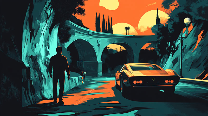
Three to five colors sitting next to each other on the wheel. Think autumn leaves: reds, oranges, and yellows blending together.
Low contrast, high cohesion. This scheme feels natural because it mirrors what you see in the real world constantly. Sunsets, forests, ocean gradients. Your eye already knows how to process these combinations.
The risk? Everything blurs together if you don’t pick a dominant color. One hue needs to lead while the others play supporting roles. Otherwise it reads as flat and forgettable.
Triadic Colors
Three colors evenly spaced at 120° intervals on the wheel. A triadic color scheme gives you vibrant results that still feel balanced, at least in theory.
In practice, triadic palettes are harder to pull off than they look. If all three colors compete for attention at equal intensity, the result feels chaotic instead of harmonious. Let one color dominate. Use the other two sparingly as accents.
Burger King’s logo is a classic triadic example. Red, yellow, blue. But notice how they don’t use all three equally.
Split-Complementary Colors
Take one base color, find its complement, then use the two colors adjacent to that complement instead. A split-complementary scheme delivers the punch of complementary contrast with less visual tension.
Honestly, this is the one I’d recommend to anyone just starting out with color. It’s more forgiving than straight complementary and more interesting than analogous. You get contrast and variety without the risk of your palette feeling aggressive.
Tetradic and Square Color Schemes
A tetradic arrangement uses four colors grouped into two complementary pairs (forming a rectangle on the wheel). A square scheme spaces all four colors equally.
| Scheme | Color Count | Contrast Level | Difficulty | | — | — | — | — | | Complementary | 2 | High | Moderate | | Analogous | 3–5 | Low | Easy | | Triadic | 3 | Medium-High | Hard | | Split-Complementary | 3 | Medium | Moderate | | Tetradic/Square | 4 | High | Very Hard |
Four-color palettes are rich but tricky. These work best in complex branding systems and editorial layouts where you need enough variety to differentiate many elements without breaking coherence. One color still has to lead. Always.
Warm, Cool, and Neutral Color Harmony
Not all harmony follows geometric rules on the color wheel. Temperature-based approaches work differently, and they’re just as effective.
How Temperature Creates Natural Harmony
Warm colors (reds, oranges, yellows) naturally group together. So do cool colors (blues, greens, purples). Sticking to one temperature range almost guarantees a cohesive result, even if you haven’t thought much about specific schemes.
This is why muted earth-tone palettes have become so popular in both web design and interior spaces. According to Fixr’s 2024 survey of 71 U.S. design professionals, 60% said natural or raw finishes would gain the most popularity, and warm neutrals like taupe ranked as a top color pick.
Neutral Palettes as a Standalone Strategy
Grays, beiges, and muted tones aren’t just background fillers. A fully neutral palette is a legitimate harmony choice on its own.
Minimalist design leans on this heavily. Apple’s product photography. Scandinavian interiors. The less color you use, the more each individual shade matters, and the more white space and tonal shifts carry the composition.
Mixing Temperatures on Purpose
The teal-and-orange look in modern film is the most well-known example of mixing warm and cool intentionally. It works because the colors are complementary, but the real control comes from matching their value and saturation levels.
You can absolutely mix temperatures. But you need to control the balance through brightness and intensity, not just hue alone. Otherwise the warm side and cool side fight each other instead of creating tension that feels deliberate.
Sherwin-Williams’ 2024 Color of the Year (Upward, a cool blue) was specifically paired with warm accents like Honeydew and Antiquarian Brown to show how temperature mixing creates flow across connected spaces.
The Role of Value and Saturation in Color Harmony

Here’s something that trips up a lot of people. You can pick the “right” harmony type and still end up with a palette that looks bad. Why? Because hue is only one piece of the equation.
Why Value Contrast Matters More Than You Think
Value is how light or dark a color is. Two colors can share the exact same hue relationship on the wheel but feel completely different depending on their value contrast.
A navy blue and a pale gold feel sophisticated. A full-blast royal blue and a bright yellow feel like a children’s party invitation. Same complementary pair. Totally different outcomes.
Around 300 million people globally have some form of color vision deficiency, according to Colour Blind Awareness. For them, value contrast (not hue contrast) is often the only thing making your design readable. This is why WCAG accessibility guidelines focus so heavily on contrast ratios.
Saturation as a Harmony Tool
Desaturated palettes feel harmonious almost automatically. Muted tones don’t compete with each other the way vivid colors do. This is exactly why so many brands have shifted toward softer, more toned-down palettes in recent years.
High saturation across multiple colors creates visual competition. Every color screams for attention, and none of them win. Pulling back the intensity on supporting colors while keeping one accent vivid is the easiest way to build balance into any palette.
Tints, Tones, and Shades
You don’t always need to add new hues to expand a palette. These three adjustments let you get more variety from colors you already have:
- Tints add white to a color, making it lighter
- Shades add black, making it darker
- Tones add gray, reducing intensity
A monochrome palette built from tints, shades, and tones of a single hue can be surprisingly effective. It creates unity without monotony, as long as the value range is wide enough.
The Munsell Color System organizes all of this formally, mapping every color by hue, value, and chroma (saturation). It’s been the backbone of color science since Albert Munsell developed it in the early 1900s and remains the reference standard for industries from paint manufacturing to soil classification.
Color Harmony in Digital Design and Branding

Harmony principles don’t just live in art class. They directly affect how users interact with websites, apps, and branded experiences. And the stakes are higher than most people realize.
WebAIM’s 2024 analysis of the top 1 million homepages found low-contrast text on 81% of sites. It was the single most common accessibility failure detected. On average, each homepage had 34.5 separate instances of it.
Accessibility and Contrast Ratios
WCAG 2.2 requires a minimum contrast ratio of 4.5:1 for normal text and 3:1 for large text to meet Level AA compliance.
Around 300 million people globally live with some form of color vision deficiency, according to Colour Blind Awareness. That’s roughly 8% of men and 0.5% of women. Red-green color blindness accounts for about 98% of all cases.
So a palette that relies on red and green to communicate status (think error messages or success indicators) fails a huge portion of your audience. Harmony has to coexist with legibility, or the design doesn’t work.
Brand Color Systems
Spotify: Built an entire visual identity around a single signature green, supported by black, white, and accent colors that shift by campaign.
Stripe: Uses gradient transitions between blues and purples that feel modern without breaking cohesion.
According to Crowdspring, consistent color usage across all brand materials can boost recognition by up to 80%. That’s why strong brand guidelines always include a defined color system with primary, secondary, and accent roles.
Dark Mode and Light Mode Challenges
Nielsen Norman Group data shows 82% of mobile users now prefer dark mode. That number alone makes dual-mode design a standard requirement, not a nice-to-have feature.
But here’s the tricky part. A color palette that looks harmonious on a white background can feel completely different on a dark surface. Saturation levels shift. Contrast ratios change. Colors that felt soft and approachable in light mode can appear harsh or overly vivid against dark backgrounds.
| Design Challenge | Light Mode | Dark Mode |
|---|---|---|
| Background | White or light gray | Dark gray (not pure black) |
| Text contrast | Dark text, easy to achieve | Light text, needs careful tuning |
| Saturated accents | Pop without vibration | Can feel harsh, needs desaturation |
| User fatigue | More strain in low light | Easier on eyes after dark |
Google’s Material Design color system addresses this by recommending tonal palettes that adapt automatically across both modes. It’s become a reference point for most digital product teams.
Tools Designers Actually Use
- Adobe Color: Generates palettes based on harmony rules directly from the color wheel
- Coolors: Fast palette generation with export options for CSS, SVG, and PDF
- Realtime Colors: Shows your palette applied to a live website mockup instantly
- Figma plugins: Dozens of color accessibility checkers built right into the design workflow
The best color tools don’t just generate pretty combinations. They test those combinations against real use cases like text on backgrounds, button states, and color contrast ratios.
Common Mistakes That Break Color Harmony
Knowing the rules helps. But knowing where people consistently get it wrong helps more.
Using Too Many Hues
This is the most common one. Five, six, seven colors all competing for attention and none of them winning.
Most successful palettes use 3 to 5 colors with clearly defined roles. One primary, one or two secondaries, an accent, and a neutral. Anything beyond that and you’re working against yourself unless you really know what you’re doing.
Ignoring Value Contrast
Two colors can be from the right harmony type on the color wheel and still look terrible together if their lightness levels are too similar.
WebAIM’s 2025 report found 79.1% of homepages still had low-contrast text issues. Clearly this is a problem the industry hasn’t solved yet, even with all the tools available. Light blue text on a medium blue background? Technically analogous. Practically unreadable.
Over-Saturating Everything
Full saturation across multiple colors creates visual noise. Every element screams at the same volume and nothing stands out.
Pull back the intensity on supporting colors. Keep one element vivid for focal point purposes and let the rest support it quietly. This is something that took me way too long to learn, honestly.
Picking Colors in Isolation
| Mistake | What Happens | Fix |
|---|---|---|
| Choosing colors individually | They clash when combined | Always test combinations together |
| Using a color picker without theory | Random pairings, no structure | Start from a harmony type on the wheel |
| Only testing on one background | Breaks in dark mode or on images | Test across all real contexts |
Sherwin-Williams designer Amy Milani put it well: if two colors create tension when placed next to each other, there’s no forcing them to work. Context is everything.
How to Build a Harmonious Color Palette From Scratch
Theory is helpful. But at some point you need to actually build something. Here’s the process that works in practice, not just on paper.
Start With One Anchor Color
Every strong palette begins with a single color. That anchor comes from your brand, the mood you want to set, or the function the design needs to perform.
A healthcare app might anchor on a calming blue. A food brand might start with a warm red or orange. The psychology behind these associations isn’t arbitrary. According to Straits Research, 85% of buyers say color is the primary factor in choosing a product.
Choose a Harmony Type Based on Desired Contrast
Low contrast needed? Go analogous. Three to five adjacent colors from the wheel create a smooth, cohesive feel.
High contrast needed? Go complementary or split-complementary. Opposite colors on the wheel give you energy and attention-grabbing punch.
Somewhere in between? Triadic offers variety with balance, though it takes more skill to manage three equally spaced colors.
Adjust Saturation and Value for Hierarchy
Once you have your hues, the real work starts. Not every color in a palette should sit at the same intensity level.
- Primary actions (buttons, CTAs) get the highest saturation
- Supporting areas (backgrounds, cards) use tints or tones
- Neutral elements (text, borders) use desaturated versions or grays
This creates a natural reading order within the design. The eye goes to the loudest color first, then steps down through the quieter ones.
Test Across Real Use Cases
A palette that looks great as five squares in a row means nothing if it falls apart on an actual screen.
Test your colors on text and background pairings, button hover states, illustration overlays, photography with text on top, and form field states. Check them in both light and dark mode. Run them through a contrast checker. Look at them on your phone screen in direct sunlight.
Terra saw their desktop bounce rate drop from 27% to 11% after implementing a properly designed dark theme, according to AlterSquare. Palette choices have measurable impact on user behavior.
Limit and Define Color Roles
3 to 5 colors for most projects. That’s it. Each one gets a specific job:
- Primary: Brand anchor, used for main actions and key elements
- Secondary: Supports the primary, used for secondary actions or sections
- Accent: Draws attention to specific moments (alerts, badges, highlights)
- Neutral: Text, backgrounds, borders, dividers
Document these roles in a brand style guide and stick to them. Consistency compounds over time. WebFX reports that consistent brand presentation can increase revenue by up to 23%, and color is the most visible part of that equation.
FAQ on What Is Color Harmony
What is color harmony in simple terms?
Color harmony is the arrangement of colors that looks visually balanced and pleasing. It follows specific relationships between hues on the color wheel, creating combinations that feel intentional rather than random or clashing.
What are the main types of color harmony?
The primary types are complementary, analogous, triadic, split-complementary, and tetradic. Each uses a different geometric relationship on the color wheel to produce varying levels of contrast and cohesion.
Why does color harmony matter in design?
It reduces visual tension and guides the viewer’s eye through a composition. Poor color choices increase cognitive load, while harmonious palettes build trust and keep users engaged longer.
How do you create a harmonious color palette?
Start with one anchor color. Choose a harmony type based on how much contrast you need. Then adjust saturation and value to create hierarchy. Test across real use cases before finalizing.
What is the difference between complementary and analogous colors?
Complementary colors sit opposite each other on the wheel, creating high contrast. Analogous colors sit next to each other, producing a softer, more cohesive feel with minimal tension.
Can you use warm and cool colors together harmoniously?
Yes. Mixing color temperatures works well when you control the value and saturation of each color. The teal-and-orange look in film is a classic example of deliberate warm-cool pairing.
What role does saturation play in color harmony?
Saturation controls intensity. Desaturated palettes feel harmonious almost automatically because the colors don’t compete. High saturation across multiple hues creates visual noise and breaks the balance.
What tools help with choosing harmonious colors?
Adobe Color, Coolors, Realtime Colors, and Figma plugins all generate palettes based on color wheel relationships. Most let you pick a harmony type and adjust from there.
How does color harmony affect branding?
Consistent, harmonious color usage strengthens brand recognition. Research shows a signature color can boost recognition by up to 80%. Strong brands define primary, secondary, and accent color roles in their guidelines.
Is color harmony the same as color theory?
Not exactly. Color theory is the broader study of how colors interact, including the wheel, mixing, and psychology. Color harmony is one specific part of that framework, focused on pleasing combinations.
Conclusion
Understanding what is color harmony gives you a practical framework for making better visual decisions. Whether you’re building a website, choosing brand colors, or designing a poster, the same principles apply.
The color wheel isn’t decorative. It’s a working tool. Complementary pairs create energy. Analogous groupings create calm. And the interplay of value, saturation, and color temperature determines whether a palette holds together or falls apart.
Tools like Adobe Color and Coolors make the process faster, but they don’t replace knowing why certain combinations work. The Munsell Color System, Johannes Itten’s original frameworks, and modern accessibility standards like WCAG all point to the same thing.
Pleasing color combinations aren’t accidents. They’re structured, testable, and repeatable. Start with one color, pick a harmony type, adjust for hierarchy, and test in context. That’s the whole process.

Renowned for his expertise in logo design and visual branding, Bogdan has developed a multitude of logos for various clients.
His skills extend to creating posters, vector illustrations, business cards, and brochures. Additionally, Bogdan's UI kits were featured on marketplaces like Visual Hierarchy and UI8.
He also wrote in the past years on sites like Design Your Way, WebDesignerDepot, WPDean, Designmodo, Speckyboy, Slider Revolution, and more.
- Minecraft Font Generator - 8 October 2026
- How Top Meta Ad Creative Is Designed for E-commerce Brands - 8 October 2026
- How photo recovery software works and when to use it - 7 October 2026

Bogdan Sandu is a seasoned designer who has been designing websites since 2008. Renowned for his expertise in logo design and visual branding, Bogdan has developed a multitude of logos for various clients. His skills extend to creating posters, vector illustrations, business cards, and brochures. Additionally, Bogdan's UI kits were featured on marketplaces like Visual Hierarchy and UI8. He also wrote in the past years on sites like Design Your Way, WebDesignerDepot, WPDean, Designmodo, Speckyboy, Slider Revolution, and more.
You Might Also Like


