


Every inconsistent social media post, every off-brand email template, every logo stretched to fit a PowerPoint slide. It adds up. And it costs more than most teams realize.
So what is a brand style guide, and why do 95% of companies have one in some form? It’s the single document that defines how your brand looks, sounds, and behaves across every channel and touchpoint.
This article breaks down the core components of a brand style guide, from color systems and typography elements to voice guidelines and digital standards. You’ll also see real examples from Spotify, Uber, and NASA, plus how to build one from scratch without overcomplicating it.
What Is a Brand Style Guide
A brand style guide is a document that defines how a brand looks, sounds, and behaves across every touchpoint. It covers everything from logo placement rules to voice and tone decisions, color values, and typography standards.
Think of it as the rulebook for your brand’s visual identity and verbal expression. Designers, copywriters, marketing teams, and external agencies all reference it.
People confuse it with a brand book. They overlap, sure. But a brand book leans strategic (mission, values, positioning). A style guide leans tactical. It tells someone exactly which shade of blue to use and where.
The format varies. Some companies still use PDFs. Others build interactive systems on platforms like Frontify or Zeroheight. Renderforest data shows that 95% of companies have some form of brand guidelines, but only 25% actively enforce them. That gap between having guidelines and actually using them is where most brand inconsistency starts.
A well-built style guide covers design elements like imagery direction, iconography, and layout specifications. It also addresses writing standards, word lists, and content formatting rules.
Without one, every designer and writer on the team makes independent decisions. Over time, those decisions slowly pull the brand identity apart.
Why Brand Style Guides Exist
Brand consistency directly affects revenue. Lucidpress survey data indicates that consistent brand presentation can increase revenue by up to 23%. And 68% of companies say that brand consistency has contributed 10% or more to their revenue growth.
The Business Case for Consistency
Recognition speed: A signature color palette alone can boost brand recognition by up to 80%, according to Reboot Online research.
Customer trust: 81% of consumers say they need to trust a brand before buying. Consistent presentation across channels builds that trust faster than any ad campaign.
Reduced revision cycles: When expectations live in a shared document instead of someone’s head, onboarding freelancers and new hires takes half the time. And fewer revision rounds.
Spotify maintains one of the more detailed public design systems available. It covers visual patterns, interaction standards, and verbal guidelines. The result? Whether you open the mobile app, visit their website, or read their marketing emails, it all feels like the same brand. That didn’t happen by accident.
What Happens Without One
Less than 10% of brands maintain a high level of brand consistency across all products and marketing channels, according to Renderforest.
The U.S. Chamber of Commerce found that 55% of first impressions about brands are visual. If your social media graphics use a different color system than your website, people notice. Maybe not consciously. But something feels off.
I’ve seen teams where the sales deck uses one set of fonts, the email templates use another, and the product UI doesn’t match either. Nobody planned it that way. It just happened because nobody wrote the rules down.
Core Components of a Brand Style Guide
Every brand style guide covers a core set of visual and verbal standards. The specifics change depending on your industry and scale, but the foundations stay the same.
| Component | What It Covers | Why It Matters |
|---|---|---|
| Logo specifications | Variations, clear space, minimum sizes | Prevents distortion and misuse |
| Color system | HEX, RGB, CMYK, Pantone values | Exact reproduction across media |
| Typography rules | Primary/secondary typefaces, weights, hierarchy | Consistent reading experience |
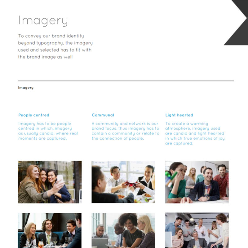
| Imagery direction | Photo style, illustration tone, subject matter | Visual coherence across channels |
| Voice and tone | Writing personality, word lists, content samples | Verbal consistency in all communications |
Logo Specifications

Your logo design principles need to be spelled out explicitly. That means documenting every variation: full color, monochrome, reversed, horizontal, stacked.
Exclusion zones matter more than most people realize. These are the minimum clear space boundaries around the logo that prevent it from getting crowded by other elements on the page.
The strongest guides show what NOT to do. Stretched logos, wrong background placements, color substitutions. NASA’s 1975 Graphics Standards Manual (designed by Danne & Blackburn) famously included pages of incorrect logo applications alongside correct ones. That manual covered everything from letterheads to spacecraft markings.
If you need your logo on different background types, specify which version works where. A full-color logo on a dark photo might need a reversed version. If you need to make a logo transparent for overlays, include file format requirements too.
Color and Typography Systems

Colors and type don’t work in isolation. They form a system together, and your style guide needs to treat them that way.
Primary colors are your main brand identifiers. Secondary colors support them. Accent colors handle highlights, calls to action, and interactive elements.
For color values, include every format your team might need. RGB and HEX for screens. CMYK for print design. Pantone for spot color printing. Understanding color theory basics helps when selecting color relationships, whether you’re building a complementary color scheme or using analogous colors for a more subtle palette.

For font selection, document your type scale, line height, and spacing values. A Monotype and Neurons study found that typeface choice alone can boost positive consumer response by up to 13%. That’s not a small number for something many teams pick without much thought.
Accessible color contrast ratios (WCAG standards) should be included too. Your brand colors need to work for everyone, not just people with perfect vision.
Voice and Tone Guidelines

Most people think of a brand style guide as a visual document. Colors, logos, layout grids. But the verbal side is just as important, and it gets overlooked constantly.
Voice is the brand’s personality. It stays constant. Tone shifts depending on context. A brand can have a friendly voice but use a serious tone in a crisis communication. Both need documentation.
Writing Standards and Word Lists
Effective voice guidelines include word lists. Preferred terms, banned terms, industry jargon decisions. If your brand never uses “synergy” but always says “collaboration,” write it down.
Mailchimp’s Content Style Guide is probably the most referenced public example. It covers everything from grammar conventions to how the brand handles humor in error messages versus support emails.
Include writing samples. Show the brand voice applied to different content types:
- Social media post
- Customer support email
- Product error message
- Landing page headline
People learn by example faster than by reading abstract descriptions of personality traits. If your brand is “approachable but professional,” show what that actually looks like in a sentence.
Brand Narrative and Storytelling
The brand narrative section documents your origin story, mission framing, and core messaging pillars. The role of storytelling in design goes beyond marketing copy. It shapes how product teams write microcopy, how HR describes the company culture, and how sales positions the product against competitors.
Strong brand narratives give everyone a shared vocabulary. Without one, the marketing team describes the company one way while customer support describes it another.
Digital-Specific Brand Guidelines

Traditional style guides were built for print. Letterheads, business cards, signage. But most brand touchpoints are digital now, and digital has its own set of problems that print never dealt with.
UI Components and Interaction Standards
Button styles, form elements, spacing grids, and component libraries need documentation. Google’s Material Design and Apple’s Human Interface Guidelines are two of the largest public references for how to approach this.
Your brand’s visual hierarchy rules should translate from marketing pages to product interfaces. If your marketing site uses one spacing system and the product uses another, users feel the disconnect even if they can’t name it.
Grid systems matter here. They keep layouts consistent across pages and screen sizes. Document your column structure, gutter widths, and margin rules. Also, consider how white space is used throughout your digital properties.
Platform Adaptations
Dark mode broke a lot of brand color systems when it became mainstream. Colors that look great on white backgrounds can look terrible inverted.
Your style guide needs to address:
- Responsive behavior of brand elements across screen sizes
- Dark mode color palette variations
- Social media template rules per platform
- Motion and animation principles for digital touchpoints
Tools like Figma and Adobe Creative Suite make it easier to maintain digital brand asset libraries. Platforms like Bynder and Brandfolder handle asset management at scale, so teams across different offices and time zones can access the latest approved files.
And here’s a thing most guides still skip: responsive logo behavior. How does the logo adapt at mobile sizes? Does it switch from a full wordmark to an icon? These decisions need to be documented, not left to whoever happens to be building the next campaign page.
How to Create a Brand Style Guide
Building a style guide isn’t something you knock out in an afternoon. But it doesn’t have to take six months either. The process is pretty straightforward if you follow a logical order.
Step-by-Step Process
1. Start with a brand audit. Collect every branded asset currently in use. Screenshots of the website, social media profiles, email templates, sales decks, packaging, signage. All of it. Look for inconsistencies. You will find plenty.
2. Define brand attributes and values first. Visual decisions come after strategic ones. What does the brand stand for? What personality traits define it? These answers drive the color choices, type selections, and voice decisions that come next.
A mood board helps here. It’s a collection of visual references (photos, textures, color swatches, type samples) that capture the direction before anyone opens a design tool.
3. Document decisions as you make them. Don’t wait until the end. Every time the team agrees on a color value, a font pairing, or a tone-of-voice rule, add it to the guide immediately.
4. Choose the right format. Simple brands can get away with a Google Slides deck or a Notion page. Larger organizations use dedicated platforms like Frontify or Zeroheight that keep assets downloadable and searchable.
Common Mistakes When Building a Style Guide
Took me a while to figure this one out, but the biggest mistake is making the guide either too rigid or too vague. Too rigid, and nobody follows it because real-world situations don’t fit neatly into rules. Too vague, and everybody interprets it differently, which defeats the purpose.
Skipping “wrong usage” examples is another one. People learn faster from seeing what not to do. NASA’s Graphics Standards Manual understood this back in 1975.
Renderforest data shows that 27% of companies with brand guidelines don’t enforce them regularly. And 21% of brands say their guidelines aren’t written anywhere at all. They’re communicated verbally. Which, if you’ve ever played the telephone game, explains a lot.
And then there’s the “shared drive graveyard.” You build a beautiful 40-page guide, upload it to a folder nobody checks, and wonder why the freelancer used the wrong blue. If nobody can find the guide, it doesn’t exist. The tools you use to distribute it matter as much as what’s inside.
Brand Style Guide Examples Worth Studying

Looking at real examples is the fastest way to understand what actually works. Some brand guidelines are legendary for a reason.
Spotify’s Design System
Spotify built its design system (called Encore) as a “system of systems,” with different teams managing components under a shared framework. Their custom typeface, Spotify Mix, debuted in the 2024 Wrapped campaign.
What makes it effective: design tokens connect every visual decision across products, so updating one color value ripples through the entire ecosystem. That’s brand consistency at a technical level most companies never reach.
Uber’s Brand Architecture
In 2024, agency JKR helped Uber evolve its brand system without touching the logo. That’s the part worth paying attention to.
Key decision: Uber kept its black-and-white core identity but added color for sub-brands like Uber Eats. Circles, lines, and squares became a flexible graphic language representing movement from point A to point B.
The rebranding strategies here focused on expansion, not replacement. Sometimes the smartest move is building on what already works.
NASA’s 1975 Graphics Standards Manual
Bynder research shows that the average rebrand takes seven months from initial planning to rollout. NASA’s 1975 manual, designed by Richard Danne and Bruce Blackburn, went much further.
The manual covered everything from letterheads to spacecraft markings. It introduced the “Worm” logo, a minimalist wordmark that became one of the most recognized graphic design movements of the era. The manual was used from 1975 to 1992 and has been reissued as a book that designers still reference today.
Smaller-Scale Examples
Not every brand needs 200 pages. A startup running a Notion-based style guide with logo files, three brand colors, and a one-page voice document can still be effective.
The goal isn’t volume. Renderforest data shows that enforced brand guidelines make consistent presentation twice as likely. A short guide that people actually use beats an elaborate one that nobody opens.
Brand Style Guide vs. Design System vs. Brand Book

These three terms get thrown around like they mean the same thing. They don’t. And the confusion wastes real time when teams are trying to figure out which document to build.
| Document | Focus | Primary Audience | Format |
|---|---|---|---|
| Brand book | Mission, values, positioning, story | Leadership, new hires, partners | Strategic, narrative-driven |
| Style guide | Visual and verbal execution rules | Designers, writers, agencies | Tactical, reference-based |
| Design system | Coded components, tokens, patterns | Product and engineering teams | Technical, living documentation |
Where They Overlap
A style guide covers the “what” and “how” of brand visuals. What fonts to use, what colors are approved, how the logo should be placed. It’s tactical and reference-oriented.
A brand book is strategic. It tells the brand story, defines the mission, and establishes brand positioning. Think of it as the “why” behind the visual decisions.
A design system goes deeper into technical territory. It includes reusable UI components with actual code, design tokens (named variables for colors, spacing, type scales), and interaction patterns. Nielsen Norman Group describes design systems as containing both style guides and component libraries under one roof.
Which One Do You Need
Solo business or small team: A style guide is enough. Cover your color system, brand typography, logo rules, and voice.
Growing company with agency partners: Add a brand book that explains your positioning and values so external teams understand the thinking behind the rules.
Product company building digital products at scale: You need all three. Frontify data indicates that digital platforms outperform static PDFs for keeping guidelines current and actually used.
Many companies combine two or all three into a single resource. That’s fine. But knowing the distinctions helps you avoid building a 100-page document when a focused 15-page style guide would do the job.
When to Update a Brand Style Guide
A brand style guide isn’t a one-and-done project. Custom Logo Shop data shows that businesses tend to rebrand every seven to ten years, with smaller refreshes happening in between.
But full rebrands aren’t the only trigger for updating your guide.
Clear Signals That It’s Time
After a visual refresh or full rebrand: The obvious one. Capital One Shopping research shows that 69% of brands acquired by S&P 100 companies rebrand within their first seven years. When the brand changes, the guide has to change with it.
When expanding into new markets or platforms: A guide built for a U.S.-only web presence won’t cover the needs of a brand entering physical retail in Asia. New touchpoints need new rules.
When team feedback reveals the guide isn’t working: If designers keep asking questions the guide should answer, or if off-brand content keeps slipping through, the guide has gaps. Renderforest found that 71% of businesses agree inconsistent brand presentation leads to customer confusion.
Version Control and Maintenance
Bynder’s 2023 survey of over 1,000 marketers found that the average rebrand takes seven months. That’s a lot of time where assets, guidelines, and brand materials are all in flux.
Track changes. Date every update. If your guide lives as a PDF, version-number it. If it’s on a platform like Frontify or Zeroheight, use the built-in versioning tools.
The rebranding checklist should include a line item for updating the style guide. Not after the rebrand launches. During the process. Companies that rebranded successfully almost always had updated documentation ready before the public launch.
Check it annually at minimum. Brand governance isn’t about building the guide once and walking away. It’s about keeping it alive so it stays useful for the people who need it every day.
FAQ on What Is a Brand Style Guide
What is the purpose of a brand style guide?
A brand style guide keeps your visual identity and verbal expression consistent across every channel. It reduces confusion, speeds up creative workflows, and makes sure designers, writers, and agencies all follow the same rules.
What should a brand style guide include?
At minimum: logo usage rules, color palette with exact values, typography standards, imagery direction, and voice and tone guidelines. Larger brands add UI components, animation principles, and content formatting rules.
Who uses a brand style guide?
Designers, copywriters, marketing teams, freelancers, and external agencies. Anyone creating branded content needs access to it. The guide also helps onboard new hires faster by showing them exactly how the brand communicates.
How long should a brand style guide be?
There’s no fixed length. A startup might need 10 to 15 pages. Enterprise brands like Spotify or Uber maintain entire digital platforms. What matters is that people actually use it, not that it looks impressive on a shelf.
What is the difference between a brand style guide and a brand book?
A style guide focuses on execution rules: colors, fonts, logo placement. A brand book covers strategy: mission, values, positioning. Many companies combine both, but they serve different purposes.
How often should you update a brand style guide?
Review it at least once a year. Update it after any rebrand, market expansion, or when teams report the guide doesn’t address their needs. Companies typically refresh their brand identity every seven to ten years.
Can a small business benefit from a brand style guide?
Absolutely. A simple document covering your logo files, brand colors, and preferred fonts prevents inconsistency from day one. You don’t need a massive budget. A Notion page or Google Doc works fine at the start.
What tools are used to create a brand style guide?
Figma and Adobe Creative Suite for design. Notion or Google Slides for simpler guides. Platforms like Frontify, Zeroheight, and Bynder handle larger-scale brand asset management with built-in versioning and distribution.
What are common mistakes in brand style guides?
Making the guide too vague or too rigid. Skipping wrong-usage examples. Burying it in a shared drive nobody checks. And the biggest one: not enforcing it. Renderforest data shows only 25% of companies actively enforce their guidelines.
How does a brand style guide affect SEO and web presence?
Consistent branding builds trust signals that keep users on your site longer and reduce bounce rates. A unified web presence with consistent color psychology and typographic hierarchy improves user experience and reinforces brand recognition across search results.
Conclusion
A brand style guide is the operational backbone of every consistent brand identity. Without one, your brand identity design fragments across teams, channels, and campaigns.
The visual rules matter. Serif or sans-serif choices, saturation levels in your color system, kerning values in your headings. These details shape how people perceive your brand in milliseconds.
But the verbal side carries equal weight. Voice guidelines, word lists, and font psychology decisions determine whether your messaging feels cohesive or scattered.
Start with what you have. Audit your current assets, document the rules that already exist informally, and build from there. A 15-page guide that your team actually references will always outperform a 200-page PDF collecting dust.
The brands that win aren’t the ones with the fanciest guidelines. They’re the ones that enforce them consistently, review them regularly, and treat brand identity development as an ongoing process rather than a one-time project.

Renowned for his expertise in logo design and visual branding, Bogdan has developed a multitude of logos for various clients.
His skills extend to creating posters, vector illustrations, business cards, and brochures. Additionally, Bogdan's UI kits were featured on marketplaces like Visual Hierarchy and UI8.
He also wrote in the past years on sites like Design Your Way, WebDesignerDepot, WPDean, Designmodo, Speckyboy, Slider Revolution, and more.
- The Windsurf Logo History, Colors, Font, And Meaning - 10 October 2026
- How to Remove Background From Product Photos (No Photoshop) - 10 October 2026
- How Designers can Build a Stronger Online Creative Identity - 9 October 2026

Bogdan Sandu is a seasoned designer who has been designing websites since 2008. Renowned for his expertise in logo design and visual branding, Bogdan has developed a multitude of logos for various clients. His skills extend to creating posters, vector illustrations, business cards, and brochures. Additionally, Bogdan's UI kits were featured on marketplaces like Visual Hierarchy and UI8. He also wrote in the past years on sites like Design Your Way, WebDesignerDepot, WPDean, Designmodo, Speckyboy, Slider Revolution, and more.
You Might Also Like


