Renderforest data shows that 95% of companies have some form of brand guidelines. Only 25% actually enforce them.
That gap explains why so many brands look polished on their website but completely fall apart on social media, in sales decks, or on product packaging. So what are brand guidelines, exactly, and why do most companies get them wrong?
This guide breaks down the core components of a brand guidelines document, from design elements and color standards to voice, messaging, and digital-specific requirements. You’ll also see real examples from companies like Spotify and NASA, and learn how to build, distribute, and enforce guidelines that your team will actually use.
What Are Brand Guidelines
Brand guidelines are a documented set of rules that define how a brand should look, sound, and behave across every single touchpoint. They cover everything from logo placement and color palette specifications to messaging frameworks and tone of voice standards.
Think of it this way. Every email, social post, billboard, and product label your company puts out there carries your brand. Without a shared reference document, those touchpoints start drifting apart fast.
According to Renderforest, 95% of companies have some form of brand guidelines. But only about 25% actually enforce them. That gap between “having” and “using” is where brand inconsistency sneaks in and starts costing money.
A solid brand guidelines document typically includes rules for your visual identity, typography standards, imagery direction, voice and tone, and approved usage examples. Some companies keep theirs in a 10-page PDF. Others build full digital brand portals with searchable assets.
Brand Guidelines vs. Brand Style Guide
People use these terms interchangeably, and honestly, most of the time that’s fine.
But there’s a distinction worth knowing. A brand style guide typically focuses on the visual side: logos, colors, fonts, spacing. Brand guidelines go wider. They wrap in voice, messaging, values, positioning, and even rules for partnerships and co-branding.
Spotify, for example, publishes design and branding guidelines that cover everything from logo colorways (only Spotify Green on black or white backgrounds) to strict rules about never separating their icon from the wordmark. Their guidelines also dictate how partner content should reference the Spotify brand.
Small companies usually combine everything into one document. Larger organizations tend to split them into separate visual identity manuals and verbal identity guides.
Who Uses Brand Guidelines
Short answer: everyone who touches the brand.
Designers, copywriters, product teams, external agencies, franchise partners, sales teams, HR departments putting together recruiting materials. Even your CEO posting on LinkedIn should be referencing them.
Capital One Shopping research shows only 30% of brands have guidelines that are widely used and recognized across the organization. That means in most companies, the marketing team knows the rules but nobody else does. Which explains why 81% of companies struggle with off-brand content, according to the Lucidpress State of Brand Consistency Report.
Why Brand Guidelines Exist
Brand guidelines exist for one reason above everything else. Consistency.
And consistency isn’t just a design preference. It directly affects revenue. The Lucidpress study found that consistent brand presentation can increase revenue by up to 33%. A separate finding from Capital One Shopping showed 68% of organizations credit brand consistency with at least a 10% boost to their revenue growth.
Here’s what guidelines actually solve on a day-to-day level:
- Faster onboarding: new designers, agencies, and freelancers get up to speed without asking 40 questions about logo sizes
- Fewer approval rounds: when everyone starts from the same rules, creative reviews go faster
- Legal protection: trademarked logos and branded assets need documented usage rules to hold up in disputes
- Cross-channel recognition: your Instagram, packaging, website, and booth at a trade show should feel like the same brand
McDonald’s runs over 40,000 locations in more than 100 countries. Every single one of those locations follows corporate brand standards. The golden arches, the red-and-yellow palette, the menu board layouts. That’s not happening by accident. That’s brand guidelines doing exactly what they’re built to do.
Renderforest data backs this up: enforced brand guidelines make consistent brand presentation twice as likely. Without enforcement, 71% of businesses agree that inconsistent branding leads to customer confusion.
Core Components of Brand Guidelines
A brand guidelines document is only as good as the components inside it. Miss a section, and that’s exactly where inconsistency creeps in.
Most guidelines cover the visual identity system at minimum. But the strongest ones also include rules for imagery, iconography, and spatial layout. Here’s what typically goes in.
Logo Usage Rules
This is the section people flip to first, and it needs to be airtight.
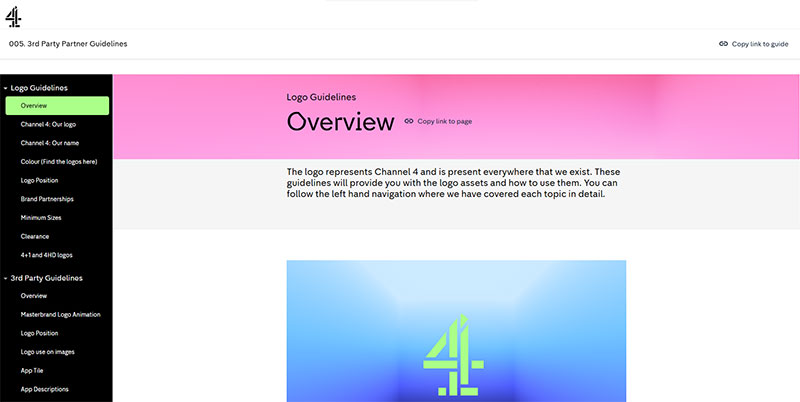
Your logo design principles should define clear space (the minimum breathing room around the logo), minimum reproduction sizes, approved color variations, and a list of incorrect usages. That last one matters more than most teams realize. Showing how the logo should NOT be used prevents more mistakes than showing the right version alone.
NASA’s 1976 Graphics Standards Manual, designed by Danne & Blackburn, is still considered one of the best examples. It specified exact grid drawings for large-scale logo applications, color standards using Pantone matching, and rules for every surface from publications to vehicle markings.
| Logo Rule | What It Covers | Why It Matters |
|---|---|---|
| Clear space | Minimum area around logo | Keeps it readable and uncluttered |
| Minimum size | Smallest allowed reproduction | Prevents illegibility on small formats |
| Color lockups | Approved color versions | Covers light, dark, and photographic backgrounds |
| Incorrect uses | Stretching, recoloring, rotating | Shows what NOT to do (prevents 80% of mistakes) |
Color Palette and Typography
Research from Loyola University shows that a signature color can increase brand recognition by up to 80% compared to monochrome presentation. That stat alone justifies an entire section in your guidelines dedicated to color.
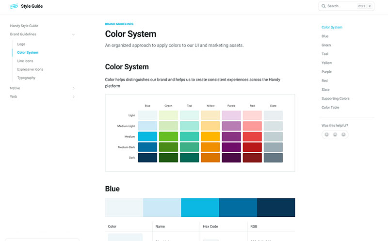
Your color theory section should list primary and secondary colors with exact values in HEX, RGB, and CMYK formats. Include saturation and hue details when you’re working with gradient or extended palette applications.
For brand typography, document your chosen typeface families, font weights, and typographic hierarchy rules. Specify leading, tracking, and kerning values for headings, body text, and captions. And don’t skip font licensing details. Took me forever to figure out why a client kept getting legal notices about web font usage. They’d listed the fonts in their guidelines but never purchased the right commercial license.
Imagery, Iconography, and Layout
Photography style might be the most overlooked section. Define whether your brand uses candid or staged shots, warm or cool tones, lifestyle or product-focused imagery.
For iconography, specify line weight, corner radius, and whether icons should be filled or outlined. Include file format requirements too. Vector graphics (SVG) for web and digital. Higher DPI raster files for print design.
Layout rules should cover grid systems and spacing standards. This is where alignment and white space guidelines keep multi-page documents, websites, and marketing collateral looking clean and consistent.
Brand Voice and Messaging Guidelines

The visual side gets all the attention. But here’s the thing: what your brand says and how it says it can matter just as much as how it looks.
Brand voice guidelines define your personality in words. Are you formal or casual? Authoritative or friendly? Technical or conversational? This section turns abstract brand values into concrete writing rules that anyone in your organization can follow.
Tone of Voice Definitions
Mailchimp’s voice and tone guide is probably the most referenced example in the industry, and for good reason. It breaks down exactly how the brand should sound in different contexts: marketing emails vs. error messages vs. legal content. The voice stays the same, but the tone flexes.
Your guidelines should include 3-4 core voice traits (like “confident but not arrogant” or “helpful but never condescending”) and examples showing each trait in action. Get quick audio samples using an AI voice generator.
A 2024 Adobe survey found that 50% of consumers have chosen one brand over another based purely on how it made them feel. Voice is a huge part of that emotional response. Brands that sound robotic or inconsistent across channels lose that connection fast.
Messaging Frameworks and Channel Rules
Messaging frameworks codify your tagline, value propositions, elevator pitch, and boilerplate descriptions. They answer: “When someone asks what your company does, what do you say?”
Channel-specific rules matter too. Your LinkedIn tone should probably differ from your TikTok tone. A social media post doesn’t read like a whitepaper, and it shouldn’t.
Include a list of approved phrases and banned words. Slack’s brand guidelines, for instance, are specific about how the product name should be styled and when it’s acceptable to use the word “Slack” as a verb (spoiler: it’s not). These small rules prevent brand drift at scale.
Digital and Web-Specific Brand Guidelines
Print-focused brand guidelines don’t cut it anymore. Not when your audience interacts with your brand through apps, websites, emails, and social feeds dozens of times a day.
Digital brand guidelines extend the core identity system into interactive environments. They cover things that a traditional PDF guide never had to: responsive behavior, animation standards, accessibility compliance, and platform-specific asset specs.
UI and Design System Standards
Google’s Material Design and IBM’s Carbon Design System are two of the most well-known examples of brand guidelines evolved into full design systems.
A design system takes your brand’s visual standards and turns them into reusable UI components. Buttons, form fields, navigation patterns, card layouts. Every component follows the brand’s contrast ratios, font choices, and spacing rules.
Key areas to cover:
- Button styles, states, and sizing across breakpoints
- Color contrast ratios meeting WCAG 2.1 AA standards (minimum 4.5:1 for body text)
- Motion and animation principles (easing curves, duration limits, when to animate vs. when not to)
- Responsive baseline grid behavior for your logo and layout elements
Social Media and Platform-Specific Rules
Each platform has its own image dimensions, video length limits, and character counts. Your guidelines should include template specs for every platform your brand actively uses.
Profile images, cover photos, story dimensions, post aspect ratios. These change regularly, so your digital brand guidelines need a review cycle built in. Quarterly is the minimum most teams can get away with.
Starbucks maintains platform-specific brand templates for over 35,000 stores globally. Each store can create local social content, but every asset pulls from pre-approved templates and brand-compliant photography. That’s how you scale consistency without killing local relevance.
Brand Guidelines Examples from Real Companies

Reading about brand guidelines theory is one thing. Seeing how actual companies build and maintain theirs tells you a lot more.
Some of the strongest examples come from brands that made their guidelines publicly accessible. Others are studied as industry benchmarks because of how effectively they maintain brand consistency at global scale.
Spotify
Spotify’s brand guidelines are publicly available through their developer portal and partner resources. They specify that the Spotify Green logo should only appear on black or white backgrounds. For all other backgrounds, partners must use a monochrome version.
The guidelines also restrict how the icon and wordmark interact. The wordmark can’t appear without the icon. Ever. And there are strict rules around clear space, minimum sizes, and color psychology considerations for their signature green (which is actually darker than what most people assume).
NASA’s Graphics Standards Manual
Designed by Richard Danne and Bruce Blackburn in 1975, NASA’s Graphics Standards Manual introduced the iconic “worm” logotype and one of the most comprehensive corporate identity systems ever created.
It covered everything: vehicle markings, signboard specifications, publication layouts, even uniform standards. The manual specified exact Pantone color matches and grid-based logo reproduction guides for large-scale applications. The manual was retired in 1992, but it was reissued in 2015 as a collector’s edition and remains one of the most studied brand guidelines documents in design history.
Uber’s Global Rebrand
When Uber rebranded, they didn’t just update a logo. They rolled out a complete identity system across 70+ countries, thousands of driver partners, and millions of digital touchpoints simultaneously.
Their brand guidelines had to account for web design, app interfaces, physical signage, vehicle decals, and marketing across dozens of languages. The guidelines were structured so regional teams could adapt within constraints rather than creating from scratch.
Small Brand vs. Enterprise Approach
| Aspect | Small/DTC Brand | Enterprise Brand |
|---|---|---|
| Format | Single PDF or Notion page | Multi-section digital portal |
| Scope | Logo, colors, fonts, voice basics | Full design system with 100+ components |
| Updates | Annual or when “things look off” | Quarterly reviews with version control |
| Enforcement | Informal, founder-driven | Dedicated brand compliance team |
| Tools | Canva, Google Drive | Frontify, Bynder, Brandfolder |
The difference isn’t about quality. A 5-page guide that everyone follows beats a 200-page manual nobody opens. Capital One Shopping data shows that 82% of organizations use templates to help maintain brand consistency, but in 37% of those businesses, only the design team actually uses them.
Look, I’ve seen startups with cleaner brand execution than Fortune 500 companies. The secret isn’t document length. It’s accessibility and enforcement.
How to Create Brand Guidelines
Most teams jump straight into picking colors and fonts. That’s backwards.
Brand guidelines should start with strategy. Positioning, values, target audience, competitive differentiation. The visual and verbal identity comes after those decisions are locked down. Otherwise you’re decorating a house with no foundation.
Brand Audit and Strategy First
Before designing anything new, look at what you already have. Pull every piece of branded content your company has produced in the last 12 months. Website pages, social posts, pitch decks, email signatures, packaging, trade show banners.
Spread it all out and ask one question: does this look and sound like the same brand?
Lucidpress data shows that 77% of brands admit to publishing off-brand content at least occasionally. The audit is where you catch those inconsistencies before codifying new rules.
Define your brand positioning next. Your mission, your audience, and what makes you different from every competitor fighting for the same attention.
Choosing the Right Format and Tools
Renderforest found that 82% of organizations use templates to keep their brand consistent. But only 16% actually roll those templates out across all teams.
Your format matters more than most people think:
| Format | Best For | Drawback |
|---|---|---|
| PDF document | Small teams, simple brands | Hard to update, gets buried in email |
| Notion or Google Docs | Startups, fast iteration | Lacks visual polish |
| Dedicated brand portal (Frontify, Brandpad) | Mid-size to enterprise | Higher cost, setup time |
| Figma-based guidelines | Design-heavy teams | Non-designers may struggle to access |
Tools like Figma and Adobe InDesign handle the creation side. Frontify, Bynder, and Brandfolder manage the distribution and enforcement side. Pick based on who needs to access your guidelines, not just who creates them.
How to Distribute and Enforce Brand Guidelines

Creating brand guidelines is the easy part. Getting people to actually follow them? That’s where most companies fail.
Capital One Shopping research shows only 30% of brands have guidelines that are widely recognized and used across their organization. The other 70% have a document that sits untouched in a shared drive somewhere, collecting digital dust.
Internal Distribution
Make guidelines part of onboarding. Every new hire, from engineering to customer support, should see the brand guidelines in their first week. Not just the design team.
Store them somewhere central. A Google Drive folder technically works, but a dedicated brand portal is better because it keeps everything searchable, version-controlled, and connected to downloadable assets.
Bynder reports that companies using centralized brand platforms see measurably better consistency because teams can pull approved assets directly instead of recreating them from memory.
External Distribution and Enforcement
According to Lucidpress, 81% of companies deal with off-brand content creation. That number grows even faster when external partners, freelancers, and co-branding partners enter the picture.
Partner toolkits solve this. Package your guidelines into a simplified external kit:
- Approved logo files in SVG, PNG, and JPEG formats
- Color codes and font files with license info
- Do’s and don’ts visual reference sheet
Enforcement takes more than documentation. Template systems (Canva for Teams, Frontify templates) lock down core brand elements while giving teams flexibility on content. Approval workflows catch off-brand material before it goes live.
When to Update Brand Guidelines
Brand guidelines aren’t a set-it-and-forget-it document. They need regular attention.
According to Landor, 74% of S&P 100 companies rebrand within their first seven years. And most successful companies make minor visual updates to their identity every 7 to 10 years, per DemandSage data.
Triggers for a Guidelines Refresh
After a rebrand or brand refresh: this one’s obvious but still gets missed. I’ve seen companies that rebranded update their website and social profiles but forget to update the actual guidelines document for months.
When entering new markets or product lines: your existing guidelines might not account for different cultural contexts, new advertising formats, or sub-brand architectures.
When the guidelines no longer match reality: if your team has drifted away from the documented standards and the new direction actually looks better, update the document to reflect where the brand has organically moved.
Review Cadence and Versioning
Most mid-to-large companies run a biannual review of their brand guidelines. Some do it quarterly, especially in fast-moving industries like tech and DTC.
Version control matters. Label each version clearly (v2.1, v3.0) and include a changelog so teams know what changed and when.
Airbnb treated their 2014 rebrand and identity overhaul as a living system, updating guidelines iteratively as they expanded into new markets and product categories rather than doing a single big revision.
Common Mistakes in Brand Guidelines
Bad brand guidelines don’t just sit unused. They actively cause problems.
The gap between having guidelines and having effective guidelines is wider than most companies realize. Renderforest data shows that enforced brand guidelines make consistent presentation twice as likely, but less than 10% of brands maintain high consistency across all channels.
The Document Nobody Opens
A 200-page PDF locked in a Dropbox folder is not brand guidelines. It’s a time capsule.
If your guidelines are too long, too complex, or too hard to find, people will just guess. And their guesses will be wrong. The mood board you spent weeks building won’t matter if nobody knows it exists.
Fix: keep the core document under 30 pages. Put the detailed specs (like exact font spacing values or complementary color combinations) in an appendix or separate resource that designers can dig into when they need it.
Missing the “Don’ts”
VistaPrint found that 60% of consumers avoid brands with unappealing or “weird” logo presentations, even if those brands have good reviews.
Showing only the correct usage of your logo isn’t enough. People learn faster from seeing what NOT to do:
- Don’t stretch or skew the logo
- Don’t change the logo colors to match a background
- Don’t place the logo on busy photography without a container
The best brand guidelines (Spotify, Slack, Apple) dedicate almost as much space to incorrect usage examples as they do to correct ones.
Ignoring Digital and Voice
Too many brand guidelines were built in 2015 and never updated for the world we live in now.
No section on social media templates. No animation standards. No rules for how the brand shows up in dark mode, on mobile, or in voice interfaces. If your guidelines don’t cover the channels where your audience actually sees your brand, they’re incomplete.
Companies spending 5-10% of their annual marketing budget on rebranding efforts (per industry data from Bynder) should allocate part of that budget to keeping their existing guidelines current, not just creating new ones.
FAQ on What Are Brand Guidelines
What is the main purpose of brand guidelines?
Brand guidelines exist to keep your brand consistent across every touchpoint. They give designers, writers, and partners a shared set of rules for how your brand looks and sounds. Consistency builds recognition, and recognition builds trust.
What should brand guidelines include?
At minimum: logo rules, color codes, type standards, imagery direction, and voice guidelines. Stronger documents also cover digital formats, accessibility requirements, and approved messaging frameworks for different channels.
How long should brand guidelines be?
There’s no fixed length. A startup might need 10 pages. A global enterprise might need 100+. The key is making them usable, not comprehensive for the sake of it. If nobody reads them, the page count doesn’t matter.
Who is responsible for creating brand guidelines?
Usually a brand strategist or creative director leads the process, working alongside designers and copywriters. Some companies hire branding agencies like Wolff Olins or Pentagram. Others build them in-house using tools like Figma or Adobe InDesign.
How often should you update brand guidelines?
Most companies review theirs annually or biannually. Major triggers include a full rebrand, entering new markets, or launching new product lines. If your team has drifted from the documented standards, it’s time for a refresh.
What is the difference between brand guidelines and a brand book?
A brand book typically tells your brand story, covering mission, values, and personality. Brand guidelines are more tactical. They specify exact rules for logo placement, color values, font usage, and tone of voice.
Are brand guidelines only for large companies?
Not at all. Even a solo freelancer benefits from documented brand standards. Small businesses especially need them when they start working with external designers, agencies, or print vendors who have no context about the brand.
What tools are used to create and manage brand guidelines?
Creation tools include Figma, Adobe InDesign, and Canva. For management and distribution, platforms like Frontify, Bynder, and Brandfolder centralize brand assets and enforce compliance. Some companies simply use Notion or Google Docs.
Can brand guidelines include rules for social media?
They should. Profile image specs, post templates, content formatting standards, and platform-specific tone adjustments all belong in your guidelines. Social channels are where most audiences encounter your brand first.
What happens when companies don’t follow their brand guidelines?
Brand inconsistency leads to customer confusion and lost revenue. Renderforest reports that 71% of businesses agree inconsistent branding confuses customers. Lucidpress data shows consistent brand presentation can increase revenue by up to 33%.
Conclusion
Understanding what are brand guidelines comes down to one thing: giving every person who touches your brand a clear playbook. Without that playbook, your brand identity fragments across channels, teams, and partners.
The data backs this up. Companies with enforced brand standards see up to 33% higher revenue from consistent presentation alone. Yet only about 25% of organizations actively use the guidelines they’ve created.
Whether you’re documenting color harmony rules, defining your typographic personality, or setting up color systems with exact HEX values, the format matters less than the follow-through.
Build guidelines your team can actually find, understand, and apply. Keep them updated. Enforce them across every touchpoint, from your website to your physical signage to your onboarding materials.
A brand that looks and sounds the same everywhere doesn’t happen by accident. It happens by design.

Renowned for his expertise in logo design and visual branding, Bogdan has developed a multitude of logos for various clients.
His skills extend to creating posters, vector illustrations, business cards, and brochures. Additionally, Bogdan's UI kits were featured on marketplaces like Visual Hierarchy and UI8.
He also wrote in the past years on sites like Design Your Way, WebDesignerDepot, WPDean, Designmodo, Speckyboy, Slider Revolution, and more.
- Canva vs PowerPoint: Which Is Better for Presentations? - 22 September 2026
- How to Install Fonts on Mac (Step-by-Step Guide) - 20 September 2026
- From Mockup to Code: How AI-Augmented Development Speeds Up the Design Handoff - 19 September 2026

Bogdan Sandu is a seasoned designer who has been designing websites since 2008. Renowned for his expertise in logo design and visual branding, Bogdan has developed a multitude of logos for various clients. His skills extend to creating posters, vector illustrations, business cards, and brochures. Additionally, Bogdan's UI kits were featured on marketplaces like Visual Hierarchy and UI8. He also wrote in the past years on sites like Design Your Way, WebDesignerDepot, WPDean, Designmodo, Speckyboy, Slider Revolution, and more.
You Might Also Like