


Two colors. Opposite sides of the color wheel. That’s a complementary color scheme at its core, and it’s one of the most powerful tools in any designer’s toolkit.
But picking opposite hues is the easy part. Getting them to work together without clashing, vibrating, or failing accessibility checks is where most people get stuck.
This guide covers what a complementary color scheme actually is, the science behind why these color pairs create such strong visual contrast, and how to apply them across branding, web interfaces, and print. You’ll also find common mistakes to avoid, real-world brand examples, and the best palette tools for building your own complementary combinations.
What Is a Complementary Color Scheme
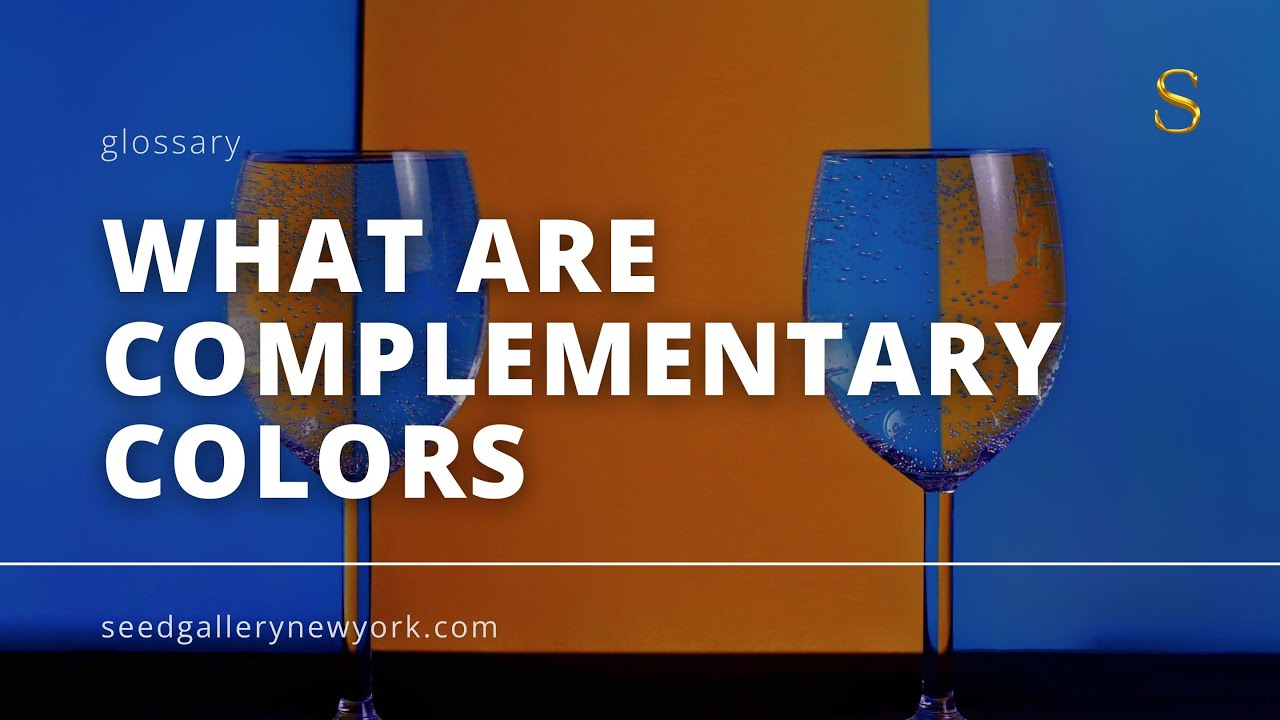
A complementary color scheme is a pairing of two colors that sit directly opposite each other on the color wheel. Red and green. Blue and orange. Yellow and purple.
That’s it. No complex formulas or hidden rules.
The relationship between these opposite hues creates the strongest visual contrast possible within any two-color combination. When you place them side by side, both colors appear more intense than they would on their own. Your eye essentially amplifies the difference.
Isaac Newton first mapped these relationships in the 1660s while experimenting with prisms and light. He arranged the visible spectrum into a circular diagram, and the colors falling on opposite points showed this intensifying effect. The basic structure hasn’t changed much since then.
Understanding color theory helps explain why this works. Every complementary pair contains one warm color and one cool color. That temperature difference is part of what makes the combination feel so charged.
How the Color Wheel Defines Complementary Pairs
The standard 12-part color wheel maps primary, secondary, and tertiary colors in a circle. Draw a straight line from any color through the center, and whatever you hit on the other side is its complement.
Three color models handle this differently:
- RGB (additive): Used in screens and digital displays. Red pairs with cyan, green pairs with magenta, blue pairs with yellow

- RYB (traditional): The painter’s model. Red/green, blue/orange, yellow/purple

- CMYK (subtractive): Used in print. Cyan pairs with red, magenta pairs with green, yellow pairs with blue

Most design conversations default to the RYB model. When someone says “complementary colors,” they almost always mean red/green, blue/orange, or yellow/purple.
Complementary vs. Other Color Harmonies
The complementary scheme is one of several ways to pick colors that work together. Here’s how it compares:
| Scheme | How It Works | Visual Effect | Example |
|---|---|---|---|
| Complementary | Two colors directly opposite on the color wheel | Very high contrast, bold, attention-grabbing | Blue & Orange |
| Analogous | Three colors next to each other on the wheel | Smooth, natural, harmonious | Blue, Blue-Green, Green |
| Triadic | Three colors evenly spaced around the wheel | Vibrant but balanced | Red, Yellow, Blue |
| Monochromatic | One hue with different tints, tones, and shades | Clean, minimal, unified | Light Blue, Blue, Dark Blue |
Complementary schemes deliver the most punch with the fewest colors. That’s their biggest strength and their biggest risk, because too much contrast without careful handling gets uncomfortable fast.
Why Complementary Colors Create Visual Contrast

There’s actual science behind why opposite colors on the color wheel hit so hard together.
The human eye has three types of cone cells, each responding to different wavelengths: long (red), medium (green), and short (blue). When you stare at a red square for 30 seconds, then look at a white surface, you see a green afterimage. The red-sensitive cones fatigue, and the remaining active cones produce the complement.
That afterimage phenomenon? It’s your visual system literally generating complementary colors on its own.
Simultaneous Contrast and Chevreul’s Discovery
Michel Eugène Chevreul figured this out in 1824 while working as director of dyeing at the Gobelins tapestry works in Paris. Workers kept complaining that the black dye looked weak and reddish when placed next to deep blue fabric.
The dye was fine. The problem was optical.
Chevreul identified what he called “simultaneous contrast,” the tendency for a color to shift toward the complement of whatever sits next to it. He published his findings in 1839 in a book that became the most widely used color manual of the 19th century.
His key insight was simple: the brain exaggerates color differences to perceive them better. Two complementary colors placed together make each other appear more intense than they actually are.
Why High Contrast Doesn’t Always Mean Readable
Here’s the tricky part. Maximum color contrast and maximum readability are not the same thing.
Place pure red text on a pure green background and you get something almost physically painful to look at. The colors “vibrate” at the boundary where they meet. This happens because both hues have similar luminance values despite being opposite in color contrast.
The 2024 WebAIM Million report found that low-contrast text appeared on 81% of the top one million homepages, making it the single most common accessibility violation on the web.
WCAG 2.2 guidelines require a minimum contrast ratio of 4.5:1 for normal text and 3:1 for large text. Many complementary pairs at full saturation actually fail these thresholds.
The fix is usually adjusting value (lightness/darkness) rather than changing the hue itself. A dark navy blue on a light peach background uses the blue/orange complementary relationship while passing every accessibility check.
Common Complementary Color Pairs and Their Uses

Each complementary pair carries its own visual weight and cultural associations. Knowing which pair fits which context saves a lot of trial and error.
Red and Green
The most culturally loaded pair. Christmas decorations, traffic signals, “go/stop” UI patterns.
Red and green also dominate food industry branding because red stimulates appetite and green signals freshness. But this combination creates serious problems for people with color vision deficiency. Red-green CVD affects up to 8% of males and 0.5% of females of Northern European descent, according to peer-reviewed epidemiological data.
If your audience is broad, this is the riskiest complementary pair to rely on alone. Always add a secondary visual cue (icons, labels, patterns) when using red and green to communicate status.
Blue and Orange
The workhorse pair of commercial design.
Movie posters use it constantly. Sports teams lean on it (the New York Knicks, the Denver Broncos). Tech brands like Firefox built their identity around it. FedEx uses purple and orange, which sits close to this territory.
Blue reads as trustworthy and stable. Orange reads as energetic and approachable. Together, they create a warm/cool tension that feels both professional and friendly. Research from Straits Research indicates that color can boost brand recognition by up to 80%, which partly explains why blue-orange shows up so often in corporate branding.
Yellow and Purple
This pair screams luxury mixed with energy. Think Lakers branding. Cadbury chocolate. Crown Royal whiskey.
Yellow grabs attention faster than any other color (it’s the first color the human eye processes). Purple has centuries of association with royalty and wealth. The combination feels expensive but not stuffy.
According to Colorlib data, 21% of consumers actually prefer complementary color schemes on websites, making it the most popular color scheme type in their survey, just ahead of analogous at 20%.
Split-Complementary, Double-Complementary, and Near-Complementary Variations
Straight complementary schemes can feel aggressive if you don’t manage them carefully. That’s where the variations come in. Each one takes the core idea of “opposite colors” and dials back the intensity in a different way.
Split-Complementary Scheme
Pick your base color. Now instead of using its direct opposite, use the two colors sitting on either side of that opposite.
Example: if your base is blue, skip orange and grab yellow-orange and red-orange instead.
The result keeps most of the contrast but reduces the visual tension. It gives you three colors to work with instead of two, which makes layout decisions easier. This is honestly the split-complementary color scheme at its best, a safer bet for anyone who finds straight complements too confrontational.
Double-Complementary and Tetradic Schemes
A tetradic color scheme uses two complementary pairs simultaneously. Four colors. Two sets of opposites.
This is harder to pull off than it sounds.
The main risk is visual chaos. With four strong colors competing for attention, you need a clear hierarchy. One dominant color, one secondary, and two accents. The 60-30-10 distribution rule applies here more than anywhere else.
| Variation | Colors Used | Best For | Example |
|---|---|---|---|
| Split-Complementary | 1 base color + the two colors next to its opposite | Beginners, safer contrast than complementary | Blue + Yellow-Orange + Red-Orange |
| Double-Complementary (Tetradic) | Two complementary pairs (4 colors) | Complex layouts, rich palettes | Blue & Orange + Purple & Yellow |
| Near-Complementary | 1 base color + a color slightly off from the direct opposite | Subtle tension, elegant palettes | Blue + Red-Orange |
Near-complementary is the least discussed but maybe the most useful in practice. Instead of going to the exact opposite, you shift by about 15 to 30 degrees on the color wheel. The result feels intentional without being obvious.
Tools like Adobe Color, Coolors, and Canva’s color wheel generator make it easy to experiment with all three variations before committing.
How to Use a Complementary Color Scheme in Design
Knowing which colors are complementary is one thing. Actually using them without making your layout look like a sports jersey is another.
The single biggest mistake I see is splitting the two colors 50/50. Equal distribution creates visual competition where neither color gets to lead. Everything ends up fighting for attention.
Balancing Dominant and Accent Colors
The 60-30-10 rule is the standard approach. Sixty percent of your design uses the dominant color (or its tints/shades). Thirty percent goes to a secondary neutral or muted tone. Ten percent is your complementary accent.
That accent does the heavy lifting. It’s where you place calls to action, key buttons, and important highlights.
According to web design research from Merehead, color alone can raise conversion rates by up to 24%. The complementary accent color in the right spot (a CTA button, a pricing badge, a notification) draws the eye precisely because it clashes with everything around it.
Here’s a quick breakdown of how this works across different contexts:
- Web interfaces: Use a blue background with orange CTA buttons. The contrast ratio practically forces attention toward the action you want users to take
- Packaging design: Tide uses orange and blue. The shelf impact is immediate because the complementary pair pops against almost any retail environment
- Poster design: Movie posters lean on blue/orange tinting in background imagery, then use the warmer accent for title treatment
Adjusting Saturation and Value for Usability
Two complementary colors at full saturation placed next to each other will vibrate. At least in my experience, this is the number one reason people abandon complementary palettes too early.
The fix is dead simple: reduce saturation on one or both colors. Or shift their value (lightness/darkness) so they’re not competing at the same intensity level.
Using tints, shades, and tones from both sides of your complementary pair gives you a much richer color palette to work with. A deep navy paired with a soft peach is still blue/orange. It just doesn’t scream at you.
Figma, Adobe Illustrator, and even CSS custom properties make it easy to build these variations into a design system. Tailwind CSS utility classes work well for quick prototyping of complementary palettes with adjusted lightness values.
Complementary Colors in Art and Historical Context
Complementary color use in art didn’t start with a theory. It started with painters noticing that certain color pairs made their work feel more alive. The theory came later to explain what they’d been doing intuitively.
Chevreul’s Influence on Impressionism
When Chevreul published his research on simultaneous contrast in 1839, it gave painters a scientific framework for something they’d already been experimenting with. Eugène Delacroix was among the first to grab hold of it. He bought Chevreul’s notes, attended his lectures, and used triangular color diagrams in his sketchbooks to plan complementary pairings.
The Impressionists took it further. Claude Monet painted colored shadows instead of gray or black ones, placing cool blue-violet shadows against warm sunlit yellows and oranges. The result looked more realistic than literal color mixing, because that’s how light actually behaves outdoors.
Neo-Impressionists like Georges Seurat and Paul Signac pushed the idea to its extreme. They placed small dots of complementary colors side by side, letting the viewer’s eye blend them optically. Signac once said he studied Chevreul’s book to understand the simple laws of simultaneous contrast. Both painters cited Chevreul directly as a source.
Van Gogh and Deliberate Color Opposition
Vincent van Gogh was maybe the most vocal advocate for complementary color use.
He wrote in his letters about Chevreul’s law, saying that juxtaposing complementary colors raises both to an intensity “so violent that human eyes will scarcely be able to bear to look at it.” He wasn’t exaggerating for effect. He meant it as a technical description.
“Café Terrace at Night” uses yellow-orange lamplight against a deep blue-violet sky. “The Starry Night” layers blues and yellows in ways that seem almost electric. His sunflower paintings set golden yellows against purple and violet backgrounds.
These weren’t random choices. Van Gogh studied color psychology and contrast theory extensively, and his letters show a designer’s precision behind what looks like emotional spontaneity.
From Bauhaus Design to Modern Practice
Johannes Itten, teaching at the Bauhaus school in the 1920s, formalized complementary color relationships into structured exercises that students still use today. His color star and contrast studies became foundational teaching tools.
Josef Albers later expanded on this with “Interaction of Color” (1963), which demonstrated through 150 plates how context changes color perception. A single orange square looks completely different on a blue background versus a red one.
That direct line, from Chevreul to the Impressionists to the Bauhaus to Albers to current digital design education, is one of the cleanest through-lines in visual arts history. Every color picker tool and color harmony generator today is built on principles these people established over 180 years ago.
Common Mistakes with Complementary Color Schemes
Most people don’t fail at picking complementary colors. They fail at using them.
The pairing is technically correct, the placement is solid, and then the whole layout feels like it’s screaming. Took me a while to figure out why this happens. It almost always comes down to one of these issues.
Equal Saturation at Equal Proportions
This is the biggest offender. Two complementary colors at full intensity, split 50/50 across a layout, creates what Josef Albers described as an “aggressive and uncomfortable” effect that viewers will actively avoid.
The colors vibrate at their boundaries. Your eye can’t rest on either one.
Albers warned against this in “Interaction of Color,” calling the vibrating effect something rarely used except for a “screaming effect in advertising.” The fix is simple: make one color dominant and the other an accent using the 60-30-10 distribution.
Ignoring Value Contrast
Hue contrast and value contrast are two different things. You can have maximum hue contrast (true complements) with almost no value contrast (similar lightness levels).
When both colors share the same luminance, text becomes nearly unreadable. Convert any complementary pair to grayscale and you’ll see the problem immediately. If the two colors look identical in gray, your value contrast is too low for functional design.
Red-Green Combinations Without Fallbacks
Red-green color vision deficiency affects roughly 300 million people globally, according to vision research data. That’s not a small edge case.
- Always pair color with a secondary cue: icons, labels, patterns, or position
- Test with a color blindness simulator (built into Chrome DevTools and Figma)
- Avoid red/green as the only differentiator for status indicators in web design
Overusing the Scheme Across an Entire Layout
Complementary colors work best as a focal point strategy, not a whole-page approach.
Reserve the complementary accent for CTAs, key data points, and areas where you need the viewer’s eye to land. The rest of your layout should breathe with neutrals, tints, and shades. Too much complementary contrast everywhere kills the visual hierarchy because nothing stands out when everything does.
Complementary Color Scheme in Digital Interfaces and Branding
The shift from print to screen changed how complementary colors behave. Light-emitting displays (RGB) handle color differently than printed ink (CMYK), and the same hex values can look wildly different across devices, browsers, and screen profiles.
That doesn’t stop complementary schemes from being one of the most effective approaches in digital product design. You just have to know where the rules change.
CTA Buttons and Conversion-Focused Design
A complementary accent on a call-to-action button is the textbook use case for this color scheme in UI.
HubSpot ran a well-known A/B test comparing red and green CTA buttons. The red button outperformed green by 21% in click-throughs. The context matters here: the surrounding page elements were mostly green-toned, making the red button a complementary accent that naturally pulled attention.
That’s not about red being “better” than green. It’s about the complementary relationship creating a point of emphasis that breaks the pattern.
Dashboard and Data Visualization Color Coding
| Use Case | Recommended Pair | Why It Works | Example Context |
|---|---|---|---|
| Success / Error states | Green / Red (with icons) | Immediate recognition; culturally associated with success vs. failure | Form validation, alerts |
| Category comparison | Blue / Orange | Opposite hues give clear separation and remain distinguishable for most color-blind users | Bar charts, dashboards |
| Hot / Cold data maps | Blue → Orange gradient | Strong temperature metaphor; easy to read at multiple intensities | Heatmaps, weather maps |
| Highlighted vs. baseline | Purple / Yellow accent | Very high contrast; yellow draws attention quickly | Highlighting selected data or features |
Blue and orange is the safest complementary pair for data visualization because it remains distinguishable to users with the most common forms of color vision deficiency.
Brand Identity Systems Built on Complementary Pairs
Mastercard uses red and yellow (near-complementary in RYB space) to create one of the most recognized brand marks on the planet. Tide’s orange and blue packaging gives it instant shelf visibility, and that same palette carries across every digital touchpoint.
Google’s Material Design system explicitly recommends that secondary colors can be “complementary or analogous” to primary brand colors. The system’s tonal palette approach generates 13 lightness levels for each selected hue, making it easy to build an entire design system from a single complementary pair.
Dark Mode and Complementary Relationships
Dark backgrounds change everything about how complementary pairs look.
Highly saturated complementary accents on dark surfaces create a visual “shaking” effect, per Acodez research. Google’s Material Design guidelines suggest reducing color saturation by 20 to 30% for dark mode interfaces and using tones in the 200-50 range for better readability.
Roughly 60% of users now prefer dark mode on their devices, according to a 2024 industry survey. That’s a big enough segment that any complementary color system needs to be tested in both light and dark contexts before shipping.
Tools for Building Complementary Color Palettes

You don’t need to eyeball complementary pairs anymore. The tooling has gotten good enough that generating, testing, and exporting color schemes takes minutes.
Here’s what actually works in practice, tested across real projects.
Adobe Color
Best for: precision and integration with Creative Suite.
Adobe Color’s interactive color wheel has a “Complementary” harmony rule that locks two colors to exact opposite positions. You drag one, the other follows. It also includes accessibility tools that test how your palette appears to users with different types of color vision deficiency.
Free to use. Requires an Adobe account to save palettes. Exports directly to Illustrator, Photoshop, and InDesign libraries.
Coolors
Over 2 million active users and integrations with Figma, Adobe Creative Suite, and Chrome, per Digidop’s tool review.
- Hit the spacebar to generate random palettes, then lock your base color and regenerate
- Built-in WCAG contrast checker for accessibility testing
- Image color extraction pulls complementary tones from uploaded photos
The free tier limits you to 5-color palettes and 10 saves. Pro runs $3/month for unlimited access.
Figma Plugins and Browser Tools
Stark plugin: Tests accessibility directly inside your Figma canvas. Simulates color blindness types and checks contrast ratios against WCAG standards.
Chrome DevTools: The built-in color picker shows contrast ratios in real-time. Under “Rendering,” you can simulate vision deficiencies without leaving the browser. Most developers already have this open anyway.
Practical Workflow for Complementary Palette Creation
This is the process that actually saves time:
- Start with your primary brand color (usually already decided)
- Find its complement using Adobe Color or Coolors
- Generate 5-7 tints and shades of both colors
- Test the darkest shade of one against the lightest tint of the other for WCAG compliance
- Build CSS custom properties or Tailwind config from the final values
Your brand guidelines document should include hex codes, RGB values, and accessibility notes for every color in the system. Skipping this step guarantees inconsistency the moment more than one person touches the design files.
FAQ on What Is A Complementary Color Scheme
What is a complementary color scheme in simple terms?
A complementary color scheme uses two colors that sit directly opposite each other on the color wheel. Red and green, blue and orange, yellow and purple. These pairs create the highest possible contrast between any two hues.
What are examples of complementary color pairs?
The three primary complementary pairs in the traditional RYB model are red/green, blue/orange, and yellow/purple. In the RGB color model used for screens, the pairs shift to red/cyan, green/magenta, and blue/yellow.
Why do complementary colors look so intense together?
Your eye’s cone cells fatigue when viewing one color and generate an afterimage in its complement. This simultaneous contrast effect, first documented by Michel Eugène Chevreul in 1839, makes both colors appear more vivid when placed side by side.
How is a complementary scheme different from a split-complementary scheme?
A complementary scheme uses two exact opposites. A split-complementary scheme replaces one opposite with the two colors flanking it, giving you three colors total. The result keeps most of the contrast but feels less confrontational.
Can complementary colors cause accessibility problems?
Yes. Red-green color vision deficiency affects up to 8% of males globally. Two complementary colors at equal saturation can also “vibrate” on screen, making text unreadable. Always check WCAG contrast ratios before finalizing your palette.
What is the 60-30-10 rule for complementary colors?
Use your dominant color for 60% of the design, a neutral or muted tone for 30%, and the complementary accent for just 10%. This distribution prevents visual competition and keeps the layout balanced and readable.
Which complementary pair works best for web design?
Blue and orange is the safest and most popular pick. It provides strong warm/cool contrast, works for most color-blind users, and carries associations of trust (blue) and energy (orange). Firefox and FedEx both built brands around it.
Do complementary colors work in dark mode interfaces?
They do, but you need to reduce saturation by 20 to 30%. Highly saturated complements on dark backgrounds create a visual shaking effect. Google’s Material Design guidelines recommend using lighter tonal values for dark theme accents.
What tools can I use to find complementary colors?
Adobe Color, Coolors, and Canva’s color wheel all have a complementary harmony mode. Figma plugins like Stark test accessibility directly in your canvas. Chrome DevTools includes a built-in contrast ratio checker and color blindness simulator.
How did artists historically use complementary color schemes?
Vincent van Gogh paired yellow and purple extensively in his paintings. Claude Monet used blue-violet shadows against warm sunlit tones. Johannes Itten formalized these relationships at the Bauhaus, and Josef Albers expanded on them in “Interaction of Color.”
Conclusion
A complementary color scheme gives you maximum visual impact from just two colors. That’s its power, and that’s exactly what makes it tricky to get right.
The difference between a palette that works and one that vibrates painfully comes down to value control, saturation adjustments, and proper distribution. Not color picking.
Test every pair against WCAG contrast ratios. Build tints and shades from both sides of your chosen complements. Use tools like Adobe Color or Coolors to generate accessible variations quickly.
Whether you’re designing a brand identity system, coding a dark mode interface, or choosing accent colors for a dashboard, the same principles from Chevreul and the Bauhaus still apply. One dominant color. One accent. Plenty of breathing room between them.
Start with one color you trust. Find its opposite. Then build from there.

Renowned for his expertise in logo design and visual branding, Bogdan has developed a multitude of logos for various clients.
His skills extend to creating posters, vector illustrations, business cards, and brochures. Additionally, Bogdan's UI kits were featured on marketplaces like Visual Hierarchy and UI8.
He also wrote in the past years on sites like Design Your Way, WebDesignerDepot, WPDean, Designmodo, Speckyboy, Slider Revolution, and more.
- How to Embed Fonts in PDF for Reliable Printing - 30 September 2026
- How to Create Product Design Principles That Evolve With Your Product - 29 September 2026
- Canva vs Midjourney: AI Design Tools Compared - 28 September 2026

Bogdan Sandu is a seasoned designer who has been designing websites since 2008. Renowned for his expertise in logo design and visual branding, Bogdan has developed a multitude of logos for various clients. His skills extend to creating posters, vector illustrations, business cards, and brochures. Additionally, Bogdan's UI kits were featured on marketplaces like Visual Hierarchy and UI8. He also wrote in the past years on sites like Design Your Way, WebDesignerDepot, WPDean, Designmodo, Speckyboy, Slider Revolution, and more.
You Might Also Like


