Walk into any food court worldwide, and your brain instantly recognizes dozens of brand symbols without conscious thought. These examples of fast food logos represent some of the most powerful visual communications ever created, collectively worth billions in brand equity and customer loyalty.
Every successful restaurant chain understands a fundamental truth: customers choose where to eat within seconds. That split-second decision often depends entirely on which logo design triggers the strongest emotional response first.
From McDonald’s golden arches to Subway’s green arrows, each corporate logo employs sophisticated color psychology and design principles to influence purchasing behavior. These aren’t random graphics, they’re carefully crafted marketing weapons.
This analysis examines how major food chain brands like Burger King, KFC, and Taco Bell transformed simple imagery into global recognition machines. You’ll discover the hidden strategies behind memorable brand symbols and why certain restaurant logos achieve instant worldwide recognition while others fade into obscurity.
Fast Food Logos
| Brand | Visual Attributes | Color Psychology Context | Brand Positioning |
|---|---|---|---|
| McDonald’s | Golden arches typography, geometric minimalism, globally recognizable iconography | Red-yellow combination signifies urgency, appetite stimulation, cheerful accessibility | Mass-market convenience, speed-focused dining, universal brand recognition |
| Burger King | Bold circular emblem, vintage-inspired serif typography, flame-grilled imagery | Orange-blue contrast creates premium perception, flame colors suggest authenticity | Premium fast-casual positioning, flame-grilling differentiation, quality emphasis |
| Wendy’s | Character-based mascot, handwritten script styling, pigtail iconography | Red communicates warmth, homestyle cooking, approachable personality | Fresh ingredients narrative, homestyle quality, personable brand character |
| Taco Bell | Geometric bell symbol, contemporary sans-serif, architectural simplicity | Purple-magenta creates unique differentiation, non-traditional fast food identity | Innovative Mexican-fusion, millennial-targeted messaging, creative menu positioning |
| Subway | Arrow symbolism, directional movement, transportation metaphor integration | Green-yellow combination emphasizes freshness, health-conscious positioning | Customization focus, health-oriented messaging, fresh ingredient emphasis |
| Pizza Hut | Red roof architectural reference, italicized typography, heritage symbolism | Classic red stimulates appetite, traditional pizza parlor associations | Established pizza authority, family dining heritage, comfort food positioning |
| KFC | Colonel Sanders portrait, southern gentleman imagery, heritage authenticity | Red-white creates classic Americana, trustworthy traditional values | Secret recipe mystique, southern cooking tradition, finger-lickin’ experience |
| Starbucks | Siren mythology, circular medallion design, maritime heritage symbolism | Forest green conveys premium quality, environmental consciousness, sophistication | Third-place social hub, premium coffee culture, experiential lifestyle brand |
| Domino’s | Domino tile metaphor, geometric precision, game-theory visual reference | Blue-red combination suggests reliability, American pizza delivery leadership | Technology-driven delivery, speed optimization, digital-first pizza ordering |
| Chick-fil-A | Script typography, handcrafted aesthetic, southern hospitality symbolism | Red signifies passion, quality commitment, traditional southern values | Chicken specialization, service excellence, faith-based brand values |
| Five Guys | Checkered pattern, retro diner aesthetic, nostalgic Americana references | Red-white creates classic burger joint identity, authentic simplicity | Fresh-never-frozen positioning, family business authenticity, burger purism |
| In-N-Out | Arrow symbolism, directional energy, California minimalist design | Red-yellow-white creates West Coast freshness, premium simplicity | Secret menu culture, California lifestyle, quality-over-quantity philosophy |
Wendy’s logo
Taco Bell logo
Subway logo
Subway founded 1965 as Pete’s Super Submarines in Bridgeport, Connecticut by Fred DeLuca and Peter Buck. Renamed Subway 1968, becoming world’s largest restaurant chain with 37,000 locations across 100+ countries.
Logo Design Elements
Visual Components: Yellow “SUB” and green “WAY” lettering with characteristic arrow tails on “S” and “Y” letters. Custom typography designed specifically for brand identity.
Symbolic Meaning: Arrows represent movement, progress, and quick service delivery. Color theory application suggests health and freshness through natural associations.
Design Evolution: Evolved from simple text 1965 to arrow integration 1968, maintaining consistent design language through multiple refinements.
Brand Recognition Factors
Color Psychology: Green represents health, nature, and freshness while yellow conveys optimism and energy. Combination differentiates from red-dominant competitors.
Typography Characteristics: Bold sans-serif with curved letter modifications creates distinctive brand personality and improved readability.
Icon Analysis: Arrow elements suggest subway transportation system and directional movement reinforcing speed positioning.
Marketing Impact
Consumer Association: Design communicates healthy fast food alternative with fresh ingredient emphasis.
Brand Positioning: Visual identity supports “Eat Fresh” messaging and customization capabilities.
Memorability Score: Unique color combination and arrow elements achieve strong differentiation in crowded market.
Historical Context
Design Origins: Arrows introduced 1968 to represent subway transportation and forward-thinking brand philosophy.
Cultural Influence: Green positioning anticipated health-conscious consumer trends decades before competitors.
Market Entry: Logo facilitated international expansion through health-focused messaging resonating globally.
Pizza Hut logo
Pizza Hut established 1958 in Wichita, Kansas by Dan and Frank Carney using $600 loan. Became subsidiary of Yum! Brands operating 19,000 locations worldwide specializing in pizza delivery and casual dining.
Logo Design Elements
Visual Components: Red circular background with white lettering using distinctive italicized font creating dynamic appearance. Traditional “hut” roof symbol incorporated in some versions.
Symbolic Meaning: Red circle suggests pizza shape while roof icon references original restaurant name and cozy dining atmosphere.
Design Evolution: Simplified from detailed hut illustration to modern circular wordmark maintaining brand heritage through color consistency.
Brand Recognition Factors
Color Psychology: Red stimulates appetite and creates urgency for food ordering while suggesting Italian cuisine heritage.
Typography Characteristics: Italicized lettering conveys speed and Italian authenticity through stylistic references.
Icon Analysis: Circular shape reinforces pizza product association and creates versatile application flexibility.
Marketing Impact
Consumer Association: Design communicates authentic pizza expertise and family dining experience.
Brand Positioning: Visual identity supports premium pizza quality perception and delivery convenience.
Memorability Score: Distinctive red circle achieves strong recognition in pizza category competition.
Historical Context
Design Origins: Red color chosen to represent tomato sauce and Italian cuisine traditions.
Cultural Influence: Logo reflects American adaptation of Italian pizza culture for mainstream acceptance.
Market Entry: Simplified design enabled global franchise expansion while maintaining recognizable brand elements.
Arby’s logo
Arby’s established 1964 in Boardman, Ohio by Forrest and Leroy Raffel brothers. Name derives from “R.B.” representing Raffel Brothers, operating 3,400 locations specializing in roast beef sandwiches and premium fast food.
Logo Design Elements
Visual Components: Orange and red color scheme with distinctive cowboy hat silhouette creating Western heritage associations. Bold lettering ensures strong brand presence.
Symbolic Meaning: Cowboy hat represents American frontier spirit and beef quality traditions. Orange suggests warmth and appetite appeal.
Design Evolution: Refined hat illustration while maintaining recognizable silhouette and Western brand positioning.
Brand Recognition Factors
Color Psychology: Orange and red combination stimulates appetite while suggesting warmth and comfort food associations.
Typography Characteristics: Bold, condensed lettering creates strong brand presence and masculine positioning.
Icon Analysis: Hat silhouette provides instant Western recognition and differentiates from burger competitors.
Marketing Impact
Consumer Association: Design communicates quality beef and American cooking traditions.
Brand Positioning: Visual identity supports premium fast food positioning and “We Have The Meats” messaging.
Memorability Score: Distinctive hat icon achieves strong category differentiation and recall.
Historical Context
Design Origins: Western imagery chosen to represent American beef quality and frontier cooking traditions.
Cultural Influence: Reflects American cowboy culture and premium meat associations.
Market Entry: Unique positioning enabled differentiation from hamburger-focused competitors.
Little Caesars logo
Little Caesars founded 1959 in Garden City, Michigan by Mike and Marian Ilitch. Operates 5,000 locations emphasizing value pricing through “Hot-N-Ready” pizza convenience and $5 price point strategy.
Logo Design Elements
Visual Components: Roman emperor character with orange and red color palette creating historical authority and appetite appeal. Cartoon illustration maintains approachable brand personality.
Symbolic Meaning: Caesar character represents Roman empire leadership and pizza Italian heritage. Crown suggests premium quality despite value pricing.
Design Evolution: Modernized character illustration while maintaining recognizable Roman emperor identity and brand equity.
Brand Recognition Factors
Color Psychology: Orange and red stimulate appetite while suggesting Italian cuisine and premium food quality.
Typography Characteristics: Bold lettering with classical influences reinforces Roman heritage and authority positioning.
Icon Analysis: Character mascot creates memorable brand personality and differentiates from abstract competitors.
Marketing Impact
Consumer Association: Design communicates Italian authenticity and value leadership in pizza category.
Brand Positioning: Visual identity supports “Pizza! Pizza!” messaging and convenience positioning.
Memorability Score: Character mascot achieves strong recall through personality-driven branding approach.
Historical Context
Design Origins: Roman theme chosen to represent pizza Italian origins and empire-building business philosophy.
Cultural Influence: Adapts classical Roman imagery for modern pizza consumption and value messaging.
Market Entry: Character branding enabled franchise expansion through memorable brand personality.
Dairy Queen logo
Dairy Queen established 1940 in Joliet, Illinois by John Fremont McCullough introducing soft-serve ice cream innovation. Operates 7,000 locations under Berkshire Hathaway ownership emphasizing treats and grill combinations.
Logo Design Elements
Visual Components: Red oval background with white and orange lettering creating classic Americana aesthetic. Cursive script elements suggest handcrafted quality and tradition.
Symbolic Meaning: Oval shape suggests ice cream scoop while red color creates appetite stimulation and brand warmth.
Design Evolution: Maintained classic script lettering while modernizing color applications and proportions for contemporary relevance.
Brand Recognition Factors
Color Psychology: Red stimulates appetite while white suggests dairy purity and cleanliness standards.
Typography Characteristics: Script lettering conveys handcrafted quality and traditional ice cream parlor authenticity.
Icon Analysis: Oval frame creates product association and provides flexible application container.
Marketing Impact
Consumer Association: Design communicates traditional American ice cream experience and family treat occasions.
Brand Positioning: Visual identity supports premium soft-serve positioning and nostalgic brand values.
Memorability Score: Classic script achieves strong recognition through traditional American branding approach.
Historical Context
Design Origins: Script lettering chosen to represent handcrafted ice cream quality and parlor tradition.
Cultural Influence: Embodies American ice cream culture and family treat traditions.
Market Entry: Traditional positioning enabled expansion through authentic American brand heritage.
Panda Express logo

Panda Express founded 1983 in Glendale, California by Andrew Cherng introducing American Chinese fast food concept. Operates 2,400 locations specializing in orange chicken and Asian-fusion cuisine for American tastes.
Logo Design Elements
Visual Components: Red background with golden lettering and panda mascot creating Asian cultural references. Bold typography ensures strong brand visibility and recognition.
Symbolic Meaning: Panda represents Chinese culture while red color suggests good fortune and celebration in Asian traditions.
Design Evolution: Simplified panda illustration while maintaining cultural authenticity and brand recognition elements.
Brand Recognition Factors
Color Psychology: Red represents luck and prosperity in Chinese culture while gold suggests premium quality and success.
Typography Characteristics: Bold lettering ensures readability while maintaining modern brand positioning.
Icon Analysis: Panda mascot creates immediate cultural association and friendly brand personality.
Marketing Impact
Consumer Association: Design communicates authentic Chinese flavors adapted for American preferences.
Brand Positioning: Visual identity supports fast-casual positioning and cultural authenticity messaging.
Memorability Score: Panda mascot achieves strong recall through distinctive animal branding approach.
Historical Context
Design Origins: Chinese cultural elements chosen to represent authentic cuisine heritage and good fortune associations.
Cultural Influence: Bridges Chinese and American dining cultures through accessible brand imagery.
Market Entry: Cultural branding enabled category leadership in American Chinese fast food segment.
McDonald’s logo
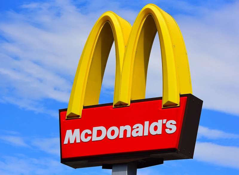
McDonald’s established 1940 in San Bernardino, California by Richard and Maurice McDonald brothers, revolutionized quick service dining through Golden Arches architecture. Corporation founded 1955 under Ray Kroc leadership, becoming global fast food empire with 40,000 locations worldwide.
Logo Design Elements
Visual Components: Primary colors feature red background with golden yellow arches forming distinctive “M” shape. Custom sans-serif typeface McLawsuit introduced 1960s maintains rounded edges and clean letterforms.
Symbolic Meaning: Golden Arches represent architectural heritage from original Des Plaines, Illinois franchise 1955. Logo embodies familiarity, comfort, and welcoming nature through maternal symbolism.
Design Evolution: Evolved from simple text wordmark 1940 to architectural integration 1961, achieving current simplified form 2003 with “I’m lovin’ it” slogan incorporation.
Brand Recognition Factors
Color Psychology: Red stimulates appetite and excitement while yellow evokes happiness and warmth. Strategic color palette creates positive emotional associations with dining experience.
Typography Characteristics: Bold sans-serif font ensures maximum readability across applications. Rounded letterforms convey approachability and friendliness.
Icon Analysis: Arches function as both architectural reference and letter “M” representation. Geometric simplicity enables instant recognition at various scales.
Marketing Impact
Consumer Association: Logo design communicates speed, consistency, and affordability to target families and young demographics.
Brand Positioning: Visual identity supports market leadership through premium brand perception despite fast-casual pricing strategy.
Memorability Score: Achieved 96% global recognition rate through consistent application and repetition across touchpoints.
Historical Context
Design Origins: Created 1961 by Jim Schindler transforming physical restaurant arches into symbolic representation.
Cultural Influence: Represents American capitalism and globalization through worldwide expansion since 1967.
Market Entry: Logo facilitated international franchising success enabling cultural adaptation while maintaining core identity.
Shake Shack logo
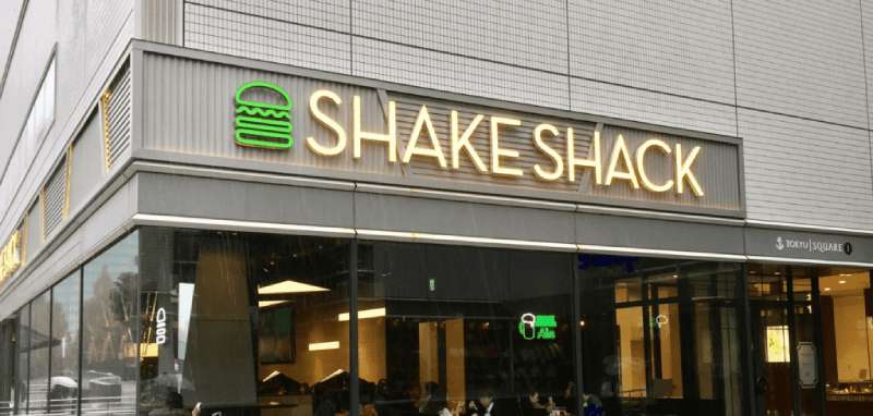
Shake Shack founded 2004 in Madison Square Park, New York by Danny Meyer as premium burger concept. Operates 400+ locations emphasizing high-quality ingredients and modern casual dining experience.
Logo Design Elements
Visual Components: Green and black color palette with modern sans-serif typography creating contemporary, upscale appearance. Minimalist design reflects premium positioning.
Symbolic Meaning: Green suggests fresh ingredients and natural quality while black adds sophistication and premium positioning.
Design Evolution: Maintained clean, modern aesthetic since inception reflecting consistent brand philosophy and target market.
Brand Recognition Factors
Color Psychology: Green communicates freshness and natural ingredients while black suggests premium quality and sophistication.
Typography Characteristics: Modern sans-serif conveys contemporary brand values and urban sophistication.
Icon Analysis: Minimalist approach creates premium brand perception and differentiates from traditional fast food imagery.
Marketing Impact
Consumer Association: Design communicates premium burger experience and artisanal food quality.
Brand Positioning: Visual identity supports fast-casual positioning and ingredient transparency messaging.
Memorability Score: Clean design achieves recognition through premium differentiation strategy.
Historical Context
Design Origins: Modern aesthetic chosen to represent elevated fast food experience and urban dining culture.
Cultural Influence: Reflects contemporary food culture emphasizing quality ingredients and dining experience.
Market Entry: Premium positioning enabled fast-casual category expansion and competitor differentiation.
Domino’s Pizza logo

Domino’s founded 1960 in Ypsilanti, Michigan by Tom Monaghan emphasizing pizza delivery speed and convenience. Operates 20,000 locations globally with technology-focused ordering and delivery innovation.
Logo Design Elements
Visual Components: Red, white, and blue domino tile design with modern typography creating game association and American patriotic colors.
Symbolic Meaning: Domino tile represents brand name while suggesting speed and systematic delivery processes.
Design Evolution: Simplified from detailed tile illustration to modern geometric interpretation maintaining brand recognition.
Brand Recognition Factors
Color Psychology: Red stimulates appetite while blue suggests reliability and trust in delivery service.
Typography Characteristics: Bold, modern lettering ensures readability across digital and physical applications.
Icon Analysis: Geometric tile shape creates immediate brand association and systematic service implications.
Marketing Impact
Consumer Association: Design communicates reliable delivery service and systematic pizza preparation.
Brand Positioning: Visual identity supports technology leadership and delivery convenience messaging.
Memorability Score: Unique domino concept achieves strong differentiation in pizza delivery category.
Historical Context
Design Origins: Domino tile chosen to represent systematic approach and brand name recognition.
Cultural Influence: Reflects American game culture and systematic business methodology.
Market Entry: Delivery focus enabled global expansion through convenience positioning and brand recognition.
Chick-fil-A logo
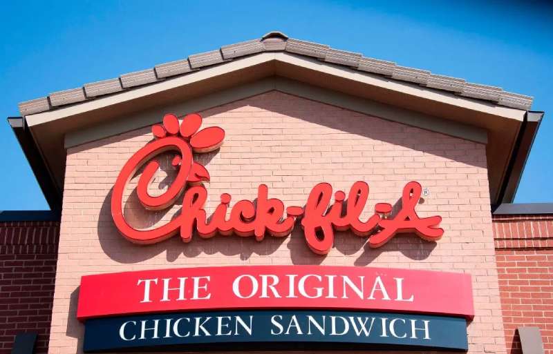
Chick-fil-A established 1946 in Hapeville, Georgia by Truett Cathy emphasizing chicken sandwich specialization and customer service excellence. Operates 2,800+ locations maintaining family ownership and Christian values integration.
Logo Design Elements
Visual Components: Red lettering with stylized “C” creating distinctive brand signature and chicken product association. Script elements suggest handcrafted quality and personal service.
Symbolic Meaning: Stylized “C” represents chicken specialization while red color creates appetite stimulation and brand warmth.
Design Evolution: Refined script lettering while maintaining recognizable “C” signature and traditional brand values.
Brand Recognition Factors
Color Psychology: Red stimulates appetite and creates emotional warmth supporting customer service positioning.
Typography Characteristics: Script lettering conveys personal service and handcrafted food quality.
Icon Analysis: Distinctive “C” creates immediate brand recognition and chicken product association.
Marketing Impact
Consumer Association: Design communicates chicken expertise and exceptional customer service standards.
Brand Positioning: Visual identity supports premium chicken positioning and service excellence messaging.
Memorability Score: Signature “C” achieves strong recognition through consistent brand application.
Historical Context
Design Origins: Script lettering chosen to represent personal service and family restaurant traditions.
Cultural Influence: Embodies Southern hospitality and Christian business values integration.
Market Entry: Service focus enabled expansion through customer loyalty and brand differentiation.
Five Guys logo

Five Guys founded 1986 in Arlington County, Virginia by Jerry and Janie Murrell emphasizing fresh ingredients and customizable burgers. Operates 1,700 locations maintaining family ownership and simple menu focus.
Logo Design Elements
Visual Components: Red and white checkered pattern with bold typography creating classic American diner aesthetic. Simple design reflects straightforward brand philosophy.
Symbolic Meaning: Checkered pattern suggests traditional American dining and racing flag energy. Red stimulates appetite and creates brand recognition.
Design Evolution: Maintained consistent checkered design since inception reflecting authentic brand values and family ownership.
Brand Recognition Factors
Color Psychology: Red and white combination stimulates appetite while suggesting cleanliness and American tradition.
Typography Characteristics: Bold, simple lettering reinforces straightforward brand approach and menu simplicity.
Icon Analysis: Checkered pattern creates immediate recognition and traditional diner associations.
Marketing Impact
Consumer Association: Design communicates fresh ingredients and traditional American burger experience.
Brand Positioning: Visual identity supports premium fast-casual positioning and ingredient quality messaging.
Memorability Score: Distinctive pattern achieves recognition through traditional American imagery.
Historical Context
Design Origins: Checkered pattern chosen to represent traditional American diner culture and quality standards.
Cultural Influence: Reflects classic American dining traditions and family restaurant values.
Market Entry: Authentic positioning enabled expansion through quality differentiation and brand consistency.
Tim Hortons logo

Tim Hortons established 1964 in Hamilton, Ontario by Tim Horton and Ron Joyce emphasizing coffee and donuts for Canadian market. Operates 5,000+ locations maintaining cultural significance in Canadian identity.
Logo Design Elements
Visual Components: Red and white maple leaf integration with oval frame creating Canadian cultural identity. Clean typography ensures readability and professional appearance.
Symbolic Meaning: Maple leaf represents Canadian heritage while red color creates warmth and appetite stimulation.
Design Evolution: Modernized maple leaf illustration while maintaining Canadian identity and cultural significance.
Brand Recognition Factors
Color Psychology: Red creates appetite stimulation while suggesting Canadian flag associations and cultural pride.
Typography Characteristics: Clean, professional lettering reinforces quality standards and Canadian business values.
Icon Analysis: Maple leaf creates immediate Canadian recognition and cultural authenticity.
Marketing Impact
Consumer Association: Design communicates Canadian authenticity and community gathering place positioning.
Brand Positioning: Visual identity supports coffee culture leadership and Canadian identity messaging.
Memorability Score: Maple leaf achieves strong recognition through cultural symbol integration.
Historical Context
Design Origins: Canadian imagery chosen to represent national identity and cultural heritage.
Cultural Influence: Embodies Canadian coffee culture and community values integration.
Market Entry: Cultural positioning enabled expansion through authentic Canadian brand representation.
Hardee’s logo
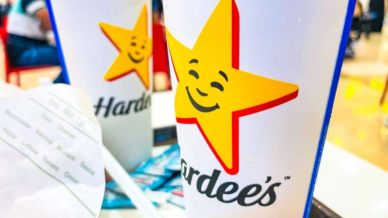
Hardee’s founded 1960 in Greenville, North Carolina by Wilber Hardee emphasizing charbroiled burgers and breakfast offerings. Operates 1,800 locations under CKE Restaurants with bold marketing approach.
Logo Design Elements
Visual Components: Red star symbol with bold typography creating distinctive brand signature and American associations. Simple design ensures strong brand recognition.
Symbolic Meaning: Star represents American excellence and quality leadership while red stimulates appetite and brand energy.
Design Evolution: Simplified star design while maintaining recognizable brand elements and American positioning.
Brand Recognition Factors
Color Psychology: Red stimulates appetite and creates brand excitement supporting bold marketing approach.
Typography Characteristics: Bold lettering reinforces masculine brand positioning and burger quality messaging.
Icon Analysis: Star symbol creates American excellence association and differentiates from competitor imagery.
Marketing Impact
Consumer Association: Design communicates American burger quality and bold brand personality.
Brand Positioning: Visual identity supports charbroiled positioning and breakfast leadership messaging.
Memorability Score: Star symbol achieves recognition through American cultural associations.
Historical Context
Design Origins: American imagery chosen to represent quality excellence and cultural heritage.
Cultural Influence: Reflects American dining values and excellence positioning.
Market Entry: Bold positioning enabled differentiation through distinctive brand personality.
Papa John’s logo

Papa John’s established 1984 in Jeffersonville, Indiana by John Schnatter emphasizing “Better Ingredients, Better Pizza” quality positioning. Operates 5,500+ locations with founder-centric branding approach.
Logo Design Elements
Visual Components: Green and red color combination with apostrophe emphasis creating Italian-American pizza heritage. Classic typography suggests traditional pizza authenticity.
Symbolic Meaning: Green represents fresh ingredients while red suggests Italian cuisine and appetite stimulation.
Design Evolution: Maintained consistent color scheme while refining typography and brand applications.
Brand Recognition Factors
Color Psychology: Green communicates fresh ingredients while red stimulates appetite and Italian cuisine associations.
Typography Characteristics: Classic lettering reinforces traditional pizza quality and Italian authenticity.
Icon Analysis: Apostrophe emphasis creates personal ownership association and founder connection.
Marketing Impact
Consumer Association: Design communicates ingredient quality and traditional pizza craftsmanship.
Brand Positioning: Visual identity supports premium ingredient positioning and quality differentiation messaging.
Memorability Score: Color combination achieves recognition through ingredient quality associations.
Historical Context
Design Origins: Italian-influenced colors chosen to represent pizza authenticity and ingredient quality.
Cultural Influence: Adapts Italian pizza traditions for American quality expectations.
Market Entry: Quality positioning enabled expansion through ingredient differentiation strategy.
Jollibee logo
Jollibee founded 1978 in Quezon City, Philippines by Tony Tan Caktiong adapting American fast food for Filipino tastes. Operates 1,500+ locations with bee mascot representing Filipino happiness and family values.
Logo Design Elements
Visual Components: Red and yellow color scheme with bee mascot creating cheerful, family-friendly appearance. Cartoon illustration maintains approachable brand personality.
Symbolic Meaning: Bee represents hardworking Filipino values while bright colors suggest happiness and celebration.
Design Evolution: Modernized bee character while maintaining recognizable brand personality and cultural connections.
Brand Recognition Factors
Color Psychology: Red and yellow combination stimulates appetite while suggesting happiness and Filipino cultural celebration.
Typography Characteristics: Friendly lettering reinforces family restaurant positioning and approachable brand values.
Icon Analysis: Bee mascot creates memorable character branding and differentiates through animal symbolism.
Marketing Impact
Consumer Association: Design communicates Filipino cultural values and family dining experience.
Brand Positioning: Visual identity supports local taste adaptation and cultural authenticity messaging.
Memorability Score: Character mascot achieves strong recall through distinctive animal branding approach.
Historical Context
Design Origins: Filipino cultural elements chosen to represent local values and family restaurant traditions.
Cultural Influence: Bridges American fast food concepts with Filipino cultural preferences.
Market Entry: Cultural branding enabled local market leadership and international expansion through authenticity.
Quiznos logo
Quiznos established 1981 in Denver, Colorado emphasizing toasted submarine sandwiches and premium ingredients. Peaked at 5,000 locations before restructuring to 400+ restaurants focusing on franchise sustainability.
Logo Design Elements
Visual Components: Red and black color scheme with flame motif creating toasted sandwich association. Bold typography ensures strong brand presence and readability.
Symbolic Meaning: Flame represents toasted preparation method while red stimulates appetite and suggests heat.
Design Evolution: Simplified flame elements while maintaining toasted sandwich positioning and brand recognition.
Brand Recognition Factors
Color Psychology: Red stimulates appetite while black adds sophistication and premium positioning.
Typography Characteristics: Bold lettering creates strong brand presence and masculine positioning.
Icon Analysis: Flame motif creates immediate toasted sandwich association and preparation method recognition.
Marketing Impact
Consumer Association: Design communicates toasted sandwich expertise and premium ingredient quality.
Brand Positioning: Visual identity supports toasted positioning and ingredient differentiation messaging.
Memorability Score: Flame concept achieves recognition through preparation method differentiation.
Historical Context
Design Origins: Flame imagery chosen to represent toasted preparation and sandwich heating innovation.
Cultural Influence: Reflects American sandwich culture evolution and premium positioning trends.
Market Entry: Toasted positioning enabled differentiation from cold sandwich competitors.
Chipotle Mexican Grill logo
Chipotle founded 1993 in Denver, Colorado by Steve Ells emphasizing “Food with Integrity” and fast-casual Mexican cuisine. Operates 3,200+ locations with sustainable ingredient sourcing and customization focus.
Logo Design Elements
Visual Components: Burgundy and white color palette with chili pepper icon creating Mexican cuisine association. Modern typography reflects contemporary brand positioning.
Symbolic Meaning: Chili pepper represents Mexican spice heritage while burgundy suggests premium quality and sophistication.
Design Evolution: Maintained consistent pepper icon while modernizing typography and application flexibility.
Brand Recognition Factors
Color Psychology: Burgundy creates premium perception while suggesting Mexican cuisine spice and authenticity.
Typography Characteristics: Modern lettering reinforces fast-casual positioning and contemporary brand values.
Icon Analysis: Pepper icon creates immediate Mexican cuisine recognition and spice level association.
Marketing Impact
Consumer Association: Design communicates authentic Mexican flavors and premium ingredient sourcing.
Brand Positioning: Visual identity supports “Food with Integrity” messaging and fast-casual leadership.
Memorability Score: Pepper icon achieves recognition through Mexican cuisine authenticity.
Historical Context
Design Origins: Mexican imagery chosen to represent authentic cuisine and ingredient integrity.
Cultural Influence: Elevates Mexican food culture through premium positioning and sustainable practices.
Market Entry: Authentic positioning enabled fast-casual category leadership and cultural appreciation.
Auntie Anne’s logo
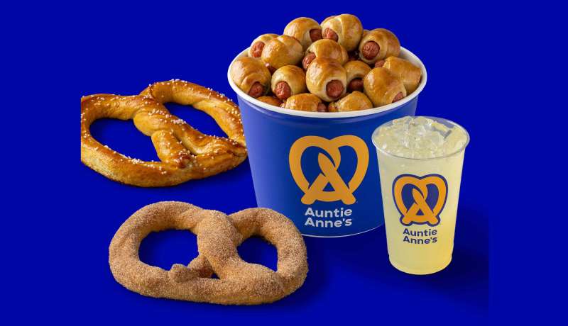
Auntie Anne’s established 1988 in Downingtown, Pennsylvania by Anne Beiler specializing in fresh-baked pretzels and mall-based locations. Operates 1,800+ outlets emphasizing handcrafted quality and family recipes.
Logo Design Elements
Visual Components: Blue and yellow color scheme with pretzel icon creating product association and cheerful appearance. Script lettering suggests handcrafted quality and personal touch.
Symbolic Meaning: Pretzel shape represents core product while family name suggests homemade recipe traditions.
Design Evolution: Modernized pretzel illustration while maintaining recognizable product association and family branding.
Brand Recognition Factors
Color Psychology: Blue suggests trust and reliability while yellow adds cheerfulness and appetite appeal.
Typography Characteristics: Script lettering conveys handcrafted quality and family recipe authenticity reinforcing personal brand connection.
Icon Analysis: Pretzel shape creates immediate product recognition and handcrafted food associations.
Marketing Impact
Consumer Association: Design communicates fresh-baked quality and family recipe traditions.
Brand Positioning: Visual identity supports handcrafted positioning and mall convenience messaging.
Memorability Score: Pretzel icon achieves strong recognition through distinctive product association.
Historical Context
Design Origins: Family name chosen to represent personal recipe heritage and handcrafted quality standards.
Cultural Influence: Reflects Pennsylvania Dutch pretzel traditions and family business values.
Market Entry: Mall-based strategy enabled expansion through high-traffic location positioning.
Carl’s Jr. logo
Carl’s Jr. established 1941 in Los Angeles, California by Carl Karcher expanding from hot dog cart to burger chain. Operates 1,100+ locations under CKE Restaurants emphasizing premium burgers and bold marketing approach.
Logo Design Elements
Visual Components: Red star symbol with bold black lettering creating masculine, premium appearance. Star design suggests American excellence and quality leadership.
Symbolic Meaning: Star represents premium positioning while red stimulates appetite and brand energy.
Design Evolution: Refined star illustration while maintaining recognizable American symbolism and bold brand personality.
Brand Recognition Factors
Color Psychology: Red creates appetite stimulation and excitement supporting premium burger positioning.
Typography Characteristics: Bold lettering reinforces masculine brand appeal and premium quality messaging.
Icon Analysis: Star symbol differentiates through American excellence associations and premium positioning.
Marketing Impact
Consumer Association: Design communicates premium burger quality and bold brand personality.
Brand Positioning: Visual identity supports “If it doesn’t get all over the place, it doesn’t belong in your face” messaging.
Memorability Score: Star symbol achieves recognition through distinctive American imagery.
Historical Context
Design Origins: American imagery chosen to represent quality excellence and bold brand positioning.
Cultural Influence: Reflects American burger culture and premium dining expectations.
Market Entry: Bold positioning enabled differentiation through distinctive marketing approach.
In-N-Out Burger logo

In-N-Out Burger founded 1948 in Baldwin Park, California by Harry and Esther Snyder emphasizing fresh ingredients and family ownership. Operates 400+ locations maintaining California-centric expansion and quality focus.
Logo Design Elements
Visual Components: Yellow arrow pointing into red circle creating directional movement and California sunshine associations. Clean typography maintains simplicity and readability.
Symbolic Meaning: Arrow suggests drive-through convenience while colors represent California lifestyle and appetite stimulation.
Design Evolution: Maintained consistent design since inception reflecting authentic brand values and family ownership philosophy.
Brand Recognition Factors
Color Psychology: Yellow suggests California sunshine and happiness while red stimulates appetite and creates brand warmth.
Typography Characteristics: Simple lettering reinforces authentic brand approach and West Coast casual culture.
Icon Analysis: Arrow and circle combination creates movement suggestion and drive-through service association.
Marketing Impact
Consumer Association: Design communicates California authenticity and fresh ingredient quality.
Brand Positioning: Visual identity supports “Quality you can taste” messaging and cult following development.
Memorability Score: Simple design achieves strong recognition through consistent brand application and limited expansion.
Historical Context
Design Origins: California imagery chosen to represent West Coast lifestyle and fresh ingredient philosophy.
Cultural Influence: Embodies California car culture and drive-through dining innovation.
Market Entry: Regional focus enabled cult brand development through quality consistency and authentic positioning.
Burger King logo
Burger King launched 1953 as Insta-Burger King in Jacksonville, Florida, purchased 1954 by David Edgerton and James McLamore. Headquartered Miami, Florida, operates 18,000 locations globally emphasizing flame-grilled preparation method.
Logo Design Elements
Visual Components: Orange bun halves frame red lettering in custom font creating hamburger visual metaphor. Light cream background provides warmth and appetite appeal.
Symbolic Meaning: Bun design directly represents core product while red wordmark suggests energy and passion for quality.
Design Evolution: Transformed from simple text 1954 to bun concept 1969, achieving current refined version 2021 through Jones Knowles Ritchie agency.
Brand Recognition Factors
Color Psychology: Orange and red combination stimulates appetite through warm, energetic associations. Colors mirror natural bread and meat tones.
Typography Characteristics: Heavy sans-serif font with rounded contours conveys authority and approachability simultaneously.
Icon Analysis: Symmetrical bun halves create balance while framing brand name effectively.
Marketing Impact
Consumer Association: Design communicates authentic flame-grilled quality and customization philosophy “Have It Your Way.”
Brand Positioning: Visual identity differentiates from competitors through distinctive burger representation rather than abstract symbols.
Memorability Score: Bun concept achieves immediate product association enhancing purchase consideration.
Historical Context
Design Origins: Introduced 1969 establishing template for subsequent iterations maintaining consistent burger metaphor.
Cultural Influence: Reflects American burger culture with emphasis on personalization and quality ingredients.
Market Entry: Logo enabled global expansion through culturally relevant food imagery transcending language barriers.
Starbucks logo
Starbucks founded 1971 in Seattle, Washington by Jerry Baldwin, Zev Siegl, and Gordon Bowker emphasizing coffee culture and third-place experience. Operates 35,000+ locations globally transforming coffee consumption worldwide.
Logo Design Elements
Visual Components: Green mermaid (siren) symbol with circular frame creating maritime heritage and premium coffee associations. Monochrome colors maintain sophisticated brand appearance.
Symbolic Meaning: Siren represents Seattle maritime heritage and coffee’s seductive appeal while green suggests natural, premium quality.
Design Evolution: Simplified from detailed illustration to streamlined icon removing text for global recognition and flexibility.
Brand Recognition Factors
Color Psychology: Green communicates natural quality and premium positioning while suggesting growth and prosperity.
Typography Characteristics: Clean, modern lettering when used reinforces contemporary brand positioning and global accessibility.
Icon Analysis: Siren symbol creates mythological associations and differentiates through unique maritime heritage.
Marketing Impact
Consumer Association: Design communicates premium coffee experience and Seattle authenticity.
Brand Positioning: Visual identity supports third-place positioning and coffee culture leadership messaging.
Memorability Score: Distinctive siren achieves global recognition through consistent application and cultural significance.
Historical Context
Design Origins: Maritime imagery chosen to represent Seattle heritage and coffee’s exotic origins.
Cultural Influence: Transformed global coffee culture from commodity to experience through premium positioning.
Market Entry: Premium branding enabled global expansion through coffee culture development and authentic Seattle heritage.
FAQ on Fast Food Logos
What makes McDonald’s golden arches so recognizable worldwide?
McDonald’s golden arches achieve 96% global recognition through strategic color psychology using red and yellow. The “M” shape originated from 1955 architectural design, creating maternal symbolism that suggests comfort and familiarity across cultures.
Why do most fast food logos use red color schemes?
Red stimulates appetite and creates urgency in purchasing decisions. Studies show red increases heart rate by 13%, triggering hunger responses. McDonald’s, KFC, Pizza Hut, and Burger King leverage this color psychology principle for maximum appetite appeal.
How do food chains maintain brand consistency across thousands of locations?
Successful restaurant chains implement comprehensive brand guidelines covering logo placement, color specifications, and sizing requirements. Franchisees receive detailed style guides ensuring uniform brand identity implementation while maintaining corporate visual standards globally.
Which fast food logo underwent the most dramatic redesign changes?
Burger King transformed most dramatically from simple 1954 wordmark to current bun-framed design. The logo evolution included king mascot phases, blue swoosh integration, and 2021 retro revival, demonstrating adaptive brand positioning strategies.
What role does typography play in fast food logo effectiveness?
Typography choice impacts readability and brand personality perception. McDonald’s uses custom McLawsuit font for friendliness, while Carl’s Jr. employs bold lettering for masculine appeal. Font psychology influences consumer trust and purchase intent.
How do international fast food chains adapt logos for different cultures?
Global food chains modify colors and symbols respecting cultural preferences. McDonald’s uses turquoise arches in Sedona, Arizona, while Tim Hortons integrates maple leaves for Canadian identity. Cultural sensitivity maintains brand recognition while honoring local values.
What psychological principles make fast food logos instantly memorable?
Effective restaurant logos employ gestalt principles, repetition, and contrast for immediate recall. Simple shapes, bold colors, and consistent application create visual hierarchy enabling three-second recognition essential for impulse dining decisions.
Which fast food logos successfully represent their core menu items?
Subway’s arrow-enhanced lettering suggests movement and freshness, while Burger King’s bun halves directly represent hamburgers. Papa John’s green emphasizes fresh ingredients. These design elements create immediate product associations enhancing brand differentiation.
How has digital transformation affected fast food logo design trends?
Modern logo design prioritizes mobile optimization and social media compatibility. Simplified icons work across app interfaces while maintaining recognition. Brands adopt flexible vector graphics supporting multiple digital formats and responsive design requirements.
What makes KFC’s Colonel Sanders portrait unique among fast food branding?
KFC’s founder portrait creates human connection distinguishing from abstract competitor symbols. The Colonel’s image suggests personal quality guarantee and Southern hospitality heritage. This brand storytelling approach achieves higher emotional engagement than geometric corporate logos.
Conclusion
These examples of fast food logos demonstrate how brilliant design transforms simple graphics into billion-dollar brand assets. From McDonald’s maternal golden arches to KFC’s trustworthy Colonel portrait, each symbol triggers precise psychological responses that drive consumer behavior and create lasting emotional connections.
Successful food industry logos share common traits: strategic color theory application, memorable visual identity systems, and cultural adaptability. Red dominates for appetite stimulation, while unique elements like Subway’s arrows and Taco Bell’s purple differentiate brands in crowded markets.
The evolution of restaurant branding reflects broader cultural shifts toward health consciousness and digital optimization. Modern food chain symbols must work across mobile apps, delivery platforms, and social media while maintaining instant recognition.
Whether you’re developing corporate identity design or analyzing brand positioning strategies, these iconic symbols prove that effective logo design transcends mere aesthetics. The best franchise branding creates emotional bonds that convert first-time visitors into lifelong customers through powerful visual marketing impact.

Renowned for his expertise in logo design and visual branding, Bogdan has developed a multitude of logos for various clients.
His skills extend to creating posters, vector illustrations, business cards, and brochures. Additionally, Bogdan's UI kits were featured on marketplaces like Visual Hierarchy and UI8.
He also wrote in the past years on sites like Design Your Way, WebDesignerDepot, WPDean, Designmodo, Speckyboy, Slider Revolution, and more.
- Canva vs PowerPoint: Which Is Better for Presentations? - 22 September 2026
- How to Install Fonts on Mac (Step-by-Step Guide) - 20 September 2026
- From Mockup to Code: How AI-Augmented Development Speeds Up the Design Handoff - 19 September 2026

Bogdan Sandu is a seasoned designer who has been designing websites since 2008. Renowned for his expertise in logo design and visual branding, Bogdan has developed a multitude of logos for various clients. His skills extend to creating posters, vector illustrations, business cards, and brochures. Additionally, Bogdan's UI kits were featured on marketplaces like Visual Hierarchy and UI8. He also wrote in the past years on sites like Design Your Way, WebDesignerDepot, WPDean, Designmodo, Speckyboy, Slider Revolution, and more.
You Might Also Like