The Wendy’s Logo History, Colors, Font, and Meaning
Striking. It’s that blend of red and yellow, right? You know it in a heartbeat—it’s the Wendy’s logo. That emblem does more than just mark a burger joint; it’s a beacon of familiarity in a sea of choice, serving up a slice of Americana with every glance. Let’s peel back the layers of this iconic design.
Here’s the meat of it: logos. They’re the face of a company, aren’t they? Instant recognition, a distilled identity that’s immediately served up to our brains.
Now, take Wendy’s. There’s depth in that simplicity; a storytelling arc contained within the contours of their emblem.
By the end of this dive, you’ll unpack the Wendy’s logo like never before. From the pigtails that hark back to a real person—to the symbolic square patties we’ve come to crave.
Explore the nuances of visual storytelling and the vital art of corporate identity.
This isn’t just a tour of a logo; it’s an insight into how the fast food industry weaves branding and marketing with graphic design to cook up something memorable.
Ready? Let’s bite into this story together.
The Meaning Behind the Wendy’s Logo
The Iconic Girl
Oh, you know her. Red hair, freckles, and that kind smile. Yes, we’re talking about Wendy, the heart of the Wendy’s logo.
Named after Dave Thomas’ (the founder) real daughter, Wendy stands as a symbol of family values, warmth, and authenticity that the brand wishes to communicate. No highfalutin concepts here, just honest-to-goodness family love.
The Hidden Message
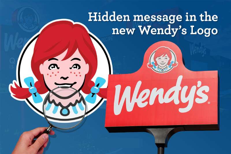
Dig a bit deeper and you’ll find something else – a hidden message! If you look closely at Wendy’s collar, the word ‘mom’ might pop out.
It’s all about home-cooked meals, right? A nod to the homey, comforting food, the sort your mom would make. A clever little bit of design, don’t you think?
The History of the Wendy’s Logo
The Humble Beginnings
Let’s turn back time to 1969. The original logo was a cameo of Wendy, encircled by the name of the restaurant. Simple, clean, and straight to the point.
The main focus? Wendy’s bright-eyed, pig-tailed cartoon depiction, a reflection of wholesome, American family values.
The Evolution
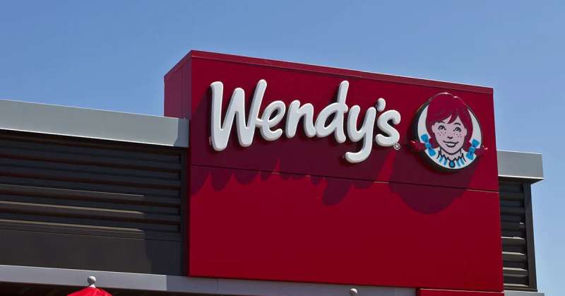
Fast forward to 2013, the logo we all know and love today made its debut. Wendy lost the boxy cameo for a sleeker, modern look. But hey, she kept her signature pigtails and freckles, staying true to her roots while adapting to the times.
The Colors of the Wendy’s Logo
The Red
It’s hard to miss that fiery red in the Wendy’s logo. Bold, intense, and stimulating, it not only grabs your attention but also whets your appetite. Clever move, Wendy’s!
The Blue
Then there’s the blue. It brings a calming balance to the bold red, symbolizing the trust and reliability that Wendy’s prides itself on.
The Font Used in the Wendy’s Logo
The Casual Script
You’ve noticed it, haven’t you? The Wendy’s logo doesn’t use your typical, run-of-the-mill font. It’s a casual script font, full of curves and personality. A bit like handwritten lettering, it adds a personal, human touch. Again, all about that homey, family feel.
The Impact of the Wendy’s Logo
Brand Recognition
You see those pigtails, you immediately think Wendy’s. That’s the power of a well-designed logo. It sticks in your mind, creating strong brand recognition.
Influencing Perception
The logo isn’t just a pretty picture. It’s a communication tool. The elements in the Wendy’s logo all work together to shape our perception of the brand. Homely, friendly, reliable – that’s Wendy’s.
The Future of the Wendy’s Logo
Change is the Only Constant
Logos evolve, adapting to changing tastes and trends. Wendy’s logo has already seen a major revamp. Who knows what the future holds? But whatever changes come, the essence of Wendy’s – that warm, family vibe – is likely to remain at its core.
The Power of Technology
As technology continues to develop, we might see the Wendy’s logo in new, innovative formats. Augmented reality, 3D versions, who knows? Exciting times ahead, folks!
FAQ On The Wendy’s Logo
Who created the Wendy’s logo?
Ah, it’s like a signature, isn’t it? The original Wendy’s logo was the brainchild of the founder, Dave Thomas, and an unnamed professional designer.
Much like Dave’s approach to burgers, it was crafted with care, meant to signal quality and a touch of nostalgia with Wendy Thomas as the mascot.
What does the Wendy’s logo represent?
Ever noticed the subtleties? The logo’s not just a picture; it’s a whole story. It symbolizes old-fashioned hamburgers and personal touch—think of it as Dave Thomas’s promise of home-cooked quality in a fast-food world.
Also, the mascot, Wendy, adds that personal, family-friendly vibe.
Has the Wendy’s logo ever changed?
Absolutely—evolution’s the name of the game. Over time, the logo’s seen tweaks, reflecting changes in the fast food landscape and design trends. It’s moved from a classic feel to a more modern look, all the while keeping Wendy herself front and center.
What’s the significance of the color scheme in the Wendy’s logo?
Those colors aren’t random. The red is bold as a shout, catching eyes and representing energy. The yellow? That’s the warmth, the familiarity of the brand. Together, they’re as invigorating as your first sip of a Frosty on a summer day.
Why does the Wendy’s logo feature a girl with pigtails?
She’s no ordinary girl; she’s Wendy Thomas, Dave’s daughter. Those pigtails? They’re symbolic of innocence, family values, and that nostalgic homegrown vibe. It’s like each twist tells a tale of the Thomas family’s commitment to keeping things real.
Is there a hidden message in the Wendy’s logo?
Now that’s a juicy bit—some say the collar of Wendy’s shirt spells out “MOM.” It’s a subtle nod, intentional or not, reinforcing that sense of home-cooked meals and care they put into their food, resonating with the homely vibe folk love.
What do designers consider the best part of the Wendy’s logo?
The best logos speak without shouting, right? Designers often applaud Wendy’s logo for its balance. It’s got brand recognition, easy on the eyes but distinct enough to stick with you—not unlike that little sprinkle of sea salt on their fries.
How does the Wendy’s logo contribute to the brand’s identity?
A logo’s like the window to a brand’s soul, showing off who they are without a word. Wendy’s logo packs that homespun quality and warmth into one neat package. It’s branding identity done right, setting Wendy’s apart in the sprawling fast-food jungle.
What challenges are involved in redesigning a well-known logo like Wendy’s?
Oh, where to start? There’s the balancing act—keeping the legacy while freshening up the look. You’ve got to maintain that brand recognition, but also appeal to the Insta-crowd.
Change too much, and you risk losing that old-fashioned charm—change too little, and you might seem stale.
How often does the Wendy’s logo get updated or modified?
Not as often as you’d think. They’re careful, ’cause a logo’s the anchor of the brand. Wendy’s tends to refresh their look every decade or so, ensuring they stay relevant while keeping that classic appeal that’s as comforting as a hot square patty fresh off the grill.
Conclusion
And just like the final satisfying bite of a Dave’s Single, we wrap up our exploration of the Wendy’s logo. We’ve journeyed through its rich reds and warm yellows, understanding what they bring to the table: a brand’s heart and soul, its identity, and the nostalgia of the good ol’ days served up in a modern, visual feast.
As someone deeply entwined with design and storytelling, peeling back these layers has been nothing short of eye-opening. The logo stands as a sentinel of brand consistency—it’s a visual identity that’s stood the test of time, evolving yet always holding on to that unmistakable Wendy’s character.
Design can be a powerful language. Done right, as Wendy’s shows us, it cuts through the noise, connecting with folks on levels they feel more than they articulate. A triumph of marketing and graphic design synergy, the Wendy’s emblem will continue to beckon generations—come on in; the food’s just fine.
If you enjoyed reading this article about the Wendy’s logo, you should read these as well:
- The Burger King logo and the history behind its brand
- What font does McDonald’s use on their website and logo?
- Burger King vs KFC vs McDonald’s Print Advertising
Bogdan Sandu, a seasoned designer with 15 years of diverse experience, has been designing websites since 2008.
Renowned for his expertise in logo design and visual branding, Bogdan has developed a multitude of logos for various clients.
His skills extend to creating posters, vector illustrations, business cards, and brochures. Additionally, Bogdan's UI kits were featured on marketplaces like Visual Hierarchy and UI8.
Latest posts by Bogdan Sandu (see all)
- Rainbow Color Palettes for Joyful Designs - 29 April 2024
- The Bethesda Logo History, Colors, Font, And Meaning - 28 April 2024
- Out of This World: Space Color Palettes for Cosmic Designs - 28 April 2024