McDonald’s currently uses Speedee, a custom sans-serif font commissioned from type foundry Dalton Maag, as its primary corporate typeface across packaging, menus, and advertising.
Turner Duckworth introduced Speedee in 2018 as part of a full visual identity overhaul, replacing the previously used Lovin’ Sans. The font name references McDonald’s original Speedee Service System, the operational model the McDonald brothers built their business on.
What Type of Font Is Speedee?
Speedee is a geometric sans-serif typeface with humanist influences. It sits somewhere between strictly constructed and warmly approachable, which is exactly the balance McDonald’s was after.
Key visual traits:
- Rounded terminals that soften the overall weight
- Generous x-height, which helps readability at both small and large sizes
- Available in two widths, each with 3 upright weights
- Draws visual cues from the curved forms of the Golden Arches
The letterforms were inspired partly by the typography in McDonald’s “You Deserve a Break Today” ads from 1971, specifically the typeface Gill Kayo used in those campaigns.
That historical reference was intentional. Dalton Maag sketched early letterforms using the Golden Arches and the McDonald’s wordmark as reference points. The result feels familiar but distinct, which is hard to pull off.
Who Designed Speedee?
Dalton Maag, a London-based type foundry, designed Speedee in 2018 in collaboration with design consultancy Turner Duckworth.
Dalton Maag has worked with major brands including Netflix, Airbnb, and BT. Their brief for McDonald’s was to create a single, cohesive typeface that could replace the scattered mix of fonts the brand had been using. The copyright on Speedee is held by McDonald’s Corporation (2018).
Before Speedee, McDonald’s used Lovin’ Sans from approximately 2014 onward. Lovin’ Sans itself was a custom adaptation of Colfax, a geometric sans-serif designed by Eric Olson and released through Process Type Foundry in 2012. Leo Burnett adapted Colfax for McDonald’s with Brian Loehr’s involvement, and it served as the brand’s corporate font across the website and marketing materials for several years.
Is Speedee Free to Use?
No. Speedee is a proprietary typeface. McDonald’s Corporation holds the rights, and it is not available for public download or commercial use.
Lovin’ Sans, the previous corporate font, is also not publicly available. It was a custom modification of Colfax, which is a commercial font available through Process Type Foundry and Adobe Fonts. You can license Colfax legitimately if you want the closest thing to Lovin’ Sans.
For Speedee specifically, there is no official alternative offered by McDonald’s. Third-party sites occasionally host leaked or reconstructed versions, but using those carries legal risk. Font licensing violations from brands like McDonald’s are taken seriously.
What Font Did McDonald’s Use Before Speedee?
McDonald’s has gone through several typefaces tied to broader rebranding efforts.
| Period | Font | Notes |
| Pre-2014 | Various (Helvetica-adjacent) | No single unified corporate typeface |
| 2014–2018 | Lovin’ Sans | Custom adaptation of Colfax by Process Type Foundry |
| 2018–present | Speedee | Custom, developed by Dalton Maag for Turner Duckworth |
The shift from Lovin’ Sans to Speedee was about consolidation. McDonald’s had accumulated a wide range of fonts across different markets and campaigns. Turner Duckworth described the old branding as cluttered. Speedee replaced that inconsistency with a single font family across all global touchpoints.
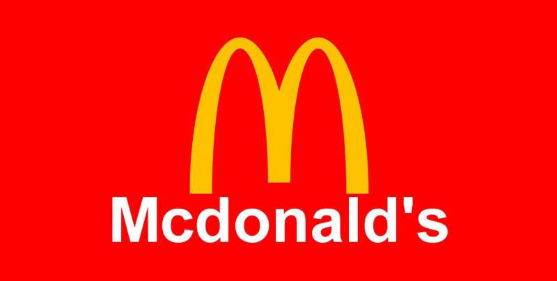
Worth noting: the Golden Arches logo itself has never used a standard typeface. The “M” is a custom-drawn graphic symbol, not a typeable character from any font. That part of the brand identity predates digital typography entirely.
What Are the Best Free Alternatives to Speedee?
Since Speedee is proprietary, these 4 free options are the closest publicly available substitutes based on their geometric construction, rounded warmth, and weight range.
| Font | Similarity | License | Source |
| Nunito | Rounded terminals, approachable weight | Free | Google Fonts |
| Poppins | Geometric structure, similar x-height | Free | Google Fonts |
| Barlow | Clean sans with multiple weights | Free | Google Fonts |
| DM Sans | Low-contrast, modern geometric sans | Free | Google Fonts |
Nunito is probably the closest in feel. The rounded ends on the strokes give it a friendliness that mirrors what Speedee aims for, without feeling childish.
Poppins is a solid second choice, especially if you need something that works well at display sizes. Check out Poppins font pairing ideas if you want to combine it with a complementary typeface. DM Sans is worth considering too, particularly for UI work.
None of these are exact matches. Speedee’s specific proportions and letter details are unique to McDonald’s. But for design projects where you want a similar energy, any of the above will get you there.
How to Use a Speedee Alternative in Your Design Tools
All 4 alternatives listed above are available on Google Fonts, which means getting them into your tools is straightforward.
For Figma: Google Fonts are available natively. Just search the font name in the typeface panel and it loads automatically.
For Photoshop: Download the font file from fonts.google.com, install it system-wide, and it appears in the font list on restart. Full steps in this guide on how to add fonts to Photoshop.
For Canva: Free users get access to the Google Fonts library directly. Pro users can also upload fonts to Canva if you have a licensed file.
For Illustrator: Same process as Photoshop. Install the font at the OS level and it shows up in Illustrator automatically. See the guide on how to add fonts to Adobe Illustrator for the full walkthrough.
For web projects: Embed the font directly via Google Fonts API. Example for Nunito:
“ <link href="https://fonts.googleapis.com/css2?family=Nunito:wght@400;600;700&display=swap" rel="stylesheet"> `
Why Did McDonald’s Choose Speedee?
The short answer: the old system had stopped working at scale.
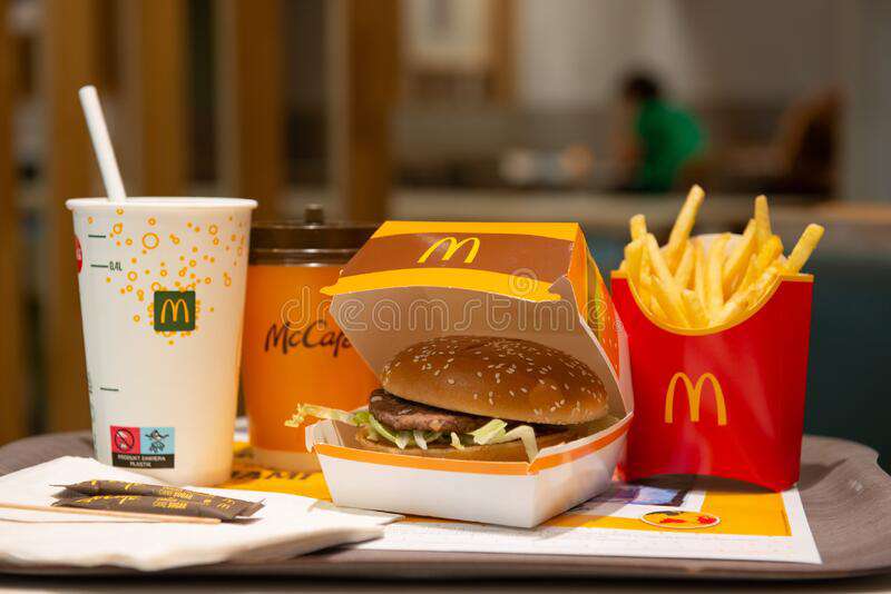
McDonald’s operates across 120 countries and roughly 40,000 locations. By 2017, the brand’s visual identity had fragmented badly. Different markets used different fonts, different color weights, different interpretations of the logo. Turner Duckworth was brought in specifically to fix this.
Speedee solved 3 concrete problems:
- Consistency: One typeface family with a limited number of weights is much easier to enforce globally than a loose collection of approved fonts
- Brand character: The rounded, approachable letterforms match McDonald’s positioning as a family-friendly, accessible brand without tipping into childish territory
- Legibility: At highway billboard scale or on a mobile app icon, Speedee holds up. That kind of range matters when you’re a brand that appears everywhere
The name itself was a deliberate brand decision. Speedee was McDonald’s original mascot, a winking chef character, before Ronald McDonald took over. Bringing the name back for the typeface was a way of anchoring modern branding to the brand’s founding story.
Turner Duckworth also replaced the 200-page brand guidelines PDF with streamlined “Cheatsheets” to make adoption practical across a decentralized franchise network. A good typeface only works if people actually use it correctly. That part often gets skipped in branding conversations.
For a broader look at how logo design principles shape brand identity choices like this, or how font psychology influences the way consumers perceive brands, both are worth reading if this topic interests you. McDonald’s is a textbook case of how typography decisions compound over decades into something that feels almost invisible, until you change it.
Other fast food brands have gone through similar processes. Dunkin’ Donuts made notable font changes as part of its rebrand too, and the reasoning was similar: too many inconsistencies, not enough coherence at scale.
FAQ on What Font Does McDonald’s Use
What is the official McDonald’s font?
McDonald’s current corporate typeface is Speedee, a custom sans-serif designed by Dalton Maag in 2018.
It replaced Lovin’ Sans and is used across packaging, menus, and global advertising. It’s proprietary and not available to the public.
What font did McDonald’s use before Speedee?
From around 2014 to 2018, McDonald’s used Lovin’ Sans, a custom adaptation of Colfax by Process Type Foundry.
Leo Burnett and type designer Brian Loehr adapted it specifically for the brand. It appeared across the website and all marketing materials.
Is the McDonald’s font available for free download?
No. Speedee is a proprietary typeface owned by McDonald’s Corporation. There is no legitimate free version.
Third-party sites may host unofficial files, but using them carries real legal risk. Stick to licensed alternatives like free Google Fonts instead.
What type of font classification is Speedee?
Speedee is a geometric sans-serif with humanist influences. Rounded terminals, generous x-height, clean stroke contrast.
It comes in two widths and three upright weights, giving the brand enough range to cover everything from billboard headlines to app UI text.
Who designed the McDonald’s Speedee font?
Dalton Maag, a London-based type foundry, designed Speedee in collaboration with Turner Duckworth as part of McDonald’s 2018 visual identity overhaul.
Dalton Maag has also worked with Netflix, Airbnb, and BT. The font name references McDonald’s original Speedee Service System.
What font is used in the McDonald’s logo?
The Golden Arches “M” is not a font at all. It’s a custom-drawn graphic symbol, not a typeable character from any typeface.
It originated from the actual architecture of early McDonald’s restaurant buildings. Understanding the difference between a logo mark and a typeface clears up a lot of confusion here.
What are the best free alternatives to the McDonald’s font?
Nunito, Poppins, Barlow, and DM Sans are the closest free matches. All are available on Google Fonts.
Nunito is the strongest alternative for warmth and rounded feel. Poppins works better for display sizes. None are exact matches, but all share similar geometric sans-serif structure with the humanist touches that define Speedee.
What font does McDonald’s use on its website?
The website uses Speedee throughout. Earlier versions of the site used Lovin’ Sans before the 2018 rebrand replaced it globally.
Speedee’s legibility across screen sizes made it a practical choice for digital as well as print and physical signage.
Why did McDonald’s change its font in 2018?
The brand had accumulated too many inconsistent typefaces across 120 countries and 40,000 locations. Turner Duckworth was brought in to fix that fragmentation.
Speedee gave McDonald’s one unified font family with enough flexibility to work globally, replacing a scattered mix that had built up over years.
Is Colfax the same as the McDonald’s font?
Not exactly. Colfax is the commercial typeface that Lovin’ Sans was based on. Lovin’ Sans was a customized version, not the font itself.
Colfax was designed by Eric Olson and released through Process Type Foundry. It’s available to license through Adobe Fonts if you want the closest legitimate version of McDonald’s former corporate typography.
Conclusion
If you’ve been wondering what font does McDonald’s use, the answer is Speedee, a proprietary geometric sans-serif developed by Dalton Maag in 2018.
It replaced Lovin’ Sans, which itself was a custom adaptation of Colfax by Process Type Foundry.
The font change wasn’t cosmetic. It solved a real problem: brand consistency across 40,000 locations and 120 countries.
For designers looking to match the style, Nunito and Poppins are the closest free alternatives available through Google Fonts. Neither is a perfect match, but both capture the same approachable, rounded sans-serif character that defines McDonald’s current corporate typographic identity.

Renowned for his expertise in logo design and visual branding, Bogdan has developed a multitude of logos for various clients.
His skills extend to creating posters, vector illustrations, business cards, and brochures. Additionally, Bogdan's UI kits were featured on marketplaces like Visual Hierarchy and UI8.
He also wrote in the past years on sites like Design Your Way, WebDesignerDepot, WPDean, Designmodo, Speckyboy, Slider Revolution, and more.
- Canva vs Photoshop: When Does Each Make Sense? - 12 September 2026
- Briefing 3D Game Animation: Rigs, Clip Lists and Engine Handoffs - 11 September 2026
- The Webflow Logo History, Colors, Font, And Meaning - 10 September 2026

Bogdan Sandu is a seasoned designer who has been designing websites since 2008. Renowned for his expertise in logo design and visual branding, Bogdan has developed a multitude of logos for various clients. His skills extend to creating posters, vector illustrations, business cards, and brochures. Additionally, Bogdan's UI kits were featured on marketplaces like Visual Hierarchy and UI8. He also wrote in the past years on sites like Design Your Way, WebDesignerDepot, WPDean, Designmodo, Speckyboy, Slider Revolution, and more.
You Might Also Like