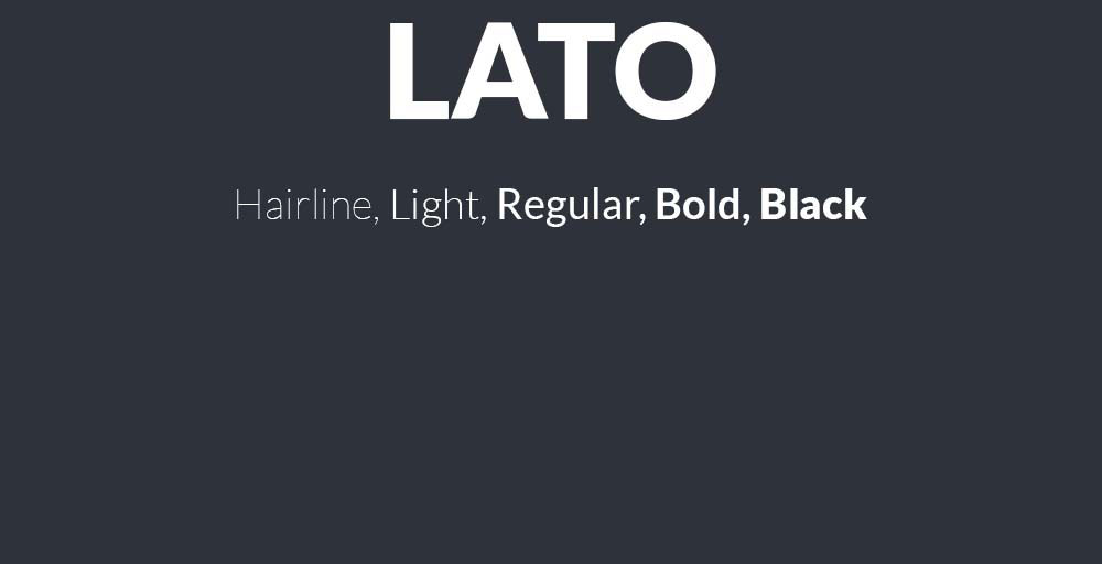
Lato’s clean lines and warm personality have made it a web design staple, but relying on a single typeface limits your creative options. Whether you’re looking to avoid overused fonts, need specific weight variations, or want a fresh take on humanist sans-serif design, exploring fonts similar to Lato opens new possibilities.
This guide examines 19 professional alternatives that share Lato’s geometric structure, readable x-height, and versatile character.
You’ll discover both free open-source options and premium choices, each with detailed specifications covering weights, licensing, implementation tips, and ideal use cases. From Google Fonts staples like Montserrat and Open Sans to professional workhorses like Proxima Nova and Avenir, these typefaces deliver the clarity and flexibility that made you consider Lato in the first place.
Some offer superior font pairing options, others provide extended language support or better performance at small sizes.
Fonts Similar To Lato
| Font Name | Primary Characteristics | Best Use Context | Contextual Similarity to Lato |
|---|---|---|---|
| Open Sans | Humanist sans-serif with neutral appearance and excellent legibility across screen sizes | Web interfaces, body text, digital applications requiring clarity | High – shares geometric warmth and professional versatility |
| Roboto | Neo-grotesque with mechanical skeleton and friendly curves for modern interfaces | Android applications, Material Design systems, mobile-first layouts | Moderate – similar readability but more geometric structure |
| Montserrat | Urban-inspired geometric sans-serif with distinctive letterforms for headers | Display text, headlines, branding materials requiring character | Moderate – works for display but less optimal for body text |
| Source Sans Pro | Adobe’s first open-source font family designed for user interface environments | Long-form reading, documentation, technical content presentation | High – balanced proportions and humanist warmth similar to Lato |
| Raleway | Elegant display font with thin weights and sophisticated aesthetic appeal | Portfolio sites, fashion brands, luxury product presentations | Low – more decorative, optimized for display rather than utility |
| Nunito | Rounded terminal sans-serif with balanced curves creating friendly appearance | Educational platforms, children’s content, approachable brand communication | Moderate – shares clarity but softer personality than Lato |
| PT Sans | Russian-optimized humanist font supporting Cyrillic and Latin character sets | Multilingual websites, international content, Cyrillic typography needs | High – comparable functionality and neutral professional tone |
| Avenir | Premium geometric humanist typeface with organic qualities and refinement | Corporate identities, premium branding, editorial design projects | Moderate – similar warmth but requires licensing for web use |
| Oxygen | KDE desktop environment font optimized for screen rendering performance | Linux applications, desktop software interfaces, system UI text | Moderate – functional similarity but less refined than Lato |
| Proda Sans | Contemporary geometric sans-serif with clean lines for modern layouts | Minimal design systems, contemporary web projects, tech startups | Moderate – similar geometric foundation with distinct personality |
| Fibon Neue | Modern sans-serif with mathematical proportions and systematic construction | Data visualization, financial platforms, analytical dashboards | Low – specialized design with different structural principles |
| Arimo | Metric-compatible alternative to Arial designed for cross-platform consistency | Document compatibility, corporate templates, Office suite replacements | Moderate – functional substitute with neutral characteristics |
| Myriad Pro | Adobe humanist sans-serif offering versatility across multiple design contexts | Adobe ecosystem projects, print design, professional publications | High – shares humanist approach and professional versatility |
| Hamlin | Contemporary sans-serif with architectural precision and structured forms | Architecture firms, real estate platforms, construction industry sites | Low – more specialized with distinct vertical emphasis |
| TT Prosto Sans | Russian foundry geometric sans with clean proportions for interface design | Eastern European markets, Cyrillic-Latin bilingual projects | Moderate – similar clarity with regional optimization focus |
| Arthura | Display typeface with artistic character designed for creative emphasis | Creative agencies, artistic portfolios, gallery websites | Low – decorative nature contrasts with Lato’s utility focus |
| Sentral | Balanced geometric sans-serif offering neutrality for corporate communications | Business presentations, corporate intranets, professional services | High – comparable professional neutrality and readability |
| Liber V2 | Contemporary sans-serif with open apertures for enhanced screen legibility | Editorial websites, online magazines, content-heavy platforms | Moderate – shares readability goals with different structural approach |
| Herz | Warm humanist sans-serif with personality suitable for brand differentiation | Lifestyle brands, wellness platforms, human-centered service businesses | Moderate – humanist warmth similar but more distinctive character |
Open Sans
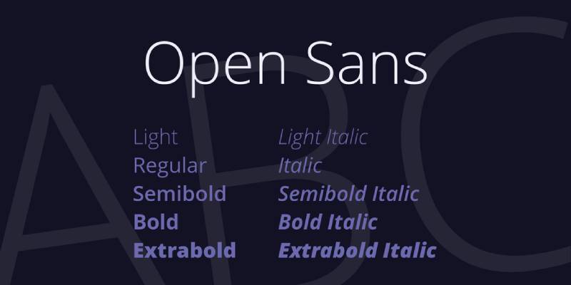
Open Sans is a humanist sans-serif font designed by Steve Matteson and commissioned by Google in 2011.
Definition & Core Context
Open Sans is an open-source humanist sans-serif typeface with 6 weights from Light (300) to Extra Bold (800), each with italic variants. The typeface features upright stress, open forms, and a neutral yet friendly appearance optimized for legibility across print, web, and mobile interfaces. It includes 897 glyphs covering Latin, Greek, and Cyrillic alphabets.
Key Attributes
Wide Apertures: Large openings in characters like ‘c’ and ‘e’ improve readability at small sizes, similar to Lato’s accessible design
Large X-Height: Tall x-height makes lowercase letters prominent and easy to read on screens
Neutral Personality: Balanced between friendly and professional, suitable for corporate and creative applications
Extensive Language Support: Covers 897 glyphs including diacritics for global typography needs
Character Variants: Includes stylistic alternates like a capital ‘i’ with serif and selectable single/double-story ‘g’
Implementation/Application
Works best at 12px+ for body text, though performs well at all sizes for headings. Available through Google Fonts, Adobe Fonts, and Font Squirrel.
Pairs effectively with serif fonts like Lora or Merriweather for body text. Set line-height between 1.4-1.6 and tracking at default for optimal readability. Use Medium (500) or SemiBold (600) weights for subheadings.
Benefits/Impact
Licensed under Apache License 2.0, eliminating costs for commercial projects
Renders consistently across browsers with excellent cross-platform compatibility
Used on millions of websites, ensuring familiarity for users
Supports ISO Latin 1, Latin CE, Greek, and Cyrillic character sets for international projects
Common Challenges & Solutions
Weight Loading: Only load weights you need (400, 600, 700) to improve page speed. Test font-display: swap property to prevent invisible text during loading.
Font Rendering: Some users report bolder appearance in Chrome vs Firefox. Use font-smoothing CSS properties: -webkit-font-smoothing: antialiased and -moz-osx-font-smoothing: grayscale.
Weight Availability: The Extended and Condensed versions have fewer weights. Stick to the main family for full weight range.
Roboto
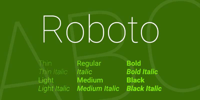
Roboto is a neo-grotesque sans-serif typeface created by Christian Robertson for Google’s Android operating system in 2011.
Definition & Core Context
Roboto is a neo-grotesque font family with 6 weights (Thin to Black) plus Condensed and Mono variants, totaling 16 styles. Designed as Android’s system font, it features slightly geometric forms with humanist-influenced italic styles. The typeface supports Latin, Greek, and Cyrillic scripts and was redesigned in 2014 for Android 5.0 Lollipop with rounder, wider characters.
Key Attributes
Neo-Grotesque Style: Clean, modern appearance with minimal ornamentation, different from Lato’s humanist warmth
Mechanical Rhythm: Letters have more consistent stroke widths than Lato, creating uniform texture
Dual Personality: Combines geometric structure with open curves in characters like ‘a’ and ‘g’
Multiple Subfamilies: Roboto Condensed, Roboto Mono, Roboto Slab, and Roboto Flex offer extensive design flexibility
Variable Font: Roboto Flex provides continuous weight values from 200-900 for precise control
Implementation/Application
Performs well at all sizes, from 10px body text to large display headings. Available through Google Fonts and integrated into Android OS by default.
Best used at font-weight 300 (Light), 400 (Regular), 500 (Medium), or 700 (Bold). Set minimum 14px for body copy with 1.5 line-height for comfortable reading. Pairs with Roboto Slab for heading/body combinations. Note that weights 200, 600, and 800 require Roboto Flex for full access.
Benefits/Impact
Free under Apache License (later OFL) for unlimited commercial use
Native support on all Android devices ensures zero loading time on mobile
Extensive adoption by Google services (YouTube, Maps, Play Store) creates instant recognition
16 style variations provide solutions for diverse design needs without switching font families
Common Challenges & Solutions
Missing Weights: Standard Roboto lacks 600 (Semi Bold) in static version. Use Roboto Flex variable font or substitute with 500 or 700 weights.
X-Height Inconsistency: Mixing local and web versions can cause height mismatches. Uninstall local fonts or use consistent sources.
Variable Font Complexity: Roboto Flex requires CSS knowledge for custom weights. Use static fonts for simpler implementation.
Related Considerations
Roboto’s mechanical precision works well for tech and app interfaces where Lato might feel too warm. For projects requiring both warmth and modernism, combine Roboto headings with Lato body text.
Montserrat

Montserrat is a geometric sans-serif typeface inspired by urban typography from Buenos Aires, designed by Julieta Ulanovsky in 2011.
Definition & Core Context
Montserrat is an open-source geometric sans-serif with 18 styles (9 weights from Thin to Black with matching italics). The typeface draws inspiration from 1920s-1950s signage in the historic Montserrat neighborhood, combining traditional letterforms with modern geometric proportions. It features over 2,731 glyphs covering Latin, Cyrillic, and extended character sets.
Key Attributes
Geometric Structure: Clean, circular forms in characters like ‘o’ and ‘a’ similar to Lato’s geometric approach
Tall X-Height: Large x-height improves readability at small sizes, matching Lato’s legibility
Weight Range: 9 weights with matching italics provide extensive design flexibility for typographic hierarchy
Historic Inspiration: Based on street signage creates unique personality while maintaining professionalism
OpenType Features: Includes tabular figures, fractions, stylistic alternates, and multilingual support
Implementation/Application
Works effectively at 14px+ for body text and all sizes for headings. Available through Google Fonts, Adobe Fonts, and direct download.
Pairs well with serif fonts like Merriweather or Lora for body text. Set line-height between 1.4-1.6 for optimal readability. Use Regular (400) for body, SemiBold (600) for subheadings, and Bold (700) for headings. The Alternates subfamily offers more rounded character variants for softer designs.
Benefits/Impact
Free SIL Open Font License eliminates font costs for commercial projects
Wide weight range reduces need for multiple font families in design systems
Strong web rendering across browsers and devices with consistent appearance
Fourth most popular Google Font with 2.7+ trillion views demonstrates proven reliability
Alternate and Subrayada variants provide creative options without switching font families
Common Challenges & Solutions
Variable Font Issues: Adobe apps may display variable fonts incorrectly. Use static font files for more consistent rendering across software.
Weight Distribution: 2017 redesign made Regular (400) lighter. Test older versions if your brand requires bolder regular weight.
Character Spacing: Some bolder weights show spacing issues. Adjust kerning manually in problematic character pairs or use Medium (500) instead of SemiBold (600).
Source Sans Pro
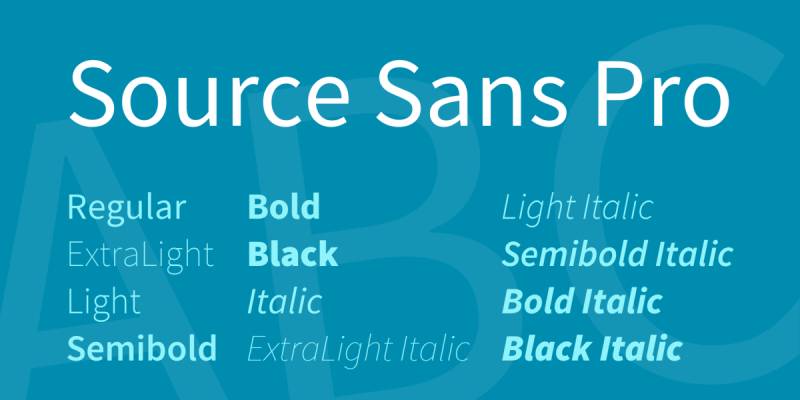
Source Sans Pro is a sans-serif typeface designed by Paul D. Hunt and released by Adobe in 2012 as their first open-source font family.
Definition & Core Context
Source Sans Pro is Adobe’s first open-source typeface, available in 6 weights (ExtraLight to Black) with matching italics, plus a variable font version with continuous weight values from 200-900. The design draws inspiration from American gothic typefaces like News Gothic and Franklin Gothic, modified with larger x-height and character width for improved UI legibility.
Key Attributes
Gothic Heritage: Based on Morris Fuller Benton’s American Type Founders gothics with modern refinements
UI Optimization: Slightly condensed shapes designed specifically for user interfaces and tight spaces
Larger Proportions: Wider characters and taller x-height than News Gothic improve screen readability
Variable Font: Continuous weight axis provides granular control from 200-900
Extensive Language Support: Covers Latin, Greek, Cyrillic, Vietnamese, pinyin, and Navajo scripts
Implementation/Application
Ideal for 12px+ body text and all heading sizes. Available through Adobe Fonts, Google Fonts, and direct download under SIL Open Font License.
Best used at Regular (400) for body text, SemiBold (600) for subheadings, Bold (700) for headings. Set line-height at 1.5-1.6 for comfortable reading. Pairs excellently with Source Serif Pro for complementary serif needs. Works particularly well in dashboards, documentation, and web applications.
Benefits/Impact
Free SIL Open Font License allows unlimited commercial use without licensing fees
Consistent color on page compared to condensed News Gothic it’s based on
Part of Source superfamily (Sans, Serif, Code) enables typographic systems with visual harmony
Wide adoption in tech products demonstrates proven performance in digital interfaces
Variable font version reduces file size by consolidating 12 font files into one
Common Challenges & Solutions
Condensed Appearance: Characters render smaller than other sans-serifs due to longer ascenders/descenders. Increase font size by 1-2px compared to similar fonts.
Weight Gaps: Some weights missing in static version. Use variable font for access to all weight values or substitute with closest available weight.
Lowercase ‘i’ and ‘l’ Confusion: Use ExtraLight carefully in body text where these characters might be mistaken. Regular and heavier weights provide better differentiation.
Raleway
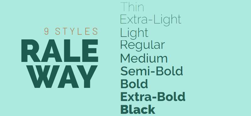
Raleway is an elegant sans-serif typeface initially designed by Matt McInerney in 2010 as a single thin weight and later expanded by Pablo Impallari and Rodrigo Fuenzalida.
Definition & Core Context
Raleway is a display-oriented sans-serif with 9 weights (Thin to Black) plus italic variants, totaling 18 styles. Originally created as a single thin weight, it was expanded in 2012 into a full family with old style and lining numerals, ligatures, extensive diacritics, and stylistic alternates. The typeface balances neo-grotesque and geometric influences with a distinctive elegant character.
Key Attributes
Display Focus: Originally designed for titles and headings with sophisticated, refined appearance
Thin to Black Range: 9 weights from ultra-light to heavy provide exceptional typographic flexibility
Dual Character Set: Includes both neo-grotesque default and geometric-inspired alternates
Community Development: Expanded through collaborative open-source effort by multiple designers
OpenType Features: Contains old style figures, lining numerals, ligatures, and stylistic alternates
Implementation/Application
Best at 16px+ for body text, though excels at display sizes 24px+. Available through Google Fonts, The League of Moveable Type, and direct download.
Use Thin (100) or Light (300) for elegant display headlines, Regular (400) for subheadings, and Medium (500) for emphasis. Avoid Thin weights below 20px as letterforms become fragile. Pairs beautifully with slab serif fonts like Roboto Slab or traditional serifs. Set line-height at 1.2-1.3 for headings, 1.5+ for body text.
Benefits/Impact
SIL Open Font License permits free commercial use with open-source flexibility
Elegant aesthetic differentiates brands from common sans-serif choices
18 style variations enable complete design systems within single font family
Sister family Raleway Dots provides decorative variant for unique applications
iKerned by Igino Marini ensures professional spacing quality throughout weight range
Common Challenges & Solutions
Thin Weight Fragility: Weights 100-200 become illegible at small sizes. Limit to 24px+ or use Light (300) as minimum weight.
Display vs Text Use: Raleway excels in display but less optimal for long-form body text. Use for headings and pair with a text-optimized font for paragraphs.
Loading Performance: 18 styles add weight. Load only 3-4 essential weights (300, 400, 600, 700) to optimize page speed.
Nunito
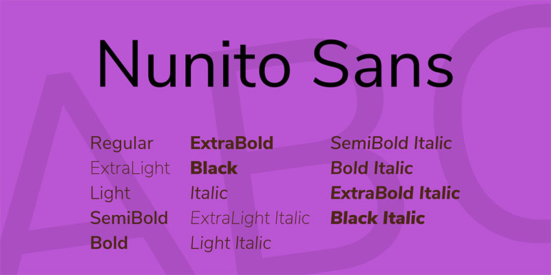
Nunito is a well-balanced sans-serif superfamily designed by Vernon Adams in 2011 as a rounded terminal sans-serif for display typography.
Definition & Core Context
Nunito is a rounded sans-serif available in 18 styles (9 weights from ExtraLight to Black with matching italics), plus a variable font with weight axis 200-1000. Originally created for display use, Jacques Le Bailly expanded it to a full weight set. The typeface features rounded terminals, high x-height, uniform stroke widths, and friendly, approachable character.
Key Attributes
Rounded Terminals: Soft, curved endings create warm, inviting personality distinct from Lato’s sharper terminals
High X-Height: Large x-height enhances legibility at small sizes and on digital screens
Balanced Proportions: Well-proportioned letterforms maintain readability across size ranges
Nunito Sans Variant: Non-rounded terminal version available for more formal applications
Extended Character Set: Supports multiple languages and scripts including Cyrillic extension
Implementation/Application
Performs well at 12px+ for body text and all display sizes. Available through Google Fonts, Adobe Fonts, and direct download under SIL Open Font License.
Use Regular (400) for body text, SemiBold (600) for subheadings, Bold (700) for headings. Set line-height at 1.5-1.6 for comfortable reading. Pairs effectively with geometric sans-serifs or traditional serifs. The rounded terminals work particularly well for child-friendly, education, health, or approachable brand applications.
Benefits/Impact
Free SIL Open Font License allows unrestricted commercial use
Rounded terminals create friendly tone without sacrificing professionalism
18 style variations plus Nunito Sans provide comprehensive type system
Variable font reduces file sizes while offering unlimited weight values
High x-height and open spacing reduce visual fatigue during extended reading
Common Challenges & Solutions
Overly Casual Appearance: Rounded terminals may feel too informal for serious corporate contexts. Use Nunito Sans for more professional applications.
Character Recognition: Rounded forms can blur character distinction at very small sizes. Maintain 12px minimum for body text.
Weight Selection: 9 weights can be overwhelming. Stick to 3-4 weights (400, 600, 700, 800) for most projects.
PT Sans
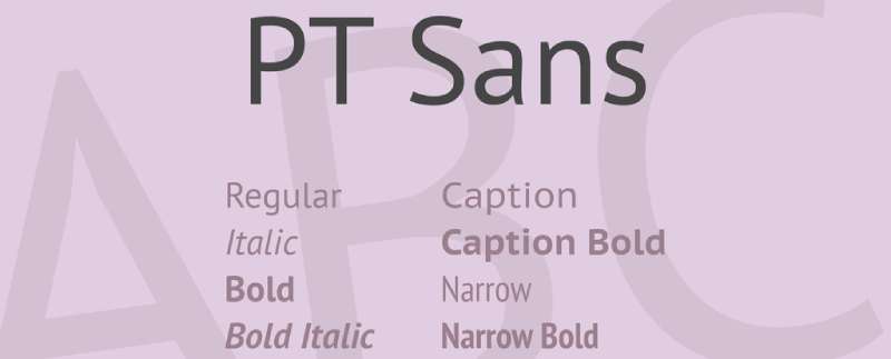
PT Sans is a humanist sans-serif typeface designed by Alexandra Korolkova, Olga Umpeleva, and Vladimir Yefimov for the Public Types of Russian Federation project in 2009.
Definition & Core Context
PT Sans is a humanist sans-serif developed for diverse Russian language typography needs, available in 4 weights (Regular, Italic, Bold, Bold Italic) with narrow and caption variants. The typeface features moderately high x-height, open apertures, and distinctive Cyrillic characters designed for excellent screen and print readability. It includes comprehensive Latin and Cyrillic glyph coverage.
Key Attributes
Russian Typography Focus: Specifically designed for Russian Federation’s typographic modernization initiative
Humanist Warmth: Friendly, approachable letterforms with subtle calligraphic influences in italics
Extended Subfamilies: PT Sans Narrow and PT Sans Caption variants address specific layout needs
Open Apertures: Wide openings in letters like ‘c’, ‘e’, ‘a’ improve legibility similar to Lato
Comprehensive Glyph Set: Extensive Latin and Cyrillic coverage for multilingual projects
Implementation/Application
Optimal at 12px+ for body text with excellent performance up to display sizes. Available through Google Fonts and ParaType foundry.
Use Regular (400) for body text, Bold (700) for headings. Set line-height at 1.5-1.6 for body copy. PT Sans Narrow works in tight layouts like sidebars, while PT Sans Caption optimizes for small sizes under 12px. Pairs well with PT Serif for complementary serif typeface in same design system.
Benefits/Impact
Free under SIL Open Font License for commercial and personal projects
Native Cyrillic expertise ensures authentic Russian typography unlike retrofitted fonts
Part of Public Types project guarantees government-grade quality standards
Narrow and Caption variants eliminate need for multiple font families in complex layouts
Humanist character creates approachable tone while maintaining professional appearance
Common Challenges & Solutions
Limited Weight Range: Only 2 weights available. Supplement with PT Sans Caption for variety or combine with similar fonts for more weight options.
Cyrillic Dominance: Latin character set, while complete, optimized secondarily to Cyrillic. Test thoroughly in Latin-only projects.
Caption Variant Specificity: PT Sans Caption designed for 10px and below. Don’t use at regular sizes where standard PT Sans performs better.
Avenir
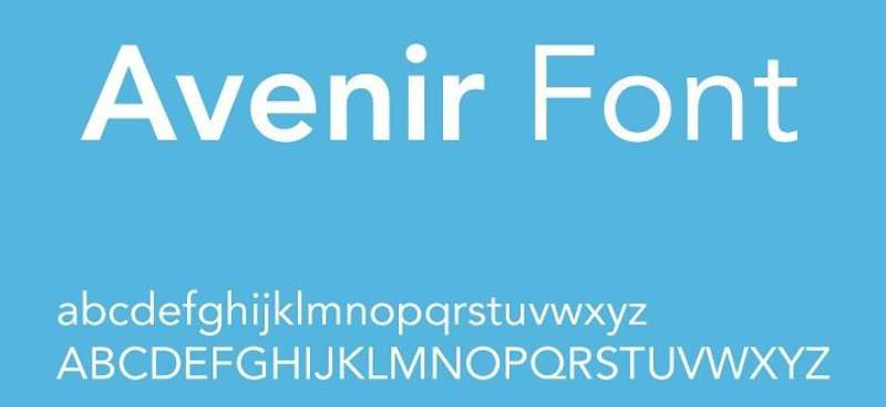
Avenir is a geometric sans-serif typeface designed by Adrian Frutiger and released in 1988 by Linotype.
Definition & Core Context
Avenir is a geometric humanist sans-serif with 12 weights (ranging from Light to Heavy) plus corresponding obliques. The name means “future” in French. Frutiger designed it as a more organic interpretation of geometric sans-serifs like Futura, combining mathematical precision with subtle humanist warmth. The typeface features vertical strokes that are thicker than horizontals, giving it better readability than pure geometric designs.
Key Attributes
Geometric Humanism: Balances geometric structure with organic warmth, avoiding mechanical coldness of strict geometric fonts
Frutiger Pedigree: Designed by legendary typographer Adrian Frutiger, ensuring exceptional craft quality
Extensive Weight Range: 12 weights from Light to Heavy provide comprehensive design flexibility
Professional Status: Premium commercial font reflecting corporate design standards
Vertical Emphasis: Thicker vertical strokes improve readability over pure geometric competitors
Implementation/Application
Performs excellently at all sizes from 10px body text to large display headings. Available through Linotype, Adobe Fonts, and Monotype with commercial licensing.
Use Book or Roman weights for body text, Medium for subheadings, Heavy for display purposes. Set line-height at 1.4-1.6 for body copy. Pairs effectively with classic serifs like Garamond or modern serifs like Freight Text. Often used in corporate branding, editorial design, and logo design.
Benefits/Impact
Premium quality ensures exceptional craft in letterforms and spacing throughout family
Adrian Frutiger’s reputation adds prestige and design credibility to brand applications
12 weights enable nuanced typographic hierarchies without switching font families
Used by major brands (Adidas, Bloomberg, Cisco) demonstrates proven corporate effectiveness
Excellent print reproduction makes it reliable for high-end packaging and publications
Common Challenges & Solutions
Licensing Costs: Commercial font requires purchase. Budget appropriately or substitute with Montserrat for similar geometric aesthetic at no cost.
File Size: 12 weight family creates large file sizes. License only needed weights for web projects.
Availability: Not available on Google Fonts. Requires Adobe Fonts subscription or direct purchase from foundry.
Related Considerations
Avenir Next is an updated version with refined spacing and additional weights. Consider this newer variant for contemporary projects. For web design on budget, Montserrat or Nunito provide similar geometric warmth at no cost.
Oxygen
Oxygen is a sans-serif typeface created by Vernon Adams for the KDE Plasma desktop environment in 2012.
Definition & Core Context
Oxygen is an open-source sans-serif designed specifically for the KDE desktop interface, available in 3 weights (Light, Regular, Bold). The typeface features large x-height, wide letterforms, and clear character differentiation optimized for screen legibility. It combines geometric structure with humanist touches for balanced readability in UI contexts.
Key Attributes
UI-First Design: Created specifically for desktop interface typography with on-screen clarity as primary goal
Wide Character Width: Generous proportions improve readability at small UI text sizes
Clear Differentiation: Characters like ‘1’, ‘l’, ‘I’ designed with obvious visual distinctions for UI clarity
Limited Weight Range: 3 weights keep family simple and focused for interface applications
Open Source Heritage: Developed for Linux desktop creates authentic open-source design culture
Implementation/Application
Optimal at 11px+ for UI elements and body text. Available through Google Fonts under SIL Open Font License.
Use Regular (400) for body text and UI elements, Bold (700) for headings and emphasis. Set line-height at 1.5 for body text, 1.3 for UI labels. Works best in tech interfaces, documentation, and dashboard designs. Pairs with Oxygen Mono for code display in technical contexts.
Benefits/Impact
Free SIL Open Font License enables unlimited commercial use
Screen optimization ensures exceptional readability in digital interfaces
Wide letterforms reduce eye strain during extended screen time
KDE project backing ensures ongoing maintenance and improvements
Lightweight family (3 weights) loads quickly on web with minimal performance impact
Common Challenges & Solutions
Limited Weights: Only 3 weights available. Combine with similar fonts for more typographic variety or use Regular at different sizes for hierarchy.
Wide Proportions: Characters take more horizontal space than condensed alternatives. Plan layouts with wider text blocks or use tighter tracking sparingly.
UI Optimization Trade-off: Designs for interface may feel too technical for editorial or branding. Reserve for web applications and technical documentation.
Proxima Nova
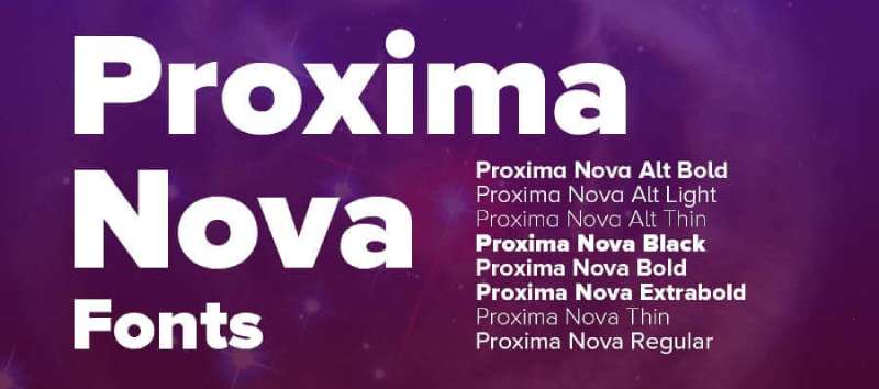
Proxima Nova is a modern geometric sans-serif designed by Mark Simonson and released in 2005, with an updated version in 2018.
Definition & Core Context
Proxima Nova is a premium geometric humanist sans-serif with 48 styles across 8 weights (Thin to Black) including condensed, extra condensed, and alt versions. The typeface balances geometric precision with humanist warmth, featuring uniform stroke widths, slightly squared proportions, and clean modern character. It bridges the gap between geometric sans like Futura and humanist sans like Lato.
Key Attributes
Geometric Humanist Hybrid: Combines geometric structure with humanist readability, avoiding coldness of pure geometric designs
Massive Family: 48 styles including condensed widths and alternate character sets provide exceptional versatility
Professional Pedigree: Mark Simonson’s expertise ensures exceptional spacing, optical sizing, and craft quality
Modern Classic Status: Widely adopted in branding and editorial creates instant professional recognition
Squared Proportions: Slightly squared curves differentiate it from circular geometric sans-serifs
Implementation/Application
Excellent at all sizes from 10px body text to large display. Available through Mark Simonson Studio, Adobe Fonts, and Monotype with commercial licensing.
Use Regular for body text, Semibold for subheadings, Bold for headings. Set line-height at 1.5 for body copy, 1.3 for headings. Condensed variants work well in tight sidebar layouts. Alt family provides single-story ‘a’ and ‘g’ for more geometric appearance. Pairs beautifully with Freight Text or Charter for serif companion.
Benefits/Impact
48 style variations eliminate need for multiple font families in design systems
Used by BuzzFeed, Wired, NBC creates proven track record in media and tech
Condensed and Extra Condensed widths solve space-constrained layout challenges
Alternate character set (Proxima Nova Alt) provides single-story characters for modern aesthetic
Professional quality ensures exceptional rendering in print and digital applications
Common Challenges & Solutions
Commercial License Required: Premium font requires purchase. Consider Montserrat or Nunito for free alternatives with similar geometric warmth.
Large File Sizes: 48 styles create significant weight. License and load only essential weights (Regular, Semibold, Bold) for web.
Not on Google Fonts: Requires paid subscription or purchase. Use Adobe Fonts if you have Creative Cloud access.
Related Considerations
Proxima Soft adds rounded terminals for friendlier appearance. Proxima Vara is variable font version offering continuous weight axis. For budget-conscious projects, Montserrat provides similar geometric aesthetic with free licensing.
Fira Sans
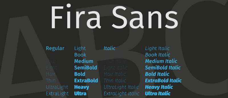
Fira Sans is a humanist sans-serif designed by Erik Spiekermann and Ralph du Carrois for Mozilla’s Firefox OS in 2013.
Definition & Core Context
Fira Sans is an open-source humanist sans-serif with 16 styles (8 weights from Thin to Heavy with matching italics), plus condensed variants totaling 40+ styles. Designed by legendary typographer Erik Spiekermann for Firefox OS, it features open apertures, narrow width, and clear character differentiation optimized for both screen and print use. The typeface includes extensive language support and OpenType features.
Key Attributes
Spiekermann Design: Created by renowned German typographer Erik Spiekermann ensures world-class quality
Narrow Proportions: Condensed character widths save space while maintaining legibility similar to condensed Lato
Open Apertures: Large openings in ‘c’, ‘e’, ‘a’ improve readability matching Lato’s accessible approach
Firefox Heritage: Designed for mobile OS creates authentic tech-industry design culture
Comprehensive Family: 8 weights plus Condensed and Mono variants provide complete type system
Implementation/Application
Performs well at 11px+ for body text and all display sizes. Available through Google Fonts, Mozilla, and direct download under SIL Open Font License.
Use Book or Regular for body text, Medium for subheadings, Bold for headings. Set line-height at 1.5-1.6 for comfortable reading. Narrow proportions work exceptionally well in responsive designs where horizontal space is limited. Pairs with Fira Mono for code display or traditional serifs for editorial contexts.
Benefits/Impact
Free SIL Open Font License allows unlimited commercial and personal use
Erik Spiekermann’s reputation adds design credibility and professional polish
Narrow proportions fit more text in constrained layouts without reducing readability
Comprehensive Condensed and Mono variants eliminate need for multiple font families
Used by Mozilla creates association with open-source technology and innovation
Common Challenges & Solutions
Narrow Width: Character width narrower than Lato may require layout adjustments. Test designs carefully when substituting.
Multiple Variants Confusion: Fira Sans, Fira Sans Condensed, Fira Mono can confuse font loading. Clearly specify which variant in code.
Condensed Appearance: Standard Fira Sans more condensed than typical humanist sans. Use Fira Sans Extra Condensed only when horizontal space extremely limited.
Arimo
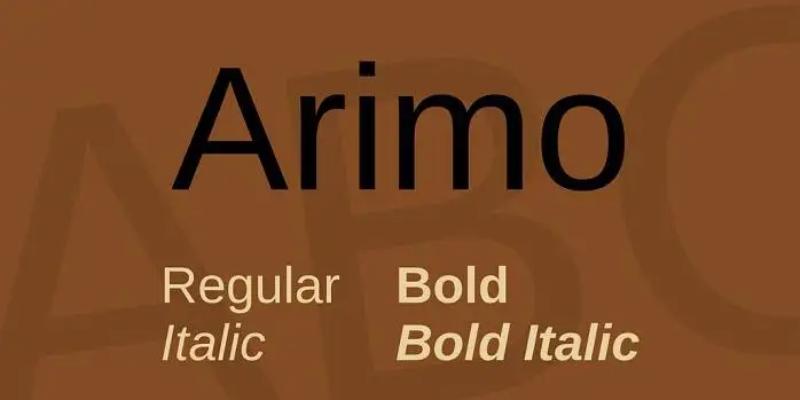
Arimo is a metrically compatible alternative to Arial designed by Steve Matteson and commissioned by Google in 2010.
Definition & Core Context
Arimo is an open-source sans-serif created as part of Google’s Croscore font collection, designed to be metrically compatible with Arial. Available in 4 weights (Regular, Bold, with matching italics), the typeface features consistent stroke widths, neutral character, and extensive language support including Latin, Greek, Cyrillic, Hebrew, and Vietnamese. It provides drop-in replacement for Arial in documents and layouts.
Key Attributes
Metric Compatibility: Identical character widths and spacing to Arial enables seamless document replacement
Chrome OS Heritage: Designed for Chrome OS creates authentic Google design ecosystem connection
Neutral Design: Professional, unfussy appearance works across corporate and casual contexts
Extensive Language Support: Covers Latin, Greek, Cyrillic, Hebrew, Vietnamese for global projects
Arial Alternative: Provides free open-source option instead of licensed Arial
Implementation/Application
Works at all sizes from 10px body text to display headings. Available through Google Fonts under Apache License.
Use Regular (400) for body text, Bold (700) for headings. Set line-height at 1.5 for body copy. Direct substitute for Arial in existing documents maintains exact layout. Pairs with Tinos (Times New Roman alternative) for traditional serif combination.
Benefits/Impact
Free Apache License eliminates Arial licensing costs for commercial projects
Metric compatibility preserves layouts when converting from Arial-based documents
Used in Chrome OS demonstrates proven performance in operating system contexts
Neutral character works across industries without strong stylistic associations
Part of Croscore trilogy (Arimo, Tinos, Cousine) provides complete liberation font system
Common Challenges & Solutions
Limited Weights: Only Regular and Bold available. Supplement with similar fonts for more weight variety.
Arial Association: Similarity to Arial may feel generic. Use only when Arial compatibility required or combine with distinctive display fonts.
Character Personality: Neutral design lacks warmth of Lato. Consider Lato or Open Sans for friendlier tone.
Related Considerations
Arimo optimized for document compatibility rather than distinctive branding. For unique brand identity, choose fonts with more personality like Lato, Montserrat, or Raleway. Use Arimo when preserving legacy Arial layouts or needing free Arial substitute.
Myriad Pro
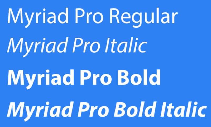
Myriad Pro is a humanist sans-serif designed by Robert Slimbach and Carol Twombly for Adobe Systems, released in 1992 and updated in 2000.
Definition & Core Context
Myriad Pro is a professional humanist sans-serif with 20 styles across 4 weights (Light, Regular, Semibold, Bold) including condensed variants. Originally designed by Adobe’s in-house team, it features clean, neutral letterforms with slight calligraphic influence in italics. The typeface gained fame as Apple’s corporate typeface from 2002-2017, appearing in marketing materials and product packaging.
Key Attributes
Adobe Craftsmanship: Designed by legendary type designers Robert Slimbach and Carol Twombly ensures exceptional quality
Humanist Structure: Subtle calligraphic warmth prevents mechanical coldness of geometric sans-serifs
Apple Association: Used by Apple for 15 years creates strong brand recognition and premium associations
Condensed Variants: Semi Condensed and Condensed widths provide space-saving alternatives
Professional Standard: Decades of use in corporate and editorial contexts proves versatility and reliability
Implementation/Application
Performs excellently at all sizes from 10px body text to large display. Available through Adobe Fonts with Creative Cloud subscription.
Use Regular for body text, Semibold for subheadings, Bold for headings. Set line-height at 1.5 for body copy. Condensed variants work in tight layouts like sidebars or narrow columns. Pairs effectively with Minion Pro (designed by same team) for typographic harmony.
Benefits/Impact
Adobe Fonts subscription includes Myriad Pro with Creative Cloud access
Premium craftsmanship ensures exceptional spacing, hinting, and optical quality
Apple heritage adds perception of innovation and premium brand positioning
20 style variations provide comprehensive design flexibility within single family
Extensive use in professional design creates instant recognition and trust
Common Challenges & Solutions
Licensing Required: Not free, requires Adobe Fonts subscription or separate purchase. Consider Open Sans or Source Sans Pro for free alternatives.
Apple Overexposure: Strong Apple association may cause brand confusion. Use carefully if design needs distinct identity from Apple.
Not on Google Fonts: Limited web availability without Adobe Fonts. Self-host or use alternative for non-Adobe workflows.
Related Considerations
San Francisco replaced Myriad Pro as Apple’s system font in 2015. For Apple-like aesthetic, consider SF Pro (available for Apple platform development) or Lato as public alternative. Myriad Variable Concept explores variable font technology for future applications.
Hamlin
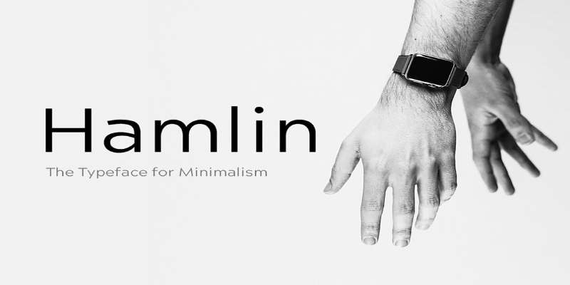
Hamlin is a geometric sans-serif designed specifically for versatile display and text applications with clean, modern proportions.
Definition & Core Context
Hamlin is a contemporary geometric sans-serif with 6-8 weights ranging from Light to Bold. The typeface features uniform stroke widths, circular geometric construction, and clean letterforms optimized for both digital and print applications. It combines geometric precision with subtle humanist refinements for improved readability.
Key Attributes
Geometric Purity: Clean circular forms in characters like ‘o’, ‘a’, ‘e’ create modern aesthetic
Uniform Strokes: Consistent stroke widths throughout letterforms provide harmonious texture
Moderate X-Height: Balanced proportions improve readability without sacrificing elegance
Contemporary Design: Modern interpretation of geometric sans-serif tradition
Display Focus: Optimized for headings and branding while remaining functional for body text
Implementation/Application
Best at 14px+ for body text, excels at display sizes 24px+. Typically available through commercial foundries.
Use Light or Regular for body text, Medium for subheadings, Bold for headings. Set line-height at 1.5 for body copy, 1.2-1.3 for display. Works well in branding, editorial design, and modern web layouts. Pairs with transitional serifs or humanist sans-serifs for typographic variety.
Benefits/Impact
Geometric structure creates clean, organized visual rhythm
Versatile weight range supports complete typographic hierarchies
Modern aesthetic aligns with contemporary design trends
Professional quality ensures reliable rendering across media
Balanced between display elegance and text readability
Common Challenges & Solutions
Geometric Coldness: Pure geometric forms may feel sterile. Combine with warmer typefaces for balance or add color and imagery for visual interest.
Limited Availability: May require commercial purchase. Research licensing terms and compare with free alternatives like Montserrat.
Display Optimization: Performance varies at small text sizes. Test readability carefully below 14px and consider humanist alternatives for body-heavy layouts.
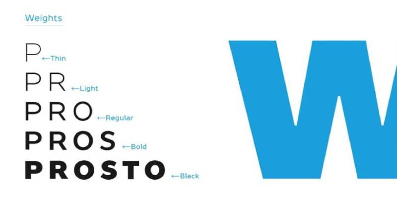
TT Prosto Sans
TT Prosto Sans is a modern geometric sans-serif designed by TypeType foundry with industrial precision and contemporary aesthetics.
Definition & Core Context
TT Prosto Sans is a geometric sans-serif family with 12 weights from Thin to Black including italics. The typeface features clean geometric construction, uniform stroke widths, and precise mathematical proportions. Designed by TypeType foundry, it combines strict geometric forms with subtle optical corrections for improved readability in both display and text applications.
Key Attributes
Industrial Precision: Mathematical geometric construction creates technical, precise appearance
Complete Weight Spectrum: 12 weights from Thin to Black provide comprehensive typographic flexibility
Geometric Neutrality: Clean, unfussy letterforms work across diverse design contexts
TypeType Quality: Professional foundry ensures exceptional craft in spacing and optical corrections
Extended Language Support: Comprehensive Latin and Cyrillic coverage for international projects
Implementation/Application
Performs well at 12px+ for body text and all display sizes. Available through TypeType foundry with commercial licensing.
Use Light or Regular for body text, Medium for subheadings, Bold or Black for display purposes. Set line-height at 1.5-1.6 for body copy. Works exceptionally well in tech interfaces, corporate presentations, and modern editorial design. Pairs with geometric or transitional serifs.
Benefits/Impact
12 weights enable nuanced typographic hierarchies within single font family
Professional quality ensures reliable performance across print and digital media
Geometric precision aligns with contemporary minimalist design trends
TypeType foundry support provides ongoing updates and technical assistance
Extended Cyrillic support makes it valuable for Eastern European markets
Common Challenges & Solutions
Commercial License: Requires purchase from TypeType. Budget appropriately or consider geometric alternatives like Montserrat for free option.
Geometric Rigidity: Strict geometric forms may feel cold in warm brand contexts. Add humanist fonts for balance or use sparingly for headings only.
File Sizes: 12 weight family creates large files. License only essential weights (Regular, Medium, Bold, Black) for web projects to optimize performance.
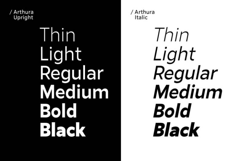
Arthura
Arthura is a contemporary display sans-serif designed with elegant proportions and refined geometric structure for modern branding applications.
Definition & Core Context
Arthura is a display-oriented sans-serif with 6-8 weights designed for headlines, branding, and editorial use. The typeface features tall x-height, geometric construction with humanist refinements, and distinctive character details that create unique personality while maintaining professional readability. It combines clean geometric forms with subtle stylistic flourishes.
Key Attributes
Display Excellence: Optimized for large sizes where character details create visual impact
Tall X-Height: Large x-height improves legibility and creates strong visual presence
Geometric Base: Clean geometric structure provides modern, organized foundation
Stylistic Details: Distinctive letterforms create memorable brand personality
Contemporary Aesthetic: Modern interpretation of geometric sans tradition
Implementation/Application
Best at 18px+ for headings, 24px+ for optimal display use. May be available through commercial foundries or independent designers.
Use Light for elegant display headlines, Medium for subheadings, Bold for strong emphasis. Set line-height at 1.1-1.3 for display text. Works excellently in logo design, packaging, and poster design. Pair with simple sans-serif for body text to let Arthura shine in display role.
Benefits/Impact
Display optimization creates strong visual impact in headlines and branding
Distinctive character creates memorable brand personality
Geometric foundation ensures clean, organized visual rhythm
Professional quality suitable for high-end branding and editorial projects
Versatile enough for both print and digital display applications
Common Challenges & Solutions
Small Size Limitations: Display optimization means limited usability for body text. Pair with text-optimized font like Lato or Source Sans Pro.
Availability Questions: May require research to locate and license. Explore foundry websites or contact designer directly.
Strong Personality: Distinctive details may limit versatility across brands. Reserve for brands where personality aligns with font character.
Sentral

Sentral is a modern geometric sans-serif designed with balanced proportions and clean lines for contemporary branding and editorial applications.
Definition & Core Context
Sentral is a geometric sans-serif family with 6-8 weights offering balanced proportions, consistent stroke widths, and clean modern aesthetic. The typeface features geometric construction with subtle humanist touches that improve readability while maintaining contemporary precision. It works effectively across both display and text applications.
Key Attributes
Balanced Geometry: Clean geometric forms with optical corrections for improved readability
Consistent Stroke Widths: Uniform strokes throughout create harmonious, predictable texture
Modern Neutrality: Professional appearance works across diverse brand contexts
Versatile Application: Functions in both display and extended text settings
Contemporary Design: Modern interpretation of geometric sans tradition without trendy excess
Implementation/Application
Performs well at 12px+ for body text and all display sizes. Availability depends on foundry or independent designer.
Use Regular for body text, Medium for subheadings, Bold for headings. Set line-height at 1.5 for body copy, 1.2-1.3 for headings. Works in corporate communications, web applications, and contemporary editorial design. Pairs with geometric or humanist serifs for typographic variety.
Benefits/Impact
Balanced geometric approach provides modern aesthetic with good readability
Weight range supports complete typographic hierarchies
Professional neutral character works across industries and applications
Contemporary design aligns with current minimalist trends
Versatility eliminates need for separate display and text fonts
Common Challenges & Solutions
Neutral Personality: Clean design may lack distinctive character for unique brands. Combine with decorative display fonts or use custom lettering for brand marks.
Licensing Research: May require investigation to locate and license. Contact foundries or designers directly for availability.
Geometric Trade-offs: Strict geometry may compromise readability at very small sizes. Test carefully below 12px and consider humanist alternatives for body-heavy content.
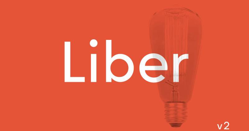
Liber V2
Liber V2 is a refined sans-serif designed with classical proportions and contemporary execution for editorial and professional applications.
Definition & Core Context
Liber V2 is a humanist sans-serif with 6-8 weights combining classical typographic proportions with modern technical execution. The typeface features moderate x-height, open apertures, and subtle calligraphic influences that create warm, readable character. It balances traditional readability principles with contemporary design aesthetics.
Key Attributes
Classical Proportions: Traditional typographic ratios ensure proven readability
Humanist Warmth: Subtle calligraphic touches create approachable, friendly character
Open Apertures: Wide openings in characters improve legibility similar to Lato
Modern Execution: Contemporary technical production ensures excellent rendering
Professional Quality: Refined details throughout demonstrate careful craft
Implementation/Application
Excellent at 11px+ for body text and all display sizes. Availability depends on foundry or independent designer licensing.
Use Regular for body text, Medium for subheadings, Bold for headings. Set line-height at 1.5-1.6 for comfortable reading. Works excellently in editorial design, corporate communications, and professional documents. Pairs with traditional or transitional serifs for typographic harmony.
Benefits/Impact
Classical proportions ensure proven readability across applications
Humanist warmth creates approachable tone for professional contexts
Open apertures improve legibility matching best-in-class sans-serifs
Professional craft quality ensures reliable rendering in print and digital
Versatile weight range supports complete design systems
Common Challenges & Solutions
Traditional Associations: Classical proportions may feel conservative for cutting-edge brands. Reserve for professional contexts or combine with modern display fonts.
Licensing Availability: May require research to locate designer or foundry. Investigate directly for licensing terms and formats.
Similar Alternatives: Character shares traits with other humanist sans. Evaluate if distinctive enough for brand needs or consider alternatives like Lato.
Herz
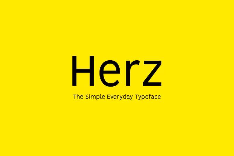
Herz is a contemporary geometric sans-serif designed with refined proportions and modern aesthetic for branding and display applications.
Definition & Core Context
Herz is a geometric sans-serif family with 6-8 weights featuring clean geometric construction, consistent stroke widths, and contemporary proportions. The typeface combines geometric precision with subtle warmth through optical refinements that improve readability while maintaining modern visual appeal. It functions effectively in both display and text contexts.
Key Attributes
Refined Geometry: Clean geometric forms with optical corrections for visual harmony
Consistent Construction: Uniform approach to letterform construction creates predictable rhythm
Contemporary Proportions: Modern character width and height ratios
Geometric Warmth: Subtle humanist touches prevent coldness while maintaining clean aesthetic
Professional Execution: High-quality spacing and technical production
Implementation/Application
Best at 13px+ for body text, excellent at all display sizes. Availability depends on foundry or independent designer.
Use Light or Regular for body text, Medium for subheadings, Bold for headings. Set line-height at 1.5 for body copy. Works well in contemporary branding, tech interfaces, and modern editorial contexts. Pairs with geometric or humanist serifs for complementary combinations.
Benefits/Impact
Geometric precision creates clean, organized visual presentation
Optical refinements improve readability over strict geometric alternatives
Contemporary aesthetic aligns with current design trends
Weight range supports complete typographic hierarchies
Professional quality ensures reliable cross-platform rendering
Common Challenges & Solutions
Geometric Associations: Clean geometric forms may feel similar to other geometric sans. Evaluate distinctive character needs for specific brand applications.
Research Required: May need investigation to locate and license. Contact type designers or foundries directly.
Body Text Suitability: Geometric base may have limitations for extended text. Test thoroughly for long-form reading or pair with humanist alternative.
FAQ on Fonts Similar To Lato
What font is most similar to Lato?
Montserrat shares Lato’s geometric structure and tall x-height. Both feature clean letterforms, wide weight ranges, and humanist warmth. Open Sans also closely matches Lato’s readability and neutral personality, making either an excellent direct substitute for most projects.
Is there a free alternative to Lato?
Open Sans, Montserrat, Source Sans Pro, and Nunito are all free Google Fonts alternatives. Each offers comparable readability, multiple weights, and open-source licensing. Roboto provides another excellent option with extensive weight variations and proven performance across devices and platforms.
Can I use Lato alternatives for commercial projects?
Yes. Open Sans, Montserrat, Source Sans Pro, Raleway, and Nunito use SIL Open Font License or Apache License, permitting unlimited commercial use. Premium options like Avenir and Proxima Nova require commercial licenses. Always verify font licensing terms before deployment.
Which Lato alternative works best for body text?
Source Sans Pro excels for body text with its slightly condensed proportions and UI optimization. Open Sans and PT Sans also perform excellently in long-form reading. Set minimum 12px size with 1.5-1.6 leading for comfortable extended reading experiences.
What’s the difference between Lato and Roboto?
Lato is humanist sans-serif with warm, organic character. Roboto is neo-grotesque with more mechanical, geometric precision. Lato features rounder curves while Roboto has straighter lines. Both offer excellent readability, but Lato feels friendlier while Roboto appears more technical and modern.
Which font similar to Lato has the most weights?
Proxima Nova offers 48 styles across different widths. Roboto Flex provides continuous weight values from 200-900 as a variable font. Montserrat includes 18 styles with 9 weights plus italics. These extensive ranges enable nuanced typographic hierarchy within single font families.
Are Lato alternatives web-safe fonts?
Most alternatives like Open Sans, Roboto, and Montserrat are web-safe through Google Fonts CDN. They render consistently across browsers with reliable performance. System fonts like Arial or Helvetica offer fallback options, though Arimo provides metrically compatible Arial alternative with better licensing.
How do I pair fonts with Lato alternatives?
Pair geometric sans-serifs like Montserrat with transitional serifs like Lora. Combine humanist sans like Open Sans with slab serifs like Roboto Slab. Match weight and contrast levels between pairing fonts for visual harmony and professional results.
Which Lato alternative loads fastest on websites?
Oxygen with only 3 weights loads quickly. Limiting any font to 2-3 weights dramatically improves performance. Use font-display: swap, preload critical weights, and subset character ranges. Variable fonts like Roboto Flex consolidate multiple weights into single file for efficiency.
Can I mix multiple Lato alternatives in one design?
Mixing similar geometric sans-serifs creates confusion and lacks visual hierarchy. Choose one alternative for primary use. If needed, combine with distinctly different typeface like script font or serif. Multiple geometric sans compete rather than complement each other visually.
Conclusion
Finding fonts similar to Lato doesn’t mean settling for inferior alternatives. The typefaces covered here offer distinct advantages depending on your project requirements.
Open Sans and Roboto dominate web typography for good reason. Montserrat brings geometric elegance without licensing costs.
Source Sans Pro excels in UI contexts while Proxima Nova delivers premium polish for high-end branding. PT Sans handles Cyrillic beautifully, and Raleway adds sophisticated display presence.
Your choice depends on specific needs: web-safe fonts for performance, extended variable fonts for flexibility, or professional typefaces for print design work.
Test candidates at actual size with real content. Check font spacing, weight availability, and language support before committing.
The right humanist sans-serif transforms good design into exceptional typography that serves both aesthetics and function.
If you enjoyed reading this article about fonts similar to Lato, you should check out these articles with fonts similar to Gotham, Garamond, Helvetica, Futura, Times New Roman, Raleway, Bodoni, Roboto, and Optima.
Renowned for his expertise in logo design and visual branding, Bogdan has developed a multitude of logos for various clients.
His skills extend to creating posters, vector illustrations, business cards, and brochures. Additionally, Bogdan's UI kits were featured on marketplaces like Visual Hierarchy and UI8.
He also wrote in the past years on sites like Design Your Way, WebDesignerDepot, WPDean, Designmodo, Speckyboy, Slider Revolution, and more.
- Canva for Teams Review: Is It Worth the Business Plan? - 24 July 2026
- 5 Brand Compliance Checkpoints Every Enterprise Should Automate - 23 July 2026
- Timeless Open Sans Font Pairing for Any Project - 22 July 2026
Bogdan Sandu is a seasoned designer who has been designing websites since 2008. Renowned for his expertise in logo design and visual branding, Bogdan has developed a multitude of logos for various clients. His skills extend to creating posters, vector illustrations, business cards, and brochures. Additionally, Bogdan's UI kits were featured on marketplaces like Visual Hierarchy and UI8. He also wrote in the past years on sites like Design Your Way, WebDesignerDepot, WPDean, Designmodo, Speckyboy, Slider Revolution, and more.
You Might Also Like