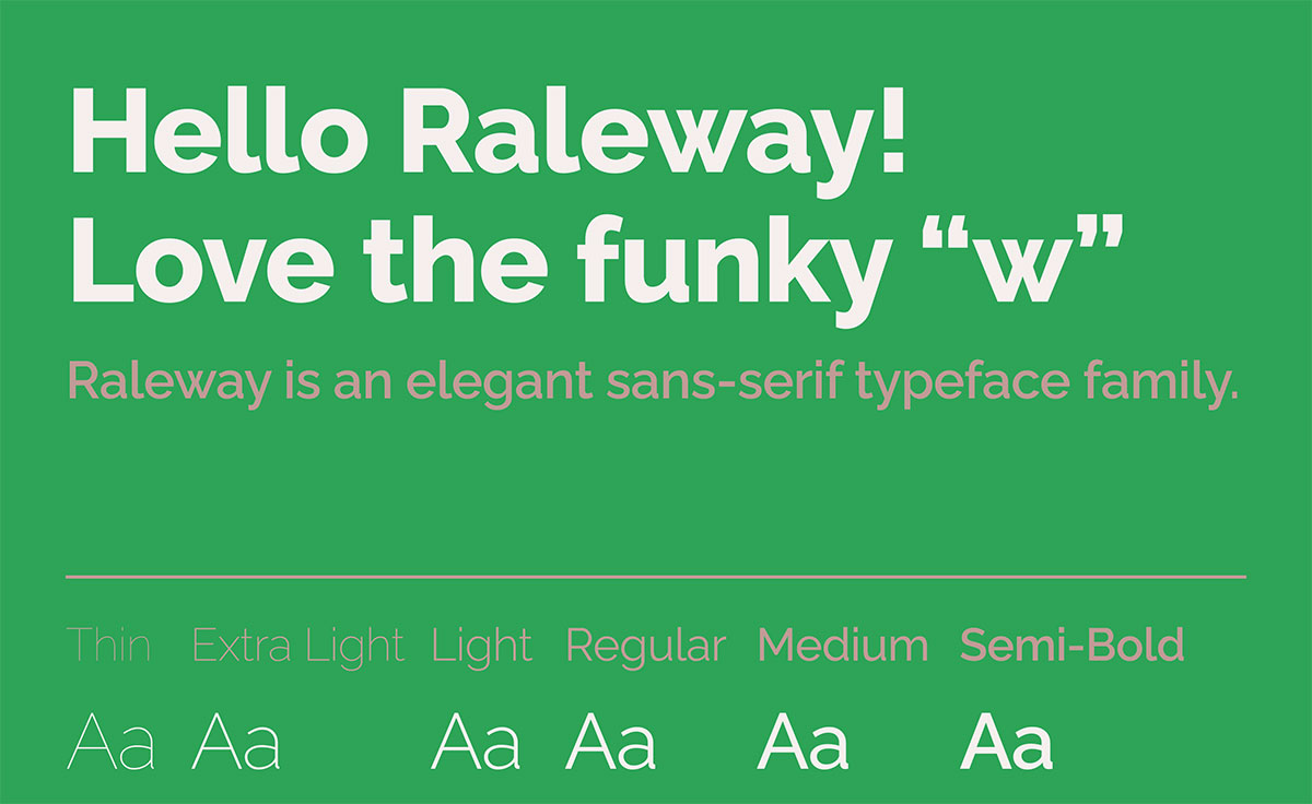
Raleway’s clean geometric elegance has made it a web design staple, but relying on a single typeface limits your creative toolkit. Whether you need a free alternative, a different weight range, or simply want to avoid the “everyone’s using it” problem, exploring fonts similar to Raleway opens up fresh possibilities.
Finding the right sans-serif isn’t about random browsing. It’s about understanding what makes Raleway work (geometric structure, thin weights, excellent kerning) and identifying alternatives that deliver those same qualities with their own character.
This guide breaks down 17 typefaces that share Raleway’s DNA. You’ll discover which ones work best for web typography, which offer superior licensing, and which provide the geometric sans-serif aesthetic you need without cookie-cutter repetition.
From free Google Fonts to premium commercial options, each choice here solves specific design challenges while maintaining the modern, minimalist feel that drew you to Raleway.
Fonts Similar To Raleway
| Font Name | Style Characteristics | Best Use Context | Weight Range |
|---|---|---|---|
| Open Sans | Humanist sans-serif with neutral appearance, optimized for screen readability, open letterforms | Body text, user interfaces, long-form content requiring high legibility | Light to ExtraBold (10 weights) |
| Lato | Semi-rounded sans-serif blending warmth with stability, slightly wider proportions than Raleway | Corporate communications, presentations, friendly professional interfaces | Thin to Black (10 weights) |
| Proxima Nova | Modern geometric sans-serif with balanced proportions, slightly warmer than Raleway’s cool aesthetic | Brand identity systems, marketing materials, contemporary web design | Thin to Black (12 weights) |
| Montserrat | Urban-inspired geometric sans-serif, wider letterforms than Raleway with distinctive capitals | Display typography, posters, contemporary digital branding with bold presence | Thin to Black (18 weights) |
| Gotham | Authoritative geometric sans based on architectural lettering, stronger than Raleway’s elegance | Corporate identity, editorial design, institutional communications requiring confidence | Thin to Ultra (8 widths) |
| Roboto | Dual-nature grotesque blending geometric structure with friendly curves, Android system default | Application interfaces, mobile design, cross-platform digital products | Thin to Black (12 weights) |
| Source Sans Pro | Adobe’s first open-source typeface, humanist structure with excellent hinting for screen rendering | Technical documentation, code editors, developer-focused interfaces | ExtraLight to Black (6 weights) |
| Poppins | Geometric sans with rounded terminals, more playful than Raleway’s serious sophistication | Lifestyle brands, creative agencies, youth-oriented digital products | Thin to Black (9 weights) |
| Inter | Optimized for computer screens with tall x-height, neutral grotesque engineered for UI clarity | User interface design, dashboard applications, data-heavy screen environments | Thin to Black (9 weights) |
| Barlow | Low-contrast grotesque with slightly condensed width, industrial aesthetic softer than Raleway | Transportation signage influence, modern web applications, technical brands | Thin to Black (9 weights) |
| Oswald | Condensed gothic revival, vertical emphasis contrasting with Raleway’s horizontal elegance | Headlines with space constraints, editorial mastheads, impactful display text | ExtraLight to Bold (6 weights) |
Open Sans

Open Sans is a humanist sans-serif font designed by Steve Matteson with wide apertures and tall x-height for screen readability. It shares Raleway’s clean geometric foundation but brings warmer, more organic curves.
Core Attributes
- Classification: Humanist sans-serif
- Weight range: 300-800 (Light to Extra Bold)
- Character set: 897 glyphs covering Latin, Greek, Cyrillic
- License: Apache License (free for commercial use)
Unique Characteristics
Released as Google’s second commissioned font in 2011, Open Sans includes true italics unlike many geometric alternatives.
Variable font version launched in 2021 offers continuous weight adjustment.
Features notably wider letterforms than Raleway, making it feel more spacious at equivalent sizes.
Use Cases
Body text for websites requiring extended reading sessions
Typography for user interfaces where warmth matters alongside clarity
Marketing materials needing professional fonts with personality
Key Considerations
Serves over 4 billion daily views across 20+ million sites as of 2018
Second most popular font on Google Fonts platform
Works particularly well when pairing fonts with serif companions
Lato

Lato is a humanist sans-serif typeface created by Łukasz Dziedzic, blending warmth with contemporary precision. The name means “summer” in Polish, reflecting its approachable personality.
Core Attributes
- Classification: Humanist sans-serif
- Weight range: Hairline to Black (9 weights total)
- Character set: 3000+ glyphs per style, 100+ Latin languages, 50+ Cyrillic
- License: SIL Open Font License
Unique Characteristics
Semi-rounded letter details create warmth while maintaining professional structure.
Taller x-height than Raleway enhances readability in compact spaces.
Originally designed as corporate identity fonts but released publicly after client direction changed.
Use Cases
Web design projects requiring approachability without sacrificing sophistication
Mobile interfaces where space efficiency meets legibility demands
Branding applications needing geometric precision with human touch
Key Considerations
Third most popular Google Fonts typeface with 1+ billion daily views
Used as official typeface for Polish Government and Bank Pekao
Classical proportions in uppercase letters provide familiar harmony
Proxima Nova
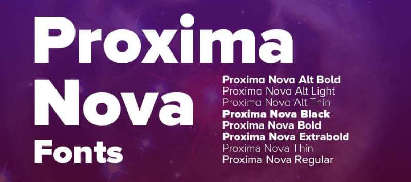
Proxima Nova is a geometric sans-serif by Mark Simonson that bridges Futura’s geometry with Akzidenz Grotesk’s practicality. Since 2010, it’s become the most popular commercial web font.
Core Attributes
- Classification: Geometric humanist hybrid
- Weight range: Thin to Black (8 weights)
- Character set: 1453+ characters with extensive language support
- License: Commercial (requires purchase from Mark Simonson Studio)
Unique Characteristics
Most widely used paid font on web with hundreds of thousands of site implementations.
Straddles gap between purely geometric and grotesque classifications.
Available in 5 widths (Normal, Condensed, Extra Condensed, Wide, Extra Wide).
Use Cases
Corporate identities requiring trustworthy yet modern appearance
Websites needing premium feel with excellent screen rendering
Editorial design balancing personality with readability
Key Considerations
Gained prominence through Obama 2008 presidential campaign typography
More expensive than free alternatives but offers unmatched refinement
Proxima Vara variable font version available separately
Montserrat

Montserrat is a geometric sans-serif inspired by 1920s-1950s signage from Buenos Aires’ Montserrat neighborhood. Designer Julieta Ulanovsky digitized these urban letterforms to preserve disappearing architectural typography.
Core Attributes
- Classification: Geometric sans-serif
- Weight range: 100-900 (Thin to Black)
- Character set: 250+ glyphs with Latin, Cyrillic, Greek support
- License: SIL Open Font License
Unique Characteristics
Large x-height with short descenders maximizes legibility at small sizes.
Features distinctive Alternates family with rounded letterforms reflecting original signage.
Fourth most popular Google Fonts typeface with 2.7+ trillion views.
Use Cases
Projects requiring free alternative to Gotham or Proxima Nova
Poster design and signage echoing mid-century aesthetics
Digital products where geometric clarity meets retro character
Key Considerations
Used on 19+ million websites globally
Subrayada variant includes integrated underline style
More informal and idiosyncratic than typical geometric fonts
Gotham
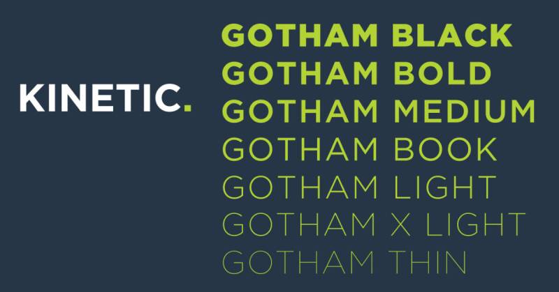
Gotham is a geometric sans-serif designed by Tobias Frere-Jones inspired by mid-century New York architectural lettering. The font embodies American vernacular typography with engineered precision.
Core Attributes
- Classification: Geometric sans-serif
- Weight range: Thin to Ultra (8 weights)
- Character set: Comprehensive Latin, Greek, Cyrillic coverage
- License: Commercial (Hoefler & Co.)
Unique Characteristics
Originally commissioned by GQ magazine for “masculine, new, fresh” appearance.
Available in 4 widths with screen-specific and rounded versions.
Based on Port Authority Bus Terminal signage and Depression-era typography.
Use Cases
Presidential campaigns and political branding (Obama 2008, Trump 2024)
Logo design requiring American authenticity with modern polish
Corporate identities needing both authority and accessibility
Key Considerations
Published by Hoefler & Co., now owned by Monotype
Features both humanistic proportions and geometric appearance
Premium pricing reflects extensive family and professional refinement
Roboto

Roboto is Google’s signature font designed by Christian Robertson, serving as Android’s default typeface since 2011. It balances mechanical skeleton with friendly, open curves.
Core Attributes
- Classification: Neo-grotesque sans-serif
- Weight range: 100-900 (Thin to Black)
- Character set: Latin, Cyrillic, Greek with extensive language support
- License: Apache License 2.0 (now SIL OFL)
Unique Characteristics
Dual nature combines geometric forms with humanist openness.
Redesigned for Android 5.0 “Lollipop” with squared punctuation and refined proportions.
Roboto Flex variable font offers continuous weight, width, optical size adjustments.
Use Cases
Android app development maintaining visual hierarchy consistency
Material Design implementations across platforms
Mobile apps requiring proven screen performance
Key Considerations
Most accessed font family across Google’s ecosystem
Condensed variants available for space-constrained layouts
Static version lacks 200, 600, 800 weights (achievable via Roboto Flex)
Kross Neue Grotesk
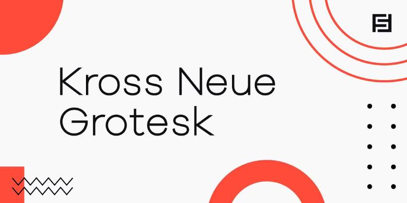
Kross Neue Grotesk is a contemporary grotesque typeface offering geometric precision with subtle optical corrections. This modern interpretation emphasizes clarity while maintaining distinctive character.
Core Attributes
- Classification: Neo-grotesque sans-serif
- Weight range: Light to Bold
- Character set: Extended Latin with comprehensive punctuation
- License: Varies by foundry
Unique Characteristics
Slightly condensed proportions create efficient text blocks without sacrificing readability.
Refined ink traps enhance definition at smaller sizes.
Lower stroke contrast than Raleway produces more even texture.
Use Cases
Editorial layouts requiring sophisticated neutrality
Digital interfaces balancing personality with professionalism
Print design where space efficiency matters
Key Considerations
Less widely known than mainstream alternatives
Works particularly well for body text applications
Modern take on grotesque traditions
Einer Grotesk
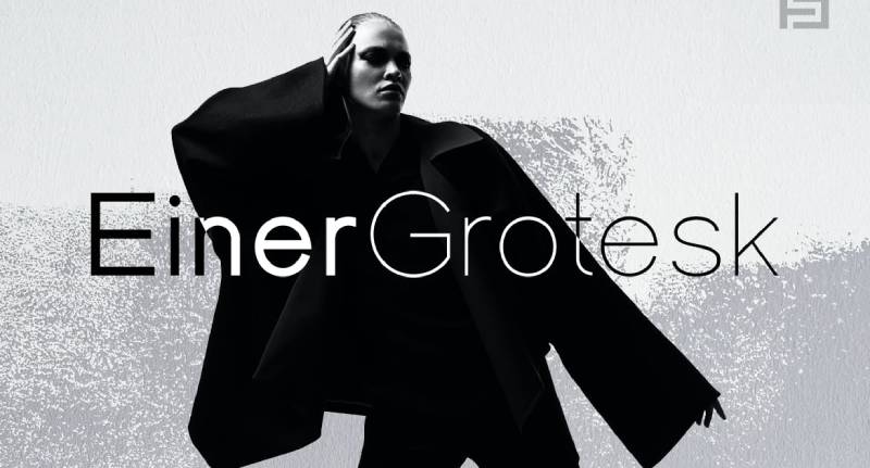
Einer Grotesk channels early 20th-century grotesque aesthetics with contemporary refinement. The design emphasizes functional beauty through restrained details.
Core Attributes
- Classification: Grotesque sans-serif
- Weight range: Light to Heavy
- Character set: Latin extended with professional features
- License: Commercial
Unique Characteristics
Double-story ‘a’ and ‘g’ provide traditional grotesque character.
Tall x-height relative to capitals enhances small-size performance.
Slightly wider set than Raleway creates more open font spacing.
Use Cases
Brand guidelines requiring timeless sophistication
Publishing projects needing reliable text performance
Corporate communications balancing formality with approachability
Key Considerations
Bridges historical grotesques with contemporary expectations
Less geometric than Raleway’s circular foundation
Excellent for establishing professional authority
Osande
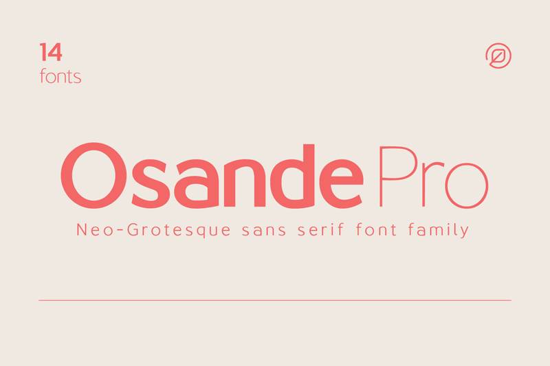
Osande brings geometric precision to modern digital environments with optimized screen rendering. This contemporary sans-serif prioritizes clarity across devices.
Core Attributes
- Classification: Geometric sans-serif
- Weight range: Thin to Black
- Character set: Extended Latin with web optimization
- License: Commercial
Unique Characteristics
Designed specifically for digital applications with enhanced screen legibility.
Slightly warmer terminals soften geometric strictness.
Kerning optimized for UI text strings and headlines.
Use Cases
Website headers requiring geometric elegance
App interfaces balancing aesthetics with function
Digital advertising needing contemporary sophistication
Key Considerations
Newer typeface with growing adoption
Particularly effective for tech and startup branding
Strong performance in responsive layouts
Metrisch
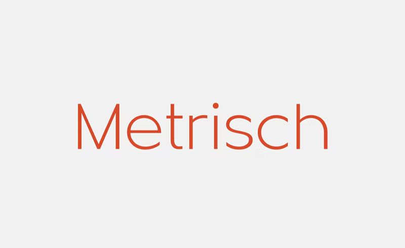
Metrisch delivers Swiss-inspired geometric rationalism with mathematical precision. The design emphasizes systematic consistency across all weights.
Core Attributes
- Classification: Geometric sans-serif
- Weight range: Light to Bold
- Character set: Comprehensive Latin with extensive language support
- License: Commercial
Unique Characteristics
Circular forms derived from precise geometric construction.
Consistent stroke width creates distinctive monolinear appearance.
Influenced by Swiss design principles of clarity and order.
Use Cases
Projects requiring systematic grid systems and mathematical precision
Minimalist design applications prioritizing purity
Tech branding emphasizing rational thinking
Key Considerations
More strictly geometric than Raleway’s optical adjustments
Appeals to audiences valuing precision over personality
Works exceptionally well at large display sizes
Source Sans Pro
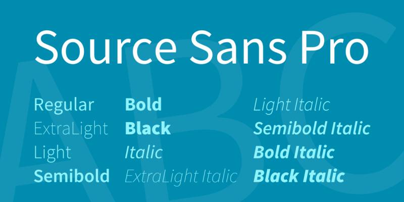
Source Sans Pro is Adobe’s first open-source font family designed by Paul D. Hunt for user interfaces. It draws from American gothic traditions while prioritizing contemporary screen readability.
Core Attributes
- Classification: Humanist gothic sans-serif
- Weight range: 200-900 (ExtraLight to Black)
- Character set: Extensive Latin, Greek, Cyrillic support
- License: SIL Open Font License
Unique Characteristics
Adobe’s flagship open-source typeface with professional refinement.
Generous width compared to similar gothics improves reading texture.
Shorter majuscules with longer extenders create pleasant typographic hierarchy.
Use Cases
UI/UX design requiring clarity without sterility
Coding environments (Source Code Pro variant)
Professional documents balancing formality with readability
Key Considerations
Variable font version offers continuous weight control
Inspired by Morris Fuller Benton’s gothic typefaces
One of most complete families on Google Fonts
Poppins
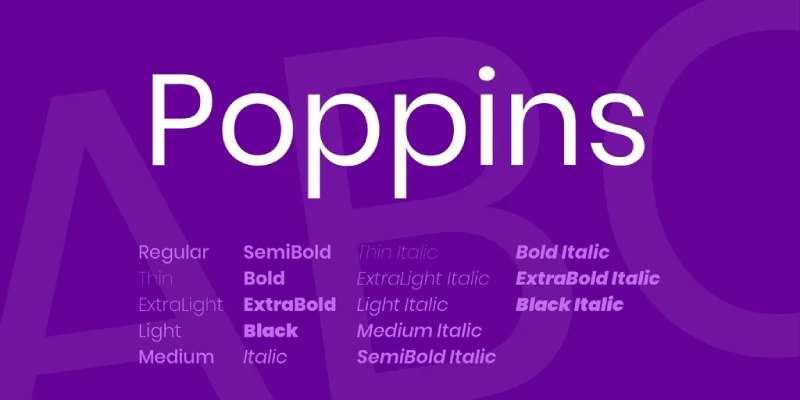
Poppins is a geometric sans-serif supporting both Devanagari and Latin scripts, created by Indian Type Foundry. The design brings geometric traditions to internationalist contexts.
Core Attributes
- Classification: Geometric sans-serif
- Weight range: 100-900 (Thin to Black)
- Character set: 1014 glyphs with extensive Devanagari support
- License: SIL Open Font License
Unique Characteristics
First Devanagari typeface with full weight range in geometric genre.
Nearly monolinear letterforms based on pure circles.
High Latin x-height with Devanagari and Latin ascenders at equal height.
Use Cases
Multilingual projects requiring Latin and Devanagari support
Modern interfaces balancing geometric clarity with warmth
Infographics needing strong visual presence
Key Considerations
Redesigned in 2017 with expanded weight range
Increasingly popular for tech and startup applications
Devanagari design by Ninad Kale, Latin by Jonny Pinhorn
Inter

Inter is a neo-grotesque sans-serif designed by Rasmus Andersson specifically for screen legibility at small sizes. Created for Figma, it has become one of the web’s most widely adopted interface fonts.
Core Attributes
- Classification: Neo-grotesque sans-serif
- Weight range: 100-900 (Thin to Black)
- Character set: 2000+ glyphs covering 147 languages
- License: SIL Open Font License
Unique Characteristics
Tall x-height with open apertures optimized for UI text.
Variable font includes optical size axis adapting from text to display.
Dedicated glyph designs at weights 100, 400, 900 ensure quality.
Use Cases
User interface text at small sizes (11px+)
Dashboard and data visualization interfaces
Product design requiring numeric clarity
Key Considerations
Accessed 414 billion times on Google Fonts in 12 months (May 2025)
Originally created to improve upon Roboto’s screen readability
Includes specialized features like tabular figures and ink traps
Encode Sans
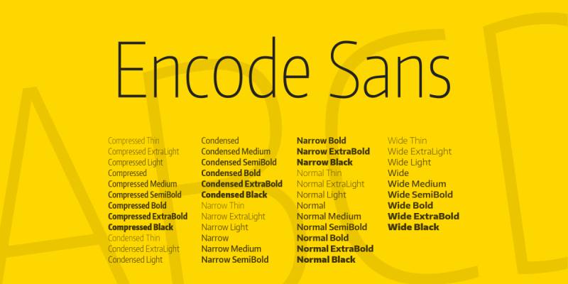
Encode Sans is a versatile sans-serif offering exceptional legibility across digital and print applications. The design balances geometric structure with humanist warmth.
Core Attributes
- Classification: Geometric humanist sans-serif
- Weight range: 100-900
- Character set: Extended Latin with comprehensive punctuation
- License: SIL Open Font License
Unique Characteristics
Condensed and Expanded width variants provide layout flexibility.
Optimized specifically for web environments with enhanced rendering.
Slightly taller x-height than Raleway improves small-size clarity.
Use Cases
Responsive web layouts requiring width flexibility
Email signatures needing reliable cross-platform rendering
Editorial projects balancing efficiency with elegance
Key Considerations
Free alternative with professional refinement
Less commonly used offers distinction from overused alternatives
Strong performance in variable browser environments
Barlow
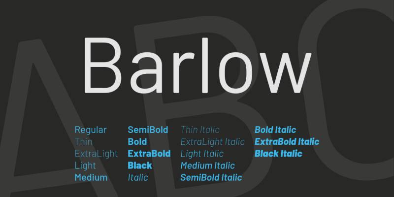
Barlow is a slightly rounded grotesque sans-serif with low-contrast stroke relationships. Designed for both functionality and character, it offers approachable professionalism.
Core Attributes
- Classification: Grotesque sans-serif
- Weight range: 100-900 (Thin to Black)
- Character set: Extensive Latin with Vietnamese support
- License: SIL Open Font License
Unique Characteristics
Semi-Condensed and Condensed variants available alongside normal width.
Subtle rounding softens geometric foundations.
Tall x-height with generous apertures enhances legibility.
Use Cases
Tech branding requiring friendly authority
Transportation and wayfinding signage
Digital products where clarity meets personality
Key Considerations
Created by Tribby Type Foundry’s Jeremy Tribby
Condensed variants particularly effective for headlines
Growing adoption in startup and tech sectors
Gilroy
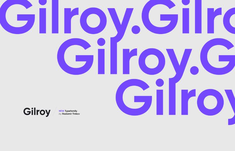
Gilroy is a modern geometric sans-serif offering both sharp precision and smooth elegance. The design emphasizes clean lines with subtle optical refinements.
Core Attributes
- Classification: Geometric sans-serif
- Weight range: Thin to Heavy (10 weights)
- Character set: Extended Latin with comprehensive features
- License: Commercial
Unique Characteristics
Perfectly circular letterforms create distinctive geometric identity.
Available in both sharp and rounded variants.
More fashion-forward aesthetic compared to traditional geometrics.
Use Cases
Luxury brand identities requiring sophisticated minimalism
Fashion and lifestyle publications
Modern logos emphasizing geometric purity
Key Considerations
Popular in fashion and lifestyle sectors
Premium commercial font with growing visibility
Slightly wider set than Raleway at equivalent sizes
Oswald
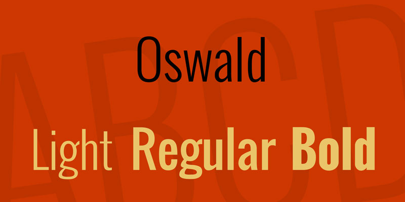
Oswald is a condensed gothic sans-serif optimized for web use, reworked from Alternate Gothic. The design prioritizes vertical efficiency while maintaining excellent legibility.
Core Attributes
- Classification: Gothic sans-serif condensed
- Weight range: 200-700 (ExtraLight to Bold)
- Character set: Latin extended with comprehensive language support
- License: SIL Open Font License
Unique Characteristics
Condensed proportions maximize vertical space utilization.
Redesigned from historical Alternate Gothic for digital optimization.
Variable font offers precise weight control between defined styles.
Use Cases
Headlines and titles requiring space efficiency
Banners and display applications
Editorial layouts with narrow column constraints
Key Considerations
Designed by Vernon Adams for Google Fonts
Not ideal for body text due to condensed nature
Particularly effective when vertical emphasis needed
FAQ on Fonts Similar To Raleway
What free fonts look most like Raleway?
Montserrat and Lato offer the closest free alternatives to Raleway’s geometric elegance. Both feature similar thin weights and are available through Google Fonts with extensive character sets. Inter and Poppins provide excellent alternatives with superior screen optimization for digital interfaces.
Is Proxima Nova better than Raleway?
Proxima Nova offers more refined kerning and professional polish but requires commercial licensing. It’s the most popular paid web font globally. The choice depends on budget and whether you need its extensive width variations for complex typography systems.
Which Raleway alternative works best for body text?
Open Sans and Lato excel for extended reading due to humanist influences and wider letterforms. Source Sans Pro provides exceptional clarity for professional documents and interfaces. Raleway itself works better for headlines than body copy because of its geometric structure.
Can I use Montserrat commercially for free?
Yes. Montserrat uses the SIL Open Font License, permitting unrestricted commercial use. You can modify, redistribute, and bundle it with products without fees. This makes it ideal for branding projects, client work, and commercial applications requiring font licensing flexibility.
What’s the difference between geometric and humanist sans-serif fonts?
Geometric fonts like Raleway use circular forms and mathematical precision. Humanist sans-serifs like Open Sans incorporate calligraphic influences with varied stroke widths. Geometric typefaces feel more modern and minimal, while humanist fonts appear warmer and more readable for body text applications.
Which font pairs well with Raleway alternatives?
Serif fonts like Merriweather or Lora complement geometric sans-serifs beautifully. For pairing fonts, combine a geometric headline font with a humanist body font. This creates visual hierarchy while maintaining readability across different text sizes and contexts.
Is Roboto too common for professional projects?
Roboto’s ubiquity stems from Android defaults, but it remains professionally viable. Its extensive weight range and proven screen performance justify continued use. Consider less common alternatives like Inter or Encode Sans if brand differentiation matters more than established reliability and cross-platform consistency.
What weights should I use for web typography?
Regular (400) for body text, Semi-Bold (600) for subheadings, and Bold (700) for headlines. Avoid weights below 300 for small text sizes. Thin weights work best for large display applications. Use variable fonts when precise weight control matters for responsive typography.
How do I choose between free and commercial fonts?
Free fonts like Montserrat suit most projects and offer font licensing flexibility. Commercial options like Gotham or Proxima Nova provide superior refinement, extensive families, and professional support. Budget, branding importance, and specific feature requirements (widths, optical sizes) determine the best choice for your project.
Which alternative works best for minimalist design?
Gilroy and Metrisch deliver the strictest geometric precision for minimalist design applications. Their perfectly circular forms and systematic construction align with reductive aesthetics. Inter offers excellent minimalism while maintaining practical readability. Choose based on whether you prioritize pure geometry or functional clarity.
Conclusion
Exploring fonts similar to Raleway reveals that geometric sans-serifs come in countless variations, each solving different design problems. Whether you choose free alternatives like Montserrat and Lato or invest in commercial options like Proxima Nova and Gotham, understanding the nuances matters more than following trends.
The best typeface choice depends on your specific needs. Screen readability? Inter wins. Print design? Source Sans Pro delivers. Brand distinction? Gilroy stands apart.
Don’t default to what everyone else uses. Test your selections with actual content at real sizes. Pay attention to font spacing, leading, and how weights interact across your typographic hierarchy.
The right modern sans-serif transforms good design into exceptional work. Choose wisely.
If you enjoyed reading this article on Fonts similar to Raleway, you should check out these articles with fonts similar to Gotham, Garamond, Helvetica, Futura, Times New Roman, Lato, Bodoni, Roboto, and Optima.

Renowned for his expertise in logo design and visual branding, Bogdan has developed a multitude of logos for various clients.
His skills extend to creating posters, vector illustrations, business cards, and brochures. Additionally, Bogdan's UI kits were featured on marketplaces like Visual Hierarchy and UI8.
He also wrote in the past years on sites like Design Your Way, WebDesignerDepot, WPDean, Designmodo, Speckyboy, Slider Revolution, and more.
- The Substack Logo History, Colors, Font, And Meaning - 2 October 2026
- How UX Design Impacts SaaS User Retention and Churn - 1 October 2026
- How to Embed Fonts in PDF for Reliable Printing - 30 September 2026

Bogdan Sandu is a seasoned designer who has been designing websites since 2008. Renowned for his expertise in logo design and visual branding, Bogdan has developed a multitude of logos for various clients. His skills extend to creating posters, vector illustrations, business cards, and brochures. Additionally, Bogdan's UI kits were featured on marketplaces like Visual Hierarchy and UI8. He also wrote in the past years on sites like Design Your Way, WebDesignerDepot, WPDean, Designmodo, Speckyboy, Slider Revolution, and more.
You Might Also Like