The wrong font can make a banner invisible, even at full size.
Whether you’re designing for a trade show display, a vinyl outdoor sign, or a digital web banner, font choice directly determines whether your message gets read or ignored. Most people treat it as an afterthought. It isn’t.
Banner typography operates by different rules than print or web design. Viewing distance, stroke weight, letter-spacing, and print material all affect legibility in ways that standard font advice doesn’t cover.
This guide covers the best fonts for banners across every use case, with specific data on weight ranges, licensing, size recommendations, and pairing options. By the end, you’ll know exactly which display typefaces work at scale, which free options hold up commercially, and what to avoid before sending files to print.
The Best Fonts For Banners
Choosing a font for a banner is not the same as choosing one for body text. Distance, print size, viewing angle, and background contrast all change what “readable” actually means.
The fonts below were selected based on structural attributes: stroke weight, condensed width, x-height, letter-spacing defaults, and real-world banner use. Each one handles large-format printing or digital display differently.
—
Bebas Neue
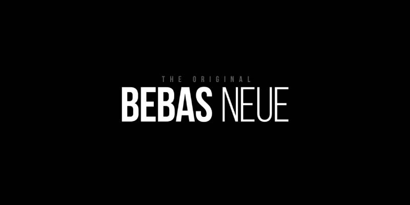
Bebas Neue is a condensed grotesque sans-serif typeface designed by Ryoichi Tsunekawa in 2010, released through Dharma Type. It delivers high-contrast uppercase letterforms optimized for large-scale headline and display use.
Bebas Neue works best for bold headline banners because its monolinear stroke and tight default letter-spacing maximize ink coverage per character at display sizes. It appeared in the film title sequence for La La Land and is widely used in event and promotional signage.
What makes Bebas Neue suitable for banners?
Bebas Neue uses a monolinear stroke with minimal contrast between thick and thin parts of each letter. This keeps legibility consistent across viewing distances of 10 to 50+ feet. The condensed proportions allow more characters per line without reducing letter height, which is a direct advantage for banners with longer copy.
Key attributes:
| Attribute | Value |
| Classification | Condensed grotesque sans-serif |
| Designer | Ryoichi Tsunekawa, 2010 |
| Weight range | Thin to Bold (5 weights via Fontfabric expansion) |
| Variable font | No (standard version); Pro version adds styles |
| Recommended sizes | 48px+ on screen; 1 inch+ letter height for print |
| Letter-spacing default | Tight |
| License | OFL (free for personal and commercial use) |
| Available on | Google Fonts, Adobe Fonts, Font Squirrel |
| Price | Free (Pro version: commercial license via Dharma Type) |
How does Bebas Neue perform at large banner sizes?
At 48px and above, Bebas Neue renders with strong edge definition due to its monolinear strokes and open counters. The lack of serifs removes potential ink bleed at the stroke terminals during vinyl printing. It is uppercase-only in the free version, which limits its use to all-caps banner text.
What are the best pairings for Bebas Neue in banners?
Bebas Neue pairs with Montserrat for contrast in stroke weight when a subheading with lowercase letters is needed. It works with Roboto Condensed when a supporting body line in a similar condensed style is required without the all-caps limitation.
What are the limitations of Bebas Neue for banners?
The free version contains no lowercase letters, which blocks its use on any banner requiring mixed-case text. The single-weight free release limits typographic hierarchy within a single banner design.
Bebas Neue – Recommended Use Cases Within Banner Design
- Best for: Event headlines, trade show displays, sale banners, vinyl outdoor signage
- Avoid for: Banners with body text or fine print below the headline
- Optimal weight: Bold (only free weight available)
- Optimal size range: 72px+ on screen; 2 inch+ letter height for print
—
Montserrat
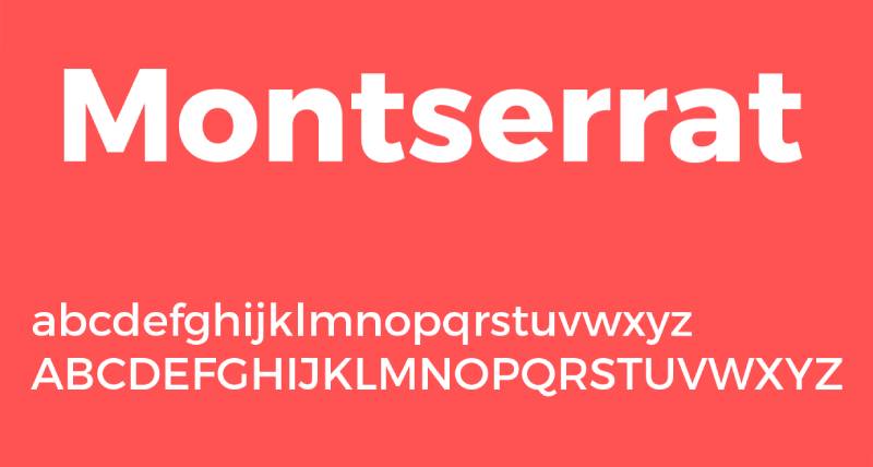
Montserrat is a geometric sans-serif font designed by Julieta Ulanovsky, first released in 2011 through Google Fonts. It delivers clean, geometric letterforms inspired by mid-century Buenos Aires signage across 9 weights from Thin 100 to Black 900.
Montserrat suits banners requiring mixed-case text at medium-to-large sizes because its high x-height and open apertures maintain legibility across both uppercase headlines and sentence-case subheadings. It has been used across more than 1,000,000 websites, including editorial and brand signage contexts.
What makes Montserrat suitable for banners?
Montserrat’s x-height is large relative to its cap height, which keeps lowercase letters readable at distance. Its 9 weights allow designers to build a clear visual hierarchy within a single banner, using Black 900 for the headline and Regular 400 for secondary text. The geometric structure also reproduces cleanly in both digital and large-format print.
Key attributes:
| Attribute | Value |
| Classification | Geometric sans-serif |
| Designer | Julieta Ulanovsky, 2011 |
| Weight range | Thin 100 to Black 900 (9 weights, each with italic) |
| Variable font | Yes (weight and italic axes) |
| Recommended sizes | 32px+ for banner headlines; 16px+ for subtext |
| Letter-spacing default | Normal (0) |
| License | OFL (free for personal and commercial use) |
| Available on | Google Fonts, Adobe Fonts |
| Price | Free |
How does Montserrat perform at large banner sizes?
Montserrat Black 900 produces dense, high-visibility text at large print sizes with strong stroke coverage. Its slightly rounded geometric terminals soften the appearance compared to pure grotesques, which makes it work well for both corporate and lifestyle banner contexts. Letter differentiation at distance is strong due to distinct geometric character shapes.
What are the best pairings for Montserrat in banners?
Montserrat pairs with serif fonts like Playfair Display for contrast when an editorial or luxury banner tone is needed. It works with Open Sans for a clean, neutral subtext option that shares similar proportions without competing with the headline weight.
What are the limitations of Montserrat for banners?
Montserrat is one of the most widely used fonts on the web, which can make banner designs feel generic without a strong pairing or layout decision. At very large outdoor sizes (above 24-inch letter height), the subtle geometric details become less visible and differentiation from alternatives like Futura decreases.
Montserrat – Recommended Use Cases Within Banner Design
- Best for: Digital web banners, event signage with mixed-case text, brand promotional displays
- Avoid for: Banners requiring a distinctive or unusual typographic personality
- Optimal weight: Black 900 for headlines; Medium 500 for subheadings
- Optimal size range: 48px–96px for headlines on screen; 1.5–3 inch letter height for print
—
Impact

Impact is a condensed grotesque sans-serif typeface designed by Geoffrey Lee in 1965, released by Stephenson Blake and later digitized by Monotype for Microsoft. It maximizes ink coverage at any given point size through extreme stroke weight and compressed letter-spacing.
Impact works best for short, high-priority headline banners because its condensed width and ultra-heavy stroke weight produce maximum visual density at large sizes. Lee’s stated design goal was “to get as much ink on paper as possible in a given size with the maximum possible x-height.”
What makes Impact suitable for banners?
Impact has a very high x-height, reaching nearly three-quarters of the cap height. This keeps even short words visually large at distance. Its compressed letter-spacing means more characters fit within a fixed horizontal space without reducing type size, which directly benefits banners where word count and viewing distance are both constrained.
Key attributes:
| Attribute | Value |
| Classification | Condensed grotesque sans-serif (industrial) |
| Designer | Geoffrey Lee, 1965 (Stephenson Blake) |
| Weight range | Single weight (Regular only) |
| Variable font | No |
| Recommended sizes | 48px+ for digital banners; 2 inch+ letter height for print |
| Letter-spacing default | Tight / compressed |
| License | Commercial (bundled with Windows; commercial use requires desktop license) |
| Available on | MyFonts (Monotype), bundled with Microsoft Windows |
| Price | Included with Windows; standalone license from Monotype |
How does Impact perform at large banner sizes?
Impact delivers extremely high visual weight at any size due to its ultra-bold strokes and minimal interior counter space. At distances over 30 feet, its compressed letterforms remain individually distinct for short words, but longer words can merge visually if tracking is not manually adjusted. Its single weight limits in-banner hierarchy options.
What are the best pairings for Impact in banners?
Impact pairs with Arial or Helvetica for secondary text lines where a cleaner, more neutral weight is needed beneath the headline. Pairing with a serif for body copy creates strong contrast in style, though Impact’s compressed personality can overpower delicate serif subtext.
What are the limitations of Impact for banners?
Impact comes in a single weight with no italic, which prevents typographic hierarchy within a single typeface. Its strong cultural association with internet meme imagery can undermine professional or high-end banner design contexts.
Impact – Recommended Use Cases Within Banner Design
- Best for: Short-word outdoor banners, sale or urgency banners where one or two words dominate
- Avoid for: Multi-line banner layouts, premium or luxury brand contexts
- Optimal weight: Regular (only weight available)
- Optimal size range: 72px+ on screen; 2–4 inch letter height for print
—
Futura

Futura is a geometric sans-serif typeface designed by Paul Renner and released in 1927 by the Bauer Type Foundry in Frankfurt. It constructs letterforms from pure geometric forms (circle, square, triangle) with subtle optical corrections for visual balance at display sizes.
Futura suits event and brand banners because its even stroke weight and wide apertures maintain legibility at distances over 50 feet. It was used on the Apollo 11 lunar plaque left on the Moon in 1969, and brands including Volkswagen, Red Bull, and Dolce & Gabbana have used it in signage and advertising.
What makes Futura suitable for banners?
Futura’s near-monolinear stroke contrast means thick and thin stroke variation is minimal, which prevents fine line elements from disappearing at large print scale or outdoor viewing distance. Its geometric letter construction produces high character differentiation, which reduces misreads at distance. The family spans multiple weights from Light to ExtraBold, enabling full typographic hierarchy within a single banner.
Key attributes:
| Attribute | Value |
| Classification | Geometric sans-serif |
| Designer | Paul Renner, 1927 (Bauer Type Foundry) |
| Weight range | Light to ExtraBold (varies by version; Futura Now adds variable axis) |
| Variable font | Yes (Futura Now from Monotype) |
| Recommended sizes | 36px+ for digital; 1 inch+ letter height for print |
| Letter-spacing default | Normal to slightly wide |
| License | Commercial (Monotype/Bauer Types; Futura PT available on Adobe Fonts) |
| Available on | Adobe Fonts (Futura PT), Monotype, Bauer Types direct |
| Price | Subscription (Adobe Fonts) or commercial license |
How does Futura perform at large banner sizes?
Futura’s geometric circular forms (especially in ‘O’, ‘C’, ‘G’) produce clear, open counters that prevent ink fill at large print sizes. The Bold and ExtraBold weights deliver strong visual contrast against most banner backgrounds. Its even spacing and wide apertures contribute to consistently high legibility at outdoor viewing distances from 15 to 100+ feet.
What are the best pairings for Futura in banners?
Futura pairs with complementary typefaces such as Garamond for serif contrast when a subheading or descriptive line is needed. It works with Gill Sans for a period-matched sans-serif that shares similar geometric principles but introduces more humanist warmth in supporting text.
What are the limitations of Futura for banners?
Futura requires a commercial license, which adds cost relative to free alternatives like Montserrat that share similar geometric proportions. The very geometric letter shapes (particularly the single-story ‘a’) can reduce readability in all-lowercase settings at smaller banner subtext sizes.
Futura – Recommended Use Cases Within Banner Design
- Best for: Brand and corporate banners, trade show displays, premium event signage
- Avoid for: Banners with extended body copy or fine-print subtext
- Optimal weight: Bold for headlines; Book or Medium for supporting text
- Optimal size range: 48px–120px for digital headlines; 1.5–4 inch letter height for print
—
Helvetica
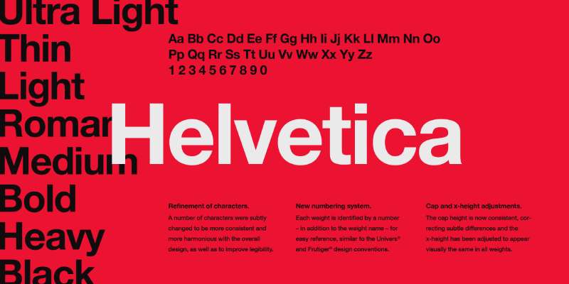
Helvetica is a neo-grotesque sans-serif typeface developed in 1957 by Max Miedinger and Eduard Hoffmann at the Haas Type Foundry in Switzerland. It delivers near-neutral letterforms with high x-height and tight default spacing, optimized for corporate and large-format signage.
Helvetica suits professional and corporate banner applications because its horizontal stroke terminals and balanced letter-spacing produce consistent legibility across wide viewing distances. It is used by the NYC Subway, American Airlines, Toyota, and hundreds of major brands in signage contexts globally.
What makes Helvetica suitable for banners?
Helvetica’s stroke terminals cut off horizontally rather than at an angle, which produces clean edges at large print sizes without optical distortion. Its high x-height relative to cap height keeps lowercase text readable at medium outdoor distances. The unusually tight default letter-spacing creates compact, dense text blocks that fill banner space efficiently.
Key attributes:
| Attribute | Value |
| Classification | Neo-grotesque sans-serif |
| Designer | Max Miedinger and Eduard Hoffmann, 1957 |
| Weight range | Thin to Black (varies by version; Helvetica Now spans 9 weights) |
| Variable font | Yes (Helvetica Now Variable from Monotype) |
| Recommended sizes | 36px+ for headlines; 14px+ for subtext |
| Letter-spacing default | Tight |
| License | Commercial (Monotype) |
| Available on | Adobe Fonts, Monotype direct |
| Price | Subscription (Adobe Fonts) or commercial license from Monotype |
How does Helvetica perform at large banner sizes?
Helvetica Bold and Heavy render with strong, consistent stroke weight at large outdoor sizes, maintaining clear edge definition on vinyl and fabric banner materials. Its neutral design means it reads as authoritative without adding stylistic personality, which works in corporate and institutional signage contexts. Very tight default tracking can cause character crowding on condensed banners; manual tracking adjustment to +20–40 units is recommended for outdoor use.
What are the best pairings for Helvetica in banners?
See our guide on Helvetica font pairing for full pairing recommendations. Helvetica works with Garamond for editorial or institutional banners requiring serif contrast, and with Futura when a geometric companion is needed for secondary text lines.
What are the limitations of Helvetica for banners?
Helvetica requires a paid license from Monotype; there is no free version for commercial banner use. Some letters (notably ‘I’, ‘l’, and ‘1’) can be difficult to differentiate at certain sizes and viewing angles due to similar terminal shapes.
Helvetica – Recommended Use Cases Within Banner Design
- Best for: Corporate trade show displays, institutional banners, airport and transport signage
- Avoid for: Banners where strong visual personality or brand differentiation is needed
- Optimal weight: Bold 700 for headlines; Regular 400 for subtext
- Optimal size range: 48px–96px for digital; 2–5 inch letter height for print
—
Oswald
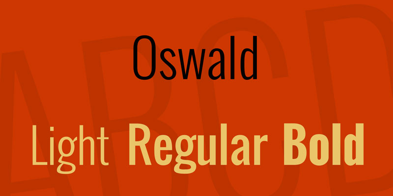
Oswald is a condensed grotesque sans-serif typeface designed by Vernon Adams in 2011, released via Google Fonts under the SIL Open Font License. It redesigns the classic Alternate Gothic style with letterforms redrawn to fit standard digital pixel grids.
Oswald works well for banner headlines because its condensed proportions allow longer text to remain large without exceeding banner width. It supports 6 weights from ExtraLight to Bold, enabling hierarchy within a single typeface family.
What makes Oswald suitable for banners?
Oswald’s characters are narrower than standard-width sans-serifs, which directly reduces the horizontal space needed for a given type size. At 60px+, the condensed letterforms remain individually distinct due to open counters and consistent stroke weight. The 6-weight range from ExtraLight 200 to Bold 700 supports headline, subheading, and detail text within one typeface without purchasing additional fonts.
Key attributes:
| Attribute | Value |
| Classification | Condensed grotesque sans-serif |
| Designer | Vernon Adams, 2011 |
| Weight range | ExtraLight 200 to Bold 700 (6 weights) |
| Variable font | Yes (variable weight axis added 2019) |
| Recommended sizes | 40px+ for headlines; 18px+ for subtext |
| Letter-spacing default | Normal (slight compression from condensed design) |
| License | OFL (free for personal and commercial use) |
| Available on | Google Fonts, Adobe Fonts |
| Price | Free |
How does Oswald perform at large banner sizes?
Oswald Bold at large display sizes produces high contrast against most banner backgrounds due to its heavier stroke weight. The condensed design keeps letter height large relative to the horizontal space used, making it effective for banners where vertical space is greater than horizontal space. Its screen-optimized pixel grid design also performs consistently in digital banner formats across different resolutions.
What are the best pairings for Oswald in banners?
Oswald pairs with Roboto for supporting subtext where a neutral, readable sans-serif is needed without stylistic conflict. It works with Lato for banner designs targeting a warmer tone in the secondary text layer, as Lato’s slightly humanist construction contrasts with Oswald’s condensed grotesque structure.
What are the limitations of Oswald for banners?
Oswald has no italic variant, which restricts typographic contrast options for banners that use oblique text for emphasis. Its condensed proportions are less effective on very wide landscape banners where standard-width letterforms would fill the space more naturally.
Oswald – Recommended Use Cases Within Banner Design
- Best for: Vertical banners, pull-up displays, event titles with longer copy
- Avoid for: Wide horizontal banners with short two-word headlines where condensed width is unnecessary
- Optimal weight: Bold 700 for headlines; Regular 400 for supporting lines
- Optimal size range: 48px–100px for digital; 1.5–3 inch letter height for print
—
Anton
Anton is a condensed display font designed by Vernon Adams, available through Google Fonts under the OFL license. It delivers a single heavy-weight condensed sans-serif built specifically for headlines, banners, and large-scale display use at sizes of 24px and above.
Anton works best for single-line or two-line banner headlines where maximum visual impact in minimal horizontal space is the primary requirement. Anton has been served billions of times across web banners and social media graphics, making it one of the most viewed display typefaces in digital history.
What makes Anton suitable for banners?
Anton’s letterforms are significantly narrower than standard-width sans-serifs, allowing more characters per line at the same type size. Its heavy stroke weight ensures strong contrast against both light and dark banner backgrounds, including photographic images. The tight default spacing increases visual density, which works well for short phrases on banners where the headline must read instantly from distance.
Key attributes:
| Attribute | Value |
| Classification | Condensed display sans-serif |
| Designer | Vernon Adams (Google Fonts) |
| Weight range | Single weight (Regular only) |
| Variable font | No |
| Recommended sizes | 24px minimum; 60px+ for banner headlines |
| Letter-spacing default | Tight |
| License | OFL (free for personal and commercial use) |
| Available on | Google Fonts, Adobe Fonts |
| Price | Free |
How does Anton perform at large banner sizes?
Anton’s heavy strokes remain fully legible on both light and dark backgrounds at large outdoor sizes. White Anton text on a colored or photographic banner background is a particularly effective treatment due to the typeface’s stroke density. Its condensed structure performs well on vertical banners, pop-up displays, and web banner ads where horizontal space is limited but vertical height is available.
What are the best pairings for Anton in banners?
Anton pairs with Open Sans for body text lines beneath the headline, where a clean and easily readable sans-serif contrasts with Anton’s display weight. It works with Lora when a serif subtext is needed for editorial-style banners, as Lora’s moderate contrast provides clear stylistic separation from Anton’s condensed grotesque structure.
What are the limitations of Anton for banners?
Anton is available in a single Regular weight only with no italic variant, making it unsuitable for any banner design requiring typographic hierarchy across multiple text levels. It is not readable below 24px, preventing its use on banners with fine print or footnote text.
Anton – Recommended Use Cases Within Banner Design
- Best for: Single-headline web banners, social media graphics, vinyl event banners
- Avoid for: Multi-level banner layouts requiring weight variation or italic emphasis
- Optimal weight: Regular (only option)
- Optimal size range: 60px–120px for digital display; 2–4 inch letter height for print
—
Playfair Display
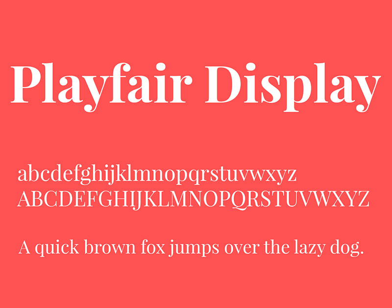
Playfair Display is a transitional serif typeface designed by Claus Eggers Sørensen, first released in 2011 through Google Fonts. It produces high-contrast letterforms with dramatic thick-to-thin stroke transitions, influenced by the typeface traditions of John Baskerville and William Martin.
Playfair Display suits luxury, editorial, and event banners because its high stroke contrast and elegant serif construction signal premium positioning at large display sizes. Version 2.0 (released 2022, stable as v2.1 in 2023) added a variable font format with width, weight, and optical size axes.
What makes Playfair Display suitable for banners?
Playfair Display has a very large x-height with short descenders, which keeps the overall text block tall and impactful at display sizes. Its high contrast between thick stems and hairline serifs creates visual drama that works particularly well for banner headlines set above 48px, where the fine details remain visible. The Black 900 weight delivers extreme visual impact while maintaining the typeface’s editorial character.
Key attributes:
| Attribute | Value |
| Classification | Transitional serif |
| Designer | Claus Eggers Sørensen, 2011 |
| Weight range | Regular 400 to Black 900 (variable axis in v2.0+) |
| Variable font | Yes (weight, width, and optical size axes in v2.1) |
| Optical sizes | Yes (Needlepoint, Hairline, Titling, Display, Headline, Trumpet) |
| Recommended sizes | 48px+ for banner headlines; not recommended for subtext below 18px |
| Letter-spacing default | Normal |
| License | OFL (free for personal and commercial use) |
| Available on | Google Fonts, Adobe Fonts |
| Price | Free |
How does Playfair Display perform at large banner sizes?
At 48px and above, Playfair Display’s hairline strokes remain visible on high-resolution digital displays and high-quality print. However, at large outdoor print sizes above 4 inches, the hairline elements can thin to near-invisibility on low-resolution vinyl printing. This limits its effectiveness for outdoor signage compared to higher-stroke-contrast alternatives. For indoor banners and digital displays, the contrast is a clear advantage for premium positioning.
What are the best pairings for Playfair Display in banners?
See the Playfair Display font pairing guide for detailed recommendations. Playfair Display pairs with Montserrat for a modern sans-serif subtext that contrasts the serif headline. It works with Lato for body copy when a warmer, more readable weight is needed beneath the editorial headline.
What are the limitations of Playfair Display for banners?
The hairline stroke elements in Playfair Display do not reproduce reliably on low-quality vinyl printing or at very large outdoor banner sizes, where thin strokes can disappear or become inconsistent. It is not effective for banners viewed from distances over 30 feet where fine stroke detail cannot be perceived.
Playfair Display – Recommended Use Cases Within Banner Design
- Best for: Indoor event banners, luxury brand displays, high-resolution digital web banners
- Avoid for: Outdoor vinyl banners viewed from more than 20 feet, low-resolution print applications
- Optimal weight: Bold 700 or Black 900 for headlines
- Optimal size range: 48px–96px for digital; 1.5–3 inch letter height for high-quality print only
—
Franklin Gothic
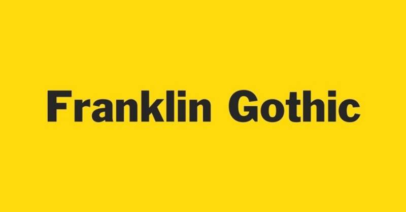
Franklin Gothic is a grotesque sans-serif typeface designed by Morris Fuller Benton for the American Type Founders company, with the original single-weight design completed around 1902 and released in 1905. It delivers bold, sturdy letterforms with open counters and moderate stroke contrast, originally created for newspaper headlines and advertising display use.
Franklin Gothic suits banners requiring authoritative, direct typography because its wide apertures and bold stroke weight maintain clear legibility at distances of 20 to 60+ feet. It has been used in Chicago’s Columbia College Chicago branding and in Star Wars film title cards.
What makes Franklin Gothic suitable for banners?
Franklin Gothic uses wider letter-spacing than condensed grotesques like Oswald or Bebas Neue, which reduces character crowding at large outdoor print sizes. Its open counters in letters like ‘C’, ‘e’, and ‘G’ prevent ink fill and maintain character differentiation on fabric and vinyl banner materials. The ITC Franklin Gothic expansion (1979, Victor Caruso) added Book, Medium, Demi, and Heavy weights, extending the family’s banner hierarchy options considerably.
Key attributes:
| Attribute | Value |
| Classification | Grotesque sans-serif |
| Designer | Morris Fuller Benton, 1902–05 (ATF) |
| Weight range | Book to Heavy (ITC version); ATF Franklin Gothic extends further |
| Variable font | Yes (ATF Franklin Gothic and Libre Franklin versions) |
| Recommended sizes | 36px+ for headlines; 16px+ for subtext |
| Letter-spacing default | Normal to slightly wide |
| License | Commercial (ITC/Monotype); Libre Franklin is OFL (free) |
| Available on | Adobe Fonts, Monotype, ATF direct; Libre Franklin on Google Fonts (free) |
| Price | Commercial license for original; Libre Franklin is free |
How does Franklin Gothic perform at large banner sizes?
Franklin Gothic Heavy and Demi weights deliver strong visual presence at large print sizes with stroke weight that holds up across most vinyl and fabric printing processes. Its wider letter proportions compared to condensed grotesques give it a more balanced, less compressed appearance, making it effective for banners where the headline spans most of the available width. The distinctive double-storey ‘a’ and ‘g’ improve character recognition at distance compared to more geometric alternatives.
What are the best pairings for Franklin Gothic in banners?
Franklin Gothic pairs with Source Sans Pro for supporting subtext when a neutral, legible sans-serif companion is needed without adding a serif. It works with Garamond for institutional or editorial banner contexts where the contrast between a classic grotesque headline and an old-style serif subtext reinforces a credible, authoritative tone.
What are the limitations of Franklin Gothic for banners?
The original ITC Franklin Gothic requires a commercial license, adding cost for banner projects. The free alternative, Libre Franklin, differs in proportions and details from the commercial original, and designers need to test them separately rather than treating them as direct substitutes.
Franklin Gothic – Recommended Use Cases Within Banner Design
- Best for: Corporate advertising banners, institutional displays, trade show signage
- Avoid for: Banners requiring a distinctly modern geometric or condensed aesthetic
- Optimal weight: Heavy or Demi for headlines; Book for supporting text
- Optimal size range: 48px–96px for digital; 1.5–4 inch letter height for print
—
Proxima Nova
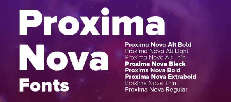
Proxima Nova is a geometric-grotesque hybrid sans-serif typeface designed by Mark Simonson, released in its current form in 2005 by Mark Simonson Studio. It combines the clean modern proportions of geometric sans-serifs like Futura with the warmth and readability of grotesque designs like Akzidenz-Grotesk, spanning 80 fonts across 8 weights and 5 widths.
Proxima Nova suits digital banners and web advertising because its broad weight range and humanist-leaning geometry produce consistent legibility across device types and screen resolutions. It has become the most widely used commercial font on the web since the mid-2010s, used by BuzzFeed, Mashable, NBC, TikTok, and Wired in various digital contexts.
What makes Proxima Nova suitable for banners?
Proxima Nova supports 8 weights from Thin 100 to Black 900, enabling full typographic hierarchy from headline to fine print within a single typeface family. Its slightly wider letter-spacing default compared to pure grotesques reduces character crowding in large-format digital banner layouts. The condensed and extra-condensed widths in the full family extend its versatility to banners with limited horizontal space.
Key attributes:
| Attribute | Value |
| Classification | Geometric-grotesque hybrid sans-serif |
| Designer | Mark Simonson, 2005 |
| Weight range | Thin 100 to Black 900 (8 weights, 5 widths, 80 fonts total) |
| Variable font | No (separate static fonts for each style) |
| Recommended sizes | 16px+ for body text; 40px+ for banner headlines |
| Letter-spacing default | Normal (slightly wider than pure grotesque designs) |
| License | Commercial (Mark Simonson Studio); available via Adobe Fonts subscription |
| Available on | Adobe Fonts, MyFonts, Mark Simonson Studio direct, Fontspring |
| Price | Subscription (Adobe Fonts) or commercial desktop license |
How does Proxima Nova perform at large banner sizes?
Proxima Nova Bold and Black produce clear, high-visibility text at large digital banner sizes with consistent stroke weight across all display resolutions. Its geometric-humanist hybrid structure makes it less distinctive than pure grotesques or geometric fonts, but more versatile across different banner contexts and industries. The full family’s 5 widths allow designers to select the right condensed or extended variant depending on available banner space.
What are the best pairings for Proxima Nova in banners?
Proxima Nova pairs with Playfair Display for banner designs requiring an editorial serif headline with a clean sans-serif supporting text layer. It works with Freight Text when warm, highly readable body copy is needed beneath a bold Proxima Nova headline, a combination that was standard in editorial web design through the mid-2010s.
What are the limitations of Proxima Nova for banners?
Proxima Nova requires a paid commercial license; there is no free version, and any free downloads found online are unauthorized copies. Its wide adoption across web design means it carries reduced distinctiveness in banner contexts where brand differentiation is a priority.
Proxima Nova – Recommended Use Cases Within Banner Design
- Best for: Digital web banners, display advertising, social media banners where brand consistency across digital platforms matters
- Avoid for: Outdoor vinyl banners where a commercial license cost is a limiting factor; contexts requiring a highly distinctive or unusual typographic personality
- Optimal weight: Bold 700 or Black 900 for headlines; Regular 400 or Medium 500 for supporting text
- Optimal size range: 40px–100px for digital banner headlines
—
Comparing the Top Banner Fonts at a Glance
| Font | Type | License | Weights | Best Banner Context |
| Bebas Neue | Condensed grotesque | Free (OFL) | 5 | Outdoor vinyl, event headlines |
| Montserrat | Geometric sans-serif | Free (OFL) | 9 | Digital, mixed-case banners |
| Impact | Condensed grotesque | Commercial | 1 | Short-word, high-urgency banners |
| Futura | Geometric sans-serif | Commercial | Multiple | Brand and corporate displays |
| Helvetica | Neo-grotesque | Commercial | 9 (Neue) | Corporate, institutional signage |
| Oswald | Condensed grotesque | Free (OFL) | 6 | Vertical banners, pull-up displays |
| Anton | Condensed display | Free (OFL) | 1 | Single-headline web banners |
| Playfair Display | Transitional serif | Free (OFL) | Variable | Luxury, indoor event banners |
| Franklin Gothic | Grotesque sans-serif | Commercial | 4+ (ITC) | Advertising, institutional displays |
| Proxima Nova | Geometric-grotesque hybrid | Commercial | 8 (x5 widths) | Digital web and display advertising |
For projects with no font budget, Bebas Neue, Montserrat, Oswald, and Anton cover condensed display, geometric, and mixed-case banner needs under free OFL licenses. For commercial projects with budget, Futura, Helvetica, and Proxima Nova add precision, brand recognition, and extended language support that free alternatives cannot fully match.
Font choices also connect to font psychology. Geometric sans-serifs like Futura and Montserrat signal modernity and confidence. Condensed grotesques like Impact and Bebas Neue communicate urgency and energy. Serif typefaces like Playfair Display suggest tradition, quality, and editorial authority. The right banner font aligns structural legibility with the message the banner is designed to communicate.
If you’re exploring how to combine these options within a single design, the font pairing generator can help test combinations before committing to a layout. And if you need fonts for signs more broadly, many of the same structural principles apply across banner and signage contexts.
Understanding font licensing matters more for banner design than for screen-only use. Large-format print, commercial advertising, and trade show displays often fall under specific licensing categories that differ from standard desktop or web use. Always verify the license type before sending files to print.
What Makes a Font Work on a Banner?
Not every font that looks good on screen holds up at 40 feet. Banner typography is a different problem entirely, one governed by physics, material, and viewing conditions rather than aesthetic preference.
The sign industry uses a simple, reliable baseline: 1 inch of letter height for every 10 feet of viewing distance (United States Sign Council). A banner readable from 60 feet needs at least 6-inch-tall letters. Font choice interacts directly with this calculation.
| Structural Factor | What It Affects | Banner Priority |
| Stroke weight | Ink density at large scale | High |
| X-height | Lowercase readability at distance | High |
| Letter-spacing default | Character crowding on vinyl | Medium |
| Stroke contrast | Hairline survival in print | Critical outdoor |
How does viewing distance affect font size requirements?
A person with 20/20 vision can read a 6-inch letter from up to 150 feet, but that same letter is only comfortably readable at 60 feet, according to research cited by The Sign Chef and based on data from the Pennsylvania Transportation Institute.
The viewing distance formula applies per font, not per banner size. A condensed font like Oswald at 3 inches covers the same horizontal space as a standard-width font at 2 inches. The trade-off is that condensed letterforms get harder to distinguish at oblique angles.
- Minimum tracking for outdoor use: add 20–50 units above default for distances over 30 feet
- Cap-height to x-height ratio matters more than total letter size for mixed-case banners
- Bold weight (700+) is the minimum recommended for any banner viewed beyond 15 feet
How does print material affect font choice?
Vinyl banners: printed at 75–150 DPI depending on viewing distance. Hairline strokes below 0.5pt at print size disappear or fill with ink bleed. Fabric banners: fabric weave adds texture that softens fine edges. Monolinear strokes (Bebas Neue, Helvetica) hold better than high-contrast serifs. Digital screens: rendered at 72–96 PPI. Anti-aliasing helps fine strokes, but small text in banner formats like 728×90 still requires minimum 16px to remain legible.
Outdoor banners set 10–35 feet from the road require roughly 75 DPI; those designed for close-up indoor viewing need 100–150 DPI (Houston Sign, 2024). At either DPI, fonts must be embedded or outlined before sending to print. Fonts not embedded are auto-substituted by the printer’s software.
—
How Do Banner Fonts Differ for Print vs. Digital Formats?
The 300×250 medium rectangle and the 728×90 leaderboard are among the most-used Google Display Network sizes. Both constrain headline text to roughly 40–80 pixels in height, which changes what “bold enough” means compared to a 3×8-foot vinyl banner.
Banners and backdrops account for 33.87% of the global printed signage market in 2024, making them the most dominant physical format by category (UPrinting, 2025). Digital banner advertising, separately, is projected to reach $174.4 billion in spending for 2024 alone (Statista). These two markets run on different technical requirements.
Which fonts hold up on vinyl and large-format print?
Vinyl printing at 75–100 DPI exposes one specific weakness: high stroke contrast. A font like Playfair Display, with hairline strokes at its thinnest, can produce barely visible thin strokes on vinyl at large letter heights.
Fonts that consistently hold up on vinyl:
- Bebas Neue: monolinear strokes, no hairlines, all-caps keeps height maximized
- Helvetica Bold: near-uniform stroke weight, horizontal terminals resist ink bleed
- Oswald Bold: condensed without hairlines, good character differentiation
- Franklin Gothic Heavy: open counters survive ink spread on fabric and vinyl
Converting text to outlines before sending files to print is a mandatory step for all print banner production. Printers that don’t have the font installed will substitute automatically, often without flagging the change (Denver Printing Company, 2024).
Which fonts perform best in web and digital banner formats?
High-constraint digital formats (728×90, 320×50): headline text typically sits between 18–40px. At these sizes, condensed fonts like Bebas Neue lose legibility fast due to tight letter-spacing defaults. Better choices for small digital banners: Montserrat Medium at 22–32px, or Oswald Regular at 24–36px. Both maintain open counters at constrained sizes.
The Google Display Network’s 300×250 medium rectangle is the most used digital banner size, according to Google’s own documentation. At this size, a headline rarely exceeds 32–48px, which means font weight matters more than condensation. Black 900 weights outperform Regular 400 at every size below 40px on colored banner backgrounds.
An 85% preference for sans-serif fonts on the web is consistent with display banner practice, where clean, low-contrast letterforms remain readable across both retina and standard-DPI screens (Toner Buzz, 2024).
—
How Do Font Weight and Letter Spacing Affect Banner Legibility?
Weight and spacing are the two variables designers control after the font is chosen. Both have measurable effects on legibility at distance, and both are commonly set wrong for large-format banner use.
Research published in the International Journal of Research and Innovation in Social Science found that optimizing inter-letter spacing can make characters up to 20% easier to read compared to default settings (Arditi, 2004, cited in Hakvoort et al., 2017). For condensed banner fonts, this matters most.
Weight thresholds and distance guidelines
Bold 700 is the practical minimum for outdoor banners viewed from 15+ feet. Below that weight, stroke thickness drops below the visual threshold for most viewers at distance, especially in bright outdoor light.
Black 900 becomes necessary for:
- Banners viewed from 30+ feet
- Reversed-out text (light on dark) where ink halation thins perceived stroke weight
- Banners competing with busy visual environments (retail districts, trade shows)
A serif headline paired with a geometric sans-serif body creates 40–60% more visual distinction than pairing fonts from the same classification (TypeSmith, 2026). On banners, this weight contrast principle is the fastest way to establish headline hierarchy without adding a third typeface.
Letter-spacing adjustments for outdoor vs. digital
Default condensed fonts (Bebas Neue, Anton, Oswald): tight spacing works at screen sizes but causes characters to visually merge at outdoor scale. Add 20–50 tracking units for banners viewed beyond 25 feet. Standard-width fonts (Montserrat, Helvetica): default spacing holds at most outdoor distances. Reduce tracking slightly (–10 to –20 units) for digital banners below 728px wide to prevent words from breaking awkwardly.
Upper-case lettering at equal cap height is readable from greater distances than mixed-case at the same measurement. All-caps condensed fonts set at 4-inch height outperform mixed-case standard-width fonts at the same measurement because cap height is consistent throughout. Mixed-case text reads more naturally for longer subheadings at shorter viewing distances.
—
What Are the Licensing Rules for Using Fonts on Commercial Banners?
Font licensing is the most commonly ignored part of banner design. The font you use on a client’s trade show display may require a different license than the one covering your own printed marketing materials.
The core distinction is between who produces the banner, who owns the design, and whether the font is embedded in a file or used in a static image. Each condition changes which license applies.
| Use Case | License Needed | Notes |
| Print banner (rasterized image) | Desktop license | No font embedding in final file |
| HTML5 digital banner ad | Digital Ads license | Font is served/embedded in code |
| Client-produced banner (agency) | Desktop license per seat | Agency responsible for compliance |
| OFL font (any banner type) | None required | Fully free, commercial and personal |
OFL fonts and what commercial banner use allows
All fonts in the Google Fonts library are released under the SIL Open Font License or Apache License, both of which explicitly permit commercial use in any format, including print banners, digital ads, and client-facing projects (Google Fonts, 2025).
The OFL’s only meaningful restriction for banner designers: you cannot sell the font files themselves as a standalone product. Using them on a banner, in a logo, on vinyl, in an HTML5 ad, or in a client deliverable carries no fees, no attribution requirements, and no limits on commercial revenue generated from the work.
- Bebas Neue, Montserrat, Oswald, Anton, Playfair Display: all OFL
- Libre Franklin: OFL, free substitute for commercial Franklin Gothic
- EB Garamond: OFL, usable on indoor banners without license cost
Commercial font license categories for banner work
Desktop license: covers the designer’s own computer. Allows creating static image banners for clients. Does not cover distributing font files to the client or printer. Digital Ads license: required when fonts are embedded in HTML5 banner ads that run across advertising networks. TypeType prices this by total ad impressions, not by time period. Proxima Nova and Helvetica: both require paid commercial licenses for print and digital banner use. Proxima Nova is available via Adobe Fonts subscription; standalone licenses are purchased directly from Mark Simonson Studio. Helvetica commercial licenses are managed through Monotype.
A common and expensive mistake in agency banner work: assuming that an Adobe Fonts subscription covers the client’s ongoing use. Commercial usage rights under Adobe Fonts end when the subscription lapses. Any projects using embedded Adobe Fonts fonts need to be re-evaluated if the subscription is cancelled (Fontfabric, 2024).
—
Which Free Banner Fonts Are Worth Using?
The font and typeface market was valued at $965.4 million globally (Toner Buzz, 2024). Most of that value sits behind paid licenses. For banner design at scale, the OFL alternatives cover the majority of display use cases without sacrificing meaningful quality.
The gap between free and paid banner fonts is narrower than most designers assume, particularly for headline use where font personality matters more than extended character sets or optical sizing.
The four OFL fonts ranked for banner versatility
Ranked by total versatility for banner work, combining weight range, lowercase support, and variable font availability:
- Montserrat: 9 weights, variable font, lowercase, all banner contexts
- Oswald: 6 weights, variable axis (2019), lowercase, strong condensed hierarchy
- Bebas Neue: 5 weights, uppercase only, best raw impact at large scale
- Anton: 1 weight, uppercase-heavy, single-headline use only
For projects running through Canva, Figma, Adobe Express, or Google Slides, all four are accessible without desktop installation. Google Fonts serves them directly via CDN, which also means no file embedding issues for HTML5 digital banners.
Free alternatives to commercial banner fonts
Libre Franklin (OFL): open-source version of Franklin Gothic. Nine weights with italics. Differences in proportion from the commercial ITC version are noticeable at very large print sizes but acceptable for most banner contexts. EB Garamond (OFL): usable for indoor event banners where an old-style serif headline is needed. Hairlines are better-suited to high-resolution indoor print than outdoor vinyl. Space Grotesk (OFL): a geometric grotesque with personality. Works as a Proxima Nova substitute for digital banners where budget excludes the commercial option.
Font Squirrel and Google Fonts are the two most reliable free sources for commercial-use banner fonts. Both display license information clearly. Avoid downloading fonts from sites that do not display a license agreement, because the assumption that “free to download” means “free to use commercially” is consistently wrong and has led to designer liability in documented cases (FontReport, 2025). See our guide on best free Google Fonts for a curated starting point.
—
How to Pair Fonts on a Banner Without Losing Legibility?
Most banner font pairing failures come from one source: treating banners like editorial layouts. A banner has between 3 and 8 seconds of viewer attention. Typographic hierarchy has to work at a glance, not on sustained reading.
Professional brand identity systems typically specify one to three typefaces maximum, with clear rules for each (The Digital Bunch, 2025). For banners, two is almost always the limit. Three competes for attention in a format that cannot afford it.
The two-font rule and weight separation
One display font for the headline. One neutral, readable font for subtext. That is the complete pairing strategy for banner design.
Weight separation between headline and subtext must be at least two steps on the standard weight scale:
| Headline Weight | Subtext Weight | Works? |
| Black 900 | Regular 400 | Yes, clear hierarchy |
| Bold 700 | Light 300 | Yes, strong contrast |
| Bold 700 | Medium 500 | Borderline, test at banner scale |
| Bold 700 | Bold 700 | No, competing weights |
Pairing condensed grotesques with supporting text
Condensed display fonts (Bebas Neue, Anton, Oswald) should pair with standard-width, medium-weight sans-serifs for subtext. Pairing two condensed fonts creates a visual jam where neither has room to dominate.
Oswald Bold with Montserrat Regular is a proven combination: both are geometric grotesques with compatible proportions, but the weight gap and width difference create clear hierarchy without stylistic clash. The same logic applies to Bebas Neue paired with Open Sans Regular.
Serif headlines with sans-serif subtext
A serif headline paired with a geometric sans-serif body creates 40–60% more visual distinction than same-classification pairings (TypeSmith, 2026). For indoor event banners and luxury retail displays, Playfair Display Black with Montserrat Regular applies this principle effectively.
Size ratio: headline text should be at minimum 3x the size of subtext on standard banner formats. Subtext below 18px (digital) or below 0.5-inch letter height (print) should be avoided regardless of font. At those sizes, no font remains reliably legible under variable lighting and viewing conditions.
The font pairing generator can help test headline and subtext combinations in real-time before committing to a print layout. For foundational theory on why certain pairs work, the guide on pairing fonts covers structural compatibility in full detail. Font spacing decisions, including tracking and kerning, are the final layer to dial in once the pairing is confirmed.
FAQ on The Best Fonts For Banners
What is the best font for a banner?
Bebas Neue, Montserrat, and Helvetica consistently rank as top choices. The best option depends on your context: condensed grotesques work for outdoor vinyl, while geometric sans-serifs suit digital web banners. Stroke weight and x-height matter most.
What font is easiest to read on a banner?
Sans-serif fonts with bold weight and open counters are the most readable at distance. Helvetica Bold, Oswald, and Franklin Gothic are proven choices. Avoid thin weights, script fonts, and decorative typefaces entirely for any banner viewed beyond 10 feet.
Should I use a serif or sans-serif font on a banner?
Sans-serif fonts outperform serif fonts for outdoor and large-format banners because monolinear strokes survive printing without hairline loss. Serifs like Playfair Display work for indoor event banners at high resolution, but poorly on vinyl at distance.
What font size should I use on a banner?
Use the 1-inch-per-10-feet rule: a banner readable from 30 feet needs 3-inch letters minimum. In digital terms, headlines in banner ads should sit at 40px or above. Never place subtext below 18px on screen or 0.5-inch letter height in print.
Is Bebas Neue good for banners?
Yes. Bebas Neue is one of the most effective display fonts for banners. Its condensed proportions, monolinear strokes, and high ink density make it ideal for vinyl outdoor signage and bold headline banners. It is free under the OFL license.
Can I use Google Fonts on commercial banners?
Yes. All Google Fonts are released under the SIL Open Font License, which permits free use on commercial banners, print signage, and digital ads without fees or attribution. Montserrat, Oswald, and Anton are all fully cleared for commercial banner use.
What fonts work best for outdoor vinyl banners?
Fonts with heavy stroke weight and no hairlines perform best on vinyl. Bebas Neue, Oswald Bold, and Helvetica Heavy hold edge definition at 75–100 DPI. High-stroke-contrast serifs like Playfair Display are not recommended for outdoor vinyl printing.
How many fonts should I use on a banner?
Two fonts maximum. One display typeface for the headline and one neutral sans-serif for subtext. More than two typefaces competes for attention in a format where viewers have under 8 seconds. Weight separation of at least two steps between headline and subtext is required.
What is the best free font for banner design?
Montserrat is the strongest free option overall. It covers 9 weights, supports lowercase and uppercase, includes a variable font axis, and works across outdoor print, digital ads, and event signage. Oswald and Bebas Neue are close alternatives depending on the layout.
Does font licensing matter for banner printing?
Yes. Static rasterized banners require only a desktop license. HTML5 digital banner ads need a separate digital ads license when fonts are embedded in code. OFL fonts like Montserrat and Oswald bypass this entirely, making them the lowest-risk choice for agency banner production.
Conclusion
This conclusion is for an article presenting the best fonts for banners, and the core takeaway is straightforward: legibility at distance overrides every other design preference.
Condensed grotesques like Oswald and Bebas Neue dominate outdoor vinyl signage. Geometric sans-serifs like Montserrat handle digital banner ads and mixed-case headline text with equal reliability.
For most projects, four OFL typefaces cover the full range of banner typography needs without any licensing cost. When budget allows, Proxima Nova and Futura add precision and extended weight ranges that free alternatives approximate but don’t fully match.
Get the stroke weight, viewing distance, and font pairing right, and the rest of the banner design follows. Start there, and the font choices become obvious.
Renowned for his expertise in logo design and visual branding, Bogdan has developed a multitude of logos for various clients.
His skills extend to creating posters, vector illustrations, business cards, and brochures. Additionally, Bogdan's UI kits were featured on marketplaces like Visual Hierarchy and UI8.
He also wrote in the past years on sites like Design Your Way, WebDesignerDepot, WPDean, Designmodo, Speckyboy, Slider Revolution, and more.
- The Airtable Logo History, Colors, Font, And Meaning - 12 July 2026
- How to Blur Background in Canva: A Quick Tutorial - 11 July 2026
- Typography Trends - 10 July 2026
Bogdan Sandu is a seasoned designer who has been designing websites since 2008. Renowned for his expertise in logo design and visual branding, Bogdan has developed a multitude of logos for various clients. His skills extend to creating posters, vector illustrations, business cards, and brochures. Additionally, Bogdan's UI kits were featured on marketplaces like Visual Hierarchy and UI8. He also wrote in the past years on sites like Design Your Way, WebDesignerDepot, WPDean, Designmodo, Speckyboy, Slider Revolution, and more.
You Might Also Like