The wrong font doesn’t just look bad. It makes reading physically harder.
With over 1 billion ebook readers globally and 30% reading on smartphones, the digital reading experience spans e-ink panels, LCD tablets, and OLED screens. Each renders type differently. What works on a Kindle Paperwhite may strain the eyes on an Android phone.
Choosing the best fonts for ebooks isn’t a design preference. It’s a decision that affects legibility, eye strain, and whether readers finish your book.
This guide covers the top 10 options across serif and sans-serif typefaces, including Georgia, Bookerly, Merriweather, and Literata. You’ll learn which fonts suit long-form reading, which are free to embed commercially, and how platform differences between Amazon Kindle, Apple Books, and Google Play Books should shape your choice.
The Best Fonts For Ebooks
Font choice in ebooks is a practical decision, not a stylistic one. The wrong typeface causes eye strain, breaks reading flow, and sends readers away. The right one disappears completely, letting the content do the work.
Below are the 10 best fonts for ebooks, covering both serif and sans-serif options, with full structural details for each.
—
Georgia
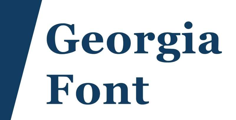
Georgia is a transitional serif typeface designed by Matthew Carter in 1993, released by Microsoft in 1996 as part of the Core Fonts for the Web collection. It delivers high screen legibility at small sizes across low- and high-resolution displays.
Georgia suits long-form ebook body text because its x-height is measurably larger than Times New Roman, keeping letterforms distinct at 11px–14px on older e-ink panels. The New York Times switched from Times New Roman to Georgia for its online articles in 2007, confirming its real-world performance at scale.
—
What makes Georgia suitable for ebooks?
Georgia has a large x-height and thickened serifs compared to traditional print typefaces, which keeps letterforms intact on e-ink displays running at 167–300 ppi. Its open counters in letters like “a”, “e”, and “c” reduce misread characters at smaller sizes. Generous default letter-spacing prevents crowding when line lengths vary across different screen widths.
Key attributes:
| Attribute | Value |
| Classification | Transitional serif (Scotch Roman) |
| Designer | Matthew Carter, 1993 |
| Weight range | Regular, Bold (Georgia Pro adds Light, SemiBold, Condensed) |
| Variable font | No (Georgia Pro is not variable) |
| Recommended sizes | 11px–14px body; 18px–24px headings |
| Letter-spacing default | Generous (wider than Times New Roman) |
| License | Proprietary Microsoft; free for personal use; commercial embedding requires Microsoft license |
| Available on | Pre-installed on Windows and macOS; Adobe Fonts |
| Price | Free (bundled); Georgia Pro available via Microsoft Store |
—
How does Georgia perform for ebook body text?
Georgia was built pixel-first, meaning Carter drew screen bitmaps before the outlines, producing a typeface with unusually sharp rendering on both low-DPI and retina displays. At 12pt in EPUB format, it renders cleanly across Kindle, Kobo, and Apple Books without hinting failures. Its moderate stroke contrast keeps text legible in both light and dark reading modes.
—
What are the best pairings for Georgia in ebooks?
Georgia pairs with Verdana for body-to-heading contrast, as both typefaces were designed together by Matthew Carter for the same screen environment. It also works with Open Sans when a more modern, neutral heading tone is needed. The Georgia + Verdana combination is the more conventional pairing; Georgia + Open Sans skews contemporary.
See more Georgia font pairing options.
—
What are the limitations of Georgia for ebooks?
Georgia ships with only 2 base weights (Regular and Bold), which limits typographic hierarchy without upgrading to Georgia Pro. Embedding the commercial version for EPUB distribution requires a paid Microsoft license, which surprises many self-publishers who assume the bundled version covers all use cases.
—
Georgia – Recommended Use Cases Within Ebook Typography
- Best for: Long-form fiction and non-fiction body text across Kindle, Kobo, and Apple Books
- Avoid for: Technical ebooks with code blocks or dense tables where a monospaced or sans-serif font performs better
- Optimal weight: Regular 400 for body; Bold 700 for chapter headings
- Optimal size range: 12pt–14pt for body text; 18pt–24pt for chapter titles
—
Bookerly
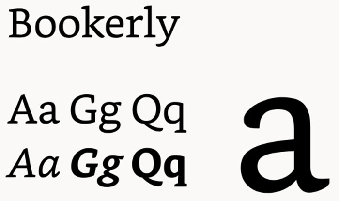
Bookerly is a serif typeface designed by Dalton Maag for Amazon, released in 2015 as the default font for the Kindle Paperwhite (3rd generation). It replaced Caecilia and is built specifically for e-ink screen reading and backlit LCD ebook apps.
Bookerly optimizes Kindle ebook reading because Amazon’s internal testing showed it reduced eye strain by approximately 2% compared to Caecilia, with improved reading speed linked to its tailored kerning pairs and custom ligatures. It remains the default font across all current Kindle devices and Kindle apps on iOS, Android, and desktop.
—
What makes Bookerly suitable for ebooks?
Bookerly includes custom kerning pairs and ligatures specifically calibrated for Kindle’s typesetting engine, which adjusts letter and word spacing dynamically based on screen size and font size selection. Its letter shapes use open counters and moderate stroke contrast, maintaining legibility across the full Kindle brightness range from 0% to 100%. The Display variant is optically adjusted for larger sizes, functioning effectively as a built-in optical sizing system.
Key attributes:
| Attribute | Value |
| Classification | Serif (purpose-built for e-ink screens) |
| Designer | Dalton Maag, 2014–2015 |
| Weight range | Light, Regular, Bold (each with Italic); Display variants in Regular and Bold |
| Variable font | No |
| Optical sizes | Yes: Text and Display |
| Recommended sizes | Kindle default range: 8–14 (device units); approximately 12pt–16pt |
| License | Proprietary Amazon; available via Amazon Developer portal |
| Available on | Kindle devices and apps; Amazon Developer site |
| Price | Free via Amazon Developer portal |
—
How does Bookerly perform for ebook readability?
Bookerly’s stroke weights are tuned for e-ink contrast ratios, which differ from LCD and OLED screens. On Kindle e-ink displays running at 300 ppi, it renders without hinting artifacts at sizes from 8 to 14 device units. Amazon’s Bookerly-specific typesetting engine handles drop caps, hyphenation, and image positioning in coordination with the font metrics, producing more consistent page layouts than third-party fonts embedded in EPUB files.
—
What are the best pairings for Bookerly in ebooks?
Bookerly pairs with Amazon Ember (Amazon’s proprietary sans-serif) for heading contrast in Kindle-native content. For broader EPUB compatibility, it pairs with Georgia when a fallback serif is needed, since both share a similar x-height and weight profile.
—
What are the limitations of Bookerly for ebooks?
Bookerly is proprietary to Amazon and only renders through Kindle’s typesetting engine. Embedding it in standard EPUB files for distribution through non-Amazon platforms is not supported, making it unsuitable as an embedded font for multi-platform ebook publishing.
—
Bookerly – Recommended Use Cases Within Ebook Typography
- Best for: Kindle-published fiction and long-form non-fiction where the default reading experience is the primary concern
- Avoid for: EPUB files distributed through Apple Books, Kobo, or other non-Amazon platforms
- Optimal weight: Regular for body text; Bold for chapter headings
- Optimal size range: Kindle device font sizes 3–5 (standard default range for most readers)
—
Palatino
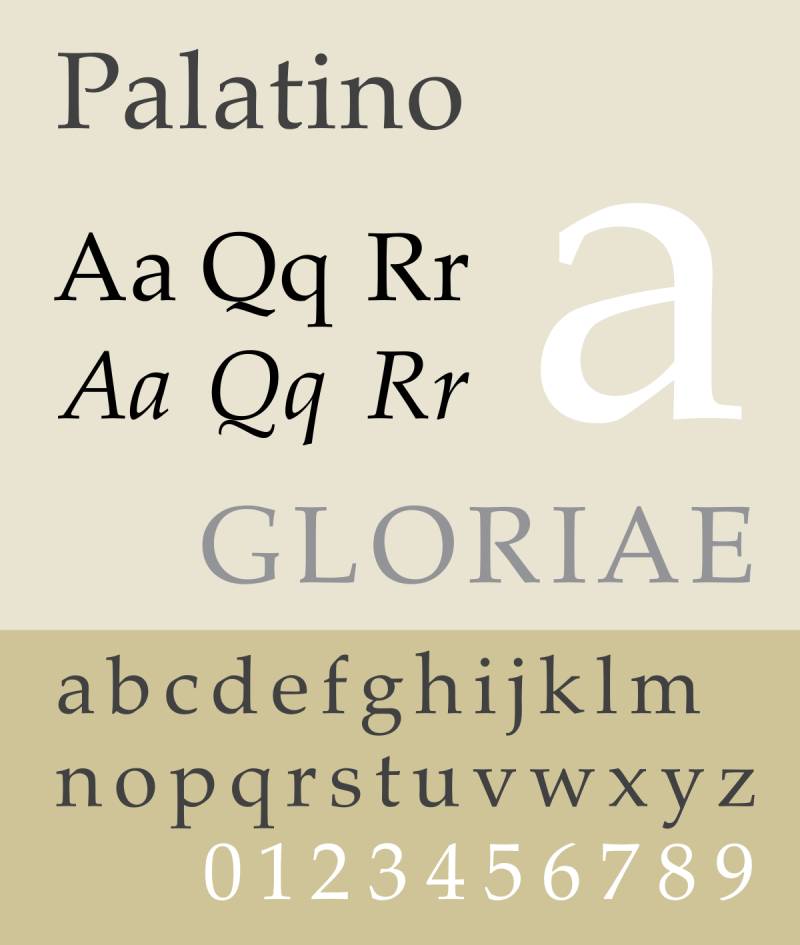
Palatino is an old-style serif typeface designed by Hermann Zapf in 1949, originally released by D. Stempel AG in Frankfurt. It delivers strong legibility through open counters and calligraphic stroke variation, maintaining clarity even on coarse printing surfaces and early digital screens.
Palatino suits ebook body text and chapter headings because its large x-height and wide, open counters keep letterforms readable at 11pt–13pt. Amazon recommends Palatino Linotype for Kindle print replica formatting, reflecting its established track record in digital publishing workflows.
—
What makes Palatino suitable for ebooks?
Palatino’s design uses carefully weighted strokes with open counters, originally optimized for legibility on the inferior paper stock available in post-WWII Germany. That same structural logic translates well to digital screens: stroke weights that survive degraded print also maintain contrast on low-resolution e-ink displays. Palatino Linotype, the version bundled with Windows, was notably the first western OpenType font Microsoft shipped.
Key attributes:
| Attribute | Value |
| Classification | Old-style serif (Humanist) |
| Designer | Hermann Zapf, 1949 |
| Weight range | Regular, Italic, Bold, Bold Italic (Palatino Nova adds 10 styles) |
| Variable font | No |
| Recommended sizes | 11pt–13pt body; 16pt–22pt headings |
| Letter-spacing default | Moderate; wider than Times New Roman |
| License | Commercial (Linotype/Monotype); Electronic Doc license required for EPUB embedding |
| Available on | Pre-installed on Windows (Palatino Linotype) and macOS; Adobe Fonts; Linotype direct |
| Price | Free (bundled system version); Palatino Nova from ~$35/style via Linotype |
—
How does Palatino perform for ebook readability?
Palatino’s stroke contrast is moderate, avoiding the hairline thins that cause rendering problems on e-ink screens at smaller sizes. On modern Kindle and Kobo devices (300 ppi), it renders cleanly at 12pt without hinting issues. The calligraphic quality of the letterforms, particularly in the italic, provides visual rhythm in long-form prose without distracting the reader.
—
What are the best pairings for Palatino in ebooks?
Palatino pairs with Helvetica for heading contrast, a conventional combination used across print publishing that carries into ebook design. It also works with Open Sans when a more neutral, screen-optimized sans-serif is preferred for chapter titles and subheadings.
—
What are the limitations of Palatino for ebooks?
Embedding Palatino or Palatino Linotype in an EPUB file for commercial distribution requires a separate Electronic Doc license from Linotype/Monotype, which adds cost per publication. The bundled system version does not include an EPUB embedding license, a common point of confusion for self-publishers.
—
Palatino – Recommended Use Cases Within Ebook Typography
- Best for: Literary fiction, academic ebooks, and non-fiction where a refined typographic tone is needed
- Avoid for: Budget ebook publishing workflows where a paid EPUB embedding license is not viable
- Optimal weight: Regular for body; Bold for headings
- Optimal size range: 12pt–13pt body; 18pt–22pt chapter titles
—
Merriweather
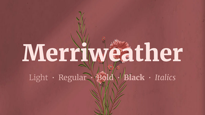
Merriweather is a screen-optimized serif typeface designed by Eben Sorkin (Sorkin Type), released in 2010 and available through Google Fonts under the SIL Open Font License. It produces comfortable long-form reading on both screen and print formats without embedding cost restrictions.
Merriweather works best for ebook body text because its very large x-height and slightly condensed letterforms maintain legibility at small sizes while fitting more text per line than wider serifs. It ranks #23 in Google Fonts popularity, reflecting active real-world use across digital reading contexts.
—
What makes Merriweather suitable for ebooks?
Merriweather has a tall x-height with wide counters, producing clear letterform distinction at 11px–14px on screen. It supports 7 weights from Light 300 to Black 900, with matching italics across all weights, enabling full typographic hierarchy within a single EPUB font stack. The variable font version (available via Google Fonts) covers weight, optical size, width, and italic axes in one file.
Key attributes:
| Attribute | Value |
| Classification | Serif (screen-optimized) |
| Designer | Eben Sorkin, Sorkin Type, 2010 |
| Weight range | Light 300 to Black 900 (7 weights with matching italics) |
| Variable font | Yes (weight, optical size, width, italic axes) |
| Optical sizes | Yes (opsz axis: 18–144) |
| Recommended sizes | 12px–16px body; 24px–36px headings |
| Letter-spacing default | 0 (standard) |
| License | SIL Open Font License (free for commercial use and EPUB embedding) |
| Available on | Google Fonts; Adobe Fonts; Font Squirrel |
| Price | Free |
—
How does Merriweather perform for ebook readability?
Merriweather renders clearly at sizes as small as 11px on standard LCD tablet screens, with its mild diagonal stress producing smooth reading flow in left-to-right Latin text. Its condensed width relative to Georgia allows slightly more characters per line, which reduces page count in reflowable EPUB files. The variable font format means a single embedded file covers all weight and size needs, keeping EPUB file sizes smaller than multi-file static font stacks.
—
What are the best pairings for Merriweather in ebooks?
Merriweather pairs with Open Sans for heading contrast, a widely used combination across editorial web and digital publishing contexts. It also pairs with Roboto for a more technical or non-fiction tone, particularly in ebooks that mix body narrative with data-heavy sections. See more ideas via the Merriweather font pairing guide.
—
What are the limitations of Merriweather for ebooks?
Merriweather’s condensed proportions and heavy default weight (Regular 400 reads slightly darker than Georgia Regular) can feel dense in ebooks with short line lengths, such as those formatted for 5-inch e-readers. Reducing to Light 300 at smaller sizes is recommended in those cases.
—
Merriweather – Recommended Use Cases Within Ebook Typography
- Best for: EPUB body text for fiction, non-fiction, and academic ebooks where free commercial embedding is required
- Avoid for: Very narrow ebook layouts (below 480px rendered width) at Regular 400 weight
- Optimal weight: Light 300 for dense layouts; Regular 400 for standard body text
- Optimal size range: 12px–16px body; 24px–32px chapter headings
—
Literata
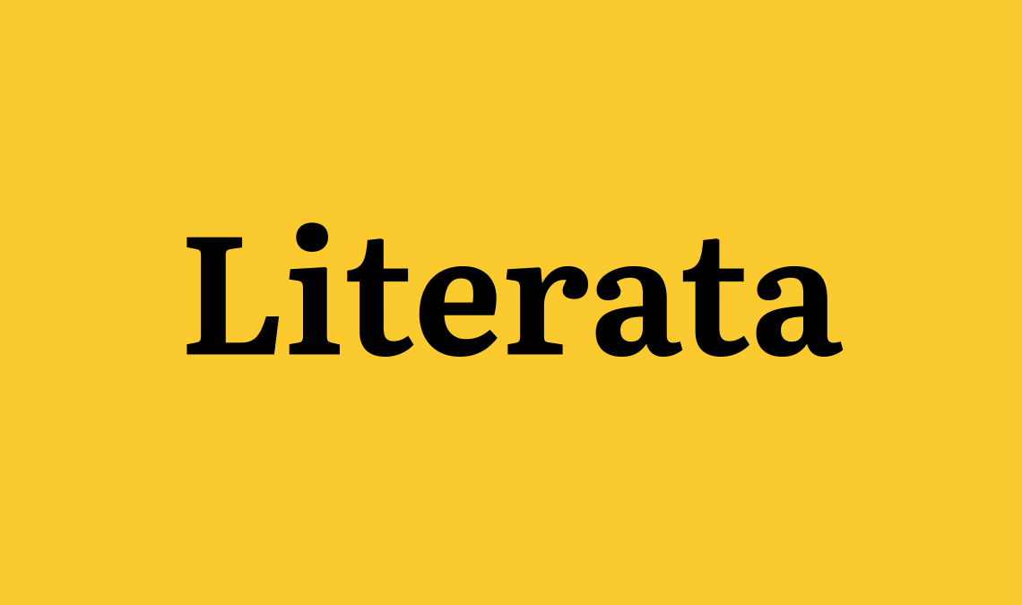
Literata is a serif typeface designed by TypeTogether (led by Veronika Burian and José Scaglione) in 2014–2015, commissioned by Google as the default font for Google Play Books. Version 3 was fully redrawn and open-sourced under the SIL Open Font License in December 2018.
Literata suits multi-platform ebook publishing because it was designed specifically for the full range of screen sizes, pixel densities, and rendering technologies used by digital reading apps. Google Play Books adopted it to replace Droid Serif as the platform’s default typeface.
—
What makes Literata suitable for ebooks?
Literata includes 4 optical sizes (Caption, Text, Subhead, Display) in Version 3, covering 7pt caption text through large display headings in a single variable font file. Its x-height is higher than Droid Serif, and its ascenders are proportionally taller, producing better differentiation between capital and lowercase letter shapes at small sizes. The upright (non-slanted) italic is a deliberate design choice intended to create visual distinction while remaining readable during extended sessions.
Key attributes:
| Attribute | Value |
| Classification | Serif (screen-optimized, Scotch Roman influence) |
| Designer | Veronika Burian & José Scaglione (TypeTogether), 2014 |
| Weight range | ExtraLight 200 to Black 900 (9 weights with italics in variable format) |
| Variable font | Yes (weight axis) |
| Optical sizes | Yes: Caption (7pt), Text (12pt), Subhead (36pt), Display (72pt) |
| Recommended sizes | 12pt–16pt body; 24pt–36pt headings |
| License | SIL Open Font License (free for commercial use and EPUB embedding) |
| Available on | Google Fonts; GitHub (open source) |
| Price | Free |
—
How does Literata perform for ebook readability?
Literata supports Latin, Greek, Cyrillic, PinYin, and Vietnamese, covering more than 1,100 characters per weight in the Version 3 release. On Google Play Books (the platform it was built for), it renders with optical size adjustment applied automatically based on the selected font size. Its moderate stroke contrast avoids the rendering problems that affect high-contrast serifs on lower-resolution screens.
—
What are the best pairings for Literata in ebooks?
Literata pairs with Noto Sans for heading contrast, particularly in multilingual ebooks where consistent script support is needed. For standard Latin-script ebooks, it also pairs with Open Sans for a clean, neutral heading treatment that contrasts with the distinctive upright italic of the body text.
—
What are the limitations of Literata for ebooks?
Literata’s upright italic (non-slanted) may not render as expected in older EPUB readers that apply automatic slant to any italic style via CSS, potentially overriding the design intent. Testing in Kindle and Kobo apps before publishing is recommended when italic differentiation is critical to the ebook’s formatting.
—
Literata – Recommended Use Cases Within Ebook Typography
- Best for: Google Play Books-distributed ebooks; multilingual ebooks requiring broad script support
- Avoid for: Ebook formats relying on conventional slanted italics for differentiation (e.g., legal or academic ebooks with heavy annotation use)
- Optimal weight: Regular 400 for body; SemiBold 600 for headings
- Optimal size range: 12pt–15pt body; 22pt–32pt chapter titles
—
Verdana

Verdana is a humanist sans-serif typeface designed by Matthew Carter for Microsoft in 1996, released as part of the Core Fonts for the Web collection. It produces strong character differentiation at small sizes through unusually wide letter-spacing and large character proportions.
Verdana suits ebook formats where character disambiguation is a priority, such as children’s ebooks or accessibility-focused publications, because its design explicitly distinguishes commonly confused characters (lowercase “i”, “l”, uppercase “I”, and numeral “1”). Microsoft’s font manager acknowledged its spacing feels wide for traditional long-form reading, but that spacing is precisely what makes it effective at small sizes on varied screens.
—
What makes Verdana suitable for ebooks?
Verdana has a very large x-height and deliberately wide counters, designed so that strokes never clash on low-resolution displays running at 72–96 ppi. Its Bold weight is visually heavier than most sans-serif bolds at the same point size, maintaining weight contrast even at 8 ppem. Carter designed each size as a pixel-precise bitmap first, then created the outlines, which means the font was built from screen constraints outward rather than adapted from print.
Key attributes:
| Attribute | Value |
| Classification | Humanist sans-serif |
| Designer | Matthew Carter, 1996 |
| Weight range | Regular, Bold (Verdana Pro adds Light, SemiBold, Black, and Condensed variants) |
| Variable font | No |
| Recommended sizes | 11px–14px body; 18px–24px headings |
| Letter-spacing default | Wide (wider than most sans-serif typefaces) |
| License | Proprietary Microsoft; Electronic Doc license required for commercial EPUB embedding |
| Available on | Pre-installed on Windows and macOS; Adobe Fonts |
| Price | Free (bundled); Verdana Pro available via Microsoft Store |
—
How does Verdana perform for ebook readability?
Verdana’s wide letter-spacing produces more words-per-line than narrower sans-serifs, which can increase page count in reflowable EPUBs. It remains highly consistent across different e-reader rendering engines because of its pre-installed status on most operating systems, reducing fallback font substitution issues. Its large characters hold detail well on screens as small as 5 inches.
—
What are the best pairings for Verdana in ebooks?
Verdana pairs with Georgia for body-to-heading contrast, a pairing documented as a deliberate companion relationship since both typefaces were designed simultaneously by Carter for Microsoft. It also pairs with Tahoma for a contained, system-native sans-serif heading, as Microsoft themselves recommend this combination for on-screen documents.
—
What are the limitations of Verdana for ebooks?
Verdana’s wide character spacing increases page count significantly in reflowable formats, which affects reading rhythm in long-form prose. It ships in only 2 base weights, limiting hierarchy options without Verdana Pro, which requires a separate purchase.
—
Verdana – Recommended Use Cases Within Ebook Typography
- Best for: Children’s ebooks, accessibility-focused ebooks, and technical ebooks where character disambiguation is critical
- Avoid for: Literary fiction ebooks requiring high word density per screen
- Optimal weight: Regular for body text; Bold for headings
- Optimal size range: 12px–14px body; 20px–26px headings
—
Garamond

Garamond is an old-style serif typeface with origins in 16th-century French type design by Claude Garamond, revived in digital form across multiple releases including EB Garamond (Georg Duffner, 2010, OFL) and Adobe Garamond (Robert Slimbach, 1989). It provides a refined, classical letterform with soft bracketed serifs suited to long-form ebook prose.
Garamond works best for literary fiction and humanities non-fiction ebooks because its balanced letterforms and calligraphic serif structure reduce reading fatigue in extended sessions. It is described as one of the ten most-used serif typefaces, reflecting its proven acceptance in book publishing across both print and digital formats.
—
What makes Garamond suitable for ebooks?
Garamond’s x-height is moderate, sitting between the larger Georgia and the compact Times New Roman, producing a classical proportion that reads naturally in paragraph-length text. EB Garamond’s open-source version supports optical sizes via its variable font format, enabling automatic size adjustment across heading and body text within a single EPUB font file. Its thin strokes can drop off on older e-ink displays at sizes below 11pt, which is the primary rendering constraint to manage.
Key attributes:
| Attribute | Value |
| Classification | Old-style serif (Humanist) |
| Designer | Claude Garamond (16th c.); EB Garamond by Georg Duffner, 2010; Adobe Garamond by Robert Slimbach, 1989 |
| Weight range | EB Garamond: Regular to ExtraBold (variable); Adobe Garamond: Regular, Italic, Bold, Bold Italic, Semibold |
| Variable font | Yes (EB Garamond) |
| Recommended sizes | 12pt–15pt body; 20pt–28pt headings |
| License | EB Garamond: OFL (free); Adobe Garamond: Commercial (Adobe Fonts subscription) |
| Available on | EB Garamond on Google Fonts; Adobe Garamond on Adobe Fonts |
| Price | EB Garamond: Free; Adobe Garamond: Adobe Fonts subscription |
—
How does Garamond perform for ebook readability?
EB Garamond renders cleanly at 12pt and above on modern e-ink displays (167–300 ppi) but shows stroke thinning at 10pt or below on older 167-ppi panels. Its calligraphic italic is one of the most refined available in an OFL font, making it a strong choice for ebooks with significant use of italicized text (quotations, titles, emphasis). On high-resolution screens (300 ppi Kindle Paperwhite, iPad Retina), its thin strokes reproduce accurately and the classical proportions are fully realized.
—
What are the best pairings for Garamond in ebooks?
Garamond pairs with Helvetica for a classical-body / modern-heading contrast, a documented pairing in editorial typography. For a fully serif ebook using Garamond body text, pairing it with a bolder Garamond variant (ExtraBold) for headings is common in print-to-digital conversions. See the Garamond font pairing guide for more options.
—
What are the limitations of Garamond for ebooks?
Garamond’s thin strokes cause legibility problems at sizes below 11pt on older 167-ppi e-ink displays, making minimum size enforcement in EPUB CSS necessary. EB Garamond lacks a true Bold weight comparable to commercial versions, which limits contrast between body and heading text at smaller size differentials.
—
Garamond – Recommended Use Cases Within Ebook Typography
- Best for: Literary fiction, humanities, and history ebooks on modern high-resolution devices
- Avoid for: Ebooks targeting older Kindle models (pre-2016, 167 ppi) at body sizes below 12pt
- Optimal weight: Regular for body; SemiBold or ExtraBold for headings
- Optimal size range: 12pt–15pt body; 22pt–28pt chapter titles
—
Baskerville

Baskerville is a transitional serif typeface originally designed by John Baskerville in 1757 in Birmingham, England. Digital revivals include Libre Baskerville (Pablo Impallari, 2012, OFL) and Mrs Eaves (Zuzana Licko, 1996). It uses higher stroke contrast than old-style serifs, producing sharper visual differentiation between thick and thin strokes.
Baskerville suits non-fiction and academic ebooks because its transitional structure communicates authority and formality without the visual density of Times New Roman. Major publishers including Oxford University Press have used Baskerville variants for digital-print hybrid publishing.
—
What makes Baskerville suitable for ebooks?
Baskerville’s stroke contrast is higher than Garamond or Palatino, with clearly differentiated thick verticals and thin horizontals. Libre Baskerville (the free OFL version) has an increased x-height compared to the original metal type, improving readability at 12pt on screen without losing the typeface’s characteristic formal tone. It supports Regular, Italic, and Bold styles in the free version, covering the minimum weight range needed for ebook heading hierarchy.
Key attributes:
| Attribute | Value |
| Classification | Transitional serif |
| Designer | John Baskerville, 1757; Libre Baskerville by Pablo Impallari, 2012 |
| Weight range | Libre Baskerville: Regular, Italic, Bold; commercial versions up to 6 weights |
| Variable font | No (Libre Baskerville); some commercial versions offer variable |
| Recommended sizes | 12pt–14pt body; 20pt–28pt headings |
| Letter-spacing default | Standard |
| License | Libre Baskerville: OFL; commercial versions: paid license |
| Available on | Libre Baskerville on Google Fonts; commercial via Adobe Fonts, MyFonts |
| Price | Libre Baskerville: Free; commercial from ~$30/style |
—
How does Baskerville perform for ebook readability?
Baskerville’s high stroke contrast can cause thin stroke drop-off at sizes below 11pt on low-resolution displays, but on 300-ppi screens it renders with clear, defined letterforms. Libre Baskerville’s adjusted x-height reduces the thin-stroke risk that affects the original proportions at small sizes. At 12pt–14pt on modern Kindle, Kobo, and iPad rendering, it produces a clean, authoritative reading experience suited to long-form non-fiction.
—
What are the best pairings for Baskerville in ebooks?
Baskerville pairs with Open Sans for a formal-body / clean-heading contrast, a common combination in digital academic publishing. It also pairs with Lato, where Lato’s semi-rounded details provide warmth against Baskerville’s formal structure. More combinations available in the Baskerville font pairing guide.
—
What are the limitations of Baskerville for ebooks?
Libre Baskerville includes only 3 styles (Regular, Italic, Bold), which limits heading hierarchy to a single level of weight contrast. The high stroke contrast is a rendering risk on pre-2016 Kindle devices at sizes below 12pt, requiring minimum-size enforcement in EPUB CSS.
—
Baskerville – Recommended Use Cases Within Ebook Typography
- Best for: Academic, non-fiction, and professional ebooks on modern high-resolution devices
- Avoid for: Body text below 12pt on older, lower-resolution e-ink screens
- Optimal weight: Regular for body; Bold for primary headings
- Optimal size range: 12pt–14pt body; 22pt–28pt chapter titles
—
Source Serif Pro
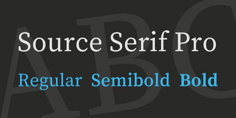
Source Serif Pro (now called Source Serif 4) is a serif typeface designed by Frank Grießhammer at Adobe, first released in 2014 and updated to version 4 in 2021 under the SIL Open Font License. It serves as Adobe’s open-source serif companion to Source Sans Pro.
Source Serif Pro suits ebook publishing because it provides a full 12-weight variable font family with optical sizes under a completely free commercial license. Its design targets mixed reading environments, handling both long-form prose and structured content like indexes and references.
—
What makes Source Serif Pro suitable for ebooks?
Source Serif Pro 4 includes a variable font with weight and optical size axes, covering 12 static weights from ExtraLight 200 to Black 900 with matching italics. Its x-height is larger than classic old-style serifs, improving legibility at 11pt–13pt on screen. Adobe designed it for reading comfort in sustained text environments, not for display use, which aligns directly with ebook body text requirements.
Key attributes:
| Attribute | Value |
| Classification | Transitional serif |
| Designer | Frank Grießhammer, Adobe, 2014 (v4: 2021) |
| Weight range | ExtraLight 200 to Black 900 (12 weights with italics) |
| Variable font | Yes (weight and optical size axes) |
| Recommended sizes | 11pt–14pt body; 20pt–28pt headings |
| Letter-spacing default | Standard |
| License | SIL Open Font License (free for commercial use and EPUB embedding) |
| Available on | Google Fonts; Adobe Fonts; GitHub |
| Price | Free |
—
How does Source Serif Pro perform for ebook readability?
Source Serif Pro 4 renders consistently across Kindle, Kobo, Apple Books, and Google Play Books at 12pt, maintaining stroke clarity on both e-ink and LCD displays. Its 12-weight range allows precise control over typographic hierarchy in ebooks with complex structures (multiple heading levels, footnotes, sidebars). The variable font format reduces total EPUB font file size compared to loading multiple static weight files.
—
What are the best pairings for Source Serif Pro in ebooks?
Source Serif Pro pairs naturally with Source Sans Pro, as both typefaces were designed by Adobe to function as a complementary system. This body-serif / heading-sans combination is documented as the intended pairing by Adobe and covers all weight and size needs across a full ebook layout from a single type family system.
—
What are the limitations of Source Serif Pro for ebooks?
Source Serif Pro is less widely recognized by readers than Georgia, Baskerville, or Garamond, which means it provides no “brand familiarity” benefit in ebook contexts where readers have configured their own preferred fonts. Some older EPUB reading apps (pre-2018) may not fully support its variable font axes, falling back to static instances.
—
Source Serif Pro – Recommended Use Cases Within Ebook Typography
- Best for: Structured non-fiction, technical, and reference ebooks requiring a full weight range under a free license
- Avoid for: Ebooks targeting very old EPUB reading apps that do not support variable font axes
- Optimal weight: Regular 400 for body; SemiBold 600 or Bold 700 for headings
- Optimal size range: 12pt–14pt body; 20pt–28pt chapter titles
—
OpenDyslexic
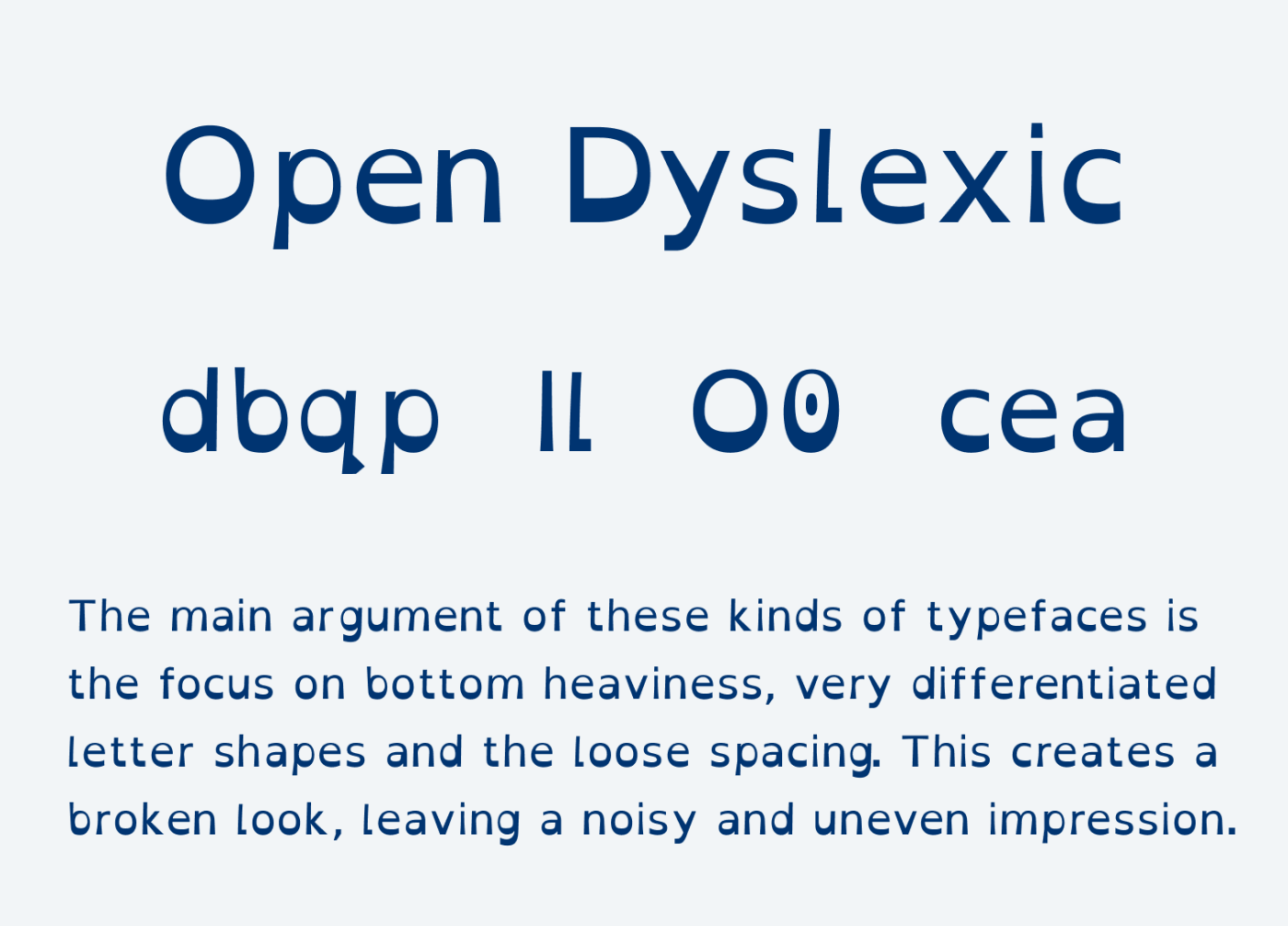
OpenDyslexic is a sans-serif typeface designed by Abelardo Gonzalez, first released in 2011 and distributed under a free license. It uses bottom-heavy letterforms with exaggerated character differentiation to reduce common letter-swapping errors associated with dyslexia.
OpenDyslexic suits accessibility-focused ebooks because its weighted base characters provide positional cues for “b”, “d”, “p”, and “q”, which are the four characters most commonly confused by readers with dyslexia. Kindle includes OpenDyslexic as a selectable font on all current devices and apps, reflecting its standing as a leading font choice for dyslexia accessibility in digital reading.
—
What makes OpenDyslexic suitable for ebooks?
OpenDyslexic uses a deliberately heavy bottom weighting on each letterform, creating a visual “anchor” that reduces the tendency to flip or rotate characters during reading. Its letter-spacing is wider than standard body text fonts, separating characters enough to reduce visual crowding at the sizes used in e-reader apps (12pt–16pt). The design distinguishes all four rotational variants of “b/d/p/q” through unique stroke and tail configurations per character.
Key attributes:
| Attribute | Value |
| Classification | Sans-serif (accessibility-optimized) |
| Designer | Abelardo Gonzalez, 2011 |
| Weight range | Regular, Bold, Italic, Bold Italic; OpenDyslexic Mono available |
| Variable font | No |
| Recommended sizes | 14px–18px body; 24px–32px headings |
| Letter-spacing default | Wide |
| License | SIL Open Font License (free for commercial use and EPUB embedding) |
| Available on | opendyslexic.org; Kindle built-in; Font Squirrel |
| Price | Free |
—
How does OpenDyslexic perform for ebook readability?
OpenDyslexic’s wide letter-spacing increases page count in reflowable EPUBs more than most body text fonts, which is an expected trade-off for its accessibility function. It renders clearly on e-ink displays at 14px and above, and its unconventional letterforms remain consistent across rendering engines since it uses simple, stroke-based character outlines without fine detail. Its inclusion in Kindle’s default font list means readers can select it without requiring the publisher to embed it.
—
What are the best pairings for OpenDyslexic in ebooks?
OpenDyslexic pairs best with itself across body and heading levels, using weight contrast (Regular body / Bold headings) rather than typeface contrast. Mixing OpenDyslexic with a standard serif for headings can disrupt the consistent accessibility experience the font is designed to provide throughout a document.
—
What are the limitations of OpenDyslexic for ebooks?
OpenDyslexic’s unconventional letterforms reduce reading speed for readers without dyslexia, making it unsuitable as a default font for general-audience ebooks. Its heavy character weighting can feel visually heavy in long prose passages at Regular weight, particularly at the larger sizes recommended for optimal performance.
—
OpenDyslexic – Recommended Use Cases Within Ebook Typography
- Best for: Accessibility-focused ebooks for readers with dyslexia; children’s educational ebooks
- Avoid for: General fiction or non-fiction ebooks intended for a broad reading audience
- Optimal weight: Regular for body; Bold for headings and emphasis
- Optimal size range: 14px–18px body; 24px–32px chapter titles
—
Comparing Ebook Fonts at a Glance
Choosing the right font depends on your distribution platform, target device, and licensing budget. This table summarizes the key decision factors across all 10 fonts.
| Font | Classification | License | Variable | Best Platform Fit |
| Georgia | Transitional serif | Proprietary (free personal use) | No | Universal EPUB, Kindle, Kobo |
| Bookerly | Serif (e-ink optimized) | Proprietary Amazon | No | Kindle only |
| Palatino | Old-style serif | Commercial (per publication) | No | Print-replica PDF, Apple Books |
| Merriweather | Serif (screen-optimized) | OFL (free) | Yes | Universal EPUB |
| Literata | Serif (screen-optimized) | OFL (free) | Yes | Google Play Books; multilingual EPUB |
| Verdana | Humanist sans-serif | Proprietary (free personal use) | No | Accessibility, children’s ebooks |
| Garamond (EB) | Old-style serif | OFL (free) | Yes | Literary fiction, humanities |
| Baskerville (Libre) | Transitional serif | OFL (free) | No | Academic, non-fiction |
| Source Serif Pro | Transitional serif | OFL (free) | Yes | Structured non-fiction, reference |
| OpenDyslexic | Sans-serif (accessibility) | OFL (free) | No | Dyslexia-accessible ebooks |
For most self-published ebooks distributed across multiple platforms, Merriweather or Source Serif Pro offer the best combination of free licensing, full weight ranges, and variable font support. Georgia remains the safest fallback when no font is embedded, as it is pre-installed across virtually all devices.
Understanding font licensing before embedding any typeface in an EPUB file is non-negotiable. Even fonts that appear free for personal use often require a separate Electronic Doc license for commercial ebook distribution.
For context on broader fonts for reading beyond ebooks, the structural principles remain consistent: large x-height, open counters, moderate stroke contrast, and sufficient weight range for hierarchy.
What determines whether a font is suitable for ebook reading?
Not all fonts that look good on paper survive a screen. Ebook typography operates under a different set of physical constraints, and the fonts that work are the ones built around those constraints from the start.
By 2024, 30% of ebooks were read on smartphones, while another large share was read on tablets, according to ebook market research. That’s three very different rendering environments: e-ink, LCD, and OLED, each with its own contrast behavior, pixel density, and light emission profile.
Five structural attributes determine whether a font is genuinely usable in digital books, or just theoretically acceptable.
X-height and stroke weight
X-height is the height of lowercase letters relative to capitals. A high x-height makes letters like “a”, “e”, and “n” appear larger at any given point size.
- Georgia has a larger x-height than Times New Roman at the same point size
- Merriweather’s x-height is taller than most Google Fonts serifs
- Bookerly was specifically engineered with x-height and stroke weight tuned for Kindle’s e-ink panel
Stroke weight matters separately. Fonts with very thin hairline strokes, like high-contrast display serifs, lose those thin strokes on lower-resolution panels. The result is gaps in letterforms that make reading physically harder.
Open counters and letter spacing
Counters are the enclosed or partially enclosed spaces inside letters (“c”, “e”, “o”, “a”). When they’re wide and open, characters stay distinct at small sizes. When they’re tight, letters start to look like blobs at 11pt on a 167-ppi e-ink screen.
Poor typographical choices increase cognitive load during reading, according to legibility research published in the International Journal of Research and Innovation in Social Science (2024).
Default letter spacing is the third variable. Fonts like Verdana use wide spacing intentionally to prevent stroke collision at low pixel densities. Georgia uses generous spacing without going as wide. Garamond’s spacing is tighter, which creates a risk at sizes below 12pt.
Rendering environment differences
All current Kindle and Kobo grayscale e-readers run at 300 ppi, according to TechRadar’s 2024 comparison, except the Kobo Elipsa 2E at 227 ppi. Older Kindle models from before 2016 ran at 167 ppi. That gap changes everything about which fonts are safe to use at small sizes.
| Platform | Display Type | Resolution | Font Risk Factor |
| Modern Kindle / Kobo (2016+) | E-ink | 300 ppi | Low, most fonts render cleanly |
| Older Kindle (pre-2016) | E-ink | 167 ppi | High, thin strokes drop off |
| iPad / Android tablet | LCD / OLED | 264–458 ppi | Low, subpixel rendering helps |
| Smartphone | OLED | 400–500 ppi | Very low, high density handles any weight |
Font licensing for EPUB embedding
License type is a decision gate, not a preference. The wrong font embedded in a commercial EPUB file is a copyright violation regardless of whether anyone notices.
Three license categories apply:
- SIL Open Font License (OFL): free to embed commercially, no per-publication fee
- Proprietary bundled fonts (Georgia, Verdana, Palatino Linotype): licensed for personal use, not commercial EPUB embedding without a separate Electronic Doc license
- Commercial Electronic Doc license: paid per publication, issued by Linotype/Monotype for fonts like Palatino and Baskerville
Adobe Fonts licensed via Creative Cloud are permitted for embedding in EPUB files where the font data is subsetted and obfuscated, according to Adobe’s font licensing documentation.
—
Which serif fonts perform best for ebook body text?
Serif fonts dominate long-form ebook body text. The serifs themselves act as horizontal guides for the eye, reducing lateral drift across lines. At 12pt–15pt on modern 300-ppi screens, a well-designed serif font produces the closest approximation to print reading comfort available on a digital device.
Over 70% of e-readers sold globally are Amazon Kindles, per ebook market data from 2024. That means any font decision for Kindle-first publishing reaches the majority of the dedicated e-reader audience.
| Font | License | Variable | Optimal Body Size | Best Platform Fit |
| Georgia | Proprietary (free personal) | No | 12pt–14pt | Universal EPUB |
| Bookerly | Amazon proprietary | No | Kindle size 3–5 | Kindle only |
| Merriweather | OFL (free) | Yes | 12px–16px | Universal EPUB |
| Literata | OFL (free) | Yes | 12pt–15pt | Google Play Books |
| Source Serif Pro | OFL (free) | Yes | 12pt–14pt | All platforms |
Georgia: the default benchmark
Matthew Carter designed Georgia in 1993 drawing screen bitmaps before outlines, building the font from pixel constraints outward. That process produces unusually sharp rendering on both legacy 167-ppi and modern 300-ppi e-ink panels.
The New York Times switched its online body text from Times New Roman to Georgia in 2007. That’s one of the clearest real-world endorsements of its screen readability at the editorial level.
Key structural advantages:
- X-height measurably larger than Times New Roman at identical point sizes
- Generous default letter spacing prevents crowding on narrow e-reader columns
- Thickened serifs survive stroke thinning on older 167-ppi Kindle panels
Georgia ships with only 2 base weights (Regular and Bold). Heading hierarchy is limited without Georgia Pro, which requires a Microsoft license for commercial EPUB embedding.
Bookerly: Kindle-native, not portable
Amazon’s internal testing showed Bookerly reduced eye strain by approximately 2% compared to its predecessor Caecilia, with improved reading speed linked to custom kerning pairs and ligatures. Spread across millions of Kindle users, Amazon considered that margin significant enough to replace the default font entirely in 2015.
Bookerly works exclusively within Kindle’s typesetting engine, which handles drop caps, hyphenation, and image positioning in coordination with the font metrics. Outside that system, it produces no benefit.
It cannot be embedded in standard EPUB files for non-Amazon platforms. Useful for Kindle-first publishing. Irrelevant for anything else.
Merriweather: the free variable serif
Eben Sorkin designed Merriweather in 2010 explicitly for screen reading, not as a screen adaptation of a print original. The distinction matters: the design priorities are inverted compared to older serifs.
Weight range: Light 300 to Black 900, 7 static weights with matching italics, plus a variable font covering weight, optical size, width, and italic axes in a single file.
The variable font format is significant for EPUB publishing. One embedded file replaces 4–8 static weight files, keeping file sizes smaller without sacrificing hierarchy options. Merriweather ranks #23 in Google Fonts by usage volume, reflecting active real-world deployment across digital reading contexts.
Literata: Google Play Books default
TypeTogether designed Literata from April 2014, commissioned by Google to replace Droid Serif as the default for Google Play Books. Version 3 (2018) rebuilt the entire family and released it under the SIL Open Font License.
Four optical sizes in the variable font: Caption (7pt), Text (12pt), Subhead (36pt), Display (72pt).
The upright italic (non-slanted) is a documented design choice. Older EPUB readers that auto-apply slant to italic CSS declarations may override it, producing a slanted version of what was intended as upright. Test on Kindle and Kobo apps before publishing if italic differentiation is structurally important to the ebook’s layout.
How do serif fonts render differently on e-ink vs. LCD screens?
E-ink displays reflect ambient light. They don’t emit it. Characters form through electrophoretic particle movement, which means contrast, font smoothness, and stroke edge definition are the critical rendering variables, not color or refresh rate.
The jump from 167 ppi to 300 ppi is significant for serif fonts specifically. At 167 ppi, thin strokes in high-contrast serifs like Baskerville can drop below the resolution threshold, creating apparent gaps in letterforms. At 300 ppi, those strokes render completely.
LCD and OLED screens (iPad, Android tablets, smartphones) use subpixel rendering, which smooths edges using the red, green, and blue components of each pixel. This benefits serif fonts at small sizes by effectively tripling horizontal resolution. Most serif fonts that render adequately on 300-ppi e-ink perform well on LCD screens.
Dark mode on Apple Books and Kindle inverts contrast. Fonts with high stroke contrast that rely on dark-on-light legibility can feel heavier or thinner under dark mode, depending on how the reading app handles color inversion. Source Serif Pro and Merriweather handle both modes consistently because their stroke weights are balanced across the weight range.
—
Which sans-serif fonts work for ebooks, and when do they apply?
Sans-serif fonts are not the default choice for long-form ebook prose. But they’re the right choice in specific contexts: children’s ebooks, accessibility-focused publishing, and technical ebooks with dense symbols or code blocks.
Roughly 15–20% of the global population may have dyslexia, according to accessiBe’s accessibility research, making it one of the most common learning disabilities. That’s a significant reader segment whose needs serif body text doesn’t always meet.
Verdana: wide spacing, strong disambiguation
Matthew Carter designed Verdana for Microsoft in 1996 using the same pixel-first approach as Georgia: bitmaps before outlines. The result is a font where every character was explicitly designed to prevent confusion with similar characters.
The digit “1”, lowercase “l”, and uppercase “I” are distinguishable in Verdana. Many sans-serif fonts make those three characters nearly identical. In technical ebooks with code snippets or alphanumeric references, that disambiguation is functionally important.
Trade-off: Verdana’s wide default spacing increases page count in reflowable EPUB formats more than any serif on this list. In a 300-page fiction ebook, that adds rendered pages, which extends reading sessions without adding content. Microsoft’s own font manager acknowledged that the spacing “never felt comfortable as an eBook font” for long prose, according to Verdana’s Wikipedia documentation.
Ships with 2 base weights. Full hierarchy requires Verdana Pro, sold separately.
OpenDyslexic: accessibility function, not general use
Abelardo Gonzalez released OpenDyslexic in 2011 using bottom-heavy letterforms to anchor characters on the baseline and reduce rotational confusion between “b”, “d”, “p”, and “q”. Amazon includes it as a selectable font across all current Kindle devices and apps.
The research on whether dedicated dyslexia fonts actually improve reading speed is mixed. A study from Yahoo Labs found OpenDyslexic did not improve readability or comprehension compared to standard fonts. A 2018 peer-reviewed study found that spacing, not letterform shape, was the variable that mattered. A 2020 study in Annals of Dyslexia found no effect from letterform design alone.
What the research consistently does support is that wider letter spacing improves reading performance for dyslexic readers by reducing visual crowding, a 2018 study confirmed. OpenDyslexic provides that spacing as a default. Whether the unique letter shapes add further benefit is contested. Whether wider spacing helps is not.
When sans-serif headings work with serif body text
The most practical sans-serif application in ebook design is not body text. It’s headings.
Works well when:
- The ebook has frequent chapter headings and section breaks that benefit from visual contrast
- The body serif has a classical tone (Garamond, Baskerville) that a neutral sans heading complements
- The reader audience skews younger or is accustomed to digital-first design
Skip the pairing when:
- The ebook targets older readers on dedicated e-readers who rarely adjust default fonts
- The publisher cannot control font rendering across all platforms (many e-reader apps override embedded fonts)
Amazon’s own pairing, Bookerly (serif body) with Amazon Ember (sans heading), is the clearest documented example of this approach applied at scale.
—
How does font licensing affect ebook publishing?
Font licensing is where most self-publishers make expensive mistakes. A font that’s free to install on a computer is not automatically free to embed in a commercial EPUB file. Those are different use cases with different license terms.
Approximately 300 million self-published books are sold each year, worth around $1.25 billion, per ebook market research. The vast majority of those authors chose their fonts without verifying EPUB embedding rights.
What the OFL license actually allows
The SIL Open Font License permits embedding in any format, including commercial EPUB files, with no per-publication fee and no restriction on distribution volume. This is the cleanest license available for ebook publishing.
OFL-licensed fonts safe for commercial EPUB embedding:
- Merriweather (Google Fonts / Sorkin Type)
- Literata v3+ (Google Fonts / TypeTogether, from December 2018)
- EB Garamond (Georg Duffner)
- Libre Baskerville (Pablo Impallari)
- Source Serif Pro / Source Serif 4 (Adobe, OFL)
- OpenDyslexic (Abelardo Gonzalez)
Including the OFL license text file inside the EPUB package is technically required by the license terms when distributing the font embedded in a publication.
Proprietary fonts that require a paid license
This is the category that catches self-publishers off guard.
Georgia and Verdana are bundled with Windows and macOS. That bundled license covers personal use and creating documents. It does not cover commercial EPUB embedding for distribution. Embedding either font in a commercial ebook without a Microsoft Electronic Doc license is outside the permitted use.
Palatino Linotype requires a separate Electronic Doc license from Linotype/Monotype for EPUB embedding. The license is priced per publication. This is why many self-publishers who start with Palatino end up switching to EB Garamond or Source Serif Pro before publishing.
Bookerly is Amazon proprietary. It renders only through Amazon’s Kindle typesetting engine. It cannot be embedded in EPUB files at all.
Adobe Fonts and the subscription path
Adobe Fonts licensed through Creative Cloud are permitted for embedding in EPUB, iBooks, Kindle MOBI, and PDF formats, according to Adobe’s font licensing documentation. The requirement is that the font data must be subsetted and obfuscated within the EPUB file. Standard EPUB creation tools (InDesign, Vellum, Sigil) handle this automatically.
The key limitation: the license is tied to an active Creative Cloud subscription. If the subscription lapses, technically the license to use the embedded fonts lapses with it. For publishers distributing ebooks over years or decades, the OFL-licensed alternatives produce cleaner long-term rights.
—
What font sizes and spacing settings optimize ebook readability?
Font choice matters. Font size and spacing matter equally. A well-chosen font set at the wrong size or line height produces a worse reading experience than a mediocre font correctly spaced.
Studies showing poor typographical choices increase cognitive load during extended reading sessions confirm what publishers have learned from reader feedback: spacing errors feel worse than font errors, because readers notice density before they notice letterforms.
Body text size recommendations by format
Ebook reading app research consistently places the comfortable default range for body text between 16px and 18px at 100% zoom in reflowable EPUB format. Most readers adjust size upward, not downward, from whatever the default is.
By format:
- Reflowable EPUB: 16px–18px as CSS default; readers will adjust
- PDF ebook: 11pt–13pt for body; smaller PDFs often used for academic or report formats
- Kindle KFX: set Kindle device size 3–4 as the target; avoid forcing a fixed px size
Heading sizes follow a consistent ratio. Chapter titles: 18pt–24pt. Subheadings: 14pt–18pt. These ratios apply across formats.
Line height and its effect on reading flow
Line height directly controls how much vertical space sits between lines of text. Too tight and lines blur together during saccadic eye movement. Too wide and the eye loses connection between lines, slowing reading rhythm.
The recommended line-height range for ebook body text is 1.4 to 1.6 (relative to font size). A 16px font at line-height 1.5 produces 24px of line spacing. Below 1.3, crowding becomes a problem in long reading sessions.
Dark mode complicates this. Some reading apps apply a slightly lighter font weight in dark mode to compensate for the reversed contrast. If an ebook’s CSS forces a specific font-weight value, it overrides that compensation. Testing in both light and dark mode before publishing is not optional.
Letter-spacing adjustments by typeface
Most ebook fonts perform well at their default letter-spacing. Adjustments are needed in specific cases only.
| Font | Default Spacing | Adjustment Needed? | When to Adjust |
| Georgia | Generous | Rarely | Only in very narrow column widths |
| Garamond (EB) | Standard (tighter) | Sometimes | Increase tracking by 0.01em–0.02em at sizes below 12pt |
| Verdana | Wide | Rarely | Consider reducing if page count matters |
| Merriweather | Standard | No | Works at default across all target sizes |
—
How do ebook fonts pair for heading and body text hierarchy?
Most ebooks don’t need two fonts. A single typeface with a full weight range, used at different sizes and weights across heading levels, produces cleaner results than a two-font system that may render inconsistently across platforms.
The practical case for font pairing in ebooks is narrower than in web or print design. E-reader apps may override embedded fonts entirely. When they do, a carefully chosen two-font pairing collapses to a single system default, making the pairing effort irrelevant.
Documented companion pairings
Some pairings aren’t opinions. They’re documented design relationships.
Georgia + Verdana is the clearest example. Matthew Carter designed both for Microsoft simultaneously, specifically for use together on screen. The x-heights are matched. The weight contrasts are calibrated. No other pairing on this list has that level of documented intentionality. See more options in the Georgia font pairing guide.
Source Serif Pro + Source Sans Pro follows the same logic. Adobe designed them as a companion system, covering identical weight ranges (Thin 100 to Black 900) with matching proportions. One OFL license covers both. One font family decision covers the entire ebook layout.
Editorial pairings from web to EPUB
Some pairings originate in web editorial design and transfer cleanly to reflowable EPUB format because both environments share the same CSS rendering model.
Merriweather + Open Sans is the most widely deployed example. The combination appears across news sites, content platforms, and digital publications. Both are OFL licensed. Both are available on Google Fonts with variable font versions. In EPUB, Open Sans headings contrast with Merriweather body text cleanly across all major reading apps.
For more pairing context, the Merriweather font pairing guide covers additional combinations. The Lora font pairing guide is also useful for ebook publishers working with another free serif alternative.
Classical body with modern heading contrast
Garamond or Baskerville body text paired with a neutral sans-serif heading is the standard combination in academic print-to-digital conversion. Oxford University Press uses this structure across many of its digital publications.
The pairing logic:
- Garamond body: classical old-style tone, suited to humanities and literary texts
- Open Sans or Helvetica heading: neutral, modern contrast that signals structure without competing with the body voice
For Garamond pairing specifics, see the Garamond font pairing guide. For Baskerville combinations, the Baskerville font pairing guide covers the most common academic and non-fiction configurations.
When does font pairing improve ebook readability, and when does it add complexity?
Font pairing improves ebook readability when the ebook has a clear heading hierarchy with 3+ levels, the publisher controls the final output format (PDF or fixed-layout EPUB), and both fonts share matching optical weights at their intended sizes.
It adds complexity without benefit when the ebook is published in reflowable EPUB for Kindle or Kobo, where the reading app may substitute both embedded fonts with its own defaults. In that case, the pairing only exists in the publisher’s authoring tool, not in the reader’s hands.
The safest approach for reflowable EPUB: single typeface, full weight range, all hierarchy handled by size and weight variation. Consider font spacing settings and weight contrast before adding a second font. Also worth exploring: variable fonts solve most hierarchy problems in a single embedded file, which is especially relevant for ebook publishing where file size and rendering consistency both matter.
FAQ on The Best Fonts For Ebooks
What is the best font for ebooks overall?
Georgia is the most consistently recommended font for ebook body text. Designed by Matthew Carter in 1993, it has a large x-height, open counters, and generous letter spacing that keeps text legible across e-ink, LCD, and OLED screens at standard reading sizes.
What font does Kindle use by default?
Amazon Kindle uses Bookerly as its default font since 2015. Designed by Dalton Maag specifically for e-ink screens, it replaced Caecilia. Amazon’s internal testing showed it reduced eye strain and improved reading speed compared to its predecessor.
Are serif or sans-serif fonts better for ebooks?
Serif fonts are generally better for long-form ebook body text. The serifs guide the eye horizontally across lines, reducing lateral drift. Sans-serif fonts work better in specific cases: children’s ebooks, accessibility-focused publishing, and technical content with code or dense symbols.
What free fonts can I embed in an EPUB file commercially?
Fonts under the SIL Open Font License are free to embed commercially. Good options include Merriweather, Literata, EB Garamond, Libre Baskerville, Source Serif Pro, and OpenDyslexic. Always include the OFL license file inside the EPUB package when distributing.
Can I use Georgia in a commercial ebook?
Georgia is bundled on Windows and macOS for personal use. Embedding it in a commercial EPUB for distribution requires a separate Microsoft Electronic Doc license. Many self-publishers switch to EB Garamond or Source Serif Pro to avoid that licensing cost entirely.
What font size is best for ebook body text?
For reflowable EPUB files, set body text at 16px–18px as the CSS default. For PDF ebooks, 11pt–13pt is the standard range. Most readers adjust size upward from defaults, so the starting point matters less than ensuring the font renders cleanly at all sizes.
What is the best font for dyslexia in ebooks?
OpenDyslexic is built into Kindle and uses bottom-heavy letterforms to reduce character rotation errors. Research shows wider letter spacing, not letterform shape alone, drives the benefit. Verdana and other wide-spaced sans-serif fonts also support dyslexic readers effectively.
What font does Google Play Books use?
Google Play Books uses Literata as its default typeface, replacing Droid Serif in 2015. Designed by TypeTogether, it includes four optical sizes and supports Latin, Greek, Cyrillic, and Vietnamese. Version 3 was open-sourced under the SIL Open Font License in December 2018.
Does font choice matter if readers can change it on their device?
Yes. Not all readers change default settings, so your chosen font shapes the first impression. On platforms like Apple Books and Kindle, embedded fonts may be overridden. Font selection still matters for PDF ebooks and fixed-layout EPUB formats where the display is locked.
What font pairs well with Georgia in an ebook?
Georgia pairs best with Verdana for heading contrast. Both were designed by Matthew Carter for Microsoft simultaneously, with matched x-heights and calibrated weight contrast. Open Sans also works as a more modern heading alternative when a neutral, screen-optimized sans-serif tone is needed.
Conclusion
This conclusion is for an article presenting the best fonts for ebooks, and the core takeaway is straightforward: typeface selection directly shapes reading experience, from eye strain levels to how long someone stays in your book.
Georgia and Bookerly lead for body text readability. Merriweather and Source Serif Pro are the strongest free options for commercial EPUB embedding under the SIL Open Font License.
For accessibility, Verdana’s wide letter spacing and OpenDyslexic’s character disambiguation address real reader needs that standard serif fonts don’t.
Font pairing, line height, and ebook formatting decisions compound the impact of your initial font choice. Get the basics right and the reading experience takes care of itself.
Pick one font. Test it across Kindle, Kobo, and Apple Books. Then publish.

Renowned for his expertise in logo design and visual branding, Bogdan has developed a multitude of logos for various clients.
His skills extend to creating posters, vector illustrations, business cards, and brochures. Additionally, Bogdan's UI kits were featured on marketplaces like Visual Hierarchy and UI8.
He also wrote in the past years on sites like Design Your Way, WebDesignerDepot, WPDean, Designmodo, Speckyboy, Slider Revolution, and more.
- The Windsurf Logo History, Colors, Font, And Meaning - 10 October 2026
- How to Remove Background From Product Photos (No Photoshop) - 10 October 2026
- How Designers can Build a Stronger Online Creative Identity - 9 October 2026

Bogdan Sandu is a seasoned designer who has been designing websites since 2008. Renowned for his expertise in logo design and visual branding, Bogdan has developed a multitude of logos for various clients. His skills extend to creating posters, vector illustrations, business cards, and brochures. Additionally, Bogdan's UI kits were featured on marketplaces like Visual Hierarchy and UI8. He also wrote in the past years on sites like Design Your Way, WebDesignerDepot, WPDean, Designmodo, Speckyboy, Slider Revolution, and more.
You Might Also Like