
Android Aesthetics: The 12 Best Fonts for Android

Imagine crafting a gripping novel, but selecting a font so jarring, readers flee after the first page. Typeface is the unsung hero of legibility, where a misplaced serif could mean the world in user engagement. In the bustling world of Android devices, the best fonts for Android serve not just as mere text, but as a gateway to usability, accessibility, and that quintessential aesthetic appeal.
This article peels back the layers of mobile typography, guiding you to the Typeface Olympus. Forget about vanilla system fonts; it’s time for a typographic upgrade that screams personality yet whispers readability on screens of all sizes.
By the final punctuation mark, you’ll be fluent in the art of font customization, from the intricacies of font files for Android to striking a balance with font weight and style.
Dive into a curated treasury of fonts that’ll transform your Android interface from drab to fab, ensuring screen readability and dynamic text scaling live harmoniously in your app designs.
Ready? Let’s talk typeface!
The Best Fonts for Android Apps
| Font Name | Designer / Foundry | Year of Release | Number of Styles | Characteristics |
|---|---|---|---|---|
| Roboto | Christian Robertson / Google | 2011 | 12 (6 weights + italics) | Modern, geometric, versatile, highly legible |
| Open Sans | Steve Matteson / Google | 2011 | 10 (5 weights + italics) | Humanist, clean, friendly, web and mobile-optimized |
| Lato | Łukasz Dziedzic / tyPoland | 2010 | 10 (5 weights + italics) | Semi-rounded, professional, harmonious |
| Montserrat | Julieta Ulanovsky / Google | 2011 | 36 (9 weights in upright and italic) | Urban, geometric, contemporary |
| Source Sans Pro | Paul D. Hunt / Adobe | 2012 | 12 (6 weights + italics) | Humanist sans-serif, neutral, optimized for UI |
| Noto Sans | 2020 | Numerous weights and styles | Aimed at universal language coverage, clean | |
| Raleway | Multiple designers / The League of Moveable Type | 2012 | 18 (9 weights + italics) | Elegant, stylish, great for titles and headings |
| PT Sans | Alexandra Korolkova, Olga Umpelova, Vladimir Yefimov / ParaType | 2009 | 8 (4 weights + italics) | Humanistic, open shapes, supports Cyrillic |
| Ubuntu | Dalton Maag / Canonical Ltd. | 2011 | 8 (4 weights + italics) | Unique, tech-oriented, Ubuntu brand identity |
| Merriweather | Sorkin Type | 2012 | 8 (4 weights + italics) | Serif font, contemporary design, readable text |
| Nunito Sans | Vernon Adams, Jacques Le Bailly / Google | 2017 | 14 (7 weights + italics) | Rounded, balanced, suitable for both display and text |
| Poppins | Jonny Pinhorn, Ninad Kale / Google | 2014 | 18 (9 weights + italics) | Geometric, modernist, friendly |
Google’s Roboto Font
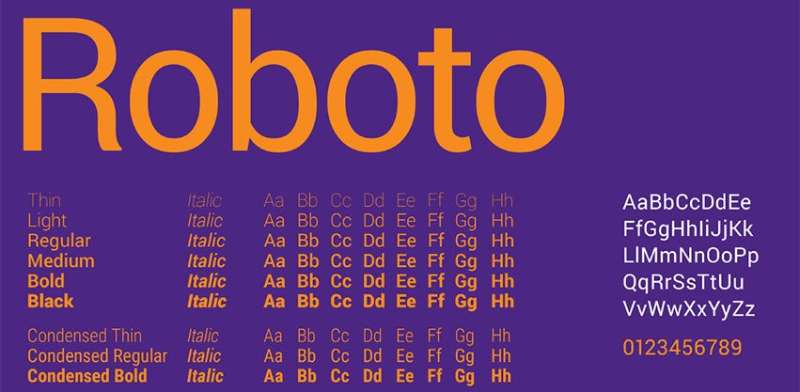
Let’s kick off with a classic: Google’s Roboto Font. This one’s like the bread and butter of Android typography. It’s everywhere, and for good reason. Designed with a focus on mobile UI design, Roboto offers an unmatchable blend of modern and approachable. It’s like that friend who’s cool without even trying.
You’ve probably seen Roboto across various Android interfaces. It’s got this mechanical skeleton but the forms are super friendly and open. This font is not just a pretty face; it’s about digital screen legibility. Whether it’s a quick notification or a long read, Roboto keeps things clear and classy.
Open Sans
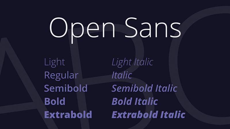
Next up is Open Sans. This one’s the people’s champ of fonts. Think of it as the friendly neighbor of fonts — familiar, versatile, and oh-so-readable. It’s got these humanist qualities that make text feel warm and inviting.
Optimized for digital screens, Open Sans is a go-to for more than just Android apps. It’s used all over the web. The best part? It’s an all-rounder. From snappy headers to detailed content, Open Sans handles it with ease. It’s like the Swiss Army knife in the world of best fonts for Android.
Lato
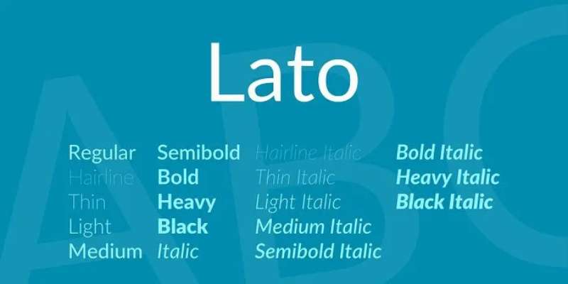
Now, let’s talk about Lato. It’s the stylish cousin in the font family. Lato brings a contemporary vibe, balancing professionalism with a friendly touch. Its readability is top-notch, making it a hit for both Android and web content.
There’s an emotional aspect to Lato that’s hard to ignore. It’s not just a font; it’s a design statement. From tech blogs to stylish apps, Lato has carved its niche beautifully. It’s that perfect mix of business with a touch of personal flair.
Montserrat
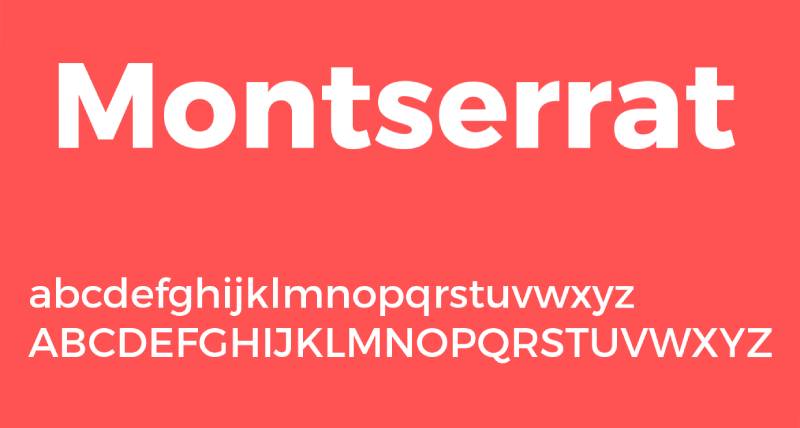
Last in this lineup is Montserrat. Picture the charming streets of Buenos Aires; that’s where Montserrat gets its inspiration. It’s geometric, versatile, and an absolute gem for UI elements and headers.
Source Sans Pro
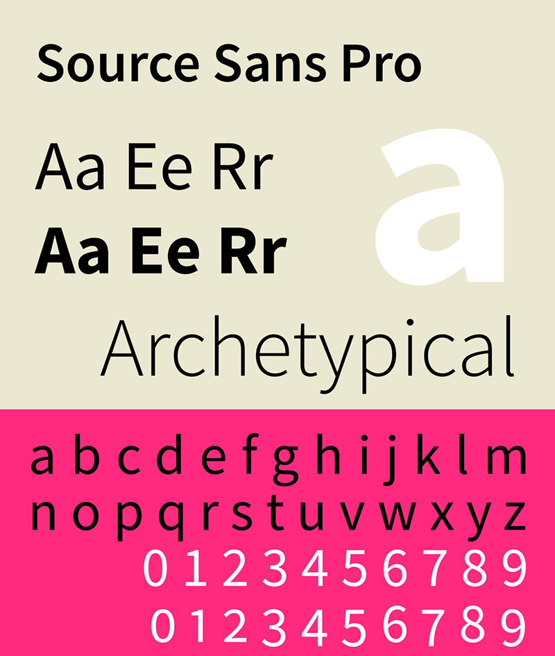
Let’s dive into Source Sans Pro. Picture this: a font that’s the epitome of clarity and simplicity, tailor-made for UI design. It’s like the clean, minimalist layout of a trendy website – easy on the eyes and super approachable.
What’s cool about Source Sans Pro is its backstory. It’s Adobe’s first leap into open-source territory, making it a big deal in the font world. Whether it’s a casual chat app or a more serious business tool, this font brings a vibe that’s both professional and relaxed. It’s a top-notch choice in the quest for the best fonts for Android.
Noto Sans
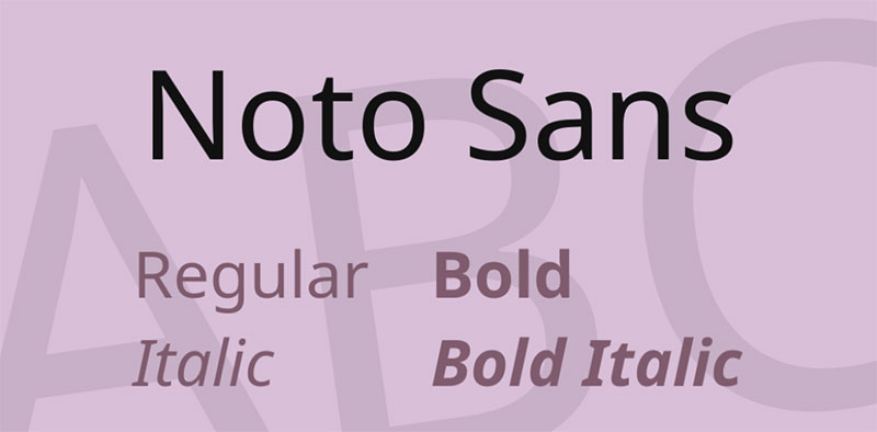
Now, meet Noto Sans. This font is like a world traveler, ready to communicate in almost any language you throw at it. Universal language support? Check. Designed for digital screens and readability? Double check.
In the universe of Android typography, Noto Sans is a peacekeeper. Its mission? No more tofu. That’s the nickname for those annoying little boxes you see when a script isn’t supported. Noto Sans covers a vast range of languages, ensuring your app speaks to everyone, everywhere. It’s a must-have for global apps and a strong contender in the best fonts for Android.
Raleway
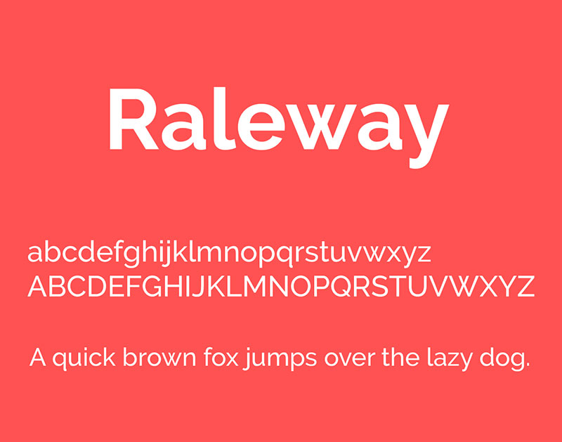
Onto Raleway. Imagine a font that walks into a room and instantly raises the elegance quotient. That’s Raleway for you. It’s got a design that’s both sophisticated and modern – perfect for making headlines (literally).
Raleway shines in titles and headers. It’s like that bold accessory that completes an outfit. Use it in an app, and watch how it transforms the screen into something chic and polished. It’s a go-to for adding a touch of class to your Android app design.
PT Sans
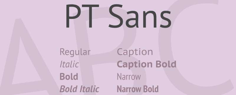
Last but not least, let’s talk about PT Sans. This font is all about open forms and a friendly, humanist character. It’s like the friendly neighbor who’s always approachable and easy to talk to.
Designed specifically for interface and short text blocks, PT Sans is a dream for readability and comfort. Whether it’s a quick notification or detailed content, PT Sans handles it with ease. In the world of mobile UI design, it’s a font that brings content to life, making it a solid choice for best fonts for Android.
Ubuntu
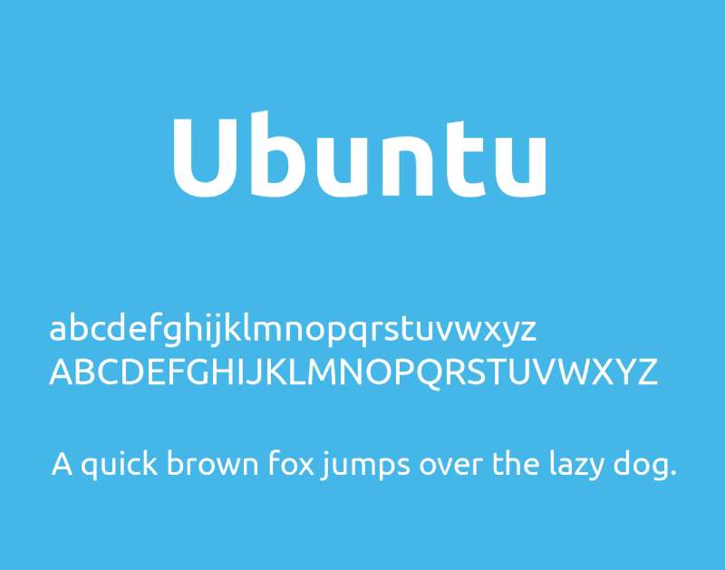
Let’s chat about Ubuntu. This font, oh man, it’s like the cool, laid-back friend who’s always easy to read. Ubuntu isn’t just a font; it’s a vibe. With its contemporary and super readable style, it’s like the jeans-and-a-t-shirt of the best fonts for Android – casual, comfortable, yet totally on point.
Ubuntu was crafted with clarity in mind, especially for both desktop and mobile screens. Whether you’re scrolling through a blog post or tapping through an app, Ubuntu keeps things smooth and easy on the eyes. It’s the kind of font that feels at home in any app, making it a solid pick for designers looking to strike a balance between personality and practicality.
Merriweather
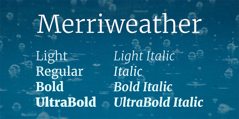
Now, let’s move to Merriweather. Imagine a font that’s like a cozy armchair – great for settling in and getting lost in a story. That’s Merriweather for you. It’s a serif font, which means it has those little feet at the ends of the letters, giving it a classic, trustworthy feel.
Merriweather shines when it comes to long reads on screens. Your eyes don’t get tired, thanks to its high readability. This font is all about making extended reading on Android devices a pleasure, not a chore. It’s a top choice for apps with lots of text where comfort and character are key. Truly one of the best fonts for Android when it comes to long-form content.
Nunito Sans
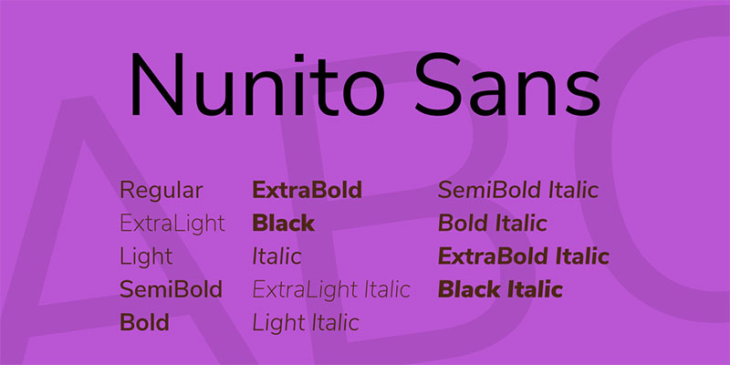
First up, Nunito Sans. Picture this: a font that’s like a breath of fresh air. Soft, relaxed, yet totally professional. It’s the kind of font that makes text look effortless, like it just belongs there.
Nunito Sans is gaining some serious traction in UI/UX design. It’s perfect for when you want something a bit more laid-back but still need your app to look sharp and on-point. It’s got this friendly vibe that works great for all kinds of apps, from social media platforms to productivity tools. Definitely a strong contender for the best fonts for Android.
Poppins
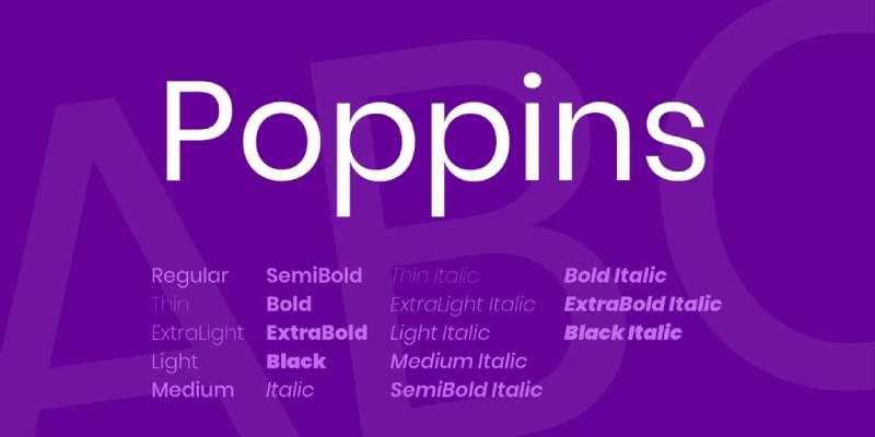
Then, there’s Poppins. Oh, Poppins – it’s like the life of the font party. With its lively feel and comfortable readability, it brings an energetic yet friendly touch to your app. Poppins is like that friend who’s always upbeat and makes everything more fun.
This font is a hit for diverse mobile app designs, thanks to its versatility. It fits just right, whether it’s a playful kid’s app or a sleek, modern business tool. Poppins has a way of making text pop (pun intended) and keeps users engaged. A definite must-try for those scouting for the best fonts for Android.
Criteria for Selecting Fonts for Android Apps
Readability and Visibility
Ever stared at an app and thought, “Wow, this is tough to read”? That’s a no-go in app design. When it comes to the best fonts for Android, readability is king.
Think about font size and spacing – it’s a delicate dance. Too cramped, and your users squint. Too spaced out, and your app feels like a deserted island.
Color contrast and background compatibility play a massive role too. It’s like choosing the right outfit for a party; your fonts need to stand out but not clash with the background.
The goal? Seamless integration that makes your users’ experience a breeze.
Style and Aesthetics
Here’s where you get to show some personality. Matching the font style with your app’s theme is like picking the perfect soundtrack for a movie. Get it right, and you elevate the user experience.
You want a font that’s unique but doesn’t make your users think, “What were they thinking?” It’s about finding that sweet spot – a font that’s familiar yet has its own flair.
Imagine the difference between a casual handwritten font in a fun cooking app and a sleek, modern font in a finance tracker. That’s the power of style in the world of best fonts for Android.
Licensing and Usage Rights
Now, let’s talk legality. Not the most exciting, but super important. Understanding the difference between open-source and commercial fonts is like knowing the rules of the road before you drive.
You don’t want to end up in a legal tangle over a font. Always check the legal considerations for font usage.
It’s about respecting the creators and keeping your app out of trouble. Remember, just because a font is free doesn’t mean it’s free for all uses.
Best Practices for Implementing Fonts in Android Apps
When we’re talking about decking out Android apps with the best fonts, it’s not just a grab-and-go kind of deal. There’s a bit of an art to it. Let’s break down some best practices that can really make your app’s typography shine.
Limiting Font Varieties
Okay, so first things first: Keep it simple. You might find a bunch of cool fonts and think, “Hey, let’s use them all!” But hold up. Using too many different fonts can make your app look like a wild, untamed garden.
A good rule of thumb? Stick to a couple of fonts that complement each other. This isn’t just about aesthetics; it’s also practical. Too many fonts can bog down your app’s performance and increase load times. Nobody wants that. Balance is key. Mix a primary font for your main content with a secondary one for headings or accents. Simple, sleek, effective.
Responsive Design Considerations
Next up, think responsive. Phones, tablets, big screens, small screens – your app will be seen on all of them. So, your fonts need to play nice with different screen sizes.
This is where font scaling and responsive typography come into play. Make sure your text is legible and looks good whether it’s on a tiny phone or a massive tablet. Test, adjust, repeat. It’s like tailoring a suit – it needs to fit just right, no matter who wears it.
Accessibility and Inclusivity
Now, let’s talk inclusivity. Your app is for everyone, right? That means thinking about users with visual impairments or reading difficulties.
Choose fonts that are easy to read and offer options like adjustable font sizes. You’re not just designing an app; you’re creating an experience that everyone can enjoy. It’s about making sure your app doesn’t leave anyone out. Accessibility guidelines are your friends here. They’re like the recipe for baking a cake that everyone can eat.
Tools and Resources for Font Selection
Alright, let’s talk tools and resources. You know, the kind of stuff that makes picking the best fonts for Android not just easier, but kind of fun too. It’s like having a treasure map in the world of typography.
Font Libraries and Repositories
Imagine a library, but instead of books, it’s full of fonts. That’s what font libraries are like. They’re these awesome online spaces where you can browse, compare, and choose fonts for your app.
Google Fonts is like the big kahuna of font libraries. It’s packed with a variety of fonts, and the best part? They’re free and easy to use. You can test out how they look and feel right there on the site. Then there are other sources too, places where you can find those hidden gems that might not be as mainstream but can give your app that unique edge.
Font Pairing Tools
Now, let’s say you’ve found a couple of fonts you like, but you’re not sure if they go well together. This is where font pairing tools come into play. They’re like the matchmaking apps for fonts.
These online tools help you mix and match fonts, showing you how they complement each other. It’s a bit like trying on outfits before a big event. You want to see what works together before you make a decision. Some tools even show examples of effective font pairings, giving you a bit of inspiration.
FAQ On The Best Fonts For Android
What makes a font ‘the best’ for Android devices?
It’s a balancing act, really. You want a font that meshes well with the versatile Android interface, maintains legibility across various screen sizes and resolutions, and embodies the personality of your app. It should also be easy on the eyes for extended reading and navigate gracefully through the waters of font licensing.
How do I change fonts on my Android device?
First things first, dive into your device settings. Look for Display or Screen options, right? If your device manufacturer’s feeling generous, you’ll spot a Font Style or Font Size choice just waiting for a tap. And if it’s customization you’re after, third-party apps are your secret passage.
Can I use custom fonts in Android app development?
Absolutely. Android Studio’s your backstage pass here. Adding your chosen .otf or .ttf files into the Assets or Resources folder paves the way. Next, a bit of XML and Java or Kotlin spell-casting in your app’s code, and voilà, your custom fonts come alive on the screen.
Are there any free fonts available for Android, or do I need to purchase them?
Oh, the treasures you’ll find! Google Fonts is a gold mine brimming with free-to-use typefaces for your Android explorations. Each with its own license, you’re free to use them in app designs, especially since they’re optimized for readability and Typeface aesthetics. But remember, always check font licenses for commercial use.
What’s the difference between serif and sans-serif fonts in terms of Android usability?
In the realm of usability, sans-serif fonts, with their clean lines and modern feel, are typically the go-to choice for Android interfaces, delivering clarity even on smaller screens. Serif fonts, while stylish, tend to suit print better, as their decorative feet may blur together on lower-res displays.
Do font choices impact the accessibility of an Android app?
Without a doubt. Think of fonts as the messengers of your app’s content. Choosing a font that’s friendly for those with visual impairments makes everyone feel welcome. High contrasts, clear typefaces, and options to enlarge text all contribute to making your app more inclusive.
How does font licensing work for Android?
It’s a legal dance. Font licensing defines how, where, and to what extent you can use a particular typeface. Some fonts come with the freedom of open licenses, ideal for the Android scene. Others, well, they might need you to pull out your wallet or navigate some usage restrictions.
Can the Android system fonts be overridden by an app?
Sure thing. An app has the power to call the shots when it comes to font aesthetics, overriding those default system choices with a range of Typeface selections. Just ensure your code calls the right familial hierarchies and attributes, and you’ll have your app speaking in its own typographic tongue.
How can I ensure my font choices will be compatible with different Android versions and devices?
Consistency is key. Stick with tried and tested fonts known for their Android compatibility. Responsiveness to different screen sizes and densities is paramount. Test extensively across multiple devices and Android versions. Consider the nuances of Material Design guidelines for that extra layer of harmony.
What are the trends in font design for Android now?
Fonts are getting smarter. We’re seeing a shift toward fonts that adapt to User Interface elements, with variable options that allow designer and user alike to tweak weight and width on the fly. Typography design is leaning into accessibility features and embracing the diversity of Android device displays.
Conclusion
Treading through the galaxy of typefaces, we’ve now anchored at the end. The haul? A treasure chest brimming with the best fonts for Android—gems that promise to elevate user experience and sprinkle personality onto the digital canvas of apps and interfaces.
- Readability? Nailed it.
- Aesthetics? Taken care of.
- Accessibility? As accessible as the morning coffee.
Armed to the teeth with knowledge about mobile typography, font licensing, and even the nitty-gritty of scalable fonts for devices, the power to command the typographic seas now rests in the swipes and taps of your fingertips.
So go ahead, make each pixel count. Fuse typeface legibility with mobile-friendly fonts to craft experiences that users won’t just see but feel—effortlessly, across the Android universe. Here’s to dynamic text adjustments and the textures of a digital typeface that redefine the mundane. Here’s to your next bold move.
If you liked this article about the best fonts for Android, you should check out this article about the best fonts for brochures.
There are also similar articles discussing the best fonts for Photoshop, the best fonts for engraving, the best fonts for ADHD, and the best fonts for monograms.
And let’s not forget about articles on the best fonts for letterhead, the best fonts for signs, the best fonts for quotes, and the best fonts for email signatures.
Bogdan Sandu, a seasoned designer with 15 years of diverse experience, has been designing websites since 2008.
Renowned for his expertise in logo design and visual branding, Bogdan has developed a multitude of logos for various clients.
His skills extend to creating posters, vector illustrations, business cards, and brochures. Additionally, Bogdan's UI kits were featured on marketplaces like Visual Hierarchy and UI8.
Latest posts by Bogdan Sandu (see all)
- Think Pink: Soft and Strong Pink Color Palettes - 14 May 2024
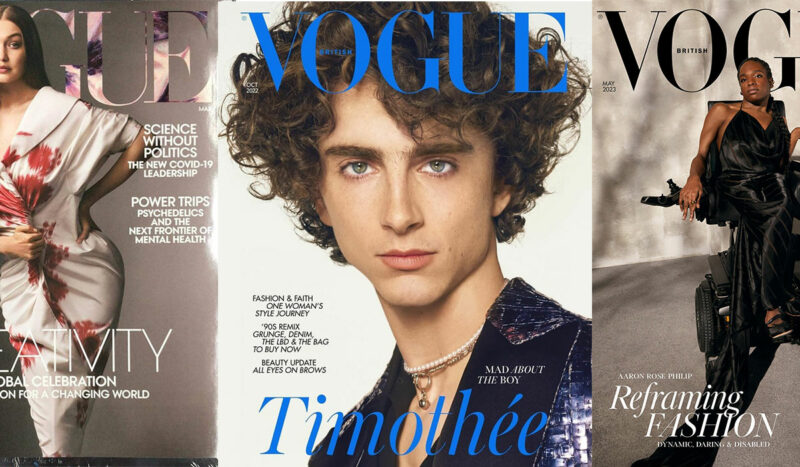
- Fashion Typography: What Font Does Vogue Use? - 14 May 2024
- The Kirin Logo History, Colors, Font, And Meaning - 13 May 2024