The Houston Astros Logo History, Colors, Font, and Meaning
Imagine the rush of excitement stirring within the stands of Minute Maid Park as the Houston Astros take the field, their iconic logo ablenty on banners and jerseys alike.
This emblem not merely represents a team, it embodies history, spirit, and a deep connection with the city of Houston.
Dive into the intricate tapestry that has woven the Houston Astros logo into the hearts of its fanbase. From its origins to its current star-spangled rendition, this article peels back the layers of design elements that craft a sports symbol into a beacon of loyalty for the baseball aficionado.
As we zip through the evolution of this enduring brand, an appreciation for the interplay of shapes and hues will unfurl.
You’ll traverse the parallel tracks of the team’s triumphs and its graphic counterpart, discerning how each World Series milestone etched new vigor into the logo’s legacy.
We’ll color within the lines of MLB logo guidelines, stride through the corridors of sports team branding, and face the curveballs of copyright laws. By article’s end, you’re set to decode the visual saga emblematic of the stellar Houston Astros.
The Meaning Behind the Houston Astros Logo
![]()
Hey there! Ever gazed upon the Houston Astros logo and wondered, “What’s the story here?” Well, grab a cup of joe, and let’s unravel this design mystery.
The Star and The H
The core component, the star, isn’t just any star. It’s symbolic of Texas, the Lone Star State. Nestled within that star is the capital letter “H.” Pretty obvious, right? Houston! But it’s more than that. The simplicity speaks to the city’s boldness, pride, and directness.
Connection with Space
Houston, we have… well, a space connection! The team name “Astros” is a nod to the city’s long-standing bond with NASA and space exploration. The logo subtly carries this essence without overdoing it. It’s not rocket science, just smart design!
The History of the Houston Astros Logo
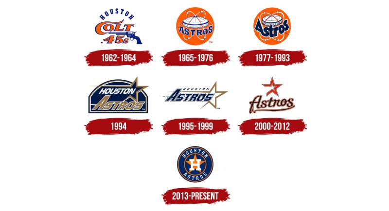
Diving into the annals of baseball history, the Astros logo has seen quite the evolution.
Early Beginnings
Started off as the Houston Colt .45s (quite the mouthful, huh?), the logo was, well, a .45 caliber pistol. Quite a difference from today’s sleek and cosmic vibes, right?
The Cosmic Shift
In the mid-60s, as the space race took off, so did the team’s identity. Enter: the Astros. The logo shifted from gunslinging to starry-eyed, perfectly capturing the space-age spirit.
Modern Iterations
Over time, this logo underwent fine-tuning, but the essence remained. It always told the story of a city intertwined with space exploration and baseball.
The Colors of the Houston Astros Logo
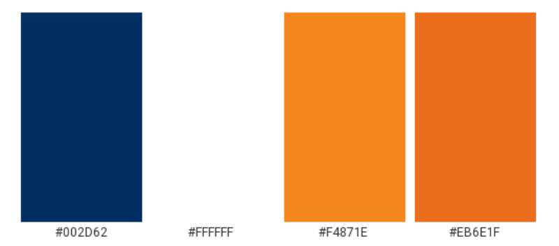
Colors tell stories, invoke feelings, and set moods. So what’s the vibe with the Astros’ shades?
Navy Blue
This isn’t just blue; it’s depth. It’s the vast expanse of space, the endless Texas sky, and the deep-rooted pride of Houstonians.
Bright Orange
Packed with energy! It’s the burst of a rocket launch, the vibrancy of the city, and the fiery spirit of the game.
The Font Used in the Houston Astros Logo
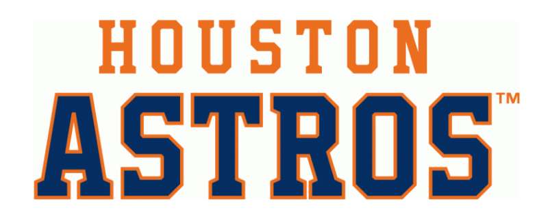
Fonts, the unsung heroes of design. Ever noticed the letters in the Astros logo?
Sleek and Modern
No frills, no fuss. The typeface is contemporary, which complements the overall modern aesthetics of the design. It’s readable but carries an edge, much like the team on the field.
Symbolism Over Time
Like all iconic symbols, the logo has carried various connotations over different eras.
Cultural Impact
From fan tattoos to graffiti art, the emblem’s cultural imprint is undeniable. It’s not just a team logo but a symbol of local pride.
Commercial Appeal
Merchandise, billboards, TV spots – the logo’s adaptability has contributed to its commercial success, making it a recognizable brand beyond baseball.
Global Recognition
Ever wondered how the logo fares beyond Texas?
International Fans
Thanks to the Internet and satellite TV, baseball and its iconic symbols, like the Astros logo, have a global fanbase. From Tokyo to Timbuktu, you’ll find folks rocking that star!
Logos that Inspire
Many young designers, yours truly included, draw inspiration from such timeless designs. It’s a testament to how a logo can transcend its primary function and become a muse.
FAQ On The Houston Astros Logo
What inspired the design of the Houston Astros logo?
The cosmos itself lent a hand, infusing this MLB phenomenon with the spirit of space exploration. Astros, evoking stars and astronauts, gives a nod to Houston’s role in celestial endeavors.
The logo, with its star and orbit motifs, pays homage to Houston’s Space City nickname, a stellar beacon of the team’s innovative spirit and trailblazing fame.
Is there a meaning behind the colors in the Astros logo?
Every hue speaks volumes. The vibrant orange represents energy and enthusiasm, reflective of a dawning sun or a crackling fire. The deep navy blue signifies professionalism and authority, mirroring the vast ocean’s depth.
Together, they strike a balance, painting a portrait of a team brimming with passion and unwavering resolve.
How has the Astros logo evolved over the years?
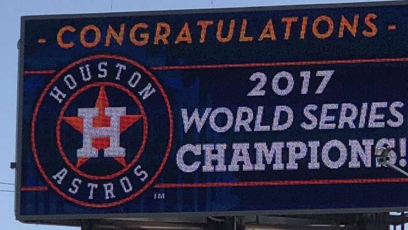
It’s a narrative of transformation, a timeline emblazoned with change. From the classic Colt .45s to the iconic orange star with the Astrodome’s silhouette, each alteration charts a course through history.
The latest iteration showcases a modern star with a beveled look, marrying tradition with forward-thinking design.
Why did the Astros change their logo?
Change fuels progression, a principle not lost on this team. It’s rejuvenation, a quest to stay fresh, relevant, and connected with a dynamic fanbase.
The changes mirror milestones: embracing a new stadium, Minute Maid Park, or celebrating a World Series victory, the logo morphs to mark these watershed moments.
How do the Astros use their logo in marketing?
Strategic placement is key. From merchandise to digital campaigns, the emblem is omnipresent. It’s a stamp of authenticity on fan apparel and a digital signature that fires up social media marketing.
Deployed wisely, it’s a rallying cry for fans, beckoning them with its magnetic pull.
What are the guidelines for using the Houston Astros logo?
Respect and legal boundaries dictate the roadmap. MLB guidelines are gospel here, governing usage to protect the integrity of the mark.
It’s about maintaining its stature, ensuring that when it appears, whether on uniforms or fan gear, it resonates with its original promise of quality and pride.
Can anyone design merchandise with the Houston Astros logo?
The short answer? No. Copyright laws grip tightly, ensuring only those with express permission can commercially explore the logo’s potent emblem.
Illegal use invites penalties; it’s a playing field hedged by respect for intellectual property, where only licensed vendors and Astros merchandise partners get the green light.
How does the logo represent the city of Houston?
The logo is a symbolic handshake between the team and the city, a union of values. It stands as a landmark, akin to the Houston Astros Hall of Fame illustrative of community pride and the shared heartbeat of locals exuding an indelible spirit synonymous with Houston’s ethos.
What was the public reaction to the latest Astros logo update?
Excitement laced with nostalgia. Changes stir a spectrum of sentiments, with traditionalists longing for bygone designs and others leaping towards the new.
Yet, spanning that divide is a collective anticipation, a city united under the latest banner, ready to wave it with the allegiance of true sportsmanship.
What merchandise is most popular with the Astros logo?
Jerseys clinch the top spot, wearable banners of loyalty. Alongside, hats emblazoned with the star-studded emblem hold their own, a ubiquitous crown for fans.
These items, among an array of fan apparel and accessories, become extensions of individuals, totems of shared conviction in the Astros journey.
Conclusion
The tapestry that is the Houston Astros logo unravels a story rich with innovation, heritage, and fanfare. As we’ve traversed the cosmic journey—from the early days of the Colt .45s through the starry paths of space exploration to the sleek, modern emblems of today—we’ve mapped a constellation that charts more than just a brand; it plots the very heartline of Houston.
It’s no mere icon; it’s a tapestry interwoven with streaks of orange vibrancy, deep navy sophistication, all shimmering under the Texan sun. From the electric ambiance of Minute Maid Park to the rippling cheers of a home game, this revered marque serves as more than just a symbol: it’s an eternal bond, clasping together the hands of a city and its team.
Embarking on this visual voyage, one can’t help but stand in awe of its influence on sports team branding, the legalities of logo use, and the flair it lends to fan apparel. This emblem transcends its graphic confines, pulsating with the living breath of its supporters.
If you liked this article about the Houston Astros logo, you should check out this article about the Arizona Diamondbacks logo.
There are also similar articles discussing the Colorado Rockies logo, the Miami Marlins logo, the Chicago White Sox logo, and the New York Yankees logo.
And let’s not forget about articles on the Philadelphia Phillies logo, the Toronto Blue Jays logo, the Kansas City Royals logo, and the Los Angeles Dodgers logo.
Bogdan Sandu, a seasoned designer with 15 years of diverse experience, has been designing websites since 2008.
Renowned for his expertise in logo design and visual branding, Bogdan has developed a multitude of logos for various clients.
His skills extend to creating posters, vector illustrations, business cards, and brochures. Additionally, Bogdan's UI kits were featured on marketplaces like Visual Hierarchy and UI8.
Latest posts by Bogdan Sandu (see all)