The New York Yankees logo is one of the most recognized marks in professional sports. That interlocking “NY” monogram has sat on navy blue caps and white home jerseys for over a century, and it has barely changed in all that time. Took me a while to fully appreciate just how rare that kind of consistency is for any brand, let alone a sports team.
What makes the Yankees emblem different from most baseball team logos is its origin story. It did not start on a baseball diamond. The design traces back to 1877, when Louis B. Tiffany of Tiffany & Co. created it for a police medal of valor. The franchise, founded as the Baltimore Orioles in 1901, adopted that interlocking “NY” in 1909 and has used it ever since. The primary logo, which includes a top hat and baseball bat, was designed by sports artist Henry Alonzo Keller in 1947. Between the cap insignia and that secondary emblem, the Yankees have gone through roughly 15 logo variations across their history.
What Is the New York Yankees Logo?
The New York Yankees logo is a combination mark featuring an interlocking “NY” monogram, officially adopted on caps in 1909. Designed originally by Louis B. Tiffany for an 1877 NYPD medal, the emblem uses a custom serif-style letterform in midnight navy blue and white to represent New York City.
Here are the key attributes that define the Yankees logo:
- Design Type: Combination mark. The team uses both the interlocking “NY” monogram (on caps and jerseys) and a secondary roundel emblem featuring a baseball, bat, and Uncle Sam hat.
- Primary Elements: Two custom glyphs, the letters “N” and “Y,” overlap in a bold serif style with slightly arched edges. The secondary logo adds a baseball with red seams, a bat forming the vertical line of the letter “K” in “Yankees,” and a patriotic top hat.
- Official Introduction Date: The interlocking “NY” first appeared on team caps and left sleeve of uniforms in 1909. The “bat and hat” secondary logo debuted in 1947.
- Designer: The original “NY” monogram was created by Louis B. Tiffany of Tiffany & Co. in 1877 for an NYPD medal. The secondary “bat and hat” logo was designed by Henry Alonzo Keller, a sports artist, in 1947.
- Trademark Status: Registered trademark owned by the New York Yankees Partnership. Filed under Mary L. Kelvin, registered October 23, 2007.
- Color Palette: Midnight Navy Blue (#0C2340), White (#FFFFFF), and for the secondary logo, Red (#E4002C) and Blue (#003087).
- Usage Context: The interlocking “NY” appears on all game caps, home and away jerseys, stadium signage, digital platforms, and licensed merchandise globally. The “bat and hat” emblem is used primarily in official team branding, printed materials, and promotional contexts.
How Has the New York Yankees Logo Evolved Over Time?
The Yankees logo has gone through roughly 15 versions since 1901. Most changes happened in the early years when the franchise was still called the Baltimore Orioles and then the New York Highlanders.
Once the interlocking “NY” locked into place in 1909, major redesigns mostly stopped. The biggest addition came in 1947 with the “bat and hat” emblem.
Baltimore Orioles Era (1901-1902)
- Years Active: 1901-1902
- Design Description: Simple single-letter logos. The first was an orange “O” on a dark background in 1901, followed by a “B” in 1902.
- Color Scheme: Orange and black
- Designer: Unknown
- Context: The franchise started in Baltimore as a charter member of the American League. Branding was minimal.
- Cultural Significance: These logos are almost forgotten today. Very few fans even know the Yankees started as the Orioles.
New York Highlanders Logo (1903-1908)
- Years Active: 1903-1908
- Design Description: The letters “N” and “Y” appeared separately on player jerseys, placed on the right and left breast sections. An Old English-style font was used initially, shifting to a more ornate style over these years.
- Color Scheme: Blue (varying shades) on white
- Designer: Unknown, likely internal to the club
- Context: Frank Farrell and Bill Devery bought the failed Baltimore franchise and moved it to Manhattan’s Hilltop Park. The “Highlanders” name referenced both the elevated field and the British Gordon Highlanders military unit, a nod to team president Joseph Gordon.
- Key Changes from Previous: Shifted from single-letter marks to a two-letter “NY” identity, establishing the geographic connection that would define the brand.
- Cultural Significance: This period planted the seed. The “NY” letters were not yet intertwined, but the building blocks were there.
First Interlocking NY Logo (1905)
- Years Active: 1905 only (one season)
- Design Description: First time the “N” and “Y” overlapped. The letters had smooth, slightly curved edges.
- Color Scheme: Dark blue on white
- Designer: Unknown
- Context: A brief experiment. The team went back to separated letters the following year.
- Key Changes from Previous: Letters overlapped for the first time, foreshadowing what would become the permanent design four years later.
- Cultural Significance: A prototype of sorts. Interesting to look at in hindsight, knowing what it eventually became.
The Permanent Interlocking NY (1909-Present)
- Years Active: 1909-present
- Design Description: Bold, custom serif-style letters “N” and “Y” interlocked with slightly arched edges. The monogram appears on caps and has been worn on the left breast of home jerseys at various points (removed from 1916-1935, returned in 1936).
- Color Scheme: Midnight navy blue and white
- Designer: Based on Louis B. Tiffany’s 1877 NYPD medal design. Team co-owner William “Big Bill” Devery, a former NYPD chief, is believed to have adopted the design for the team.
- Context: Devery’s connection to the police department likely influenced the decision. The cap design was finalized by 1922 and hasn’t changed since.
- Key Changes from Previous: This version stuck. The letters have a bolder, more authoritative feel than the 1905 experiment.
- Cultural Significance: This is the one. Babe Ruth wore it (on his cap, not his jersey). Lou Gehrig, DiMaggio, Mantle, Jeter. It went from sports insignia to global fashion symbol. Worth noting that Ruth never actually wore the “NY” on his jersey during his Yankees career (1920-1936), since the team removed it from jerseys in 1916 and only brought it back in 1936.
The “Bat and Hat” Logo (1947-Present)
- Years Active: 1947-present
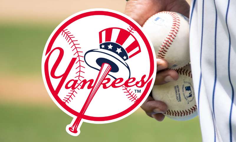
- Design Description: A white baseball with red seams. The word “Yankees” is written across it in red script. A red baseball bat forms the vertical line of the letter “K.” An Uncle Sam-style top hat in red, white, and blue hangs from the bat’s barrel.
- Color Scheme: Red, white, blue
- Designer: Henry Alonzo Keller, a sports artist
- Context: Introduced after World War II. The patriotic imagery connected the team to American identity during a time of national pride.
- Key Changes from Previous: This was an entirely new secondary mark, not an evolution of the interlocking “NY.” Both logos have coexisted since 1947.
- Cultural Significance: The Uncle Sam hat on a baseball bat screams Americana. This is the logo you see on official team documents, letterheads, and promotional material. But let’s be real, when people think “Yankees logo,” they think of the interlocking “NY” first.
What Do the Design Elements of the New York Yankees Logo Mean?
Every part of the Yankees logo carries weight. The interlocking “NY” is a direct representation of New York City, built from a design originally meant to honor police bravery.
The secondary emblem layers on American patriotism with its Uncle Sam hat and baseball imagery. Together, these two marks tell a story about city pride, national identity, and the sport itself.
What Does the Interlocking “NY” Symbolize?
The overlapping letters represent unity and strength. Originally designed for a medal honoring NYPD officer John McDowell (the first New York policeman shot in the line of duty), the mark carried meaning long before it touched a baseball cap.
Bill Devery brought it to the team as a symbol that connected the club to the city’s identity. The overlap of the two letters suggests cohesion. Nothing feels accidental about it.
What Does the “Bat and Hat” Emblem Represent?
The Uncle Sam top hat is an obvious nod to American patriotism, which hit differently in 1947 when the country was coming out of World War II.
The baseball and bat root the logo in the sport. The clever integration of the bat as the letter “K” in “Yankees” adds a layer of design thinking that most fans never even notice.
Why Did the Yankees Choose These Specific Colors?

The Yankees color palette is tight. Here’s what they use:
- Midnight Navy Blue – Hex: #0C2340, RGB: (12, 35, 64), CMYK: (100, 60, 0, 56), Pantone: PMS 289 C. This shade reads as authority and tradition. Navy blue carries psychological weight, suggesting trust, stability, and professionalism. It’s why blue logos show up constantly across banking, tech, and sports.
- White – Hex: #FFFFFF. Clean, simple, and high-contrast against the navy. White creates the visual punch that makes the “NY” readable at a distance, whether on a cap in the stands or a billboard in Times Square.
- Red (Secondary Logo Only) – Hex: #E4002C, RGB: (228, 0, 44), CMYK: (0, 91, 76, 0), Pantone: PMS 185 C. Used exclusively in the “bat and hat” emblem, the red connects to the American flag theme. It creates contrast against the white baseball background.
- Blue (Secondary Logo) – Hex: #003087, RGB: (0, 48, 135), CMYK: (100, 69, 0, 11.5), Pantone: PMS 287 C. A slightly brighter blue than the cap navy, used in the Uncle Sam hat element of the secondary mark.
- Gray (Uniforms) – Hex: #C4CED3, RGB: (196, 206, 211), CMYK: (0, 10, 7, 11), Pantone: PMS Cool Gray 7 C. Used on road uniforms only. Not present in the logo itself but part of the broader brand palette.
The psychology behind these colors is straightforward. Navy blue and white together read as classic and restrained. No bright accents, no neon. That restraint is part of what makes the whole identity feel timeless.
What Typography Style Is Used in the Yankees Logo?
The interlocking “NY” uses a custom serif font that has never been publicly released or named. The letterforms have slightly arched edges and bold strokes, giving them a hand-crafted quality.
The typeface sits somewhere between traditional serifs and custom display lettering. It’s readable at extremely small sizes on a cap, which is hard to pull off with interlocking letters. The “Yankees” script in the secondary logo uses a flowing hand-lettered style more common in mid-century sports branding.
What Are the Hidden Meanings in the New York Yankees Logo?
There’s the bat-as-letter-K trick in the secondary logo. Most people miss that completely. Henry Alonzo Keller worked the baseball bat into the word “Yankees” in a way that looks natural unless you’re specifically looking for it.
The Tiffany connection is another layer. A luxury jewelry house designed the foundation for a baseball team’s identity. That accidental pairing of high-end craftsmanship and working-class sport captures something about New York itself. Whether Devery intended that or just liked the way the letters looked on a police medal, we’ll never know for sure.
How Does the New York Yankees Logo Compare to Competitor Logos?
Most MLB logos lean into mascots, wordmarks, or detailed illustrations. The Yankees went the other direction with a stripped-down monogram, and that decision has aged better than almost anything else in the league.
The Boston Red Sox logo uses a pair of red socks, which is literal and playful. The Los Angeles Dodgers logo relies on a script wordmark that feels close to the Yankees in terms of restraint, but still uses more color variation. The New York Mets logo, sharing the same city, went with a more complex bridge-and-skyline approach that dates itself more quickly.
Teams like the Detroit Tigers use a similar single-letter concept with their Old English “D,” but it lacks the interlocking element that makes the Yankees mark feel more structured. The St. Louis Cardinals logo uses birds-on-bat imagery, which is charming but more illustrative. The Chicago Cubs logo with its bold “C” inside a circle takes a cleaner approach, yet still doesn’t carry the same cultural reach.
Where the Yankees logo really separates itself is recognition outside of baseball. If you showed 100 people on a street in Tokyo or London the interlocking “NY,” a good number would recognize it even without knowing anything about the sport. That’s not happening with the San Francisco Giants mark or the Philadelphia Phillies logo.
What Are the Technical Specifications of the New York Yankees Logo?
Official Color Codes
- Primary Color – Midnight Navy Blue: Hex: #0C2340, RGB: (12, 35, 64), CMYK: (100, 60, 0, 56), Pantone: PMS 289 C
- Secondary Color – White: Hex: #FFFFFF, RGB: (255, 255, 255), CMYK: (0, 0, 0, 0)
- Accent Color – Red (Secondary Logo): Hex: #E4002C, RGB: (228, 0, 44), CMYK: (0, 91, 76, 0), Pantone: PMS 185 C
- Accent Color – Blue (Secondary Logo): Hex: #003087, RGB: (0, 48, 135), CMYK: (100, 69, 0, 11.5), Pantone: PMS 287 C
- Uniform Gray: Hex: #C4CED3, RGB: (196, 206, 211), CMYK: (0, 10, 7, 11), Pantone: PMS Cool Gray 7 C
Dimensions and Proportions
- Aspect Ratio: The interlocking “NY” monogram sits within a roughly square proportion. The cap version and the print version differ slightly, with the cap version having equal-proportion letters and the print version featuring a slightly larger “Y” relative to the “N.”
- Minimum Size: MLB and the Yankees organization require that the logo maintain legibility at all sizes. The interlocking design works down to very small applications because of the bold stroke widths.
- Clear Space: Official guidelines mandate clear space around the logo equal to roughly half the height of the “N” on all sides.
- Usage Variations: Three official versions exist. The cap logo (equal proportions), the jersey logo (slightly larger “Y” with more curved strokes), and the print logo (slightly emphasized serifs on both letters).
What Cultural Impact Has the New York Yankees Logo Had?
The Yankees “NY” broke out of sports a long time ago. By the 1990s, the interlocking monogram was showing up in hip-hop music videos, on streetwear, and on heads that had never watched a single inning of baseball.
Jay-Z turned the navy blue Yankees cap into his personal signature. He literally rapped about making the hat more famous than any Yankee player. But the real credit for pushing it into fashion goes to Spike Lee, who convinced New Era to make a red Yankees cap for the 1996 World Series. Before that, team hats only came in official game colors.
That single move cracked open the floodgates. Now you can buy Yankees caps in any color you can think of. Supreme, Kith, and Gucci have all done collaborations with the Yankees brand. Alessandro Michele wore a Yankees cap at the end of a Gucci runway show in 2018.
David Beckham wore one. The Notorious B.I.G. wore one. President Clinton wore one. The cap transcended team loyalty completely. In cities around the world, from Tokyo to London to Sao Paulo, people wear it as a statement about New York City itself, not necessarily about baseball.
Fred Durst of Limp Bizkit even shifted the “NY” off-center on his cap in a 1999 music video, which became a whole thing in streetwear for a while. That’s the kind of influence we’re talking about.
How Does the New York Yankees Logo Fit Into the Overall Brand Identity?
The logo is one piece of a larger identity system that includes the pinstriped home uniforms (unchanged since 1936, the longest-running uniform design in MLB), the gray road jerseys, Yankee Stadium’s architecture, and even the team’s grooming policy.
Everything connects. The navy and white palette runs through the stadium signage, the merchandise, the digital properties, and the broadcast graphics on the YES Network. The Yankees are one of the few teams that don’t put player names on the back of jerseys, which keeps the focus on the team identity rather than individuals.
The brand guidelines are strict. The interlocking “NY” doesn’t get rotated, recolored outside of approved variations, or modified. That discipline is a big part of why the mark still feels authoritative after 100+ years. Other MLB teams redesign every decade or two. The Yankees just… don’t. And it works.
How Should the New York Yankees Logo Be Used?
- Official Usage Guidelines: The Yankees logo may not be altered, distorted, or combined with other design elements without express permission from the New York Yankees Partnership. The interlocking “NY” must always appear in its complete form. No letter should be used independently.
- Where to Access Official Logos: Official team logos for media and editorial use are available through MLB’s media resources. Licensed merchandise uses logos supplied directly through the Yankees organization and their licensing partners.
- Licensing Information: The Yankees logo is one of the most licensed marks in professional sports. New Era holds the exclusive MLB cap license. Nike produces official uniforms. Fanatics handles most retail merchandise. All require formal licensing agreements with MLB Properties and the Yankees organization.
- Trademark Protection: The interlocking “NY” is a registered trademark. Unauthorized commercial use, reproduction, or modification is prohibited and subject to legal action. The trademark was formally registered with the USPTO on October 23, 2007, though the mark has been in continuous use since 1909.
- Do’s: Use official color codes when reproducing the logo digitally. Maintain clear space requirements. Use only approved logo files from authorized sources.
- Don’ts: Don’t stretch or compress the logo. Don’t place it on busy backgrounds that reduce legibility. Don’t create mashups or parody versions for commercial purposes. Don’t use the interlocking “NY” on products without a license.
FAQ on The New York Yankees Logo
Who Designed the New York Yankees Logo?
The interlocking NY monogram traces back to Louis B. Tiffany of Tiffany & Co., who created it in 1877 for an NYPD medal of valor. The secondary “bat and hat” emblem was designed by sports artist Henry Alonzo Keller in 1947.
When Was the Interlocking NY First Used on Yankees Uniforms?
The interlocking NY appeared on caps and left sleeves in 1909. Team co-owner Bill Devery, a former NYPD chief, adopted the design from the police medal.
The cap insignia has stayed the same since 1922. That’s over a century of the same look.
What Do the Letters NY Stand for in the Yankees Logo?
They stand for New York. Pretty straightforward. The overlapping letters represent the city itself, not just the baseball team. The monogram first identified the New York Highlanders before the franchise became the Yankees in 1913.
What Are the Official Colors of the New York Yankees Logo?
The primary cap logo uses midnight navy blue (#0C2340) and white. The secondary emblem adds red (#E4002C) and blue (#003087).
Road uniforms include gray (#C4CED3). The color palette has remained consistent for decades.
What Is the “Bat and Hat” Yankees Emblem?
Henry Alonzo Keller designed this secondary logo in 1947. It shows a white baseball with “Yankees” in red script, a bat forming the letter K, and an Uncle Sam top hat hanging from the barrel. Pure Americana.
Has the Yankees Logo Ever Changed?
The franchise went through roughly 15 logo versions between 1901 and 1947. Most changes happened during the Baltimore Orioles and New York Highlanders years.
Since 1909, the interlocking NY on the cap has barely been touched. The home uniform design has been the same since 1936.
Why Is the Yankees Logo So Popular in Fashion?
Spike Lee convinced New Era to make a red Yankees cap during the 1996 World Series. That cracked open the door. Jay-Z, The Notorious B.I.G., and David Beckham turned it into a global streetwear staple. Gucci even put it on the runway in 2018.
Is the New York Yankees Logo Trademarked?
Yes. The New York Yankees Partnership owns the trademark, registered with the USPTO on October 23, 2007. Unauthorized commercial use is prohibited.
The mark has been in continuous use since 1909, which gives it strong legal protection under Major League Baseball licensing.
What Font Is Used in the New York Yankees Logo?
The interlocking NY uses a custom serif letterform that has never been publicly named or released. The characters have slightly arched edges and bold strokes. It sits between traditional typography and hand-crafted lettering, built specifically for legibility at small sizes on a baseball cap.
Can I Use the New York Yankees Logo on My Products?
Not without a license. The Yankees brand is one of the most protected in professional sports. New Era, Nike, and Fanatics hold official licensing agreements for merchandise.
Using the interlocking NY or “bat and hat” emblem commercially without permission from MLB Properties will get you a legal notice. Fast.
Conclusion
The New York Yankees logo has done something that most sports emblems never manage. It outlasted every design trend thrown at it since 1909 and still looks like it belongs.
From a Tiffany-designed police medal to Yankee Stadium to Gucci runways, that interlocking NY monogram crossed boundaries that no one planned for. Twenty-seven World Series titles helped, obviously.
The midnight navy blue and white monochrome color scheme keeps things simple. And simple is what lasts.
Whether stitched on a New Era fitted cap or printed on licensed merchandise, this Bronx Bombers emblem remains the standard for effective logo design in professional sports. Few marks carry that kind of weight across baseball, fashion, and pop culture at the same time.

Renowned for his expertise in logo design and visual branding, Bogdan has developed a multitude of logos for various clients.
His skills extend to creating posters, vector illustrations, business cards, and brochures. Additionally, Bogdan's UI kits were featured on marketplaces like Visual Hierarchy and UI8.
He also wrote in the past years on sites like Design Your Way, WebDesignerDepot, WPDean, Designmodo, Speckyboy, Slider Revolution, and more.
- The Cursor Logo History, Colors, Font, And Meaning - 24 September 2026
- Top 7 Web Design Subscription Services That Replace Full-Time Hires - 24 September 2026
- Canva vs PowerPoint: Which Is Better for Presentations? - 22 September 2026

Bogdan Sandu is a seasoned designer who has been designing websites since 2008. Renowned for his expertise in logo design and visual branding, Bogdan has developed a multitude of logos for various clients. His skills extend to creating posters, vector illustrations, business cards, and brochures. Additionally, Bogdan's UI kits were featured on marketplaces like Visual Hierarchy and UI8. He also wrote in the past years on sites like Design Your Way, WebDesignerDepot, WPDean, Designmodo, Speckyboy, Slider Revolution, and more.
You Might Also Like