The San Francisco Giants Logo History, Colors, Font, and Meaning
Diving into the deep end of visual identity, one icon delivers a splash of fervent passion and timeless tradition—the San Francisco Giants logo.
Woven into the fabric of Major League Baseball’s storied heritage, this emblem epitomizes more than the sum of its parts; it captures a saga brimming with home runs and heart.
In the paragraphs that follow, one will unravel the threads of this iconic symbol’s evolution. From its humble inception to becoming a beacon of the Bay Area sports scene, the journey of the Giants’ logo mirrors the team’s own triumphs.
By article’s end, navigate the transformation of a simple design into an unshakeable brand identity. Explore the nuances behind the team’s emblem—how the interplay of orange and black transcends the bounds of the baseball diamond, and the way a cleverly crafted logo can encapsulate the spirit of San Francisco itself.
Expect revelations about marketing savvy in sports logo design, the true currency in fan loyalty, and the magic spun into fibers of Giants merchandise.
This isn’t just a tale of a logo; it’s the emblematic heartbeat of MLB team loyalty and sports memorabilia—a legacy stitched with victory and the echoes of cheering fans.
The Meaning Behind the San Francisco Giants Logo
Ever just stopped and thought, “Hey, why does the San Francisco Giants logo look the way it does?” Well, my friends, strap in, because we’re diving deep into this iconic piece of artistry.
Symbolism in Simplicity
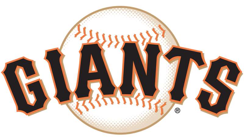
Now, if you’re from the Bay Area or just a die-hard baseball fan, you’ve probably noticed the big SF that graces the San Francisco Giants logo.
This, of course, stands for San Francisco. But it’s not just about the city’s initials. It’s a representation of the team’s identity, its home, and its passionate fanbase.
Tradition and Tenacity
The design feels timeless, right? It evokes the team’s storied past while staying present. It’s a blend of history and the never-ending drive to win.
The History of the San Francisco Giants Logo
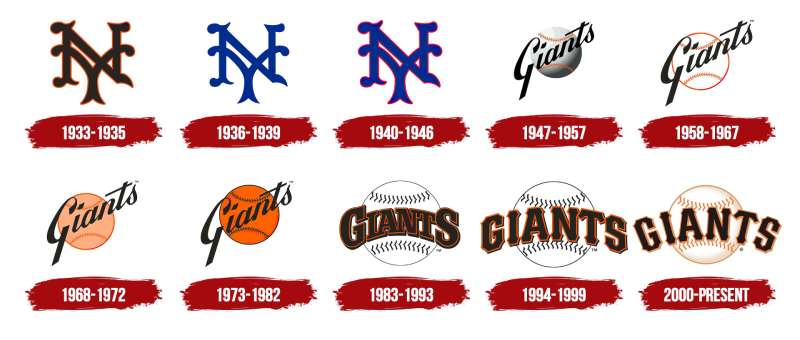
Logo journeys? Totally my jam. The San Francisco Giants logo is not just something whipped up overnight. Nope, it’s got layers, baby.
Roots in New York
Did you know? The Giants weren’t always based in SF. They started off as the New York Giants! And their logo? It had a more detailed player design. But as the team moved and evolved, so did its visual identity.
From NY to SF
The transition from New York to San Francisco brought changes in both the team’s name and emblem. Over time, the intricate designs simplified, leading to the iconic SF we know and love.
The Colors of the San Francisco Giants Logo
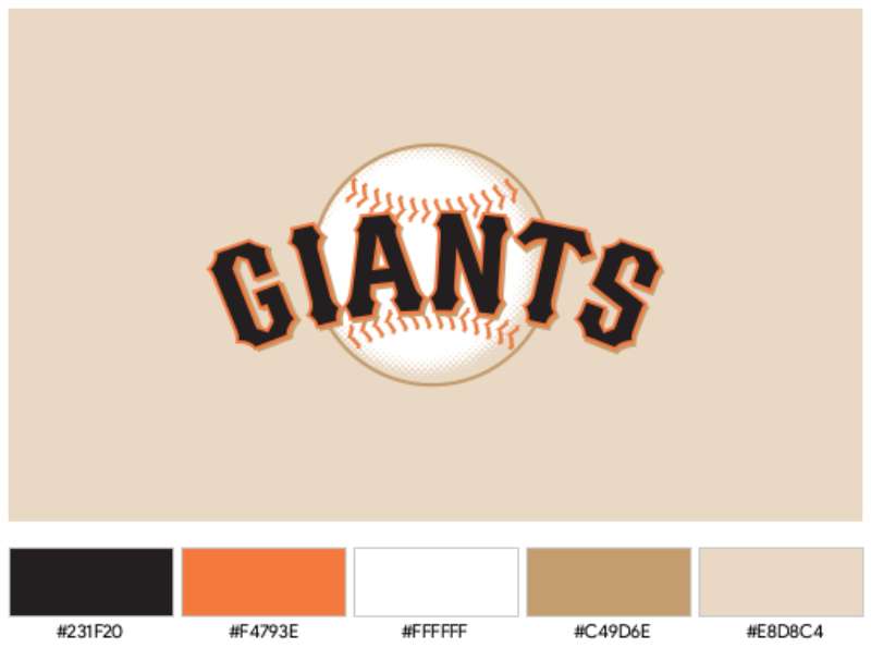
Colors aren’t just for making things look pretty. Oh no, they mean something.
Black & Orange Crush
The dominant colors of the logo are black and orange. Black signifies strength, determination, and power. Meanwhile, orange? That’s for enthusiasm, happiness, and success. Now think about a Giants game. All making sense, huh?
Accent of Cream
It’s subtle, but there’s a cream hue, representing purity, tradition, and the classic feel of the sport.
The Font Used in the San Francisco Giants Logo
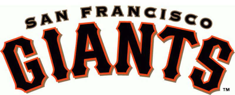
Let’s chat fonts. A logo’s typeface can make you feel a type of way, and the Giants nailed it.
Bold and Classic
The font is bold, making a statement. It screams confidence and carries a classic feel, connecting to baseball’s rich history.
Easy Recognition
It’s easily distinguishable from afar. Whether you’re in the nosebleed seats or catching a glimpse on TV, that SF is unmistakable.
Fan Connection Through the Logo
Emotional Ties

Logos aren’t just visuals. For fans, they’re an emotional connection to memories, moments, and community. Every curve, color, and letter brings back that home run or that unforgettable match.
More Than Just Baseball
The logo represents the spirit of the Bay Area, its vibrancy, and its eclectic mix of tradition and innovation.
Evolution Over the Years
Logo Transitions
Over the years, there’ve been slight tweaks and changes. However, the core spirit, that bold SF, remains untouched. It’s a testament to holding onto roots while embracing change.
Adapting Without Losing Essence
While the team has adapted to new eras of baseball, the essence of the logo remains – a beacon of tradition, tenacity, and timeless love for the game.
FAQ On The San Francisco Giants Logo
What’s the history behind the San Francisco Giants logo?
The timeline of the Giants logo is a romp through design evolution. It began as a simple ‘NY’ entwining, then sprouted into the ‘SF’ emblem we see stitched on jerseys today. Like layers of a historic ballpark, each redesign chronicles eras of triumphs, trials, and transformation.
How does the logo embody the spirit of San Francisco?
The logo cinches together Bay Area Sports and community pride. With its crisp, interlocked ‘SF’, it mirrors the city’s heart—dynamic, enduring, and bold.
Its orange and black palette echoes the city’s vibrant murals, the Golden Gate Bridge at sunset, and echoes of perseverance amid the infamous fog.
What are the colors used in the San Francisco Giants logo, and what do they represent?
Beyond merely MLB team colors, the orange and black scheme of the Giants logo radiates energy and elegance.
Orange—daring, bright, lively; and black—sophisticated, solid, stemming from the team’s New York Gothams roots. Together, they’re a visual chant, as timeless as the game itself.
Has the San Francisco Giants logo changed over time?
Absolutely. Akin to a seasoned pitcher refining his throw, the logo has seen its fair share of tweaks and turns since 1883.
Each update reflects a strategic design in sports—modernizing while paying homage to a storied past, upholding the emblem’s legacy as a symbol of baseball history.
Why is the logo so significant to Giants fans?
To fans, the Giants emblem is more than merch—it’s a badge of unity, worn as a signal of devotion across generations. In the stands of Oracle Park, it’s a flag that rallies a shared love for the game and for the kinship felt with every home run and strikeout.
What are some iconic moments associated with the San Francisco Giants logo?
The logo’s been a silent witness to World Series wins, perfect games, and Barry Bonds’ 756th homer. It’s an image indelibly linked to storied players like Willie Mays and icons of victory.
Each milestone enriches the logo’s narrative, burnishing its status within Major League Baseball branding.
Are there any legal issues around the use of the San Francisco Giants logo?
Trademark laws guard the logo fiercely. As a treasured SF Logo Trademark, it’s the team’s intellectual property—misuse or counterfeiting steps on the toes of legalities. Every cap, tee, and foam finger stands as a testimony to the protected sports logo design that is the Giants’ own.
How does the logo affect the team’s merchandise sales?
In the realm of sports memorabilia and logos, the Giants insignia is akin to a magnet in a sea of iron filings. It draws fans to Giants Dugout Stores, enhances the allure of merch, and ensures that with every purchase, a piece of the Giants’ soul finds a new home.
What is the symbolism of the logo’s font and design?
Dignified serifs speak to tradition; bold lines, to an unflinching resolve on the field—the font and design choices are masterstrokes by the hand of graphic aptitude.
They resonate with the sport’s history while flexing modern flair, a harmonious blend that scores both in aesthetics and fan merchandise designs.
How does the logo compare to other MLB team logos in terms of popularity?
It’s a heavyweight champion in a league of style and substance. Set beside its contemporaries, the Giants logo has cachet—an ambassador of the city, its fans, and a royal history.
In terms of professional baseball trademarks, it’s a contender for the crown of notoriety and affection.
Conclusion
Enigmatic yet emblematic, the San Francisco Giants logo concludes its design odyssey here, yet the journey through its undulating waves of black and orange is infinite. Think of it as a beacon, forever ablaze, in the heart of the city by the bay—a memento of euphoria etched in time, space, and memory.
In our exploration, we’ve touched upon:
- The heritage-rich transformation of a simple badge into Major League Baseball’s iconography elite.
- The robust symbolism, married flawlessly to the city’s own narrative fabric.
- Its uncanny ability to fuel the commerce of Giants Dugout Stores with something as intangible as fervor for the game, materialized into merchandise.
As the sun sets on this page, the afterglow—the silhouette of the SF emblem—remains both a salute to the not-so-bygone era of Willie Mays and a nod to the future whispers of Oracle Park. It prevails, larger than life, just like the spirit it encapsulates.
If you liked this article about the San Francisco Giants logo, you should check out this article about the Cleveland Indians logo.
There are also similar articles discussing the Atlanta Braves logo, the Milwaukee Brewers logo, the Chicago Cubs logo, and the Minnesota Twins logo.
And let’s not forget about articles on the New York Mets logo, the Washington Nationals logo, the Texas Rangers logo, and the Baltimore Orioles logo.
- Seamlessly Blended: Gorgeous Gradient Color Palettes - 30 April 2024
- Examples of Great Gym Websites to Inspire You - 30 April 2024
- The Activision Blizzard Logo History, Colors, Font, And Meaning - 29 April 2024


