The Texas Rangers logo is one of those marks in professional baseball that just sticks with you. Red “T” on a white baseball, wrapped in a blue and red circle. Simple enough to recognize from the nosebleed seats, detailed enough to hold up on a cap or jersey sleeve.
The franchise, originally founded as the Washington Senators in 1961, relocated to Arlington, Texas in 1972. Since then, the team has gone through seven distinct primary logo designs. Each one tried to answer the same question: how do you represent Texas baseball in a single badge?
The current mark, introduced in 2003 and designed by Skilo Brands out of New York, is the longest-running primary logo in franchise history. It has become the face of the Rangers through two World Series appearances, a 2023 championship, and more than two decades of AL West competition.
Look, not every MLB team gets their branding right on the first try. The Rangers sure didn’t. But that long process of refinement is actually what makes their current identity so solid. Seven logos in, they finally landed on something that feels permanent.
What Is the Texas Rangers Logo?
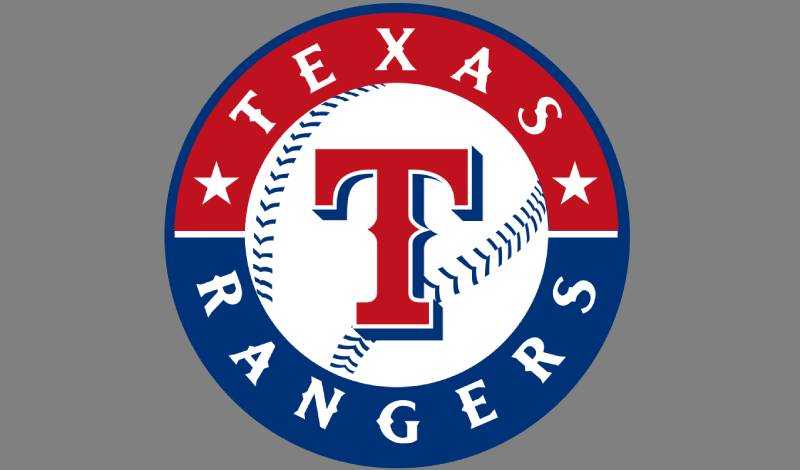
The Texas Rangers logo is a circular emblem featuring a bold red “T” with a blue drop shadow, placed on a white baseball with blue stitching. This baseball sits inside a red and blue ring bearing the words “TEXAS RANGERS” in white, separated by two small white stars. Designed by Skilo Brands, it was officially introduced in 2003.
Here is a breakdown of the logo’s core attributes:
- Design Type: Combination mark (emblem with wordmark and icon)
- Primary Elements: Stylized capital “T” in wishbone serif lettering, white baseball with blue stitching, circular red and blue border ring, “TEXAS RANGERS” wordmark, two white five-pointed stars
- Official Introduction Date: 2003 season
- Designer/Agency: Skilo Brands, New York
- Trademark Status: Registered trademark of MLB and the Texas Rangers franchise, protected under Major League Baseball Properties
- Color Palette: Royal Blue (#003278), Red (#C0111F), White (#FFFFFF)
- Usage Context: Game-day uniforms, caps, official merchandise, digital platforms, broadcast graphics, stadium signage, and all licensed fan apparel
In 2024, the Rangers shifted this circular emblem to secondary status and promoted a standalone red “T” with a blue shadow as the new primary mark. But the round badge remains central to the team’s identity and still appears across most merchandise and marketing.
How Has the Texas Rangers Logo Evolved Over Time?
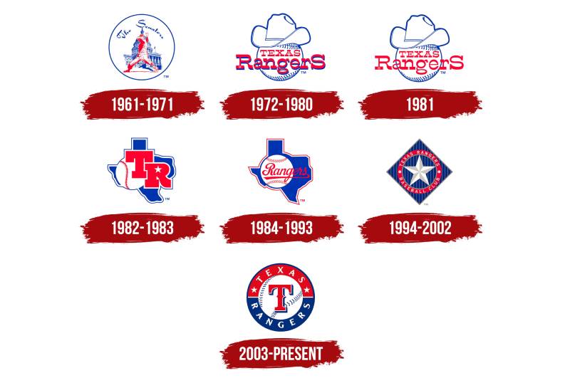
The Texas Rangers logo has changed seven times since the franchise began as the Washington Senators in 1961. The designs moved from a Capitol building scene to cowboy hats, then the Texas state outline, then star-based badges, and finally the current circular baseball emblem. Each redesign reflected the team’s shifting identity and growing connection to Texas culture.
Washington Senators Logo (1961-1971)
- Years Active: 1961-1971
- Design Description: White circle containing a blue outline of the White House, a red-outlined baseball player in a pitching pose, and “The Senators” text above
- Color Scheme: Red, blue, and white
- Designer: Uncredited
- Context: Created for the expansion franchise that replaced the original Senators (who became the Minnesota Twins). The design tied the team directly to Washington, D.C.
- Cultural Significance: This was a literal representation of the team’s home city. The White House imagery made sense for a D.C. team, but it wouldn’t survive the move south.
Cowboy Hat Logo (1972-1980)
- Years Active: 1972-1980
- Design Description: A white baseball with red stitching, topped by a blue-outlined cowboy hat. “Texas Rangers” written in red across the ball with blue outlines
- Color Scheme: Red, white, and blue
- Designer: Uncredited
- Context: The franchise moved to Arlington, Texas and needed a completely new identity. The cowboy hat was an instant signal that this was a Texan team now.
- Key Changes from Previous: Dropped all Washington, D.C. imagery. Introduced Western themes.
- Cultural Significance: This logo built the first real connection between the franchise and Texas heritage. It leaned hard into frontier imagery and worked. Fans accepted it immediately.
Refined Cowboy Hat Logo (1981)
- Years Active: 1981 (single season)
- Design Description: Same baseball-and-hat composition but with thinner lettering. The blue outline and shadow were removed from the “Texas Rangers” text, keeping only red.
- Color Scheme: Red, white, and blue (with reduced blue presence)
- Key Changes from Previous: Typography became more refined. The overall look felt cleaner and less cluttered.
- Cultural Significance: This was a quick transitional design. It only lasted one season before the team went in a totally different direction.
Texas State Outline with “TR” Logo (1982-1983)
- Years Active: 1982-1983
- Design Description: Blue silhouette of the state of Texas with a double blue and white outline. A white baseball with red stitches sat on the left side, overlapped by bold red “TR” letters. The negative space of the “R” formed a white five-pointed star.
- Color Scheme: Royal blue, red, and white
- Context: The team wanted something bolder. The state outline replaced the cowboy hat, moving from Western cliches to geographic identity.
- Key Changes from Previous: Complete departure from the hat concept. First appearance of the Texas state silhouette and the star motif.
- Cultural Significance: The hidden star in the “R” was a nice touch. This mark only lasted two seasons, but it planted seeds for design ideas the team would return to later.
Texas State Outline with Script “Rangers” Logo (1984-1993)
- Years Active: 1984-1993
- Design Description: Kept the blue Texas state silhouette and the baseball, but replaced the “TR” monogram with an italicized script “Rangers” in red. Added a thin red outline to the white emblem.
- Color Scheme: Blue, red, and white
- Context: This version coincided with the Nolan Ryan era and became the most nostalgic mark in franchise history for many fans.
- Key Changes from Previous: Script lettering replaced the blocky “TR” initials. The overall feel shifted from aggressive to classic.
- Cultural Significance: This is the logo that lots of long-time fans still consider “the real Rangers logo.” Took me a while to understand why people get so sentimental about it, but then I saw photos from Arlington Stadium in the late ’80s and it clicked. That mark just belongs to that era.
Lone Star Diamond Logo (1994-2002)
- Years Active: 1994-2002 (with modifications in 1998)
- Design Description: Diamond-shaped badge with vertical silver pinstripes over a blue background. A large five-pointed star sits at the center, surrounded by a red circular frame. “Texas Rangers Baseball Club” written in white around the perimeter. In 1998, the star became larger and gained spherical tips (resembling a sheriff’s badge), with “Rangers” on a blue ribbon across the center.
- Color Scheme: Blue, red, white, and silver/gray
- Context: This was the most drastic branding change in team history. It arrived alongside the team’s first playoff appearances and their move toward becoming genuine contenders.
- Key Changes from Previous: Dropped the Texas state outline entirely. Introduced the diamond shape and sheriff’s badge star. Added silver to the palette for the first time.
- Cultural Significance: The sheriff’s badge reference tied back to the actual Texas Rangers law enforcement agency. It was a clever connection, though some fans felt the design was too busy.
Current Circular Emblem (2003-Present)
- Years Active: 2003-present (primary 2003-2023, secondary from 2024)
- Design Description: Circular badge with a red and blue ring. White baseball at center with blue stitching. Bold red “T” with blue drop shadow placed on the ball. “TEXAS RANGERS” in white letters around the ring, separated by two white stars.
- Color Scheme: Royal Blue (#003278), Red (#C0111F), White (#FFFFFF)
- Designer: Skilo Brands, New York
- Context: Introduced to give the franchise a cleaner, more contemporary identity. It was the team’s first fully circular primary mark.
- Key Changes from Previous: Simplified everything. Removed the diamond shape, pinstripes, and sheriff’s badge. Focused on the “T” as the central graphic element.
- Cultural Significance: This logo carried the team through their 2010 and 2011 World Series runs and their 2023 championship victory. It is now the most recognized version of the Rangers brand.
What Do the Design Elements of the Texas Rangers Logo Mean?
The central “T” is the most obvious element. It represents Texas, and it doubles as the team’s initial. The wishbone-style serifs on the letter give it a Western, old-time feel that connects to the state’s frontier roots.
The baseball behind the “T” is there for a reason you probably already guessed. It grounds the logo in the sport. Without it, the “T” could belong to any Texas-based organization.
The two white stars separating the team name on the outer ring reference Texas as the Lone Star State. And the circular shape itself recalls a classic seal or badge, which ties back to the Texas Rangers law enforcement agency that gave the team its name.
Why Did the Texas Rangers Choose These Specific Colors?
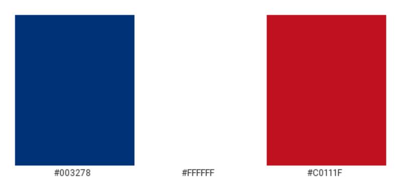
Red, white, and blue. Same as the Texas state flag. Same as the American flag. The choice was never really a mystery.
Here are the official color palette specs:
- Royal Blue – Hex: #003278, RGB: (0, 50, 120), CMYK: (100, 65, 0, 30), Pantone: 288 C. Represents loyalty, trust, and stability. It is the dominant color on caps and the outer ring of the logo.
- Red – Hex: #C0111F, RGB: (192, 17, 31), CMYK: (0, 100, 65, 15), Pantone: 200 C. Signals energy and passion. It is the color of the “T” and the outer border band.
- White – Hex: #FFFFFF, RGB: (255, 255, 255), CMYK: (0, 0, 0, 0). Used for the baseball, the text, and the stars. Provides contrast and readability against the darker colors.
The franchise has used this same three-color combination since 1972. It has never changed. The specific shades have shifted slightly over the decades, but the core identity stays red, white, and blue. Understanding color psychology helps explain why these particular tones work so well for a team rooted in state pride and patriotic identity.
What Typography Style Is Used in the Texas Rangers Logo?
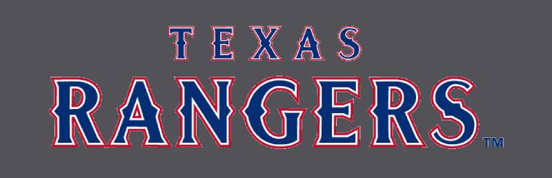
The “T” at the center of the logo uses a custom wishbone-style serif typeface. It is not a commercially available font.
The closest match that type enthusiasts have identified is FM Bolyar Ornate Regular. But the Rangers’ version is custom-drawn with distinctive mid-letter serifs that give each character a spiked, badge-like appearance.
The “TEXAS RANGERS” wordmark around the outer ring uses a clean all-caps serif typeface with strong readability at small sizes. This matters more than you might think. Logos get printed on everything from stadium banners to tiny hat tags, so legibility at different scales is not optional.
What Are the Hidden Meanings in the Texas Rangers Logo?
The circular badge shape is not an accident. It mirrors the shape of a law enforcement badge, connecting the baseball team to the historic Texas Rangers agency founded by Stephen F. Austin in 1823.
The two stars on the outer ring do more than just separate text. They reinforce the Lone Star identity. And the blue drop shadow behind the red “T” creates a sense of depth that makes the letter pop forward, almost like it is jumping off the baseball.
Is that a hidden meaning? Maybe not hidden exactly. But it is intentional. The whole composition is designed to feel authoritative, like something official. At least, that is how I read it.
How Does the Texas Rangers Logo Compare to Competitor Logos?
Among baseball team logos, the Rangers’ circular emblem sits in a specific category. It is a seal-style mark, similar to what the New York Mets and Minnesota Twins use. These teams all wrap their branding inside a circular frame with text running along the perimeter.
Compare that to clubs like the New York Yankees or the Los Angeles Dodgers, who rely on standalone wordmarks or letterforms without any circular framing. Those marks feel more minimal. The Rangers’ approach carries more weight visually.
Within the AL West, the Rangers’ logo is the most traditional in feel. The Houston Astros use a star-heavy mark with a more modern edge. The Seattle Mariners lean into a compass-and-trident concept. The Rangers stick with their badge.
One thing worth noting. The red-white-blue palette is shared by several MLB teams, including the Atlanta Braves, Chicago Cubs, and Philadelphia Phillies. What separates the Rangers is the badge structure and the wishbone serif “T.” That typeface detail is unique across the entire league.
What Are the Technical Specifications of the Texas Rangers Logo?
Official Color Codes
- Primary Color: Royal Blue – Hex: #003278, RGB: (0, 50, 120), CMYK: (100, 65, 0, 30), Pantone: 288 C
- Secondary Color: Red – Hex: #C0111F, RGB: (192, 17, 31), CMYK: (0, 100, 65, 15), Pantone: 200 C
- Tertiary Color: White – Hex: #FFFFFF, RGB: (255, 255, 255), CMYK: (0, 0, 0, 0)
- Accent Color: Dark Gray – Hex: #857874, RGB: (133, 120, 116), CMYK: (0, 10, 13, 48), Pantone: 409 C
- Accent Color: Light Gray – Hex: #BFB8AF, RGB: (191, 184, 175), CMYK: (0, 4, 8, 25), Pantone: Warm Gray 3 C
Dimensions and Proportions
- Aspect Ratio: 1:1 (circular format)
- Minimum Size Requirements: Per MLB guidelines, the logo should not be reproduced smaller than 0.5 inches in diameter for print to maintain legibility of the wordmark text
- Clear Space: A minimum clear space equal to the height of the “T” letterform should surround the logo on all sides
- File Formats: Official logos are available in vector formats (AI, EPS, SVG) for scalable reproduction, plus rasterized JPEG and PNG versions for digital use
- Usage Guidelines: All usage must comply with MLB Properties licensing standards. The logo cannot be stretched, rotated, recolored, or modified in any way without explicit approval
What Cultural Impact Has the Texas Rangers Logo Had?
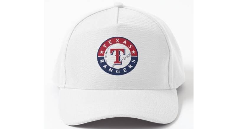
The Texas Rangers logo became a symbol of the franchise’s biggest moments. It was on every cap, every jersey, every piece of championship merchandise when the team won the 2023 World Series.
For fans in the Dallas-Fort Worth area, the logo represents more than baseball. It is a regional identity marker. You see it on trucks, on bar walls, on baby onesies. It is part of the visual texture of North Texas.
The Nolan Ryan-era script logo from 1984-1993 still shows up on throwback merchandise regularly. That tells you something about how deeply these marks get woven into fan identity. People don’t just wear the current logo. They wear the one that matches their personal timeline with the team.
The 2023 championship run gave the current mark its biggest cultural moment. Before that, the logo had been through some lean years. But winning changes everything for a brand, and now the circular “T” badge carries the weight of a title.
How Does the Texas Rangers Logo Fit Into the Overall Brand Identity?
The logo does not exist on its own. It is part of a system that includes the standalone “T” cap mark, the full “Texas Rangers” wordmark in wishbone serifs, alternate marks, and the Globe Life Field stadium branding.
Everything connects through the same three colors and the same typographic style. The wishbone serif “T” appears on caps, the circular badge appears on jerseys and merchandise, and the full wordmark appears on stadium signage and broadcast graphics.
In 2024, the team promoted the standalone red “T” with blue shadow as the new primary mark. This was a move toward simplicity. But they kept the circular badge as a secondary logo because that mark carries too much recognition to retire.
The whole identity system works because every piece shares the same DNA. Same colors. Same type style. Same attitude. Swap any element out and the rest still reads as “Texas Rangers.”
How Should the Texas Rangers Logo Be Used?
If you are looking to use the Texas Rangers logo for any purpose, here is what you need to know:
- Official usage requires licensing. All Texas Rangers logos, wordmarks, and related visual assets are trademarks of the Texas Rangers and Major League Baseball. Commercial use requires a license through MLB Properties.
- Do not alter the logo. Stretching, recoloring, adding effects, or modifying any part of the mark violates trademark guidelines. The logo must be reproduced exactly as provided in official brand assets.
- Where to access official logos: Licensed vendors and partners receive official logo files through MLB Properties. Fans can access approved imagery through the team’s official website at mlb.com/rangers and through licensed merchandise retailers.
- Editorial and news use: Media outlets may reproduce the logo for news reporting and editorial purposes under fair use, with proper attribution to the Texas Rangers and MLB.
- Fan and personal use: Creating personal, non-commercial items using the logo (like a custom phone wallpaper) generally falls outside enforcement, but selling anything with the mark without a license is a trademark violation.
- Digital use: When using the logo digitally, maintain minimum size requirements and always use transparent PNG or vector files to preserve the mark’s integrity against different background colors.
Bottom line: if money is involved, get a license. If it is for personal use, you are probably fine. But don’t guess on the legal stuff. Check with MLB Properties if you are unsure.
FAQ on The Texas Rangers Logo
What does the Texas Rangers logo look like?
The current Texas Rangers logo features a bold red “T” with a blue drop shadow, placed on a white baseball with blue stitching. A red and blue circular ring surrounds it, with “TEXAS RANGERS” in white and two small stars.
When was the current Texas Rangers logo introduced?
The current primary logo was introduced in 2003. Skilo Brands, a New York design agency, created it in collaboration with Rangers Baseball Express.
MLB approved the design before the season started. It served as the primary mark through 2023.
What do the colors in the Texas Rangers logo mean?
Royal blue, red, and white mirror the Texas state flag. Blue stands for loyalty. Red signals energy and passion. White provides clean contrast.
The franchise has used this same three-color combination since relocating to Arlington in 1972. It has never changed.
How many times has the Texas Rangers logo changed?
Seven times. The franchise started as the Washington Senators in 1961 with a Capitol building design. After moving to Texas, they went through cowboy hats, the Texas state outline, star badges, and finally the current circular emblem.
What font does the Texas Rangers logo use?
The “T” uses a custom wishbone-style serif typeface. It is not commercially available. The closest match identified by type enthusiasts is FM Bolyar Ornate Regular, though the Rangers version is a proprietary design with unique mid-letter serifs.
Why is there a star on the Texas Rangers logo?
Two white stars appear on the outer ring of the badge. They reference the Lone Star State identity that defines Texas.
Earlier versions from the 1990s featured a much larger star, styled like a sheriff’s badge. That connected the team to the actual Texas Rangers law enforcement agency.
What are the official Texas Rangers logo color codes?
Royal Blue is Hex #003278, Pantone 288 C. Red is Hex #C0111F, Pantone 200 C. White is Hex #FFFFFF.
These are the codes used across all MLB merchandise, broadcast graphics, and licensed team apparel for the Arlington-based franchise.
Can I use the Texas Rangers logo for my own project?
Not commercially. The logo is a registered trademark of the Texas Rangers and Major League Baseball. Any commercial use requires licensing through MLB Properties. Personal, non-commercial use like phone wallpapers generally falls outside enforcement.
What did the original Texas Rangers logo look like?
The first Texas Rangers logo in 1972 showed a white baseball topped with a blue cowboy hat. “Texas Rangers” was written in red across the ball.
It replaced the Washington Senators mark, which featured the White House and a baseball player. The cowboy hat was a direct nod to the state’s Western heritage.
Did the Texas Rangers change their logo in 2024?
Yes. The team promoted a standalone red “T” with a blue shadow as the new primary mark for the 2024 season. The circular baseball emblem shifted to secondary status but still appears on merchandise and marketing materials across the Dallas-Fort Worth area.
Conclusion
The Texas Rangers logo tells the story of a franchise that took decades to figure out its visual identity. Seven redesigns, three different creative directions, and one 2023 World Series title later, the circular badge with the red “T” finally feels like it belongs.
From cowboy hats to the Texas state silhouette to sheriff’s badge stars, every version added something to the brand’s DNA.
The current mark works because it is clean, scalable, and rooted in the same red, white, and blue palette the team has carried since arriving in Arlington. That consistency matters.
Whether you are a fan tracking MLB team branding or a collector hunting vintage Rangers merchandise, this emblem connects Globe Life Field to five decades of American League West baseball history. Not bad for a letter on a ball.

Renowned for his expertise in logo design and visual branding, Bogdan has developed a multitude of logos for various clients.
His skills extend to creating posters, vector illustrations, business cards, and brochures. Additionally, Bogdan's UI kits were featured on marketplaces like Visual Hierarchy and UI8.
He also wrote in the past years on sites like Design Your Way, WebDesignerDepot, WPDean, Designmodo, Speckyboy, Slider Revolution, and more.
- How to Install Fonts on Mac (Step-by-Step Guide) - 20 September 2026
- From Mockup to Code: How AI-Augmented Development Speeds Up the Design Handoff - 19 September 2026
- The Beehiiv Logo History, Colors, Font, And Meaning - 18 September 2026

Bogdan Sandu is a seasoned designer who has been designing websites since 2008. Renowned for his expertise in logo design and visual branding, Bogdan has developed a multitude of logos for various clients. His skills extend to creating posters, vector illustrations, business cards, and brochures. Additionally, Bogdan's UI kits were featured on marketplaces like Visual Hierarchy and UI8. He also wrote in the past years on sites like Design Your Way, WebDesignerDepot, WPDean, Designmodo, Speckyboy, Slider Revolution, and more.
You Might Also Like