The wrong font can kill a poster before anyone reads a single word.
Choosing the best fonts for posters is not about personal taste. It’s about legibility at distance, stroke weight under print conditions, and whether your headline holds up at 100pt on coated stock or collapses into visual noise.
Typography carries the message before the content does. Concert posters, fashion campaigns, political flyers, film titles — each category has typefaces that work structurally and ones that fail predictably.
This guide covers the 10 best poster fonts used by designers across print and large-format design, with full specs, pairing recommendations, licensing details, and honest limitations for each.
The Best Fonts For Posters
Poster typography lives or dies at large sizes and at distance. The fonts below cover the full range of poster design needs: bold display typefaces for concert and event posters, high-contrast serifs for editorial and fashion work, and versatile sans-serifs that hold up across print formats. Each entry includes structural specs, pairing suggestions, and honest limitations.
| Font | Classification | Best Poster Context | License |
| Bebas Neue | Display sans-serif | Concert, sports, bold headlines | OFL (Free) |
| Montserrat | Geometric sans-serif | Event, promotional, modern | OFL (Free) |
| Futura | Geometric sans-serif | Brand, cinematic, editorial | Commercial |
| Playfair Display | Transitional serif | Fashion, theatre, luxury | OFL (Free) |
| Oswald | Condensed gothic sans-serif | News, political, narrow layouts | OFL (Free) |
| Abril Fatface | Display Didone serif | Magazine covers, bold editorial | OFL (Free) |
| Bodoni | Didone serif | Fashion, theatre, luxury print | Commercial |
| Helvetica | Neo-grotesque sans-serif | Corporate, institutional, neutral | Commercial |
| Franklin Gothic | Realist sans-serif | Advertising, political, billboards | Commercial |
| Lato | Humanist sans-serif | Body copy, informational, mixed-use | OFL (Free) |
—
Bebas Neue
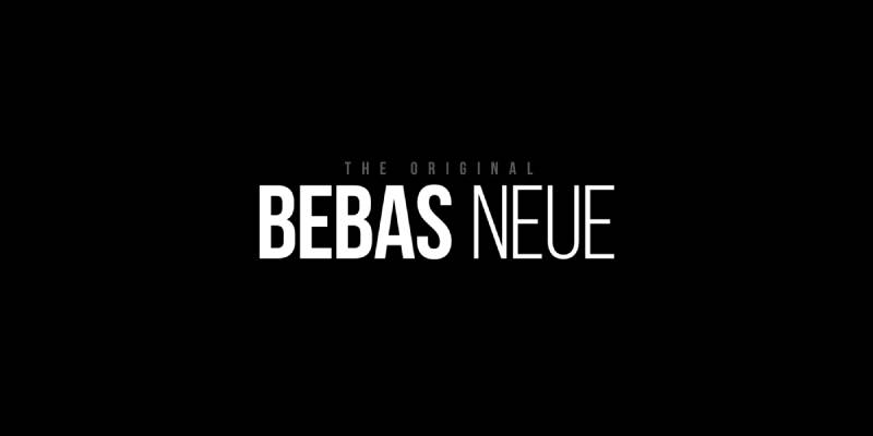
Bebas Neue is a display sans-serif typeface designed by Ryoichi Tsunekawa of Dharma Type, first released in 2010 and open-sourced under SIL OFL in 2018. It delivers all-caps headline typography with tight letter-spacing and uniform stroke weight.
Bebas Neue works best for bold poster headlines because its all-caps construction, minimal stroke variation, and condensed proportions stay readable at sizes from 60px up to large-format print. The film La La Land used it in its title treatment.
What makes Bebas Neue suitable for posters?
The typeface uses near-zero stroke contrast and tightly condensed uppercase letterforms. At 72px and above, individual characters remain distinct with no optical crowding. The condensed width lets designers stack large display text without losing horizontal space.
Key attributes:
| Attribute | Value |
| Classification | Display sans-serif (All-caps) |
| Designer | Ryoichi Tsunekawa, 2010 |
| Weight range | Thin 100 to Bold 700 (Fontfabric version) |
| Variable font | No (Free version); Yes (Bebas Neue Pro) |
| Recommended sizes | 48px+ for headlines; 72px+ for display |
| Letter-spacing default | Tight |
| License | OFL (Free for personal and commercial use) |
| Available on | Google Fonts, Adobe Fonts, Fontfabric |
| Price | Free (Base versions) |
How does Bebas Neue perform at large poster sizes?
At 100px+, the uniform stroke weight and tight kerning create a dense, punchy block of text with high visual impact. It holds legibility even on low-quality print runs because the strokes are thick enough to survive ink spread.
At small sizes (below 24px), the tight spacing reduces readability significantly. This is a headline-only typeface.
What are the best pairings for Bebas Neue in posters?
Bebas Neue pairs with a neutral sans-serif like Lato or Open Sans for supporting body copy, providing weight contrast without visual conflict. For event posters needing a softer secondary voice, Montserrat Light works well against Bebas Neue Bold.
What are the limitations of Bebas Neue for posters?
The base free version contains only uppercase glyphs, making it unsuitable for mixed-case poster copy. Sentence-case text requires Bebas Neue Pro, which is a paid upgrade.
Bebas Neue – Recommended Use Cases Within Poster Design
- Best for: Concert posters, sports event headlines, film title treatments, bold promotional banners
- Avoid for: Body copy, bilingual posters requiring lowercase, small-format printing below A4
- Optimal weight: Regular 400 for most posters; Bold 700 for maximum impact
- Optimal size range: 60px–200px for poster headlines
—
Montserrat
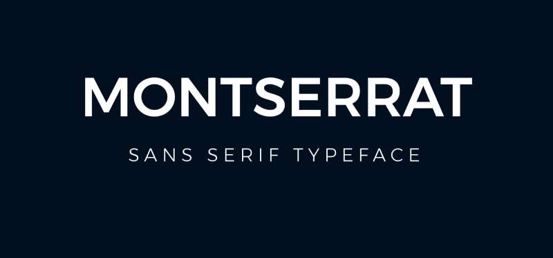
Montserrat is a geometric sans-serif designed by Julieta Ulanovsky in 2011, inspired by early 20th-century signage in the Montserrat neighborhood of Buenos Aires. It supports 9 weights from Thin 100 to Black 900, plus a variable font version that spans the full axis in a single file.
Montserrat suits modern event and promotional poster design because its slightly compressed proportions and strong geometric structure remain legible at headline sizes while the lighter weights work cleanly for supporting text.
What makes Montserrat suitable for posters?
Its weight range spans Thin (100) to Black (900), giving designers full control over typographic hierarchy within a single typeface family. The variable font version covers all 900 weight steps in one WOFF2 file.
Montserrat’s letterforms are modestly narrower than comparable geometric sans-serifs like Poppins, which lets it fit more characters per line without breaking visual rhythm at large sizes.
| Attribute | Value |
| Classification | Geometric sans-serif |
| Designer | Julieta Ulanovsky, 2011 |
| Weight range | Thin 100 – Black 900 (9 weights) |
| Variable font | Yes |
| Recommended sizes | 16px–24px body; 48px+ for headlines |
| Letter-spacing default | 0 (normal) |
| License | OFL – free for commercial use |
| Available on | Google Fonts, Adobe Fonts |
| Price | Free |
How does Montserrat perform at poster sizes?
At 60px+, Montserrat Black delivers a clean, commanding presence with open apertures that prevent characters from closing up optically. The geometric construction keeps letters distinct even at very large print sizes on low-res previews.
One practical note: Montserrat is heavily used across web and digital design, so posters using it without a distinctive pairing can feel templated.
What are the best pairings for Montserrat in posters?
For a full guide, see Montserrat font pairing examples with technical specs. In short: Montserrat Bold pairs with Merriweather or Lora for editorial warmth, and with Source Sans Pro when a clean, functional secondary is needed.
What are the limitations of Montserrat for posters?
Its ubiquity in free template designs makes it feel generic without strong layout differentiation. The lightest weights (Thin 100, ExtraLight 200) lack impact at poster headline sizes and disappear at distance.
Montserrat – Recommended Use Cases Within Poster Design
- Best for: Modern event posters, promotional materials, tech and startup event collateral
- Avoid for: Luxury or heritage brand posters where a more distinctive typeface is needed
- Optimal weight: SemiBold 600 or Bold 700 for headlines; Light 300 for subtext
- Optimal size range: 48px–120px for headline; 14px–20px for supporting copy
—
Futura
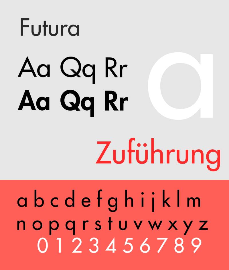
Futura is a geometric sans-serif designed by Paul Renner and released by the Bauer Type Foundry in 1927. It is based on simple geometric forms (circles, triangles, squares) and uses near-even stroke weights throughout. Brands including Volkswagen, Supreme, FedEx, and Red Bull have used it in their visual identities.
Futura works for brand-driven and cinematic poster design because its low stroke contrast and long ascenders maintain clarity at both large display sizes and mid-range headline sizes.
What makes Futura suitable for posters?
Futura has a low x-height relative to its cap height, which gives the uppercase letters a commanding, open presence at display sizes. The near-even stroke weight means it renders clearly at sizes from 36px up to large-format billboard output without stroke artifacts.
It was famously used on movie poster and theatrical title treatments for films like Gravity, Interstellar, and Gone Girl. The Boeing aviation industry also uses it for instrument panel readability, which speaks to its distance legibility.
| Attribute | Value |
| Classification | Geometric sans-serif |
| Designer | Paul Renner, 1927 (Bauer Type Foundry) |
| Weight range | Light – Heavy (condensed variants included) |
| Variable font | No (standard Futura); Futura Now has extended options |
| Recommended sizes | 36px+ for poster display; 14px+ for body |
| Letter-spacing default | Normal to slightly wide |
| License | Commercial (Bauer/Neufville Digital/Monotype) |
| Available on | Adobe Fonts, MyFonts, Monotype |
| Price | Paid (subscription or one-time via foundry) |
How does Futura perform at poster sizes?
The even stroke weight and geometric precision hold up cleanly in large-format printing. Unlike high-contrast serifs, it does not develop optical artifacts when scaled beyond 200pt. The condensed variants are especially practical for vertical poster layouts.
What are the best pairings for Futura in posters?
See Futura font pairing combinations for detailed guidance. Futura pairs with Garamond for a modernist contrast between geometric sans and classical serif. For a purely typographic poster, pairing Futura Light with Futura Bold creates sufficient hierarchy without introducing a second typeface.
What are the limitations of Futura for posters?
Futura is a paid commercial typeface. No free version with full weight coverage exists, and the trademark is held by Neufville Digital. The copyright expires in January 2027, after which it enters public domain, but current use requires a valid license.
Futura – Recommended Use Cases Within Poster Design
- Best for: Film and cinematic posters, brand event collateral, modernist editorial poster work
- Avoid for: Budget projects without license budget; vintage or handcrafted poster aesthetics
- Optimal weight: Bold or ExtraBold for headlines; Book for supporting text
- Optimal size range: 48px–150px for headline display
—
Playfair Display

Playfair Display is a transitional serif designed by Claus Eggers Sørensen, first published in 2011 and updated to a full variable font (v2.1) in 2023. It draws from 18th-century European type design with high stroke contrast, delicate hairlines, and broad letterforms built specifically for display use.
It suits fashion, theatre, and luxury poster design because the extreme thick-thin stroke contrast reads as sophisticated editorial typography at large sizes. The variable font version includes axes for weight, width, and optical size.
What makes Playfair Display suitable for posters?
The high stroke contrast between thick stems and hairline serifs creates dramatic visual weight at headline sizes. Playfair Display is available from Regular 400 to Black 900, with the Black weight delivering maximum contrast between thick and thin strokes.
The v2.1 variable font includes an optical size axis, allowing proper adjustment from small text settings through large display output in a single font file. Small caps are included across all weights.
| Attribute | Value |
| Classification | Transitional serif (Didone-influenced) |
| Designer | Claus Eggers Sørensen, 2011 (updated 2023) |
| Weight range | Regular 400 – Black 900 |
| Variable font | Yes (weight, width, optical size axes) |
| Recommended sizes | 36px+ for display; not recommended below 18px |
| Letter-spacing default | Normal |
| License | OFL – free for commercial use |
| Available on | Google Fonts, Adobe Fonts |
| Price | Free |
How does Playfair Display perform at poster sizes?
At 72px and above, the hairline serifs and high stroke contrast produce an editorial, magazine-quality appearance. Below 24px, the hairlines begin to disappear on low-DPI outputs and in low-quality print runs.
It requires high-resolution output for the thin strokes to render correctly. Offset printing at 300dpi handles it well; inkjet printing below 150dpi risks losing the hairline details.
What are the best pairings for Playfair Display in posters?
For a complete breakdown, see Playfair Display font pairing options. In poster work: Playfair Display Bold pairs with Source Sans Pro Regular for body copy, giving a clear contrast between decorative headline and neutral supporting text. Inter Medium works as a secondary choice when a more digital-neutral feel is needed.
What are the limitations of Playfair Display for posters?
The hairlines require high-resolution printing to render correctly. On textured paper stocks or low-quality print runs, thin strokes fill in and the intended contrast collapses. It is also not suitable for reversed-out white text on dark backgrounds at small sizes.
Playfair Display – Recommended Use Cases Within Poster Design
- Best for: Fashion event posters, theatre and opera announcements, luxury product editorial posters
- Avoid for: Street-level outdoor posters, low-resolution digital screens, reversed-out small text
- Optimal weight: Bold 700 or Black 900 for headlines; Regular 400 for subheadings
- Optimal size range: 48px–120px for display use
—
Oswald
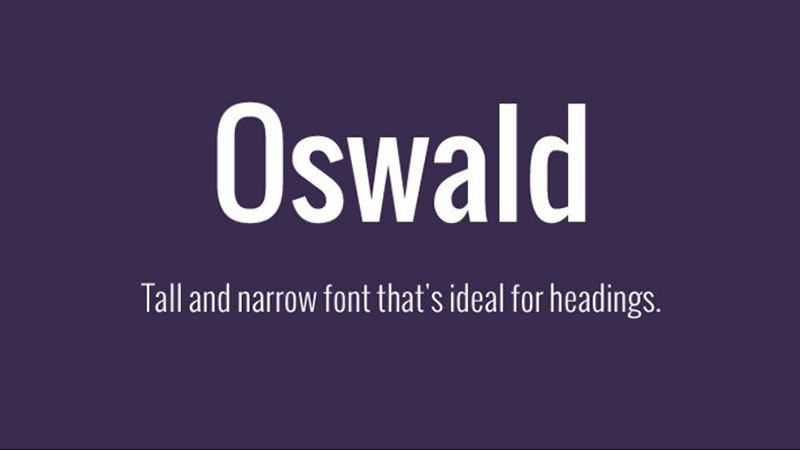
Oswald is a condensed gothic sans-serif created by Vernon Adams, Kalapi Gajjar, and Cyreal in 2011. It reworks the classic Alternate Gothic style for digital screens, with characters redrawn to fit pixel grids and extended to include Cyrillic support.
Oswald is available in 6 weights from ExtraLight 200 to Bold 700 under SIL OFL, free for commercial use.
What makes Oswald suitable for posters?
The condensed proportions and strong vertical stress mean Oswald commands attention in narrow column layouts and vertical poster orientations. It supports 6 weights, making full typographic hierarchy possible within a single typeface.
Unlike Bebas Neue, Oswald includes lowercase letterforms, making it useful for mixed-case poster copy where all-caps would read as too aggressive.
| Attribute | Value |
| Classification | Condensed gothic sans-serif |
| Designer | Vernon Adams, 2011 |
| Weight range | ExtraLight 200 – Bold 700 (6 weights) |
| Variable font | Yes |
| Recommended sizes | 24px–120px for poster headlines |
| Letter-spacing default | Tight |
| License | OFL – free for commercial use |
| Available on | Google Fonts, Adobe Fonts |
| Price | Free |
How does Oswald perform at poster sizes?
The condensed structure allows headlines to run at large sizes without spilling across the poster width. At 80px, Oswald Bold retains clean edges and even spacing. The even stroke weight resists breaking down in lower-quality print environments.
What are the best pairings for Oswald in posters?
Oswald pairs effectively with a classical serif font like Garamond or Quattrocento for body text, giving historical contrast between a modern condensed gothic and a traditional long-form reading typeface. For simpler informational posters, Open Sans Regular works as a clean secondary.
What are the limitations of Oswald for posters?
Oswald’s maximum weight is Bold 700. There is no Black or ExtraBold variant, which limits maximum headline impact compared to heavier display typefaces. Also, the condensed width can reduce legibility at small sizes below 16px.
Oswald – Recommended Use Cases Within Poster Design
- Best for: Political posters, news-style event announcements, narrow-format vertical layouts
- Avoid for: Ultra-bold poster headlines where maximum weight impact is needed
- Optimal weight: SemiBold 600 or Bold 700 for headlines; Regular 400 for secondary copy
- Optimal size range: 36px–120px for display headlines
—
Abril Fatface
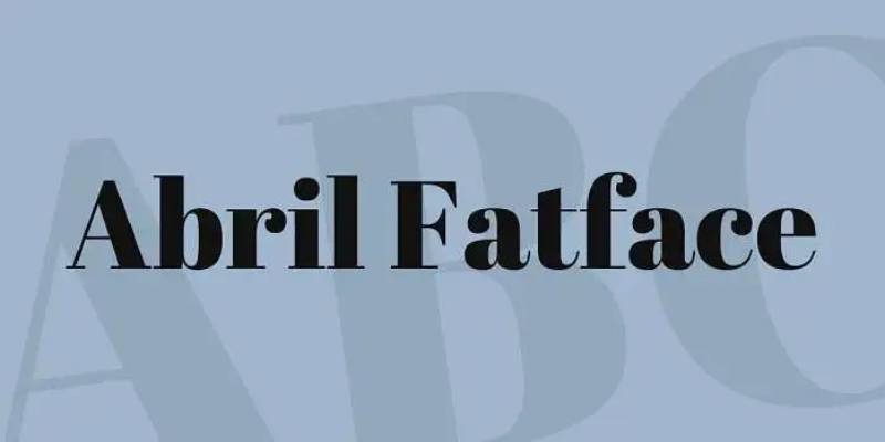
Abril Fatface is a single-weight display Didone serif designed by Veronika Burian and José Scaglione of TypeTogether. It is inspired by 19th-century British neoclassical advertising type and delivers maximum stroke contrast in a single, heavily weighted style.
It is free on Google Fonts under OFL, though the broader Abril family (with additional weights) is commercial.
What makes Abril Fatface suitable for posters?
The extreme thick-thin stroke contrast and heavy main strokes create immediate visual weight even without a bold weight variant. At 60px+, the letterforms function as graphic elements rather than just typographic ones.
Set at -0.02em tracking, Abril Fatface reads as a tight, authoritative headline. Abril Fatface font pairing guides recommend using it at 58px+ for hero headlines with tight tracking.
| Attribute | Value |
| Classification | Display Didone serif |
| Designer | Veronika Burian & José Scaglione, TypeTogether |
| Weight range | Single weight (display only) |
| Variable font | No |
| Recommended sizes | 48px+ for display; 60px+ for poster headlines |
| Letter-spacing default | Normal; -0.02em recommended for headlines |
| License | OFL – free for commercial use |
| Available on | Google Fonts, Adobe Fonts |
| Price | Free (single display weight) |
How does Abril Fatface perform at poster sizes?
The heavy strokes hold up cleanly across print outputs. High stroke contrast makes it particularly effective on white or light-colored backgrounds. On dark backgrounds, the hairlines can break down in lower-quality offset printing.
What are the best pairings for Abril Fatface in posters?
Abril Fatface pairs with Lato Regular for body copy, providing contrast between a decorative, high-contrast display serif and a neutral humanist sans-serif. Poppins Light works as an alternative when a more geometric secondary voice is needed.
What are the limitations of Abril Fatface for posters?
It exists in a single weight only. There is no way to create internal weight hierarchy using Abril Fatface alone. All headline differentiation must come from size variation, not weight change. Reversed-out on dark or textured backgrounds, hairlines frequently disappear.
Abril Fatface – Recommended Use Cases Within Poster Design
- Best for: Magazine-style editorial poster headlines, luxury promotional posters, large-format retail signage
- Avoid for: Multi-level typographic hierarchies, dark background designs, small-format print below A4
- Optimal weight: Single weight only
- Optimal size range: 58px–180px for poster headline use
—
Bodoni
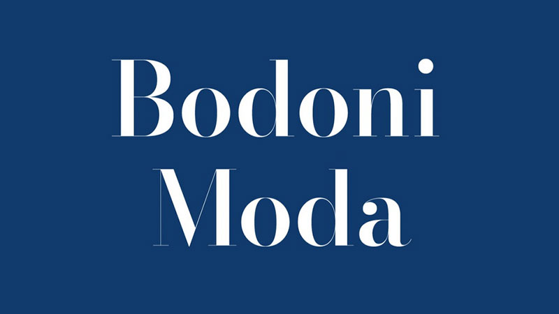
Bodoni is a Didone serif originally created by Giambattista Bodoni (1740–1813) and widely digitized by Linotype with contributions from Morris Fuller Benton. The Linotype version includes 7 styles; the Bodoni Poster variant, published specifically for large-format and display use, contains 4 styles.
Bodoni suits fashion, theatre, and luxury print poster design because of its extreme thick-thin stroke contrast and the strong associations it carries with high-end editorial and publishing contexts. Vogue magazine has long relied on Bodoni-influenced type for its identity.
What makes Bodoni suitable for posters?
The Didone construction produces the highest stroke contrast of any font category. Vertical stems are very thick; horizontal serifs and connecting strokes are hairline-thin. This contrast reads as sophisticated and theatrical at display sizes 60pt and above.
Bodoni Poster (the specific poster variant from Linotype) is drawn with optically corrected proportions for large-scale use, making it more practical than the standard text-weight Bodoni for headline poster work.
| Attribute | Value |
| Classification | Didone serif |
| Designer | Giambattista Bodoni (1767); digitized by Linotype/Morris Fuller Benton |
| Weight range | Roman, Italic, Bold, Bold Italic (Bodoni Poster: 4 styles) |
| Variable font | No (Bodoni Moda on Google Fonts is a variable alternative) |
| Recommended sizes | 48pt+ for poster display |
| Letter-spacing default | Normal to wide |
| License | Commercial (Linotype/Monotype) |
| Available on | Adobe Fonts, MyFonts, Monotype |
| Price | Paid |
How does Bodoni perform at poster sizes?
At 72pt and above, the thick-thin stroke contrast is fully visible and delivers maximum editorial impact. The hairlines require high-resolution print output (300dpi minimum offset). Bodoni Moda (free via Google Fonts) is the closest available OFL-licensed alternative for budget-constrained projects.
What are the best pairings for Bodoni in posters?
Bodoni font pairing works best with a neutral or humanist sans-serif secondary. Futura Light creates a pure modernist contrast between two historically significant geometric typefaces. Helvetica Neue Light is the more practical choice for informational poster body copy.
What are the limitations of Bodoni for posters?
Bodoni is a paid commercial typeface requiring a Linotype or Monotype license. The hairline strokes fail on rough paper stocks and in digital environments below 1080p. Below 30pt, legibility drops sharply as thin strokes disappear.
Bodoni – Recommended Use Cases Within Poster Design
- Best for: Fashion event posters, classical music and opera announcements, luxury brand display materials
- Avoid for: Street-level outdoor posters, rough or uncoated paper stocks, reversed-out designs
- Optimal weight: Bold or Poster variant for headlines
- Optimal size range: 60pt–200pt for poster headline use
—
Helvetica
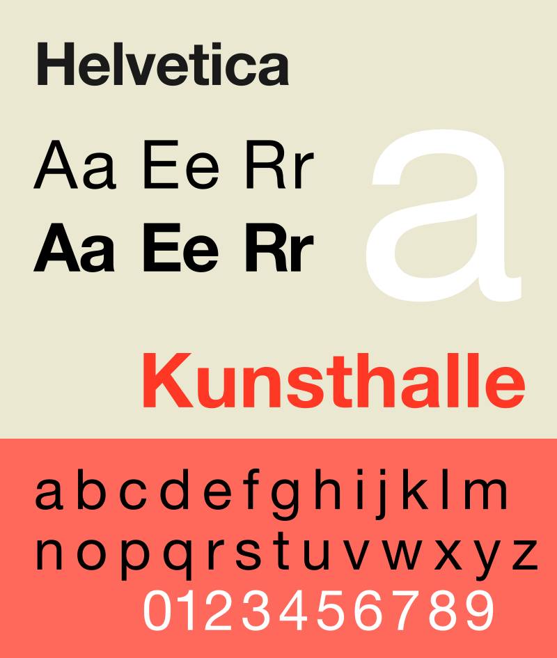
Helvetica is a neo-grotesque sans-serif developed in 1957 by Max Miedinger and Eduard Hoffmann at the Haas Type Foundry in Switzerland. It features a high x-height, horizontal and vertical stroke terminations, and characteristically tight default letter-spacing.
It is one of the most widely used typefaces globally, carried in every Mac OS installation and available through Monotype for commercial licensing.
What makes Helvetica suitable for posters?
The high x-height and clean terminals produce strong legibility across a wide size range. At 48px–200px, Helvetica’s neutral letterforms allow the poster’s content to carry the visual message without the typeface adding stylistic noise.
The tight default letter-spacing is both a feature and a limitation: it creates a dense, confident headline appearance at large sizes but reduces readability below 14px.
| Attribute | Value |
| Classification | Neo-grotesque sans-serif |
| Designer | Max Miedinger & Eduard Hoffmann, 1957 |
| Weight range | Ultralight – Black (Helvetica Neue: multiple condensed and extended variants) |
| Variable font | No (standard); Neue Haas Grotesk available via Monotype |
| Recommended sizes | 24px+ for poster display; not ideal below 14px |
| Letter-spacing default | Tight |
| License | Commercial (Monotype) |
| Available on | Adobe Fonts (as Neue Haas Grotesk), Monotype, pre-installed on macOS |
| Price | Pre-installed on Mac; paid license for extended commercial use |
How does Helvetica perform at poster sizes?
The high x-height ensures letters remain readable at distance, making it effective for outdoor poster formats. Its neutral design means it works across a wide range of poster categories without suggesting a specific mood or era. Brands using Helvetica for institutional or corporate poster work include many government and transit systems precisely for this neutrality.
What are the best pairings for Helvetica in posters?
For a detailed approach, see Helvetica font pairing options. In poster design: Helvetica Bold headlines pair with Garamond or Bodoni body text to introduce editorial warmth. Keeping everything in Helvetica across weights also works, particularly for minimalist and institutional poster formats.
You can also look at fonts that go with Helvetica for more curated options.
What are the limitations of Helvetica for posters?
Helvetica’s tight default spacing requires manual kerning adjustments for large-format poster headlines. It is also a paid typeface outside macOS, and the tight spacing becomes a legibility problem in body copy below 12px.
Helvetica – Recommended Use Cases Within Poster Design
- Best for: Corporate and institutional posters, neutral informational signage, modernist typographic poster layouts
- Avoid for: Expressive or emotive poster design where typeface personality is important; body copy below 12px
- Optimal weight: Medium or Bold for headlines; Regular for body
- Optimal size range: 36px–160px for poster headline use
—
Franklin Gothic
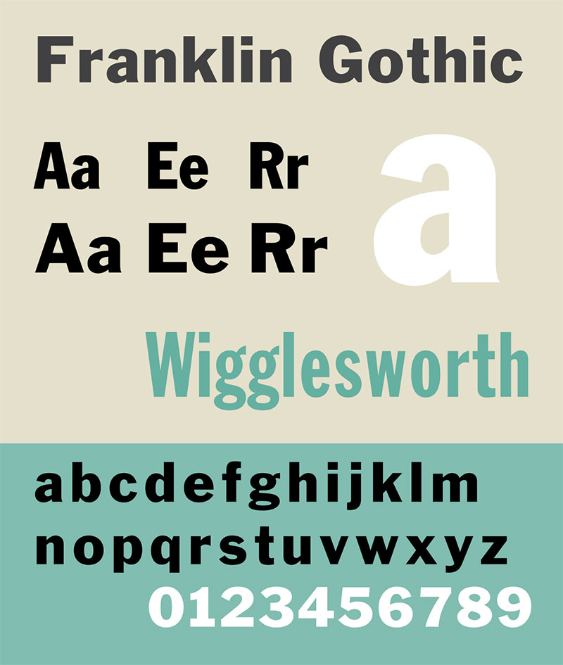
Franklin Gothic is a realist sans-serif designed by Morris Fuller Benton for American Type Founders in 1902. It is historically associated with newspaper headlines, political campaign materials, and advertising signage. Adobe Fonts carries the ITC Franklin Gothic set with 12 fonts.
The typeface is named after Benjamin Franklin and was designed as a bold, legible face for editorial and advertising use at distance.
What makes Franklin Gothic suitable for posters?
The condensed proportions and strong vertical stress allow large type to occupy minimal horizontal space. Legibility at distance is a structural attribute of the design: thick strokes, generous letter spacing by default, and wide apertures in open letters keep characters distinct even in adverse reading conditions.
Condensed weight variants make it particularly useful for vertical poster layouts and multi-line headline stacks, which is exactly why it remains a standard for billboard and political poster work.
| Attribute | Value |
| Classification | Realist sans-serif |
| Designer | Morris Fuller Benton, 1902 (ATF) |
| Weight range | Book, Medium, Demi, Heavy (ITC: 12 styles) |
| Variable font | No |
| Recommended sizes | 36px+ for posters; effective on billboard scale |
| Letter-spacing default | Normal |
| License | Commercial (ITC/Monotype) |
| Available on | Adobe Fonts, Monotype, MyFonts |
| Price | Included in Adobe CC; Paid per-license otherwise |
How does Franklin Gothic perform at poster sizes?
At 60pt and above, the thick strokes and condensed construction deliver high impact without the decorative complexity of display faces. It reads cleanly on coated and uncoated paper stocks, including rough outdoor surfaces. Its origins in newspaper printing mean it was designed specifically to survive less-than-ideal reproduction conditions.
What are the best pairings for Franklin Gothic in posters?
Franklin Gothic Heavy pairs with Garamond Italic for body copy in classical advertising poster layouts, a combination visible in mid-20th-century American poster design. For more contemporary work, pairing it with a slab serif font like Clarendon adds structural weight to the secondary text layer without losing the industrial character.
What are the limitations of Franklin Gothic for posters?
Franklin Gothic is a commercial typeface. Free alternatives like Libre Franklin exist but lack the full weight range of the ITC version. The design also carries strong historical associations with 20th-century American mass media, which can feel dated in contemporary minimalist poster work.
Franklin Gothic – Recommended Use Cases Within Poster Design
- Best for: Political posters, advertising campaigns, event posters referencing mid-century Americana, billboard headline work
- Avoid for: Luxury, fashion, or minimalist poster design where historical references undercut the intended tone
- Optimal weight: Medium or Heavy for headlines; Book for secondary copy
- Optimal size range: 48px–200px+ for poster and billboard use
—
Lato

Lato is a humanist sans-serif designed by Łukasz Dziedzic of tyPoland in summer 2010 and released under SIL OFL in December of the same year. It spans 9 weights from Hairline to Black, with corresponding italic variants across all 18 styles. As of 2018, it was the third most served font on Google Fonts with over one billion views per day.
Lato works for informational and mixed-use poster design because the semi-rounded letter details improve readability in dense body text sections while the Black weight delivers adequate headline presence.
What makes Lato suitable for posters?
Lato uses classical proportions in the uppercase combined with semi-rounded details at stroke terminals. This creates a typeface that stays legible in body copy contexts (14px–18px) but also scales to poster headline sizes without losing structural clarity.
The 9-weight range gives full typographic hierarchy control within a single family. Save the Children adopted Lato alongside Oswald in 2022 for global communications, demonstrating its cross-format reliability.
| Attribute | Value |
| Classification | Humanist sans-serif |
| Designer | Łukasz Dziedzic (tyPoland), 2010 |
| Weight range | Hairline – Black (9 weights) |
| Variable font | No |
| Recommended sizes | 12px–20px for body; 36px+ for poster headlines |
| Letter-spacing default | 0 (normal) |
| License | OFL – free for commercial use |
| Available on | Google Fonts, Adobe Fonts, latofonts.com |
| Price | Free
|
How does Lato perform at poster sizes?
At 60px+, Lato Black delivers clean, readable headline text with enough weight to anchor a poster layout. It lacks the pure display impact of condensed gothic typefaces like Bebas Neue or Oswald, but handles dual-purpose posters (large headline plus readable body sections) more effectively than most pure display fonts.
What are the best pairings for Lato in posters?
For a complete reference, see Lato font pairing combinations. In poster design: Lato Black for headlines pairs with Lato Light for body copy, keeping everything within the family. For a contrasting option, Playfair Display works as a headline above Lato body copy, mixing high-contrast serif with neutral humanist sans.
What are the limitations of Lato for posters?
Lato is not a variable font, which means multiple weight files are needed for complex typographic layouts. Its Black weight lacks the condensed profile that makes typefaces like Bebas Neue or Oswald particularly effective for bold poster headlines.
Lato – Recommended Use Cases Within Poster Design
- Best for: Informational and wayfinding posters, corporate event materials, posters requiring readable body copy sections
- Avoid for: High-impact single-word display posters where maximum headline boldness is needed
- Optimal weight: Black 900 for headlines; Regular 400 for body; Light 300 for captions
- Optimal size range: 36px–100px for headline; 14px–20px for body copy
What Makes a Font Work on a Poster?
Poster typography is a different discipline from screen or body text design. The viewing distance, print format, and single-glance communication goal all impose hard structural requirements on typeface selection.
76% of designers cite readability and accessibility as their top font selection priority, according to Monotype’s 2024 Global Font Use Survey of 4,777 participants across 13 countries.
That instinct is correct for posters. But readability at 12px on a screen is not the same as legibility at 72pt viewed from 10 feet. The criteria diverge significantly.
| Criterion | What to measure | Why it matters for posters |
| X-height ratio | Height of lowercase vs. cap height | Higher x-height = more readable at distance |
| Stroke contrast | Ratio of thick to thin strokes | High contrast loses hairlines on low-res print |
| Aperture width | Opening in letters like c, e, a | Wide apertures prevent characters closing up |
| Weight range | Number of available weights | More weights = more hierarchy options |
| Letter-spacing default | Built-in tracking value | Tight defaults require manual kerning at large sizes |
Research from Platon Graphics confirms a practical rule: every inch of letter height provides visibility from 10 feet. A headline meant to be read from across a room needs to be at least 72pt.
Toner Buzz data shows 94% of designers prioritize font size over weight when creating visual emphasis. In poster design, that preference is structural, not aesthetic: size does more work than weight alone.
The wrong typeface fails before content even registers. A font that performs well at 14px can completely collapse at 120pt on a printed surface if its hairlines are too thin for the paper stock or print resolution.
—
How Does Font Classification Affect Poster Design?
Classification determines everything from minimum viable print size to which poster category a typeface belongs in. The structural DNA of each font category produces predictable behavior at large scale.
83% of designers acknowledge typography’s importance in brand identity, according to Monotype 2024. That brand signal carries into poster design: font classification communicates category before a word is read.
Display Fonts vs. Text Fonts in Poster Contexts
Display fonts are drawn for sizes above 36pt. Their details, stroke variation, and spacing are calibrated for large output. Text fonts drawn for 10–14pt body use often look clunky and oversized when blown up to poster headline scale.
A display font accounts for optical effects that appear at large sizes: ink spread on paper, distance viewing, and the way the eye reads letterforms differently at 100pt vs. 12pt.
- Display-optimized: Bebas Neue, Abril Fatface, Bodoni Poster, Playfair Display
- Dual-purpose (display and text): Montserrat, Oswald, Lato, Franklin Gothic
- Text-only (avoid at large poster sizes): Georgia, Times New Roman, Calibri
Playfair Display v2.1 (released 2023) introduced an optical size axis specifically to address this: the same variable font adjusts letterform proportions from small body text to large display headlines without switching files.
How Serif Classification Changes at Large Print Sizes
Didone serifs (Bodoni, Playfair Display, Abril Fatface) behave differently at 72pt than they do on screen. Their extreme thick-thin contrast, which reads as elegant at headline size, becomes a liability on certain paper stocks.
Key difference: On coated paper at 300dpi, Didone hairlines render crisply. On uncoated or textured paper, the same hairlines absorb ink and disappear.
A serif font like Bodoni requires minimum 300dpi offset printing to preserve its defining stroke contrast. Below that threshold, the Didone characteristic that makes it distinctive becomes the reason it fails.
Serif vs. sans-serif decisions in poster design are not about taste. They are about print environment, viewing distance, and reproduction method.
| Classification | Stroke contrast | Print requirement | Best poster category |
| Geometric sans-serif | Near-zero | Any stock, any resolution | Concert, event, brand |
| Didone serif | Extreme | 300dpi+, coated stock | Fashion, luxury, theatre |
| Condensed gothic | Low to medium | Any stock | Political, news, sports |
| Humanist sans-serif | Low | Any stock, any resolution | Informational, mixed-use |
—
How Do You Pair Fonts on a Poster?
Two typefaces per poster is the structural ceiling. More than that creates visual competition that undermines hierarchy rather than supporting it.
The goal of pairing fonts is contrast, not similarity. Two geometric sans-serifs of similar weight create monotony. A high-contrast serif headline against a neutral humanist sans-serif body creates clear reading order.
Contrast principle in practice:
- Classification contrast: serif headline + sans-serif body (or reverse)
- Weight contrast: Black 900 headline + Light 300 supporting copy
- Width contrast: condensed gothic headline + regular-width body text
Single-family hierarchy is the other option. Montserrat Black for headlines over Montserrat Light for supporting text eliminates pairing risk entirely while maintaining sufficient weight contrast for poster hierarchy.
A font pairing generator can speed up testing before committing to a final layout, particularly useful when evaluating how a condensed display face reads against a wider-proportioned body typeface at actual print sizes.
Avoid these combinations in poster design:
- Bodoni + Playfair Display (two high-contrast Didones competing)
- Bebas Neue + Oswald (two condensed all-caps gothics with no contrast)
- Futura + Montserrat (two geometric sans-serifs with near-identical structure)
Toner Buzz data shows 76% of designers combine larger sizes and heavier weights for emphasis. In poster contexts, the correct approach is to use size AND weight contrast across the two fonts, not just within one.
For specific combination guidance, see curated examples for Bodoni font pairing, Playfair Display font pairing, and Futura font pairing for poster use cases.
—
What Font Spacing and Size Settings Work Best for Poster Typography?
Size and font spacing decisions in poster design follow distance-based rules, not screen-based conventions. The number that looks large in a design tool preview will often look small on a printed A1.
Distance-based size reference (Platon Graphics / UC Davis):
- 6 feet: minimum 30pt
- 10 feet: minimum 48–72pt
- 12 feet: minimum 60pt
- 14+ feet: 72pt or above
These are floor values, not targets. A strong poster headline typically runs 100–200pt on A1 format.
Letter-spacing (tracking) by typeface type:
- All-caps condensed (Bebas Neue, Oswald): -0.02em to -0.04em tightening at 80pt+
- Mixed-case geometric sans (Montserrat, Futura): 0 to +0.01em at headline sizes
- Didone serifs (Bodoni, Playfair Display): 0 default; never tighten, hairlines need breathing room
Legibility research via the Google Fonts Legibility Project confirms that tightening letter-spacing below a typeface’s default consistently reduces readability. For poster headlines specifically, the risk is optical crowding at large sizes where letters appear to merge.
Line height for poster headlines: 1.0–1.1 for single-line display text; 1.15–1.2 for multi-line headline stacks. Body copy sections within a poster need 1.4–1.6.
Variable fonts simplify the spacing adjustment workflow significantly. Instead of switching between multiple static font files at different weights, a single variable font file adjusts weight and width axes simultaneously, reducing the risk of optical inconsistency between weights.
By 2024, variable fonts reached 34% of mobile pages (up from 30% in 2023), according to the HTTP Archive Web Almanac. Variable fonts can also reduce typography file sizes by 35%–45% vs. loading multiple static weights, which matters for digital poster formats served on the web.
Montserrat, one of the top poster typefaces, was found on 9–10% of all websites using variable fonts in 2024, according to the same HTTP Archive data. Its variable font version spans the full Thin 100 to Black 900 axis in a single WOFF2 file.
—
What Are the Font Licensing Rules for Poster Design?
47% of designers find font licensing challenging to navigate, according to Monotype’s 2024 survey. Poster design adds specific complexity: physical print runs, large-format reproduction, and commercial distribution all affect which license type is required.
Font licensing for posters depends on three variables: the license type, the distribution method, and the print quantity.
OFL (SIL Open Font License): what it covers
- Personal and commercial poster design: permitted without restriction
- Print-on-demand and large-format printing: permitted
- Reselling the font file itself: not permitted
- Fonts covered: Bebas Neue, Montserrat, Oswald, Playfair Display, Abril Fatface, Lato
OFL is the practical default for most poster work. The six OFL fonts in the top 10 list cover concert, event, political, informational, editorial, and fashion poster categories without requiring a license purchase.
Commercial licenses: key restrictions
- Futura (Neufville Digital/Monotype): desktop license required; print use typically covered by standard desktop EULA, but large-scale commercial distribution may require extended license
- Bodoni (Linotype/Monotype): desktop license covers print design; embedding in PDF for distribution requires separate license
- Helvetica (Monotype): bundled with macOS for personal use; commercial print requires a paid desktop license from Monotype
- Franklin Gothic (ITC/Monotype): accessible via Adobe Fonts subscription; subscription covers design use but not redistribution of the font files
According to Business Research Insights, 68% of U.S. digital marketing agencies purchase commercial font licenses for branding projects. Poster design for commercial clients falls into this category.
Monotype’s 2024 survey found 68% of designers now use font subscription services, which simplifies licensing for commercial poster work: Adobe Fonts and Monotype Fonts subscriptions cover most commercial print use cases without per-project licensing.
Desktop vs. print license: the key distinction
A standard desktop license covers creating and printing a poster. It does not cover embedding the font into a digital document for open redistribution, or using the font in a product that ships (like packaging). Posters printed by a print shop on your behalf are covered under the designer’s desktop license in most EULAs.
—
How Do Poster Font Choices Differ by Poster Type?
Font selection for posters is a decision about category first, aesthetics second. Each poster type has structural constraints that narrow the viable typeface list before any creative decisions apply.
Concert and music event posters
Bebas Neue and Franklin Gothic dominate here. Both deliver high-impact headlines readable under low-light venue conditions and at distance on a crowded wall. Bebas Neue’s all-caps construction eliminates mixed-case reading issues at distance.
Franklin Gothic has been used on music and entertainment advertising since its design in 1902. The ITC family available via Adobe Fonts includes condensed variants particularly suited to stacked multi-artist lineup layouts common in festival poster design.
Fashion and luxury posters
Bodoni, Playfair Display, and Abril Fatface. High stroke contrast signals premium editorial positioning. Vogue’s long-term use of Bodoni-influenced typography established this association. The typeface category communicates brand tier before the content is processed.
These fonts require high-quality coated paper and 300dpi+ print resolution. Their hairlines define their character and their failure mode simultaneously.
Political and public information posters
- Oswald: condensed authority, readable at distance, lowercase available
- Franklin Gothic: historical credibility, strong vertical stress, multiple condensed variants
- Helvetica: institutional neutrality, no stylistic associations, high x-height for distance legibility
Film and brand campaign posters
Futura and Montserrat. Futura has appeared in theatrical poster treatments for films including Gravity, Interstellar, and Gone Girl. Its geometric neutrality allows production design to control mood through composition and color rather than typeface personality.
Montserrat is the free alternative for brand campaign work with similar geometric structure. Its slightly more compressed proportions and the availability of 9 weights (including variable font) give designers more hierarchy options than Futura’s standard family.
Academic, cultural, and event program posters
Lato and Playfair Display. These posters typically combine a headline section with readable body copy, schedule information, or supporting text. Lato Black for the headline with Lato Regular for body copy is the simplest execution. Pairing Playfair Display for the headline with Lato for the body adds editorial weight without sacrificing body copy readability.
| Poster Type | Primary font | Secondary font |
| Concert / music event | Bebas Neue | Lato or Open Sans |
| Fashion / luxury | Bodoni or Playfair Display | Helvetica Light or Futura Light |
| Political / informational | Oswald or Franklin Gothic | Lato or Source Sans Pro |
| Film / brand campaign | Futura or Montserrat | Garamond or Futura Light |
| Academic / cultural | Playfair Display or Lato Black | Lato Regular or Source Sans Pro |
For adjacent print formats, the same font logic applies: see fonts for flyers and fonts for banners for size and hierarchy adaptations specific to those formats.
The font statistics behind typeface adoption confirm what poster design practice shows: sans-serif fonts dominate in most commercial print contexts, with serif selections reserved for specific category signals.
FAQ on The Best Fonts For Posters
What is the best font for posters?
There is no single answer. Bebas Neue works for bold event headlines, Playfair Display suits fashion and theatre, and Helvetica handles institutional work. The best poster font depends on print format, viewing distance, and the category of poster you’re designing.
What font size should I use for a poster headline?
Size depends on viewing distance. A headline read from 10 feet needs at least 72pt. For large-format printing viewed from across a room, 100–200pt is standard. The rule: every inch of letter height provides roughly 10 feet of visibility.
Should I use a serif or sans-serif font for a poster?
Both work, depending on the poster type. Sans-serif fonts like Bebas Neue and Oswald hold up better on low-quality print stocks. Serif fonts like Bodoni and Playfair Display require high-resolution printing to preserve their hairline strokes at large sizes.
How many fonts should a poster use?
Two at most. One display font for the headline, one supporting typeface for body copy or secondary information. More than two creates visual competition and breaks typographic hierarchy. A single-family approach, like Montserrat Black paired with Montserrat Light, also works cleanly.
Is Bebas Neue good for posters?
Yes. Bebas Neue is one of the most widely used display typefaces in concert and event poster design. Its all-caps condensed structure stays legible at distance. The base version is free under SIL OFL. Lowercase letterforms require the paid Bebas Neue Pro upgrade.
Can I use Google Fonts for commercial poster printing?
Yes. Google Fonts are released under the SIL Open Font License, which permits commercial use including print. Fonts like Montserrat, Oswald, Playfair Display, Abril Fatface, and Lato are all free for commercial poster production without restriction.
What font do most movie posters use?
Futura appears on theatrical posters for films including Gravity, Interstellar, and Gone Girl. It is a geometric sans-serif designed by Paul Renner in 1927. Trajan is also common in drama and epic film poster design for its Roman inscription aesthetic.
What is the difference between a display font and a text font?
A display font is drawn for large sizes, typically 36pt and above, with details calibrated for headline impact. A text font is optimized for small sizes and long reading. Using a text font at poster headline scale often looks clunky and structurally wrong.
How do I pair fonts for a poster?
Lead with contrast: a high-weight display font paired with a neutral, lighter secondary typeface. Avoid pairing two geometric sans-serifs or two high-contrast serifs. A font pairing built on classification contrast, not similarity, creates clear reading hierarchy.
Do I need a special license to print fonts on posters?
A standard desktop license covers most commercial poster printing. It does not cover embedding fonts in open-distribution PDFs or using fonts in products that ship. OFL fonts like Montserrat and Lato have no print restrictions. Commercial fonts like Helvetica and Futura require a valid font license from the foundry.
Conclusion
This conclusion is for an article presenting the best fonts for posters, and the core takeaway is straightforward: typeface selection is a structural decision, not a stylistic one.
Display typefaces like Bebas Neue and Abril Fatface deliver bold headline typography at large-format scale. High-contrast serifs like Bodoni and Playfair Display signal category before content. Condensed gothic options like Oswald and Franklin Gothic handle political, sports, and news poster layouts efficiently.
Get the font pairing right and the visual hierarchy follows. Get the licensing wrong and a commercial print run becomes a legal problem.
Every poster type has a typeface that fits its print environment, viewing distance, and audience. Use this guide to match the right display typeface to the right context, every time.

Renowned for his expertise in logo design and visual branding, Bogdan has developed a multitude of logos for various clients.
His skills extend to creating posters, vector illustrations, business cards, and brochures. Additionally, Bogdan's UI kits were featured on marketplaces like Visual Hierarchy and UI8.
He also wrote in the past years on sites like Design Your Way, WebDesignerDepot, WPDean, Designmodo, Speckyboy, Slider Revolution, and more.
- The Windsurf Logo History, Colors, Font, And Meaning - 10 October 2026
- How Designers can Build a Stronger Online Creative Identity - 9 October 2026
- Minecraft Font Generator - 8 October 2026

Bogdan Sandu is a seasoned designer who has been designing websites since 2008. Renowned for his expertise in logo design and visual branding, Bogdan has developed a multitude of logos for various clients. His skills extend to creating posters, vector illustrations, business cards, and brochures. Additionally, Bogdan's UI kits were featured on marketplaces like Visual Hierarchy and UI8. He also wrote in the past years on sites like Design Your Way, WebDesignerDepot, WPDean, Designmodo, Speckyboy, Slider Revolution, and more.
You Might Also Like