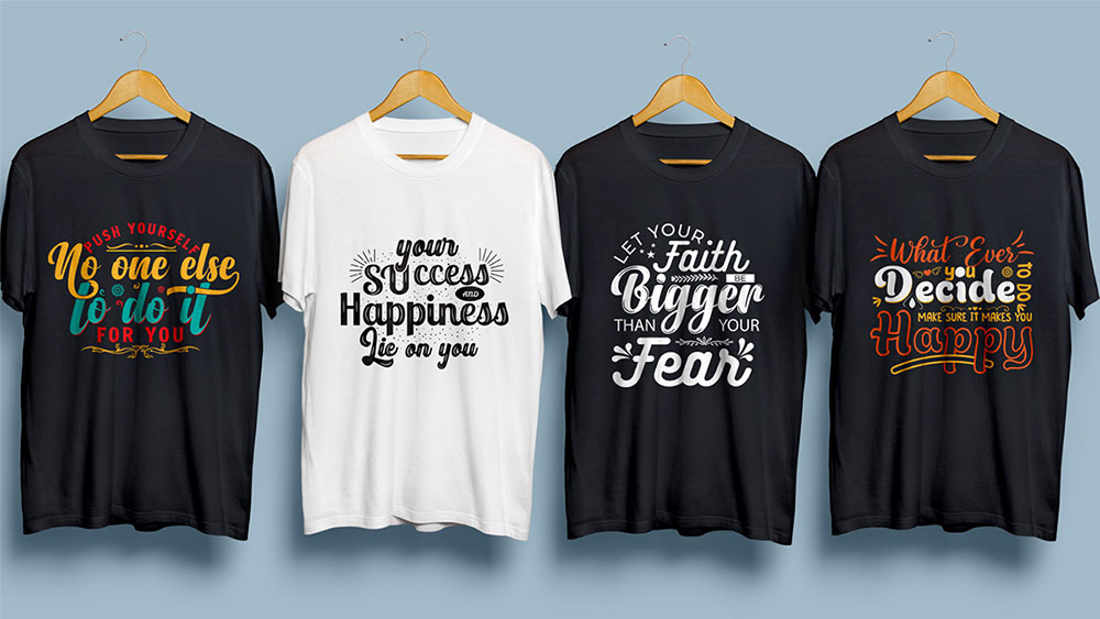
The wrong font can kill a great t-shirt design before it ever reaches the printer.
Choosing the best fonts for t-shirts isn’t just about what looks good on screen. It’s about what survives ink, fabric, heat, and distance — and still communicates clearly.
Most designers pick typefaces based on aesthetics alone. That’s how you end up with hairline serifs that bleed on cotton, or script fonts that merge into illegible smudges after screen printing.
This guide covers the fonts that actually work on garments — from bold display sans-serifs built for chest prints to script fonts with connected strokes that hold up under heat transfer. You’ll also learn which font classifications suit each printing method, how to pair typefaces for visual hierarchy, and what licensing rules apply when selling custom apparel.
By the end, you’ll know exactly which typeface fits your design, your print method, and your audience.
The Best Fonts For T-Shirts
The font you pick for a t-shirt isn’t just a stylistic call. It determines whether your text survives ink bleed on cotton, holds up at arm’s length, and actually communicates what you intended. Bold, condensed letterforms tend to outperform delicate or thin ones in screen printing and DTG contexts. Understanding what a font actually is at a structural level helps you make better decisions from the start.
Below are 10 of the best fonts for t-shirt printing, each with technical specs, pairing suggestions, and honest limitations.
—
Bebas Neue
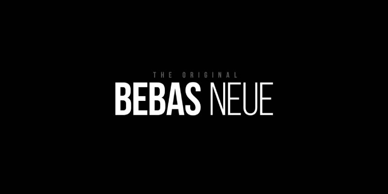
Bebas Neue is a display sans-serif typeface designed by Ryoichi Tsunekawa in 2010, released through Dharma Type and later expanded by Fontfabric. It delivers tall, all-caps letterforms with tight monolinear strokes built for high-impact headlines.
Bebas Neue suits large-format t-shirt printing because its condensed proportions allow long phrases to fit a chest print without wrapping. Its even stroke weight avoids thin lines that bleed or fade under heat transfer. The font has appeared on the La La Land movie title and in countless streetwear drops, making it one of the most recognized apparel typefaces in use today.
What makes Bebas Neue suitable for t-shirts?
Bebas Neue uses monolinear strokes with no stroke contrast, which means every part of each letter holds the same ink density during printing. Its x-height is unusually tall relative to cap height, maximizing visual presence even at smaller print sizes. The all-caps design removes the risk of descenders getting cut off in tight layout areas.
Key attributes:
| Attribute | Value |
| Classification | Display sans-serif (condensed, all-caps) |
| Designer | Ryoichi Tsunekawa, 2010 |
| Weight range | Thin to Heavy (5 weights in free version) |
| Variable font | No |
| Letter-spacing default | Tight |
| License | OFL (SIL Open Font License) – free commercial use |
| Available on | Google Fonts, Adobe Fonts, Fontfabric direct |
| Price | Free |
How does Bebas Neue perform at t-shirt printing?
The monolinear stroke structure holds its shape well during screen printing on cotton because no hairlines are present to bleed. At chest-print sizes of 3 to 6 inches tall, letter clarity stays consistent across fabric types. On dark garments with white ink, the tight letter spacing can cause adjacent letters to merge slightly under heavy ink deposits.
What are the best pairings for Bebas Neue in t-shirt design?
Bebas Neue pairs with Montserrat for secondary text, using the weight contrast between Bebas Neue’s bold all-caps and Montserrat Regular to build a clear hierarchy. It also pairs with Roboto Condensed when a slightly warmer, less aggressive secondary typeface is needed for taglines or event details.
What are the limitations of Bebas Neue for t-shirts?
The standard free version is all-caps only, making it unsuitable for designs that require lowercase lettering. Lowercase support requires the commercial Bebas Neue Pro, which is a paid upgrade from Dharma Type.
Bebas Neue – Recommended Use Cases Within T-Shirt Design
- Best for: Full-chest headline prints, athletic jersey lettering, streetwear slogans
- Avoid for: Long body-copy text, designs requiring mixed case, fine-detail sleeve prints
- Optimal weight: Regular for most prints; Heavy for oversized graphic tees
- Optimal size range: 1.5 inches tall minimum for chest prints; 0.75 inches for secondary lines
—
Montserrat
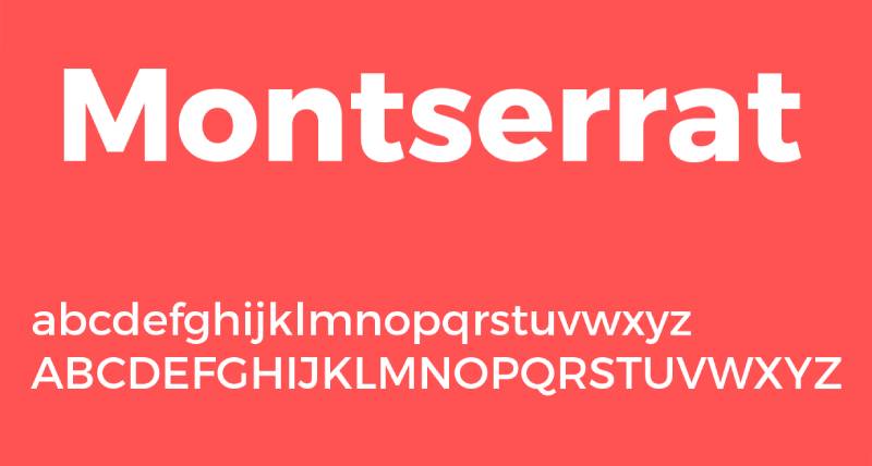
Montserrat is a geometric sans-serif font designed by Julieta Ulanovsky in 2011, released through Google Fonts. It draws from 1920s-1950s urban signage in the Montserrat neighborhood of Buenos Aires and covers headline, subheading, and body text roles across a single family.
Montserrat works best for minimalist t-shirt designs because its 9-weight range from Thin 100 to Black 900 supports everything from delicate chest pocket logos to full-front bold statements. According to Wikipedia, Montserrat is used on over 19 million websites, and its geometric clarity translates cleanly to print formats including garment printing.
What makes Montserrat suitable for t-shirts?
Montserrat has a large x-height, short descenders, and wide apertures on letters like “c,” “e,” and “a,” which keep characters legible even at smaller print sizes. The wide proportions distribute ink pressure evenly during DTG printing, reducing bleed risk. Its 9 weight options let designers create typographic hierarchy within a single-font layout.
Key attributes:
| Attribute | Value |
| Classification | Geometric sans-serif |
| Designer | Julieta Ulanovsky, 2011 |
| Weight range | Thin 100 to Black 900 (18 styles) |
| Variable font | Yes (Weight axis) |
| Recommended sizes | 16px+ for body; 24px+ for headers |
| Letter-spacing default | Generous (Optimized for digital) |
| License | OFL (Free for personal and commercial use) |
| Available on | Google Fonts, Adobe Fonts, Fontsource |
| Price | Free |
How does Montserrat perform at t-shirt printing?
Bold and ExtraBold weights (700-800) print cleanly on cotton and polyester blends without stroke collapse. At uppercase sizes above 1 inch tall, the geometric forms stay sharp in both screen printing and heat transfer vinyl applications. Lighter weights below 300 are not recommended for any fabric printing method due to thin-stroke bleed risk.
What are the best pairings for Montserrat in t-shirt design?
Montserrat pairs with Libre Baskerville for editorial-style shirt designs, using serif warmth in subtext to contrast Montserrat’s geometric headlines. It also works with Oswald when both fonts are needed in condensed, high-impact layouts like team apparel or event shirts.
What are the limitations of Montserrat for t-shirts?
Montserrat is so widely used that it reads as generic in commodity print-on-demand markets. Thin weights (100-300) are not viable for fabric printing and must be avoided entirely in any production context.
Montserrat – Recommended Use Cases Within T-Shirt Design
- Best for: Minimalist branding shirts, chest pocket logos, lifestyle apparel wordmarks
- Avoid for: Designs needing a distinctive or niche personality; thin-weight applications on fabric
- Optimal weight: SemiBold 600 or Bold 700 for primary text; Medium 500 for secondary lines
- Optimal size range: 1 inch minimum for primary text; 0.5 inches for supporting copy
—
Impact

Impact is a grotesque display sans-serif designed by Geoffrey Lee in 1965, released by the Stephenson Blake foundry of Sheffield. It delivers maximum stroke weight in a highly condensed form built specifically for poster and publicity use.
Impact suits bold slogan t-shirts because its compressed letter spacing and heavy stroke weight produce high character density in a narrow horizontal footprint. Its x-height reaches nearly three-quarters of the cap line, making it one of the most space-efficient display fonts available for fabric printing.
What makes Impact suitable for t-shirts?
Impact’s stroke contrast is low and weight is uniform at heavy across the entire character set, which prevents ink variation during screen printing. The condensed width allows designers to fit 8 to 10 characters per inch at headline sizes, making it useful for long phrases on front chest prints. Microsoft bundled Impact with Windows since 1998, making it universally available without licensing overhead.
Key attributes:
| Attribute | Value |
| Classification | Grotesque display sans-serif (condensed) |
| Designer | Geoffrey Lee, 1965 |
| Weight range | Single weight (heavy/bold only) |
| Variable font | No |
| Letter-spacing default | Tight to very tight |
| License | Commercial (bundled with Windows; separate license for expanded use) |
| Available on | Microsoft system fonts, Linotype, Adobe Fonts |
| Price | Free via Windows / commercial for foundry license |
How does Impact perform at t-shirt printing?
The heavy single weight prints with consistent opacity on both light and dark garments. At reversed-out applications (white on black fabric), the tight letter spacing holds well in screen printing but can cause ink fill-in between characters in DTG printing at smaller sizes. Minimum recommended print size is 1.5 inches for the full cap height to preserve inter-character spacing.
What are the best pairings for Impact in t-shirt design?
Impact pairs with Oswald for a weight-contrast hierarchy where Oswald handles secondary information in its lighter weights. It also pairs with a simple monospaced font when a technical or military-adjacent aesthetic is needed for the supporting text block.
What are the limitations of Impact for t-shirts?
Impact is a single-weight font with no light or medium options, limiting it to headline-only use. Its strong association with internet memes since the 2010s makes it a liability for brands targeting audiences who might read it as ironic rather than intentional.
Impact – Recommended Use Cases Within T-Shirt Design
- Best for: High-contrast slogan tees, bold one-word statement designs, event shirts where legibility at distance is the priority
- Avoid for: Brand apparel targeting premium or fashion-conscious consumers; anything requiring lowercase body text
- Optimal weight: Regular (only available weight)
- Optimal size range: 1.5 inches minimum for headlines; not recommended below 1 inch on fabric
—
Oswald
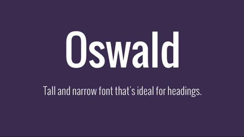
Oswald is a condensed sans-serif typeface designed by Vernon Adams, released in 2012 through Google Fonts. It is a modernized interpretation of Alternative Gothic, a typeface in use since 1903 and still found in the YouTube logo today.
Oswald optimizes for stacked text and vertical sleeve prints because its narrow proportions deliver strong visual weight without occupying significant horizontal space. Seven weights from Extra-Light to Heavy give it a flexibility that single-weight condensed fonts like Impact simply can’t match.
What makes Oswald suitable for t-shirts?
Oswald’s condensed letterforms carry a tall cap height relative to their width, which produces strong vertical rhythm when text is stacked in multiple lines. Its 7-weight range allows both headline and secondary text to sit within the same font family. Compared to Bebas Neue, Oswald’s letterforms are slightly more rounded, which softens the overall tone while maintaining print legibility.
Key attributes:
| Attribute | Value |
| Classification | Condensed sans-serif |
| Designer | Vernon Adams, 2012 |
| Weight range | Extra-Light 200 to Heavy 700 (7 weights) |
| Variable font | Yes |
| Letter-spacing default | Normal to slightly tight |
| License | OFL – free commercial use |
| Available on | Google Fonts, Adobe Fonts |
| Price | Free |
How does Oswald perform at t-shirt printing?
Bold and Heavy weights (600-700) reproduce cleanly across screen printing, DTG, and heat transfer vinyl. At medium weights (400-500), strokes are thick enough to avoid bleed on standard cotton but may thin on heavily textured or fleece fabrics. The condensed width makes it well suited to vertical chest prints and sleeve typography where horizontal space is limited.
What are the best pairings for Oswald in t-shirt design?
Oswald pairs with Montserrat for contrast between a condensed headline and a wider secondary typeface, creating clear visual separation between the two information levels. It pairs with Lato when a warmer, less structured secondary font is preferred for taglines or event subtitles.
What are the limitations of Oswald for t-shirts?
Extra-Light and Light weights (200-300) are not viable for fabric printing due to thin strokes that bleed or disappear during pressing. Oswald also lacks a true italic in most weight ranges, limiting its use in designs requiring slanted emphasis.
Oswald – Recommended Use Cases Within T-Shirt Design
- Best for: Team jerseys, athletic apparel, stacked multi-line chest prints, sleeve text
- Avoid for: Lightweight fashion tees; designs requiring true italic styling
- Optimal weight: Bold 600 or Heavy 700 for primary text; Regular 400 for supporting lines
- Optimal size range: 0.75 inches minimum for body lines; 2+ inches for primary headline
—
Futura

Futura is a geometric sans-serif typeface designed by Paul Renner and released by the Bauer Type Foundry in 1927. It builds all letterforms from circles, triangles, and squares, producing a precise, architectural visual system.
Futura suits minimalist and premium apparel brands because its geometric construction signals clarity and intentionality. Brands like Supreme, Louis Vuitton, and Volkswagen have used it in logo and apparel contexts, giving it a strong association with design-forward identity.
What makes Futura suitable for t-shirts?
Futura’s consistent stroke width (low contrast) means ink applies at an even pressure across each letterform during screen printing. Its geometric basis produces sharp, clean edges that hold definition on both cotton and polyester. The Bold and Extra Bold weights carry enough mass for chest-print visibility from 10 or more feet.
Key attributes:
| Attribute | Value |
| Classification | Geometric sans-serif |
| Designer | Paul Renner, 1927 |
| Weight range | Light to Extra Bold (varies by version; typically 4–6 weights) |
| Variable font | No (original); some modern revivals offer variable axes |
| Letter-spacing default | Normal |
| License | Commercial (Bauer/Neufville foundry; digital versions via Adobe Fonts, Fonts.com) |
| Available on | Adobe Fonts, Fonts.com, MyFonts (licensed versions) |
| Price | Paid (subscription via Adobe Fonts or one-time license) |
How does Futura perform at t-shirt printing?
Bold weight Futura performs well in screen printing at headline sizes of 1.5 inches and above. Its geometric letterforms maintain definition on both light and dark garment colors. Book and Light weights are acceptable for heat transfer vinyl on polyester but are not recommended for cotton screen printing at sizes under 1 inch.
What are the best pairings for Futura in t-shirt design?
Futura pairs with Playfair Display when a fashion-forward, luxury-adjacent contrast is needed between headline and subtext. It also pairs with Trade Gothic for a fully geometric, modernist system when the design calls for typographic consistency throughout.
What are the limitations of Futura for t-shirts?
Futura is a commercial font with no free version, which adds cost to any print-on-demand workflow. Free alternatives like Jost or Century Gothic share its geometry but lack Futura’s refined optical corrections, producing visibly different results at large display sizes.
Futura – Recommended Use Cases Within T-Shirt Design
- Best for: Premium brand apparel, minimalist lifestyle tees, fashion-adjacent streetwear
- Avoid for: Budget print-on-demand where licensing cost is a constraint; designs requiring a warm or handcrafted feel
- Optimal weight: Bold for headlines; Book or Medium for secondary lines at large sizes only
- Optimal size range: 1.5 inches minimum for Bold; 2+ inches for Medium/Book on fabric
—
Playfair Display

Playfair Display is a high-contrast transitional serif font designed by Claus Eggers Sorensen, released through Google Fonts in 2011. It draws from 18th-century European typography and uses extreme thick-to-thin stroke variation as its primary visual characteristic.
Playfair Display works best for premium fashion tees and editorial-style apparel where the thick vertical strokes provide visual weight while the hairline serifs add a refined, upscale quality. Its updated v2 (2023) introduced variable font support with width, weight, and optical size axes.
What makes Playfair Display suitable for t-shirts?
The thick vertical strokes in Playfair Display carry enough ink mass to print cleanly on fabric at large display sizes. Its high stroke contrast signals luxury and fashion, making it a preferred choice for clothing brands targeting premium market segments. At Regular to Black weights, the bold vertical elements remain stable during screen printing, though the hairline thin strokes require careful management.
Key attributes:
| Attribute | Value |
| Classification | High-contrast transitional serif |
| Designer | Claus Eggers Sorensen, 2011 |
| Weight range | Regular 400 to Black 900 (v2 variable font) |
| Variable font | Yes (v2, 2023: Weight, Width, Optical Size axes) |
| Letter-spacing default | Normal |
| License | OFL – free commercial use |
| Available on | Google Fonts, Adobe Fonts |
| Price | Free |
How does Playfair Display perform at t-shirt printing?
Bold and Black weights print well at headline sizes of 2 inches or more, where the thick strokes dominate and hairlines are wide enough to hold ink. Below 1.5 inches, the thin strokes in letters like “H,” “T,” and “A” risk collapsing under ink pressure on absorbent cotton. DTG printing handles Playfair Display better than screen printing at mid-sizes, as digital ink application is more precise.
What are the best pairings for Playfair Display in t-shirt design?
Playfair Display pairs with Raleway for a design that contrasts high-contrast serif headlines with a clean geometric sans-serif secondary text. It pairs with Montserrat Bold when the secondary text needs to stay visually assertive rather than recede into the background.
What are the limitations of Playfair Display for t-shirts?
Hairline strokes in Regular weight (400) are too thin for reliable screen printing on cotton at any practical t-shirt size. The font’s strong association with wedding and editorial design can clash with streetwear or casual apparel aesthetics.
Playfair Display – Recommended Use Cases Within T-Shirt Design
- Best for: Fashion brand statement tees, luxury apparel wordmarks, editorial-style graphic tees
- Avoid for: Athletic wear, casual humor tees, any print below 1.5 inches cap height
- Optimal weight: Bold 700 or Black 900 for any fabric printing method
- Optimal size range: 2 inches minimum for screen printing; 1.5 inches minimum for DTG
—
Pacifico

Pacifico is a brush script font designed by Vernon Adams in 2011, released via Google Fonts. It was inspired by 1950s American surf culture and redrawn by Jacques Le Bailly in 2016 with Cyrillic extension added in 2017.
Pacifico suits casual lifestyle and summer apparel because its connected, rounded strokes communicate a relaxed, hand-lettered quality. Its single Regular weight is consistent enough for fabric printing when used at appropriately large sizes.
What makes Pacifico suitable for t-shirts?
Pacifico’s brush stroke construction uses medium stroke weight throughout, avoiding the ultra-thin hairlines that cause problems in fabric printing. The connected letterforms produce a single continuous ink area per word, which prints more reliably than disconnected script fonts. Its tall ascenders and distinct letter shapes maintain readability from a distance at sizes of 2 inches or more.
Key attributes:
| Attribute | Value |
| Classification | Brush script |
| Designer | Vernon Adams, 2011 |
| Weight range | Regular only (single weight) |
| Variable font | No |
| Letter-spacing default | Normal (connected script) |
| License | OFL – free commercial use |
| Available on | Google Fonts, Adobe Fonts |
| Price | Free |
How does Pacifico perform at t-shirt printing?
Pacifico’s medium brush weight holds well in DTG printing at cap heights above 1.5 inches. In screen printing, the connected letterforms simplify film production since each word creates fewer isolated ink areas. On dark garments, white Pacifico text requires a thicker ink deposit to fill the rounded enclosed areas in letters like “o,” “d,” and “p.”
What are the best pairings for Pacifico in t-shirt design?
Pacifico pairs with Montserrat for a contrast between handwritten headline text and a clean geometric secondary line. It also works with Oswald Bold when the supporting text needs to carry visual weight that balances the flowing script headline.
What are the limitations of Pacifico for t-shirts?
Pacifico is available in a single weight with no Bold option, which limits design flexibility. Long phrases in Pacifico lose legibility quickly on fabric, making it suitable only for short words or brief two-to-three word phrases.
Pacifico – Recommended Use Cases Within T-Shirt Design
- Best for: Summer and surf lifestyle tees, brand name wordmarks in script, casual event shirts
- Avoid for: Long text passages, athletic or sports apparel, designs requiring weight variation
- Optimal weight: Regular (only available weight)
- Optimal size range: 1.5 inches minimum cap height; 2.5+ inches for best legibility at distance
—
League Gothic

League Gothic is a condensed display sans-serif released by The League of Moveable Type in 2009 as an open-source revival of Alternate Gothic No. 1. It is one of the earliest major open-source typeface releases, distributed under the OFL license.
League Gothic works best for vintage-style and graphic tee designs because its ultra-condensed letterforms produce strong vertical rhythm at large display sizes. Brands in the music, skateboarding, and independent apparel sectors have consistently used it for its raw, poster-derived energy.
What makes League Gothic suitable for t-shirts?
League Gothic has a single, heavy-condensed weight with tall cap height and minimal stroke contrast. This uniform weight means every character deposits ink at the same density, reducing printing inconsistency. Its extreme condensed width allows more characters per line than almost any other display font, making it ideal for long band names or event details in a single horizontal print strip.
Key attributes:
| Attribute | Value |
| Classification | Ultra-condensed display sans-serif |
| Designer | The League of Moveable Type (revival), 2009 |
| Weight range | Condensed Italic and Regular (limited, with variable version available) |
| Variable font | Yes (updated variable version released) |
| Letter-spacing default | Very tight |
| License | OFL – free commercial use |
| Available on | The League of Moveable Type website, Google Fonts |
| Price | Free |
How does League Gothic perform at t-shirt printing?
The uniform heavy weight and condensed structure print reliably in both screen printing and heat transfer at headline sizes. At sizes below 1 inch, the very tight default letter spacing causes adjacent characters to merge, especially in screen printing with high ink deposits. The font performs best in large-format applications where its condensed width advantage is most visible.
What are the best pairings for League Gothic in t-shirt design?
League Gothic pairs with a wide-set sans-serif like Futura Book to create contrast between the ultra-condensed headline and an open, airy secondary text block. It also pairs with a textured or distressed secondary font for band merch and music apparel where a worn, vintage feel is part of the design system.
What are the limitations of League Gothic for t-shirts?
League Gothic’s tight default letter spacing requires manual adjustment in design software before sending files to print, as the default kerning can cause letter collision at print resolutions. It also lacks weight variety beyond its condensed regular, limiting its use to headline-only roles.
League Gothic – Recommended Use Cases Within T-Shirt Design
- Best for: Band merch, vintage poster-style graphic tees, event shirts needing long text in narrow formats
- Avoid for: Any print below 1.25 inches cap height; designs targeting premium fashion segments
- Optimal weight: Regular (only viable print weight)
- Optimal size range: 1.5 to 4+ inches for primary display text
—
Blackletter
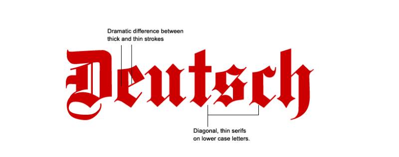
Blackletter is a category of typefaces, not a single font, originating from medieval European manuscript writing. Common t-shirt variants include Old English Text (various foundries), UnifrakturMaguntia (Georg Duffner, 2010, Google Fonts), and Chomsky (Fredrick Brennan, 2019). The category defines letterforms using angular, high-contrast strokes arranged in a dense, vertical script structure.
Blackletter suits streetwear, tattoo culture apparel, and heavy metal merchandise because its visual density and historical weight communicate strength and authority. Supreme has used blackletter in its box logo, and countless independent apparel brands use Old English variants for brand name treatments.
What makes Blackletter suitable for t-shirts?
Most blackletter fonts use heavy uniform stroke weights that print with strong ink coverage on both light and dark garments. The dense letterform structure means individual characters have large surface areas for ink adhesion, which helps stability on stretchable fabric. The genre’s strong visual identity communicates specific cultural codes (streetwear, luxury, gothic, metal) that resonate clearly with target audiences.
Key attributes (representative: UnifrakturMaguntia):
| Attribute | Value |
| Classification | Blackletter (Fraktur) |
| Designer | Georg Duffner, 2010 (UnifrakturMaguntia) |
| Weight range | Single weight (display-heavy) |
| Variable font | No |
| Letter-spacing default | Tight to normal |
| License | OFL – free commercial use (UnifrakturMaguntia) |
| Available on | Google Fonts, DaFont, Font Squirrel (varies by variant) |
| Price | Free (most common variants) |
How does Blackletter perform at t-shirt printing?
Heavy blackletter variants print reliably at headline sizes of 2 inches and above. The complex inner details of blackletter letterforms (crossbars, diamond terminals, fine inner angles) can fill in during screen printing if ink is over-applied, losing definition. DTG printing handles blackletter detail better than screen printing when fine inner structure needs to be preserved.
What are the best pairings for Blackletter in t-shirt design?
Blackletter pairs with a neutral sans-serif like Helvetica or Arial for secondary information, allowing the blackletter headline to dominate without typographic competition. It also works alongside distressed or rough-textured typefaces when an aged or worn aesthetic supports the brand direction.
What are the limitations of Blackletter for t-shirts?
Blackletter has low legibility for general audiences unfamiliar with the script form, making it unsuitable for any t-shirt where the text message itself needs to be read quickly or from a distance. Most blackletter variants are all-caps or mixed-case only, limiting compositional flexibility.
Blackletter – Recommended Use Cases Within T-Shirt Design
- Best for: Brand name treatments in streetwear, heavy metal merch, gothic aesthetic apparel, tattoo culture tees
- Avoid for: Text-heavy designs; any context requiring fast, distance reading; children’s or family-market apparel
- Optimal weight: Bold/Heavy only (lighter weights not viable in most variants)
- Optimal size range: 2 inches minimum for cap height; 3+ inches for designs with fine inner detail
—
Lobster
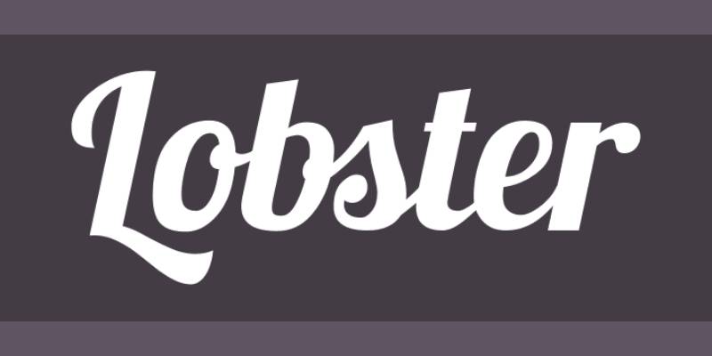
Lobster is a connected display script font designed by Pablo Impallari and released in 2010 through Google Fonts. It uses multiple ligatures and contextual alternates to produce smooth connections between letters, mimicking hand-lettered sign painting.
Lobster suits retro-themed and artisanal apparel because its bold connected strokes communicate a handmade, craft-era quality while maintaining the print consistency of a digital font. It is one of the most downloaded fonts on Google Fonts with consistent use in food, beverage, and lifestyle brand applications.
What makes Lobster suitable for t-shirts?
Lobster uses a bold single weight with medium-to-high stroke contrast, giving it enough mass for clean fabric printing at sizes above 1.5 inches. Its built-in ligature system automatically connects letter pairs, which reduces isolated thin strokes that would otherwise present print risks. The display-size design means it is optimized for large headline use, not small text.
Key attributes:
| Attribute | Value |
| Classification | Connected display script |
| Designer | Pablo Impallari, 2010 |
| Weight range | Regular only (single bold display weight) |
| Variable font | No |
| Letter-spacing default | Normal (connected via ligatures) |
| License | OFL – free commercial use |
| Available on | Google Fonts, Adobe Fonts |
| Price | Free |
How does Lobster perform at t-shirt printing?
The bold connected strokes print well in DTG and heat transfer applications at 1.5 inches and above. In screen printing, the connected letterforms create a single continuous ink film per word, which improves adhesion on stretchy fabric. The thin connections between certain letter pairs (particularly “fl,” “fi” combinations) can break under heavy screen printing ink deposits at sizes below 1.5 inches.
What are the best pairings for Lobster in t-shirt design?
Lobster pairs with Montserrat for a contrast between the decorative script headline and a clean sans-serif supporting text. It also works with slab serif typefaces like Arvo when the design calls for a vintage americana or craft-market aesthetic throughout.
What are the limitations of Lobster for t-shirts?
Lobster is available in one weight only, giving designers no option to create weight hierarchy within the same font family. Its extreme popularity in food and beverage branding means it carries strong associations with those categories, which can feel out of place in apparel contexts targeting fashion or streetwear audiences.
Lobster – Recommended Use Cases Within T-Shirt Design
- Best for: Retro and vintage-themed tees, artisanal brand wordmarks, event and occasion shirts with a handmade feel
- Avoid for: Streetwear, athletic apparel, designs requiring multiple weight levels within a single font
- Optimal weight: Regular (only available weight)
- Optimal size range: 1.5 inches minimum; 2 to 4 inches for screen printing to protect ligature connections
—
Choosing the Right Font For Your Print Method
Font choice and print method have to work together. A font that looks great in Illustrator can fall apart on fabric if its stroke weight doesn’t match the printing process.
| Print Method | Safe Min. Stroke / Size | Best Font Types | Critical Fail Points |
| Screen Printing | 1pt stroke / 12pt size | Heavy/Bold Sans-Serifs | Thin serifs (like Playfair) “disappear” or break on mesh. |
| DTG / DTF | 0.75pt stroke / 10pt size | Most styles, including Script | High detail is possible, but thin lines can “peel” over time. |
| Heat Transfer Vinyl | 2pt stroke / 24pt size | Clean, blocky Sans-Serifs | Tiny details are impossible to “weed” (peel away by hand). |
| Embroidery | 0.05″ (1.3mm) stroke | Bold Sans or Slab Serifs | Fine script becomes a “bird’s nest” of tangled thread. |
When working across multiple products, it helps to understand font licensing before committing to a typeface for commercial apparel production. Free OFL fonts like Bebas Neue, Montserrat, and Oswald remove that friction entirely.
If you are combining two fonts in a single design, a font pairing generator can help you test combinations before committing to a final layout. The fundamental rule holds: pair a condensed or display font with a neutral secondary, and let one carry the visual weight while the other supports the message.
What Makes a Font Suitable for T-Shirt Printing?
The global custom t-shirt printing market was valued at $5.16 billion in 2024 and is projected to reach $9.82 billion by 2030 (Grand View Research). That growth puts more designers than ever in front of the same question: which fonts actually survive the move from screen to fabric?
Most articles answer that question with aesthetics. The real answer is structural.
| Structural Factor | Why It Matters for Printing | Safe Threshold |
| Stroke weight | Thin strokes collapse under ink pressure on cotton | Bold/Heavy minimum for screen printing |
| X-height | Determines legibility at 3–10 feet viewing distance | Large x-height preferred |
| Stroke contrast | High contrast (thick/thin) risks hairline bleed on absorbent fabric | Low contrast safer on cotton |
| Letter spacing | Tight kerning causes character merge at print resolution | Normal to loose default |
Font selection for apparel printing is a technical decision first, a design decision second.
How Does Fabric Type Affect Font Legibility?
Cotton is the most absorbent common garment material. Ink spreads slightly as it soaks into the fiber, which widens strokes and fills in small counters (the enclosed spaces inside letters like “o,” “e,” and “p”).
Polyester absorbs less ink, so strokes stay sharper. Finer detail survives better on polyester than on cotton, which is why athletic jersey fonts often work at slightly lighter weights on synthetic fabrics.
- 100% cotton: Bold/Heavy weights only. No hairline serifs or thin connecting strokes.
- Cotton-poly blend (50/50): Medium to Bold weights. Moderate detail survives.
- 100% polyester: Medium weights viable. Detail holds at smaller print sizes.
What Is the Minimum Font Size for T-Shirt Printing?
Screen printing industry standard sets 1 inch cap height as the minimum for primary text on cotton garments. Below that threshold, individual letters begin to lose internal structure under plastisol ink deposits.
DTG printing handles smaller sizes better, down to 0.5 inches for bold sans-serif fonts, because digital ink application is more precise than squeegee-pushed ink through a mesh screen.
Viewing distance matters too. A reader standing 6 feet away needs at minimum 1.5-inch cap height to read a word without stepping closer. Athletic jerseys, designed to be read at 10 to 30 feet, use 3 to 4-inch lettering almost without exception.
—
Which Font Classifications Work Best on T-Shirts?
Font classification tells you more about print viability than any aesthetic judgment. Each category carries structural characteristics that either help or hurt performance on fabric.
Screen printing held 56% of the custom t-shirt printing market share in 2024 (Grand View Research), making it the dominant production context for font decisions. And screen printing is the most structurally demanding method for typography.
Condensed Display Sans-Serifs
The strongest category for garment printing. Uniform stroke weight and tall cap-to-width ratio combine to create maximum visual impact at minimum horizontal space.
- Bebas Neue: all-caps, monolinear, tight spacing, used in athletic and streetwear globally
- Oswald: 7-weight range, condensed but not ultra-narrow, rounded terminals reduce fill-in risk
- League Gothic: ultra-condensed, single weight, derived from early 20th-century poster type
- Impact: grotesque single weight, maximum ink density per character
Supreme built its entire apparel brand identity around a single blackletter wordmark, proving that visual simplicity in font choice compounds into recognition over time.
Geometric Sans-Serifs
Second-strongest category. Wide apertures on letters like “c,” “e,” and “s” reduce counter fill-in risk. Low stroke contrast means ink applies at consistent pressure across the letterform.
Key structural advantage: geometric construction produces optically balanced ink coverage across the whole character set, not just high-mass sections like vertical stems.
Montserrat’s 9-weight range (Thin 100 to Black 900) makes it the most flexible option. Only weights above 500 are viable for fabric printing. Futura’s geometric precision holds at large display sizes but requires a paid commercial license.
Bold Serif and Slab Serif Fonts
Viable at high weights and large sizes. Risky below Bold 700.
Slab serifs (Graduate, Arvo, ChunkFive) use rectangular, blunt terminals that hold more ink mass than hairline serifs. They print more reliably than transitional or old-style serifs.
High-contrast transitional serifs (Playfair Display) work only at Black 900 weight and above 2 inches cap height. The hairline thin strokes in Regular weight collapse on any absorbent fabric.
Brush and Connected Script Fonts
Viable when connected strokes create a single continuous ink area per word. Avoid disconnected scripts entirely for screen printing.
- Pacifico: medium brush weight, connected letters, survives DTG at 1.5 inches and above
- Lobster: bold connected script with built-in ligatures that simplify film production
Thin cursive scripts and calligraphic fonts fail on fabric regardless of printing method. The hairline connecting strokes simply cannot hold ink mass at any practical garment print size.
Blackletter
Dense, heavy, and surprisingly print-stable. The uniform stroke mass characteristic of most blackletter fonts creates consistent ink coverage.
The risk is legibility, not printing. Audiences unfamiliar with the script form read blackletter slowly. Use it only for single words or brand names where recognition, not reading speed, is the goal.
—
How Does the Printing Method Change Which Font You Should Use?
DTG held 43.92% of print method market share in 2025, making it the largest single technology segment (Mordor Intelligence). Screen printing still accounts for the majority of bulk apparel production. Each method has a different relationship with font structure.
The wrong font in the wrong method doesn’t just look bad. It actively costs money in reprints, returns, and rejected production runs.
| Print Method | Minimum Weight | Min. Cap Height | Risky Font Types |
| Screen printing | Bold 700+ | 1.5 inches | Hairline serif, thin script, light weights |
| DTG | Medium 500+ | 0.75 inches | Ultra-thin strokes, isolated fine details |
| Heat Transfer Vinyl | Medium 500+ | 0.5 inches | Tiny counters, overlapping script strokes |
| Embroidery | Bold only | 0.5 inches minimum | Serifs, scripts, fine inner detail |
Screen Printing Font Requirements
Screen printing uses plastisol or water-based ink pushed through a mesh stencil by a squeegee. Ink deposits are thicker than DTG and tend to spread slightly at the letterform edge.
This spread means tight letter spacing causes adjacent characters to merge. Any font with default tracking below -5 (very tight) needs manual adjustment before screen printing production.
Non-negotiable rules for screen printing:
- Bold or Heavy weight only. Medium weights acceptable on polyester, not on cotton.
- Minimum 1.5-inch cap height for primary text, 0.75 inches for secondary lines at Bold weight.
- Open counters in letters like “B,” “P,” “R,” “e,” “a” must be large enough to remain open after ink spread.
- White ink on dark fabric requires heavier weight than the same font on light fabric, as white ink requires thicker deposit for opacity.
DTG Printing Font Requirements
DTG sprays water-based ink at 1200 to 2400 dpi directly onto fiber. Ink absorbs into the fabric rather than sitting on top, which means detail holds better at smaller sizes. According to Fortune Business Insights, the global DTG market was valued at $985.5 million in 2024 and is growing at 11.2% annually.
Medium weights (500) are viable on cotton at sizes above 1 inch. At smaller sizes or lighter weights, pre-treatment quality becomes the limiting factor, not the font itself. Fonts with complex inner details (Blackletter crossbars, script ligatures, decorative terminals) survive DTG better than they survive screen printing.
Heat Transfer Vinyl and Embroidery
Heat Transfer Vinyl (HTV) cuts letterforms from colored vinyl sheet and applies them with heat and pressure. The cutting blade requires clean, closed letterforms. Tiny counters (the hole inside an “e” or “a”) that are smaller than the blade path fill in completely and are lost.
Embroidery converts letterforms into thread paths. Serifs and fine inner details require tiny thread segments that pull out under tension. Condensed bold sans-serifs are the only reliable choice. Playfair Display Regular would be a disaster. Bebas Neue Bold works cleanly.
—
How Do You Pair Fonts Effectively in T-Shirt Design?
Most t-shirt typography problems come from using two fonts that compete rather than cooperate. The dominant font carries the message. The secondary font supports hierarchy without pulling visual attention.
A 2024 Deloitte survey found that 1 in 5 consumers are willing to pay a 20% premium for personalized products. Clean, professional typography is part of what signals that premium quality.
What Font Combinations Work for Athletic and Sportswear T-Shirts?
Athletic typography needs to be read fast, at distance, and under motion. That narrows the viable range significantly.
Condensed Bold headline + neutral condensed secondary:
- Bebas Neue (headline) + Oswald Regular (team or event name below)
- Impact (headline) + Roboto Condensed (supporting line)
- League Gothic (headline) + Montserrat SemiBold (secondary)
Avoid pairing two condensed fonts at similar weights. The visual mass becomes indistinct and hierarchy collapses. One font should dominate. The second should clearly recede.
What Font Combinations Work for Vintage and Retro T-Shirt Designs?
Vintage apparel typography pulls from American woodblock type, mid-century signage, and 1950s-70s print culture. The font pairing logic shifts: the combination should feel like it was assembled from a limited type drawer, not chosen from infinite digital options.
Lobster (connected script headline) paired with Oswald Bold (secondary line) creates a reliable vintage americana structure.
Playfair Display Black paired with Futura Medium creates a 1960s editorial contrast that works for boutique and artisanal apparel.
Distressed or textured treatments applied in post-production can substitute partially for weight in vintage designs, but they don’t replace minimum stroke weight requirements. Thin fonts with distress textures still fail at print.
—
What Are the Licensing Rules for Using Fonts on T-Shirts?
Font licensing for commercial apparel is where most print-on-demand sellers get caught. Production Type sought $150,000 per infringement from Nike in 2023 for unauthorized font use (designyourway.net). That figure is not an outlier.
The license type determines whether you can sell a t-shirt with that font. Not whether you can use the font to design the shirt.
| License Type | T-Shirt Commercial Use | Examples |
| SIL OFL | Yes, including POD and resale | Bebas Neue, Montserrat, Oswald, Pacifico, Lobster |
| Apache 2.0 | Yes, no restrictions on commercial use | Some Google Fonts variants |
| Personal use only | No. Selling shirts is commercial use. | Many DaFont free downloads |
| Desktop license (paid) | Often No. Covers design use, not product resale. | Most commercial foundry fonts |
OFL Fonts and What They Allow
The SIL Open Font License is the clearest license for apparel use. The OFL FAQ explicitly lists t-shirts, personalised fabric, and merchandise as permitted uses (SIL International, 2023).
OFL allows: printing on t-shirts, using in logos, selling the finished product, modifying the font for internal use.
OFL prohibits: selling the font files themselves, renaming derivative fonts to the original name.
Google Fonts serves approximately 54% of desktop websites and uses OFL licensing for nearly its entire catalog (HTTP Archive, 2024 via designyourway.net). Every font available on Google Fonts is cleared for commercial product use including apparel without attribution.
Desktop Licenses and Their Limits
This is the most common licensing error in the print-on-demand market. A desktop license covers installing the font on your computer and using it to create design files. It does not automatically cover printing that design on products for resale.
Futura, for instance, is a commercially licensed font available through Adobe Fonts with a subscription. The Adobe Fonts subscription clears the font for commercial print use while the subscription is active. But if the subscription lapses, technically the license for any ongoing commercial reproduction lapses with it.
Before using any paid or unknown-license font on commercial apparel, verify the license at the foundry’s direct website, not on a third-party download page. Third-party sites frequently misrepresent license terms.
—
How Do Font Trends in Apparel Design Affect Longevity?
Font trends in apparel follow a predictable cycle: underground use, mainstream adoption, commodity saturation, ironic revival or abandonment. Choosing a font at the wrong point in that cycle dates a design faster than any other single decision.
Graphic-designed shirts accounted for 46% of the custom t-shirt printing market in 2024 (Mordor Intelligence), and typography-led designs are a significant share of that category.
Fonts With Multi-Decade Apparel Track Records
Futura has appeared in apparel since the 1970s. Volkswagen has used it as a brand font for over 50 years. Supreme has used Futura for its logo since 1994. These aren’t coincidences. Geometric, low-contrast construction ages well because it doesn’t carry the stylistic associations of any particular decade.
Helvetica follows the same pattern. It has been used in apparel across at least six distinct fashion cycles without ever feeling dated, because its neutral structure resists period association.
Bebas Neue has been in active use since 2010 across streetwear, athletics, and event merchandise. Fifteen years of consistent use with no sign of saturation suggests it belongs in the durable category now.
The Overexposure Problem
Lobster peaked around 2012 to 2016. It appeared on millions of restaurant menus, craft beer labels, and casual apparel designs. That overexposure created a strong association with a particular moment in design culture, making it hard to use today without signaling that era.
Montserrat faces a milder version of the same risk. It is used on over 19 million websites (Wikipedia), and its print-on-demand saturation is proportionally high. A shirt using Montserrat without a strong design concept around it reads as generic.
The mitigation strategy: pair an overexposed font with a less common secondary, use an unusual weight (Black 900 instead of Bold 700), or apply a structural treatment (stacked layout, curve arch, size contrast) that makes the typography itself the statement rather than just the typeface choice.
How to Evaluate Font Longevity Before Committing
Three practical checks:
- Search the font name alongside “streetwear,” “merch,” and “apparel.” If the image results are dominated by one aesthetic moment, the font carries that association.
- Check whether any premium apparel brands (above $80 retail per item) use the font in current collections. Premium brands are slower to adopt trends and faster to drop them when they peak.
- Look at the font’s use in non-apparel contexts (tech brands, editorial design, packaging). Fonts with cross-industry use tend to reset their cultural associations faster than fonts trapped in one category.
The safest long-term fonts for t-shirt design remain the ones with structural clarity, low stroke contrast, and no decade-specific stylistic features: Futura, Helvetica, Bebas Neue, and the better-constructed fonts used by established clothing brands. Everything else requires a deliberate decision about how long the design is intended to stay in production.
FAQ on The Best Fonts For T-Shirts
What is the best font for t-shirt printing?
Bebas Neue is the most reliable choice. Its all-caps, monolinear structure holds up in screen printing, DTG, and heat transfer vinyl. Bold condensed sans-serifs outperform decorative or thin typefaces on any fabric type.
What fonts work best for screen printing on t-shirts?
Bold and Heavy weight fonts with low stroke contrast perform best. Bebas Neue, Oswald Bold, Impact, and League Gothic all meet the minimum requirements. Avoid hairline serifs and thin script fonts entirely.
Can I use Google Fonts on t-shirts I sell commercially?
Yes. Google Fonts are licensed under the SIL Open Font License, which explicitly permits commercial apparel use. Montserrat, Oswald, Pacifico, and Lobster are all cleared for print-on-demand and direct resale without attribution.
What is the minimum font size for t-shirt printing?
1 inch cap height is the industry minimum for screen printing on cotton. DTG handles sizes down to 0.75 inches at Bold weight. Athletic jerseys designed for distance reading typically use 3 to 4-inch lettering.
Are serif fonts suitable for t-shirt design?
Slab serif fonts like Arvo and Graduate work at Bold weight and large sizes. High-contrast transitional serifs like Playfair Display require Black 900 weight and a minimum 2-inch cap height. Regular weight serifs fail on cotton.
What font does Supreme use on their t-shirts?
Supreme uses a blackletter typeface called Futura for its wordmark, combined with a red box logo. The bold, dense letterforms print consistently across garment types and have anchored the brand’s visual identity since 1994.
Can I use script fonts on t-shirts?
Only connected script fonts are viable. Pacifico and Lobster use joined strokes that create a single continuous ink area per word, which prints reliably. Disconnected calligraphic scripts and thin cursive fonts fail at any practical print size.
What font pairing works best for graphic tees?
A condensed bold headline paired with a neutral sans-serif secondary is the standard approach. Bebas Neue with Montserrat SemiBold is the most common combination. One font carries visual weight; the other supports hierarchy without competing.
Does fabric type affect which font I should use?
Yes. Cotton absorbs ink and causes slight stroke spread, requiring Bold or Heavy weights. Polyester holds sharper detail, making Medium weights viable at larger sizes. Cotton-poly blends fall between the two in terms of ink behavior.
What fonts should I avoid for t-shirt printing?
Avoid hairline fonts, ultra-thin weights, highly decorative letterforms, and disconnected script fonts. Papyrus and Comic Sans have legibility and aesthetic problems. Any font with strokes thinner than 1pt at print resolution will bleed or disappear on fabric.
Conclusion
This conclusion is for an article presenting the best fonts for t-shirts, and the core takeaway is straightforward: font choice is a structural decision, not just a visual one.
Stroke weight, x-height, and letter spacing determine whether your garment printing typography survives cotton, heat, and distance.
Stick with bold condensed typefaces like Bebas Neue and Oswald for athletic and streetwear apparel. Pair them with neutral sans-serifs to build hierarchy without visual conflict.
Always verify your font licensing before sending files to production. OFL-licensed typefaces from Google Fonts cover commercial apparel use with zero restrictions.
And think long-term. Geometric sans-serifs with low stroke contrast age well across fashion cycles. Trendy display fonts date your design faster than any other single decision.
Pick for the printer first. The aesthetic will follow.

Renowned for his expertise in logo design and visual branding, Bogdan has developed a multitude of logos for various clients.
His skills extend to creating posters, vector illustrations, business cards, and brochures. Additionally, Bogdan's UI kits were featured on marketplaces like Visual Hierarchy and UI8.
He also wrote in the past years on sites like Design Your Way, WebDesignerDepot, WPDean, Designmodo, Speckyboy, Slider Revolution, and more.
- The Windsurf Logo History, Colors, Font, And Meaning - 10 October 2026
- How to Remove Background From Product Photos (No Photoshop) - 10 October 2026
- How Designers can Build a Stronger Online Creative Identity - 9 October 2026

Bogdan Sandu is a seasoned designer who has been designing websites since 2008. Renowned for his expertise in logo design and visual branding, Bogdan has developed a multitude of logos for various clients. His skills extend to creating posters, vector illustrations, business cards, and brochures. Additionally, Bogdan's UI kits were featured on marketplaces like Visual Hierarchy and UI8. He also wrote in the past years on sites like Design Your Way, WebDesignerDepot, WPDean, Designmodo, Speckyboy, Slider Revolution, and more.
You Might Also Like