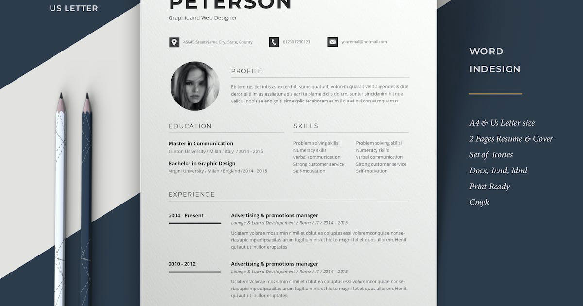
Your resume has roughly six seconds to make an impression. The font you pick decides whether those six seconds work for you or against you.
Choosing the best fonts for resumes isn’t just a design decision. It determines whether an Applicant Tracking System can parse your content cleanly, and whether a recruiter’s eye moves through your document without friction.
Most job seekers spend hours on content and minutes on typography. That’s backwards.
This guide covers the 10 best resume fonts, how to match them to your industry, the right sizes and spacing, and which fonts to avoid entirely. By the end, you’ll know exactly which typeface to use and why it works.
The Best Fonts For Resumes
Font choice on a resume affects two things: whether an ATS can parse your document cleanly, and whether a recruiter can scan your content in under 10 seconds. According to YesWriting, hiring managers form their first impression within 6 to 8 seconds. The wrong font doesn’t just look off. It can cause an ATS to skip entire sections, dropping your keyword match score before a human ever sees your resume.
The fonts below are chosen on structure, ATS compatibility, and industry fit. Not aesthetics.
| Font | Type | Best For | ATS Safe |
| Calibri | Sans-serif | General / Corporate | Yes |
| Garamond | Serif | Law / Academia / Executive | Yes |
| Georgia | Serif | Print-heavy / Senior roles | Yes |
| Cambria | Serif | Management / Engineering | Yes |
| Arial | Sans-serif | Universal / Risk-averse | Yes |
| Helvetica | Sans-serif | Design / Corporate | Yes |
| Times New Roman | Serif | Finance / Government | Yes |
| Lato | Sans-serif | Tech / Marketing / HR | Yes |
| Montserrat | Sans-serif | Creative / Real estate | Yes |
| Aptos | Sans-serif | Tech / Healthcare | Yes |
—
Calibri
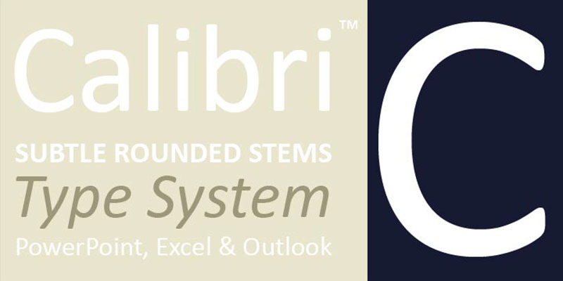
Calibri is a humanist sans-serif typeface designed by Lucas de Groot between 2002 and 2004, released by Microsoft with Windows Vista and Office 2007. It serves as the default professional document font across corporate environments for over 17 years.
Calibri suits general and corporate resumes because its open apertures and rounded terminals produce high legibility at 10pt to 12pt on both screen and print. Microsoft Word used it as the default from 2007 to 2023, meaning ATS platforms are built around it.
What makes Calibri suitable for resumes?
Calibri has a moderate x-height relative to cap height, which keeps lowercase letters readable at smaller sizes without sacrificing line density. It supports 6 weights (Light to Bold), including Calibri Light introduced in Windows 8 for headings. The font’s ClearType optimization means it renders accurately on LCD screens without hinting artifacts.
Key attributes:
| Attribute | Value |
| Classification | Humanist sans-serif |
| Designer | Lucas de Groot, 2002–2004 |
| Weight range | Light to Bold (6 styles including italics) |
| Variable font | No |
| Recommended sizes | 10pt–12pt body; 14pt–16pt headings |
| License | Proprietary (bundled with Microsoft Office) |
| Available on | Microsoft Office, Windows, macOS (via Office) |
| Price | Included with Microsoft 365 / Windows |
How does Calibri perform at resume readability?
Calibri renders cleanly in every major ATS tested, including Workday, Taleo, and Greenhouse, according to Resume Optimizer Pro. Its rounded terminals reduce visual noise in dense bullet-point blocks at 10pt. The font parses consistently in both .docx and PDF formats.
What are the best pairings for Calibri in resumes?
Calibri pairs with Garamond for headings when a more authoritative tone is needed, contrasting the sans-serif body with a classic serif font. It also works with Cambria as a single-family approach when consistent weight across all sections is the priority.
What are the limitations of Calibri for resumes?
Calibri replaced Aptos as Microsoft’s default in January 2024, which means design-forward recruiters may flag it as dated. For creative director or brand designer roles, it reads as the lowest-effort font choice.
Calibri – Recommended Use Cases Within Resume Typography
- Best for: Mid-management, government, healthcare, and general corporate applications
- Avoid for: Creative agency roles, senior design positions, startups with strong brand culture
- Optimal weight: Regular 400 for body; Bold 700 for section headings
- Optimal size range: 10pt-11.5pt body; 16pt-20pt name
—
Garamond
Garamond is an old-style serif typeface originating from the work of French punchcutter Claude Garamond in the 16th century, with modern digital versions released by Adobe (Robert Slimbach, 1989) and available through Adobe Fonts. It delivers high typographic density at small point sizes without compromising character distinction.
Garamond suits executive, legal, and academic resumes because its tight but open letterforms allow more content per page at 10.5pt without shrinking to illegibility. ResuFit testing confirms excellent ATS compatibility across major recruitment platforms.
What makes Garamond suitable for resumes?
Garamond’s low stroke contrast and angled serifs produce a slightly smaller apparent size than most fonts at the same point setting, letting senior candidates fit two-page content comfortably at 11pt. Adobe Garamond supports 6 styles including italic and semibold, giving enough weight range for clear visual hierarchy on a resume.
Key attributes:
| Attribute | Value |
| Classification | Old-style serif |
| Designer | Claude Garamond (16th c.); Robert Slimbach digital version, 1989 |
| Weight range | Regular to Bold (Adobe Garamond: 6 styles) |
| Variable font | No |
| Recommended sizes | 10.5pt-11.5pt body; 13pt-15pt headings |
| License | Commercial (Adobe Fonts subscription); EB Garamond available under OFL |
| Available on | Adobe Fonts; Microsoft Word (built-in); Google Fonts (EB Garamond) |
| Price | Included with Adobe Creative Cloud; EB Garamond free |
How does Garamond perform at resume readability?
At 11pt, Garamond delivers tighter line density than Calibri or Georgia, which works in favor of content-heavy executive resumes. Its thin strokes can soften at very small sizes on low-DPI monitors, so it performs better in print and PDF than in plain-text ATS extraction. The font passes major ATS parsers cleanly when exported as a selectable-text PDF.
What are the best pairings for Garamond in resumes?
Garamond pairs with Calibri for body text when a warmer, more modern contrast is needed between headings and content sections. For a fully traditional resume, pairing Garamond headings with Cambria body text maintains serif consistency while adding slight weight differentiation through Cambria’s higher stroke contrast.
What are the limitations of Garamond for resumes?
Garamond’s thin strokes render poorly when printed on low-quality office printers, reducing legibility in physical review stacks. Adobe Garamond requires an active Creative Cloud subscription; EB Garamond (OFL) is the free alternative but has fewer weights.
Garamond – Recommended Use Cases Within Resume Typography
- Best for: Law, academia, publishing, finance, senior executive roles
- Avoid for: Tech startups, creative design roles, digital-first companies scanning resumes on screen
- Optimal weight: Regular for body; Bold or Semibold for headings
- Optimal size range: 10.5pt-11pt body; 13pt-15pt section headings
—
Georgia
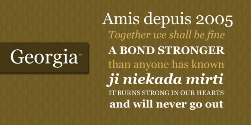
Georgia is a transitional serif typeface designed by Matthew Carter in 1993 for Microsoft, released as part of Microsoft’s core web font set. It delivers high on-screen legibility for serif body text, built specifically for low-resolution screen rendering.
Georgia suits print-heavy and senior-level resumes because its x-height is higher than Times New Roman at the same point size, making characters more distinct in dense text blocks at 10pt to 11pt.
What makes Georgia suitable for resumes?
Georgia’s x-height exceeds that of Times New Roman, producing clearer lowercase character distinction at 10pt on standard monitor resolutions. Its serifs are broader and flatter than Garamond’s, giving it better print resilience on lower-quality printers. The font supports 4 styles: Regular, Italic, Bold, and Bold Italic.
Key attributes:
| Attribute | Value |
| Classification | Transitional serif |
| Designer | Matthew Carter, 1993 |
| Weight range | Regular to Bold (4 styles) |
| Variable font | No |
| Recommended sizes | 10pt–12pt body; 14pt–16pt headings |
| License | Proprietary (bundled with Windows and macOS) |
| Available on | Windows, macOS, Google Docs |
| Price | Free (pre-installed) |
How does Georgia perform at resume readability?
Georgia was engineered for screen legibility before screen rendering technology matured, which means it holds up better than most serif fonts at 10pt in PDF viewers and browser-based ATS interfaces. Its wider letter spacing relative to Garamond reduces character confusion between similar glyphs like ‘I’, ‘l’, and ‘1’. Academic hiring committees who print applications typically find Georgia more scan-friendly than Garamond at small sizes.
What are the best pairings for Georgia in resumes?
Georgia pairs with Arial as a body font when a contrast between a classic serif heading and a neutral sans-serif font is needed. It also pairs with Helvetica for a more design-aware combination that signals both editorial authority and typographic awareness.
What are the limitations of Georgia for resumes?
Georgia’s limited weight range (4 styles, no Light or ExtraBold) restricts visual hierarchy options for multi-section resumes. Its wide letterforms consume more horizontal space than Garamond, which can force content-heavy resumes onto a second page.
Georgia – Recommended Use Cases Within Resume Typography
- Best for: Academic, research, and senior professional roles; resumes frequently printed by hiring committees
- Avoid for: Tech and startup roles where sans-serif fonts are the industry norm
- Optimal weight: Regular 400 for body; Bold for section headings
- Optimal size range: 10pt-11pt body; 14pt-16pt headings
—
Cambria
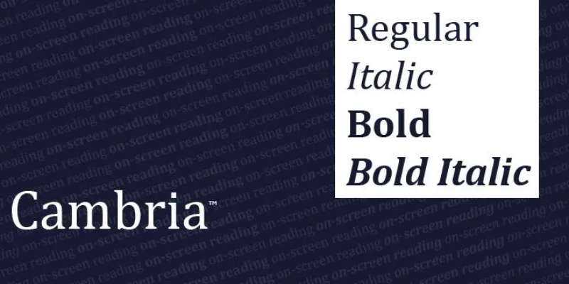
Cambria is a transitional serif typeface designed by Jelle Bosma in 2004, commissioned by Microsoft and distributed through Windows and Office. It was built specifically for on-screen reading at small point sizes and maintains sharpness in printed output.
Cambria works well for management, engineering, and HR resumes because its strong stroke contrast and clear character shapes retain readability at 10pt across both screen and print formats.
What makes Cambria suitable for resumes?
Cambria’s letterforms were designed with math and science symbols in mind, supporting engineering and architecture resumes that include technical notation. Its moderate x-height and clear ascender-to-descender ratio provide strong visual differentiation between capital and lowercase characters at body text sizes. The font supports 4 styles and renders accurately in Microsoft Word without substitution issues.
Key attributes:
| Attribute | Value |
| Classification | Transitional serif |
| Designer | Jelle Bosma, 2004 |
| Weight range | Regular to Bold (4 styles) |
| Variable font | No |
| Recommended sizes | 10pt-12pt body; 14pt-16pt headings |
| License | Proprietary (bundled with Microsoft Office) |
| Available on | Windows, macOS (via Office) |
| Price | Included with Microsoft 365 |
How does Cambria perform at resume readability?
Cambria’s higher stroke contrast than Georgia produces sharper letterforms at 10pt in PDF viewers. It parses cleanly in all major ATS platforms as a system font. Microsoft’s own resume templates default to Cambria for formal industry positions, confirming its standard-bearer status for print-safe serif resume typography.
What are the best pairings for Cambria in resumes?
Cambria pairs with Calibri for body text when a serif heading needs a modern sans-serif counterpart, which is the standard combination in most Microsoft resume templates. It also pairs well with Arial in roles where maximum ATS safety is the priority across both heading and body fonts.
What are the limitations of Cambria for resumes?
Cambria offers only 4 weight options, which limits heading hierarchy depth compared to multi-weight sans-serif options like Lato or Montserrat. It is not available outside the Microsoft ecosystem without a license, so candidates building resumes in Google Docs may encounter substitution if the file is opened on a machine without Office installed.
Cambria – Recommended Use Cases Within Resume Typography
- Best for: Management, HR, engineering, architecture, and leadership roles
- Avoid for: Creative roles; resumes built and shared primarily outside the Microsoft ecosystem
- Optimal weight: Regular for body; Bold for headings
- Optimal size range: 10pt-12pt body; 14pt-16pt headings
—
Arial
Arial is a neo-grotesque sans-serif typeface designed by Robin Nicholas and Patricia Saunders for Monotype Typography in 1982. Microsoft licensed it in 1992 for inclusion with Windows, making it one of the most universally installed fonts across all operating systems and ATS environments.
Arial suits risk-averse job applications because it ships with every major OS and passes every ATS parser without configuration. It is metrically compatible with Helvetica, so it can substitute without affecting layout.
What makes Arial suitable for resumes?
Arial’s neo-grotesque letterforms have consistent stroke widths and open apertures that maintain legibility at 10pt in both print and digital formats. The font family has expanded to 28 weights and versions, offering enough range for resume hierarchy without relying on a secondary font. Its pre-installation across Windows, macOS, and Google Docs eliminates font substitution risk entirely.
Key attributes:
| Attribute | Value |
| Classification | Neo-grotesque sans-serif |
| Designer | Robin Nicholas, Patricia Saunders, 1982 |
| Weight range | Regular to Black (28 variants including Narrow and Rounded) |
| Variable font | No |
| Recommended sizes | 10pt-10.5pt body; 14pt-16pt headings |
| License | Proprietary (pre-installed with Windows and macOS) |
| Available on | Windows, macOS, Google Docs (default) |
| Price | Free (pre-installed) |
How does Arial perform at resume readability?
Arial runs slightly optically smaller than Calibri at the same point size, so 10.5pt is recommended for body text rather than 10pt. Its consistent stroke width removes visual noise in dense bullet blocks. Resume Optimizer Pro and Resumemate both confirm clean parsing in Workday, Taleo, Greenhouse, and Lever without errors.
What are the best pairings for Arial in resumes?
Arial pairs with Georgia for a classic heading-body contrast that balances sans-serif neutrality with serif authority. It also works with Garamond in heading position when body text needs a lighter, more neutral tone than the heading.
What are the limitations of Arial for resumes?
Arial’s near-identical appearance to Helvetica can read as a budget substitute in design-aware industries. Some career advisors on Piktochart’s resume guide classify it as too generic for modern roles, particularly at startups where typographic awareness is part of the job evaluation.
Arial – Recommended Use Cases Within Resume Typography
- Best for: Healthcare ATS-heavy applications, government roles, clinical positions, any situation where parsing reliability is the top priority
- Avoid for: Creative director, brand designer, or UX roles where font choice signals design judgment
- Optimal weight: Regular for body; Bold for headings
- Optimal size range: 10pt-10.5pt body; 15pt name
—
Helvetica
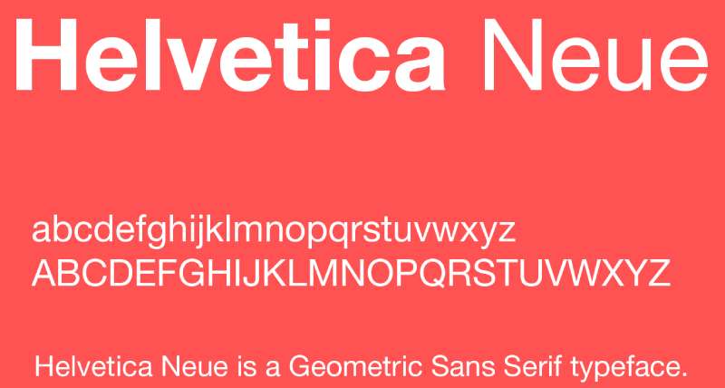
Helvetica is a neo-grotesque sans-serif typeface designed by Max Miedinger and Eduard Hoffmann in 1957 for the Haas Type Foundry in Switzerland. It serves as the benchmark for neutral, corporate typography and has appeared in documentary film, major brand identities, and government signage worldwide.
Helvetica suits corporate and design-adjacent resumes because its tight letter spacing and consistent stroke weights signal typographic precision without calling attention to itself.
What makes Helvetica suitable for resumes?
Bloomberg Business cited typography experts who ranked Helvetica as the top resume font, describing it as “professional, lighthearted, and honest” in the words of Brian Hoff Design. Its uniform stroke width across all letterforms produces a highly scannable text block at 10pt to 11pt. Neue Helvetica supports over 50 weights and widths, giving significant control over visual hierarchy without switching fonts.
Key attributes:
| Attribute | Value |
| Classification | Neo-grotesque sans-serif |
| Designer | Max Miedinger, Eduard Hoffmann, 1957 |
| Weight range | Thin to Black (Neue Helvetica: 50+ variants) |
| Variable font | No |
| Recommended sizes | 10pt-11pt body; 14pt-16pt headings |
| License | Commercial (Monotype / Linotype) |
| Available on | macOS (pre-installed); Adobe Fonts; Monotype direct |
| Price | Free on macOS; paid license required on Windows |
How does Helvetica perform at resume readability?
Helvetica’s tight apertures on letters like ‘c’ and ‘e’ can reduce legibility at 10pt on low-DPI screens compared to Calibri or Lato. In print, it reads sharply and professionally. The main ATS risk is on Windows: Helvetica is not pre-installed, so resumes must be exported as PDF to prevent font substitution to Arial.
What are the best pairings for Helvetica in resumes?
Helvetica pairs with Georgia when a strong serif heading creates visual hierarchy against the neutral sans-serif body. For a fully modern resume, pairing Helvetica body with Montserrat headings works in creative fields where both fonts signal design awareness. See more on Helvetica font pairing options across different contexts.
What are the limitations of Helvetica for resumes?
Helvetica is not pre-installed on Windows, creating a substitution risk if the resume is submitted as a .docx file. A paid license is required for Windows use outside macOS. Arial is a metrically compatible alternative that avoids this problem entirely.
Helvetica – Recommended Use Cases Within Resume Typography
- Best for: Corporate, consulting, finance, and design-aware candidates on macOS
- Avoid for: Resumes submitted as .docx files on Windows without a Helvetica license
- Optimal weight: Regular 400 for body; Medium or Bold for headings
- Optimal size range: 10pt-11pt body; 16pt name
—
Times New Roman
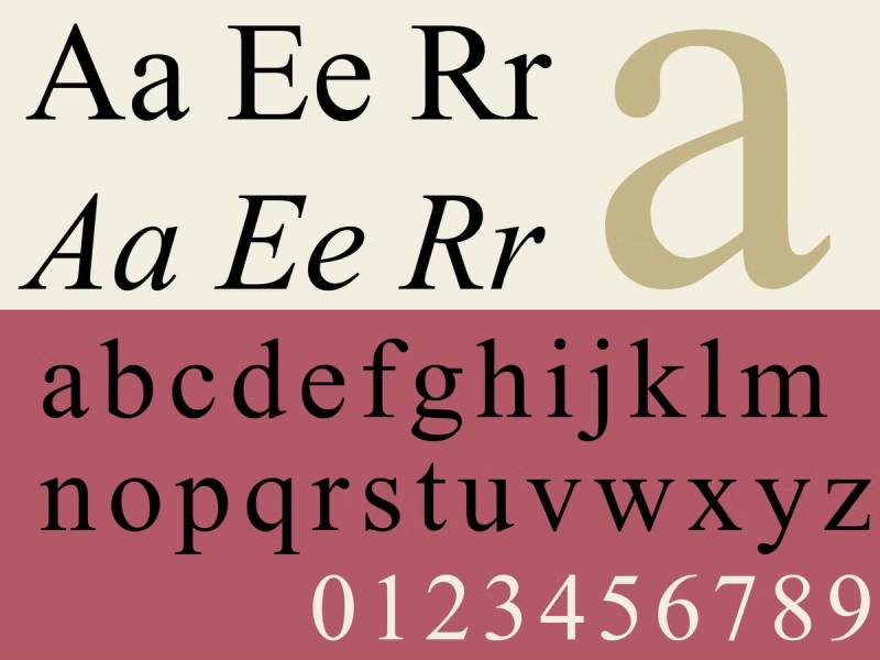
Times New Roman is a transitional serif typeface designed by Stanley Morison and Victor Lardent in 1931 for The Times newspaper, released commercially by Monotype. It was the default word processing font for decades before Calibri replaced it in Microsoft Word in 2007.
Times New Roman remains a safe choice for finance, government, and legal resumes where formal presentation is the baseline expectation. It is not the best choice for digital-first or startup applications.
What makes Times New Roman suitable for resumes?
Times New Roman was engineered for high-density newspaper printing, giving it tightly spaced letterforms that fit more text per line than most serif alternatives. Its narrow character width lets candidates fit dense content on one page at 11pt. The font is universally installed across all systems and passes every ATS parser without exception.
Key attributes:
| Attribute | Value |
| Classification | Transitional serif |
| Designer | Stanley Morison, Victor Lardent, 1931 |
| Weight range | Regular to Bold (4 styles) |
| Variable font | No |
| Recommended sizes | 11pt-12pt body; 14pt-16pt headings |
| License | Proprietary (pre-installed with Windows and macOS) |
| Available on | Windows, macOS, Google Docs |
| Price | Free (pre-installed) |
How does Times New Roman perform at resume readability?
At 10pt on screen, Times New Roman’s compressed letterforms reduce visual distinctiveness between similar characters. Recruiters at tech companies and startups flag it as a no-effort default, according to Piktochart’s resume guide. At 11pt in print, it reads cleanly and densely, which suits formal review environments where physical copies are evaluated.
What are the best pairings for Times New Roman in resumes?
Times New Roman pairs with Arial as a body font to contrast the formal serif heading with a clean sans-serif section content, a standard academic approach. Pairing it with Helvetica in heading position while using Times New Roman for body text is less common but used in legal sector resumes that value both typographic weight and tradition.
What are the limitations of Times New Roman for resumes?
Modern recruiters, particularly in tech and creative fields, associate Times New Roman with a no-thought default choice, which can create a negative impression before content is read. Its 4 weight styles limit visual hierarchy compared to multi-weight font families.
Times New Roman – Recommended Use Cases Within Resume Typography
- Best for: Law firm applications, government positions, traditional finance roles, academic CVs
- Avoid for: Tech companies, startups, design agencies, marketing roles
- Optimal weight: Regular 12pt for body; Bold for section headings
- Optimal size range: 11pt-12pt body; 14pt-16pt headings; 18pt-20pt name
—
Lato
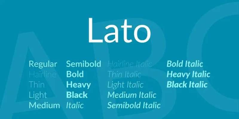
Lato is a humanist sans-serif typeface designed by Łukasz Dziedzic in 2010 for a corporate client, released through Google Fonts under the Open Font License. The name means “summer” in Polish. As of 2018, it served over 1 billion views per day on Google Fonts alone.
Lato suits tech, marketing, product, and HR resumes because its semi-rounded terminals add warmth to a structurally strong letterform, differentiating it from the more neutral Calibri while remaining fully ATS-compatible.
What makes Lato suitable for resumes?
Lato supports 10 styles including Hairline and Black, giving it the broadest weight range of any font on this list. Its semi-rounded details create slight visual warmth at body text sizes without introducing curvature that reduces ATS parsing accuracy. Google Fonts availability means it renders consistently across all major resume platforms including Google Docs and Canva without substitution.
Key attributes:
| Attribute | Value |
| Classification | Humanist sans-serif |
| Designer | Łukasz Dziedzic, 2010 |
| Weight range | Hairline 100 to Black 900 (10 styles) |
| Variable font | No |
| Recommended sizes | 10pt-12pt body; 14pt-16pt headings |
| License | OFL (Open Font License, free for all use) |
| Available on | Google Fonts, Adobe Fonts |
| Price | Free |
How does Lato perform at resume readability?
Lato renders cleanly in ATS tests across Workday, Greenhouse, and Lever when exported as a selectable-text PDF. Its moderate x-height keeps body text legible at 10pt without the optical compression issues that affect narrower sans-serif fonts. Resume Optimizer Pro recommends Lato as the top designer-approved ATS-safe alternative to Calibri for roles requiring typographic differentiation. Read more on Lato font pairing for use across document and digital contexts.
What are the best pairings for Lato in resumes?
Lato pairs with Montserrat for headings when a consistent geometric aesthetic is wanted across both heading and body. For a classic contrast, pairing it with Georgia in headings provides a serif authority counterpoint to the neutral sans-serif body.
What are the limitations of Lato for resumes?
Lato is not pre-installed on Windows or macOS, so resumes must be exported as PDF to avoid substitution when opened on systems without the font installed. Its broad weight range is only useful when the resume is built in a platform that supports Google Fonts directly.
Lato – Recommended Use Cases Within Resume Typography
- Best for: Tech, product, marketing, customer success, and HR roles; candidates who want to stand out from the Calibri crowd without design risk
- Avoid for: Resumes submitted as .docx files to companies without Google Fonts pre-installed
- Optimal weight: Regular 400 for body; SemiBold 600 for section headings
- Optimal size range: 10.5pt-12pt body; 16pt-20pt name
—
Montserrat
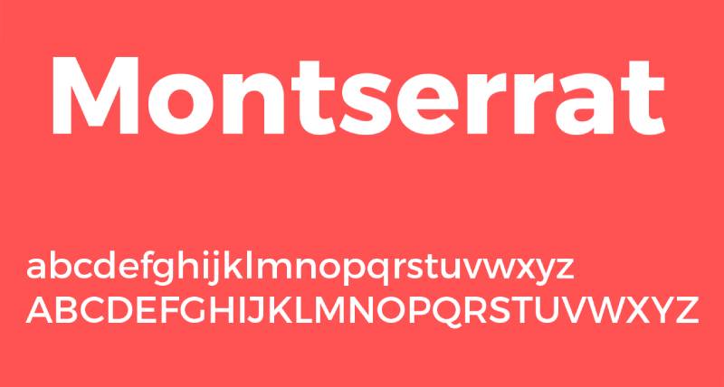
Montserrat is a geometric sans-serif typeface designed by Julieta Ulanovsky and released through Google Fonts in 2011, inspired by early 20th-century urban signage in the Montserrat neighborhood of Buenos Aires. It is used on over 19 million websites and was Fiverr’s Font of the Year for 2024.
Montserrat suits creative, real estate, and wellness resumes because its large x-height and wide apertures produce high legibility in both headings and body text, while its geometric structure signals modern design awareness.
What makes Montserrat suitable for resumes?
Montserrat features 9 weights from Thin to Black with matching italics, plus the Montserrat Alternates variant for stylistic customization. Its large x-height relative to cap height keeps lowercase characters readable even at 10pt in dense bullet lists. The font is licensed under OFL, meaning it renders correctly in Google Docs, Canva, and any platform connected to Google Fonts without substitution risk.
Key attributes:
| Attribute | Value |
| Classification | Geometric sans-serif |
| Designer | Julieta Ulanovsky, 2011 |
| Weight range | Thin 100 to Black 900 (9 weights + italics) |
| Variable font | No |
| Recommended sizes | 10pt-11.5pt body; 14pt-18pt headings |
| License | OFL (Open Font License, free for all use) |
| Available on | Google Fonts, Adobe Fonts |
| Price | Free |
How does Montserrat perform at resume readability?
Montserrat is most effective in heading position at 14pt or larger, where its geometric letterforms create strong visual hierarchy. In body text at 10pt, its wide letter-spacing can consume horizontal space faster than Calibri or Lato, potentially pushing content-heavy resumes to a second page. Microsoft Word’s ATS resume builder lists it as suitable for creative and real estate roles where a bold feel is needed while maintaining scannability.
What are the best pairings for Montserrat in resumes?
Montserrat pairs with Lato for body text as the standard modern clean pairing. For a more editorial contrast, Montserrat heading paired with Garamond body combines geometric modern headings with a classic serif text block, used in design-forward professional resumes.
What are the limitations of Montserrat for resumes?
Montserrat’s wide character spacing increases line length in body text, consuming more page space than condensed alternatives like Garamond. For highly content-dense resumes, using Montserrat exclusively as the body font can make the document feel padded without adding to readability.
Montserrat – Recommended Use Cases Within Resume Typography
- Best for: Creative roles, real estate, wellness, marketing, and design-adjacent positions; heading use in modern resumes
- Avoid for: Body text in content-dense, one-page resumes; conservative finance and law applications
- Optimal weight: Regular 400 for body; SemiBold 600 or Bold 700 for headings
- Optimal size range: 10pt-11pt body; 14pt-18pt headings; 20pt name
—
Aptos

Aptos (originally named Bierstadt) is a neo-grotesque sans-serif typeface designed by Steve Matteson, commissioned by Microsoft and released in 2023 as the new default font for Microsoft Office, replacing Calibri after 17 years. It was developed with screen readability on modern high-DPI displays as the primary design goal.
Aptos suits technology, healthcare, and management resumes because it was optimized for current screen resolutions and carries the implicit endorsement of being the current Microsoft Office default, which means ATS platforms are already calibrated for it.
What makes Aptos suitable for resumes?
Aptos features open shapes, slightly rounded edges, and balanced proportions designed specifically for extended reading on screens ranging from smartphones to desktop monitors. Its humanist touch (similar to Calibri) gives it warmth without the decorative complexity that reduces ATS parsing accuracy. As a 2023 default, it is now the font most recruiters using Microsoft 365 see in their own interface daily.
Key attributes:
| Attribute | Value |
| Classification | Neo-grotesque sans-serif |
| Designer | Steve Matteson, 2019 (released 2023) |
| Weight range | Regular to Bold (with Aptos Display and Aptos Serif variants) |
| Variable font | Yes (Weight axis in Microsoft 365 environments) |
| Recommended sizes | 10pt–12pt body; 14pt–16pt headings |
| License | Proprietary (bundled with Microsoft 365) |
| Available on | Microsoft 365 apps, Windows 11 |
| Price | Included with Microsoft 365 subscription |
How does Aptos perform at resume readability?
Aptos renders with high clarity on modern LCD and OLED screens because of its geometric precision combined with slightly open apertures. Its neutral tone prevents strong industry associations, making it effective across technology, healthcare, and management applications where recruiter first impressions are screen-based. The Microsoft Word blog confirms Aptos as the recommended font for these three sectors specifically.
What are the best pairings for Aptos in resumes?
Aptos pairs with Cambria in heading position when a transitional serif heading adds authority above a modern sans-serif body. For a fully Microsoft-native approach, using Aptos in Regular weight for body and Aptos Bold for headings eliminates all font substitution risk when resumes are shared as .docx files within corporate networks.
What are the limitations of Aptos for resumes?
Aptos is only available through Microsoft 365 and Windows 11, which means candidates building resumes in Google Docs, Canva, or non-Microsoft tools cannot use it without font substitution. Its limited weight range (compared to Lato or Montserrat) restricts visual hierarchy options in multi-section resumes.
Aptos – Recommended Use Cases Within Resume Typography
- Best for: Technology, healthcare, and management roles; resumes built and submitted within the Microsoft ecosystem
- Avoid for: Resumes created outside Microsoft 365; creative or design roles where font originality is evaluated
- Optimal weight: Regular for body; Bold for headings
- Optimal size range: 10pt-12pt body; 14pt-16pt headings; 18pt-20pt name
—
How to Choose the Right Resume Font
The right font depends on three variables: the industry you are targeting, the platform your resume will be read on (screen vs. print), and the file format you are submitting (.docx vs. PDF).
Sans-serif fonts are preferred by 70% of recruiters for digital resumes, according to AI ResumeGuru data. Serif fonts remain the standard in academia, law, and finance where printed review is still common.
| Industry | Recommended Font | Reason |
| Tech / Engineering | Calibri, Arial, Lato | Clean, screen-optimized, ATS-safe |
| Finance / Law / Government | Garamond, Georgia, Times New Roman | Formal tone, print-resilient |
| Creative / Design / Marketing | Helvetica, Montserrat, Lato | Typographic awareness, modern |
| Academic / Research | Georgia, Cambria, Garamond | Strong print performance, high legibility |
| Management / HR | Calibri, Cambria, Aptos | Neutral, ATS-optimized, professional |
Font Size Rules
Body text should sit between 10pt and 12pt. Going below 10pt creates a legibility risk for both humans and ATS systems. Going above 12pt makes the resume appear padded.
- Name: 18pt-22pt
- Section headings: 12pt-16pt
- Body text: 10pt-12pt
- Line spacing: 1.15 to 1.2 (single spacing feels cramped; double spacing wastes space)
Serif vs. Sans-Serif
The serif vs. sans-serif decision comes down to industry and reading context. Serif fonts perform better in print and in formal industries. Sans-serif fonts parse more cleanly on-screen and in ATS systems that extract plain text from uploaded PDFs.
If you are unsure, use a sans-serif for body text and a serif for headings. That combination, as used in most professional resume templates built around pairing fonts correctly, creates visual hierarchy without sacrificing ATS safety.
Font Psychology and Professional Impression
Font psychology research shows that serif fonts are perceived as more authoritative and traditional, while sans-serif fonts read as modern and approachable. This maps directly to industry expectations: law firms and consulting companies expect serifs, while tech companies and startups lean toward sans-serifs.
This is not a soft consideration. It affects recruiter first impressions within seconds of opening the document. Choosing a font that contrasts with industry norms creates friction before content is evaluated.
ATS Compatibility: What Actually Fails
Most ATS systems do not evaluate fonts directly. They extract plain text from your document and discard the font metadata. The failure modes come before that step.
- Scanned or flattened PDFs: Text is not selectable, so ATS cannot extract it at all
- Script or decorative fonts: Glyphs may not map to standard Unicode characters, causing garbled extraction
- Text in image format: Common in Canva-built resumes exported without selectable text layers
- Uncommon embedded fonts: Can cause character substitution during extraction in some older ATS builds
The fonts on this list avoid all of these failure modes when exported as selectable-text PDFs. If you are submitting a .docx file, use only fonts that are pre-installed on the recipient’s system (Calibri, Arial, Georgia, Cambria, Times New Roman, Aptos) to prevent substitution.
How Many Fonts Should a Resume Use?
One font in multiple weights is the safest approach. Two fonts (one for headings, one for body) is acceptable. Three or more creates visual clutter and signals poor formatting judgment to design-aware recruiters.
When using two fonts, apply the one serif plus one sans-serif rule. Never pair two serifs or two sans-serifs. The heading font carries the typographic personality; the body font carries the content. Keep the weight balance consistent: avoid pairing a heavy heading font with an ultra-light body font.
For more on using fonts in professional documents beyond the resume context, the same core rules apply: legibility first, weight range second, license and availability third.
Does Font Choice Affect Whether a Resume Passes ATS Screening?
The short answer is: indirectly, yes. But not for the reasons most career blogs claim.
98% of Fortune 500 companies use an ATS, according to ResumeAdapter’s 2024 pipeline analysis. However, the same research found that 92% of those systems do not auto-reject resumes based on font or formatting. They rank and sort.
What actually causes a resume to disappear isn’t the font family. It’s what the font enables or prevents during text extraction.
What Actually Causes a Font to Fail ATS Parsing
ATS platforms extract plain text from your file first, then analyze it. Font issues create failures in that extraction step, before the system ever evaluates your content.
The four real failure modes:
- Script and decorative fonts that map to non-standard Unicode glyphs, producing garbled or missing text after extraction
- Text embedded as an image layer (common in Canva exports), which no ATS can read regardless of the font used
- Fonts stored in headers or footers, which 67% of ATS systems skip entirely, according to Jobscan 2025
- Non-standard embedded fonts in .docx files that trigger substitution, shifting character spacing and disrupting section parsing
Standard fonts (Arial, Calibri, Garamond) are 20% less likely to cause ATS parsing errors than decorative or custom fonts, per LinkedIn Talent Solutions 2024.
Formatting errors overall account for up to 25% of ATS ranking drops, with non-standard fonts listed alongside tables, text boxes, and multi-column layouts as primary causes, according to TopResume 2023.
Which File Formats Preserve Font Rendering Across ATS Systems
PDF with selectable text is the safest submission format. It locks the layout and prevents font substitution on the recipient’s machine.
| Format | Font Substitution Risk | ATS Parse Accuracy |
| PDF (selectable text) | None | High |
| .docx (system font) | None if font pre-installed | High |
| .docx (embedded custom font) | Medium on recipient machine | Medium |
| PDF (flattened/image) | N/A (no parseable text) | None |
The EDLIGO 2025 analysis of 1,000 rejected resumes across Workday, Taleo, and Greenhouse found DOCX files with plain formatting had a 4% failure rate, compared to 18% for PDFs exported incorrectly. The issue wasn’t the font. It was the export method.
If a font isn’t pre-installed on the system opening the .docx, the OS substitutes a fallback. That shift moves characters, collapses line breaks, and can push section headings into body text. Calibri, Arial, Georgia, Cambria, Times New Roman, and Aptos avoid this entirely on both Windows and macOS.
—
How Does Industry Affect the Right Font Choice for a Resume?
Font choice sends a signal before content is read. A 2024 survey of 1,003 hiring managers (Resumly) found that recruiters don’t consciously evaluate fonts unless the choice is extreme. But the overall typographic tone affects how professional and calibrated the resume feels at first glance.
73% of hiring managers reject candidates due to poor resume formatting, according to High5Test’s 2024 aggregated data. Font mismatch with industry expectations is one dimension of that judgment.
| Industry | Font Type | Recommended Options | Reason |
| Law / Finance / Government | Serif | Garamond, Georgia, Cambria | Formal tone, print-resilient |
| Tech / Engineering / Startups | Sans-serif | Calibri, Lato, Arial | Screen-optimized, modern |
| Creative / Design / Marketing | Sans-serif | Helvetica, Montserrat, Lato | Typographic awareness signal |
| Academic / Research | Serif | Georgia, Garamond, Cambria | Print-heavy review environment |
Conservative Industries: Law, Finance, Government
Hiring committees in these sectors frequently review printed applications. That changes the evaluation context significantly.
Serif fonts like Garamond and Georgia maintain legibility in print at 10pt to 11pt. Their slightly traditional visual register also aligns with the professional norms these industries enforce explicitly.
A 2024 survey by ResuFit confirmed that finance and law recruiters prefer Georgia or Garamond at 11pt body, noting that serif fonts match the tonal weight expected for senior roles where dense content is the norm.
Times New Roman technically fits this category, but modern law firm recruiters increasingly flag it as the zero-effort default. Garamond is the stronger choice in 2025.
Tech, Product, and Startup Environments
ResuFit testing across Workday, Greenhouse, and Lever confirmed that Calibri, Arial, and Lato parse cleanly without errors in all three systems. No configuration required.
But parsing isn’t the only consideration here. Startups with strong design culture evaluate font choice as a proxy for typographic awareness.
- Calibri: Default safe. No risk, but no differentiation either
- Lato: Top ATS-safe alternative for roles where standing out from the Calibri crowd matters (Resume Optimizer Pro, 2024)
- Helvetica: Design-forward signal, but only available natively on macOS. Requires PDF export on Windows
Creative and Design Roles
Font choice carries direct professional weight here. Using Calibri on a UX designer’s resume signals that the candidate has no opinion about typography, which is a functional skill in the role itself.
Montserrat or Helvetica as a heading font, paired with Lato or Roboto for body text, communicates design judgment without crossing into experimental territory. The resume still needs to be parseable.
Montserrat is used on over 19 million websites (Wikipedia, 2025) and was Fiverr’s Font of the Year for 2024, which means design-aware recruiters recognize it without finding it unusual.
—
What Is the Correct Font Size and Spacing for a Resume?
ResumeGo’s 2024 survey of 418 U.S. hiring professionals found that 81% of recruiters spend less than one minute on initial resume screening. Font size and line spacing directly control how much content they can scan in that window.
Getting the size wrong in either direction costs you. Too small and the document feels cramped. Too large and it reads as padded, which signals inexperience or content shortage.
Body Text Size Range
10pt to 12pt is the standard range. The specific point within that range depends on font and content density.
- Garamond and Georgia run optically smaller at the same point size, so 11pt is the effective minimum for these fonts
- Calibri and Arial run slightly larger, so 10pt to 10.5pt is workable for dense content
- Going below 10pt creates a legibility failure for both ATS extraction and human reviewers, according to Resumemate’s 2026 ATS guide
Microsoft Word’s resume builder recommends body text between 10pt and 12pt, with the lower end reserved for content-heavy senior resumes.
Name, Heading, and Body Hierarchy
Three-tier sizing creates scannability without requiring a second font.
| Element | Size Range | Style |
| Name | 18pt – 22pt | Bold or SemiBold |
| Section headings | 12pt – 16pt | Bold |
| Body text | 10pt – 12pt | Regular |
| Bullet points | 10pt – 11pt | Regular |
Line Spacing and Margin Rules
Line spacing between 1.15 and 1.2 is the effective range for professional documents. Single spacing (1.0) compresses lines enough that a recruiter’s eye struggles to track between rows. Double spacing (2.0) wastes page real estate and signals a thin content base.
Margins should stay at a minimum of half an inch on all sides. Going narrower than that causes text to be cut off in some printing environments. Going wider than one inch on a single-page resume makes the document look sparse.
Using weight variation (Regular 400 for body, Bold 700 for headings) within a single font family gives clear visual hierarchy without introducing font substitution risk from a second typeface.
—
Serif vs. Sans-Serif Fonts: Which Works Better on a Resume?
A 2024 survey of 1,003 hiring managers (Resumly) rated Times New Roman, Arial, and Helvetica as the top three resume fonts. Two of the three are sans-serif. One is a transitional serif. The answer depends entirely on context.
40% of recruiters report being turned off by resumes with flashy design elements including hard-to-read fonts, according to Resume Genius’s 2024 Hiring Trends Survey. The concern is legibility, not whether the font has serifs.
When to Use a Serif Font on a Resume
Serif fonts outperform sans-serif in two specific conditions: print review environments and industries where formal presentation is a baseline expectation.
Key contexts for serif use:
- Academic hiring committees that print and physically review applications
- Law firm applications where Garamond or Georgia signals industry alignment
- Executive-level roles (Director and above) in finance, consulting, and government
- Two-page resumes with dense content where Garamond’s tight setting saves space at 10.5pt
Georgia’s x-height is higher than Times New Roman at the same point size, which means better lowercase legibility at 10pt. This is a structural advantage in print, where the resolution is fixed.
When to Use a Sans-Serif Font on a Resume
Sans-serif fonts have consistently open apertures in letters like ‘c’, ‘e’, and ‘a’, which reduces character confusion at 10pt on standard monitor resolutions. That’s a measurable advantage for digital-first review environments.
AI ResumeGuru’s 2024 data shows 70% of recruiters prefer sans-serif fonts for digital resume submissions. The preference traces directly to screen legibility, not aesthetic choice.
Sans-serif works best for:
- Tech, product, startup, and marketing roles reviewed primarily on screen
- Healthcare and clinical roles processed through Oracle Health, Epic, or Workday ATS systems
- Any submission format where the resume is unlikely to be printed before the interview stage
The Hybrid Pairing Approach
One serif plus one sans-serif covers both reading contexts without compromising either.
Standard hybrid combinations:
- Garamond heading + Calibri body (traditional authority, modern readability)
- Georgia heading + Arial body (classic structure, universal compatibility)
- Montserrat heading + Lato body (modern, design-aware, fully ATS-safe)
The rule is consistent: headings take the “personality” font, body text takes the “readability” font. Don’t reverse this. And never pair two serifs or two sans-serifs, as the result is visual monotony without hierarchy.
For guidance on how specific font combinations work across document types, the principles of pairing fonts apply directly to resume typography. Weight balance matters as much as classification. A heavy Montserrat heading needs a Regular-weight Lato body, not a Thin variant that creates a jarring contrast.
—
How Many Fonts Should a Resume Use, and How Should They Be Paired?
One font in multiple weights is the safest baseline. It eliminates substitution risk entirely and forces clean hierarchy through sizing and weight alone.
Two fonts are acceptable, with one structural rule: one serif plus one sans-serif. Three or more fonts on a resume signals poor formatting judgment and creates visual noise that competes with content.
The One-Font Approach
A single font in Regular and Bold weight covers all resume hierarchy needs. Most professional document fonts include at least 4 weights, which is enough.
Effective single-font setups:
- Calibri: Regular body, Bold headings. Pre-installed everywhere
- Lato: Regular body, SemiBold or Bold headings. Free via Google Fonts, 10 weight options
- Garamond: Regular body, Bold headings. Works for traditional industry CVs
This approach eliminates the risk of mismatched weight contrast, which happens when a heavy heading font is paired with an ultra-light body font.
The Two-Font Pairing Approach
Weight balance rule: Don’t pair a heading font heavier than Bold 700 with a body font lighter than Regular 400. The visual contrast becomes distracting rather than hierarchical.
For deeper guidance on specific font combinations, see resources on Garamond font pairing, Lato font pairing, and Open Sans font pairing, each of which covers how these fonts interact with common companion typefaces across different document contexts.
A 2024 survey by Resumly confirmed that design-aware recruiters in creative, brand, and UX roles do evaluate typographic combinations as part of their candidate assessment. For everyone else, font pairing is a hygiene factor: it shouldn’t draw attention either way.
Understanding the basics of font psychology helps explain why pairing decisions carry weight beyond aesthetics. Serif fonts are consistently perceived as more authoritative and traditional, while sans-serif fonts read as modern and approachable. When those two registers are combined in a single document, the result covers a wider range of professional tone without committing too far in either direction.
What Three or More Fonts Signal to Recruiters
In design-adjacent roles, three fonts on a resume is a direct signal that the candidate lacks typographic discipline. In non-design roles, it reads as inconsistency.
Zety’s 2024 survey of 753 recruiters found that 72% of recruiters spend under two minutes reviewing a resume before deciding. Within that window, visual consistency either builds or erodes trust in the candidate’s attention to detail.
—
Which Fonts Should Be Avoided on a Resume?
Some font choices carry a penalty before a single word of content is read. The penalty comes from three distinct sources: ATS parsing failure, professional signal mismatch, and recruiter first-impression friction.
Script and Cursive Fonts
Script fonts like Brush Script and Zapfino use ligatures and glyph shapes that don’t map to standard Unicode character ranges. When an ATS extracts text, these characters either produce garbled output or are dropped entirely.
Microsoft explicitly lists script and cursive typefaces alongside Comic Sans and Papyrus as fonts that “appear unprofessional and are difficult for ATS software to scan accurately.” This isn’t a preference. It’s a functional failure.
Resumes with text in non-standard fonts have measurably lower ATS compatibility scores. ResumeAdapter’s 2024 pipeline data found a median ATS score of 48 out of 100 for unoptimized resumes, with non-standard fonts consistently appearing in the lowest-scoring bracket.
Decorative and Novelty Fonts
The three to avoid unconditionally:
- Comic Sans: Universally flagged as unprofessional. No industry context makes this acceptable
- Papyrus: Poor legibility at body sizes and associated with low-effort design decisions
- Impact: A display font built for headlines and posters, not body text. Its condensed weight at 10pt is nearly unreadable
The Resumly 2024 hiring manager survey flagged Consolas, Roboto Mono, and Comfortaa as poor resume choices alongside the classic offenders. Monospaced fonts like Consolas make body text look like code output, which is functionally confusing in a professional document.
Ultra-Light Weights and Times New Roman’s Borderline Status
Ultra-light and Thin weight variants (100 to 200) of otherwise acceptable fonts fail legibility at 10pt on low-DPI monitors. This applies to Helvetica Thin, Calibri Light at body size, and Lato Hairline. These weights are reserved for display sizes (18pt and above), not body text.
Times New Roman occupies a distinct category. It passes ATS parsing without issues and remains technically appropriate for law, finance, and government roles. But recruiter perception has shifted.
Piktochart’s 2026 resume guide notes that modern recruiters (particularly at tech companies and startups) associate Times New Roman with a “no-thought-required” default choice. For senior or design-adjacent roles, it reads as a signal that the candidate didn’t spend five minutes on typography. Garamond or Georgia deliver the same traditional authority without that association.
Canva-Specific Font Risk
The issue with Canva-built resumes isn’t the font selection. It’s the export method.
Canva’s design interface nudges users toward poster-style layouts with decorative fonts that look sharp as images. When exported to PDF without enabling selectable text, the result is a flattened file that no ATS can parse. The font family is irrelevant at that point.
If building a resume in Canva, restrict font choices to Helvetica, Arial, Montserrat, or Lato (all available in Canva’s free tier), use single-column layout, and verify the exported PDF has selectable text before submitting. Understanding what fonts work in professional documents more broadly applies here: clean, widely supported typefaces in standard weights, exported correctly.
FAQ on The Best Fonts For Resumes
What is the best font for a resume in 2025?
Calibri remains the safest choice for most roles. It’s ATS-friendly, pre-installed on every major system, and reads cleanly at 10pt to 12pt on screen and in print. Lato is the top alternative when you want to stand out without taking risks.
What font size should a resume use?
Body text should sit between 10pt and 12pt. Section headings work best at 12pt to 16pt. Your name at the top can go up to 20pt to 22pt. Going below 10pt anywhere creates legibility problems for both recruiters and ATS systems.
Are serif or sans-serif fonts better for resumes?
Sans-serif fonts perform better for digital submissions. Serif fonts like Georgia and Garamond hold up better in print. Match the font type to how your resume will actually be reviewed, not just how it looks on your screen.
What fonts should you never use on a resume?
Avoid Comic Sans, Papyrus, and any script or cursive font. These fail ATS parsing and signal poor professional judgment. Impact and Courier New also underperform at body text sizes. Decorative fonts belong in portfolios, not job applications.
Is Times New Roman still acceptable on a resume?
It passes ATS screening without issues. But many recruiters now associate it with a zero-effort default, especially in tech and creative roles. Garamond or Georgia delivers the same formal tone with a stronger professional impression in 2025.
How many fonts should a resume have?
One font in multiple weights is the safest approach. Two fonts maximum if you want visual hierarchy through pairing. More than two reads as inconsistency. One serif plus one sans-serif is the standard rule when using two fonts together.
Does font choice affect ATS compatibility?
Indirectly, yes. Standard fonts like Arial, Calibri, and Garamond are 20% less likely to cause parsing errors than decorative or custom fonts, per LinkedIn Talent Solutions 2024. The real risk comes from script glyphs and flattened PDF exports, not the font family itself.
What is the best font for a creative resume?
Montserrat or Helvetica as a heading font, paired with Lato for body text. Both signal typographic awareness without crossing into experimental territory. The resume still needs clean ATS parsing, so avoid decorative options regardless of how design-forward the role is.
What font does Google or Microsoft recommend for resumes?
Microsoft’s Word blog recommends Calibri, Garamond, and Aptos (the current Office default since 2023) as top resume choices. Google Docs defaults to Arial. Both platforms prioritize clean, widely supported typefaces over stylistic originality for professional documents.
What resume font is best for academic or research CVs?
Georgia or Garamond. Academic hiring committees often print applications, so choose a serif font with a strong x-height and clear character distinction at 11pt. Both handle dense, multi-page content well and carry the formal authority these environments expect.
Conclusion
This conclusion is for an article presenting the best fonts for resumes, and the core takeaway is straightforward: typography is a functional decision, not a decorative one.
The right typeface improves recruiter readability, supports ATS compatibility, and signals professional judgment before a single line of content is evaluated.
Match your font to your industry. Use serif fonts like Garamond or Georgia for law, finance, and academic CVs. Lean on clean sans-serif options like Lato or Calibri for tech, marketing, and management roles.
Stick to a maximum of two fonts. Keep body text between 10pt and 12pt. Export as a selectable-text PDF. These three rules alone eliminate the most common formatting mistakes.
Font choice won’t get you hired. But the wrong one can quietly cost you the interview.
Renowned for his expertise in logo design and visual branding, Bogdan has developed a multitude of logos for various clients.
His skills extend to creating posters, vector illustrations, business cards, and brochures. Additionally, Bogdan's UI kits were featured on marketplaces like Visual Hierarchy and UI8.
He also wrote in the past years on sites like Design Your Way, WebDesignerDepot, WPDean, Designmodo, Speckyboy, Slider Revolution, and more.
- The Airtable Logo History, Colors, Font, And Meaning - 12 July 2026
- How to Blur Background in Canva: A Quick Tutorial - 11 July 2026
- Typography Trends - 10 July 2026
Bogdan Sandu is a seasoned designer who has been designing websites since 2008. Renowned for his expertise in logo design and visual branding, Bogdan has developed a multitude of logos for various clients. His skills extend to creating posters, vector illustrations, business cards, and brochures. Additionally, Bogdan's UI kits were featured on marketplaces like Visual Hierarchy and UI8. He also wrote in the past years on sites like Design Your Way, WebDesignerDepot, WPDean, Designmodo, Speckyboy, Slider Revolution, and more.
You Might Also Like


