Your thumbnail gets roughly half a second of attention before a viewer scrolls past. The font on it either stops them or doesn’t.
Choosing the best fonts for YouTube thumbnails isn’t about personal taste. It’s about legibility at 120 pixels wide, stroke weight under JPEG compression, and whether your text reads on a phone screen at arm’s length.
This guide covers 10 proven typefaces used across millions of high-performing videos, from bold display fonts like Bebas Neue and Anton to versatile options like Montserrat and Poppins.
You’ll learn what makes each font work structurally, which channel types they suit, how to pair them for clear visual hierarchy, and what font properties actually move click-through rates.
No filler. Just the fonts that hold up when it counts.
The Best Fonts For YouTube Thumbnails
Font choice on a thumbnail isn’t a decoration decision. It’s a functional one. The text has roughly two seconds to register on a mobile screen at 120px wide, and most viewers never consciously read it. They scan it. That reality makes the font you pick one of the most consequential choices in your whole thumbnail design.
Below are 10 typefaces with proven track records on YouTube, each with full structural data, pairing options, and honest limitations.
—
Bebas Neue
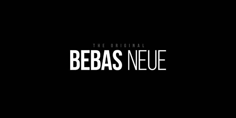
Bebas Neue is a condensed display sans-serif typeface designed by Ryoichi Tsunekawa in 2010, released through Dharma Type. It delivers maximum text impact in minimum horizontal space using an all-caps design.
Bebas Neue works best for YouTube thumbnail headlines because its tall, narrow letterforms allow 6–8 words to fit across a 1280px canvas without wrapping, while its uniform stroke weight maintains legibility when the thumbnail scales to 120px on mobile.
Channels like Linus Tech Tips and IGN have used it consistently across thousands of thumbnails, treating it as part of their visual identity system.
What makes Bebas Neue suitable for YouTube thumbnails?
Bebas Neue has a high x-height relative to its cap height, which keeps letterforms open and readable under compression. Its stroke weight is uniform with no thick-thin contrast, meaning it holds detail even at small sizes or on low-DPI screens. The condensed width allows larger point sizes without crowding the image behind the text.
Key attributes:
| Attribute | Value |
| Classification | Condensed display sans-serif |
| Designer | Ryoichi Tsunekawa, 2010 |
| Weight range | Single weight (Regular) |
| Variable font | No (Pro version adds weights) |
| Recommended sizes | 60px+ for thumbnail headlines |
| Letter-spacing default | Tight |
| License | SIL OFL — free for commercial use |
| Available on | Google Fonts, Adobe Fonts |
| Price | Free (Pro version is paid) |
How does Bebas Neue perform at thumbnail scale?
At display sizes above 60px, Bebas Neue renders with sharp edges and zero ambiguity between characters. Its all-caps design prevents ascender/descender collisions with image elements above or below the text. At the standard mobile thumbnail width of 120px, the text remains distinguishable even without outlines or drop shadows.
What are the best pairings for Bebas Neue in YouTube thumbnails?
Bebas Neue pairs with Roboto Regular for secondary labels — the neutral stroke weight of Roboto creates clear hierarchy without competing. It also pairs with Oswald when a condensed secondary font is needed for a subtitle line, though the similarity in structure means the size difference must be significant (2:1 ratio minimum).
What are the limitations of Bebas Neue for YouTube thumbnails?
Bebas Neue is all-caps only in the free version, which limits tone flexibility — it reads as shouting regardless of content. Overuse across YouTube has made it instantly recognizable as a “default creator font,” which can undercut distinctiveness on channels trying to build a unique visual identity.
Bebas Neue — Recommended Use Cases Within YouTube Thumbnails
- Best for: Gaming, tech, and reaction channel headline text
- Avoid for: Lifestyle, beauty, or educational channels where a less aggressive tone is needed
- Optimal weight: Regular (only free weight available)
- Optimal size range: 72px–120px for primary headline text
—
Impact

Impact is an industrial grotesque display sans-serif typeface designed by Geoffrey Lee in 1965, released by Stephenson Blake. It produces maximum ink density per unit of space — Lee’s stated design goal was to get “as much ink on paper as possible in a given size.”
Impact suits high-energy, reaction, and meme-style thumbnails because its extremely compressed letterforms and near-zero counterform space produce high visual weight even at small sizes. PewDiePie’s channel has used Impact extensively, and the association with urgency and humor remains strong.
What makes Impact suitable for YouTube thumbnails?
Impact’s x-height reaches nearly three-quarters of the cap line — one of the highest ratios of any display typeface. Its condensed proportions mean characters stack tightly, producing dense black text blocks that read as “important” without requiring large point sizes. Stroke width is uniformly heavy with minimal variation.
Key attributes:
| Attribute | Value |
| Classification | Industrial grotesque display sans-serif |
| Designer | Geoffrey Lee, 1965 |
| Weight range | Single weight (Regular) |
| Variable font | No |
| Recommended sizes | 48px+ for thumbnail text |
| Letter-spacing default | Very tight (compressed) |
| License | Commercial license required for some uses; bundled with Windows |
| Available on | Pre-installed on Windows/macOS, MyFonts |
| Price | Bundled with OS; commercial licensing varies |
How does Impact perform at thumbnail scale?
At large sizes (80px+), Impact delivers extremely high contrast text that reads clearly over busy image backgrounds, especially with a white fill and black stroke. Its narrow apertures can cause individual characters to merge at smaller sizes, particularly in the lowercase — though most thumbnail usage is all-caps, which avoids this issue.
What are the best pairings for Impact in YouTube thumbnails?
Impact pairs with Arial Bold for a secondary text line — Arial’s wider letterforms contrast Impact’s compressed shapes and create readable hierarchy. Pairing Impact with Bebas Neue is generally a mistake since both compete for the same visual register.
What are the limitations of Impact for YouTube thumbnails?
Impact’s cultural association with internet memes makes it a double-edged choice. Channels using it risk being read as comedic or ironic even when that’s not the intent. It also ships in a single weight with no italic, meaning there’s no internal weight hierarchy available.
Impact — Recommended Use Cases Within YouTube Thumbnails
- Best for: Reaction channels, comedy, drama, and challenge videos
- Avoid for: Educational, business, or premium-positioning channels
- Optimal weight: Regular (only option available)
- Optimal size range: 60px–100px for headline text with stroke outline
—
Anton
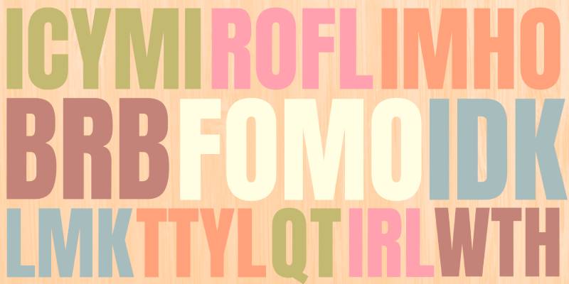
Anton is a condensed display sans-serif designed by Vernon Adams in 2011, available through Google Fonts. It is a reworked digitization of traditional advertising grotesque letterforms, optimized specifically for web and screen rendering.
Anton works best for action-driven thumbnail headlines because its single heavy weight, open counters, and tall x-height ensure maximum legibility at 120px thumbnail width on mobile screens. Linus Tech Tips relies on Anton for its bold headline text.
What makes Anton suitable for YouTube thumbnails?
Anton uses open counters in characters like “a,” “e,” and “c,” which prevents counter collapse when the font is rendered small or with compression artifacts. Its stroke weight is heavy without reaching Impact’s level of compression, meaning individual characters remain distinguishable at smaller sizes. The x-height is extremely tall relative to cap height.
Key attributes:
| Attribute | Value |
| Classification | Condensed display sans-serif |
| Designer | Vernon Adams, 2011 |
| Weight range | Single weight (Regular 400) |
| Variable font | No |
| Recommended sizes | 60px+ for primary thumbnail headlines |
| Letter-spacing default | Tight |
| License | SIL OFL — free for commercial use |
| Available on | Google Fonts, Adobe Fonts |
| Price | Free |
How does Anton perform at thumbnail scale?
Anton renders cleanly on both high-DPI and standard screens due to its open counter design. Its condensed width means text can be set at larger point sizes without running off-canvas, producing higher visual impact than wider typefaces at the same size. The single weight limits internal hierarchy options but removes decision fatigue for headline-only usage.
What are the best pairings for Anton in YouTube thumbnails?
Anton pairs with Open Sans Regular for supporting label text, as Open Sans’s wider proportions and neutral weight provide contrast without conflicting. It also pairs with Lato Light when a softer secondary element is needed. See more display font pairing principles for context.
What are the limitations of Anton for YouTube thumbnails?
Anton comes in a single weight only, with no italic or lighter variant. This makes it unsuitable for any thumbnail design requiring typographic hierarchy within a single text block. Like Bebas Neue, its single-weight limitation means every text element set in Anton reads at equal visual priority.
Anton — Recommended Use Cases Within YouTube Thumbnails
- Best for: Tech reviews, top-10 lists, action and sports content
- Avoid for: Multi-line text blocks requiring internal weight contrast
- Optimal weight: Regular 400 (only option)
- Optimal size range: 72px–110px for single-line thumbnail headlines
—
Montserrat
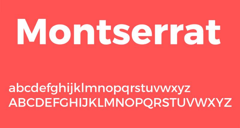
Montserrat is a geometric sans-serif typeface designed by Julieta Ulanovsky in 2011, released through Google Fonts. It is used on over 19 million websites globally, making it one of the most-deployed typefaces in digital design.
Montserrat works best for lifestyle, travel, and polished educational thumbnails because its 9-weight range allows clear visual hierarchy within a single type family, and its large x-height maintains legibility from Bold 700 down to SemiBold 600 at display sizes.
What makes Montserrat suitable for YouTube thumbnails?
Montserrat has a large x-height, short descenders, and wide apertures — a combination that improves legibility at reduced sizes. Its weight range spans Thin 100 to Black 900, allowing headline and subheading text to use the same family without sourcing a second typeface. The geometric construction gives it a clean, structured appearance that reads as professional in thumbnail contexts.
Key attributes:
| Attribute | Value |
| Classification | Geometric sans-serif |
| Designer | Julieta Ulanovsky, 2011 |
| Weight range | Thin 100 – Black 900 (18 styles with italics) |
| Variable font | Yes |
| Recommended sizes | 48px+ for Bold/ExtraBold thumbnail headlines |
| Letter-spacing default | Normal to slightly wide |
| License | SIL OFL — free for commercial use |
| Available on | Google Fonts, Adobe Fonts |
| Price | Free |
How does Montserrat perform at thumbnail scale?
At Bold 700 or ExtraBold 800, Montserrat renders with strong visual weight and clear character differentiation. At smaller thumbnail sizes (120px wide), it performs better than narrower condensed typefaces because its wider proportions keep counters open under JPEG compression. It also ships as a variable font, enabling fine-tuned weight control without loading multiple font files.
What are the best pairings for Montserrat in YouTube thumbnails?
Montserrat pairs with Roboto Regular for secondary thumbnail labels — the structural similarity keeps the design cohesive while Roboto’s slightly narrower proportions differentiate it. It also pairs with Playfair Display Bold when serif contrast is needed for fashion or luxury-oriented content. Check out the full Montserrat font pairing guide for more combinations.
What are the limitations of Montserrat for YouTube thumbnails?
Montserrat’s ubiquity is its primary limitation. It appears on millions of sites and in countless YouTube thumbnails, which reduces its ability to signal a distinctive brand. At Regular 400 weight, it lacks the visual punch needed for thumbnail text on busy backgrounds — Bold 700 or heavier is required for thumbnail use.
Montserrat — Recommended Use Cases Within YouTube Thumbnails
- Best for: Lifestyle, travel, beauty, and educational channel thumbnails
- Avoid for: Gaming or action content where higher visual aggression is expected
- Optimal weight: Bold 700 – ExtraBold 800 for headlines; SemiBold 600 for secondary text
- Optimal size range: 56px–100px for headline use
—
Oswald
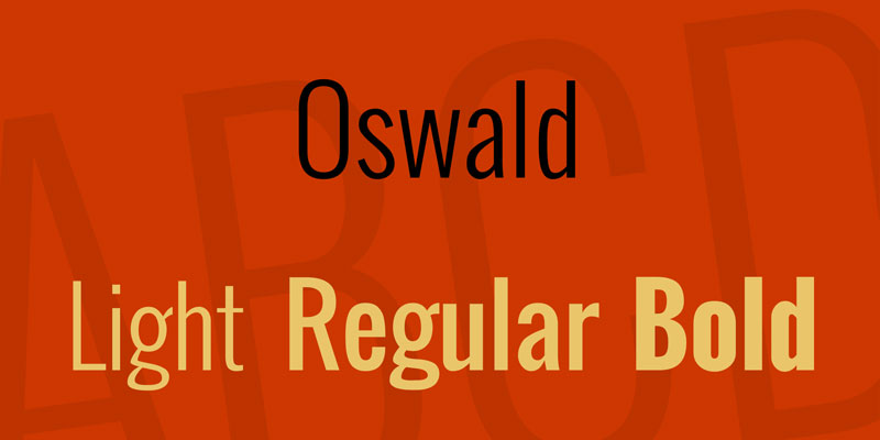
Oswald is a condensed neo-grotesque sans-serif designed by Vernon Adams, Kalapi Gajjar, and Cyreal in 2011, released through Google Fonts. It is a reworking of the classic Alternate Gothic typeface style, redrawn for screen rendering.
Oswald suits tech reviews, tutorials, and professional channel thumbnails because its 6-weight range (ExtraLight 200 to Bold 700) allows internal hierarchy within a single thumbnail design, and its condensed proportions allow larger point sizes at any given canvas width.
What makes Oswald suitable for YouTube thumbnails?
Oswald’s condensed letterforms have moderate stroke contrast — heavier verticals, slightly lighter horizontals — which helps characters remain distinct at smaller sizes without becoming ambiguous. Its 6-weight span is wide enough to cover headline (Bold 700) and supporting label (Regular 400) text from a single family. The updated variable weight version (2019) adds smooth interpolation across the full range.
Key attributes:
| Attribute | Value |
| Classification | Condensed neo-grotesque sans-serif |
| Designer | Vernon Adams, 2011 |
| Weight range | ExtraLight 200 – Bold 700 (6 weights) |
| Variable font | Yes (updated 2019) |
| Recommended sizes | 56px+ for Bold thumbnail headlines |
| Letter-spacing default | Tight to normal |
| License | SIL OFL — free for commercial use |
| Available on | Google Fonts, Adobe Fonts |
| Price | Free |
How does Oswald perform at thumbnail scale?
Oswald Bold 700 produces strong display presence while retaining more character differentiation than Impact or Bebas Neue. MKBHD (Marques Brownlee) has used Oswald extensively across his channel, establishing it as a reliable choice for tech-oriented visual branding. At SemiBold 600, it functions as a secondary text element without competing with the headline weight. Consider fonts similar to Oswald if you want a less-common alternative with the same structural advantages.
What are the best pairings for Oswald in YouTube thumbnails?
Oswald Bold pairs with Open Sans Regular as a supporting text element — the contrast between Oswald’s condensed weight and Open Sans’s wider, lighter proportions creates clear hierarchy. It also pairs with Roboto for a cleaner, more utilitarian look suited to tutorial-style content.
What are the limitations of Oswald for YouTube thumbnails?
Oswald’s top weight is Bold 700, which is lighter than fonts like Impact or Bebas Neue. On dark or complex backgrounds, it may require a heavier outline or shadow to maintain legibility. Its heaviest weight still reads as “professional” rather than “aggressive,” which may not match high-energy channel aesthetics.
Oswald — Recommended Use Cases Within YouTube Thumbnails
- Best for: Tech, tutorial, and educational channel thumbnails requiring internal type hierarchy
- Avoid for: High-energy gaming or reaction thumbnails where heavier display weights are expected
- Optimal weight: Bold 700 for headlines; Regular 400 for supporting text
- Optimal size range: 60px–96px for headline use
—
Bangers
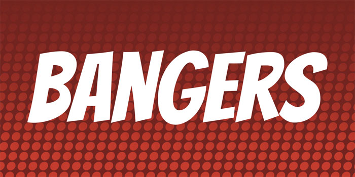
Bangers is a comic display typeface designed by Vernon Adams in 2011, available through Google Fonts. It is modeled on mid-20th-century superhero comic book cover lettering.
Bangers works best for entertainment, gaming, and pop-culture thumbnails because its exaggerated stroke weight and slightly irregular letterforms signal energy and fun, matching viewer expectations for non-serious content. It comes in a single weight, so every usage decision comes down to size and color.
What makes Bangers suitable for YouTube thumbnails?
Bangers uses heavy stroke weights with slightly irregular baseline alignment — a structural feature borrowed from hand-lettered comic art. The font supports 60 languages under a single SIL OFL license. Its mixed-case design (unlike all-caps-only competitors) allows more flexible headline construction while maintaining a consistent visual register.
Key attributes:
| Attribute | Value |
| Classification | Comic display |
| Designer | Vernon Adams, 2011 |
| Weight range | Single weight (Regular) |
| Variable font | No |
| Recommended sizes | 60px+ for thumbnail headline text |
| Letter-spacing default | Normal to slightly wide |
| License | SIL OFL — free for commercial use |
| Available on | Google Fonts |
| Price | Free |
How does Bangers perform at thumbnail scale?
At 72px and above, Bangers renders clearly with strong contrast against most backgrounds. Its wide letterforms and open counters prevent collapse under JPEG compression. The slightly irregular letterform alignment adds an informal quality that reads well for entertainment content but can feel sloppy in professional or educational contexts.
What are the best pairings for Bangers in YouTube thumbnails?
Bangers pairs with Roboto Bold for secondary text — the structural contrast between Bangers’ cartoon-inspired construction and Roboto’s mechanical rationalism creates a clear primary/secondary distinction. Using Bangers with another display comic font is generally counterproductive since neither can function as the calmer secondary element.
What are the limitations of Bangers for YouTube thumbnails?
Bangers is a single-weight font with no italic, limiting its flexibility for multi-element thumbnail designs. Its comic-book connotation is strong and difficult to override — using it for serious or educational content creates a tone mismatch that undermines credibility.
Bangers — Recommended Use Cases Within YouTube Thumbnails
- Best for: Gaming, challenge, pop-culture, and reaction thumbnails
- Avoid for: Finance, health, education, or any content requiring viewer trust
- Optimal weight: Regular (only option)
- Optimal size range: 72px–120px for primary headline use
—
Raleway
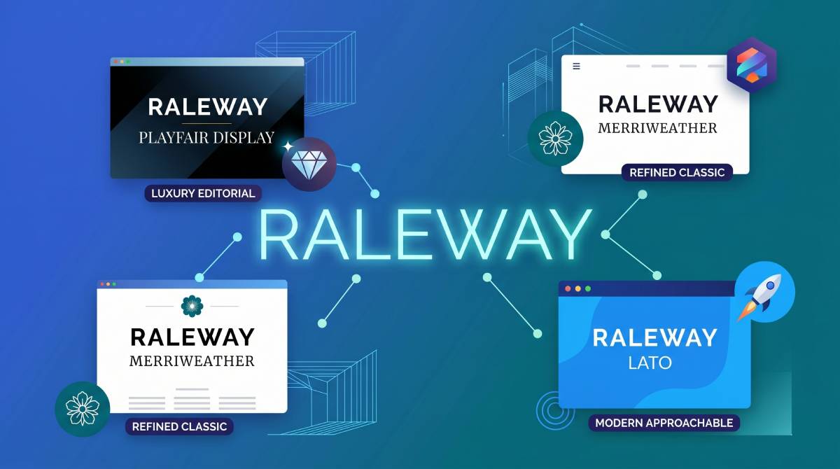
Raleway is an elegant display sans-serif originally designed by Matt McInerney, later expanded by Pablo Impallari and Rodrigo Fuenzalida, released through Google Fonts in 2012. It features thin stroke contrast and geometric construction with distinctive letterforms including a unique “W” design.
Raleway works best for fashion, lifestyle, and minimalist channel thumbnails at heavier weights — ExtraBold 800 or Black 900 — because its structural elegance holds at display sizes while its lighter weights (below SemiBold 600) lose visual strength at typical thumbnail scale.
What makes Raleway suitable for YouTube thumbnails?
Raleway’s geometric construction gives it clear letterform differentiation at display sizes. At weights of 700 and above, its stroke contrast is strong enough to read over image backgrounds. It includes 18 styles (9 weights with italics), providing more internal hierarchy options than single-weight display fonts. Its wider proportions suit thumbnail layouts where text spans the full horizontal width.
Key attributes:
| Attribute | Value |
| Classification | Geometric display sans-serif |
| Designer | Matt McInerney / Pablo Impallari, 2012 |
| Weight range | Thin 100 – Black 900 (9 weights) |
| Variable font | No |
| Recommended sizes | 56px+ at Bold 700 or heavier for thumbnails |
| Letter-spacing default | Slightly wide |
| License | SIL OFL — free for commercial use |
| Available on | Google Fonts, Adobe Fonts |
| Price | Free |
How does Raleway perform at thumbnail scale?
At ExtraBold 800 or Black 900, Raleway maintains its structural elegance while producing enough visual weight for thumbnail headlines. Thomas Frank uses Raleway to maintain a consistent, professional look across his educational content. Below Bold 700, it lacks the visual presence needed for thumbnail text on image backgrounds and should not be used for primary headline text.
What are the best pairings for Raleway in YouTube thumbnails?
Raleway ExtraBold pairs with Lato Regular for supporting text — Lato’s humanist warmth contrasts Raleway’s geometric coolness while maintaining visual compatibility. It also pairs well with Montserrat SemiBold when a consistent geometric aesthetic is needed across headline and subheading. The Raleway font pairing guide covers more combinations in depth.
What are the limitations of Raleway for YouTube thumbnails?
Raleway is not a variable font, so loading multiple weights requires separate font files. More critically, its lighter weights (Thin 100 through Medium 500) are entirely unsuitable for thumbnail use — they disappear on busy backgrounds. The font’s wider letterform proportions can limit how much text fits per line at large point sizes.
Raleway — Recommended Use Cases Within YouTube Thumbnails
- Best for: Fashion, lifestyle, luxury, and minimalist design channel thumbnails
- Avoid for: Action, gaming, or text-heavy thumbnails requiring condensed letterforms
- Optimal weight: Bold 700 – Black 900 for thumbnail headlines
- Optimal size range: 56px–90px for primary display use
—
Poppins

Poppins is a geometric sans-serif designed by Jonny Pinhorn and Ninad Kale at the Indian Type Foundry, released through Google Fonts in 2014. It supports both Latin and Devanagari scripts under a unified geometric framework — one of few typefaces to achieve this at a professional quality level.
Poppins works best for educational, productivity, and approachable entertainment thumbnails because its perfectly circular bowls and even stroke weight read as clean and friendly rather than aggressive, matching the tone of channels building viewer trust over time.
What makes Poppins suitable for YouTube thumbnails?
Poppins is monolinear — stroke width is consistent throughout each letterform with no thick-thin variation. This uniformity makes it highly predictable on screen and resistant to rendering degradation at reduced sizes. It ships in 9 weights (Thin 100 to Black 900) with matching italics, enabling complete internal hierarchy within a single type family.
Key attributes:
| Attribute | Value |
| Classification | Geometric sans-serif |
| Designer | Jonny Pinhorn / Ninad Kale (ITF), 2014 |
| Weight range | Thin 100 – Black 900 (18 styles with italics) |
| Variable font | No |
| Recommended sizes | 52px+ at SemiBold–Bold for thumbnail use |
| Letter-spacing default | Slightly wide |
| License | SIL OFL — free for commercial use |
| Available on | Google Fonts, Adobe Fonts |
| Price | Free |
How does Poppins perform at thumbnail scale?
Poppins Bold 700 and ExtraBold 800 deliver solid display presence. Its circular letterforms remain open at thumbnail-compressed sizes, avoiding the counter-collapse that affects narrower or higher-contrast typefaces. Its wide proportions mean it occupies more horizontal space than condensed fonts at the same point size — a consideration for thumbnail layouts with multiple text elements.
What are the best pairings for Poppins in YouTube thumbnails?
Poppins ExtraBold pairs with Poppins Regular for supporting text — using a single family across weights is the simplest way to maintain visual cohesion. It also pairs with Playfair Display Bold when serif contrast is needed for a more editorial thumbnail style. The full Poppins font pairing options include options across both casual and formal registers.
What are the limitations of Poppins for YouTube thumbnails?
Poppins is not a variable font, requiring separate file loads for each weight. Its wide proportions make it inefficient for thumbnails with long headline text — it uses significantly more horizontal space than condensed alternatives like Oswald or Bebas Neue at the same point size. It also lacks the visual aggressiveness expected in high-energy gaming or action content.
Poppins — Recommended Use Cases Within YouTube Thumbnails
- Best for: Educational, productivity, wellness, and personal finance channel thumbnails
- Avoid for: Long headline text or thumbnails requiring aggressive visual weight
- Optimal weight: SemiBold 600 – ExtraBold 800 for headlines; Regular 400 for supporting labels
- Optimal size range: 52px–84px for primary headline use
—
Roboto
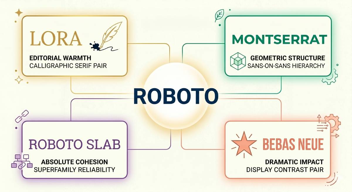
Roboto is a neo-grotesque sans-serif designed by Christian Robertson at Google, initially released in 2011 as the Android 4.0 system font. It is the most-used typeface on Google Fonts with billions of weekly views.
Roboto suits informational, tech, and tutorial thumbnails as a secondary text element because its neutral character and 12-style family (6 weights with obliques) make it highly legible at label sizes, where other display fonts begin to fail. It functions best as a supporting actor rather than the headline choice.
What makes Roboto suitable for YouTube thumbnails?
Roboto has a “dual nature” design philosophy: a geometric skeleton with humanist curves. Its double-story lowercase “a” and “g” improve character differentiation at small sizes compared to single-story geometric designs. Open apertures in “c,” “e,” and “s” resist compression degradation in JPEG thumbnail exports. Six weight options allow precise visual hierarchy control.
Key attributes:
| Attribute | Value |
| Classification | Neo-grotesque sans-serif |
| Designer | Christian Robertson (Google), 2011 |
| Weight range | Thin 100 – Black 900 (6 weights with obliques) |
| Variable font | Yes (Roboto Flex) |
| Recommended sizes | Bold 700+ for thumbnail headlines; Regular for labels |
| Letter-spacing default | Normal |
| License | Apache License 2.0 — free for commercial use |
| Available on | Google Fonts, Adobe Fonts, pre-installed on Android/ChromeOS |
| Price | Free |
How does Roboto perform at thumbnail scale?
Roboto Bold renders reliably across all major screen types, from low-DPI displays to Retina. Its open apertures and generous spacing defaults mean it remains legible at the 120px thumbnail width on mobile, even when secondary text is set at 24–32px. Roboto Flex — the variable version — covers an extended range of width and optical size axes beyond standard weights. Read more on the YouTube font choices that inform how Roboto fits into the platform’s own design language.
What are the best pairings for Roboto in YouTube thumbnails?
Roboto Bold pairs with Bebas Neue for a primary headline — Bebas Neue handles the display headline while Roboto manages supporting text. It also pairs with Oswald Bold for a two-weight condensed system, using Oswald for headlines and Roboto for any fine-print label text. The Roboto font pairing guide covers this in more detail.
What are the limitations of Roboto for YouTube thumbnails?
Roboto’s primary limitation is distinctiveness. As the Android system font and one of the most-used typefaces on the web, it carries no brand signal of its own. Using Roboto as the sole headline font produces thumbnails that look unbranded and generic. It is better deployed as a secondary font supporting a more distinctive primary choice.
Roboto — Recommended Use Cases Within YouTube Thumbnails
- Best for: Supporting label text, secondary information, and subtitle lines within thumbnails
- Avoid for: Primary display headlines where brand distinctiveness matters
- Optimal weight: Bold 700 if used as headline; Regular 400 for supporting text
- Optimal size range: 24px–48px for secondary thumbnail text
—
Playfair Display

Playfair Display is a transitional serif typeface designed by Claus Eggers Sørensen in 2011, released through Google Fonts. It draws on late 18th-century printing traditions — specifically the high-contrast letterforms that became possible when pointed steel pens replaced broad-nib quills.
Playfair Display works best for fashion, beauty, food, and luxury-positioned channel thumbnails because its high stroke contrast (wide stems against hairline thin strokes) signals quality and editorial sophistication, matching the visual language viewers expect from premium or aspirational content. Zoella’s channel has used it to reinforce exactly this tone.
What makes Playfair Display suitable for YouTube thumbnails?
Playfair Display has pronounced thick-thin stroke contrast and large ball terminals, producing high visual interest at display sizes. Its large x-height keeps the text readable at medium display sizes (48px+) despite the hairline strokes. As of Playfair 2.0 (2022), it ships as a variable font with axes for Width, Weight, and Optical Size — a significant upgrade from the original static family. Its use of serif details at display scale gives it a strong visual contrast against the sans-serif thumbnails that dominate YouTube.
Key attributes:
| Attribute | Value |
| Classification | Transitional serif (high-contrast display) |
| Designer | Claus Eggers Sørensen, 2011 |
| Weight range | Regular 400 – Black 900 (with italics) |
| Variable font | Yes (v2.0, 2022 — Width, Weight, Optical Size axes) |
| Optical sizes | Yes — Needlepoint, Hairline, Titling, Display, Headline, Trumpet |
| Recommended sizes | 48px+ for Bold thumbnail headlines |
| Letter-spacing default | Normal to slightly wide |
| License | SIL OFL — free for commercial use |
| Available on | Google Fonts, Adobe Fonts, Font Squirrel |
| Price | Free |
How does Playfair Display perform at thumbnail scale?
At Bold 700 and above, Playfair Display delivers strong display presence with visible stroke contrast that reads as premium at first glance. Its hairline strokes can degrade under heavy JPEG compression — a real concern for YouTube’s thumbnail processing. This makes it better suited to thumbnails with simpler, high-contrast backgrounds rather than busy photographic backdrops where the fine strokes can disappear.
What are the best pairings for Playfair Display in YouTube thumbnails?
Playfair Display Bold pairs with Poppins Regular for supporting text — Poppins’ circular, monolinear construction contrasts the serif’s high-contrast drama while sharing a similar geometric sensibility. It also pairs with Lato Light for a softer secondary element. The Playfair Display font pairing guide covers serif and sans-serif combinations in detail.
What are the limitations of Playfair Display for YouTube thumbnails?
Playfair Display’s hairline strokes are vulnerable to JPEG compression artifacts, which can make thin elements blur or disappear in the final exported thumbnail. It is not suitable for dark or heavily textured backgrounds without significant stroke weight adjustment. The Titling optical size (available in v2.0) partially addresses this at very large sizes, but requires variable font support in your design tool.
Playfair Display — Recommended Use Cases Within YouTube Thumbnails
- Best for: Fashion, beauty, food, travel, and luxury-positioned channel thumbnails
- Avoid for: Gaming, action, or meme-style content; dark or busy backgrounds where hairline strokes degrade
- Optimal weight: Bold 700 – Black 900 for thumbnail headlines
- Optimal size range: 56px–96px on light or simple backgrounds
—
Quick Comparison: All 10 Fonts at a Glance
| Font | Best Channel Type | Weight Range | Variable | License |
| Bebas Neue | Gaming, Tech, Action | Single (5 weights in Pro) | No | Free (OFL) |
| Impact | Reaction, Comedy | Single | No | System / Proprietary |
| Anton | Tech, Top Lists | Single | No | Free (OFL) |
| Montserrat | Lifestyle, Travel | Thin–Black (18 styles) | Yes | Free (OFL) |
| Oswald | Tutorials, Professional | ExtraLight–Bold (6 weights) | Yes | Free (OFL) |
| Bangers | Gaming, Pop Culture | Single | No | Free (OFL) |
| Raleway | Fashion, Luxury | Thin–Black (9 weights) | Yes | Free (OFL) |
| Poppins | Education, Wellness | Thin–Black (18 styles) | Yes | Free (OFL) |
| Roboto | Supporting text, Tech | Thin–Black (6 weights) | Yes (Flex) | Free (Apache 2.0) |
| Playfair Display | Fashion, Food, Beauty | Regular–Black (6 weights) | Yes | Free (OFL) |
Most of these are available directly through Google Fonts or Adobe Fonts at no cost. Understanding font licensing still matters even for free fonts — OFL allows commercial use, Apache 2.0 allows modification and distribution, but commercial fonts bundled with software (like Impact) may have restrictions outside their bundled context.
The right choice depends almost entirely on your channel’s tone. For more on how font structure affects viewer perception, the principles behind font psychology explain why aggressive condensed typefaces perform differently from geometric sans-serifs in attention-capture contexts.
What Makes a Font Work on a YouTube Thumbnail?
Most thumbnail font decisions are made based on how something looks on a design canvas at full size. That’s the wrong starting point.
The correct starting point is a mobile home feed grid, where thumbnails render at roughly 120px wide. Everything else follows from that constraint.
According to WordStream, more than 70% of YouTube views come from mobile devices. A font that reads well at 800px on a Canva preview but collapses at 120px is a failed choice, regardless of how it looks in your design tool.
X-height and legibility at small sizes
X-height is the height of lowercase letters relative to capitals. Higher x-height means more ink coverage per unit of space, which is the core structural reason why fonts like Anton, Bebas Neue, and Impact stay readable when compressed.
Fonts with low x-height — many elegant serif faces — lose definition fast as thumbnails scale down. The letterforms thin out and details disappear under JPEG compression before the viewer has processed a single word.
Stroke weight and JPEG compression
YouTube applies JPEG compression to every thumbnail at upload. Hairline strokes (common in transitional serifs like Playfair Display and decorative fonts) are the first casualties of that compression.
Uniform, heavy stroke weight is the single structural attribute that resists this degradation best. Fonts with monolinear construction (Poppins, Anton) or industrial-grotesque weight (Impact, Bebas Neue) hold their edges under compression where high-contrast serif faces smear.
Condensed vs. wide proportions on a 1280×720 canvas
A standard YouTube thumbnail is 1280x720px. That canvas has to fit a background image, often a face, and text. Space is the binding constraint.
| Font type | Horizontal space use | Max words per line (at 72px) |
| Condensed (Bebas Neue, Oswald) | Low | 6–8 words |
| Normal-width (Montserrat, Poppins) | Medium | 4–5 words |
| Wide (Raleway, some Roboto weights) | High | 3–4 words |
Condensed typefaces let designers set text at larger point sizes within the same horizontal space, which is why they dominate thumbnail design across high-view channels.
Counter openness and character differentiation
Open counters — the enclosed or semi-enclosed spaces in letters like “a,” “c,” “e,” and “g” — determine whether characters stay distinct when scaled down.
Tight counters collapse under JPEG compression and at small rendered sizes, turning “a” and “o” into near-identical shapes. Anton and Oswald both use deliberately open counters, which is why they maintain character differentiation at thumbnail scale better than fonts with tighter geometric construction.
Why all-caps display fonts outperform mixed-case for thumbnails
All-caps text uses a shorter vertical range than mixed-case — no ascenders, no descenders. That vertical compression allows larger point sizes within the same bounding box height.
MrBeast’s thumbnail text almost never includes lowercase. The Artiphik analysis of 50 top-performing MrBeast thumbnails (2023–2026) found text was almost always 2–4 words in all-caps, set large enough to read at 200px — the typical in-feed size on a phone at home screen brightness.
—
How Does Font Size Affect YouTube Thumbnail Readability?
90% of top-performing YouTube videos use a custom thumbnail, according to YouTube Creator Academy. That stat says nothing about font size — but the underlying reason those thumbnails work usually does come down to text visibility across screen sizes.
YouTube displays your thumbnail in at least three distinct contexts, and each has a different rendered size. Designing for only one of them is a common reason thumbnail text fails.
The three rendering contexts that matter
Desktop grid: approximately 210px wide. Text is readable down to 40–48px at this scale for heavy-weight condensed fonts.
Mobile home feed: approximately 120px wide. This is the critical breakpoint. Text below 60px in a condensed heavy weight, or below 52px in a wide geometric sans-serif, becomes ambiguous at this size.
Connected TV / large screen: 320px wide or more. Text legibility is not the issue here. Thin stroke fonts that failed on mobile begin to recover. But the mobile threshold is still the design constraint, since 63% of YouTube watch time happens on mobile devices (The Social Shepherd).
Minimum viable point sizes by font classification
These are practical thresholds — not theoretical minimums — based on rendering behavior under YouTube’s JPEG compression:
- Condensed display fonts (Bebas Neue, Anton, Impact): 60px minimum for primary headline use
- Normal-width geometric sans-serif (Montserrat, Poppins, Oswald Bold): 52px minimum
- High-contrast serif (Playfair Display) on clean backgrounds: 56px minimum
- High-contrast serif on busy photographic backgrounds: not recommended below 72px
JPEG compression and hairline stroke degradation
Hairline strokes — the thin elements in high-contrast serif fonts — typically have a stroke width of 1–3px at display sizes. YouTube’s thumbnail compression can introduce block artifacts at that level of detail, turning crisp thin strokes into blurred noise.
The 3:1 size ratio rule between primary headline and secondary text is a practical guard against this. If your headline runs at 80px, secondary text at 26px or below will lose definition before the thumbnail even reaches mobile. Keep secondary text no smaller than one-third the headline point size.
The connected TV reversal
Over 94% of consumers who stream to TVs watch YouTube, compared to 75% for Netflix (The Shelf, 2023). On a 65-inch TV, thumbnails can render at 400px wide or more — large enough that fonts which failed on mobile read clearly.
This does not change the mobile-first design rule. It does mean that Playfair Display and Raleway at heavier weights recover on large screens and remain viable choices for channels with high TV viewership, even if they’re marginal on mobile.
—
How to Pair Fonts for YouTube Thumbnails
Most thumbnail font pairing mistakes come from picking two fonts that compete rather than contrast. Competition means similar stroke weight, similar proportions, or similar visual register.
The goal is a clear primary/secondary distinction that the viewer processes in under half a second.
The core pairing principle: structural contrast
Condensed display headline + wider neutral secondary text is the most reliable pairing structure in thumbnail design. It works because the two fonts occupy different structural territories.
The condensed font handles maximum visual weight. The neutral font handles information delivery. Neither competes with the other.
Three patterns that consistently appear in high-performing thumbnails:
- Condensed grotesque (Bebas Neue / Oswald Bold) + neutral sans (Roboto Regular)
- Geometric sans Bold (Montserrat / Poppins ExtraBold) + humanist sans Regular (Lato / Open Sans)
- Display serif Bold (Playfair Display) + geometric sans Regular (Poppins / Roboto)
Same-family weight pairing vs. cross-family pairing
Same-family: Poppins ExtraBold for headline, Poppins Regular for secondary label. Cohesive and fast to implement. The risk is visual monotony if the size difference is insufficient.
Cross-family: Bebas Neue headline + Roboto Regular secondary. Creates more visual contrast between elements. Requires more care to maintain proportional balance and tonal consistency.
Same-family pairing suits channels building a clean, consistent visual system. Cross-family pairing suits channels that want maximum visual differentiation between text hierarchy levels. Use a font pairing generator to test combinations before committing to a design system.
Size ratios that maintain hierarchy at thumbnail scale
A 2:1 ratio between primary and secondary text produces the minimum readable hierarchy at mobile thumbnail scale. A 3:1 ratio produces stronger separation.
| Headline size | Secondary text (2:1) | Secondary text (3:1) |
| 80px | 40px | 27px |
| 72px | 36px | 24px |
| 60px | 30px | 20px |
At 3:1 ratio, secondary text at 20–24px approaches the lower threshold for JPEG-compressed mobile thumbnails. If using a cross-family pairing at this size, a high-contrast neutral sans (Roboto, Open Sans) is the safer choice over a geometric or display face.
What to avoid in thumbnail font pairing
Two patterns that consistently produce weak thumbnail text hierarchy:
- Two condensed display fonts at similar sizes (Bebas Neue + Oswald at 72px and 60px — both read as primary, neither reads as secondary)
- Two fonts with identical stroke weight — the visual hierarchy disappears at thumbnail scale even if sizes differ
Avoid pairing fonts from the same structural category (two geometric sans-serifs, two condensed grotesques) unless using the same family with strong weight contrast.
—
Which Thumbnail Fonts Do Top YouTube Channels Use?
Font choices by large channels aren’t random. They reflect hundreds or thousands of A/B tests, audience data, and brand positioning decisions made over years.
The patterns across top channels tell you more about what actually works than any general design recommendation.
MrBeast: Obelix Pro with heavy text effects
MrBeast’s primary thumbnail font is Obelix Pro, a comic-style sans-serif by Valentin Antonov. It appears almost exclusively on numbers and financial figures — “$10,000,” “50 Hours” — not full sentences.
The text strategy is deliberately minimal. An Artiphik analysis of 50 top-performing MrBeast thumbnails found text was almost always 2–4 words, always in heavy weight, always with a thick black stroke and white fill. The font does one job: make the stakes impossible to ignore. For more on the exact choices, see the full breakdown of what font MrBeast uses.
MKBHD: Oswald Bold for clean tech positioning
Marques Brownlee’s channel uses Oswald Bold as the dominant headline font across thumbnails. The choice matches the channel’s premium tech aesthetic — condensed enough to allow large sizing, structured enough to read as professional rather than aggressive.
It’s a deliberate contrast to the heavy-impact display choices of gaming and reaction channels. Oswald at Bold 700 reads as authoritative. Impact reads as urgent. That distinction aligns directly with audience expectations by content category.
Linus Tech Tips: Anton as a consistency system
Linus Tech Tips has used Anton as a consistent thumbnail headline font across thousands of videos. The value isn’t in Anton’s visual novelty — it’s in its recognizability.
Consistent font usage across 100+ thumbnails trains viewers to recognize channel output at a glance, before reading any text. The thumbnail becomes a brand signal, not just a content preview. That pattern holds for most channels with 5M+ subscribers: consistent typography across the catalog outperforms visually varied approaches over time.
PewDiePie: Impact as an intentional register choice
PewDiePie’s use of Impact is not a default or a legacy choice. It’s a deliberate tonal signal — Impact’s cultural association with meme culture matches the ironic, high-energy register of the channel’s content.
The lesson isn’t to use Impact. The lesson is that font choice communicates channel personality before the viewer reads the text. Impact signals comedy and reaction content. Oswald signals tech authority. Playfair Display signals premium lifestyle. Each font choice attracts a slightly different viewer expectation and filters for the right audience.
—
What Font Properties Affect YouTube Thumbnail Click-Through Rate?
Half of all YouTube channels have a CTR between 2% and 10%, according to YouTube’s own documentation. CTR above 7% is considered strong. The difference between a 3% CTR and a 7% CTR on the same video, with the same title and content, often comes down to thumbnail design — and font choice is a measurable component of that.
Stroke weight and visual urgency
Bold, high-weight fonts increase CTR by up to 35% in comparable thumbnail contexts, based on analysis cited by theinklusive.com. The mechanism is not aesthetic — it’s attentional. Heavy stroke weight creates luminance contrast against image backgrounds that lighter fonts cannot match.
This is the structural explanation for why Impact, Anton, and Bebas Neue dominate thumbnail design across the highest-view channels. Not brand preference. Not aesthetic convention. Ink density drives attention capture.
Contrast ratio between font color and background
WCAG 2.1 sets a minimum contrast ratio of 4.5:1 between text and background for standard body text. For large display text (18pt bold and above — approximately 24px at standard resolution), the minimum is 3:1.
YouTube thumbnails are images, not web text. JPEG compression degrades contrast at the pixel level. In practice, thumbnail text targeting mobile readability needs a ratio well above the 3:1 large-text minimum — designers at top channels routinely use white text on dark overlays or add black strokes specifically to push effective contrast above 7:1.
| Effect applied | Functional contrast improvement | Background compatibility |
| None (white text only) | High on dark backgrounds | Dark images only |
| Black stroke (2–4px) | High on most backgrounds | Works on light and dark |
| Drop shadow (hard, 80% opacity) | Medium-high | Works on most, fails on mid-grey |
| Semi-transparent overlay behind text | Highest | Any background, reduces image impact |
Font weight and emotional register in CTR
Font weight communicates channel tone and sets viewer expectation before the title is read. That tone alignment — or misalignment — directly affects whether a viewer in the right audience clicks.
Heavy condensed display fonts (Impact, Bebas Neue, Anton) signal urgency, stakes, and high-energy content. They attract clicks from viewers seeking entertainment and reaction content.
Geometric sans-serif at mid-weight (Poppins SemiBold, Roboto Bold, Montserrat Bold) signals clarity and competence. Education, productivity, and tutorial channels using these fonts attract clicks from viewers seeking instruction.
A mismatch — using Impact on a calm meditation channel, or using Poppins Light on a challenge video — produces a tone conflict that suppresses CTR even when content quality is high.
A/B testing font-driven CTR changes
MrBeast’s team creates over 50 thumbnail variations per video and tests them in-market. That’s the extreme end. For most creators, structured A/B testing is available through TubeBuddy’s Test & Compare feature (available on Legend license) and VidIQ’s thumbnail tools.
The most reliable test is a single-variable swap: same image, same title, different font or font color. Running both versions for 48–72 hours after publish gives enough impression data to identify which version drives higher CTR. Thumbnail typography patterns that compound over time produce measurable channel-level CTR improvements, not just individual video gains.
FAQ on The Best Fonts For YouTube Thumbnails
What is the best font for YouTube thumbnails overall?
Bebas Neue is the most consistently recommended option across channel types. Its condensed, all-caps design reads clearly at small sizes, holds up under JPEG compression, and works across gaming, tech, and lifestyle content without modification.
What font does MrBeast use on his thumbnails?
MrBeast’s team primarily uses Obelix Pro, a bold comic-style sans-serif by Valentin Antonov. It appears almost exclusively on numbers and short stakes text. Earlier thumbnails used Impact. Both choices prioritize maximum readability at mobile thumbnail scale.
Are Google Fonts good enough for YouTube thumbnail design?
Yes. Bebas Neue, Anton, Oswald, Montserrat, and Poppins are all available free on Google Fonts under the SIL Open Font License. They cover every major thumbnail use case and are cleared for commercial use without restrictions.
What font size should I use for YouTube thumbnail text?
For condensed display fonts, use a minimum of 60px for primary headline text. Wider geometric sans-serifs need at least 52px. Secondary text should stay at a 2:1 to 3:1 ratio below the headline to maintain readable visual hierarchy at mobile scale.
Should I use a serif or sans-serif font for YouTube thumbnails?
Sans-serif fonts dominate thumbnail design because their uniform stroke weight resists JPEG compression better. Serif fonts like Playfair Display work for fashion and lifestyle content but require clean backgrounds and heavier weights to stay legible at small sizes.
Can I use the same font for every thumbnail?
Yes, and for most channels it’s the smarter approach. Consistent thumbnail typography across 100+ videos trains viewers to recognize your content instantly before reading anything. MKBHD and Linus Tech Tips both use consistent font systems across thousands of videos.
What makes a font readable on a YouTube thumbnail?
Three structural attributes matter most: high x-height, heavy stroke weight, and open counters in letters like “a,” “c,” and “e.” These properties keep characters distinct when thumbnails compress to 120px wide on a mobile home feed grid.
How do I pair fonts for YouTube thumbnails?
Use a condensed display font for the headline and a wider neutral sans-serif for supporting text. A 2:1 to 3:1 size ratio between the two elements creates clear hierarchy. Avoid pairing two condensed fonts or two fonts with identical stroke weight at similar sizes.
Is Impact still a good font for YouTube thumbnails in 2025?
Impact still works for reaction, comedy, and high-energy content where its meme-culture associations reinforce channel tone. For channels building a distinct or premium brand identity, its overuse makes it a weaker choice. Fonts similar to Impact like Anton offer the same weight with less baggage.
Does font choice actually affect click-through rate?
Yes. Bold, high-weight fonts increase CTR by up to 35% in comparable thumbnail tests. Font weight communicates channel tone before the viewer reads the title, and a tone mismatch between font style and content type suppresses clicks even when the video itself is strong.
Conclusion
This conclusion is for an article presenting the best fonts for YouTube thumbnails, and the core takeaway is simple: thumbnail typography is a performance decision, not a style one.
Condensed display typefaces like Anton and Oswald handle headline text at mobile scale. Geometric sans-serifs like Poppins and Montserrat cover lifestyle and educational channels. Playfair Display works when channel tone calls for editorial weight.
Font pairing, point size, stroke weight, and contrast ratio all connect directly to click-through rate. None of these are aesthetic choices.
Start with one typeface that fits your channel’s visual register. Test it consistently across at least 20 thumbnails before switching. Use TubeBuddy or VidIQ to measure CTR shifts.
The right font won’t make a bad video perform. But the wrong one will stop a good video from getting clicked.

Renowned for his expertise in logo design and visual branding, Bogdan has developed a multitude of logos for various clients.
His skills extend to creating posters, vector illustrations, business cards, and brochures. Additionally, Bogdan's UI kits were featured on marketplaces like Visual Hierarchy and UI8.
He also wrote in the past years on sites like Design Your Way, WebDesignerDepot, WPDean, Designmodo, Speckyboy, Slider Revolution, and more.
- How to Install Fonts on Mac (Step-by-Step Guide) - 20 September 2026
- From Mockup to Code: How AI-Augmented Development Speeds Up the Design Handoff - 19 September 2026
- The Beehiiv Logo History, Colors, Font, And Meaning - 18 September 2026

Bogdan Sandu is a seasoned designer who has been designing websites since 2008. Renowned for his expertise in logo design and visual branding, Bogdan has developed a multitude of logos for various clients. His skills extend to creating posters, vector illustrations, business cards, and brochures. Additionally, Bogdan's UI kits were featured on marketplaces like Visual Hierarchy and UI8. He also wrote in the past years on sites like Design Your Way, WebDesignerDepot, WPDean, Designmodo, Speckyboy, Slider Revolution, and more.
You Might Also Like