


Menu Typography: The 19 Best Fonts for Menus
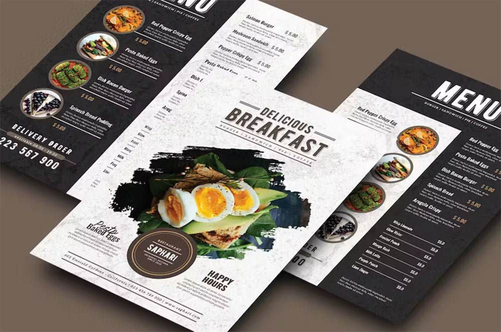
Imagine crafting the perfect invitation to a feast—not with food, but with your restaurant’s vibe, etched into the very face of the menu. A font does more than carry words; it flavors them, imbuing your offerings with personality and allure before the first bite is taken.
The pulse of any eatery leans heavily on its menu’s readability. It’s the silent ambassador of your style. Within this piece, I’m unwrapping the secrets of typography in menu design, tying together the practical with the beautiful.
This is beyond a mere list; it’s a journey through visual hierarchy, branding, and user experience—essentials that define the menu graphic design principles.
You’ll leave with a palette, not of flavors, but of the most readable restaurant typefaces primed for print or digital menus.
Dive deep into the art of menu typography trends and how they anchor your establishment’s identity in the minds of diners.
Let’s carve out a space where typeface legibility and design aesthetics coalesce, making your menu a mouth-watering prelude to the culinary experience you offer.
The Best Fonts for Menus
| Font Name | Type | Readability | Style | Best for |
|---|---|---|---|---|
| Rigatoni | Display | Moderate | Playful | Italian, Comfort Food Menus |
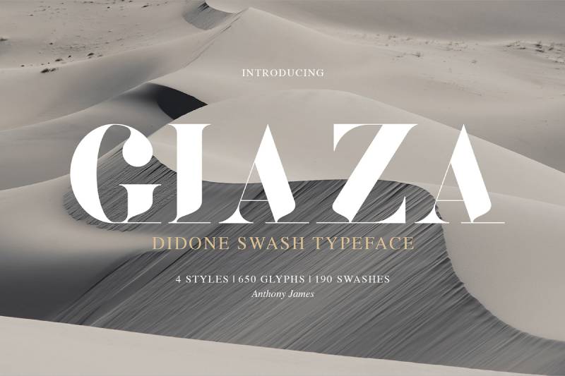
| Giaza Pro | Display/Script | High | Elegant | Upscale, Fine Dining Menus |
| Timberline | Script | Moderate | Rustic | Farm-to-table, Organic Menus |
| Didot | Serif | High | Classic | Traditional, French Menus |
| Baskerville | Serif | High | Refined | Classic, Timeless Menus |
| Plantin | Serif | High | Versatile | General, All-purpose Menus |
| Open Sans | Sans-serif | Very High | Modern | Clean, Modern Menus |
| Helvetica | Sans-serif | Very High | Neutral | Corporate, Functional Menus |
| Brandon Grotesque | Sans-serif | High | Friendly | Trendy, Contemporary Menus |
| Proxima Nova | Sans-serif | Very High | Geometric | Digital, Minimalist Menus |
| Montserrat | Sans-serif | High | Urban | Casual, Eclectic Menus |
| Flood | Display | Low | Expressive | Artistic, Concept Menus |
| Cookie | Script | Moderate | Casual Cursive | Bakery, Café Menus |
| Malaga | Serif | Moderate | Warm | Mediterranean Menus |
| Arvo | Serif | High | Clear | Diverse Cuisine Menus |
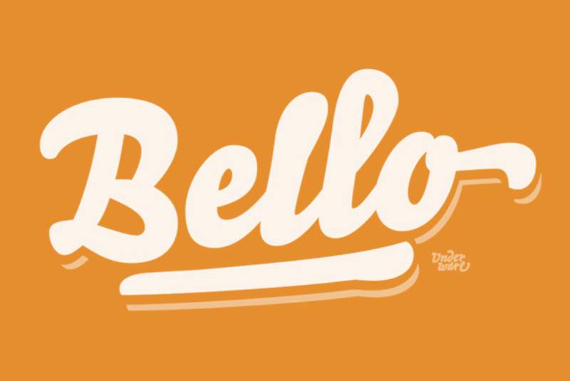
| Bello | Script | Moderate | Whimsical | Fun, Kid-friendly Menus |
| La Belle Aurore | Script | Moderate | Handwritten | Boutique, Specialty Menus |
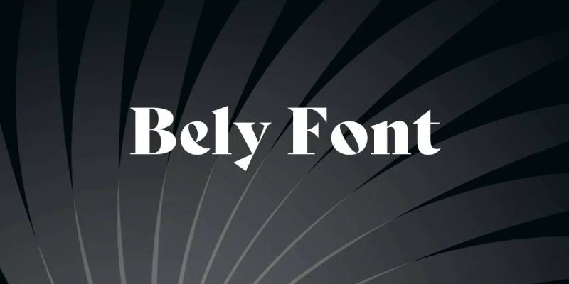
| Bely | Serif | Moderate | Contemporary | Modern, Fusion Menus |
| Ubuntu | Sans-serif | High | Humanist | Tech-oriented, Startup Menus |
Display Fonts for Impact
Imagine you’re designing a menu for a pasta-themed eatery. You want something that screams “Italiano!” right? That’s where Rigatoni steps in, a font as delicious as the dish. It’s all about making an impact.
Giaza Pro is your go-to for that high-end restaurant. It’s like the little black dress of fonts – timeless and elegant. Perfect for those fine dining elegance vibes.
Now, think of an artisan or vegetarian café. You want something earthy and organic. Enter Timberline – a font that feels like it’s been hand-carved by a nature-loving craftsman.
Classic Serif Fonts for Elegance
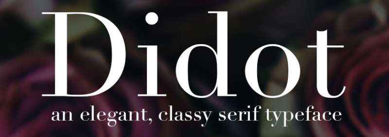
For haute cuisine, Didot is the star. It’s like the fine wine of fonts – sophisticated and classy.
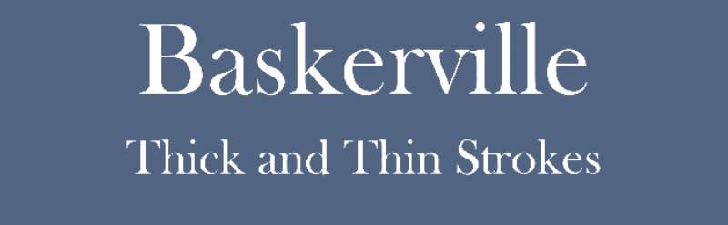
Baskerville, meanwhile, is your versatile buddy, great for any setting that demands a touch of sophistication.
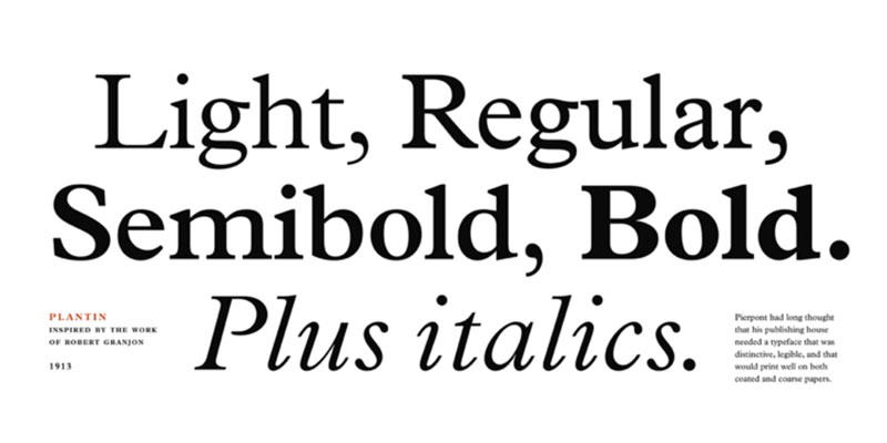
And then there’s Plantin. If fonts had a hall of fame, Plantin would be in it. It’s the timeless alternative, never going out of style.
Modern Sans Serif Fonts for Minimalism
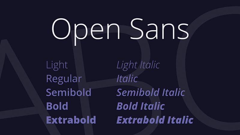
Open Sans shines in its legibility and neutrality. Imagine a modern café, where simplicity rules. This font makes reading a breeze.
Helvetica, oh Helvetica. It’s like the chameleon of fonts, blending into any design while maintaining its unobtrusive design.
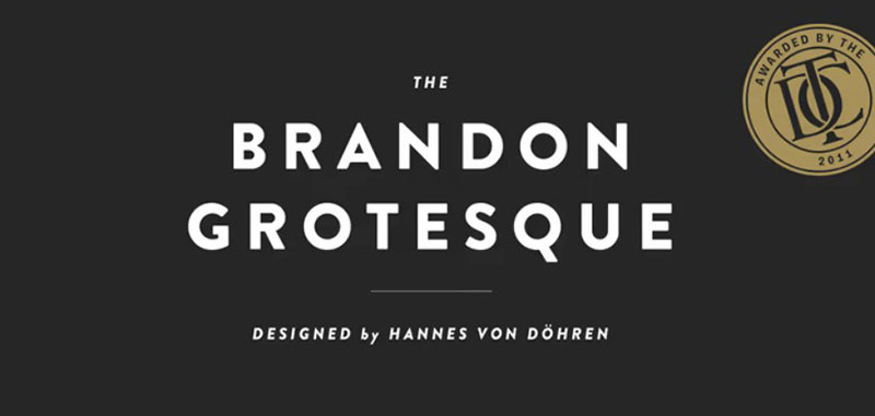
Lastly, there’s Brandon Grotesque. It’s warm, it’s friendly – it’s like that barista who remembers your name. Ideal for places that value warm functionality.
Font Selection for Specific Restaurant Types
Alright, let’s get real about fonts. Picking the best fonts for menus? It’s like dressing up your restaurant’s personality in letters. Different vibes, different typefaces. Here’s the lowdown on what works where.
Modern Restaurant Fonts
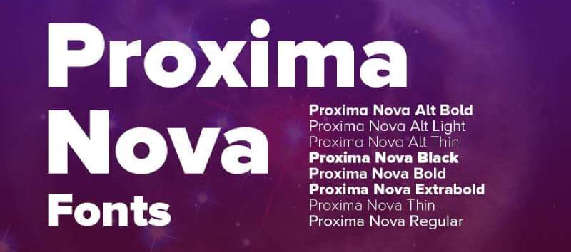
Proxima Nova – think of it as the cool, urban cousin in the font family. It’s sleek, it’s contemporary. Perfect for those modern eateries that want to scream chic without trying too hard.
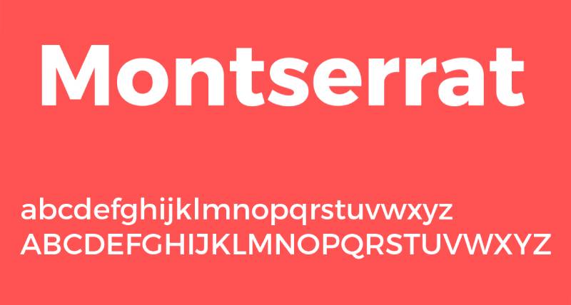
Then there’s Montserrat. It’s the underdog that came out on top. Ideal for menus that have an urban edge. You know, the kind that pairs craft beer with gourmet burgers.
Cultural and Thematic Fonts
This is where it gets spicy. Literally.
Got a Chinese restaurant? Flood is your guy. It’s got that oriental flair without being cliché.

Pair it with Cookie, and your menu’s speaking Mandarin.

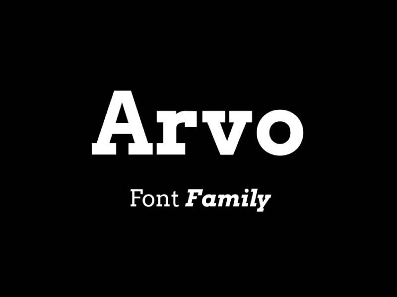
Mexican themes? Say hola to Malaga and Arvo. They’re like the fiesta of fonts. Bold, lively – they bring the party to your enchiladas.
Italian cuisine, you ask? Bello and La Belle Aurore. They’re the romance languages of fonts. They make your spaghetti carbonara sound like a love story.
And for those Mediterranean vibes, mix in some Bely and Ubuntu. It’s like a warm Mediterranean breeze in font form.
FAQ On The Best Fonts For Menus
What makes a font ideal for a restaurant menu?
Top-shelf fonts for menus need to nail two things: personality and clarity. Picture your brand’s heart and your customer’s ease of reading becoming best friends. You want something that’s not just legible but also mirrors the ambience you’re serving up—be it elegant serif charms or sleek sans-serif modernity.
How does a menu’s font affect customer experience?
It’s all about that first impression. Before tasting, there’s feasting with the eyes. Fonts hold the power to sway a diner’s mood—imagine the subtle allure of a well-chosen typeface sparking appetite and excitement. It’s User Experience (UX) design at the heart of a consumer’s interaction with your brand.
Can the font choice impact the perception of food quality?
Absolutely. A well-crafted, legible font on a menu can elevate perceived food quality. Think about it—when you see a carefully designed menu, don’t you think, “They must put the same effort into their dishes”? It’s psychology subtly woven through typography at play.
What’s the best font for readability on menus?
Aim for those fonts that guests won’t have to squint at. Helvetica? It’s a classic for a reason. Arial or Verdana can be great picks too—clean, with plenty of breathing room. The goal? Ensure no diner ever has to puzzle over what a readable restaurant typeface looks like.
Do the best fonts for digital menus differ from print menus?
Oh, for sure. Digital realms introduce backlighting and screen glare. Your best bet here leans towards larger, bolder sans-serif varieties. Fonts like Google Fonts for menus are a trove for digital settings—they’ve got that crispness that cuts through the pixel barrier.
How do font pairings work for menu design?
Like wine and cheese, there’s an art to pairing. Contrast is good—maybe a bold header font to grab attention, paired with a simpler body font for easy reading. The secret? Keep them complementary, but varied enough to guide customers through the menu design like a story.
Is it worth investing in custom fonts for a menu?
Invest if branding’s your battleground. Custom fonts can be that unique identifier, the standout flair that embeds your eatery’s brand in memory. Think of it as a signature—the one element that whispers your restaurant’s name without saying a word.
What are some menu font faux pas to avoid?
Skip the Comic Sans parade, and any font that looks like it’s trying too hard to be quirky. Overly ornate? Save it for the special boards. The aim—menu readability over style excess. Plus, never overlook licensing—stay legit with font licensing for commercial use.
How often should a restaurant update its menu fonts?
Not a sprint, but a marathon—you want staying power with your typography in menu design. However, keep an eye on menu typography trends, and if you’re going through a rebrand or menu overhaul, that’s the perfect time to refresh your fonts like a new season’s wardrobe.
Are there any tools or resources for selecting menu fonts?
Plenty of treasure chests out there! Adobe Fonts is a good start, teeming with choices. Online platforms like Design portfolio websites such as Behance and Dribbble could spark inspiration. Remember, the font you choose needs to sync with the whole user interface (UI) design of your menu.
Conclusion
Alright, so we’ve feasted our eyes on this smorgasbord of the best fonts for menus—the serifs that have whispered elegance, the sans-serifs that have shouted modernity, and the calligraphy styles that have sung tradition. It’s been a quest, one where typography isn’t just a background player, but the lead act on the stage of your menu.
In the end, whether it’s about nailing font psychology or making menu font pairings that harmonize like a fine symphony, the fonts chosen should resonate with your restaurant’s unique flavor. It’s a delicate blend of font aesthetics, readability, and that special pinch of character that sets a menu apart.
Remember, a menu isn’t just a list; it’s a story told in courses. And the font? It’s your narrator. So, when customers walk away, what they’ll remember isn’t simply the dish they ordered, but the sensory experience that started at first glance—the moment they held your menu in their hands.
If you liked this article about the best fonts for menus, you should check out this article about the best fonts for dyslexia.
There are also similar articles discussing the best fonts for PowerPoint presentations, the best fonts for infographics, the best fonts for Instagram posts, and the best fonts for websites.
And let’s not forget about articles on the best fonts for Facebook ads, the best fonts for billboards, the best fonts for embroidery, and the best fonts for letters.
Bogdan Sandu, a seasoned designer with 15 years of diverse experience, has been designing websites since 2008.
Renowned for his expertise in logo design and visual branding, Bogdan has developed a multitude of logos for various clients.
His skills extend to creating posters, vector illustrations, business cards, and brochures. Additionally, Bogdan's UI kits were featured on marketplaces like Visual Hierarchy and UI8.
Latest posts by Bogdan Sandu (see all)
- Fashion Typography: What Font Does Vogue Use? - 14 May 2024
- The Kirin Logo History, Colors, Font, And Meaning - 13 May 2024
- The Benefits Of Print on Demand - 13 May 2024