The wrong font can ruin an embroidery project before the first stitch drops.
Choosing the best fonts for embroidery isn’t about what looks good on screen. It’s about what survives digitizing, holds up on fabric, and reads clearly once thread replaces ink.
Font readability, stroke width, letter spacing, and fabric compatibility all determine whether your embroidery lettering comes out sharp or turns into a tangled mess. Most people learn this the hard way.
This guide covers 10 fonts that consistently perform across machine embroidery and hand embroidery projects, from corporate uniforms to wedding monograms. You’ll also learn what makes a font stitch-friendly, how fabric type changes your options, and which mistakes to avoid before you digitize a single character.
The Best Fonts For Embroidery
Not every font translates well to thread. What looks sharp on a screen can turn into a stitched mess on fabric, especially at small sizes or on textured materials.
The main factors that determine whether a font works for embroidery: stroke width, letter spacing, and how the letterforms hold up when digitized into stitch files. Thin strokes disappear. Tight spacing blurs. Ornate details collapse.
Below are 10 fonts that consistently perform well across machine embroidery and hand embroidery projects, covering everything from corporate uniforms to wedding monograms.
—
Arial

Arial is a neo-grotesque sans-serif font designed by Robin Nicholas and Patricia Saunders in 1982, released by Monotype Typography. It delivers clean, uniform letterforms at a wide range of sizes.
Arial suits machine embroidery on workwear, hats, and bags because its consistent stroke weight (no contrast between thick and thin strokes) produces even satin stitches with minimal compensation adjustments. It digitizes reliably down to 6mm (~0.25 inch) letter height without losing legibility.
What makes Arial suitable for embroidery?
Arial has uniform stroke width across all characters, which means stitch density stays consistent throughout a word. Its open counters (the enclosed spaces inside letters like “e”, “a”, and “o”) remain readable after stitching, even on textured fabrics like fleece or terry cloth. No serif details means no fine strokes to lose.
| Attribute | Value |
| Classification | Neo-grotesque sans-serif |
| Designer | Robin Nicholas & Patricia Saunders, 1982 |
| Weight range | Regular, Bold, Black, Narrow, Italic variants |
| Variable font | No |
| Recommended sizes | 6mm+ for embroidery; Bold weight at small sizes |
| Letter-spacing default | Normal |
| License | Bundled with Windows/macOS; commercial use included |
| Available on | System font (Windows, macOS) |
| Price | Free (included with OS) |
How does Arial perform at machine embroidery?
Arial renders clearly at sizes from 6mm to 75mm+ without stitch quality degradation. Its horizontal terminal cuts produce straight, clean stitch ends, which is a measurable advantage for satin stitch lettering. At 10mm (~0.4 inch), it remains legible on polo shirts and jacket chest placements.
What are the best pairings for Arial in embroidery?
Arial pairs with Helvetica for consistent corporate branding across both font families (near-identical metrics, making multi-supplier embroidery consistent). It pairs with Bodoni when a bold headline letter needs contrast against Arial body text in a multi-line design.
What are the limitations of Arial for embroidery?
Arial’s narrow apertures in the uppercase “C” and “G” can close up on high-pile fabrics at sizes below 8mm. The Regular weight is too light for sizes under 10mm — Bold weight is required for small-text embroidery.
Arial – Recommended Use Cases Within Embroidery
- Best for: Corporate uniforms, name badges on polo shirts, hat lettering, backpack labels
- Avoid for: Fine monogram work, wedding linens, designs under 6mm
- Optimal weight: Bold 700 for sizes under 15mm; Regular 400 for larger display text
- Optimal size range: 8mm–50mm for most embroidery applications
—
Helvetica

Helvetica is a neo-grotesque sans-serif typeface designed by Max Miedinger and Eduard Hoffmann in 1957, released by Haas Type Foundry (later Linotype). It produces neutral, high-legibility letterforms suitable for professional embroidery applications.
Helvetica optimizes embroidery on corporate and promotional apparel because its tall x-height maintains letter proportion when scaled to small stitch sizes. American Airlines, BMW, and Lufthansa all used Helvetica as a core identity font, which gives it wide recognition in professional contexts.
What makes Helvetica suitable for embroidery?
Helvetica has a notably tall x-height (the height of lowercase letters relative to capitals), which keeps lowercase text legible at small embroidery sizes. Stroke weight is consistent with near-zero contrast between thick and thin, reducing uneven stitch density. Its tight default letter spacing works well for machine embroidery where slight compression during stitching is expected.
| Attribute | Value |
| Classification | Neo-grotesque sans-serif |
| Designer | Max Miedinger & Eduard Hoffmann, 1957 |
| Weight range | Hairline to Extra Black (34+ weights in Neue Helvetica) |
| Variable font | Yes (Helvetica Now Variable, 2021) |
| Optical sizes | Yes — Micro, Text, Display (Helvetica Now) |
| Recommended sizes | 10mm+ for satin stitch; 25mm+ for fill stitch |
| Letter-spacing default | Tight |
| License | Commercial — Monotype licensing required |
| Available on | Monotype, Adobe Fonts (subscription) |
| Price | Subscription / per-weight licensing |
How does Helvetica perform at machine embroidery?
Helvetica’s horizontal stroke terminals stitch cleanly because they terminate at 90-degree angles, which aligns naturally with satin stitch direction. The tight letter spacing requires slight manual adjustment during digitizing to prevent stitch overlap on condensed settings. At 25mm (~1 inch), it produces sharp, professional results on smooth cotton and canvas.
What are the best pairings for Helvetica in embroidery?
Helvetica pairs with Times New Roman when a formal header/body contrast is needed across a two-line embroidery design. For sports and streetwear applications, it pairs with Futura to maintain a consistent geometric, clean aesthetic.
What are the limitations of Helvetica for embroidery?
The narrow apertures in Helvetica’s “c”, “e”, and “s” characters reduce legibility below 10mm on textured fabrics. Commercial licensing fees make it a cost consideration for small embroidery operations compared to free alternatives like Arial.
Helvetica – Recommended Use Cases Within Embroidery
- Best for: Corporate apparel branding, promotional merchandise, jacket back text
- Avoid for: Small-text applications below 10mm, high-pile fabric embroidery
- Optimal weight: Medium (55) for body text; Bold (75) for headline applications
- Optimal size range: 10mm–75mm
—
Times New Roman
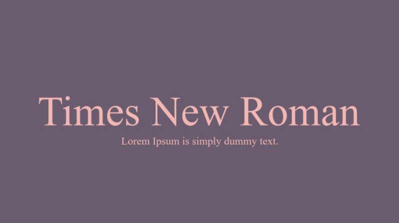
Times New Roman is a transitional serif font designed by Stanley Morison and Victor Lardent in 1931, originally released by The Times newspaper and Monotype. It delivers formal, high-readability letterforms for structured embroidery projects.
Times New Roman suits embroidery on dress shirts, formal jackets, and professional uniforms because its moderate stroke contrast (clear thick/thin variation, but not extreme) holds up during digitizing better than high-contrast serifs like Bodoni.
What makes Times New Roman suitable for embroidery?
The stroke contrast in Times New Roman is moderate — thick stems are roughly 3x the weight of thin hairlines, a ratio that digitizes into visible but stitchable detail. Its bracketed serifs (curved joins between stem and serif) translate more cleanly to thread than sharp, unbracketed serifs. Recommended minimum height is 0.35 inch (approximately 9mm) to preserve serif detail on smooth fabric.
| Attribute | Value |
| Classification | Transitional serif |
| Designer | Stanley Morison & Victor Lardent, 1931 |
| Weight range | Regular, Bold, Italic, Bold Italic |
| Variable font | No |
| Recommended sizes | 9mm+ (0.35 inch+) for legible serif detail in embroidery |
| License | Bundled with Windows/macOS; commercial use included |
| Available on | System font (Windows, macOS, Microsoft Office) |
| Price | Free (included with OS) |
How does Times New Roman perform at formal embroidery contexts?
On smooth fabrics — cotton twill, poplin, satin — Times New Roman serifs stitch clearly at 12mm and above. Below that, serif detail begins to merge with the stem stitches on standard-density digitizing. It performs well for monogram embroidery on dress shirts when letter height stays at 15mm or higher.
What are the best pairings for Times New Roman in embroidery?
Times New Roman pairs with Arial Bold for two-line designs where a formal name sits above a role or company title. It pairs with Garamond when a softer, more classic tone is needed across a multi-text embroidery layout.
What are the limitations of Times New Roman for embroidery?
Thin hairline strokes disappear at sizes below 9mm on any fabric with surface texture. It requires smooth fabric (cotton, satin) to preserve serif detail — avoid terry cloth, fleece, or canvas for small Times New Roman text.
Times New Roman – Recommended Use Cases Within Embroidery
- Best for: Dress shirt monograms, formal jacket text, business uniform lettering
- Avoid for: Small text below 9mm, textured or high-pile fabrics
- Optimal weight: Bold for sizes under 20mm; Regular for display text 25mm+
- Optimal size range: 12mm–50mm on smooth fabric
—
Garamond

Garamond is an Old Style serif typeface with origins in the work of Claude Garamond in the 16th century, with widely used digital versions released by Adobe (Adobe Garamond, 1989) and available through multiple foundries. It produces refined, classic letterforms suited to formal and luxury embroidery work.
Garamond works best for embroidery on wedding garments, luxury linens, and formal occasion pieces because its old-style design uses gradual stroke transitions rather than sharp contrast, which holds structure during digitizing better than modern serifs.
What makes Garamond suitable for embroidery?
Garamond’s angled stress (the axis of stroke weight transitions diagonally rather than vertically) creates softer, more gradual thick-to-thin transitions. This means fewer extreme hairlines compared to Bodoni or Didot, reducing the risk of thin strokes disappearing during stitching. Its open, slightly wide letter proportions give individual characters room to breathe when converted to thread.
| Attribute | Value |
| Classification | Old Style serif |
| Designer | Claude Garamond (original, 16th c.); Adobe Garamond by Robert Slimbach, 1989 |
| Weight range | Regular, Bold, Italic, Bold Italic (Adobe version) |
| Variable font | No (EB Garamond on Google Fonts has limited variable support) |
| Recommended sizes | 12mm+ for embroidery to preserve old-style serif detail |
| License | Adobe Garamond: Adobe Fonts subscription; EB Garamond: OFL (free) |
| Available on | Adobe Fonts, Google Fonts (EB Garamond), system fonts (some OS) |
| Price | Free (EB Garamond) / Adobe subscription |
How does Garamond perform at luxury embroidery contexts?
Garamond’s gradual stroke transitions stitch more cleanly than high-contrast serifs at equivalent sizes. On smooth satin or fine cotton, it produces legible, formal text at 12mm–15mm. Its slightly narrow default set width means words stay compact without requiring tight kerning adjustments in embroidery software.
What are the best pairings for Garamond in embroidery?
Garamond pairs with Futura for designs that contrast old-world elegance against clean modernism — common in luxury branding embroidery. It pairs with Baskerville when a consistent serif tone is needed across a multi-text layout with slightly more stroke contrast.
What are the limitations of Garamond for embroidery?
Garamond is not suited to sizes below 12mm due to its old-style thin strokes, which lose definition in thread. Textured fabrics (fleece, terry) will distort the fine serif details regardless of size.
Garamond – Recommended Use Cases Within Embroidery
- Best for: Wedding garment monograms, luxury linen embroidery, high-end gift items
- Avoid for: Workwear, small-text applications, any fabric with surface texture
- Optimal weight: Regular for display monograms; Bold for multi-letter designs
- Optimal size range: 15mm–60mm on smooth, flat fabric
—
Futura

Futura is a geometric sans-serif typeface designed by Paul Renner in 1927, released by Bauer Type Foundry. It uses near-perfect circular and geometric shapes built on Bauhaus design principles.
Futura works best for sports uniforms, gym bags, and modern apparel embroidery because its geometric uniformity produces highly consistent stitch paths during digitizing. Brands like Volkswagen, FedEx, and Supreme have used Futura in identity systems — its recognition in contemporary branding makes it a common choice for embroidered merchandise.
What makes Futura suitable for embroidery?
Futura’s strokes are nearly monoweight — stroke width variation is minimal across each character. This creates predictable, even stitch density with no sudden transitions that require compensation. Its geometric shapes (the “O” is almost a perfect circle, the “A” is a precise triangle) digitize into clean, scalable stitch paths.
| Attribute | Value |
| Classification | Geometric sans-serif |
| Designer | Paul Renner, 1927 |
| Weight range | Light, Book, Medium, Heavy, Bold, ExtraBold, Condensed variants |
| Variable font | No (Futura Now has variable version via Monotype) |
| Recommended sizes | 8mm+ for satin; 25mm+ for fill stitch embroidery |
| License | Commercial — Monotype/Bauer licensing required |
| Available on | Adobe Fonts, Monotype, foundry direct |
| Price | Subscription / per-weight licensing |
How does Futura perform at sports and apparel embroidery?
Futura’s monoweight strokes produce sharp, consistent satin stitch results at sizes from 8mm upward. Its wide proportions (letters are broader than compressed geometric fonts) give embroidery digitizers more stitch path area to work with at small sizes. At 25mm+, it holds crisp edges even on structured fabrics like canvas or denim.
What are the best pairings for Futura in embroidery?
Futura pairs with Bodoni for luxury or fashion-forward embroidery where geometric sans-serif contrasts against high-stroke-contrast serif. It pairs with Garamond for heritage or artisan brand embroidery where the modernist structure of Futura benefits from an old-style serif complement.
What are the limitations of Futura for embroidery?
Futura Light and Extra Light weights have strokes too thin for embroidery below 20mm — Medium or Bold is required for small-text applications. Commercial licensing fees apply; free alternatives like Century Gothic share similar geometry but differ in stitch performance.
Futura – Recommended Use Cases Within Embroidery
- Best for: Sports uniforms, gym bags, streetwear, modern brand merchandise
- Avoid for: Light weight at sizes under 20mm; formal or traditional design contexts
- Optimal weight: Medium or Bold for most embroidery sizes
- Optimal size range: 8mm–75mm
—
Baskerville

Baskerville is a transitional serif typeface designed by John Baskerville in 1757, with widely used digital versions available through multiple foundries including Monotype. It has higher stroke contrast than Times New Roman but more moderate contrast than modern serifs like Bodoni.
Baskerville suits embroidery on vintage-inspired designs, heritage brand apparel, and traditional linens because its refined letterforms carry historical character that stitches cleanly on smooth, flat fabric.
What makes Baskerville suitable for embroidery?
Baskerville sits between old-style and modern serifs in stroke contrast — thick stems are prominent, thin strokes visible but not as extreme as Didot or Bodoni. Its bracketed, slightly wedge-shaped serifs join stems with a gradual curve, which translates to cleaner thread joins than sharp-cut serifs. The University of Birmingham and Canadian government documents use Baskerville as a standard typeface, evidencing its legibility across formal contexts.
| Attribute | Value |
| Classification | Transitional serif |
| Designer | John Baskerville, 1757 (digital: various) |
| Weight range | Regular, Bold, Italic, Bold Italic (standard); expanded in some versions |
| Variable font | No (Libre Baskerville on Google Fonts — no variable) |
| Recommended sizes | 12mm+ for embroidery on smooth fabric |
| License | Commercial versions via Monotype; Libre Baskerville: OFL (free) |
| Available on | Google Fonts (Libre Baskerville), Adobe Fonts, system fonts (macOS) |
| Price | Free (Libre Baskerville) / commercial for premium versions |
How does Baskerville perform at heritage and linen embroidery?
On smooth cotton, linen, or handkerchief fabric, Baskerville produces legible, elegant stitch results at 12mm and above. Its moderate stroke contrast means thin details remain visible without requiring extremely fine digitizing compensation. It performs poorly on anything with surface texture above 12mm due to its hairline strokes catching on fabric nap.
What are the best pairings for Baskerville in embroidery?
Baskerville pairs with Futura for contrast between traditional serif and geometric sans-serif in a two-line embroidery design. It pairs with Garamond for consistent old-world serif tone across embroidered text where subtle variety between fonts adds visual interest.
What are the limitations of Baskerville for embroidery?
Baskerville requires smooth, flat fabric — its hairline serifs and thin strokes collapse on terry cloth, fleece, or heavy canvas regardless of size. Minimum recommended embroidery size is 12mm; below that, thin strokes become indistinguishable from satin stitch fill areas.
Baskerville – Recommended Use Cases Within Embroidery
- Best for: Handkerchiefs, fine linen napkins, heritage brand garments, vintage-style designs
- Avoid for: Textured fabric, sizes below 12mm, casual sportswear
- Optimal weight: Regular at 20mm+; Bold for sizes under 20mm
- Optimal size range: 12mm–50mm on flat, smooth fabric
—
Bodoni

Bodoni is a modern serif typeface first designed by Giambattista Bodoni in 1798, with widely used digital versions including ITC Bodoni (1994) and Bodoni Moda (Google Fonts, 2020). It has extreme stroke contrast — one of the most dramatic thick-to-thin ratios of any commonly used serif.
Bodoni works best for large-format embroidery on tote bags, jacket backs, and display pieces because the dramatic stroke contrast only holds at sizes where hairlines can be stitched at a minimum of 1–2 stitches wide.
What makes Bodoni suitable for large embroidery?
Bodoni’s thick vertical stems are very heavy, which stitch solidly with fill or satin techniques. The contrast element — extremely thin horizontal strokes — only reproduces accurately in embroidery at sizes above 25mm, where those strokes can be digitized as 2–3 stitch widths. Below 25mm, thin strokes collapse or disappear entirely.
| Attribute | Value |
| Classification | Modern serif (Didone) |
| Designer | Giambattista Bodoni, 1798; ITC Bodoni by Sumner Stone et al., 1994 |
| Weight range | Regular, Bold, Black, Poster, Italic variants |
| Variable font | Yes (Bodoni Moda on Google Fonts) |
| Optical sizes | Yes (ITC Bodoni 6, 12, 72 — optimized for different sizes) |
| Recommended sizes | 25mm+ for embroidery; 50mm+ for hairline detail preservation |
| License | ITC Bodoni: commercial (Monotype); Bodoni Moda: OFL (free) |
| Available on | Google Fonts (Bodoni Moda, free), Adobe Fonts, Monotype |
| Price | Free (Bodoni Moda) / commercial for ITC versions |
How does Bodoni perform at large-format embroidery?
At 50mm+ letter height on smooth fabric, Bodoni Poster delivers high-impact, high-contrast stitch results that no other font matches for fashion and luxury applications. At 25mm–50mm, the thin strokes need careful manual digitizing to avoid disappearing. Bodoni Poster (the heaviest display variant) reduces hairline risk by using more balanced stroke weights than standard Bodoni.
What are the best pairings for Bodoni in embroidery?
Bodoni pairs with Futura — one of the most established combinations in fashion design history — contrasting Bodoni’s organic stroke drama against Futura’s mechanical geometry. It pairs with Arial for functional two-line designs where Bodoni serves as a display initial and Arial handles readable supporting text.
What are the limitations of Bodoni for embroidery?
Bodoni is unusable for embroidery below 25mm due to hairline stroke collapse — this is a hard limit, not a guideline. It requires smooth fabric exclusively; any surface texture will disrupt the fine horizontal strokes that define the typeface’s character.
Bodoni – Recommended Use Cases Within Embroidery
- Best for: Fashion garment display text, tote bags, jacket back designs, luxury brand initials
- Avoid for: Any embroidery below 25mm, textured fabric, workwear applications
- Optimal weight: Bold or Poster weight for most embroidery sizes
- Optimal size range: 25mm–100mm+ on smooth, flat fabric
—
Georgia
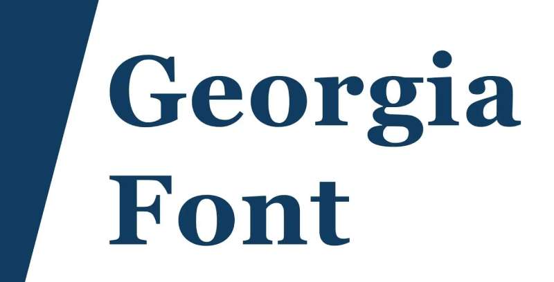
Georgia is a transitional serif typeface designed by Matthew Carter in 1993, released by Microsoft specifically for screen legibility at low resolutions. It produces robust, readable serif letterforms that hold structure under embroidery conditions.
Georgia suits casual clothing embroidery — t-shirts, sweatshirts, casual jackets — because Carter designed it with generous stroke widths throughout, making it more forgiving than fine-stroke serifs when digitized into thread.
What makes Georgia suitable for embroidery?
Georgia was designed with intentionally larger stroke widths than equivalent print serifs, a decision made to ensure legibility on 1990s low-resolution screens. That same stroke robustness benefits embroidery: strokes are thick enough to stitch clearly at smaller sizes than Garamond or Baskerville. Its large x-height (taller lowercase relative to capitals) keeps multi-word text readable at sizes around 10mm–12mm.
| Attribute | Value |
| Classification | Transitional serif |
| Designer | Matthew Carter, 1993 |
| Weight range | Regular, Bold, Italic, Bold Italic |
| Variable font | No |
| Recommended sizes | 10mm+ for embroidery (smaller than most serifs due to robust strokes) |
| License | Bundled with Windows/macOS; commercial use included |
| Available on | System font (Windows, macOS) |
| Price | Free (included with OS) |
How does Georgia perform at casual apparel embroidery?
Georgia’s robust stroke widths allow legible serif embroidery at 10mm — roughly 2mm smaller than the recommended minimum for Baskerville or Garamond. On medium-weight cotton (t-shirts, casual jackets), it maintains serif detail that finer serifs lose. It holds legibility across a wider range of fabric types than other serif options.
What are the best pairings for Georgia in embroidery?
Georgia pairs with Arial for mixed serif/sans designs on casual garments, using Georgia for display initials and Arial for secondary text. It pairs with Helvetica when a cleaner modern companion is needed for two-line embroidery layouts.
What are the limitations of Georgia for embroidery?
Georgia’s wider proportions mean it takes more horizontal space than other serifs at equivalent letter height — long words need wider embroidery areas or smaller sizing. Below 10mm, serifs still begin to merge with stems on textured fabric.
Georgia – Recommended Use Cases Within Embroidery
- Best for: Casual t-shirt text, sweatshirt lettering, accessories, multi-word phrases
- Avoid for: Formal or luxury garments, heavily textured fabric under 15mm
- Optimal weight: Regular or Bold depending on size
- Optimal size range: 10mm–50mm
—
Lobster
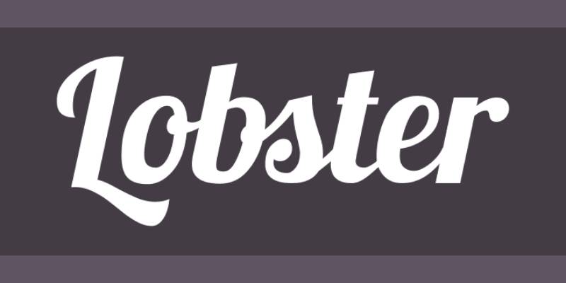
Lobster is a script font designed by Pablo Impallari in 2010, released under the SIL Open Font License through Impallari Type. It uses thick, connected letterforms with automatic ligatures that join letters naturally.
Lobster works best for embroidered name designs, casual brand logos, and decorative t-shirt lettering because its thick stroke width — significantly heavier than traditional script fonts — translates to thread without the hairline problems common in lighter cursive typefaces.
What makes Lobster suitable for embroidery?
Lobster’s stroke width is heavy and consistent throughout the letterform, avoiding the extreme thick-to-thin contrast of calligraphic scripts. Its connected letters use automatic ligatures that maintain stroke flow between characters, reducing the number of jump stitches needed during digitizing. The large x-height keeps individual letters clear even in multi-letter connected words.
| Attribute | Value |
| Classification | Bold display script |
| Designer | Pablo Impallari, 2010 |
| Weight range | Regular; Lobster Two adds upright variants (2011) |
| Variable font | No |
| Recommended sizes | 15mm+ for connected script; 25mm+ for best ligature clarity |
| Letter-spacing default | Connected (ligature-dependent) |
| License | OFL — free for personal and commercial use |
| Available on | Google Fonts, Adobe Fonts, Font Squirrel |
| Price | Free |
How does Lobster perform at name and phrase embroidery?
Lobster’s heavy, uniform strokes produce bold, readable embroidery at 15mm+ with minimal compensation requirements. The built-in ligature connections between letters mean fewer jump stitches in the stitch file, which reduces both production time and the risk of connection threads showing on the fabric surface. At 25mm it stitches cleanly on cotton, denim, and canvas.
What are the best pairings for Lobster in embroidery?
Lobster pairs with Arial Bold for name-over-title two-line designs where the script name sits above a clean sans-serif label. It pairs with Futura Bold for modern merchandise designs that combine retro script aesthetics with contemporary geometric sans-serif supporting text.
What are the limitations of Lobster for embroidery?
Lobster’s connected letter paths require embroidery digitizing software that handles ligature joins correctly — auto-digitizing tools often break connections, creating gaps between letters. At sizes below 15mm, letter joins become indistinct and the connected script effect is lost.
Lobster – Recommended Use Cases Within Embroidery
- Best for: Embroidered names on casual garments, t-shirt branding, tote bag text, informal monograms
- Avoid for: Sizes below 15mm, formal or corporate applications, fine-line fabric
- Optimal weight: Regular (the only standard weight)
- Optimal size range: 15mm–75mm
—
Edwardian Script

Edwardian Script ITC is a calligraphic script typeface designed by Edward Benguiat for the International Typeface Corporation, inspired by early 20th-century Edwardian-period handwriting. It produces flowing, connected letterforms with decorative swashes on capitals and ascenders.
Edwardian Script suits wedding embroidery, formal occasion gifts, and luxury monogram work at sizes where its hairline connecting strokes can be reproduced in thread — recommended minimum 25mm for lowercase, 50mm+ for capital swashes.
What makes Edwardian Script suitable for formal embroidery?
Edwardian Script capital letters have generous, decorative swash extensions that, at large sizes, create distinctive monogram characters unlike any sans-serif or basic serif alternative. Its connecting strokes follow natural calligraphic paths, which — when digitized at sufficient size — produce flowing satin stitch lines that resemble hand embroidery. It supports uppercase and lowercase at commercial embroidery sizes up to 126mm according to digitized embroidery vendors.
| Attribute | Value |
| Classification | Calligraphic script |
| Designer | Edward Benguiat, International Typeface Corporation |
| Weight range | Regular only |
| Variable font | No |
| Recommended sizes | 25mm+ for lowercase text; 50mm+ for capital swash letters |
| License | Commercial — ITC/Monotype licensing required for desktop use |
| Available on | Adobe Fonts (subscription), Monotype, system font on some Windows installs |
| Price | Adobe subscription / Monotype per-license |
How does Edwardian Script perform at wedding and monogram embroidery?
At 50mm+, Edwardian Script capital letters deliver the most decorative, recognizable calligraphic embroidery results of any widely available script font. On smooth satin or silk, swash details stitch with visible elegance. Below 25mm, hairline connecting strokes and thin letterforms collapse — the font becomes unrecognizable in thread at small sizes.
What are the best pairings for Edwardian Script in embroidery?
Edwardian Script pairs with Garamond for wedding keepsake embroidery — the old-style serif body text complements the calligraphic script initials. It pairs with Times New Roman for formal garment monogram layouts where a clear, legible secondary font supports the decorative script initial.
What are the limitations of Edwardian Script for embroidery?
Edwardian Script has a single weight — Regular — with no bold option, meaning thin strokes cannot be compensated by selecting a heavier weight. Embroidery use is limited to smooth, flat fabrics exclusively. Commercial licensing is required for desktop use; budget-conscious buyers need to factor in ITC/Monotype costs.
Edwardian Script – Recommended Use Cases Within Embroidery
- Best for: Wedding garment monograms, luxury gift embroidery, formal occasion linens, single-initial designs
- Avoid for: Sizes below 25mm, any fabric with texture, multi-word phrases, casual apparel
- Optimal weight: Regular only (no alternatives)
- Optimal size range: 25mm–126mm on smooth, flat fabric
—
How To Choose The Right Embroidery Font
The right choice depends on three concrete factors: fabric type, letter size, and design context.
| Font | Classification | Min. Embroidery Size | Best Use Case |
| Arial | Sans-serif | 6mm | Workwear, hats, bags |
| Helvetica | Sans-serif | 10mm | Corporate apparel, promo items |
| Times New Roman | Transitional serif | 9mm | Formal uniforms, dress shirts |
| Garamond | Old Style serif | 12mm | Wedding, luxury linens |
| Futura | Geometric sans-serif | 8mm | Sports, streetwear, modern merch |
| Baskerville | Transitional serif | 12mm | Heritage brands, handkerchiefs |
| Bodoni | Modern serif | 25mm | Fashion, luxury display text |
| Georgia | Transitional serif | 10mm | Casual clothing, accessories |
| Lobster | Bold display script | 15mm | Name designs, casual brand logos |
| Edwardian Script | Calligraphic script | 25mm | Wedding monograms, formal gifts |
Understanding font psychology also helps when choosing between styles for a brand. A serif font signals tradition and formality. A sans-serif font reads as modern and clean. Script fonts suggest personalization and handcraft.
For projects that mix fonts — a name embroidered in script above a bold sans-serif role title — understanding pairing fonts correctly prevents visual clashes. And always check font licensing before commercial embroidery production. Some fonts bundled with operating systems restrict commercial use on finished goods sold at scale.
If the embroidery is going on something like a t-shirt or casual garment and you want to look at what works for related fonts for t-shirts as a reference point, the same rules apply: bold strokes, clear letter spacing, and sizes that hold up at the application scale.
What Makes a Font Work for Embroidery?
Thread is not ink. A font that looks clean at 12pt on screen can turn into an unreadable mess at 10mm on fabric.
The embroidery market reached USD 3.2 billion in 2023 and is growing at 9.5% annually (Dataintelo), driven largely by demand for custom lettering on apparel. Getting font selection right is where most of that customization fails or succeeds.
Three physical constraints define every font decision in embroidery:
- Stroke width must be at least 1mm due to needle diameter and thread thickness (Melco)
- Lowercase letters require a minimum height of 0.25 inches (6.35mm) for legibility
- Uppercase letters require a minimum of 0.3 inches (7.6mm) to hold stitch integrity
Any font with strokes thinner than 1mm will either break thread or produce stitches that sink into the fabric surface.
What is the minimum font size for embroidery?
The absolute floor is 5mm for block fonts in satin stitch. Serif lettering needs at least 6mm. Script fonts need 8–10mm before they read as intended.
Lowercase letters are approximately 70% the height of uppercase letters (Hatch Embroidery). That math matters: if you want lowercase at 6mm, your design must be set to roughly 8.5mm total to keep lowercase above the legibility threshold.
Text below 4.57mm (0.18 inch) gets automatically enlarged or removed by professional digitizing services during production.
| Font Classification | Minimum Embroidery Height | Stitch Type |
| Block / sans-serif | 5mm (0.20″) | Satin stitch |
| Serif | 6mm (0.24″) | Satin stitch |
| Script / cursive | 8mm (0.32″) | Satin stitch |
| Monogram script | 25mm (1″) | Satin or fill stitch |
How does stroke contrast affect stitch quality?
Stroke contrast is the ratio between the thickest and thinnest parts of a letterform. High contrast means wide variation. Low contrast means consistent width throughout.
Low contrast wins in embroidery. Monoweight fonts like Arial, Helvetica, and Futura have nearly identical stroke widths across all characters, producing even satin stitch density with no sudden transitions requiring compensation.
High-contrast fonts like Bodoni have extreme thick-to-thin ratios. The thick stems stitch solidly. The hairline strokes (as thin as 0.1mm in print) cannot be reproduced in thread below 25mm letter height because thread itself is approximately 0.4mm thick.
At sizes under 25mm, high-contrast serif fonts lose their defining details. The font that looked elegant on a design brief looks blurry when stitched.
—
How Does Fabric Type Change Font Selection for Embroidery?
The embroidery software market was valued at USD 3.17 billion in 2023 and is projected to reach USD 8.07 billion by 2032 (Zion Market Research). Most of that growth is driven by apparel personalization across multiple fabric types, and fabric choice changes every font decision.
Choosing a font without considering fabric is the single most common production error in commercial embroidery.
| Fabric Type | Best Font Class | Fonts to Avoid | Size Adjustment |
| Smooth cotton, linen, satin | Serif, script, monoweight | None if sized correctly | Standard minimum |
| Fleece, terry cloth, knit | Bold sans-serif, block | Serif, script, fine-stroke | Add 3–5mm to minimum |
| Denim, canvas | Sans-serif, geometric | High-contrast serif | Standard to +2mm |
| Stretchy jersey, spandex | Simple block, sans-serif | Complex scripts, serifs | Add 2–3mm minimum |
Which fonts work on textured or high-pile fabrics?
Terry cloth, fleece, and velour fabrics have surface fibers that physically absorb fine stitch detail.
Practical threshold: on fleece or terry, add 3–5mm to the standard minimum font height. A serif that works at 9mm on cotton twill requires 12–14mm on terry to hold the same legibility (MaggieFrames).
The only font classifications that reliably survive high-pile fabric at any reasonable size:
- Bold sans-serif (Arial Bold, Helvetica Bold, Impact)
- Geometric block letters with stroke widths above 2mm
- Futura Medium or heavier at 10mm+
On terry cloth towels specifically, water-soluble stabilizer (topper) helps keep stitches from sinking into the nap. Even with topper, thin script fonts remain unreliable.
Which fonts require smooth fabric to hold legibility?
Smooth, flat fabrics are the only surfaces where fine serif and script details survive the digitizing and stitching process intact.
Baskerville and Garamond: require smooth cotton, satin, or linen. Bracket serifs and thin strokes collapse on anything with surface texture.
Edwardian Script and Lobster: connection strokes between letters disappear into terry and fleece. Script fonts perform on cotton, silk, or satin where the flat surface keeps connecting strokes above the fabric surface.
Logotech, a U.S.-based promotional products company, notes that serif fonts should target a minimum of 0.35 inch (9mm) height on smooth fabrics. That threshold rises to 0.45 inch or more on anything textured.
—
What Is the Difference Between Hand Embroidery and Machine Embroidery Fonts?
Machine embroidery does not use fonts the way a computer does.
A standard TTF or OTF font file describes letter outlines as mathematical curves. An embroidery machine reads stitch coordinates — X/Y needle positions, jump commands, and thread trim instructions. The conversion between these two formats is called digitizing, and it cannot be done automatically with reliable results for most fonts.
What file formats do machine embroidery fonts use?
Machine embroidery uses format-specific stitch files, not standard font formats. The most common:
- DST (Tajima): industry standard for commercial machines; stores only stitch coordinates, no color data
- PES (Brother/Babylock): stores stitch data plus color sequences; supports up to 300,000 stitches and 127 thread colors per design
- JEF (Janome): includes full color mapping and hoop sizing information
- BX: a specialized format for mapping fonts to keyboard strokes in Embrilliance software
- EMB: native Wilcom format; fully editable but not machine-readable without export
BX fonts are particularly useful for name embroidery because the operator types letters directly from a keyboard rather than placing individual letter files manually. This format cannot be loaded directly into an embroidery machine without Embrilliance software.
Can standard fonts be used directly in embroidery machines?
No. A TTF or OTF font file cannot be loaded into an embroidery machine.
Some software (Brother PE-Design, Hatch Embroidery) can auto-generate stitches from TrueType font artwork. The results are acceptable for simple sans-serif fonts at sizes above 15mm. For script fonts with connected letterforms, auto-digitizing breaks ligature joins, creating visible gaps between letters that require manual correction.
Hand embroidery removes this constraint entirely. A skilled hand embroiderer can adapt any letterform in real time, tightening corners, adjusting stroke width, and correcting spacing as the work progresses. Machine digitizing is fixed at file creation.
| Factor | Machine Embroidery | Hand Embroidery |
| Font format required | DST, PES, JEF, BX, etc. | Any reference image |
| Minimum stroke width | 1mm (hard limit) | Adjustable by stitcher |
| Script font complexity | Requires manual digitizing | Manageable with skill |
| Consistency at scale | High | Variable |
| Production speed | Fast | Slow |
—
How Do You Choose a Font for Embroidery Monograms?
Monogram embroidery follows different rules than multi-word text. A single letter or three-letter initial is displayed at sizes where decorative detail can actually survive in thread.
Embroidery accounted for over 40% of global decorated apparel revenue in 2023 (Grand View Research), and personalized monograms represent one of the fastest-growing categories within that segment.
What fonts work best for single-letter monograms?
Single-letter monograms run at 1 to 4 inches tall, with 1 inch and 4 inches being the most common sizes (Hatch Embroidery).
At those sizes, high-contrast and decorative fonts that are unusable at 10mm become viable. Edwardian Script capitals with swash extensions, Bodoni display initials, and ornate calligraphic letterforms all work at 1 inch and above because hairline strokes are now wide enough to stitch at 2–3 stitch widths.
Best for single-letter monograms: Edwardian Script ITC (50mm+), Bodoni Poster (25mm+), Garamond (20mm+), or any block font with decorative alternates.
Avoid: fonts that are italicized or asymmetrical — they create visual imbalance when displayed as a single large letter without surrounding text.
What fonts work best for three-letter monograms?
Three-letter monograms use a traditional layout where the center letter (last name initial) is larger than the flanking letters. Stacked monograms run at 3.5 to 4 inches for the center letter (Hatch Embroidery).
Font symmetry is critical. Letters must have similar overall proportions across all 26 characters so the three-letter combination appears balanced. Italicized fonts create visual inconsistency between the flanking letters and center initial.
- Script fonts: work at 3.5–4 inches on smooth fabric; avoid on towels or fleece at this size without adding stroke weight
- Block serif fonts: reliable at any size above 25mm; maintain balance across all letter combinations
- Vine monogram styles: interconnected vine letterforms work at 3–6 inches; require smooth cotton or linen
On towels specifically, the stitch stroke width matters more than the font style. Very thin embroidery fonts get lost in the nap even at 4 inches if strokes are under 1.5mm wide. Pre-digitized embroidery monogram fonts from vendors like Designs by JuJu or Rivermill Embroidery are optimized for fabric-specific stitch density in ways that auto-digitized fonts are not.
—
What Are the Most Common Mistakes When Choosing Embroidery Fonts?
The caps segment dominated the embroidery market with 35% of application share in 2023 (Verified Market Reports). Hat embroidery is also where the most font errors occur, because curved surfaces and tight embroidery areas make size thresholds even more restrictive than flat garments.
Five mistakes appear repeatedly across commercial and home embroidery production.
1. Selecting fonts below the stroke-width threshold. The most common error. Bodoni at 12mm, Edwardian Script at 15mm, and any condensed serif at small sizes will fail. Stroke width, not aesthetic preference, determines the floor.
2. Ignoring fabric texture. A font approved for cotton twill gets applied to a fleece hoodie without adjustment. Result: thin strokes disappear into the pile. Fix: add 3–5mm to every size threshold when switching to textured fabric.
3. Using auto-digitizing on script fonts. Auto-digitizing tools handle simple sans-serif geometry reasonably well. Connected script letterforms (Lobster, Edwardian Script, Monotype Corsiva) require manual digitizing to preserve ligature joins. Auto-converted scripts produce jump stitches where letter connections should be, visibly breaking the flow of the design.
4. Confusing screen appearance with stitch output. A font at 12pt on screen has nothing to do with how it looks at 8mm stitched. Screen rendering uses anti-aliasing to smooth edges. Thread has no equivalent. Thin strokes that appear sharp on screen disappear or merge in thread.
5. Licensing errors in commercial production. Standard desktop font licenses do not automatically cover commercial embroidery production for sale. The BX and stitch file formats sold through embroidery vendors carry their own licensing terms. Many restrict redistribution of the stitch files themselves, even if finished embroidered goods can be sold. Verify production-for-sale rights before using any purchased font licensing agreement for commercial embroidery.
Caps have a standard front embroidery area of approximately 2.1 × 4.2 inches (MaggieFrame). That physical constraint forces minimum font sizes upward compared to flat garment embroidery, meaning the 0.25 inch minimum that works on a polo shirt is already at the borderline for hat text. Professional embroidery services like Printify enforce a minimum of 0.25 inch for hat text as a hard rule, with recommendations to use Bold weight variants for anything near that threshold.
Understanding font psychology also helps avoid a different kind of error: selecting a font style that conflicts with the brand or occasion context. A bold display font on a wedding linen, or a delicate calligraphic script font on a sports uniform, fails on context even if it technically stitches correctly. The structural requirements and the design context both have to align. If you want to explore how fonts for adjacent applications differ, fonts for vinyl lettering and fonts for laser cutting follow similar stroke-width logic but have different minimum thresholds because neither uses thread.
FAQ on The Best Fonts For Embroidery
What is the best font for embroidery beginners?
Arial Bold is the most beginner-friendly embroidery font. Its uniform stroke width, open letter spacing, and monoweight structure digitize cleanly with minimal compensation. Start at 10mm or larger on smooth cotton for reliable, readable results on your first projects.
What font size is recommended for machine embroidery?
Lowercase letters need a minimum of 6.35mm (0.25 inch) in height. Uppercase starts at 7.6mm (0.3 inch). Script and serif fonts require more — target 10–12mm minimum to preserve stroke detail and avoid thread collapse during stitching.
Can you use any font for embroidery?
No. Standard TTF or OTF font files cannot be loaded into an embroidery machine. Every font must be digitized into a stitch file format (DST, PES, BX) first. Fonts with thin strokes or complex serifs often require manual digitizing for acceptable results.
What is the difference between serif and sans-serif fonts in embroidery?
Sans-serif fonts like Arial and Helvetica tolerate more fabric types and smaller sizes. Serif fonts like Baskerville and Garamond require smooth fabric and larger sizes to preserve their decorative stroke endings in thread.
What fonts work best for embroidery on hats?
Bold sans-serif and block fonts perform best on hats. The standard cap embroidery area is approximately 2.1 × 4.2 inches, and curved surfaces amplify small-size problems. Use Bold weight fonts at a minimum of 7–8mm and avoid script fonts entirely on structured caps.
What is the best script font for embroidery?
Lobster is the most reliable script font for embroidery. Its heavy, connected strokes digitize consistently at 15mm and above. Edwardian Script works beautifully for monograms at 50mm+, but it fails below 25mm on any fabric type.
How do I choose an embroidery font for monograms?
Single-letter monograms typically run 1–4 inches tall, allowing decorative fonts that fail at small sizes. For three-letter monogram lettering, choose symmetrical fonts with consistent proportions across all characters. Italicized fonts create visual imbalance in traditional left-center-right monogram layouts.
What embroidery fonts work on fleece and terry cloth?
Only bold sans-serif and block fonts survive textured fabrics. Thin strokes sink into the fabric pile and disappear. Add 3–5mm to standard size minimums when moving from smooth cotton to fleece or terry. Arial Bold, Helvetica Bold, and Futura Medium are reliable options.
Do I need special software to use embroidery fonts?
Yes. Software like Wilcom, Hatch Embroidery, Embrilliance, or Brother PE-Design is required to convert font designs into stitch files. BX format fonts work directly within Embrilliance as keyboard fonts, reducing manual letter placement compared to individual DST or PES stitch files.
Are embroidery fonts free or do they cost money?
Both options exist. Lobster is free under the SIL Open Font License and works commercially. Pre-digitized machine embroidery fonts from vendors like Designs by JuJu or Rivermill Embroidery carry their own licensing terms and typically cost between $5–$20 per font set.
Conclusion
This conclusion is for an article presenting the best fonts for embroidery, and the core takeaway is simple: font choice is a technical decision, not just a visual one.
Stroke width, fabric compatibility, and minimum stitch size determine whether your embroidery lettering holds up in thread.
Sans-serif fonts like Arial and Futura give you the widest range of applications. Serif options like Georgia and Baskerville add elegance where fabric and size allow. Script fonts work beautifully for monogram embroidery and name designs at the right scale.
Match your font to the fabric, the hoop size, and the embroidery digitizing software you use.
Get those three aligned and the stitch density, satin stitch quality, and overall readability follow. That’s what separates clean embroidery lettering from costly rework.

Renowned for his expertise in logo design and visual branding, Bogdan has developed a multitude of logos for various clients.
His skills extend to creating posters, vector illustrations, business cards, and brochures. Additionally, Bogdan's UI kits were featured on marketplaces like Visual Hierarchy and UI8.
He also wrote in the past years on sites like Design Your Way, WebDesignerDepot, WPDean, Designmodo, Speckyboy, Slider Revolution, and more.
- The Windsurf Logo History, Colors, Font, And Meaning - 10 October 2026
- How to Remove Background From Product Photos (No Photoshop) - 10 October 2026
- How Designers can Build a Stronger Online Creative Identity - 9 October 2026

Bogdan Sandu is a seasoned designer who has been designing websites since 2008. Renowned for his expertise in logo design and visual branding, Bogdan has developed a multitude of logos for various clients. His skills extend to creating posters, vector illustrations, business cards, and brochures. Additionally, Bogdan's UI kits were featured on marketplaces like Visual Hierarchy and UI8. He also wrote in the past years on sites like Design Your Way, WebDesignerDepot, WPDean, Designmodo, Speckyboy, Slider Revolution, and more.
You Might Also Like