The wrong font doesn’t just look bad on vinyl. It tears, shreds during weeding, and wastes an entire sheet of adhesive vinyl before you even get to the transfer tape.
Choosing the best fonts for vinyl lettering comes down to stroke width, counter size, and how cleanly a typeface converts to an SVG cut path. Font psychology and aesthetics matter, but they come second to whether the cutting machine can handle the letterforms at all.
This guide covers 10 fonts that work reliably across Cricut Design Space, Silhouette Studio, and commercial plotters like Roland and Graphtec. For each one, you’ll find the classification, weight range, license type, and exactly where it performs well and where it doesn’t.
No guesswork. Just the information you need to pick the right vinyl cutting font for your project and cut it cleanly the first time.
The Best Fonts For Vinyl Lettering
Picking the right font for vinyl lettering isn’t just about looks. It’s about whether the cutting machine can handle it cleanly, whether the weeding process will be a nightmare, and whether the final result holds up on a car door, storefront window, or wall decal. Thin strokes tear. Overly intricate letterforms jam up plotters. Bold, clean cuts survive.
Below are the 10 best fonts for vinyl lettering, each with full technical detail, performance notes, and pairing recommendations.
—
Helvetica

Helvetica is a neo-grotesque sans-serif font designed by Max Miedinger and Eduard Hoffmann in 1957, released by the Haas Type Foundry in Basel, Switzerland. It delivers neutral, high-legibility letterforms at any scale for signage and commercial applications.
Helvetica works best for vinyl signage because its stroke widths are uniform across all weights, reducing the risk of thin-point tearing during die-cut lettering. Brands like BMW, Lufthansa, and The North Face use it precisely because it reads clearly from distance on flat surfaces, which maps directly to vinyl sign performance.
What makes Helvetica suitable for vinyl lettering?
Helvetica has a high x-height (approaching 72% of cap height) that keeps letters readable at smaller vinyl sizes. Its tight default letter-spacing reduces gap issues during transfer tape application. The family supports 34+ weights in Neue Helvetica, so designers can select stroke thicknesses above the 1.5mm minimum recommended for clean vinyl cuts.
Key attributes:
| Attribute | Value |
| Classification | Neo-grotesque sans-serif |
| Designer | Max Miedinger & Eduard Hoffmann, 1957 |
| Weight range | Thin to Black (34 weights in Neue Helvetica) |
| Variable font | No (static family) |
| Recommended sizes | 18pt minimum for vinyl; optimal at 36pt+ |
| Letter-spacing default | Tight |
| License | Commercial (via Linotype/Monotype) |
| Available on | Adobe Fonts, Linotype, Monotype direct |
| Price | Subscription or one-time purchase (varies by foundry) |
How does Helvetica perform at vinyl cutting?
Helvetica’s uniform stroke weight across letterforms means the cutting blade maintains consistent pressure throughout each character. At Regular and Bold weights, stroke widths stay well above the 1.5mm durability threshold. The near-horizontal stroke terminals also reduce complex angle cuts that can snag on slower plotters.
What are the best pairings for Helvetica in vinyl lettering?
Helvetica pairs with Bodoni for high-contrast storefront signage (weight contrast between thick sans and hairline serif creates clear hierarchy), and with Futura when a more geometric, modernist look is needed for vehicle decals. The Helvetica + Futura combination is less conventional but works well for technical or automotive brands.
For more on Helvetica font pairing options, there are several direction you can take depending on the project tone.
What are the limitations of Helvetica for vinyl lettering?
Helvetica requires a paid commercial license, which adds cost for small crafters selling vinyl products. The free version (Helvetica Neue for macOS system font) is restricted to personal use only, so commercial vinyl signage requires a purchased license.
Helvetica – Recommended Use Cases Within Vinyl Lettering
- Best for: Storefront window lettering, vehicle fleet signage, professional business decals
- Avoid for: Small monogram vinyl under 18pt, intricate layered decal designs
- Optimal weight: Bold 700 for signage; Regular 400 for secondary text
- Optimal size range: 36pt+ for primary vinyl lettering; 18pt minimum for legibility
—
Bebas Neue
Bebas Neue is a display-weight condensed sans-serif typeface designed by Ryoichi Tsunekawa, originally released in 2005 as Bebas, then refined as Bebas Neue in 2010 by Dharma Type. It delivers all-caps letterforms with tall, tight geometry suited for bold vinyl signage and headline decals.
Bebas Neue works best for vinyl headline applications because its condensed all-caps design maximizes letter height within narrow horizontal space, and its consistent heavy stroke weight stays well above the 1.5mm minimum for clean plotter cuts.
What makes Bebas Neue suitable for vinyl lettering?
Bebas Neue uses uniform stroke widths across all letterforms, eliminating the thin-stroke problem that trips up scripts and serif fonts on cutting machines. The condensed letterforms (taller than they are wide) mean more text fits per linear inch on a vinyl panel. Fontfabric expanded the family in 2014 to include Thin, Light, Book, Regular, and Bold weights, but Bold is the clear choice for vinyl.
Key attributes:
| Attribute | Value |
| Classification | Display condensed sans-serif |
| Designer | Ryoichi Tsunekawa, 2010 |
| Weight range | Thin to Bold (5 weights in expanded family) |
| Variable font | No |
| Letter-spacing default | Tight |
| License | OFL (SIL Open Font License) — free for commercial use |
| Available on | Google Fonts, Adobe Fonts, Fontfabric direct |
| Price | Free (base family); Bebas Neue Pro is paid |
How does Bebas Neue perform at vinyl cutting?
At Bold weight, Bebas Neue delivers solid stroke coverage with no hairlines or thin joints that snap during weeding. The font’s simple geometric structure means Cricut Design Space and Silhouette Studio process its outlines cleanly, with minimal node complexity that could cause cut-path errors. It was used in the La La Land title sequence, which shows its tolerance for large-format, high-visibility display conditions similar to vinyl signage.
What are the best pairings for Bebas Neue in vinyl lettering?
Bebas Neue pairs with Montserrat for secondary vinyl text (weight contrast between Bebas headlines and Montserrat body labels reads clearly on layered decals), and with a script font like Bromello when a personal-use project needs a contrast between bold block text and flowing accent lettering.
What are the limitations of Bebas Neue for vinyl lettering?
Bebas Neue is all-caps only in the free version, making it unsuitable for any vinyl lettering requiring lowercase characters without upgrading to the paid Bebas Neue Pro. The thin weights (Thin, Light) are not recommended for vinyl cutting as their stroke widths fall below safe cutting thresholds.
Bebas Neue – Recommended Use Cases Within Vinyl Lettering
- Best for: Banner lettering, vehicle decal headlines, all-caps storefront signs
- Avoid for: Mixed case text, small vinyl labels under 24pt, script-adjacent applications
- Optimal weight: Bold for all primary vinyl applications
- Optimal size range: 48pt+ for maximum impact; 24pt minimum for readable cuts
—
Futura

Futura is a geometric sans-serif font designed by Paul Renner, released in 1927 by the Bauer Type Foundry in Frankfurt. It delivers clean geometric letterforms based on perfect circles and straight lines for precise, high-legibility display and signage use.
Futura works best for vinyl lettering where geometric clarity and stroke consistency are priorities, because its even-weight construction eliminates the thin/thick contrast that causes vinyl tearing. Volkswagen, Vogue, and Louis Vuitton have all used Futura in large-format applications, showing its durability as a display-distance typeface.
What makes Futura suitable for vinyl lettering?
Futura’s low x-height relative to cap height creates tall uppercase letters that read well at distance on vinyl signs. Its geometric construction (circles, triangles, straight lines) produces smooth, simple cut paths with minimal node complexity, which reduces plotter errors. The family spans Light to ExtraBold, covering all typical vinyl weight requirements.
Key attributes:
| Attribute | Value |
| Classification | Geometric sans-serif |
| Designer | Paul Renner, 1927 |
| Weight range | Light to ExtraBold (22 styles in URW version) |
| Variable font | Yes (Futura Now Variable via Monotype) |
| Recommended sizes | 18pt minimum; 36pt+ optimal for vinyl |
| Letter-spacing default | Normal to slightly wide |
| License | Commercial (Bauer Types, URW, Monotype — varies) |
| Available on | Adobe Fonts (Futura PT), Monotype, Bauer Types direct |
| Price | Paid; Futura PT via Adobe Fonts subscription |
How does Futura perform at vinyl cutting?
Futura’s near-monoweight strokes (especially in Book and Medium weights) cut with high consistency across a vinyl plotter’s full blade range. Its open counters in letters like ‘C’, ‘G’, and ‘O’ give enough interior space to weed cleanly without collapsing. At large sizes (48pt+), Futura’s geometric structure holds sharp angles and perfect curves without distortion.
What are the best pairings for Futura in vinyl lettering?
For more on Futura font pairing strategies, Bodoni is the most widely used companion (high-contrast serif against geometric sans). Futura also pairs with Bebas Neue for all-caps multi-size vinyl layouts where the condensed/expanded width contrast creates visual hierarchy without mixing type styles.
What are the limitations of Futura for vinyl lettering?
Futura requires a paid commercial license, with no free or open-source equivalent that perfectly replicates its proportions. The low x-height means lowercase Futura text can appear small relative to cap height, which is a problem for vinyl labels where mixed-case readability at small sizes matters.
Futura – Recommended Use Cases Within Vinyl Lettering
- Best for: Premium brand decals, automotive window lettering, large-format wall vinyl
- Avoid for: Small mixed-case vinyl labels under 18pt
- Optimal weight: Medium or Bold for signage; Book for secondary labels
- Optimal size range: 36pt+ for primary; 24pt for secondary elements
—
Montserrat
Montserrat is a geometric sans-serif font designed by Julieta Ulanovsky, released in 2011 through Google Fonts. It was inspired by early 20th-century signage and posters in the Montserrat neighborhood of Buenos Aires, and delivers high legibility across 9 weights for both display and body-text applications.
Montserrat works best for vinyl lettering projects requiring weight flexibility, because its large x-height and wide apertures keep letterforms legible at smaller vinyl sizes where other geometric sans-serifs break down.
What makes Montserrat suitable for vinyl lettering?
Montserrat has a large x-height, short descenders, and wide apertures, which Wikipedia confirms “achieves high legibility even in small sizes.” Its 9 weights (Thin 100 to Black 900) give crafters precise stroke control for vinyl cutting, and the SIL Open Font License means commercial vinyl products face zero licensing restrictions. Over 19 million websites use it, which reflects its broad compatibility with design tools including Cricut Design Space and Silhouette Studio.
Key attributes:
| Attribute | Value |
| Classification | Geometric sans-serif |
| Designer | Julieta Ulanovsky, 2011 |
| Weight range | Thin 100 to Black 900 (9 weights, 18 styles) |
| Variable font | Yes |
| Recommended sizes | 14pt+ for vinyl labels; 24pt+ for signs |
| Letter-spacing default | Normal |
| License | OFL (SIL Open Font License) — free for commercial use |
| Available on | Google Fonts, Adobe Fonts |
| Price | Free |
How does Montserrat perform at vinyl cutting?
At SemiBold (600) and Bold (700) weights, Montserrat’s stroke widths comfortably exceed the 1.5mm minimum for clean vinyl cuts. The open counters in characters like ‘e’, ‘c’, and ‘a’ weed cleanly without tearing surrounding vinyl. Its geometric-but-optically-adjusted letterforms produce smooth SVG outlines that transfer accurately through Cricut Maker and Silhouette Cameo plotters.
What are the best pairings for Montserrat in vinyl lettering?
Montserrat pairs with Bebas Neue for headline-plus-detail vinyl layouts, with Bebas handling bold all-caps titles and Montserrat covering any descriptive secondary text. For more on Montserrat font pairing approaches across design contexts, there are also strong editorial combinations worth exploring.
What are the limitations of Montserrat for vinyl lettering?
Montserrat’s Thin (100) and ExtraLight (200) weights are not suitable for vinyl cutting, as their stroke widths fall below minimum thickness for plotter cutting without tearing. Variable font versions may display inconsistently in some Adobe CC applications according to the official GitHub repository.
Montserrat – Recommended Use Cases Within Vinyl Lettering
- Best for: Vinyl labels, wall decals with mixed hierarchy, commercial signage on a budget
- Avoid for: Thin/ExtraLight weights in any vinyl cutting application
- Optimal weight: SemiBold 600 to Bold 700 for primary vinyl
- Optimal size range: 14pt+ for labels; 24pt+ for wall and window signs
—
Impact

Impact is an industrial condensed sans-serif typeface designed by Geoffrey Lee in 1965, released by the Stephenson Blake foundry in Sheffield. It delivers maximum ink coverage in minimum horizontal space, designed from the start for posters and high-visibility advertising material.
Impact works best for vinyl sign lettering that needs to be legible at distance from a vehicle or street-level viewing angle, because its compressed letterforms and heavy strokes maintain visibility across 10+ meters.
What makes Impact suitable for vinyl lettering?
Impact has a high x-height reaching nearly three-quarters of the cap line, meaning its lowercase letters maintain strong visual presence even on smaller vinyl pieces. Its thick strokes and minimal interior counterforms (tight counters) give the cutting blade consistent paths with almost no thin-point risk. Lee’s stated design goal — “to get as much ink on paper as possible in a given size” — translates directly to maximum vinyl coverage per character.
Key attributes:
| Attribute | Value |
| Classification | Industrial condensed sans-serif (grotesque) |
| Designer | Geoffrey Lee, 1965 (Stephenson Blake) |
| Weight range | Single weight (Bold only in base version) |
| Variable font | No |
| Recommended sizes | 24pt+ for vinyl; excels at 48pt and above |
| Letter-spacing default | Compressed/tight |
| License | Commercial (Monotype); free on Windows as system font |
| Available on | Pre-installed on Windows; Monotype direct |
| Price | Free (system font); commercial license via Monotype |
How does Impact perform at vinyl cutting?
Impact’s bold stroke coverage and condensed architecture cut cleanly on Roland and Graphtec vinyl plotters at sizes from 24pt upward. The heavy stroke weight eliminates the thin-line failure mode entirely. Its compressed letterspacing means individual characters can be cut close together without transfer tape application issues.
What are the best pairings for Impact in vinyl lettering?
Impact pairs with Arial for mixed-weight vinyl signage where body text needs to follow a bold headline. It also pairs with Bebas Neue for all-caps multi-line designs, though both are condensed, so size differentiation between lines is necessary to avoid a monotone weight feel.
What are the limitations of Impact for vinyl lettering?
Impact ships in a single weight only (no Light, Regular, or Medium options), which limits hierarchy flexibility in multi-element vinyl designs. Its tight counters on lowercase letters like ‘e’ and ‘a’ can create weeding difficulty at small sizes below 18pt.
Impact – Recommended Use Cases Within Vinyl Lettering
- Best for: Vehicle lettering, large outdoor vinyl banners, high-visibility storefront signs
- Avoid for: Small vinyl labels under 18pt, designs requiring weight hierarchy
- Optimal weight: Single weight (Bold) only
- Optimal size range: 48pt+ for maximum readability at distance
—
Bodoni
Bodoni is a didone (modern) serif font based on the work of Giambattista Bodoni, the Italian typographer of the late 18th century. Modern digital versions (including ITC Bodoni, Bodoni Moda on Google Fonts) deliver high-contrast letterforms with sharp serifs for premium display applications.
Bodoni suits large-format vinyl lettering on luxury signage because its strong vertical stress and thick main strokes cut cleanly, while the dramatic thin-thick contrast creates high visual impact at display sizes. Pentagram and similar branding agencies use Bodoni in high-end hospitality and editorial contexts, which align closely with premium storefront vinyl applications.
What makes Bodoni suitable for vinyl lettering?
Bodoni’s main stem strokes are substantially heavier than its hairline serifs. At large sizes (48pt+), this extreme contrast is an asset rather than a liability: the thick strokes cut cleanly, and the hairlines add visual elegance without tearing risk when the overall size is large enough to keep hairline widths above 1.5mm. Below 36pt, the hairlines become a cutting risk.
Key attributes:
| Attribute | Value |
| Classification | Didone (modern) serif |
| Designer | Giambattista Bodoni (c. 1798); multiple modern revivals |
| Weight range | Varies by version; Bodoni Moda: Light to ExtraBold |
| Variable font | Yes (Bodoni Moda on Google Fonts) |
| Recommended sizes | 48pt+ for vinyl; hairlines become a risk below 36pt |
| Letter-spacing default | Normal |
| License | OFL (Bodoni Moda); commercial (ITC Bodoni, Bodoni MT) |
| Available on | Google Fonts (Bodoni Moda); Adobe Fonts (various paid versions) |
| Price | Free (Bodoni Moda); paid for ITC/licensed versions |
How does Bodoni perform at vinyl cutting?
At 48pt and above, Bodoni’s thick main strokes cut with precision, and the serifs remain wide enough to transfer cleanly with standard vinyl transfer tape. The high stroke contrast (thick verticals, thin horizontals) is a strength for large-format luxury signage where the thin strokes add refinement without posing structural risk. Below 36pt, hairline strokes regularly fall under the 1.5mm safety threshold and will tear during weeding.
What are the best pairings for Bodoni in vinyl lettering?
Bodoni pairs with Futura for the most widely used luxury combination in vinyl and print design (geometric sans against didone serif creates clear hierarchy). For budget-conscious projects, Bodoni Moda from Google Fonts pairs with Montserrat as a free alternative, with Montserrat handling any secondary vinyl text elements.
What are the limitations of Bodoni for vinyl lettering?
Bodoni’s hairline strokes make it completely unsuitable for vinyl cutting at sizes below 36pt. The extreme thin-thick contrast also means it performs poorly on heat transfer vinyl (HTV) applied to textured fabric surfaces, where thin strokes can lift or crack after washing.
Bodoni – Recommended Use Cases Within Vinyl Lettering
- Best for: Large luxury storefront lettering, premium event signage at 48pt+, high-end brand window decals
- Avoid for: Small vinyl labels, HTV on fabric, any cut below 36pt
- Optimal weight: Regular to Bold for primary display; avoid Thin entirely in vinyl
- Optimal size range: 48pt minimum for reliable vinyl cuts
—
Arial

Arial is a neo-grotesque sans-serif font designed by Robin Nicholas and Patricia Saunders in 1982 for Monotype Typography. It was developed for low-resolution laser printers and subsequently licensed to Microsoft, making it one of the most widely distributed typefaces in the world.
Arial works best for vinyl lettering where broad software compatibility and zero licensing cost matter most. It is pre-installed on Windows and macOS, meaning any vinyl design file using Arial opens without font substitution errors across teams or print vendors.
What makes Arial suitable for vinyl lettering?
Arial has more open counters and softer curve terminals than Helvetica, which makes it slightly easier to weed on adhesive vinyl, particularly in curved letters like ‘C’, ‘G’, and ‘Q’. Its moderate stroke width in Regular and Bold weights sits comfortably above the 1.5mm vinyl cutting minimum. The family includes Regular, Bold, Black, Narrow, and Condensed variants, giving enough weight variation for basic vinyl signage hierarchy.
Key attributes:
| Attribute | Value |
| Classification | Neo-grotesque sans-serif |
| Designer | Robin Nicholas & Patricia Saunders, 1982 (Monotype) |
| Weight range | Regular to Black (including Narrow and Condensed variants) |
| Variable font | No |
| Recommended sizes | 16pt+ for vinyl labels; 24pt+ for signs |
| Letter-spacing default | Normal |
| License | Free (bundled with Windows/macOS); commercial extension via Monotype |
| Available on | Pre-installed on Windows and macOS; Adobe Fonts |
| Price | Free (system font) |
How does Arial perform at vinyl cutting?
Arial Regular renders cleanly on Cricut and Silhouette machines at sizes 16pt and above. Its diagonal terminal cuts (rather than horizontal cuts like Helvetica) produce slightly fewer node-heavy cut paths, which speeds up plotter processing. Arial Black delivers maximum stroke coverage for high-visibility vinyl signage when weight impact is a priority.
What are the best pairings for Arial in vinyl lettering?
Arial pairs with Impact for headline-plus-body vinyl layouts (Impact handles the large condensed headline, Arial manages supporting text). It also works alongside Bromello script fonts for craft-oriented vinyl projects where a handwritten accent complements a clean sans-serif base.
What are the limitations of Arial for vinyl lettering?
Arial has a limited weight range compared to Montserrat or Helvetica Neue, with no true Thin, Light, or ExtraLight options in the standard system bundle. Its association as a “generic” typeface also means it lacks the brand recognition that premium vinyl signage sometimes requires.
Arial – Recommended Use Cases Within Vinyl Lettering
- Best for: General-purpose vinyl labels, utility signage, budget projects requiring zero font cost
- Avoid for: Premium brand vinyl where font distinctiveness is a requirement
- Optimal weight: Bold for primary text; Arial Black for high-impact headers
- Optimal size range: 16pt+ for labels; 24pt+ for primary signs
—
Bromello
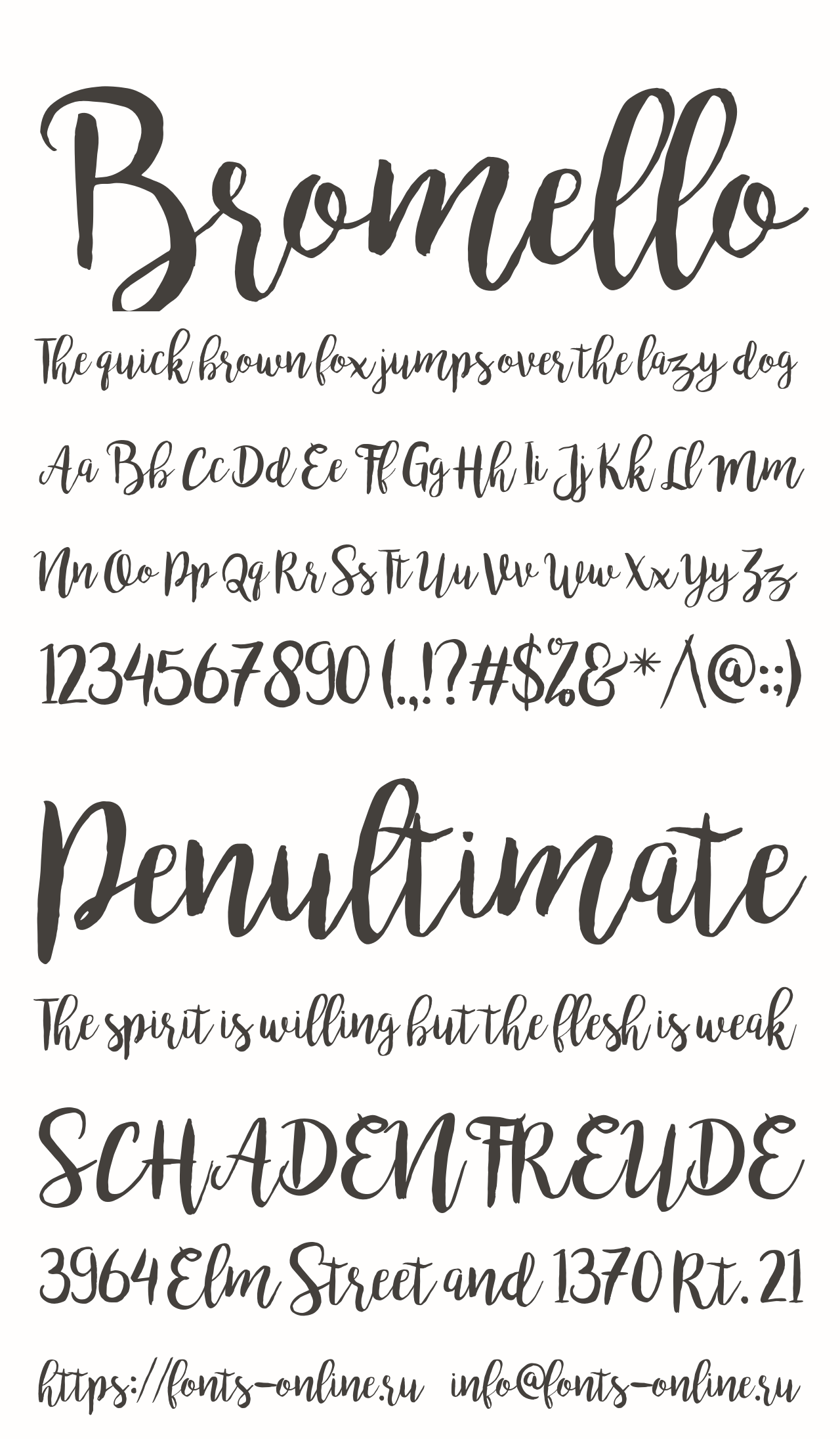
Bromello is a brush script font designed by Alit Design (Alit Suarnegara), first released on DaFont in February 2016. It delivers handwritten brush-style letterforms with thick, connected strokes optimized for craft and personal-use vinyl projects.
Bromello works best for personal-use vinyl lettering where a handcrafted, calligraphic appearance is the goal, because its thick brush strokes maintain structural integrity through the cutting and weeding process better than thin script fonts.
What makes Bromello suitable for vinyl lettering?
Bromello uses a relatively uniform thick stroke across its brush letterforms, avoiding the extreme thin-thick variation that makes most calligraphic scripts unreliable on vinyl cutters. Its connected letterforms — when welded in Cricut Design Space or Silhouette Studio — produce a single continuous cut path per word, reducing the chance of individual letter detachment during transfer. The font’s moderate letter complexity also keeps node counts low for plotter processing.
Key attributes:
| Attribute | Value |
| Classification | Brush script |
| Designer | Alit Suarnegara (Alit Design), 2016 |
| Weight range | Single weight (Regular only) |
| Variable font | No |
| Recommended sizes | 24pt+ for reliable vinyl cuts |
| Letter-spacing default | Connected (overlap designed for welding) |
| License | Free for personal use only; commercial license required for selling vinyl products |
| Available on | DaFont (free personal), Creative Market / MyFonts (commercial) |
| Price | Free (personal); paid for commercial |
How does Bromello perform at vinyl cutting?
Bromello’s thick stroke consistency makes it one of the more reliable brush scripts for vinyl cutting among the fan-favorite fonts reported by Expressions Vinyl’s community of crafters. When welded before cutting, its connected letterforms produce clean single-path words that weed without separation. The font performs best in adhesive vinyl for wall decals and personalized item lettering, rather than heat transfer vinyl applications where its thick strokes can create adhesion bulk.
What are the best pairings for Bromello in vinyl lettering?
Bromello pairs with Bebas Neue for a bold headline plus flowing script combination common in craft vinyl sign-making. It also pairs with Montserrat at SemiBold weight when a cleaner sans-serif secondary element is needed to balance its brush texture.
What are the limitations of Bromello for vinyl lettering?
Bromello requires a commercial license purchase from Creative Market or MyFonts for any vinyl products sold commercially, which is easy to miss if downloaded from DaFont. It also ships in a single weight only, making it a one-role font with no weight variation for hierarchy.
Bromello – Recommended Use Cases Within Vinyl Lettering
- Best for: Wall decal accent text, personalized gift vinyl, craft project name lettering
- Avoid for: Small vinyl under 24pt, heat transfer vinyl on fabric, commercial signage (without proper license)
- Optimal weight: Regular only (single weight available)
- Optimal size range: 36pt+ for best weeding results
—
Evogria
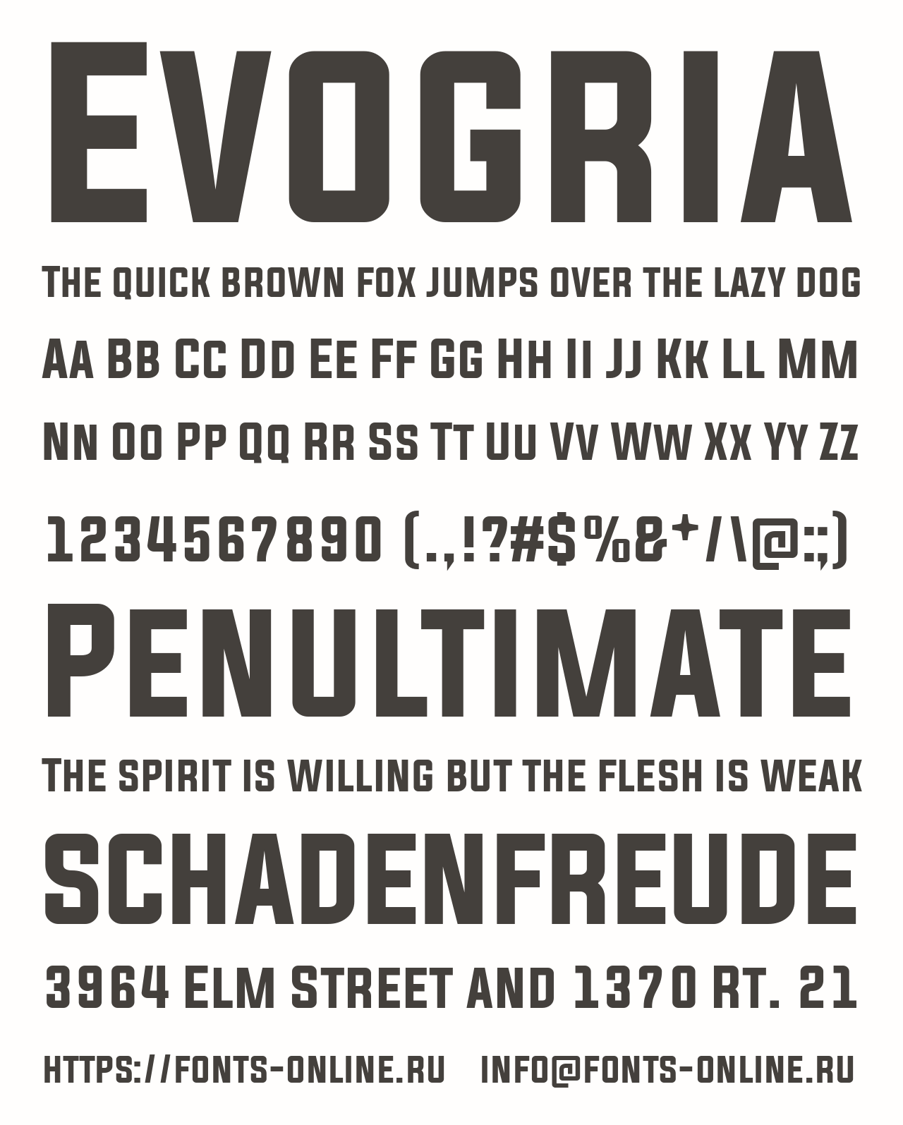
Evogria is a sans-serif typeface designed by Situjuh Nazara, released in August 2014 through the 7NTypes foundry. It delivers bold, clean letterforms with good structural weight in Regular and Italic styles, suited for headline-level vinyl applications and custom decal designs.
Evogria works best for vinyl cutting on Cricut machines because its clean lines, even stroke weights, and minimal ornamentation produce straightforward cut paths that plotters handle efficiently. Creative Fabrica specifically lists it as one of the top vinyl-ready fonts for cutting machines.
What makes Evogria suitable for vinyl lettering?
Evogria’s stroke widths maintain consistent weight throughout all letterforms, with no hairlines or thin joints that create tear points during vinyl weeding. It supports English, Greek, Turkish, and French, making it practical for multilingual vinyl sign applications. Each weight contains 499 characters with standard punctuation coverage, adequate for most commercial vinyl lettering needs.
Key attributes:
| Attribute | Value |
| Classification | Sans-serif display |
| Designer | Situjuh Nazara (7NTypes), 2014 |
| Weight range | Regular and Italic (2 styles) |
| Variable font | No |
| Recommended sizes | 24pt+ for vinyl cutting |
| Letter-spacing default | Normal |
| License | Free personal (DaFont); commercial via Creative Fabrica |
| Available on | DaFont, Creative Fabrica |
| Price | Free (personal); subscription or one-time via Creative Fabrica |
How does Evogria perform at vinyl cutting?
Evogria’s clean geometric construction produces low-complexity SVG outlines that Cricut Design Space and Silhouette Studio process without cut-path errors. At Regular weight, stroke widths are sufficient for reliable cuts at 24pt and above. Its bold presence at large sizes (48pt+) gives it strong visual impact for headline decals and storefront lettering.
What are the best pairings for Evogria in vinyl lettering?
Evogria pairs well with Arial for utility vinyl signage where a headline-plus-body structure is needed, with Evogria handling display-level text. It also works alongside Montserrat Regular for projects requiring a weight distinction between a moderately bold primary and a lighter secondary font element in a layered vinyl decal.
What are the limitations of Evogria for vinyl lettering?
Evogria only ships in 2 styles (Regular and Italic), severely limiting weight hierarchy options compared to Montserrat or Bebas Neue. Commercial vinyl use requires purchasing a license, which is not immediately obvious from its DaFont presence where only the personal-use version is free.
Evogria – Recommended Use Cases Within Vinyl Lettering
- Best for: Display-level vinyl decals, Cricut headline lettering, custom signage at 24pt+
- Avoid for: Multi-weight vinyl layouts requiring hierarchy, commercial use without proper license
- Optimal weight: Regular for all primary vinyl applications
- Optimal size range: 24pt minimum; 48pt+ for headline vinyl
—
Milkshake
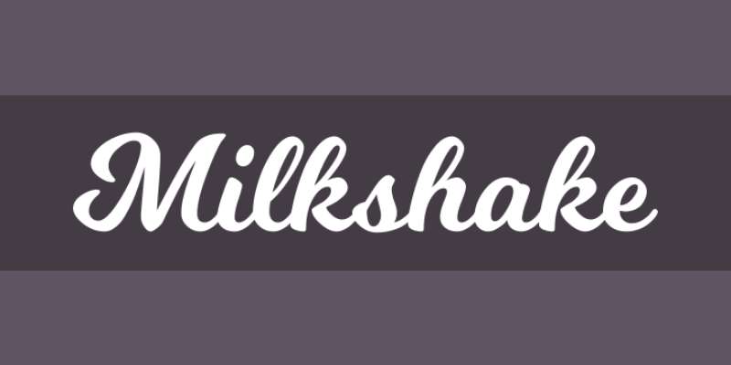
Milkshake is a hand-lettered display script font created by Laura Worthington, available through Creative Market. It delivers rounded, bouncy letterforms with thick strokes and a casual handwritten character suited for personal and craft-oriented vinyl projects.
Milkshake works best for vinyl lettering where a friendly, informal aesthetic is needed, because its thick rounded strokes maintain structural integrity through cutting and its connected letterforms weld cleanly in Cricut Design Space without manually adjusting letter overlap.
What makes Milkshake suitable for vinyl lettering?
Milkshake uses thick, rounded stroke weights throughout its letterforms, keeping stroke widths above the 1.5mm minimum for safe vinyl cutting even at moderate sizes. Its casual hand-lettered construction produces smooth curves with relatively low node counts, which reduces plotter processing time. Expressions Vinyl’s community named it one of the most frequently used vinyl fonts, validating its real-world cutting performance among Cricut and Silhouette users.
Key attributes:
| Attribute | Value |
| Classification | Display hand-lettered script |
| Designer | Laura Worthington |
| Weight range | Single weight (Regular only) |
| Variable font | No |
| Recommended sizes | 24pt+ for reliable vinyl cuts |
| Letter-spacing default | Connected (designed for welding) |
| License | Commercial license included on Creative Market |
| Available on | Creative Market, Laura Worthington direct |
| Price | Paid (one-time purchase) |
How does Milkshake perform at vinyl cutting?
Milkshake’s thick round strokes cut reliably on both Cricut Maker and Silhouette Cameo at sizes 24pt and above. The connected letterform design means welding in Cricut Design Space produces a single-path word cut with no internal connection issues. It performs well on both adhesive vinyl (wall decals, stickers) and heat transfer vinyl for fabric applications, where its rounded thick strokes hold up better than thin script alternatives after washing.
What are the best pairings for Milkshake in vinyl lettering?
Milkshake pairs with Bebas Neue for craft project vinyl where a playful script needs a bold, structured complement. It also works with Montserrat Bold for product label vinyl where the casual script handles the brand name and Montserrat manages descriptor text below it.
What are the limitations of Milkshake for vinyl lettering?
Milkshake ships in a single weight with no alternative styles, making it a one-purpose font in any vinyl layout. Its purely rounded, casual character also limits its use in professional or corporate vinyl signage contexts where a more structured typeface is needed.
Milkshake – Recommended Use Cases Within Vinyl Lettering
- Best for: Craft vinyl decals, personalized gift lettering, HTV on fabric items, kids’ room wall decals
- Avoid for: Corporate signage, professional business vinyl, sizes below 24pt
- Optimal weight: Regular only (single weight available)
- Optimal size range: 36pt+ for best visual impact and weeding reliability
—
Quick Comparison: Vinyl Font Selection by Use Case
| Font | Best Use | Min Safe Size | License | Weedability |
| Helvetica | Commercial signage | 18pt | Paid | Excellent |
| Bebas Neue | Bold headlines | 24pt | Free (OFL) | Excellent |
| Futura | Premium brand decals | 18pt | Paid | Excellent |
| Montserrat | Flexible vinyl labels | 14pt | Free (OFL) | Very good |
| Impact | High-visibility signs | 24pt | Free (system) | Excellent |
| Bodoni | Luxury large-format | 48pt | Free/Paid | Moderate (size-dependent) |
| Arial | General-purpose labels | 16pt | Free (system) | Very good |
| Bromello | Craft script accents | 24pt | Personal free / Commercial paid | Good (when welded) |
| Evogria | Display Cricut decals | 24pt | Personal free / Commercial paid | Good |
| Milkshake | Craft & HTV projects | 24pt | Paid (one-time) | Good (when welded) |
If you are choosing fonts for other physical media or cut-based projects, check these related resources on fonts for laser cutting, fonts for engraving, and fonts for signs broadly, as the structural requirements for clean machine cuts overlap significantly with vinyl lettering principles.
For broader considerations around font licensing before using any of these commercially, especially Bromello and Evogria where the free version is personal-use only, always verify the specific license terms before selling vinyl products.
What Makes a Font Suitable for Vinyl Cutting?
Not every font that looks good on screen survives contact with a cutting blade. The vinyl cutting process imposes hard structural limits on letterforms, and ignoring them wastes material and time.
The vinyl cutters market was valued at $3.46 billion in 2022 and is projected to reach $5.83 billion by 2030 at a 7.6% CAGR, according to Precision Market Insights. That growth is driven by custom signage, vehicle decals, and HTV apparel — all use cases where font choice directly determines output quality.
The five structural criteria that determine vinyl compatibility:
- Stroke width minimum: 1.5mm (0.06 inches) is the industry threshold below which vinyl tears during weeding
- Stroke contrast risk: High contrast between thick and thin strokes (as in didone serifs) causes the thin strokes to fall below the cutting threshold at smaller sizes
- Counter size: The enclosed spaces in letters like “e”, “c”, and “a” must be large enough to weed cleanly without collapsing
- Node complexity: Ornate or decorative fonts generate high node counts in SVG outlines, which slows plotter processing on Cricut Maker, Silhouette Cameo, and Graphtec machines
- Minimum point size: 18pt applies to clean sans-serif fonts; hairline serif fonts (Bodoni, Didot) require 48pt minimum before thin strokes stay above the safe cut threshold
Font Bundles confirms the practical rule: “The thinner the cuts, the more likely you will accidentally tear it while working.” Thick, structurally simple fonts are always the safer starting point for die-cut lettering on adhesive vinyl.
—
How Do Font Classifications Perform Differently on Vinyl?
Font classification determines the structural profile of a typeface. On a vinyl cutter, that structural profile maps directly to cut reliability, weeding time, and transfer success rate.
| Classification | Risk Level | Min Safe Size | Main Issue |
| Geometric sans-serif | Low | 14pt | None at bold weights |
| Neo-grotesque sans-serif | Low | 16pt | None at regular/bold |
| Didone/modern serif | High | 48pt | Hairline strokes tear below threshold |
| Brush script (connected) | Medium | 24pt | Requires welding before cutting |
| Display/decorative | Medium-High | 36pt | Node complexity, intricate paths |
Sans-Serif Fonts and Vinyl Cutting
Geometric and neo-grotesque sans-serif fonts are the lowest-risk category for vinyl cutting. Their monoweight or near-monoweight strokes produce consistent blade pressure across each letterform, and their open counters weed cleanly at standard vinyl sizes.
Why they perform well:
- Uniform stroke widths stay above the 1.5mm cutting threshold at regular and bold weights
- Simple geometric outlines generate low node counts for fast plotter processing
- Wide apertures in letters like “c” and “e” prevent counter collapse during weeding
Montserrat, Bebas Neue, Futura, Helvetica, and Arial all fall into this category. Desktop cutters (which hold 35% of the vinyl cutter market according to Verified Market Reports) are particularly well-suited to these fonts at standard craft sizes.
Serif Fonts and Vinyl Cutting
A serif font carries inherent risk in vinyl cutting because the serifs themselves are thin horizontal or angled strokes.
Slab serifs (uniform thick serifs, like Rockwell or Courier) cut reliably at 24pt and above because the serif weight matches the stem weight.
Didone serifs (Bodoni, Didot) create extreme thin-thick contrast. Their hairline strokes fall below 1.5mm at sizes under 36-48pt. At large-format display sizes (48pt+), they cut cleanly and deliver high visual impact for luxury storefront vinyl lettering.
A slab serif font is actually the safest serif option for vinyl cutting, because its bracket-free, uniform-weight serifs cut with the same reliability as sans-serif fonts at most standard sizes.
Script and Brush Fonts and Vinyl Cutting
Script fonts are the most widely misused category in vinyl lettering. They look clean on screen but cut as disconnected letter paths by default.
The critical rule: any script font must be welded in Cricut Design Space or Silhouette Studio before cutting. Welding merges touching letterforms into a single continuous cut path per word, preventing the machine from cutting between each character and leaving letters that detach during transfer.
Brush fonts with thick strokes (Bromello, Milkshake) weld cleanly and cut reliably at 24pt+.
Calligraphic scripts with thin strokes fail below 36pt regardless of welding, because the thin connecting strokes fall below the 1.5mm minimum. Font Bundles explicitly advises: avoid brush fonts that “have gaps in them” — these gaps become torn vinyl in production.
—
What Role Does Font Licensing Play in Commercial Vinyl Projects?
Downloading a font from DaFont and using it on products you sell is one of the most common legal mistakes in the vinyl crafting community. The free download and the commercial use right are two entirely separate things.
Vehicle decals are the fastest-growing vinyl application segment, according to Precision Market Insights — meaning more sellers are entering commercial vinyl production without understanding the licensing rules that apply.
For detailed background on font licensing structures, including the difference between desktop, web, and commercial use rights, the full license type breakdown covers each scenario.
Three license types that apply to vinyl sellers:
- OFL (SIL Open Font License): Free for commercial use with no restrictions on items sold. Bebas Neue and Montserrat both carry OFL licenses. Safe for Etsy vinyl shops without any additional purchase.
- Personal use only (free version): Bromello and Evogria fall here when downloaded from DaFont. Selling vinyl products made with these fonts without purchasing a commercial license is a license violation.
- Commercial license (paid): Helvetica, Futura, and Impact require paid commercial licenses. Helvetica is available via Linotype or Monotype; Futura via Bauer Types or Adobe Fonts subscription.
Where to verify license terms before selling:
- DaFont listing pages (check the license dropdown, not just the download button)
- Foundry-direct pages (Dharma Type for Bebas Neue, Alit Design for Bromello)
- Creative Fabrica and Creative Market, which both provide explicit commercial use confirmation per product
Etsy takes copyright infringement seriously. According to UPrinting’s legal guide on sticker and label sales, posting disclaimers like “credits to the owner” provides no legal protection. The license is either in place or it is not.
—
How Do Vinyl Cutting Machines Process Font Files?
The font file on your computer and the cut path on your vinyl plotter are not the same thing. The machine never sees the font. It sees vector paths derived from the font, and how those paths are generated determines whether your letters cut cleanly or collapse.
File Format Requirements for Vinyl Cutting
SVG (Scalable Vector Graphic) is the required format for clean vinyl cuts. It is the only format that preserves precise cut paths at any size without quality loss.
Format behavior on major cutting platforms:
- SVG: Cut-ready, layer-separated, scalable without quality loss. Required for Cricut Design Space; primary format for Silhouette Studio (paid version)
- DXF: Vector-based, supported by Cricut Design Space and Silhouette Studio free version. Note: DXF files are “very node-intense,” according to Sweet Red Poppy, and can cause longer cut times and noisy plotter behavior on complex fonts
- TTF/OTF: These are screen font files. They must be converted to outlines in Adobe Illustrator or Inkscape before a cutting machine can use them as cut paths
- PNG/JPG: Raster formats with no cut path data. Not suitable for vinyl cutting without tracing, which degrades outline quality
Cricut Design Space introduced a multiple-layers conversion feature in 2024 that can convert PNG files to cuttable SVG, but vector-native SVG files still produce cleaner cut paths for text.
Welding and Outline Conversion in Cutting Software
Two steps that are skipped constantly, and both ruin vinyl projects.
Convert text to outlines before sending any font file to a vinyl plotter. Editable text remains dependent on the font being installed on the receiving computer. Once converted to outlines, the letterforms become vector paths that any machine can process without font substitution. This step is required in Adobe Illustrator (“Create Outlines”), Inkscape (“Object to Path”), and before exporting SVGs from any design program for commercial plotter use (Roland, Graphtec, USCutter).
Weld script fonts in Cricut Design Space or Silhouette Studio before cutting. Without welding, the software treats each letter as a separate object and cuts around every individual character, including the connection points between letters. The result: disconnected letters that fall apart during weeding. Welded script text cuts as one continuous path per word.
The vinyl cutters market is dominated by large format cutters at 65% market share (Verified Market Reports, 2023), but desktop cutters used by hobbyists and small Etsy sellers account for the fastest-growing segment. Both categories require the same SVG preparation process.
—
How Does Vinyl Surface and Application Type Affect Font Choice?
A font that cuts perfectly on Oracal 651 adhesive vinyl for a window decal may crack on heat transfer vinyl applied to a stretchy athletic garment after five washes. The surface and application method impose separate structural requirements on top of the cutting requirements.
Fonts for Hard Surface Vinyl (Windows, Vehicles, Signage)
Large format signs led the vinyl cutter application segment with 40% of total revenue in 2023, according to Verified Market Reports. Vehicle decals are growing fastest. Both applications share the same font performance requirements: readability at distance, structural durability on curved or flat hard surfaces, and resistance to UV and moisture.
Hard surface font priorities:
- Bold stroke weight for visibility at 5-15 meter viewing distances
- Condensed letterforms (Impact, Bebas Neue) for fitting long text across vehicle panels
- Open counters that weed cleanly without requiring transfer tape precision on large panels
- Oracal 651 is the standard adhesive vinyl for outdoor hard surfaces, rated for 6-year outdoor durability
For storefront window lettering, Helvetica Bold and Futura Medium deliver the clean, professional appearance that matches standard commercial signage expectations. Impact dominates vehicle fleet lettering because its condensed heavy strokes remain legible across van-size panels at highway viewing distances.
Fonts for Heat Transfer Vinyl on Fabric
HTV on fabric fails differently than adhesive vinyl on hard surfaces. The failure mode is cracking after repeated washing, not tearing during weeding. Font choice directly affects post-wash durability.
Quality HTV is rated for 50+ machine washes without deterioration when properly applied, according to HTVRONT and KIMS Direct manufacturing specifications. But that rating assumes the vinyl design itself has no structural weak points. Thin strokes in fonts are the primary structural weakness on washed garments.
HTV font performance by type:
- Thick rounded fonts (Milkshake, Bebas Neue Bold): Best HTV performers. Rounded edges distribute stress during fabric stretch and resist edge lift after washing
- Geometric sans-serif bold (Montserrat Bold, Futura Bold): Reliable on standard cotton and poly blends at 24pt+. Clean edges maintain adhesion through normal wash cycles
- Thin stroke fonts and hairline serifs: High failure risk on HTV. PVC-based HTV is thicker and more rigid; thin strokes in thicker vinyl create stress points that crack during fabric movement
HTV Font Bundles confirms: “heat transfer is a little bit more forgiving because it has the carrier sheet already attached” during production, but the long-term wash durability depends entirely on stroke weight. Thin fonts that survive the initial cut still fail on the garment over time.
—
What Are the Most Common Font Mistakes in Vinyl Lettering?
Most vinyl cutting failures are font failures. The machine did exactly what it was told. The problem was the font choice or preparation.
The electronic craft cutting machines market reached $11.25 billion in 2024 (Future Market Report), with hobbyists comprising the largest end-user segment. That means the majority of vinyl cutters in use are operated by people who are still learning these rules.
The five most common font mistakes:
- Using light weights of reliable fonts: Montserrat Thin (100) and Helvetica Light fall below the 1.5mm stroke threshold at standard vinyl sizes. The font family is safe, but the weight is not. Always use SemiBold (600) or Bold (700) minimum for vinyl cutting.
- Selecting brush fonts with stroke gaps: Brush scripts that look connected on screen often have intentional gaps in their stroke design (mimicking natural brush lift). These gaps become actual cuts in vinyl, producing letters that fall apart during transfer. Vinyl Decal School explicitly flags this as one of the most frequent beginner errors.
- Skipping the weld step on script fonts: Without welding in Cricut Design Space or Silhouette Studio, every character in a script word cuts as a separate object. The result is individual floating letters with no connecting strokes, which shred during application.
- Choosing fonts based on screen appearance rather than stroke weight: A font that looks bold and solid at 12px on a monitor may only produce 0.8mm strokes when sized for a 2-inch vinyl label. Always check actual stroke width at your target cut size before committing to a full vinyl sheet.
- Using high-node decorative fonts on entry-level plotters: Fonts for signs with complex decorative details generate hundreds of nodes per character in their SVG outlines. Entry-level Cricut Joy and basic Silhouette Portrait models process these paths slowly and imprecisely, producing jagged cut lines on intricate letterforms. Reserve decorative display typefaces for commercial-grade Roland and Graphtec plotters that handle node-dense paths accurately.
The fix in most cases is simple: choose a thicker font, use a heavier weight, or simplify the design. Vinyl cutting rewards structural clarity. The fonts that cut cleanly on a Cricut Maker are the same fonts that hold up on a vehicle decal after three years of UV exposure, or on an HTV garment after 50 wash cycles. Structural reliability at the cutting stage predicts durability in final application.
For projects where bold sans-serif display fonts are paired with secondary text, review fonts for banners and fonts for labels to see how weight and size relationships work across multi-element vinyl designs.
FAQ on The Best Fonts For Vinyl Lettering
What is the best font for vinyl lettering?
Bebas Neue and Montserrat are the most reliable choices. Both have uniform stroke widths, OFL commercial licenses, and cut cleanly on Cricut and Silhouette machines without tearing during weeding.
What fonts work best with Cricut Design Space for vinyl?
Montserrat, Impact, and Bebas Neue process cleanly in Cricut Design Space as SVG files. Avoid thin-weight variants. SemiBold or Bold weights keep stroke widths above the 1.5mm minimum required for reliable die-cut lettering.
Can you use script fonts for vinyl cutting?
Yes, but only thick connected scripts like Bromello or Milkshake. Always weld the letters in Cricut Design Space or Silhouette Studio first. This merges characters into one cut path, preventing the blade from cutting between individual letterforms.
What font size is best for vinyl lettering?
pt is the general minimum for sans-serif fonts on adhesive vinyl. Hairline serif fonts like Bodoni require 48pt minimum. Anything smaller risks strokes falling below 1.5mm, causing tears during weeding and failed transfers.
Are serif fonts good for vinyl cutting?
Slab serifs work well at 24pt and above. Didone serifs like Bodoni only cut safely at large display sizes. High stroke contrast in thin-thick serif designs causes hairline strokes to fall below the cutting threshold at smaller sizes.
What is the easiest font to cut and weed for vinyl projects?
Impact and Bebas Neue are the easiest. Both use heavy strokes with minimal interior complexity, which means fast plotter processing and clean weeding with almost no risk of tearing on Oracal 651 adhesive vinyl or standard HTV.
Do I need a commercial license to sell vinyl products?
Yes. Bebas Neue and Montserrat carry OFL licenses, free for commercial use. Fonts like Bromello are personal-use only when downloaded from DaFont. Selling vinyl products without the correct commercial license is a licensing violation.
What file format do I need for vinyl cutting fonts?
SVG is the required format. TTF and OTF font files must be converted to outlines in Adobe Illustrator or Inkscape before export. DXF works in Silhouette Studio’s free version but generates higher node counts, slowing plotter performance on complex letterforms.
What fonts work best for heat transfer vinyl on fabric?
Thick rounded fonts like Milkshake and Montserrat Bold perform best on HTV. Thin strokes crack after repeated washing on fabric. Quality HTV is rated for 50+ machine washes, but only when the font’s stroke widths are structurally solid throughout.
What fonts should you avoid for vinyl lettering?
Avoid thin-weight fonts, high-contrast didone serifs at small sizes, and brush scripts with stroke gaps. Decorative display fonts with high node counts also cause problems on entry-level plotters, producing jagged cut lines and wasted vinyl material.
Conclusion
This conclusion is for an article presenting the best fonts for vinyl lettering, and the core takeaway is straightforward: stroke width decides everything before aesthetics does.
Geometric sans-serif typefaces like Montserrat and Bebas Neue handle plotter cutting reliably across Cricut Maker and Silhouette Cameo. Brush scripts need welding. Didone serifs need scale. Impact and Arial need no preparation at all.
Check the license before you cut. OFL fonts cost nothing and cover commercial vinyl sales. Personal-use-only fonts downloaded from DaFont do not, regardless of what the download page implies.
Match the font to the surface. Heat transfer vinyl on fabric demands thick rounded strokes that survive 50+ wash cycles. Hard surface decals on vehicles and storefronts need condensed bold letterforms that hold legibility at distance.
Pick the right weight, convert to outlines, weld your scripts. Clean cuts follow from those three steps every time.

Renowned for his expertise in logo design and visual branding, Bogdan has developed a multitude of logos for various clients.
His skills extend to creating posters, vector illustrations, business cards, and brochures. Additionally, Bogdan's UI kits were featured on marketplaces like Visual Hierarchy and UI8.
He also wrote in the past years on sites like Design Your Way, WebDesignerDepot, WPDean, Designmodo, Speckyboy, Slider Revolution, and more.
- The Windsurf Logo History, Colors, Font, And Meaning - 10 October 2026
- How to Remove Background From Product Photos (No Photoshop) - 10 October 2026
- How Designers can Build a Stronger Online Creative Identity - 9 October 2026

Bogdan Sandu is a seasoned designer who has been designing websites since 2008. Renowned for his expertise in logo design and visual branding, Bogdan has developed a multitude of logos for various clients. His skills extend to creating posters, vector illustrations, business cards, and brochures. Additionally, Bogdan's UI kits were featured on marketplaces like Visual Hierarchy and UI8. He also wrote in the past years on sites like Design Your Way, WebDesignerDepot, WPDean, Designmodo, Speckyboy, Slider Revolution, and more.
You Might Also Like